One of the primary reasons for taking Ann’s data visualization course, Great Graphs, was to learn better ways to use Microsoft Excel as a visualization tool.
I am so excited to share how grateful I am to Ann and her colleagues for putting together an online training to share their talents with me.
In return, I am paying it forward by teaching my Advanced Excel students at Central Washington University a tiny portion of how they can use Excel as a data viz tool and application.
Here’s how my own work and my students’ work evolved after taking the data visualization course.
My Own Challenges to Communicating Results
One of the biggest challenges I faced as an evaluator was to show “differences” between “pre & post” or “before & after” an intervention other than a typical table of numbers.
Most evaluation reports were made up of narrative and making references to tables of results. When I heard about Ann K. Emery and how she used Excel to produce dynamic and creative stories about programs, I was all about learning more and so I enrolled in Simple Spreadsheets and Great Graphs last year.
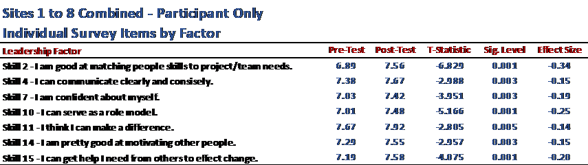
Before: Tables to Show Pre-Post Differences
Here’s what my own work looked like before taking two of Ann’s courses—a table with key statistics.
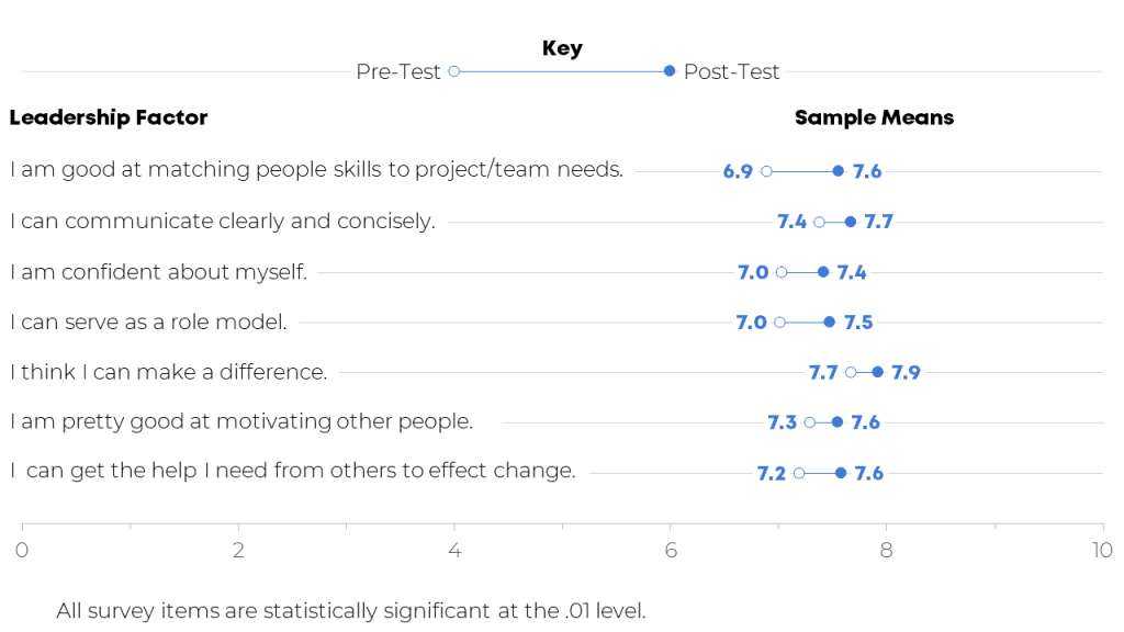
After: Dot Plots to Show Pre-Post Differences
I used several of Ann’s lessons in Great Graphs to create more visually appealing and easier to read charts to show differences in the intervention of leadership education for teens.
For example, I used Ann’s step-by-step process to create a dot plot chart to show the pre- to post-test difference.
She provided a template that walked me through each step of creating the dot plot and now I have the template to keep creating dot plots:
Here’s what my work looks like now:
Editing My Own Visuals
In addition to the dot plots, Ann provided clear instructions for how to work create, edit, declutter, and place charts in a variety of reporting formats.
Before: A Black and White Table with Little Font Size Variation
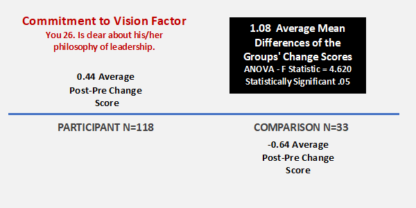
The next example is related to an individual survey item which was statistically significant between the participant and comparison group.
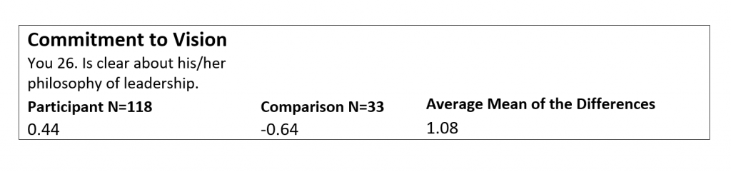
After: Using Dark Colors and Larger Font Sizes to Highlight Key Details
The same information is included in each chart, but hopefully the “After” is easier on the eyes!
Training University Students on Data Visualization
I also wanted to expose these tools and applications to students that are enrolled in the Advanced Excel Spreadsheets course at Central Washington University.
First, I require students to sign up for Ann’s Soar Beyond the Dusty Shelf Report mini course so they can get acquainted with what data visualization is and how they can use Excel beyond just pivot tables, what if statements, and business intelligence applications.
Next, there is one assignment for the students to use an existing set of data (i.e. work-related, volunteer project for non-profit, or choose a data set I provided for them) and create a “before” and “after” data viz using the tools and techniques from the mini course and an extensive review of Ann’s blog.
A University Student’s Before-After Transformation
One of my students, Kelly, volunteers for a small newly organized non-profit organization. They needed help developing an overview of their organization and information showing how they are good stewards of financial donations.
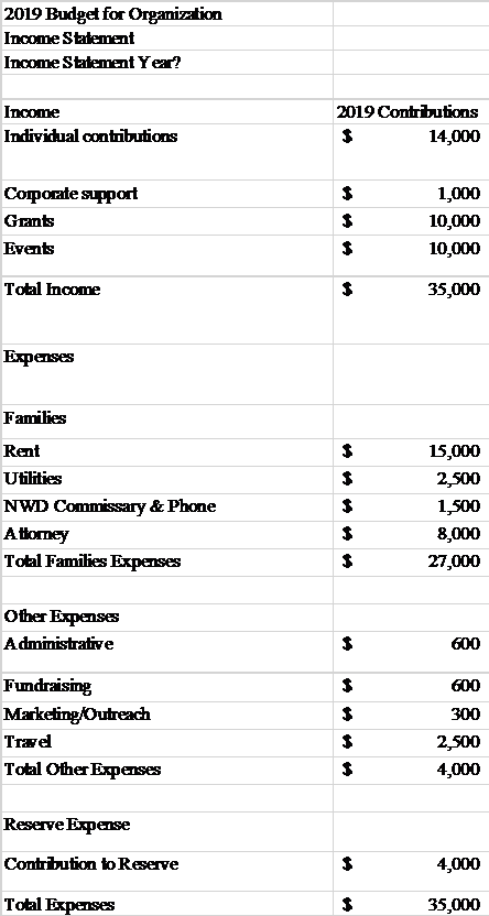
Before: A Table
Here’s what the information used to look like: a table.
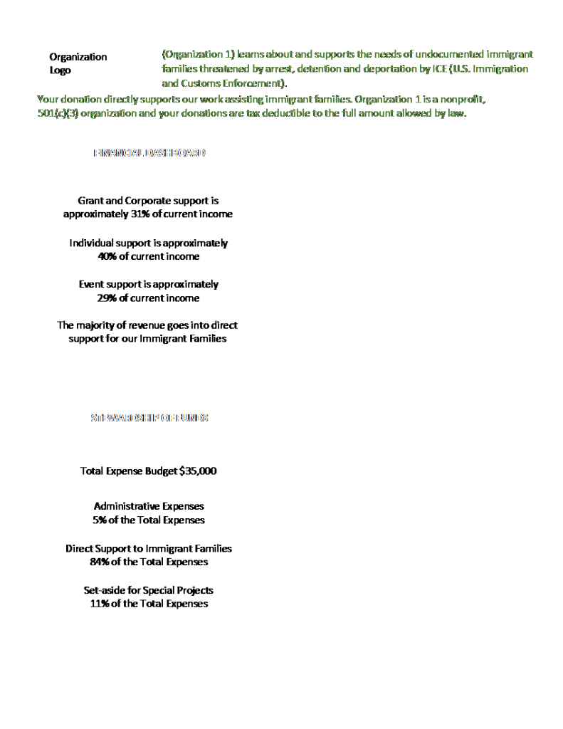
After: A One-Pager with Graphs and Narrative
Kelly provided a one-page document that briefly explained the organization’s mission and program, along with their non-profit status.
She included two column charts as the data visualization portion of the document representing dashboard of finances (income) and stewardship of funds (expense/costs) to clearly define the majority of the contributions are in direct support of immigrant families.
She also included small narrative blocks to briefly highlight grant and corporate donors, in the first block, and that the majority of funds raised go to directly support immigrant families. Both corporate contributions and direct support of immigrant families were the two items that this organization wanted clearly stated.
I love to learn and one of my professional goals continues becoming a better communicator of information using data visualization tools and techniques. I am going to continue seeking out opportunities with Ann and her team and learn more about data viz every day!
Connect with Lori
Connect with Lori Thompson on LinkedIn: https://www.linkedin.com/in/lori-a-thompson-ph-d-8023b85a/.