In this article, guest author Molly Hanlon shares how she uses data to create visualizations and stories that help school staff make decisions to better serve their students. Please comment below with your own tips! Let’s learn with each other. –Ann
We use stories to affirm our beliefs. This is especially true in conversations about equity.
Over many years, I’ve observed countless situations in which school administrators were presented data that showed unjust equity in their system. Most often, administrators told themselves stories to justify that result. A common story was, “That data is confusing, and it can’t be right.”
Many school systems are not using data to make informed decisions. Too often, they are making decisions on what feels right to them, based on a story that isn’t consistent with the evidence. My goal is to use data to create visualizations and stories that are consistent with the evidence, and to help staff focus on how to make schools more equitable and just for all students.
It has felt so gratifying to me to create and share data visualizations that help people accept stories consistent with the evidence. Those stories empower them to identify and accept the challenges faced by their systems, and to inform possible solutions.
Producing Data Visualizations for the Seattle Public Schools
In 2019, I was tasked with presenting data to an Advanced Learning taskforce within the Seattle Public Schools. Advanced Learning programs are designed for students who demonstrate an exceptional ability or potential to learn and reason beyond their same-age classmates.
The taskforce examined disparities among students of color who participated in the program, how students were selected for the program, the program’s delivery, and institutional best practices.
The following two examples are a small sample of the visualizations I provided the taskforce, to help them understand the demographic student populations in the advanced learning programs.
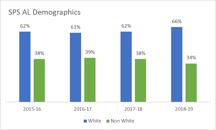
Visualizing White vs. Non-White Students
This first visualization illustrates the percentage of white versus non-white students in the Seattle Public Schools Advanced Learning program over time.
These graphs were presented in-person to the taskforce, and then included into a “fact pack” for later reference.
Before: A Clustered Column Chart with Default Software Settings
Here’s what our graphs used to look like: a clustered column chart with default software settings.
After: A Stacked Column Chart with a Takeaway Title
Here’s what our graphs look like now.
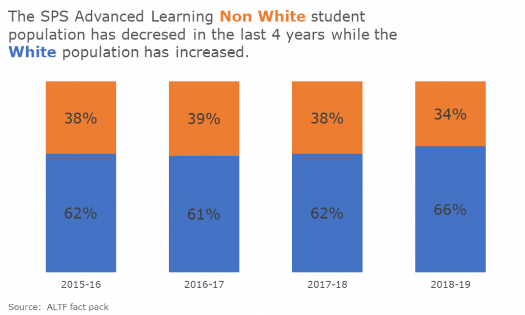
Here are the improvements we made. We:
- changed the font and color schemes to match the Seattle Public Schools style guide;
- wrote a more descriptive title;
- eliminated the superfluous legend, which distracts the viewer’s attention;
- changed the chart type from a clustered column to a 100% stacked column for easier reading;
- increased the font size of percentages for easier reading; and
- eliminated the border and x-axis line, which introduced unhelpful visual distractions.
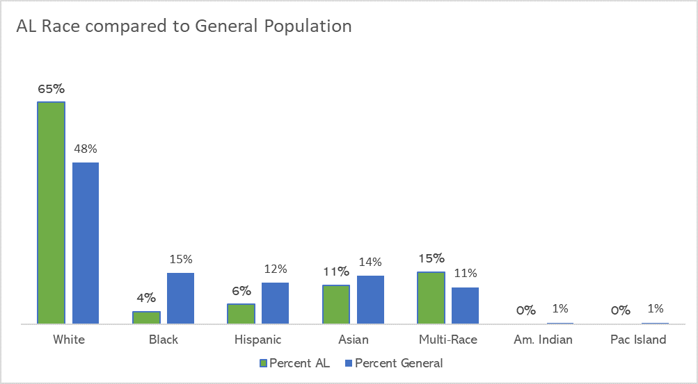
Visualizing Disparities of Students of Color
The second example shows the disparities of students of color compared to their overall representation in the district.
Before: A Clustered Column Chart with Default Software Settings
Here’s what our graphs used to look like:
After: Adding Color-Coded Annotations
Here’s what our graphs look like now:
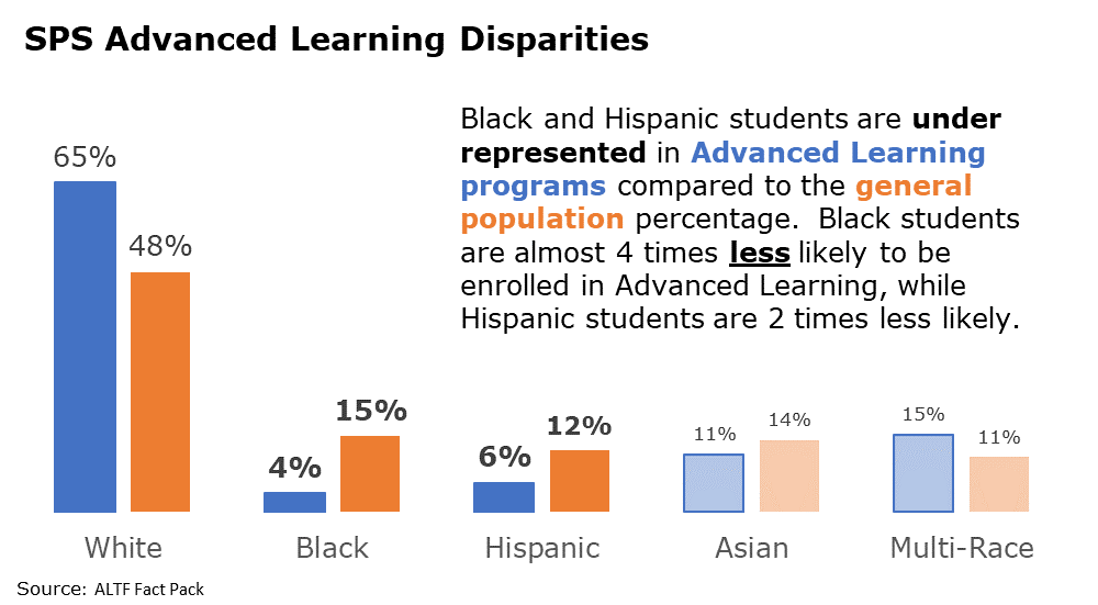
Here are the improvements we made. We:
- changed font and color schemes to match the Seattle Public Schools style guide;
- wrote a descriptive title and inserted a text box to further explain the significance of the data;
- eliminated or used a lighter shade for the data that wasn’t as significant;
- increased the font of the percentages that were more significant;
- eliminated the legend by coloring the font in the descriptive text box; and
- eliminated the border and x-axis line.
The Impact of Intentional Data Visualization
These graphs challenged the task force to think about the inequities in Advanced Learning programs given the change in district demographics.
Collect with Molly
Connect with Molly Hanlon on LinkedIn: https://www.linkedin.com/in/molly-hanlon-b701305a/