Data visualization is an effective approach for improved data comprehension. Seeing the data presented in a clear, concise fashion drives your overall message home much better than cluttered tables. In this article I outline seven simple tips that will help to improve your visuals.
1. Choose the correct chart
There are a multitude of charts that may adequately represent your data. However, before selecting a chart, you need to be clear on what you, and your data, are trying to communicate. Consider the message you want to convey to your audience and select your chart accordingly.
As a side note, 3D graphics are never the correct chart. They distort the data and reduce the comprehension of your chart.
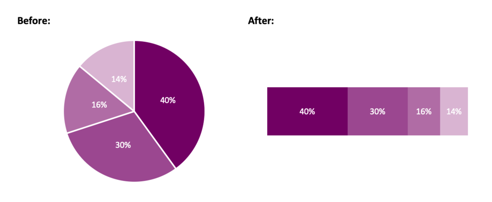
Instead of a pie chart, try a stacked bar chart.
2. Opt for simplicity
After you have selected the chart that tells the story of your data, it is time to visualize your data. In Excel, the default chart is accompanied by excess gridlines, uninformative titles, and poorly positioned legends. The goal: remove anything that does not support the message you are communicating to your audience.
Simplifying your chart will help your message shine through. You want your audience to focus on what is important. Therefore, remove what is not crucial for understanding your data. Excess gridlines and axis labels can be removed if you have labeled data points. Your chart title can be re-written to highlight the core message of the data. Legends can be deleted in favour of a custom-made legend that better aligns with the theme of your chart.
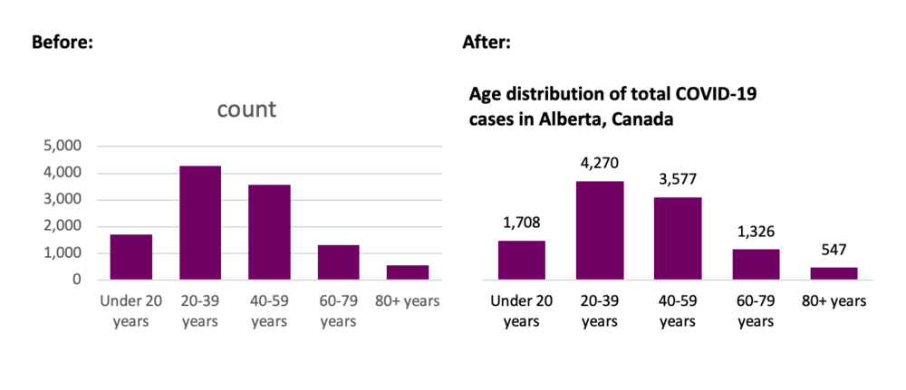
Simplify your chart to let the message shine through.
Source: https://www.alberta.ca/stats/covid-19-alberta-statistics.htm
3. Order data
Ordering data improves the overall comprehension of your chart. By ordering data, random data points can be reorganized in such a way that is meaningful for your audience. This allows for the clear interpretation and understanding of the data.
Categories should be ordered both logically and consistently. Categories independent? Order by value. Categories sequential? Order sequentially. Ordering by value or sequentially does not quite work? Order alphabetically. Regardless, the ordering should improve the comprehension of your chart.
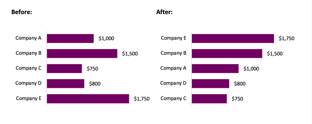
Order your data in a logical way.
4. Include a zero baseline
Truncating axis baselines is an efficient method to lie with data. Truncated axes skew visual comparison, exaggerating differences within your chart. As a result, minor differences appear larger and more significant.
To avoid errors in interpretation, include a zero baseline in your charts. This allows for more accurate interpretation of results. This improves the overall comprehension of your chart and better communicates your overall message.
There are exceptions to the rule, although most often, it is suggested that you use a zero baseline. Line charts are used to compare between lines and a truncated y-axis may be opted for to emphasize differences between lines. If highlighting clear variations between your lines is the goal, truncating the axes may be an option. In this case, clearly identify to your audience that you are using a non-zero baseline.
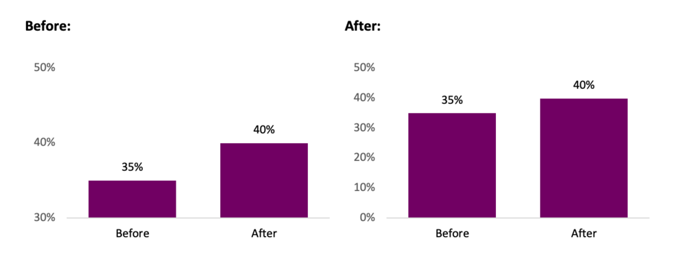
Avoid misleading with your data by including a zero baseline.
5. Use colour to highlight the important information
Colour is a great way to highlight important data within your chart. While you should be mindful to use like colours for like data, it is often beneficial to use accent colours to emphasize a point. These accent colours will pull the reader’s attention and help them focus in on the core message of the chart.
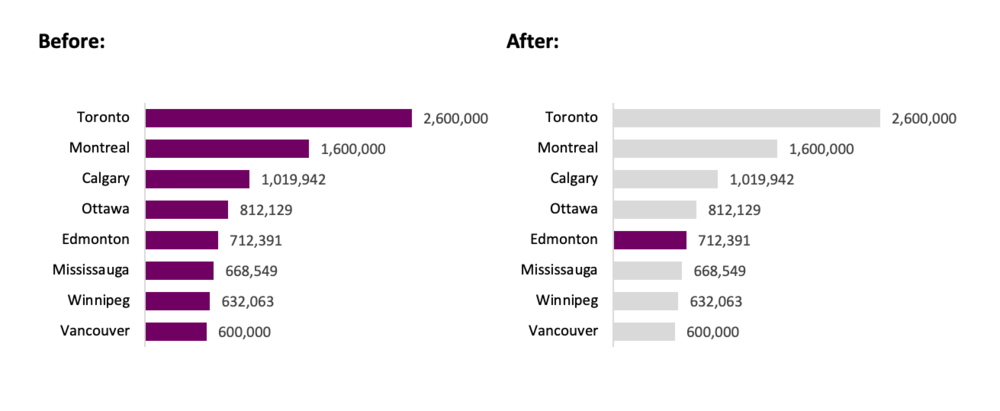
Use an accent colour to highlight important information.
Source: https://www.geonames.org/CA/largest-cities-in-canada.html
6. Select an appropriate colour palette
Avoid using mixed colour palettes. While a mixed palette may provide ample contrast between your data, it also reduces the efficacy of your chart. Instead opt for different shades of the same colour. Use darker shades to emphasize important data (based on value, hierarchy, etc.) and lighter shades for less important data.
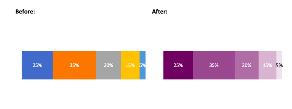
Choose a cohesive colour palette.
7. Experiment, revise and edit
Initially, all charts are limited in their ability to communicate the desired message. However, with simple tweaks, you can create charts that are clean and comprehensible. Plus, data visualization should be fun. Seek inspiration from the many great visualizations online and experiment with your own charts. Through experimentation, revision, and editing, your charts will be able to “wow” both colleagues and clients.
Conclusion
Simple changes to the default Excel chart can lead to significant improvements in your data visualizations. Following the tips outlined above will help you get started creating better charts that will both impress and inform.
Some Data Visualization resources
Chart Selection:
Data Viz Project: https://datavizproject.com/
The Data Visualization Catalogue: https://datavizcatalogue.com/
Inspiration:
Information is beautiful: https://informationisbeautiful.net/
Depict Data Studio: https://depictdatastudio.com/
Evergreen Data: https://stephanieevergreen.com/
Sign up for our newsletter
We’ll let you know about our new content, and curate the best new evaluation resources from around the web!
We respect your privacy.
Thank you!