Six hacks for renovating your evaluation report
PART 6
This article is Part 6 in a six-part series that walks you through how to reno your evaluation reports using six of Canva’s design lessons.
-
Part 1 focused on how to take your audience on a journey using storytelling techniques.
-
Part 2 focused on how to format your report with a consistent, cohesive look using colour and font.
-
Part 3 dove into grouping and spacing elements in your reporting.
-
Part 4 explored how to make elements in your report pop using focal points.
-
Part 5 explored how to use images as focal points.
This last article explores how to simplify data presented in graphs and tables in your report.
Simplifying data starts by having a clear message to convey
In the past, I have been guilty of putting any and all data I could into a report. I’m talking pages of charts to show ALL the results. If I’m being honest, in some instances, I didn’t know what the point was. I put in as much detail as I could to shift the burden of deciphering the meaning behind the data to my reader. Or, I fell back on my training that ingrained in my brain that I should be objective and not provide any insights into what the data might mean (see Part 1).
Regardless, what I learned the hard way is that I need a big idea (see Part 1), position, thesis, point, message, whatever you want to call it, when I am pulling my evaluation report together. Your big idea is your filter for determining what should and should not be included in your report; it will also help you determine how to present it.
Choosing how to present your data is no longer limited to simple column and bar graphs. In fact, the number of different charts and ways to present the data in your report is sometimes overwhelming. Should you use a line chart? Bar chart? Column chart? Bubble chart? Scatter plot? Tree map? Heat map – the list goes on.
There are a number of different chart chooser tools out there you can find. Stephanie Evergreen has both quantitative and qualitative chart chooser tools. The Data Visualization Catalogue is another great online resource for selecting and understanding the various chart available to you. What you’ll notice though, is regardless of the tool you choose, they all rely on you being able to identify your story.
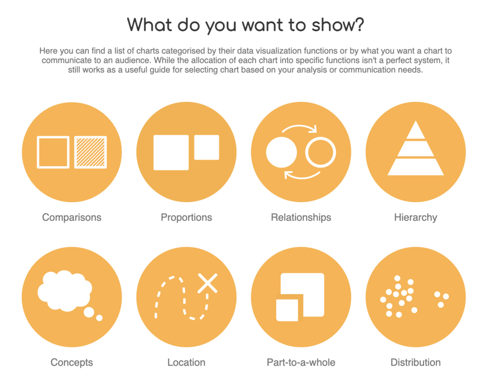
The Data Visualization Catalogue
Once you know what it is you are trying to convey, selecting the right chart becomes a whole lot easier – and more impactful. Take for example the chart below.
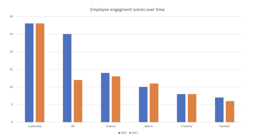
It probably took you some time to figure out the message – engagement within the HR department has tanked. The column chart is not doing anything to highlight that story. Compare that column chart to this slope chart.
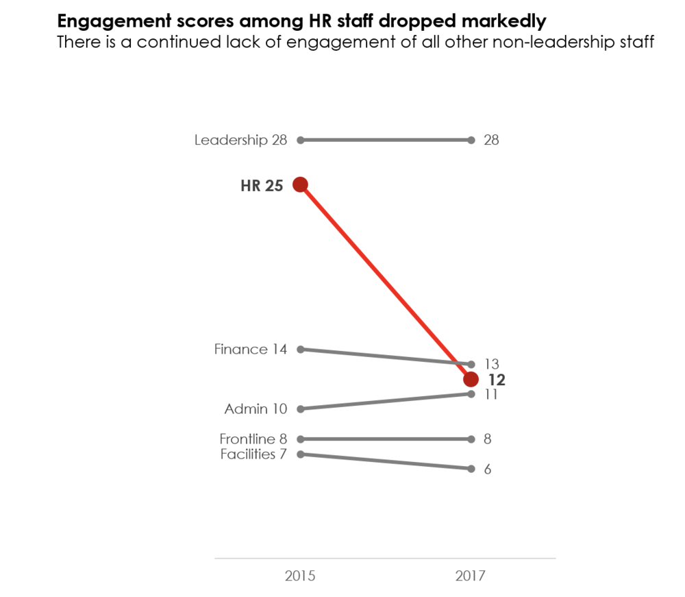
The slope chart immediately highlights the change in scores from 2015 to 2017. Of course, there are many other formatting elements that help to convey our message, which brings me to my next point….
Don’t default to the defaults
Your software is smart, but not smart enough to know the message you are trying to convey. The column chart example highlights how default charts will only get you so far. Choosing the right chart (i.e., the slope chart as opposed to the column chart) helps to convey your message; however, formatting your chart to hone your message is where the magic happens. The slope chart highlights three ways we did that. We….
-
Got rid of distractions – We removed the gridlines from the default column chart. I tend to always remove those since I find them distracting to the eye. We also removed the y-axis. If you include data labels, then often one of the axes becomes redundant and can be removed. You can also remove the tick marks on the remaining axes to dial down another default distraction.
-
Used colour intentionally – The blue and orange columns tell our eyes to look at the columns, but the colours compete with each other and for our eyes’ attention. The slope chart uses red intentionally to highlight the HR department and mutes out the rest of the data with grey. Immediately, the red draws attention to the message we want to highlight without being distracted by competing colours.
-
Stated the story – The column chart contains a generic title “Employee Engagement Scores Over Time.” The slope chart clearly states the key message the audience needs to know.
Dialing down your data means you have a dialed message. That dialed message frames not only what data goes into your report, but how that data is presented. Take a look at some of the reports you are creating. Are there opportunities to dial down your data? Try it out! And don’t forget about the other five hacks outlined in this series.
Sign up for our newsletter
We’ll let you know about our new content, and curate the best new evaluation resources from around the web!
We respect your privacy.
Thank you!