I work with a lot of different groups — government, universities, foundations, nonprofits, for-profits and many others.
One thing I’ve learned is that organization has a little bit different communication style.
Some groups are report-heavy. Think lots of paragraphs, portrait, Calibri size 11 turned into a PDF.
Other groups are dashboard-heavy. They either have lots of static dashboards (short PDF reports) or lots of interactive dashboards and databases.
While other groups are presentation-heavy, kind of. They use PowerPoint, but they’re making standalone documents, not slides for presentations.
One thing these groups all have in common: Everyone has reports of one kind or another. And I often see three common report hurdles over and over again.
The Data Viz Today Podcast with Alli Torban
I recently spoke with Alli Torban on her podcast, Data Viz Today. Alli is an information design consultant who discovered data visualization while on maternity leave. She started the podcast as a way to grow and learn more about the data viz field.
She and I discussed those three common report hurdles we all run into and I gave solutions of how to overcome them.
Watch Our Conversation Here
Challenge 1: Soaring Beyond the Dusty Shelf Report
The first common challenge I see is going beyond the report.
Most organizations have a report of some kind, but it’s hard to get into the mindset of a report AND a dashboard, slideshow, handout, etc.
In many workplaces, we definitely still need a report as one of our formats (e.g., grant reports that are required to be submitted at the end of a multi-year, multi-million-dollar project).
But our data can inform more decisions if we can offer a report plus other formats.
There’s often a misperception that it’s going to be time-consuming or costly to design a report and some other formats.
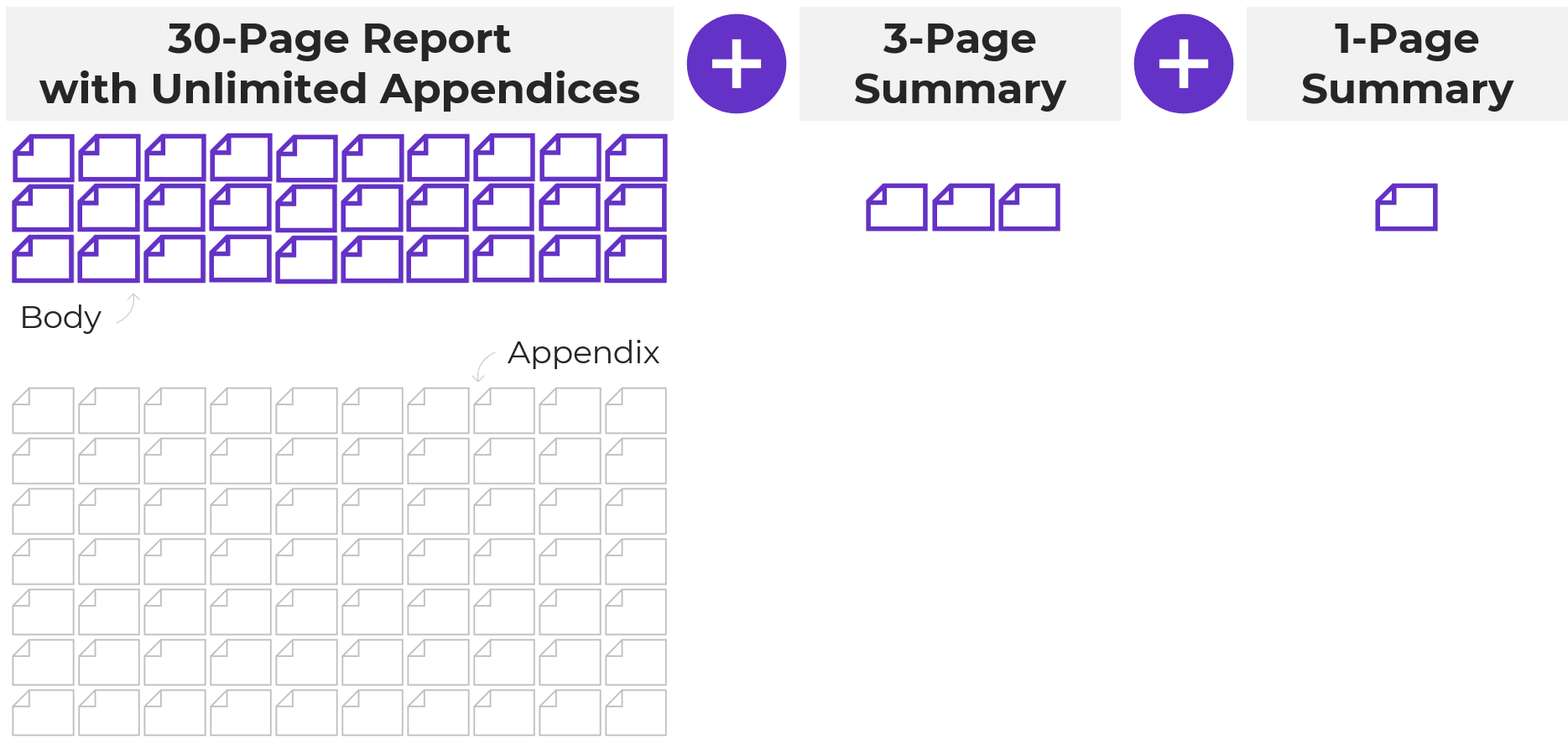
But, there’s a cost-effective and time-efficient solution: 30-3-1 with unlimited visual appendices.
The 30-3-1 approach is this: you take your dusty shelf report and you limit the body of the report to just 30 pages, the most important data. The rest of it doesn’t get deleted, you simply push it to back of the report in a visual appendix (which unlimited in terms of page numbers).
Then when you’re done with the 30-page report, you also make a 3-pager and a 1-pager. Each format will reach a different audience and will help your data reach more people and actually inform decisions.
Not sure how to incorporate a visual appendix? You can learn more about how to start using this technique here: https://depictdatastudio.com/designing-visual-appendices-for-your-next-report-in-under-an-hour/
Challenge 2: Packing a Lot of Dense, Technical Information into a Report – Without Overwhelming Our Readers
Another common challenge we all run into is needing to pack a lot of dense, technical information into a report—without overwhelming our readers.
I worked with a county to help create their 100+ page public health report card.
There was one page for each variable: traffic accidents, cancer deaths, pregnancy rates, environmental/ozone data, etc. Our challenge was to find a way to chunk all that data into a few categories that would make easier to read and navigate.
Our solution: Color-coding by chapter.
After categorizing the data, each chapter was designated its own different brand color.
The headings and visuals all used that brand color throughout the chapter (heading 1s, heading 2s, call-out boxes, sidebars, graphs, maps, bullet points, etc.).
The end result allowed readers to easily tell when a new topic began.
Your brain recognizes new color; the content must have changed as well.

Here’s another example of when I worked with a university library to use color-coding to simply their report: https://depictdatastudio.com/how-to-transform-a-text-heavy-report/
This technique can also be applied to slideshows, dashboards and infographics.
I use this technique when I give presentations as well: https://depictdatastudio.com/visually-structure-your-presentation-around-key-points/
Challenge 3: Incorporating a Variety of Visuals—Not Just Graphs
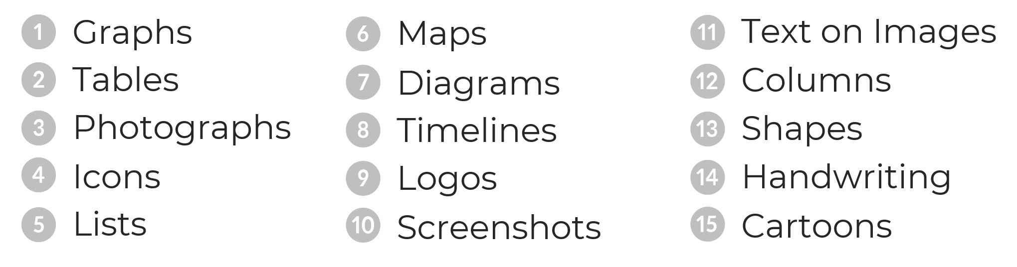
The final challenge I see are reports that are ALL narrative, or ALL graphs, or ALL photos.
We all tend to gravitate towards what we’re comfortable with but there are so many great types of visuals you can include.
In the video, you’ll hear Alli and I talk through this list of 15 visuals to include in our reports:
- Graphs
- Photographs
- Icons
- Lists
- Maps
- Diagrams
- Timelines
- Logos
- Screenshots
- Text overlaid on images
- Columns
- Shapes
- Handwriting
- Cartoons
- GIFs
Your Turn
I’d love to hear from you. What challenge have you dealt with (or are currently dealing with)? Which of these techniques have you use in your work? Comment and let me know.
Connect with Alli
Website: www.allitorban.com
LinkedIn: @allisontorban
Data Viz Today Podcast: https://dataviztoday.com/