Kristen Summers is the Senior Grants Manager at Saint Luke’s Foundation and a Depict Data Studio student. She emailed me an example of how she’s revamped her organizations grants docket and I knew I had to showcase her hard work. Keep up the great work Kristen! – Ann
_________________
I work at a grantmaking organization and it is my job to update the board three times a year on the grant applications we are considering for awards, the grantmaking budget and other information.
You will see below an example of the grants docket (slate of grant proposals under consideration) as well as a grantmaking budget summary. I am almost too embarrassed to show these!
Fortunately, after completing about 70% of the Dashboard Design course, I was able to revitalize a tired spreadsheet into an information powerhouse and a colorful budget visualization into a professional presentation.
It’s the same information, just presented differently!
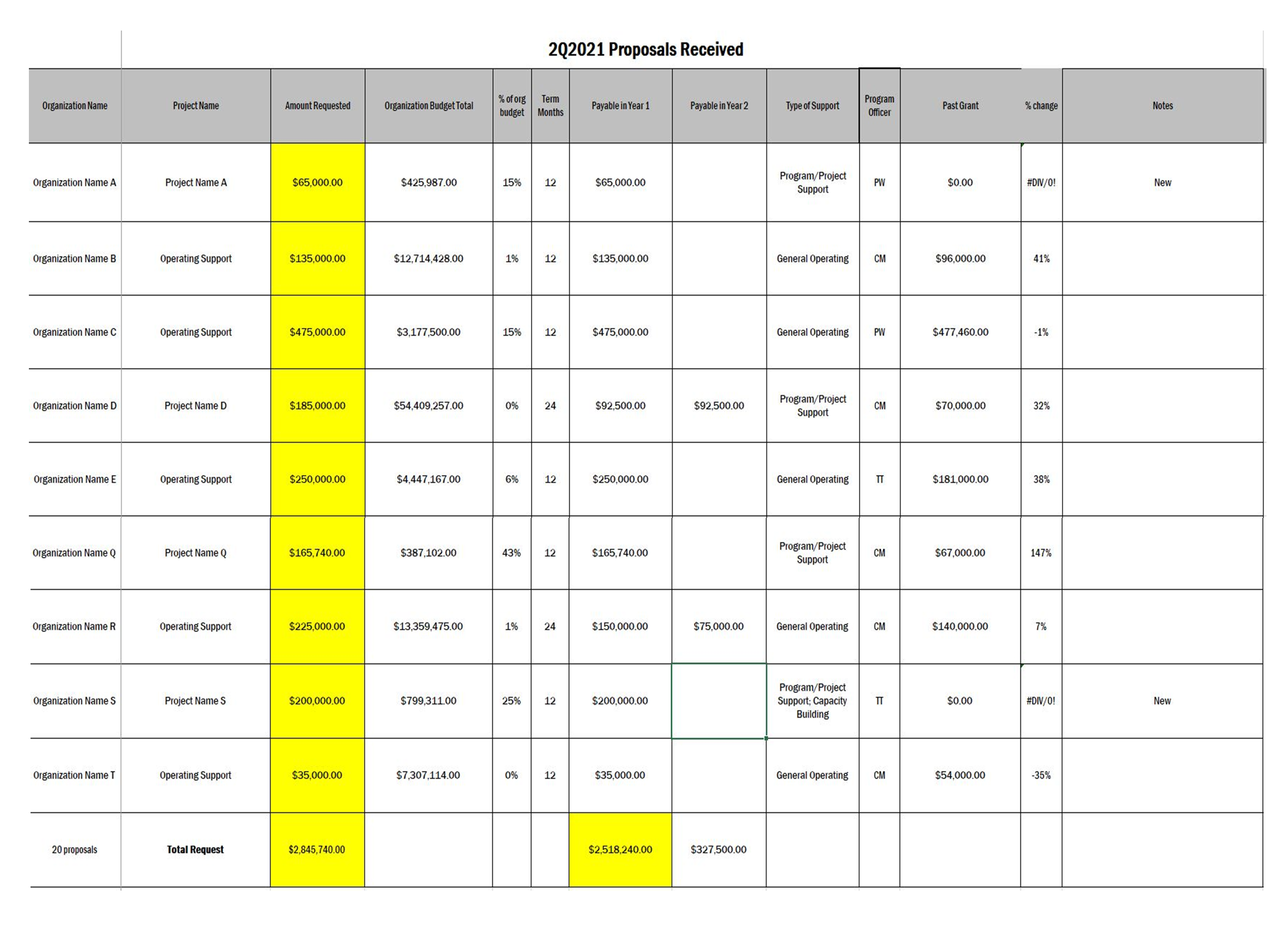
The Docket
Before: Gridlines Galore and No Visualizations
This docket was printed on 11×17 paper for easier readability and called a “placemat”.
Gridlines, some highlighted cells in yellow to draw the eye.
A lot of information and a bit overwhelming to take in.
Applications were presented alphabetical by organization and not grouped in any way.
After: Fewer Columns, Bigger Impact
When I started the Dashboard Design course with Ann, my intention was to revamp our organizational dashboard and not even this document (once I get that done, I will have to write another blog!).
But the course showed me what little changes I could make to have a big impact.
Although we do not compare numbers over time in this document as it is just a list of our applications, I was still able to use some helpful visualizations, icons, colors, and conditional formatting to tell a story.
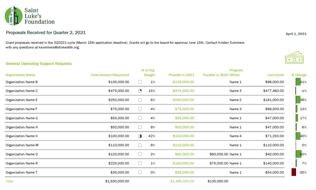
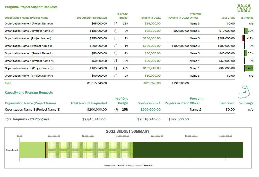
A summary of the changes made:
- Added logo and subtitle
- Used brand colors in headings and their corresponding icon
- Minimized the use of gridlines
- Removed highlighting of a column but used font colors for key info
- Grouped applicants together by type of grant (general operating vs. project)
- Hid the column with the organization budget, but added an icon set of pie charts via conditional formatting
- Correct alignment for numbers vs. text
- Deviation bar visualization to show the percent change of the current request from their previous award instead of just expecting the reader to do the math
- Added a budget summary chart at the bottom
This resulted in a much more well-received document with lots of compliments from board members!
I have begun creating a cohesive aesthetic for all the documents I produce for the board to give them the information they need but in the most streamlined way possible.
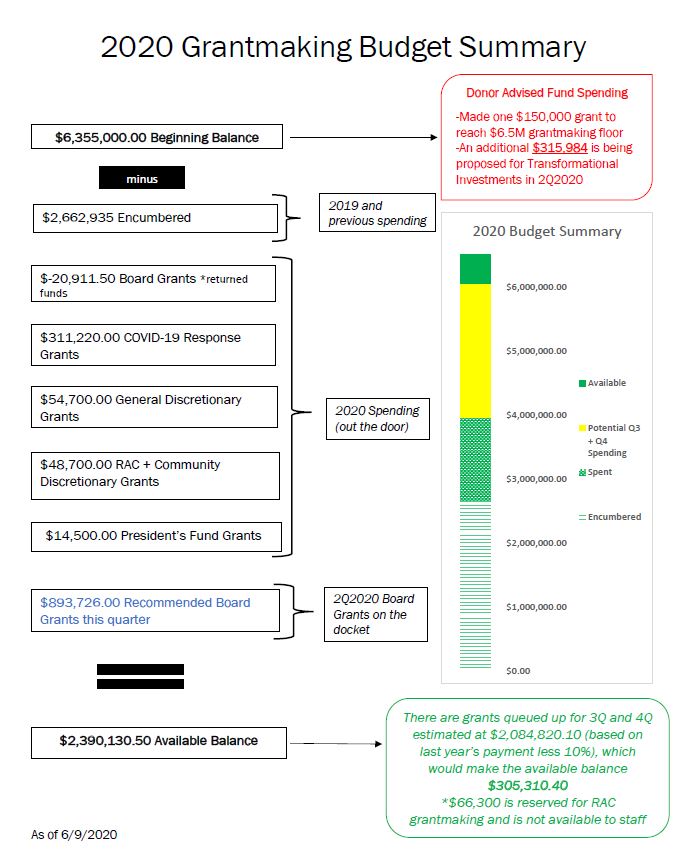
The Budget
In 2019 I developed the below budget visualization to up my game a bit from a spreadsheet that board members had a hard time understanding.
This was an improvement over the previous version, but Ann’s course challenged me to turn it up a few notches.
Before:
After:
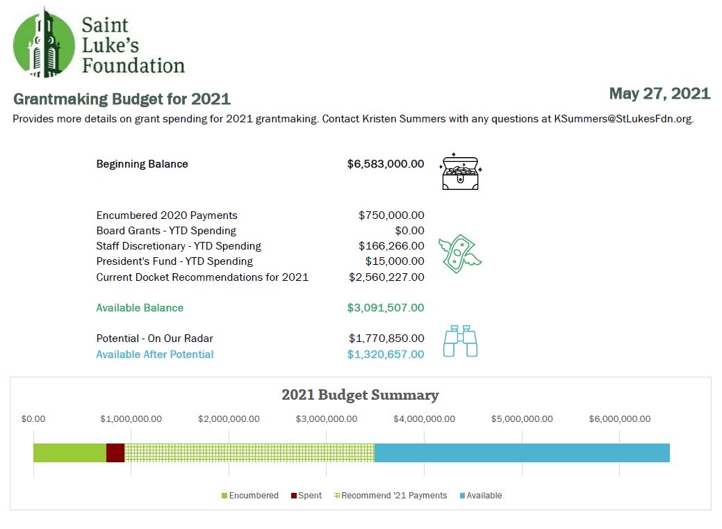
There were not many “big” changes to this in terms of conditional formatting or visualizations, but it has definitely been toned down.
The biggest change was that I replaced the text explanations with icons to illustrate where we are in the budget, which the board members appreciated.
As you can see, there is that cohesive title, subtitle, font, and color choice to keep the branding in line.
Take the Time to Take the Course!
I am pleased with what I am able to do now that I have completed Dashboard Design. The lessons were fun and I was able to put my skills to the test in a matter of weeks!
Now I am enrolled in Simple Spreadsheets which will really provide me a good base as my role stretches me to do more community engagement data evaluation and learning. Thank you, Ann!
Connect with Kristen
LinkedIn: @summerskristen
Lift every Voice 216: https://www.facebook.com/216lift
Saint Luke’s Foundation: https://www.facebook.com/saintlukesfoundationcleveland