Shawna Rohrman, Ph.D., is the Evaluation Manager for the Cuyahoga County Office of Early Childhood and its public-private partnership, Invest in Children. She enrolled in our Dashboard Design course and is sharing how she uses her new skills in real life. Thanks for sharing, Shawna! –Ann
—–
Using a dashboard has been central to my work as a program evaluator.
My office funds several early childhood programs that all differ in their program content, performance indicators, and outcomes.
As the person who reviews each program’s quarterly report showing progress on each of their performance indicators, I am also often asked to report overall performance for our office—for example, total number of families served or number of home visits made.
This can be unwieldy when looking across many reports, and it’s useful to have a document that allows us to assess progress across all the programs at once.
When I enrolled in Ann’s Dashboard Design course, my goal was to build on an existing document, making it easier to read and identify successes and areas for improvement.
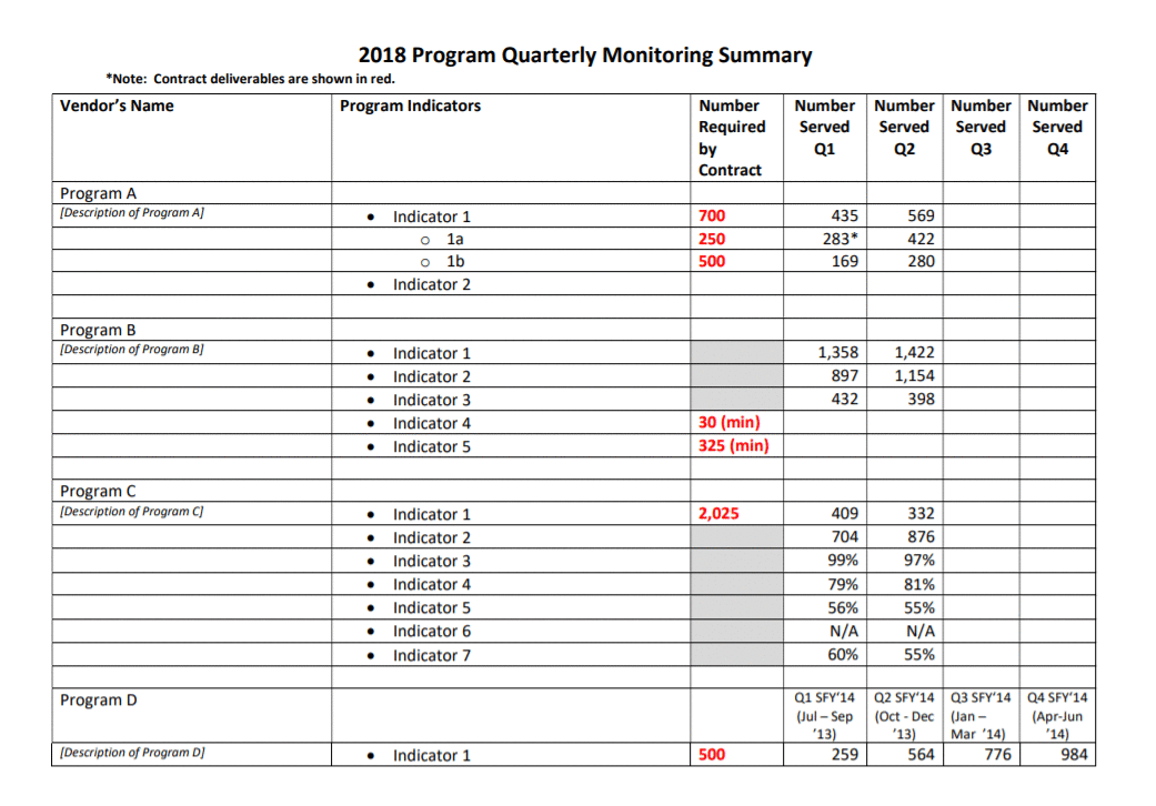
From a Basic Many-Paged Table in Word…
Initially, our office used a table in a Word document to track quarterly performance across programs.
It served the basic function of being able to see, in one file, how each program was doing each quarter. But it was lacking in a few areas.
One was that, although the annual targets for indicators were clearly marked in red and there were quarterly totals, there was no annual or year-to-date total to compare to the target.
Additionally, although it was very helpful to have all the performance data in one place, it wasn’t especially easy to see trends from quarter to quarter and the table split across two pages.
…To a One-Page Visual Overview of Key Performance Metrics
The first thing I did to make data tracking easier was move to Excel.
Even before taking Ann’s Dashboard Design course, I knew Excel was the smarter choice just for the ability to use formulas.
I also worked with my colleagues—the main audience of this internal performance-monitoring dashboard—to determine what features would be most useful. We came up with a few that make the dashboard much more user-friendly.
First, we chose a few key indicators to include on a cover page (pictured below). This allowed us to see the most critical data for each program all on one page, rather than having to scroll or flip through several pages.
In this Excel workbook the cover page is followed by separate worksheets, each showing one program’s data on their full list of performance indicators, which is helpful when we are taking a deeper dive into one program’s work.
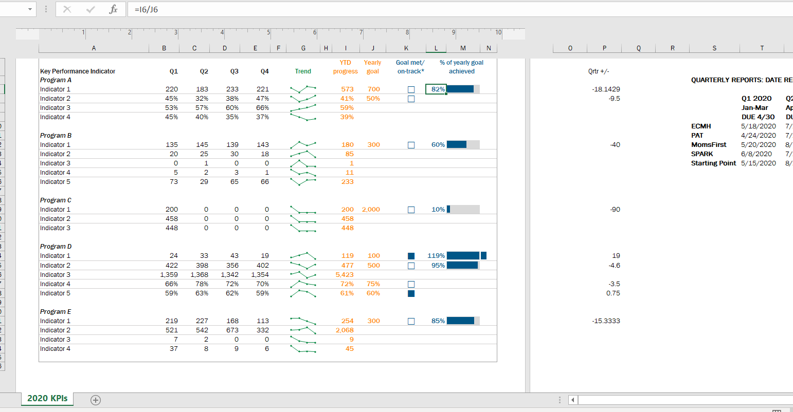
Second, we all agreed the dashboard needed year-to-date totals to compare with the yearly targets.
This is especially helpful for some indicators, like number of individuals served, where many people continue to participate in a program from quarter to quarter.
Adding up the quarterly number served would count longer-term participants more than once; the unduplicated total is essential for understanding whether the program is meeting its contract target.
I took what I learned in Ann’s Dashboard Design course and added a third feature to visualize progress toward the yearly target: checkboxes and progress bars.
The checkboxes allowed us to see whether, at the end of each quarter, the program was on track to meet the yearly target. So, for example, a program would have to exceed 50% of the performance target at the end of Q2 (halfway through the year) in order to be “on track.”
The progress bar shows exactly what percent of the yearly goal has been achieved year-to-date. I used helper cells outside the print area to determine whether the checkboxes would be filled or empty.
Finally, we found it helpful to use sparklines (another tool learned in Ann’s class!) to succinctly show how performance changed from quarter to quarter.
In 2020, the second quarter was an especially unusual time as programs adjusted to the start of the pandemic. Seeing dips and spikes during that time helped us get a quick sense of what was working and what was not, and we were able to use that information to drill down with program staff.
The Outcome: More Effective Use of Data in Decision-Making
Even with just these few changes (and using a program nearly everyone can access!), our new performance monitoring dashboard has made it so much easier for our team to review quarterly progress in one place and visualize how our system of early childhood programs are working for children and families in the county.
The dashboard has become a quarterly staple at our staff meetings, where we review as a group and use the data to generate next steps.
It is also easy to share with senior leadership, so they can see at-a-glance the important work our programs are doing.