You’ve completed your qualitative data collection and you’re writing up your report. You step back and look at All. The. Text. If only you had some quantitative data to include in a chart, or some numbers to report!
We’ve previously written about how to quantify qualitative data and offered some definitions for things like “few” or “some” or “many”. In this article, we’ll give you even more tips for quantifying qualitative data.
-
Frequencies
Maybe this is obvious but there’s no rule against counting codes! I will say, though, that this approach may lend itself to data that are addressing a very specific question. “Describe a time you experienced discriminatory behaviour” may be more difficult to quantify than “What is one improvement you’d make to your workplace?”
I recently coded some data where participants were asked “What was the most helpful part of the program?”
There were thousands of typed-in responses. I was able to read through it and quickly come up with a list. I could then report that, for example, 40% of respondents thought that flexible scheduling was most helpful, while 30% thought support from the staff was the most helpful.
Usually there will be an “other” category and that’s okay – just describe what the “other” means: “5% of respondents reported other things, for example, they liked the website, or they liked the snacks at reception.”
Now you have some numbers to use your data viz skills on!
-
Demographic descriptions
You’ve completed all those interviews and are reporting the findings through themes and quotes, but have you explored if there are differences between who said what?
Maybe there are gender differences in how questions were answered, or role/title differences?
You could include charts or numbers by reporting something like: “80% of frontline staff but only 20% of managers described a time when they had encountered workplace conflict” or “70% of respondents who lived in a specific geographic region reported more stories of difficulty accessing care compared to only 10% who lived in another region.”
As always, be cautious about drawing any causation or firm correlations.
-
Play with data presentation
Ok, this one may not be quantifying the data per se, but it can break up those text-heavy report pages.
Word clouds seem to be an oft-used example for visualizing qualitative data. I’ll go out on a limb and say I’m not a fan. I can’t think of a time when I’d gained any meaningful insight from a world cloud.
Some other options include:
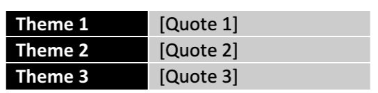
Tables
-
Create a two-column table with your core theme on the left and example quotes on the right.
Journey maps
-
are your participants describing an experience or a narrative? Perhaps you can map it out in stages and include descriptions or quotes at each stage. I’ve found journey maps to be very impactful in reports. You have the option of using one participant as a case study or describing a “typical” experience.
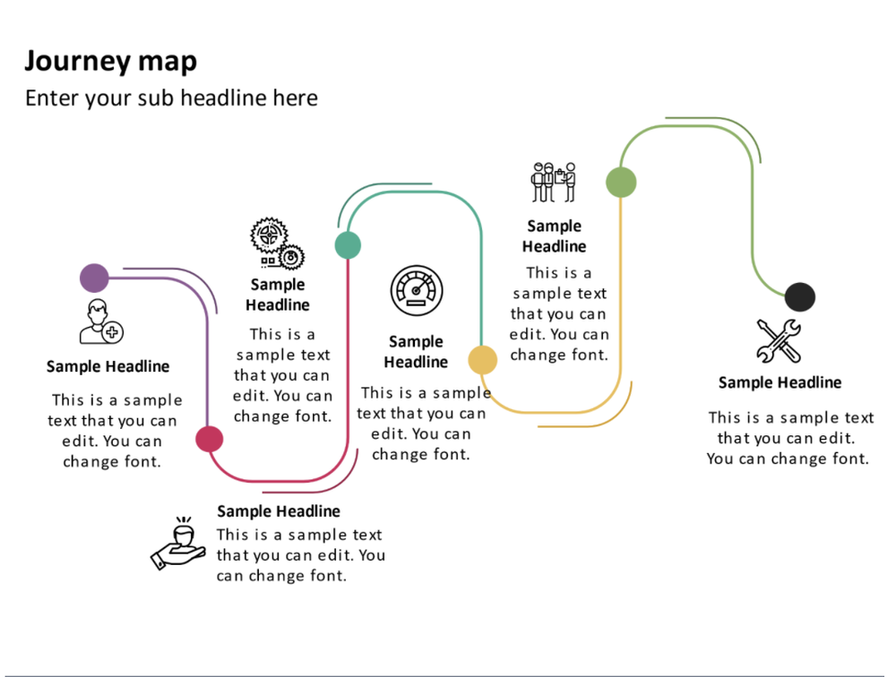
(example maps are free slide templates from SketchBubble)
Images
-
Sometimes something as simple as adding an image, icon or photo along with a quote can make it stand out more and break up the text. Maybe even try a stand-out border.

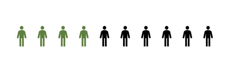
Icon array
-
If you’ve been able to do any frequencies or counts of your qualitative data, you can certainly include any number of charts to depict your data. An icon array may be particularly impactful to give a visual to how many participants said whatever it is you’re highlighting.
What tips have we missed? Share them by commenting on this article!
Sign up for our newsletter
We’ll let you know about our new content, and curate the best new evaluation resources from around the web!
We respect your privacy.
Thank you!