“But you can’t do that in [Excel / Tableau / Numbers / Google Sheets / insert your own…]!”
Well, maybe you could.
When you work with data, you usually use the same tools over and over. You become familiar with them. You know the ins and outs, and you work faster because you remember the shortcuts and hidden menus.
Even with all your know-how, you can still come up against a roadblock, unable to do what you need. How about taking what you know and use it…but differently. Hack it.
Hack? What?
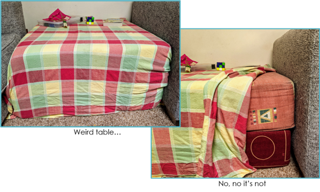
What hacking am I talking about? Not any of the Merriam-Webster definitions (think literally beating around the bush  ). This hacking is more like the idea behind ikeahackers – taking a product and using it in a different way or for a different purpose than the original creator intended. Psst.. It doesn’t have to be ikea. You can take 2 giant foam cushions, and turn them into a side table.
What Do You Want?
Microsoft Excel added a map to its chart types. Great!
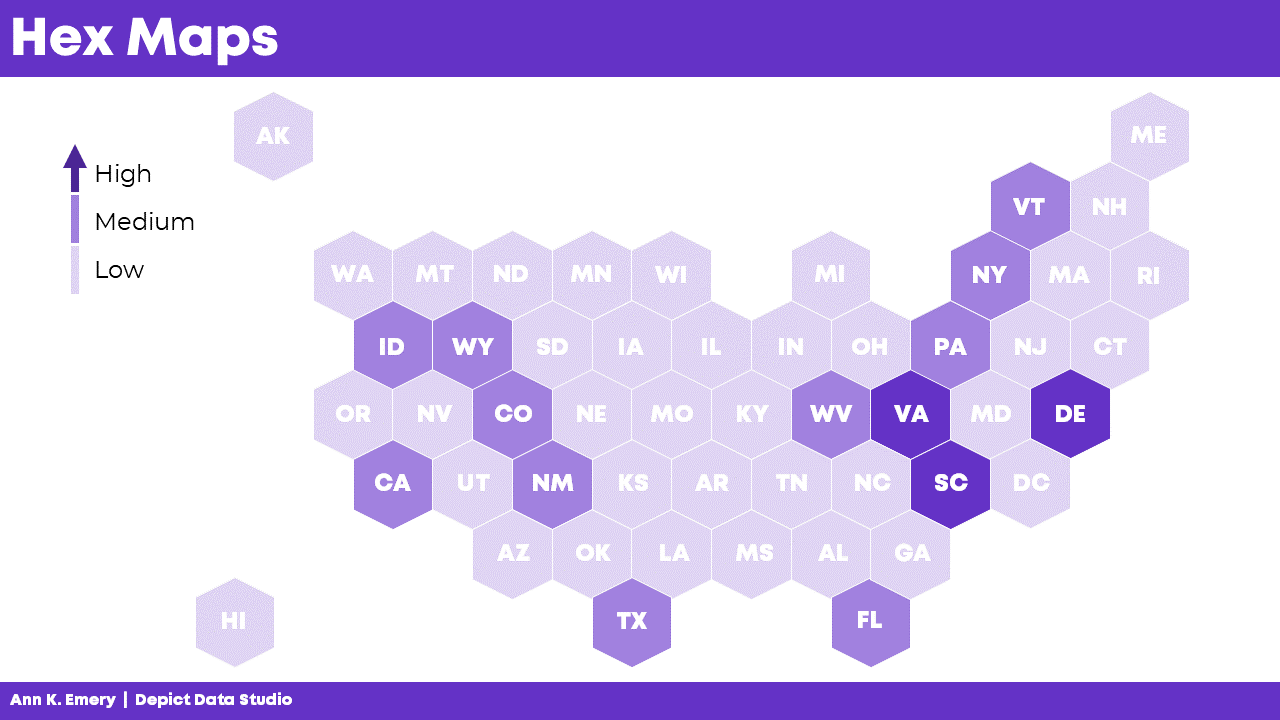
But what if you want to create a hex map?
A hex map is a map that represents an area (a US state for example) as a single hexagon, in the approximate position it should be. This eliminates problems that come up because of the different sizes of states. In the US it is especially helpful when including Alaska and Hawaii since they are both positioned far away from the contiguous US states.
A hex map would have equal representation for all the US states. No state would be too small (hello Rhode Island) or too big (looking at you, Alaska).
Get from Where You Are…
Ok, how to do that? Does Excel map include a hex map option? Nope.
Well, it looks like it’s organized in rows and columns.
Could we use the Excel cell structure for that? Maybe, but how will we get the data to the cells?
Well, a scatter plot could be the basis of that but you would need to build the whole map somehow.
How?
…to Where You Need to Go!
Other people (like David Napoli and John Schwabish) who understand Excel quite well sat down and wrote the process.
They did not use code. They did not use a special hidden feature.
They hacked Excel by using a standard feature such as the scatter plot.
It was done by understanding how scatter plots are built.
Scatter plots place your data in certain positions, based on the x,y coordinates provided.
You could use that to prepare the data for a scatter plot that looks like the US, then add the data, add hexagons, and so on. Since someone already did that, you can simply read up on their work.
Keep it Simple, S…Sweetheart
There are many more simple hacks you can use in Excel.
A useful one I recently used is showing the total in a stacked bar or column chart.
A stacked bar chart has the option to display the data labels of each series but not the total.
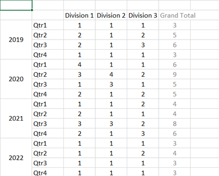
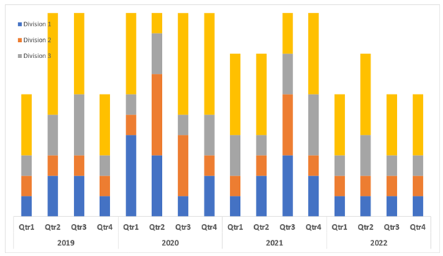
Consider this example displaying the number of projects in different divisions.
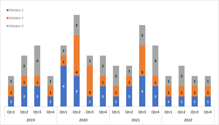
Aside from the clutter, if users want to know the total per quarter, I don’t expect them to start adding up the numbers themselves.
But it’s not an option!
Wait, Excel displays the data labels of each series.
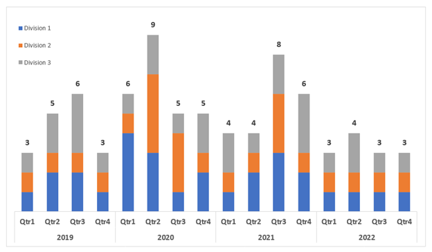
Why not create a series summing up quarterly projects and then just showing the data labels?
Did it.
Then added it to the chart where it was displayed in all its glory.
Once I choose “No Fill” and “No Line” and add the data labels, things look different.
If you don’t like to think of all those stacked pieces jutting out of the chart, or you want the vertical axis to be determined automatically there’s another thing you can do.
Edit the chart type and choose the Grand Total series to be something other than a stacked column.
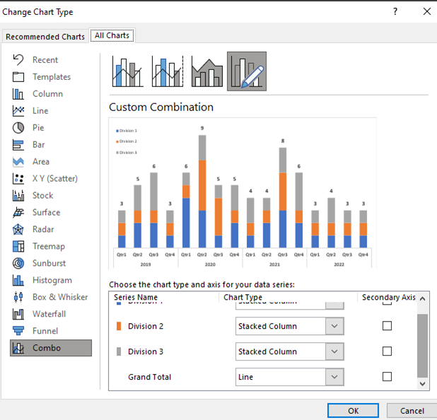
Same result, one more step, but a step that can keep the chart looking this way even if the data changes and your axis needs to change as well.
Gimme More…
I also have to mention one of Ann’s many hacks, because it is just so useful and so simple – using the Webdings font as a dynamic graphic component.
Read it and congratulate yourself on learning something small but powerful.
Now What?
Stop.
Stop and think.
Stop and find time to invest in your professional development and think on the tools you are using. Break away from the “walls” of the examples you’ve learned from and truly think about features you know. Try to imagine them as simple, skeletal definitions of input-output. “I have data and Excel places it on a grid.” “If there is space in the data, there is space in the table.” “My chart doesn’t have to show everything included in it, some of it can just be structure.”
Stop before you create a chart, table or report and think about what you want to do, without restricting yourself to whatever tool you need to use. Sketch it, describe it in words, use whatever helps you have it defined in your mind. Only after that think of your implementation, think of your own view of features in your tools and plan on how to use them.
Now, go forth and be technically creative!
Connect with Anat Zohar
LinkedIn: https://www.linkedin.com/in/anatzohar/