After enrolling in Depict Data Studio’s Great Graphs in Excel course and watching many of the videos, I was excited to apply what I had learned.
My first chance came in the form of a front-end evaluation project for a children’s museum planning a new exhibition on dinosaurs.
Measuring What Kids Already Know about Dinosaurs
The museum wanted to understand what children and families already knew about dinosaurs – including whether they knew what other types of animals and plants existed at the same time.
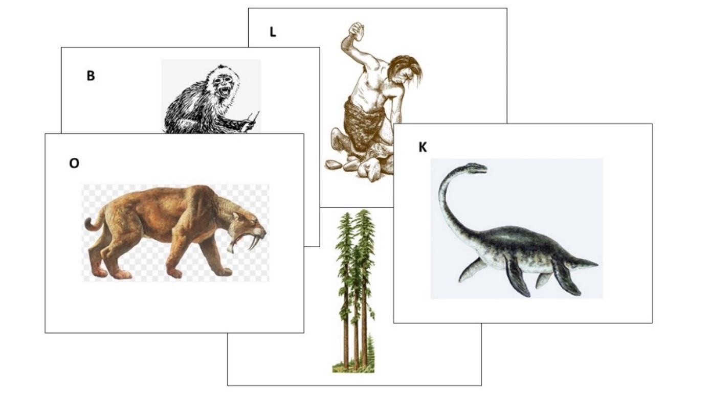
I designed a fun card-sort activity, where parent-child pairs were asked to work together to sort 19 cards with images of different plants and animals into two piles:
- one pile for those they thought lived at the same time as dinosaurs, and
- one pile for those they thought didn’t live with dinosaurs.
Here’s a sample of a few of the cards we gave to families:
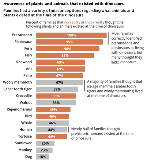
Draft 1
For my first stab at a graph showing the results, I applied several of the best practices I learned about in Great Graphs:
- I sorted my data from largest to smallest.
- I applied color meaningfully – using the client’s brand orange to show the animals that did exist at the time of dinosaurs and gray to show those that didn’t.
- I eliminated the unnecessary visual clutter from the Excel default graph and made some simple modifications (for example, increasing the width of the bars and the text font size).
- I even added annotations highlighting interesting findings.
Here’s what my first version looked like:
Draft 2
I thought I was off to a pretty good start, but I wasn’t sure if my graph was clearly explaining that some of the answers were correct and some were incorrect, so I decided to bring my graph to Office Hours with Ann to see what else I could do.
Ann offered me three simple ideas that took this graph from good to great.
1. Group the bars to better show which responses were correct or incorrect.
Rather than order all the bars from largest to smallest, Ann suggested that I group all the correct answers together (ordered from largest to smallest) and similarly group all the incorrect answers together.
2. Add space between the groups to create a visual distinction.
Although the same effect could be achieved by creating two separate graphs, Ann showed me how to add a gap between two sets of bars in a single graph by simply inserting one (or more) blank rows in the source table. (Note from Ann: Learn more about adding blank rows in this tutorial, and view another example of intentional gaps here.)
To make the difference between the two groups even more obvious, we also added subtitles to indicate correct and incorrect responses.
3. Add icons for visual interest and whimsy.
This graph is for a children’s museum project about dinosaurs. This is the type of graph that is just calling for a touch a playfulness.
We found an adorable dinosaur icon in the free icons that are included with all Microsoft Office products.
We added an orange dinosaur icon to highlight the correct answers and a grey one with a slash through it to highlight the incorrect answers.
Here’s the final version of the graph that I included in my report:
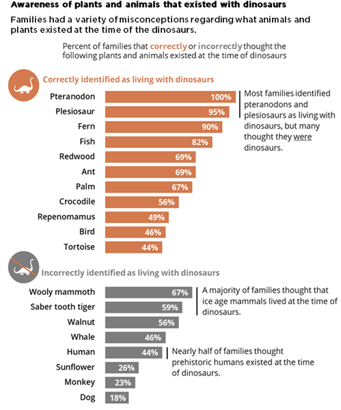
A big improvement made in three simple steps and less than 30 minutes.
There’s a reason the course is called Great Graphs.
Connect with Maia Werner-Avidon
On LinkedIn: https://www.linkedin.com/in/maia-werner-avidon/
Learn more about Maia’s work at www.mwainsights.com.