This article is rated as:


This is an accompanying piece to our Data Visualization Applications: Bar Charts tutorial. While the standard bar chart is one of the simplest and most effective data visualizations, we sometimes want alternatives to freshen up our reports. This is where the lollipop chart comes in. It presents the same data as a bar chart, but in a slightly different package that works well with numerous bars of data.
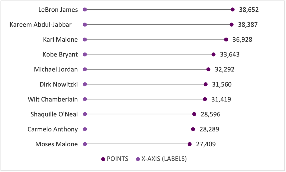
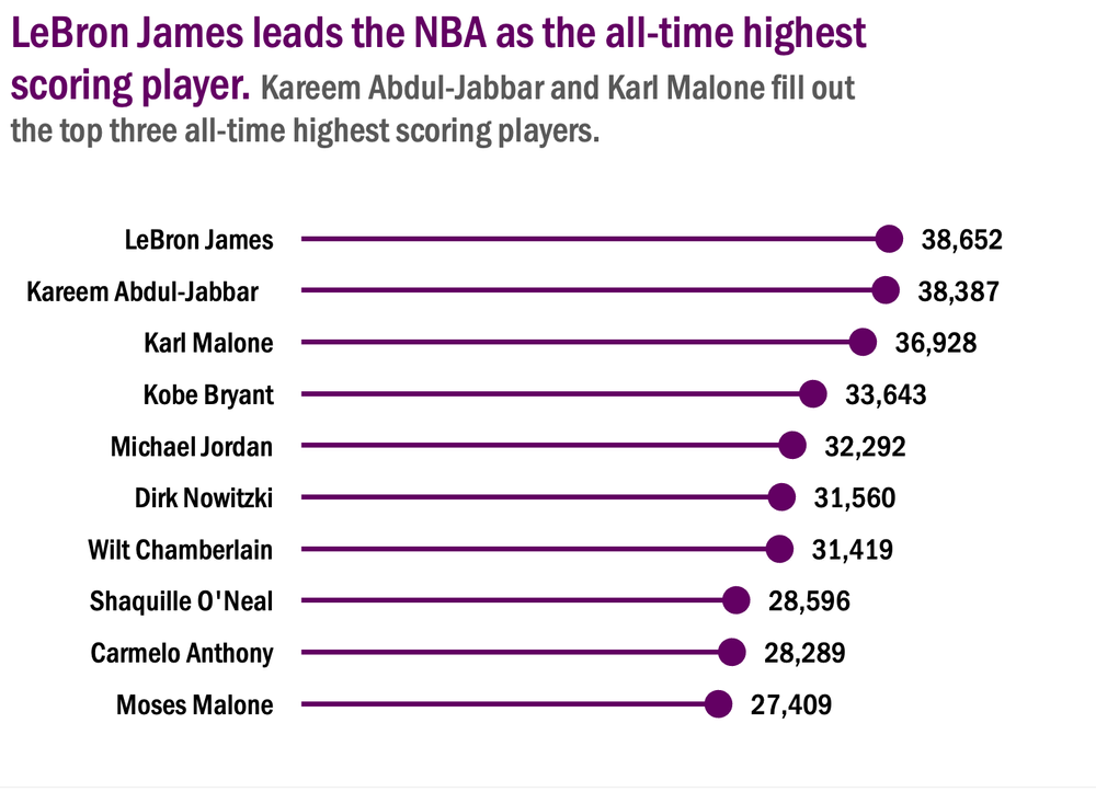
Again, we will use the all-time highest scoring NBA players data for this tutorial.
If your data are not structured for analysis yet, here are a few resources to get your data ready for analysis:
From Bar to Lollipop
While I will always suggest starting with the bar chart, sometimes we want to mix things up. A nice way to freshen up your data viz game is by incorporating lollipop charts into the mix. They present the same data as a bar chart but in a new, refreshing way. However, I would stress that the tried-and-true bar chart still wins 9 times out of 10. But on that rare occasion, a lollipop chart is a nice alternative.
Setting Up the Data
While the data presented are identical, we need some additional helper columns to align everything within our lollipop chart. Using the NBA data from the bar chart tutorial the new helper columns will appear as such:
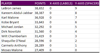
X-AXIS (LABELS): These are used as placeholders to insert our data labels to the left of each lollipop. These will always be set at zero (0) regardless of how many data labels you are using.
Y-AXIS (SPACERS): These space out our data points such that each player is presented on their own line within the lollipop chart. These are manually selected. Using incremental values (e.g., 1, 2, 3, …, n) will provide even spacing for the lollipop chart. Just note that the largest y-value will be placed highest (i.e., at the top) on the resulting chart.
Note: The Y-AXIS (SPACERS) will be used for both the data labels and the actual data lollipops (in this case, points scored by NBA player).
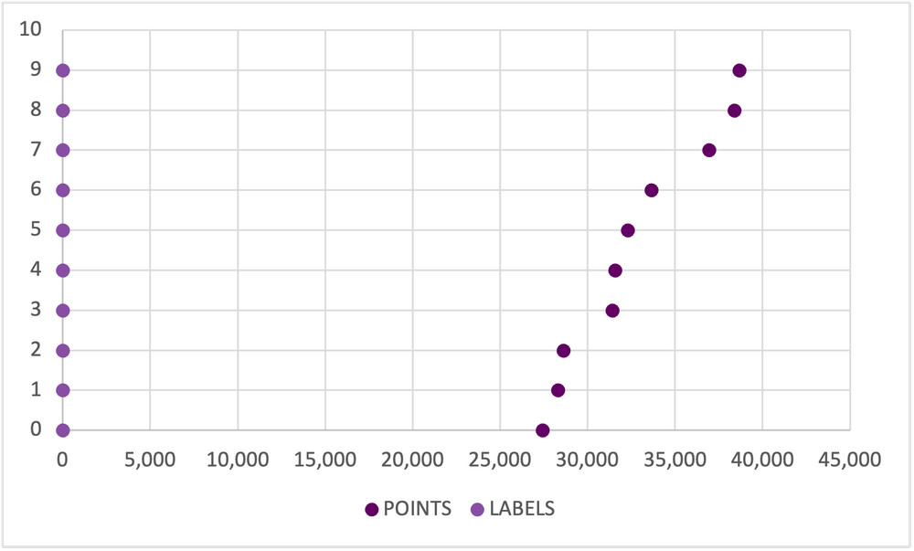
The Scatterplot
While lollipop charts present data identically to the bar chart, it is created using a scatterplot. Following these steps will get you to a clean lollipop chart in no time.
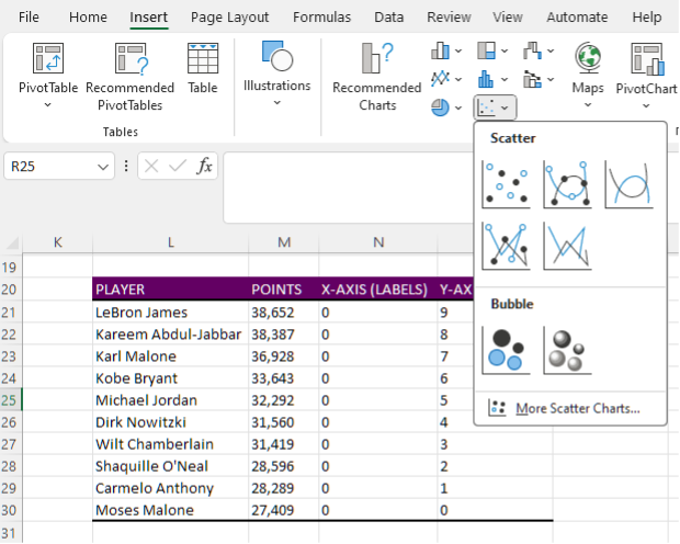
1. Insert a blank Scatter chart.
-
Insert > Charts > Scatter.
2. Right click on the blank Scatter chart and Select Data.
3. Under Legend Entries (Series) and Add data.
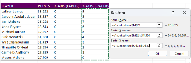
4. First select the POINTS data by clicking in Series X values: and highlighting the POINTS values.
5. Next, select the Y-AXIS (SPACERS) by clicking in Series Y values: and highlighting the Y-AXIS (SPACERS) values.
6. Follow Steps 4 & 5 for the LABELS data.
Improve the Appearance
Remove Gridlines
1. Left click on the horizontal gridlines and hit Delete.
-
Alternatively, use the Chart Elements menu to toggle off the Primary Horizontal gridlines.
2. Repeat the process for the vertical gridlines. Left click and Delete.
-
Again, you may use the Chart Elements menu to toggle off the Primary Vertical gridlines.
Scale and Delete Axis Labels
1. Delete the x-axis labels. Left click and Delete.
2. Before deleting the y-axis labels, right click on the y-axis and select Format Axis.
3. Set the Bounds of the y-axis to fit the range of your y-axis labels (in this case, from 0 to 9).
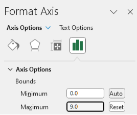
4. With the Bounds set, delete the y-axis labels. Left click and Delete.
Adding in Data Labels
1. Right click on any data point presenting the POINTS (far right) and Add Data Labels.
-
This can also be accomplished through the Chart Elements menu.
2. The labels will present the Y-value by default. However, we want to present the X-value for these data points. To do this, right click on any data label and toggle off Y Value and toggle on X Value.
3. Repeat Step 1 for the data label points (far left).
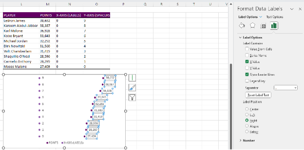
4. These labels need to be shifted to the left of the data points. Right click on any data label and Format Data Labels.
5. The default Label Position is Right, but we want to select Left.
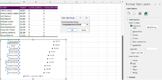
6. Next, we need to insert the player names. The label points are placeholders for the NBA players. To replace these points, right click on any data label and Format Data Labels.
7. Toggle on Values From Cells and highlight the PLAYER list and toggle of Y-VALUE.
Creating the Lollipop
1. Select any of the data points to the far right and navigate to Chart Design at the top right of Excel.
2. Go to Add Chart Element > Error Bars and select the Percentage option.
-
This can also be accomplished through the Chart Elements menu. Again, just toggle on the Percentage error bars.
3. The vertical error bars are not required. Left click and Delete.
4. For the horizontal error bars, right click and select Format Error Bars.
5. Under Direction toggle the Minus option.
6. Under End Style toggle the No Cap option.
7. And lastly, under Error Amount change the Percentage to 100%.
Cleaning Up
1. Remove the legend at the bottom of the chart by left clicking and Deleting.
2. Select the data points on the far left and change the Fill to No Fill.
3. Update your fonts and colours according to your style guide.
-
Note: Refer to the bar chart tutorial for suggestions on fonts and colours.
4. Insert an appropriate title that highlights the key message for the data.
Make the Lollipop Pop
1. Right click on any error bar and change the Outline to your primary colour.
2. In the same Outline menu, change the line Weight to a 1.5 pt thickness.
3. Right click on the data points to the far right and select Format Data Series.
4. Under Fill & Line go to the Marker section.
5. In Marker Options change the Size of the markers to 8 pt.
Final Thoughts
If you are looking to expand your repertoire and insert new visuals into your reports, the lollipop chart can be a nice alternative to the standard bar chart. However, be sure to use alternatives like the lollipop chart to supplement, not replace, your standard charting for the most impact.