Sometimes our graphs have a single, overarching takeaway message.
Maybe the numbers simply went up over time. Or down.
Other times, it’s more complicated.
Here’s how to explain multiple takeaway messages in presentations: with multiple slides, one per takeaway message.
Before: Everything Smushed on One Slide
Here’s what I typically see: lots of possible takeaway messages shoved into a single graph on a single slide.
The presenter says something like this:
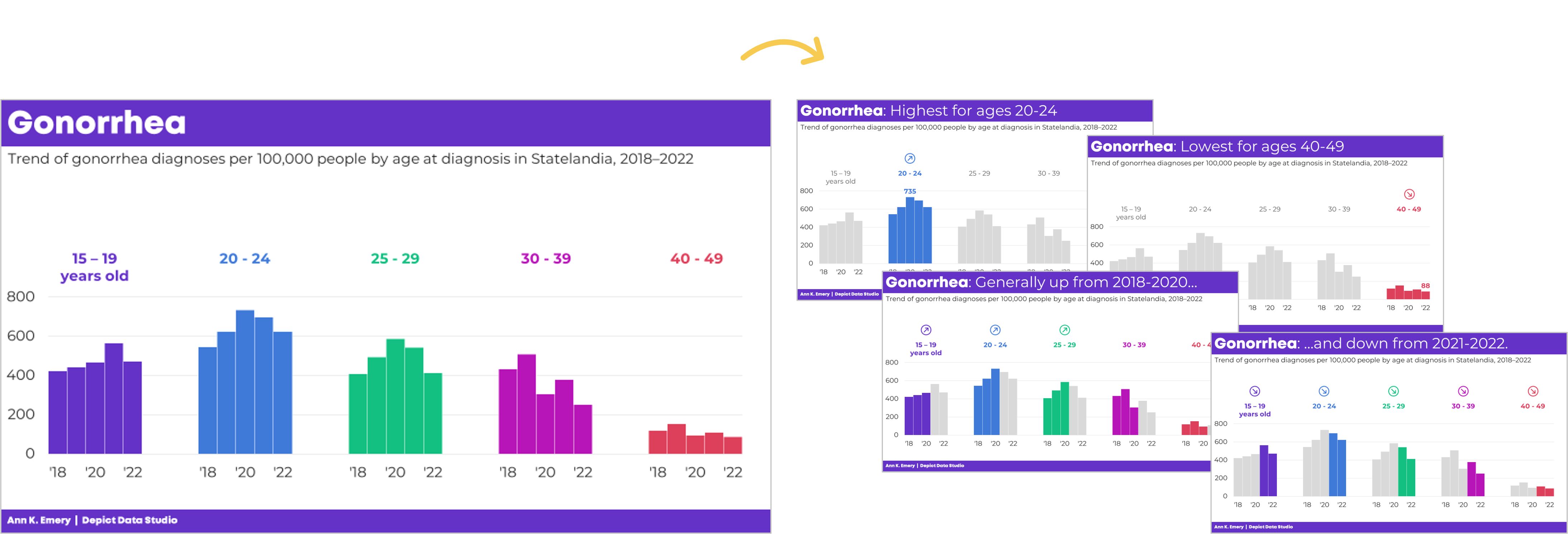
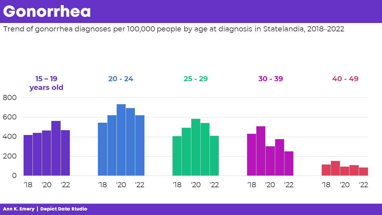
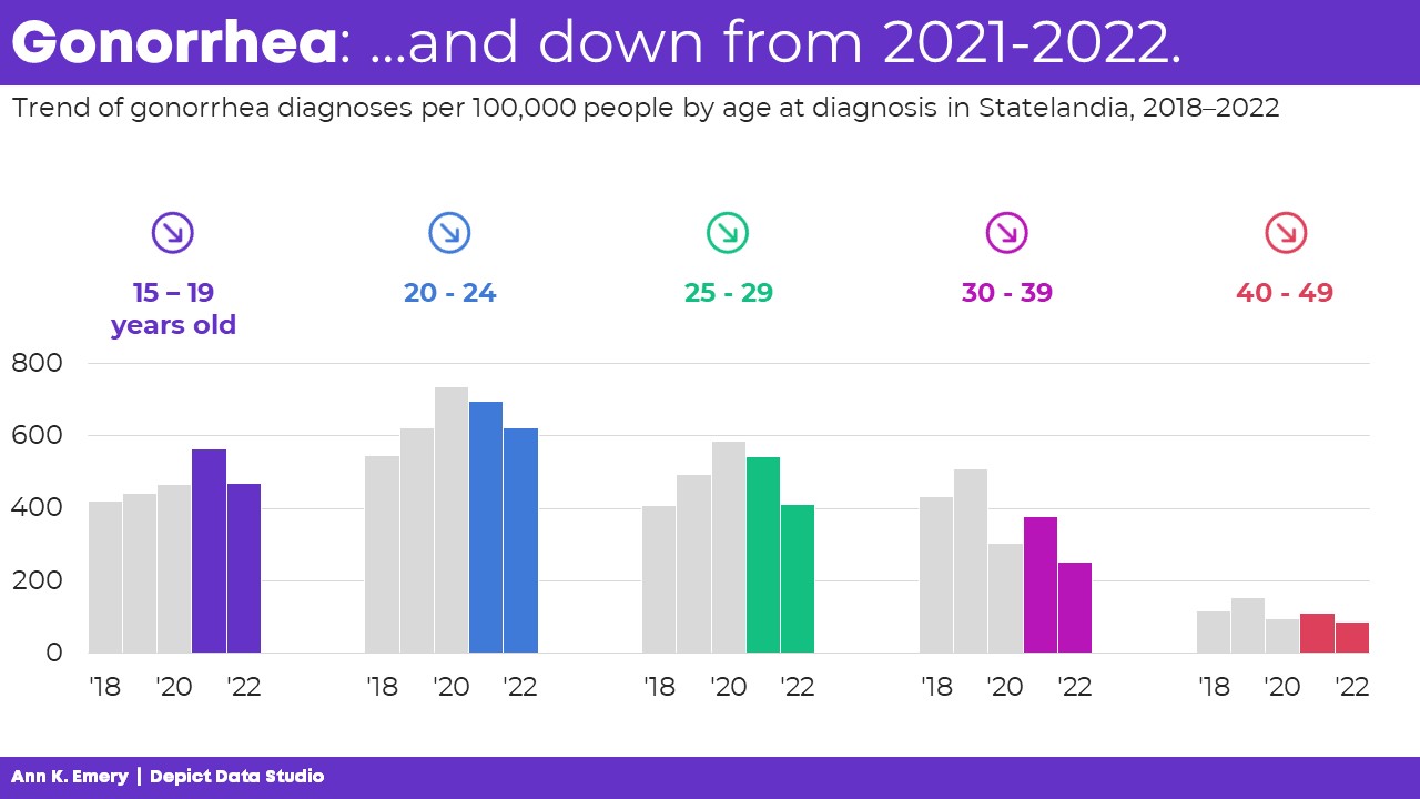
“Next, let’s talk about gonorrhea diagnoses in our state. We’re looking at the number of diagnoses per 100,000 people. We’re also looking at age ranges. This is the person’s age when they were diagnosed with gonorrhea. We’ve got five years’ worth of data: from 2018 through 2022. Let’s look at a few key findings. Gonorrhea diagnoses were highest for people in their early twenties. In 2020, for example, there were 735 gonorrhea diagnoses per 100,000 people ages 20-24 in our state. Gonorrhea was lowest for ages 40-49. In 2022, for example, there were 88 diagnoses per 100,000 people ages 40-49 in our state. Here’s another pattern we found: Gonorrhea diagnoses generally went up from 2018 through 2020. For the three younger age groups, at least. And, gonorrhea diagnoses went down from 2021 to 2022 for all age groups.”
And while you’re talking through allllllll those numbers and age ranges and timeframes, the audience only sees this:

You see the problem, right??
The presenter is talking about one thing… but the audience is probably looking at something else.
That’s the very definition of Death by PowerPoint.
After: Describing One Takeaway Message at a Time with Multiple Slides
Instead, let’s use multiple slides!
We’re aiming for a single takeaway message per slide.
That way, what we say = what the audience sees.
There should be a perfect cohesion between sight and sound.
The presentation would look and sound like this:
“Next, let’s talk about gonorrhea diagnoses in our state. We’re looking at the number of diagnoses per 100,000 people.”
“We’re also looking at age ranges. This is the person’s age when they were diagnosed with gonorrhea.”
“We’ve got five years’ worth of data: from 2018 through 2022.”
“Here are the patterns at a glance. Next, let’s look at a few key findings.”
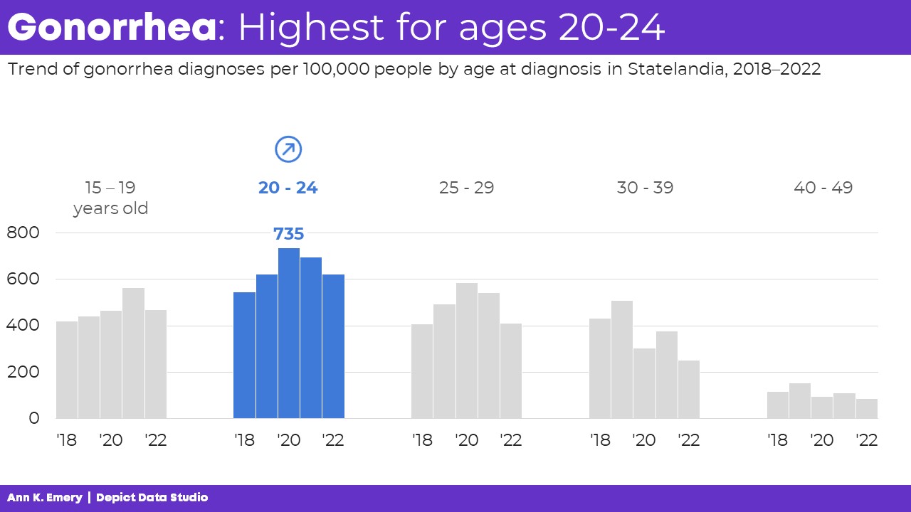
“Gonorrhea diagnoses were highest for people in their early twenties. In 2020, for example, there were 735 gonorrhea diagnoses per 100,000 people ages 20-24 in our state.”
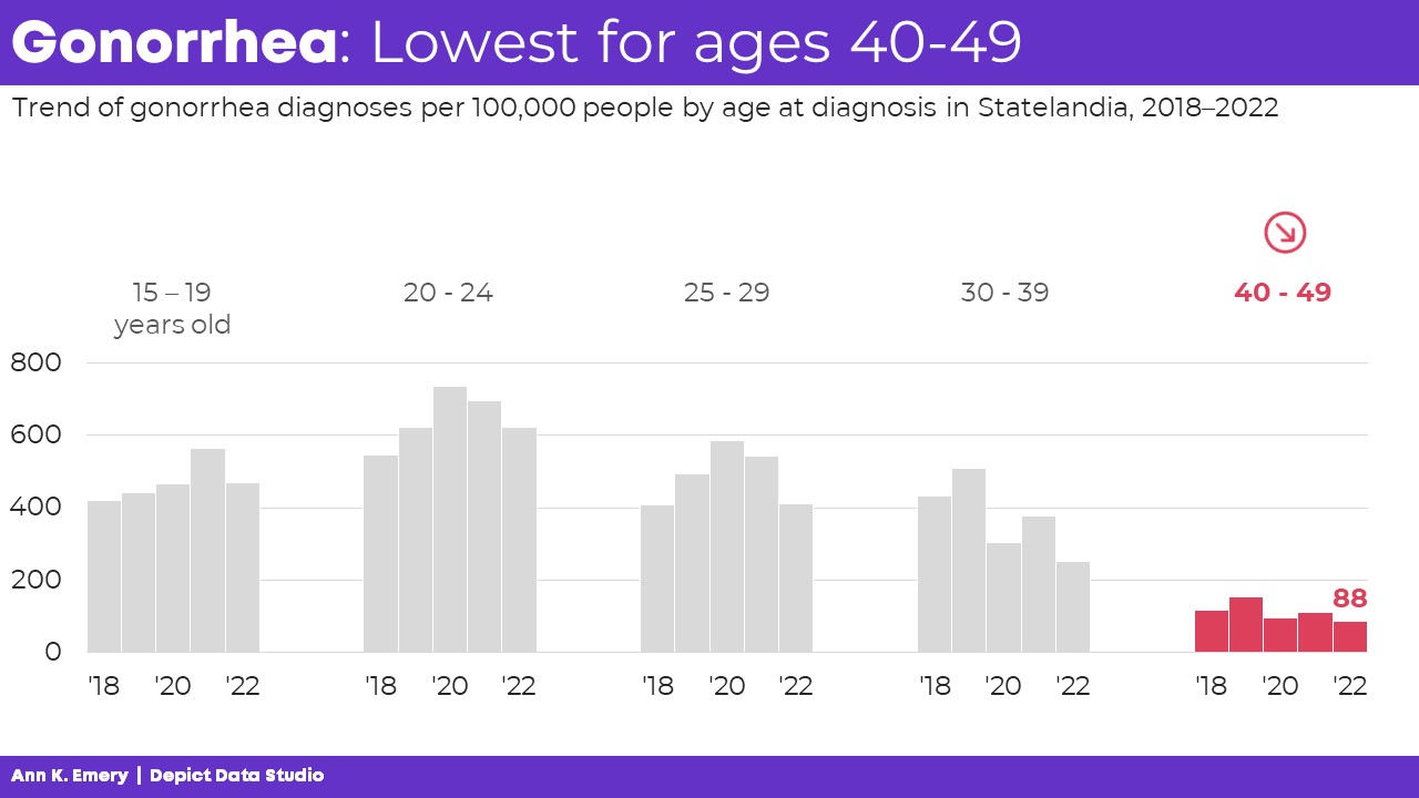
“Gonorrhea was lowest for ages 40-49. In 2022, for example, there were 88 diagnoses per 100,000 people ages 40-49 in our state.”
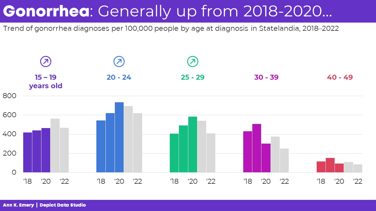
“Here’s another pattern we found: Gonorrhea diagnoses generally went up from 2018 through 2020. For the three younger age groups, at least.”
“And, gonorrhea diagnoses went down from 2021 to 2022 for all age groups.”
Finally, you’d show the “full” graph again, pausing for questions and a discussion.

The Bottom Line: Use More Slides!!!
We’re not making the presentation longer. We’re speaking for the same amount of time as before.
We’re not rushing or slurring our words. We’re speaking at the same pace as before.
We’re not wasting paper or ink. These are the slides shown on screen during a presentation. If you want to print something, just print the “full” graph (which is slide 462 in the screenshot below).

We’re syncing our words and visuals.
We’re keeping our audience’s attention.
Because if they’re not even paying attention… How will they possibly understand, remember, and use the findings for decision making?!