• Skip to main content
  • Skip to footer
  • Home

The May 13 Group

the next day for evaluation

  • Get Involved
  • Our Work
  • About Us
You are here: Home / allblogs / engagewithdata / The “How” of Data Tracking: Conditional Formatting

Aug 24 2020

The “How” of Data Tracking: Conditional Formatting

I’ve written a lot lately (here and here) about WHY tracking your school or organization’s data is so critical right now.

As schools begin to reopen, I’ve heard from educators of so many different configurations for what school is going to look like: some totally virtual, some in person, some in a hybrid model… 

That’s a lot to keep track of!

It’s hard enough to make sure that no child falls through the cracks when school is operating as usual — now that task seems herculean. 

So how can we be sure that we know where each student stands, even if we don’t see them every day?

How can we know that we’re doing our best to meet their needs (and that we even know what those needs are)? 

That, my friends, is where some simple data tracking strategies come in. 

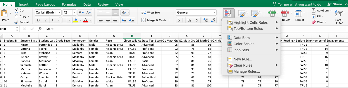
Here is one trick to help you assess, at a glance, which students or families need a little more support: conditional formatting. 

Conditional formatting allows you to set criteria to automatically color-code or highlight values that you need to take action on.

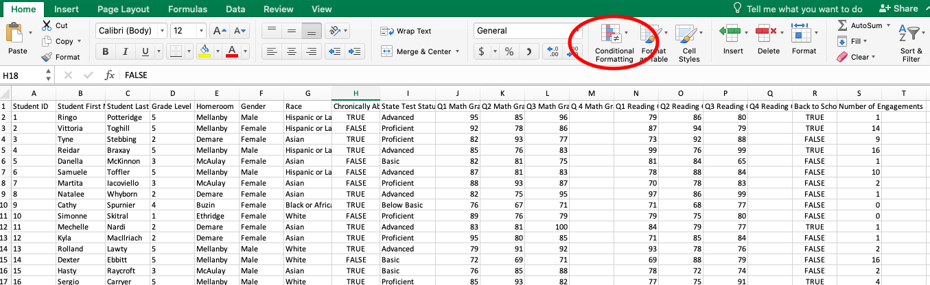
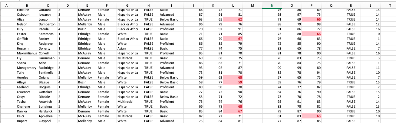
You’ll see that my (totally fictitious) dataset below is just a typical spreadsheet — nothing stands out at a glance, and it’s hard to see which of these students really needs the most attention. 

We can use conditional formatting to visually highlight some of the students who need some support. We can find it by clicking selecting the text we want to format, and then clicking on the circled icon below.

Picture

Once you click on the icon, you’ll see a drop-down menu pop up with all of the options you have for automatically color-coding your data. I think the easiest way to start is by selecting “New Rule.”
Picture

In the menu that pops up to manage your rules, you’ll set the criteria that will determine what gets color-coded and how you want to code it. 

​This is where things get fun. 
Picture

The simplest option is “Classic.” I always choose “Format cells that contain” and set either a text or numerical value that I want to highlight. Below is how I highlighted the students whose Quarter 3 grades were below a 70. 
Picture

And voila! Now you can see, at a glance, the students who were struggling in Quarter 3. No fancy statistical skills needed!

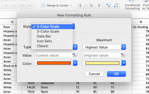
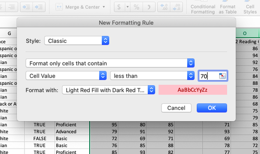
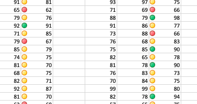
I could also create other rules for my high-performing students or those ones that fell in the middle of the class.

Picture

There are TONS of other ways to conditionally format your data — here are two other examples for the same data that address the whole range of grades.

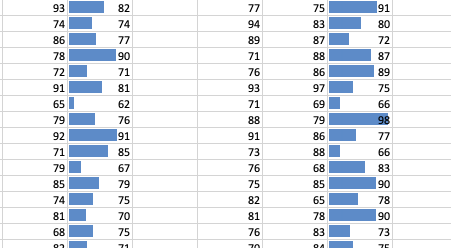
On the left, you’ll see that instead of the Classic mode, I used an Icon Set to do a little traffic light system for the student grades. On the right, I used Data Bars to help me see students’ grades on a scale from the lowest to highest score.

Picture

Picture

With these formatting options, I can see the students that might need some extra support… and it only took a few clicks and a decision about the point at which I’d be concerned about a student. 

This is just one strategy of many that can help you quickly and easily to make sure no students are falling through the cracks. 

Want to learn more? 

  • Schedule an Excel workshop (or three!) for your organization – check out the descriptions from my three-part series here. 
  • Sign up here for the free Evidence for Engagement mini-course! It will walk you through how to become an evidence-based organization. 
  • Pencil this into your calendar: Evidence for Engagement is going live! On September 16 at 3:00 EST, Tamara Hamai and I will be leading a workshop on how to use data to ensure that you’re still making an impact, even if your services have gone virtual. More information coming soon!

None of these work for you? Schedule a free 30-minute consultation with me so we can figure out how to best get your data tracking system started!
​

Written by cplysy · Categorized: engagewithdata

Related Posts

You may be interested in these posts from the same category.

[grid content=”post” taxonomy=”category” terms=”current” exclude_current=”true” number=”12″ gutter=”10″ align=”center” slider=”true” center_mode=”true”]

Footer

Follow our Work

The easiest way to stay connected to our work is to join our newsletter. You’ll get updates on projects, learn about new events, and hear stories from those evaluators whom the field continues to actively exclude and erase.

Get Updates

Want to take further action or join a pod? Click here to learn more.

Copyright © 2026 · The May 13 Group · Log in

en English
af Afrikaanssq Shqipam አማርኛar العربيةhy Հայերենaz Azərbaycan dilieu Euskarabe Беларуская моваbn বাংলাbs Bosanskibg Българскиca Catalàceb Cebuanony Chichewazh-CN 简体中文zh-TW 繁體中文co Corsuhr Hrvatskics Čeština‎da Dansknl Nederlandsen Englisheo Esperantoet Eestitl Filipinofi Suomifr Françaisfy Fryskgl Galegoka ქართულიde Deutschel Ελληνικάgu ગુજરાતીht Kreyol ayisyenha Harshen Hausahaw Ōlelo Hawaiʻiiw עִבְרִיתhi हिन्दीhmn Hmonghu Magyaris Íslenskaig Igboid Bahasa Indonesiaga Gaeilgeit Italianoja 日本語jw Basa Jawakn ಕನ್ನಡkk Қазақ тіліkm ភាសាខ្មែរko 한국어ku كوردی‎ky Кыргызчаlo ພາສາລາວla Latinlv Latviešu valodalt Lietuvių kalbalb Lëtzebuergeschmk Македонски јазикmg Malagasyms Bahasa Melayuml മലയാളംmt Maltesemi Te Reo Māorimr मराठीmn Монголmy ဗမာစာne नेपालीno Norsk bokmålps پښتوfa فارسیpl Polskipt Portuguêspa ਪੰਜਾਬੀro Românăru Русскийsm Samoangd Gàidhligsr Српски језикst Sesothosn Shonasd سنڌيsi සිංහලsk Slovenčinasl Slovenščinaso Afsoomaalies Españolsu Basa Sundasw Kiswahilisv Svenskatg Тоҷикӣta தமிழ்te తెలుగుth ไทยtr Türkçeuk Українськаur اردوuz O‘zbekchavi Tiếng Việtcy Cymraegxh isiXhosayi יידישyo Yorùbázu Zulu