• Skip to main content
  • Skip to footer
  • Home

The May 13 Group

the next day for evaluation

  • Get Involved
  • Our Work
  • About Us
You are here: Home / Archives for allblogs / engagewithdata

engagewithdata

May 31 2022

When the data speaks for itself

When the data speaks for itself

(I’m back! Let’s just say that working from home full-time with an infant and no childcare is not for the faint of heart. I’m hoping to share with you more regularly throughout the summer and beyond.)

As I’m sure has been the case with you, the past few weeks have weighed heavily on my heart. 

With the news of the racially motivated slaughter of Black Americans at a grocery store in Buffalo and then the shooting rampage at an elementary school in Uvalde, Texas, I have felt a range of emotions.

I remember doing active shooter drills with elementary school students at the last school where I worked — both as a precaution and also when we thought there was an intruder in the building. Thankfully, nothing happened, but as we saw this week (and so many times before), we might not have been so lucky. 

I’m also thinking about my young daughter and the world we’ve brought her into. 

I’m sad for the victims and their families, enraged at our country for being the only developed country to continue to have mass shootings and do nothing about it, and I’m fearful for what might come without action on the part of our government.

But my feelings really don’t matter. This isn’t a political blog. This is, however, a prime example, of how some data tells quite the story without us having to do much to it. 

Every Town for Gun Safety is skillful at letting this truly horrifying data stand on its own.

Take, for example, their interactive map of all of the mass shootings in this country in the past 13 years (274 of them). 


Interactive map of all mass shootings in the US from 2009 to 2022

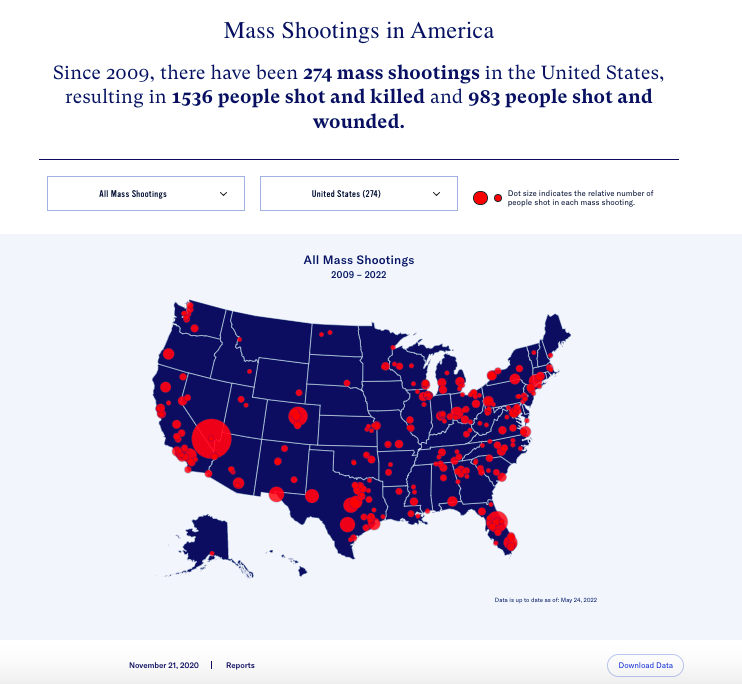
It takes only a glance to see that:

  1. There are far too many red dots on this map,
  2. There have been some particularly catastrophic shootings in the past decade, and
  3. Some parts of our country have been especially impacted by brutal gun violence. Texas alone has had 30 of these 274 mass shootings (11%).

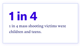
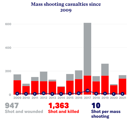
Every Town does a great job of data visualization, as seen in the graph below, but sometimes, all it takes is focusing on a single statistic to drive the point home. 


1 in 4 mass shooting victimes were children and teens


Stacked bar graph showing the number of mass shooting casualties since 2009

I truly believe that their use of data is helping spread their message in a clear and concise way, at a time when that is more crucial than ever. 

Think about your organization’s message and the key data points that are important for you to share. 

Which data points tell your story for themselves?

This week, I’ll be presenting at the 2022 National Community Schools And Family Engagement Conference (CSxFE) with my clients from Greeley-Evans District 6 in Colorado.

 They are doing a GREAT job of using their data to make change for students and families in their district (more on that in a future post!).  

If you’ll be at the conference, we’d love to have you at our session, Using Data to Build a Culturally Responsive District Equity Strategy. 

Written by cplysy · Categorized: engagewithdata

Feb 22 2022

“I couldn’t have put it better myself”

“I couldn’t have put it better myself…”

We all know how powerful a startling statistic can be.

Maybe you’ve seen a PowerPoint presentation where there is just a huge number on the slide or a newspaper headline that highlights the stark realities of a situation.

Remember the New York Times’ cover early on in the pandemic that shared the tragedy of reaching 100,000 deaths from COVID?

Numbers are impactful. But words are too. 

I’m sure you’ve remarked to yourself at some point, “I couldn’t have put it better myself!”

Or, maybe when you were writing term papers, you struggled to paraphrase a source because you just didn’t know how something could be expressed better than the authors put it?

To me, those phenomena are the beauty of qualitative data – we don’t have to rephrase anything! We get to let people’s words speak for themselves. 

I’ve written before about a research project I’ve been working on to learn more about the effects of the pandemic on the lives of kinship caregivers (e.g., grandparents raising their grandchildren).

When I was conducting focus groups of caregivers, it was truly emotional to hear them share their experiences and the dedication and love they have for their children.

Now, a few months later, we are analyzing the data we collected, and I am seeing how impactful their words are, even in print.

I’m sure you’ve had the same experience through your family engagement work.

Have you ever had a conversation with a child or family member that just stuck with you? 

I bet their words and experiences began to inform your interactions with the next family you saw or the next time a similar situation came up.

And I bet the services and support you provided were better for it.

So how can we create more opportunities for families to share their brilliant insights and teach us about their lives?

Here are a few ideas to get you started:

– Add open-ended questions to your family surveys to allow families to provide some responses in their own words. 

– Host a listening session or “parent cafe” where the participants, not the educators, are the stars of the show. (TIP: If you get consent to record these conversations, you can use anonymous versions of their quotes to guide your work or highlight needs or impacts for grants or reports.)

– Post questions on social media and invite families to respond in the comments.

– Host your own focus groups or interviews with family leaders in the school community to pick their brains.

The families we work with are the experts on their kids and their lives. Let’s let them tell us what they need, in their own words. 

Over the next few weeks, I’ll be actively working through my mom brain to post more regularly and share more content about qualitative data – how you can collect it, analyze it, and use it to improve your work with kids and families.

Written by cplysy · Categorized: engagewithdata

Dec 29 2021

How Can We measure 2021?

How can we measure 2021?

Over the past few months, we’ve been playing a lot of music for our baby girl, to keep her entertained (mostly because Mommy and Daddy sing and dance around the house like fools) and to help lull her to sleep. 

We may not be helping her get along with her future peers, but for now, she’s becoming an aficionado of Queen, The Beatles, and Broadway classics.

So, in the spirit of the musical RENT, let’s amuse ourselves with a game of “how do we measure a year?” – 2021 edition.

I don’t think that 2021 was the year that any of us were expecting. 

Right now, it feels like we are right back where we started in early 2020, with school being disrupted, cases surging, and holiday plans being canceled. 

For me, while the world feels very much the same, most everything in my daily life has changed!

If I’m going to be super nerdy (which should be expected of me at this point), we can take a lesson from “Seasons of Love” and see that we can both quantify and qualify our measurements. 

So what metrics could I use to describe my year?


  • How many ounces our little one takes at each feeding and over the course of a day


  • How many hours of sleep we get (or don’t get!) each night


  • How many times a day our dog licks the baby or her stuff (sigh)


  • How many hours (no wait, minutes) of work I get done before needing to put her pacifier back in her mouth

These are all VERY REAL metrics for me right now! 

But of course, they don’t capture the full picture of my year or my experience as a new working mom.

It’s also important to consider how joyful we feel when our daughter breaks into a grin when she sees us, or the burning rage that comes with being woken from a much-needed nap (me, of course – not the baby), or the fear I have on a daily basis of exposing my child to one of the many diseases running rampant right now. 

All of these things are both valid and critical to understanding my experience and to uncovering unmet needs.

When we think of how to tell the story of our family engagement work during yet another challenging year, we need to consider how to quantify and qualify our efforts and impacts. 

Of course, we’ll want to know who we reached and track our efforts to do so.

But it’s also important to know how those people felt after that outreach and the ways in which their lives were (hopefully) made a bit easier as a result. 

Sometimes, we also need to know how we can do better and what else our students and families need.

It just takes a creative approach to data collection to capture the full story.

As you reflect on how 2021 went for you, both personally and professionally, how would you measure your year?

Leave a comment below and let me know what measures feel authentic to your year!

Written by cplysy · Categorized: engagewithdata

Nov 15 2021

A Sleep-Deprived perspective on Data Tracking

A sleep-deprived perspective on data tracking

I’m back from maternity leave! 

I’ve always had great admiration for parents and caregivers, and after almost two months with a newborn, that respect has grown ten-fold! 

Parenting (especially without much sleep) is tough work. 

While I was out, I had a few discussions with data-minded colleagues and read some articles about tracking data about the baby’s behaviors to help understand their habits and establish better routines. 

Of course, that’s pretty intriguing for me, since that’s essentially what my business is about. 

But I found that my pajama-clad, sleep-deprived self was too overwhelmed to even begin to set up a new spreadsheet. 

Me! Couldn’t handle a spreadsheet! (I know, I’m just as shocked and bewildered.)

In that moment, before I collapsed on the sofa to take a nap, I had a realization. 

For many overworked, overwhelmed, and exhausted educators — the ones who are giving their all, day-in and day-out, for their kids and families — they may not have the brain space or energy to even begin to take on something new. 

In my work, I’ve tried to break it down, provide simple strategies, and offer encouragement to those who were unsure about where to begin with tracking their family engagement data. 

But I didn’t factor in that people may not have room left for a new skill or for tracking details of their work in ways that are unfamiliar to them. 

For example, my husband and I keep a notebook where we log how much our daughter eats and when. Yet this is purely for survival – otherwise, we simply can’t remember!

It reminds me of the piles of sign-in sheets I used to have when I was a Community School Coordinator. The data’s all there, but I didn’t always know what to do with it. 

I have also thought about tracking her sleep and wake windows in an attempt to get her to sleep better at night. 

In my head, I have grand visions of a Gantt chart where I’d color-code each time block of the day. 

Want to know how far I’ve gotten?

One note to myself on my phone. SIGH. I gave up.

Pre-baby, I would have had the entire spreadsheet designed and in use within an hour. 

So if you’re reading this and you have aspirations of being more data-driven but have struggled to find the bandwidth to get there, I see you.

While of course, I wish that I would have gotten significantly more sleep over the past eight weeks, I am grateful for this new insight.

I look forward to using my new perspective to inform how I work with educators whose attention – rightfully so – is on educating children and engaging families.

Written by cplysy · Categorized: engagewithdata

Sep 28 2021

A New Arrival

A New Arrival

I’ve been a bit off my posting schedule the past few weeks, but I have a good reason, I promise!

Last Monday, my husband and I welcomed a beautiful, healthy baby girl into the world (albeit a few weeks early!). Our hearts are full and our brains are fried, but we are nonetheless very happy to be new parents. 

Told you I had a good reason! 

I had grand plans to get this blog set up for the fall while I am on maternity leave, but baby had other plans. 

So for now, I thought I would make sure you had access to some Engage with Data resources until my next post. 

While I am on leave, here is where you can find some of my content for free: 

BLOG POSTS


  • The Power of a Positive Interaction: Using Asset-Based Engagement Strategies (YEP-DC)

  • Using Free Data and Mapping Resources to Better Understand School Communities (AEA 365 Blog)

  • Don’t Be Scared of Data – How it Can Guide Family Engagement and Attendance Interventions (NAFSCE)

  • Education Evaluation’s Lessons Learned from a Year at Home (AEA 365 Blog)

DOWNLOADS


  • Title 1: The Heart of Engagement White Paper (ClassTag)

  • Engage with Excel: Track Your Engagement Data with 4 Simple Steps

WEBINAR RECORDINGS


  • Measuring Family Engagement: An Introduction (Ohio Families Engage)

  • Effective Practices Webinar: Using Qualitative and Quantitative Data to Evaluate Family Engagement (NAFSCE)

  • ESSA Session 1: What Do ESSA’s Evidence Requirements Mean for My Organization? (MOST Network)

  • ESSA Session 2: How Do I Find Evidence of Similar Programs for My Application?

  • ESSA Session 3: How Do I Create A Logic Model for My Organization?

  • ESSA Session 4: How Do I Plan for Future Evaluations of My Program?

OTHER RESOURCES


  • Evidence for Engagement Email Mini Course

  • IEL Conference Attendees (until 9/30 only): Let’s Get Tracking! Building a Simple Tool to Measure and Amplify Your FCE Efforts

I hope these resources help you while I am out, and I look forward to reconnecting soon. 

Feel free to forward this list to colleagues who might be interested! 

Written by cplysy · Categorized: engagewithdata

  • Go to page 1
  • Go to page 2
  • Go to page 3
  • Interim pages omitted …
  • Go to page 11
  • Go to Next Page »

Footer

Follow our Work

The easiest way to stay connected to our work is to join our newsletter. You’ll get updates on projects, learn about new events, and hear stories from those evaluators whom the field continues to actively exclude and erase.

Get Updates

Want to take further action or join a pod? Click here to learn more.

Copyright © 2026 · The May 13 Group · Log in

en English
af Afrikaanssq Shqipam አማርኛar العربيةhy Հայերենaz Azərbaycan dilieu Euskarabe Беларуская моваbn বাংলাbs Bosanskibg Българскиca Catalàceb Cebuanony Chichewazh-CN 简体中文zh-TW 繁體中文co Corsuhr Hrvatskics Čeština‎da Dansknl Nederlandsen Englisheo Esperantoet Eestitl Filipinofi Suomifr Françaisfy Fryskgl Galegoka ქართულიde Deutschel Ελληνικάgu ગુજરાતીht Kreyol ayisyenha Harshen Hausahaw Ōlelo Hawaiʻiiw עִבְרִיתhi हिन्दीhmn Hmonghu Magyaris Íslenskaig Igboid Bahasa Indonesiaga Gaeilgeit Italianoja 日本語jw Basa Jawakn ಕನ್ನಡkk Қазақ тіліkm ភាសាខ្មែរko 한국어ku كوردی‎ky Кыргызчаlo ພາສາລາວla Latinlv Latviešu valodalt Lietuvių kalbalb Lëtzebuergeschmk Македонски јазикmg Malagasyms Bahasa Melayuml മലയാളംmt Maltesemi Te Reo Māorimr मराठीmn Монголmy ဗမာစာne नेपालीno Norsk bokmålps پښتوfa فارسیpl Polskipt Portuguêspa ਪੰਜਾਬੀro Românăru Русскийsm Samoangd Gàidhligsr Српски језикst Sesothosn Shonasd سنڌيsi සිංහලsk Slovenčinasl Slovenščinaso Afsoomaalies Españolsu Basa Sundasw Kiswahilisv Svenskatg Тоҷикӣta தமிழ்te తెలుగుth ไทยtr Türkçeuk Українськаur اردوuz O‘zbekchavi Tiếng Việtcy Cymraegxh isiXhosayi יידישyo Yorùbázu Zulu