Sarah Dunifon is Founder and Principal Evaluator of Improved Insights LLC, an educational evaluation firm focused on STEM and youth-based programming. She is based in Cleveland, Ohio and is a fellow board member of the Ohio Program Evaluators Group.
We hope you enjoy our post below.
It’s not usually too hard to find data for things that are measurable. We know we can do surveys, or count the number of attendees, or track patterns over time.
Qualitative data though – the context for those numbers – often takes a little more work to track down. Of course, we can always do interviews and focus groups with stakeholders to learn about their experiences, our usual go-to’s.
However, if you think of qualitative data for what it is – simply put, another information source – you’ll find that so many other forms of it are hiding in plain sight.
Think about the chatbox in your last Zoom session – you may not have realized it, but that’s a source of qualitative data! Other sources you may have readily available include the phone call logs that your teachers keep when they call families or even the observations you did of an event (online, drive-up, or fully in-person).
If you need more, there are lots of ways of collecting qualitative data, and many of them are even more prevalent now in our almost fully virtual world.
This makes our lives a lot easier, as we prepare to write our annual reports, apply for grants, or share the impact that our program had during this unusual year.
Like I mentioned in my last post, sharing the context for our quantitative findings can make those reports tell a much richer story.
Yet it’s not always intuitive to know how to turn a whole bunch of text into these powerful programmatic insights.
So when you find these sources of qualitative data, what do you do with them?
We can actually find patterns in our data by assigning thematic codes to different words, phrases, or even images. Sometimes, you start with a set of codes that have to do with your program goals, or the research concepts underlying your program.
Other times, you just code as you go. If you start to see a lot of mentions of a particular topic, that topic can become a code.
Coding can take many forms, and there is fancy software that can help you do it, but sometimes all you need is a notebook and some markers or a color-coded spreadsheet.
Below you can see some sample data about an after-school program focused on science and animals that we’ve color-coded according to the themes we saw.
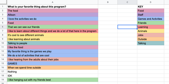
Coding allows us to see what’s happening across the dataset and pull out themes or key insights that we need to highlight.
Sharing your qualitative data analysis can be an important addition to your data story when demonstrating the impact of your work. It can add relevance, personality, and context to quantitative data by illustrating individual effects.
By reviewing our datasets systematically, we can also find some incredible quotes – the kind you would never attempt to paraphrase if you were writing a paper because they were so perfectly worded — and let our stakeholders’ words shine.
You can feature key quotations by offsetting them or putting them in a different color in your report to highlight individual experiences and catch readers’ attention.
Another popular way to display qualitative data is in a word cloud.
Word clouds are visual representations of keywords that come up frequently in a set of qualitative data. Typically, the bigger the word, the more frequently it appeared in a data set.
There are plenty of critiques of word clouds in the data visualization space and rightly so – word clouds can often obscure meaning rather than clarify it. So if you are going to use them, here are three things you should know:
1. Give the data a good cleaning to remove anything that you don’t want represented in the visual.
Here, we’d recommend removing any responses that do not give value (e.g., “idk,” “I’m not sure,” “Nothing,” etc.) as well as any text surrounding the main themes (e.g., “I like the […],” “I love […],” “my favorite thing is […],” etc.).
2. Consider the messages or key points you see in the data that you wish to convey visually. If it is possible to condense themes further or pull out important words, now is the time to do so.
This might mean collapsing phrases as best as possible to a single word, or perhaps a few words of important meaning.
3. Make sure to keep the essence of the data – meanings can be misconstrued when collapsing phrases into single words or shorter phrases.
If you’re finding this is happening, perhaps a word cloud is not the best way to display your data.
However, with data cleaning and basic analysis, the word cloud can change drastically.
Take a look here at three versions of the same word cloud we generated on WordItOut using the data we shared earlier. The first was created with original – or “raw” – data, the second with cleaned data, and the third with some basic analysis and condensing.
Notice how the prominent words change with each version, and how the meaning and key messages can shift.
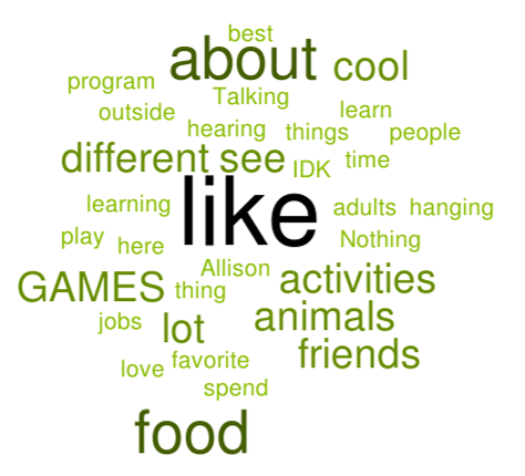
Word Cloud 1 – Original Data
|
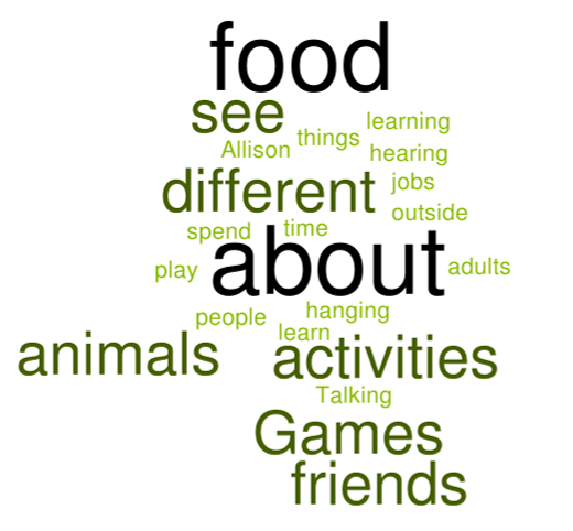
Word Cloud 2 – Cleaned Data
|
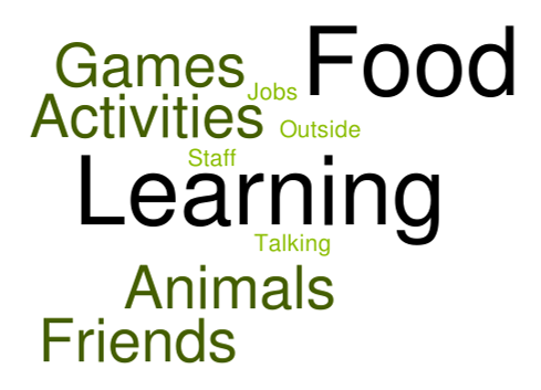
Word Cloud 3 – Basic Analysis
|
However, word clouds aren’t your only option. Data visualization experts like Stephanie Evergreen, Storytelling with Data, and Depict Data Studio all have great resources on different qualitative data displays.
The case is clear – with some simple analysis and visualization, qualitative data can be a powerful addition to your data story.