If you want to be taken seriously as a data professional, there are some things that you just need to know. The difference between a Bar Chart and a Histogram is one of those things.
This post is a little cartoon illustrated explanation of the differences.
In short: the difference between a Bar Graph and a Histogram. Histograms are a bunch of bars connected to each other, visualizing a distribution of a some continuous quantitative variable. Bar graphs (or bar charts) use proportionally sized rectangles to visualize some type of categorical data.

The purpose of a histogram (where you often see histograms).
So I started my career as a researcher, spending a lot of time looking at survey data. One of the first you do after data collection (or really during data collection), is create a report with all the response frequency tables. For the categorical data you would visualize the frequencies with a bar chart. With any quantitative data, you would visualize the frequencies with a histogram.
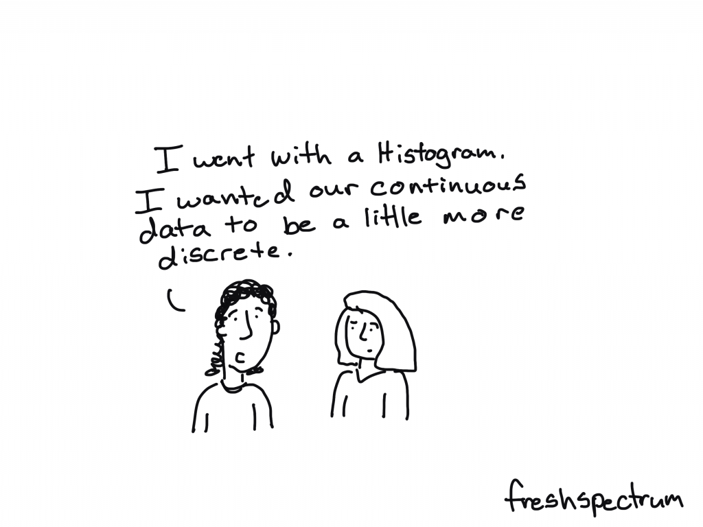
Histograms let you see the data distribution, and this is one of the first things most researchers will look at when analyzing quantitative data.
Calling a histogram a bar chart (or connecting your bars) is the data person equivalent of using the wrong “there.” Does it really matter that much? I don’t know…but it will draw attention in certain crowds.

Some of the main differences between bar charts and histograms.
- As already discussed, the whole continuous variable vs categorical variable thing.
- The bars touch in histograms.
- You can’t change the sort order with a histogram (or I guess you could, but you shouldn’t).
- Histograms require you to bin your numerical data.

Putting your data into Bins.
Bins are the groupings you put your data into.
It’s kind of like grades in school. Is there a huge cognitive difference between kids born in June and October of the same year? Is it any different from kids born in February and June? I would think not, but at some point people needed to decide the cutoff point for a certain group of kids they wished to educate together. So they split them into bins (in this case they called them grades).

There is no set rule saying “you must bin like THIS!!!!” So a lot of bins are based on the judgement of the data analyst.
Take age for example, it’s a continuous variable. Let’s say you have a community survey and your responses ranged from a 17 year old to a 93 year old. How would you bin it? You could use 5 year bins starting (for example 16-20, 21-25, 26-30…) or 10 year bins (11-20, 21-30, 31-40…).

Histogram and Bar Chart Resources
- Want to create a Histogram in Excel? Here is a short guide from Excel Easy.
- More interested in creating bar charts? I have a post on How to Create Bar Charts in Excel.
- I also have a sister post on How to Create Bar Charts in Adobe XD.
- Don’t like my explanation and want someone else to explain the difference between bar charts and histograms? Storytelling with Data also has a Histogram vs Bar Chart post.
- Want a more comprehensive guide to setting bin sizes? Here is one from Statistics How To.