Is your data dashboard useful? How do you know?
Most of the time it’s a question that gets left unanswered. As if the dashboard getting created is enough, and whether or not it works is really not that important.
Perhaps it’s the data idealist in me, but I think we can do better.
- TLDR: I created a free UX Evaluation eBook – you can download it here.
The “How to Evaluate a Dashboard” Question
Up until recently I’ve seen very few organizations really putting any time or effort into evaluating their data products. A dashboard or report is something that often comes at the end of a project. And by that time, everyone is already moving on to the next thing.
That’s starting to change at least. When an organization has had a dashboard live for a few years, or they start building more and more dashboards, that nagging “usefulness” question starts to become more prominent. Especially if a good amount of work is put into to maintaining/updating the tool.
So how do you evaluate a data dashboard?

The Problem with Defaulting to a Survey
The knee jerk response from a lot of evaluators is to send out a survey.
And yes, this will give you some insight if you’re good at writing surveys and know how to get a good response rate. But a survey also has some major drawbacks.
- You don’t want to survey too often, so it’s hard to use in support of new tool development.
- Even with a well developed survey, you don’t get the depth of information you can with qualitative methods.
- Lots of user experience issues can be found through just a few tests. So a survey can be overkill.
- And surveys can be a lot of work. At least if you do it right.
Plus, I think there is a better method.

The Limitations of a Checklist
So another thing to mention would be the checklist approach.
For instance, there is this data visualization checklist designed by Ann K Emery and Stephanie Evergreen.
Now let me go on record to say that it is a good idea to run through a checklist like this one. It can help guide you towards better visualization practice. And that’s a good thing.
But ultimately it’s insufficient.
One of the things I teach a lot in my workshops is that a bad chart with the right data is more useful than an amazing chart with the wrong data.
Checklists can help you towards creating better quality products. But that doesn’t mean the products will be more useful.

What is UX Evaluation?
UX Evaluation is how I refer to the use of user experience design methods for the purpose of evaluating the usefulness of products or programs.
While UX Design is completed during the development process, UX Evaluation can occur before or after a product has been completed. Insights can inform future iterations or entirely new designs.
Long story short, it’s a qualitative approach that I have found to be really useful for evaluating things like data dashboards, reports, and other data products.

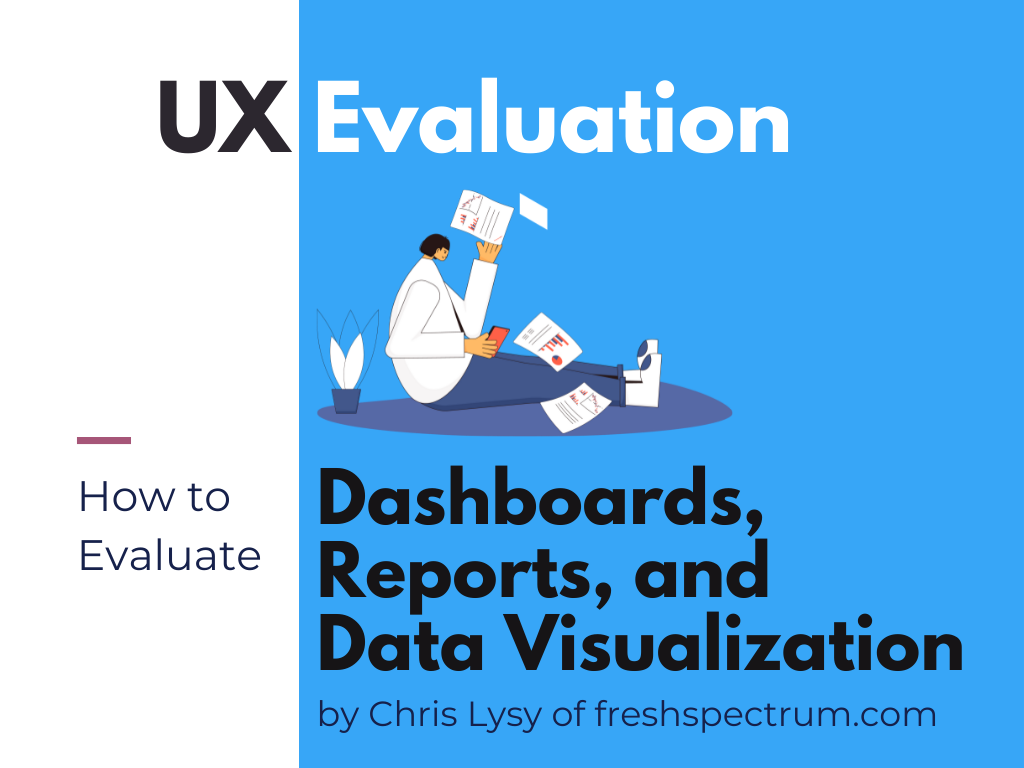
UX Evaluation: How to Evaluate Dashboards, Reports, and Data Visualization
Want to know how I would approach UX evaluation for a data dashboard, report, or other type of data visualization product? I wrote up my method in a free eBook you can download.