So what’s better, creating one great report or ten good reports?
In an ideal world we would have ample time to plan, write, develop, illustrate, test, and iterate our evaluation reports. But that’s likely not the professional world you occupy (and it’s certainly not the world I occupy).
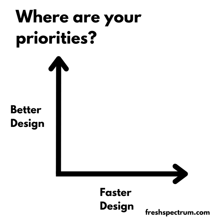
I decided to try out a little activity at the beginning of my workshop session last week. I drew a simple x and y axis. On one axis I wrote “better design” and on the other axis I wrote, “faster design.” Then I asked everyone to find where they were on the grid now, and where they hope to be later.
The “short activity” ended up taking most of our session. Because the answers were fascinating.
I think in the field of data visualization and report design the general argument you’ll find is, “good design takes time.” So if you want to prioritize good design, you need to budget more time. But what if you don’t have more time, and you’re not likely to get more time for your next report either?
Wouldn’t it be a good idea to learn how to create better reports in less time?

So I want you to try this little activity. On a sheet of paper draw an x and a y axis. On the Y, write “Better Design” and on the X, write “Faster Design.”
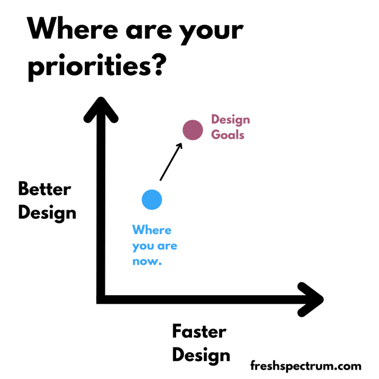
Next, draw two points.
The first point is where you think you are right now. Are you a good designer, fast designer, both, neither? The scale is completely yours to decide.
For the second point, draw where you would like to be in the future. As you improve your design skills, do also see yourself committing more time to reporting? If so, your overall design speed might go down.
So why ask the question?
Because better design isn’t always slower design. Sometimes being the better designer is being able to create more reports and reach more audiences in a shorter time period.
Spending a lot of time on your reports is a design choice. Deciding between one great report and ten good reports, that’s a choice you make.
How do you design better?
Short answer, practice and support.
It might not be the answer you were hoping to find, but becoming a better designer just takes a lot of practice. The more practice, the better.
And if you are an organization hoping to grow your team’s data design skills, provide them with support. Give your team opportunities to try new things and get more practice. And seek to eliminate any bureaucratic procedures that may be inhibiting your team’s creativity.
How do you design faster?
Short answer, assets and process.
I have subscriptions Adobe CC and Office 365. I have designed high quality reports and infographics using Adobe Illustrator, InDesign, XD, Sketch, and PowerPoint. But most of the time I choose to use Canva.
It’s not that Canva is a superior graphic design tool. But the access to a huge library of assets (stock photos, icons, templates) speed up my ability to create better design, faster. And often, much faster.
If you want to design faster, surround yourself with assets and develop a streamlined creative process.
And if you are an organization hoping to speed up your team’s data design production, give them assets. Easy to use templates, lots of stock photos, and pre-branded icon libraries. And give them the training and support they need to use the tools.