In this series of blog posts I will share examples of professionally designed modern reports. For each report I’ll also write out a list of things to notice. My goal is not to critique but to show you real life examples of design concepts to help you become a better report designer.
First up, the 2022 Goalkeepers Report put out by Bill & Melinda Gates Foundation.
To get the most out of this post I suggest opening the report in another browser tab so you can bounce and forth as your read this post.
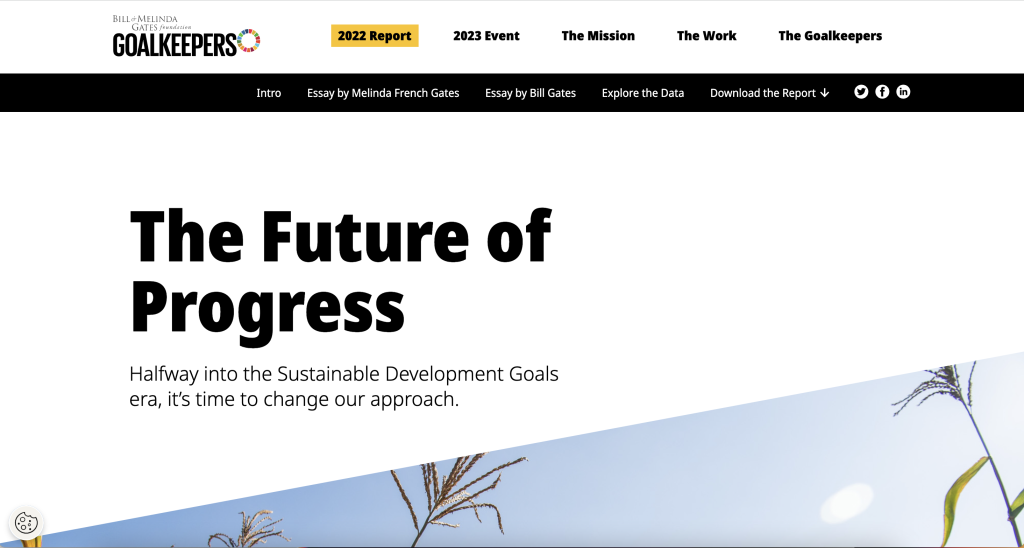
1. Notice the Tiny Header and Subheader
Notice how they didn’t mention “Goalkeepers,” in the report header or use the word, “Report.”
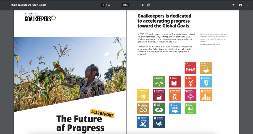
They didn’t need to. The report lives on the Goalkeepers page under the 2022 Report heading. So instead, they could put something simpler. Not quite sure what “The Future of Progress” means but the subheader, “Halfway into the Sustainable Development Goals era, it’s time to change our approach,” really sets up the report.
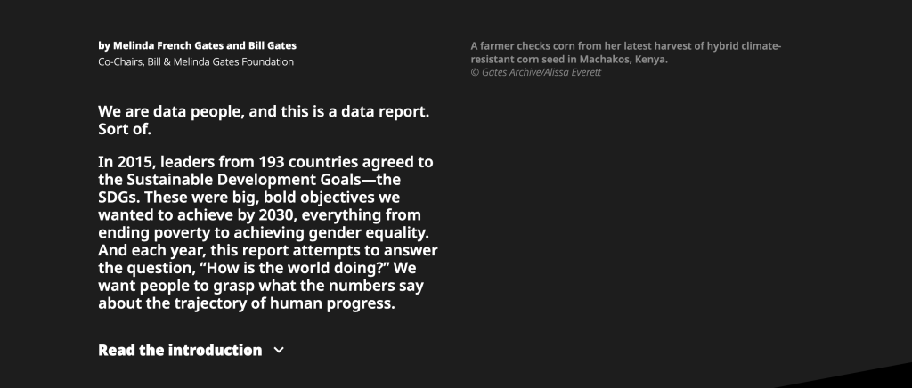
2. You are not forced to read the full introduction.
This report introduces a lot of choice. It gives you a paragraph of introduction, but if you want to read more, you have to click the expandable link for “Read the introduction.”
This is not the only time the report does this. Both featured essays are also only provided if you click to read. So right away the report feels more like the front page of a modern blog or newspaper than something you have to scroll through.
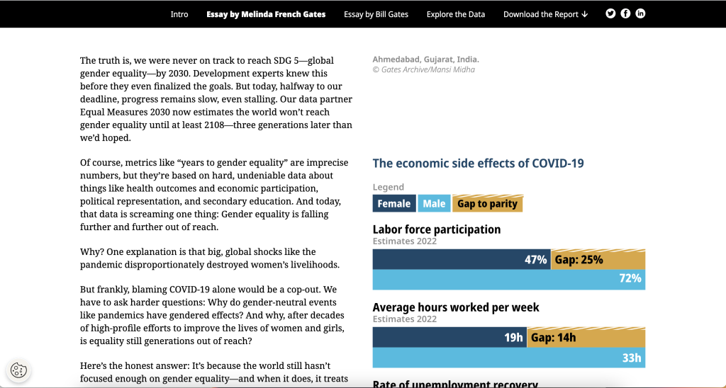
3. The left column is for the narrative.
There is a principle in design called “continuation.”
Basically, when you share something to read you want it to flow. If you constantly move your paragraphs around the page or break it up constantly with pictures and charts, it will stop feeling like something to read.
Across the intro and essays there is a two column setup with ample white space surrounding the columns. But only the left column contains the narrative. In the right column you’ll find charts, photo captions, and occasional photos. In this way, the page is broken down so you can easily read through the narrative.
As a bonus, since the narrative takes up very little space on the page, there isn’t a huge difference between how it reads on the web as to how it would read on a phone. This is increasingly common. For example, go check out a news site like the NY Times and notice how little landscape the column of narrative actually takes up.
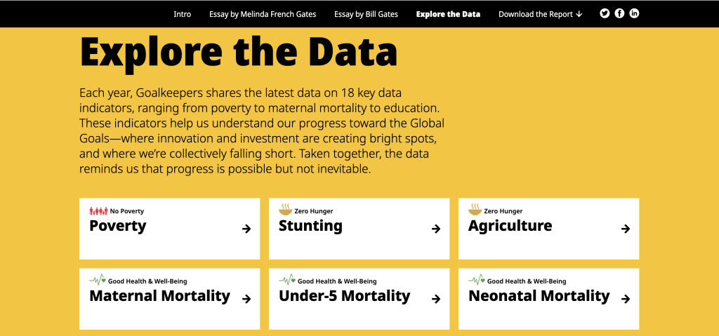
4. Look at how the data exploration takes advantage of repetition.
One of the mistakes amateur report creators make all the time is that they think every single new chart needs to be different from the last chart. You know, “to keep it fresh.”
But there is also a comfort in repetition, especially when you are looking at different indicators. Click around the different indicators in the “Explore the Data” section. Notice how they use the same chart types over and over and over again.
This lets you view the charts for the data, and not have to relearn how each specific chart is supposed to work on every page.
5. Check out the changes made in the PDF version.
Like many modern reports created by larger organizations, there is also a downloadable PDF. You get to it by clicking “Download the Report.”
Look at how the PDF compares to online version. Ask yourself what’s the same and what’s different? Personally, I really like how they kept the repetition in the “Explore the Data” section. Each indicator is given its own page, even if that means a bit of white space.
I also like how the Sources and Notes section isn’t just a list of reference links. There are narrative style notes and explanations shared within the section.
What are your takeaways?
Did you check out the report? Anything interesting catch your eye? If yes, leave a comment and let me know what you noticed.