Interactivity can really elevate certain charts, graphs, and illustrations. In this series of posts I will be highlighting visuals that work particularly well within interactive reports and data dashboards. First up, the quadrant graph.
What is a quadrant graph?
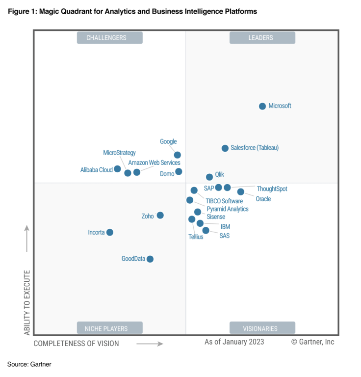
Simply, it’s a scatterplot with a two by two grid overlayed on top. There are different variations and sometimes the visual gets tagged with a different name. For example, a perceptual map is a kind of quadrant graph as are Gartner’s well-known magic quadrants (like the one below that Microsoft is more than happy to show off).
Here are 3 reasons why you should consider creating a quadrant graph.
Reason 1: Scatterplots in general make great interactive charts, but they have a drawback.
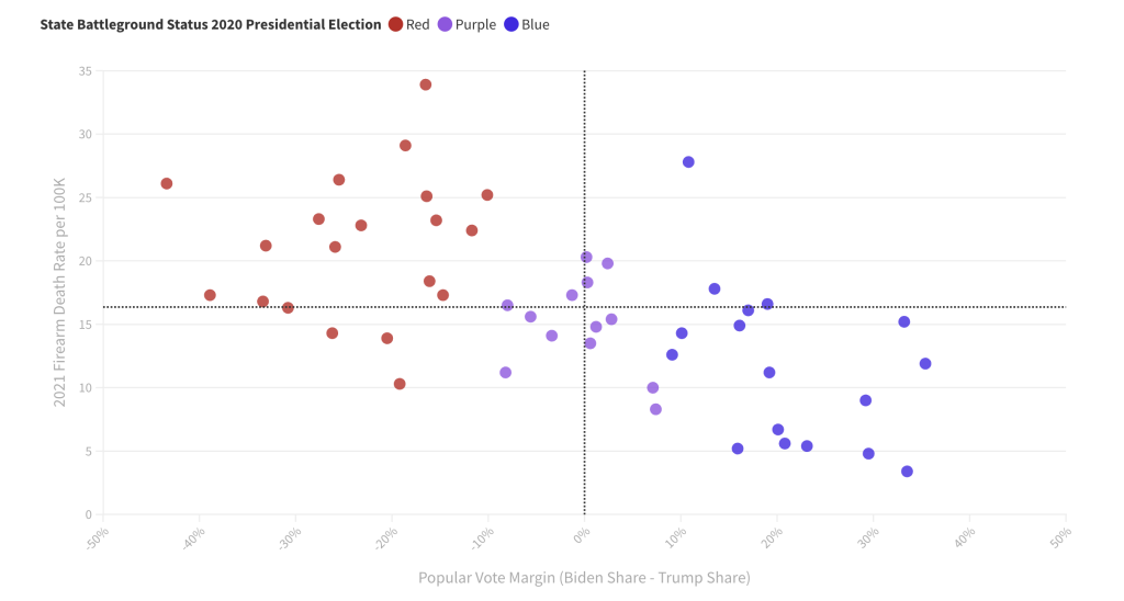
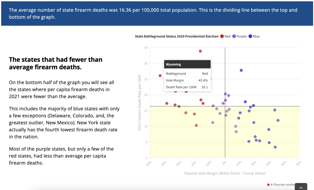
A scatterplot is a really great chart for showing possible relationships between two continuous variables. You also get the chance to show off all the data without hiding it behind descriptive statistics. The downside is that a bunch of dots on a graph can be tricky to discuss without some other visual aid, even when there is a pretty clear relationship.
One way to discuss the chart is to use stat talk. You can mention the mean, linear relationships, highlight outliers, and talk about standard deviation. But even the most basic stat talk can quickly lose a large portion of your audience.
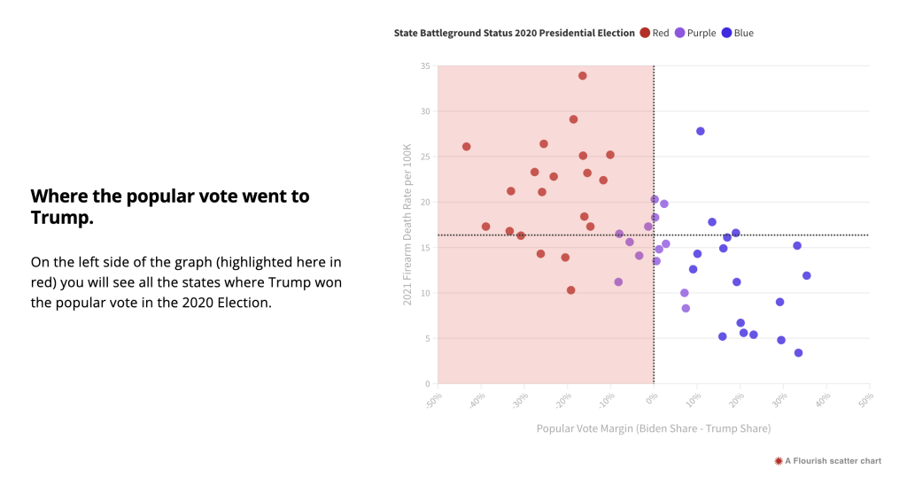
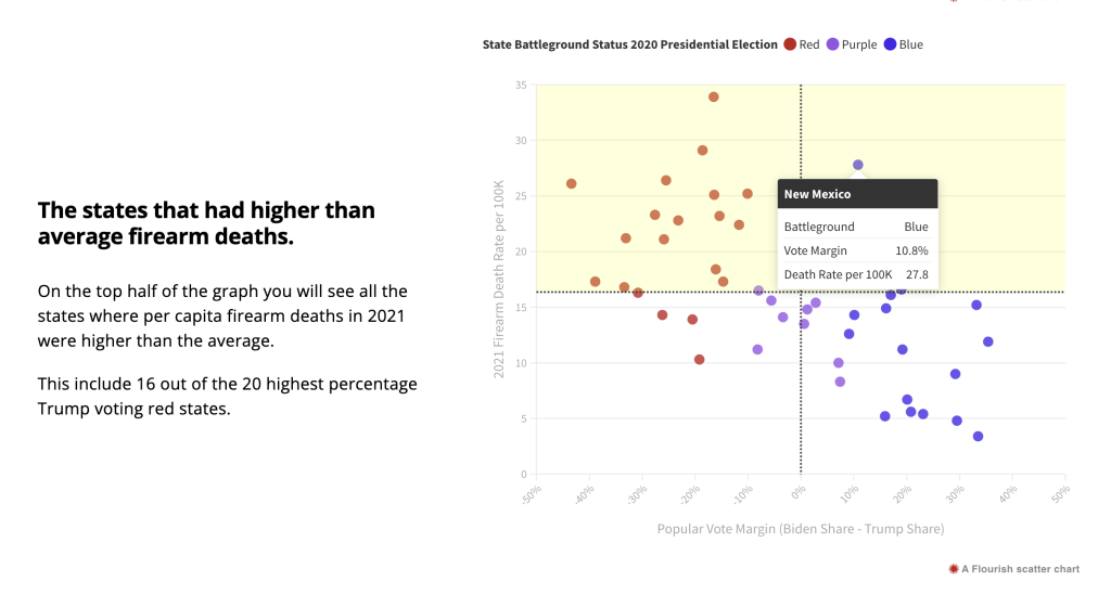
By adding a two by two grid on top we create an additional way to discuss the graph. Instead of a collection of dots, we can talk about each of the 4 quadrants. Or we can talk about the top half and bottom half. Or we can talk about the left half and right half.
Reason 2: A quadrant graph can be data dense without introducing information overload.
Interactivity gives you the ability to use tooltips that provide additional information about each point on the graph with a simple mouse hover. With a quadrant graph, the scatterplot works as a simple interface. In my example you only get one extra piece of information with the mouseover (the name of the state) but it also gives you the precise numbers behind each plot. You can also use the tooltip menu to embed other interesting data.
Reason 3: Some quantitative data is important to discuss, even when there is no clear relationship.
Not all quantitative datasets will show a pattern, but that doesn’t mean it’s worthless to discuss. Let’s say for example that there was no linear relationship between vote margin and firearm death rate. It would still be interesting to discuss where on the chart each state appeared, because every data point is a story. The quadrant graph makes it easier to tell every one of those stories.
This is most important when you have census data (ex. all states, all program sites, all students in a classroom, etc.). Each data point is meaningful. With sampled data, where the goal is to find patterns within the dataset that can be generalized to a larger population, you can still use a quadrant graph, but it’s less useful.
Want to some help building interactive charts or infographics like the one I shared?
That’s what I do for a living! Connect with me for a free consultation.