[…] When Disaster Strikes: Assistance by Museums Nearby because of its gripping personal narrative of 9/11 combined with a real-world example of a museum stepping up in times of crisis, and […]
Relevance Revisited: A Postscript

As we exit 2021, I’m reflecting back on where I began the year, when I noted that “in 2020, the museum field as a whole showed itself to be out of step with society. . . [and] irrelevant.” At that time, I had begun having regular conversations with Emlyn Koster, a thought leader with three decades of experience as a nature and science museum CEO. We talked about the ideas he expressed in his then-recently published Informal Learning Review article, where he emphasized urgency for relevance in museums, asking of any one museum, “Why does it exist? How does it align with surrounding environmental and/or societal needs?” We talked about museums needing to “be bold” and step outside the constraints of their colonial and rationalistic origins, which privileges perspectives of those in power and separates nature from humans. We discussed how we both wanted museums to embrace the complexity, interdependence, and global problems of life on Earth. From those conversations, Emlyn became our regular 2021 guest blogger, writing monthly posts from his vantage point as a geoscientist, museologist, and humanist about difficult topics of our time, pleading museums to be leaders in addressing these issues.
What I have valued most about Emlyn over the last year is his ability to bring together ideas and voices across time and disciplines and find interesting new ways of seeing things. I’ve also thoroughly enjoyed the zeal with which he thinks, talks, and writes about the issues that are important to him. Emlyn covers a wide range of topics in his 12 guest blogs, from his thoughts on how museums confront (or don’t confront) climate change to his beliefs on the type of leadership that is needed in museums. From among them, two stand out as my personal favorites.
- When Disaster Strikes: Assistance by Museums Nearby because of its gripping personal narrative of 9/11 combined with a real-world example of a museum stepping up in times of crisis, and
- Earth Day at 51: Why Museums Must Embrace the Anthropocene for drawing our attention to the world’s new geologic context of the Anthropocene and pleading for museums to present a unified [rather than the all-to-common divided] portrait of nature and culture, “with equal respect for both.”
Yesterday we published his final RK&A guest blog, Imagine: Museums Engaging with the Issues of an Anxious World. In it, he weaves together voices from the distant and near past to illustrate how the museum field has repeated itself over the last century in its calls to be responsive and relevant during times of crisis in our country, yet the status quo remains the same. From all of us at RK&A, I want to offer a strong expression of gratitude to Emlyn for his critical eye, commitment to the field, and camaraderie.
The post Relevance Revisited: A Postscript appeared first on RK&A.
Top 21 Dataviz Resources of 2021
6,000 total participants in our dataviz training academy so far (with 5 cohorts going through our Full Courses in 2021 alone).
28 blog posts.
14 YouTube videos.
1 new baby.
What a year.
Top 21 Dataviz Resources of 2021
Want to do some year-end learning as 2021 winds down?
Here are our favorite 21 data visualization resources from the past year.
Why “Know Your Audience” is Terrible Dataviz Advice—and What to Do Instead
Every time I scroll through social media, someone’s post is telling me: “Want to know the secret to great dataviz?! Know your audience!” I mean… duh. “Knowing your audience” is terrible data visualization advice. What’s the alternative? Not know my audience? Of course not.
In this blog post, you’ll learn 8 specific, nuanced, advanced ways of “knowing our audience.”
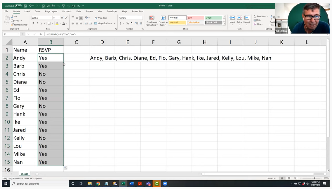
The Inside Scoop on Excel with Bill Jelen (Mr. Excel)
This year I had the honor of speaking with Bill Jelen, a.k.a. Mr. Excel. He was a guest speaker inside our data analysis course, Simple Spreadsheets, and is a big, big deal in the Excel community! I’ve internet-stalked him for years on his website and his popular YouTube channel. Frankly, I’m still shocked he agreed to come speak with us.
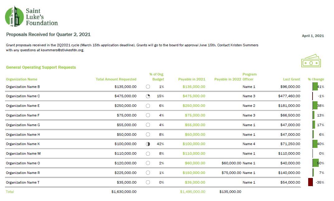
Better Storytelling with the Same Data: Upgrade that Board Packet!
“A lot of information and a bit overwhelming to take in.” That’s how Kristen Summers described her old grants docket. She emailed me an example of how she’s revamped her organization’s grants docket and I knew I had to showcase her hard work (keep it up, Kristen!).
In this guest blog post, Kristen walks us through the steps she took to remake her organization’s grants docket and budget visualizations.
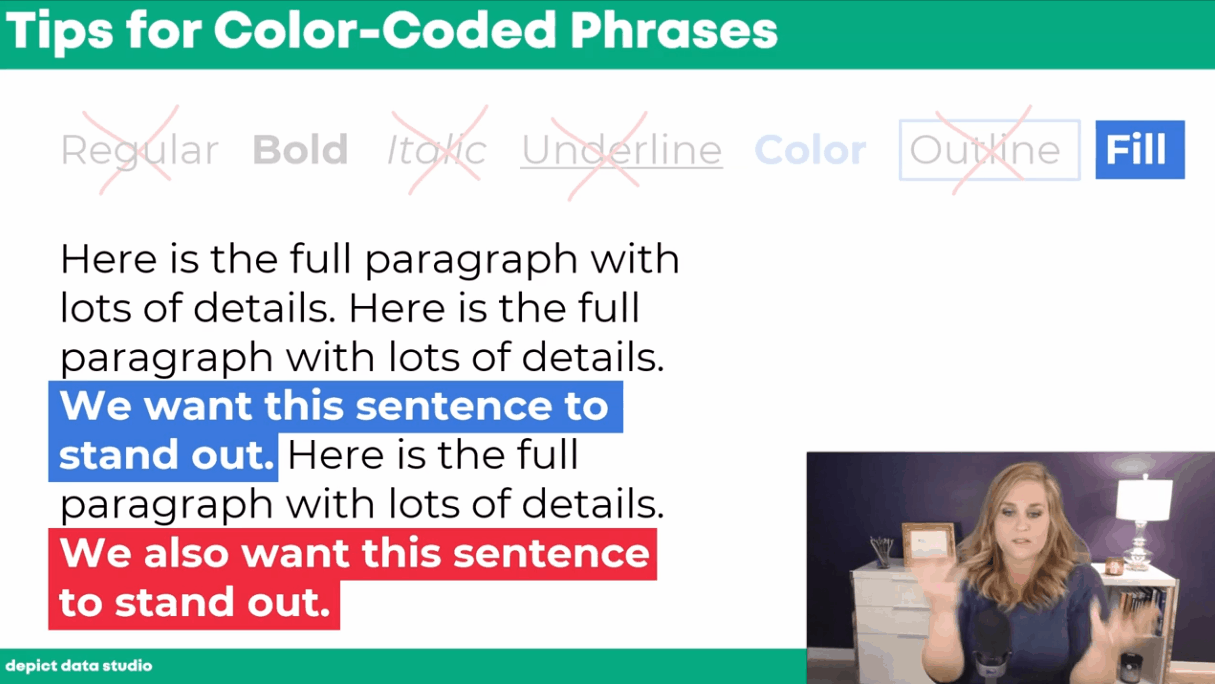
How to Visualize Qualitative Data with Colored Phrases
When my friend Jon Schwabish asked me to partner on his One Chart at a Time project, it was an easy “yes.” For the project, I created a tutorial on using colored phrases to visualize qualitative data.
You’ll learn about the first time I ever used colored phrases to visualize qualitative data, my favorite examples of colored phrases, and practical tips for using colored phrases in your project.
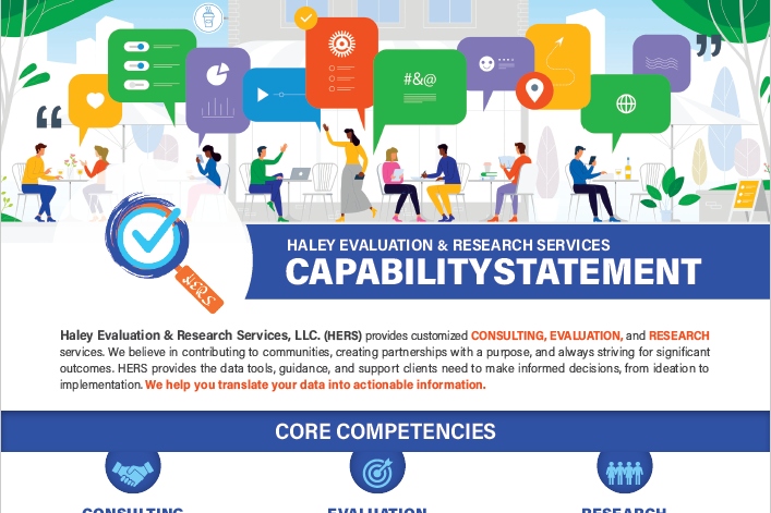
Applying Data Visualization Principles to Your Business: A Before/After One-Pager Makeover
Talk about a before/after makeover! Lillian Haley, Ph.D., MSW, ChFC® said, “Enrolling in courses at Depict Data Studio is one of the best professional developments I have ever made.”
In this guest blog post she shared how she originally based her capability statement on an example she found on the U.S. Department of Health and Human Services website and then transformed it using skills she learned in our courses.
Escaping the Bar Chart
Ready to escape the bar chart? Bar charts aren’t evil. But they’re overused.
In this blog post and video tutorial, you’ll learn about my 3 favorite exploratory vizzes (sparklines, data bars, and heat tables) and the pros and cons of choropleth maps, square tile grid maps, and hex maps.
Dashboard Design and “The Big Picture” in Dataviz: A Conversation with Steve Wexler
Are you familiar with The Big Book of Dashboards?? It’s THE reference book with dozens of real-life case studies. The author, Steve Wexler, joined our Dashboard Design course as a guest speaker where we talked about his career, his books, the goal of data visualization, why he loves collaboration and a lot more.
How to Pass the Excel Certification Exam
Want to pass the Excel certification exam? Maybe you want proof that you can rock Excel for your resume? For your boss? In this blog post, I’ll share behind-the-scenes tips for registering for and pacing the MOS-200 exam.
Designing a Prettier and More Effective Dashboard with Excel
Has using a dashboard has been central to your work? In this blog post, you’ll see Shawna Rohrman’s before/after dashboard makeover.
Shawna wrote, “Even with just these few changes (and using a program nearly everyone can access!), our new performance monitoring dashboard has made it so much easier for our team to review quarterly progress in one place and visualize how our system of early childhood programs are working for children and families in the county.”
How to Engage Your Audience with “Choose Your Own Adventure” Presentations
Ready for an advanced presentation technique? Want to make sure your audience is engaged?
In this blog post, you’ll learn about the “Choose Your Own Adventure” method for engaging our audiences during presentations. This style puts our audience in the driver’s seat. We prepare lots of topics in advance, but they vote on which topics they want to cover.
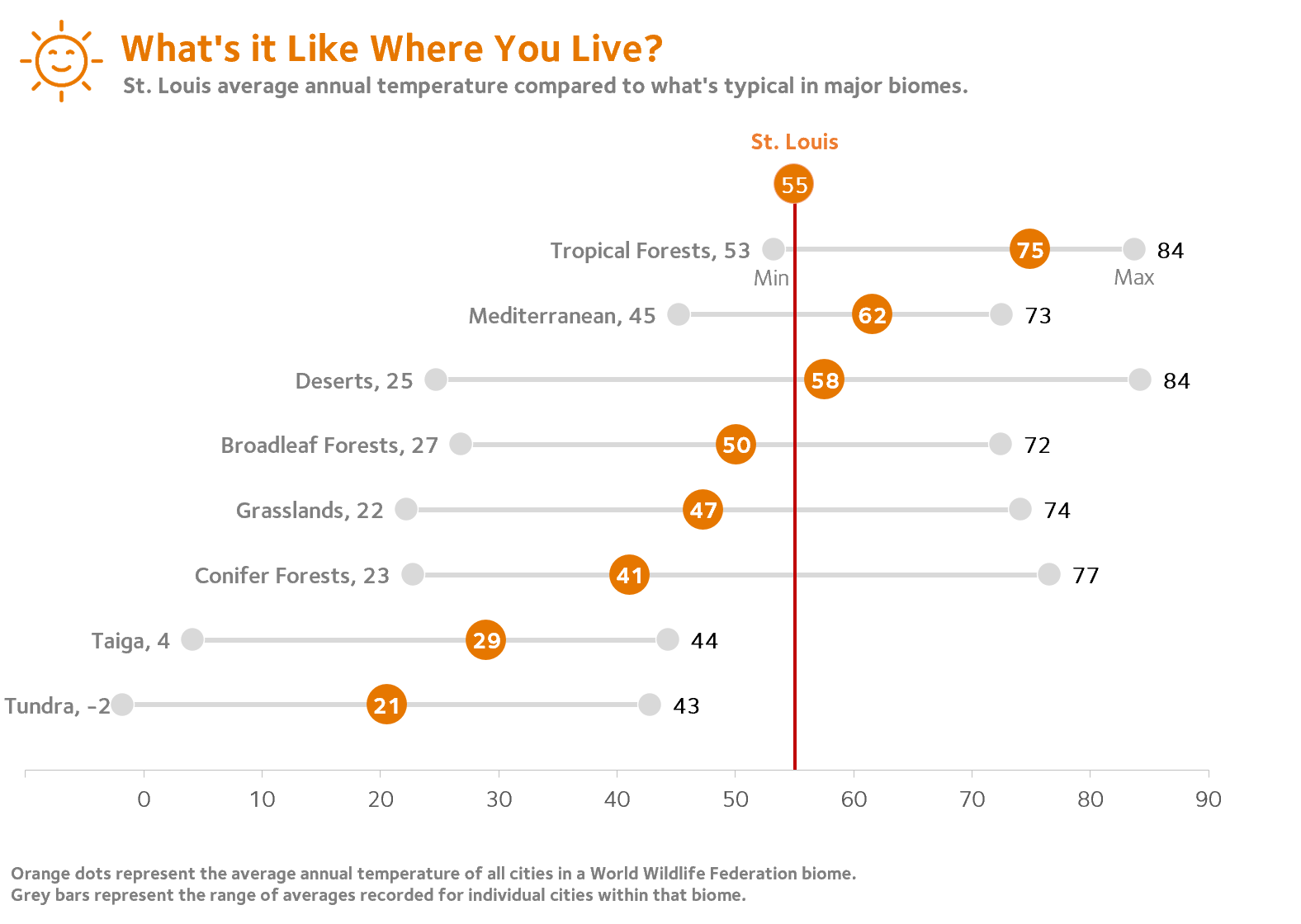
Dashboards for 10-Year-Olds: Connecting Data to Students’ Lived Experience
Who are your datavizzes for? For your Board members? Other staff members? The general public? But what about for kids?
Bob Coulter has been “developing dashboards to support students’ understanding of local ecology and equip them to use that local understanding as a baseline to explore the rest of the world.” In this blog post, you’ll learn how Bob Coulter designed visualizations that personalize the experience for kids, too.
Creating a Powerful Presentation: 3 Easy Changes to Revamp your PowerPoint
“Over the past few years, I have given a number of presentations across the country. I’ve learned the importance of presenting a creative topic rather than just ‘Hey, here’s my program. Let me throw some stats at you…’ I realized my slides needed some quick but major changes,” said Kelsey Watterson.
In this guest blog post she shared how she transformed her text-heavy presentations with her three favorite tips: color coding, increasing readability, and storyboarding.
3 Common Reporting Hurdles—and How to Overcome Them
I was a guest on Alli Torban’s podcast, Data Viz Today.
In this episode, you’ll learn how to overcome common reporting challenges like:
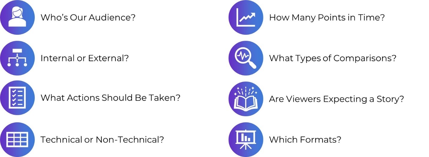
- Figuring out how to incorporate a variety of formats. Not just slideshows, not just reports, not just dashboards, and not just infographics. A different format for each of our different audiences.
- Trying to pack a lot of dense, technical information into each format — without overwhelming our readers. This is a tough one, even for me. And 3)
- Incorporating a variety of visuals. Not just graphs. Not just tables. Not just photographs.
Communicating with Your Audience More Effectively: Using One-Pagers Internally
Need a skimmable one-pager?
Guest blogger Juan DeJesus needed a one-pager that his team of 100+ people could read in 2 minutes or less.
“Instead of dense and text-heavy presentations, I minimize the text to include only the main points and actions I need from my team,” he wrote.
How to Use Vlookup in Microsoft Excel: Two Step-by-Step Examples for Beginners
Have you conquered the lookup functions yet? (vlookup, hlookup, index-match, and xlookup?)
In this blog post, you’ll learn:
- what vlookup is used for,
- why vlookup can be tricky, and
- how to fill in the four pieces of the formula.
Navigating Tableau’s Resources with Zach Bowders
Curious about Tableau? Want to get started for the first time? Maybe you’re already using Tableau… but want to use it even better?
Zach Bowders, Tableau Zen Master and Tableau Ambassador, was a guest speaker during a Dashboard Design live session and he helped us navigate the Tableau community’s resources.
A Trick, a Tip and a Thing to Try in Your Next Presentation
Are you using visual frameworks to explain your data?
This is an advanced technique, and it definitely requires more up-front planning time than usual. (But, it’s time well spent! More planning = better comprehension for our audience.)
“The effort to pick the right visual metaphor transformed the way I understood my own content,” explained Elizabeth Dove, guest blogger who shared her tips and tricks for presentations.

Creating a Community through Graphs
Do I selfishly hold Office Hours every week just so I can talk with you about data? Maybe. Wink.
Guest blogger Maddison Staszkiewicz shared how she transformed her data visualizations after getting feedback from our community during Office Hours.
Getting Started with Sketchnoting: A Conversation with Emily Mills
Most of us were trained to write formal, academic reports.
Transitioning into infographics, dashboards, slidedocs… or even landscape orientation… yikes! It’s a big difference from what we’re used to.
To ease that transition, I invited professional illustrator Emily Mills to lead a sketchnoting session for our Report Redesign Full Course.
If we can get comfortable drawing graphics by hand, I thought, then adding a few more graphs to our reports won’t feel so daunting. Grab a pencil and paper to follow along.

Why Nonprofits Shouldn’t Use Statistics
Overwhelmed by fancy statistics? Does that make you feel like a wimp?? What if statistics weren’t necessary for some organizations???
Drs. Maryfrances Porter & Alison Nagel were guest speakers in our Simple Spreadsheets course, and they explained why nonprofits shouldn’t use statistics.
Don’t miss this one if you work at a nonprofit!
Speeding Up Your Data Viz (& Preventing Future Injuries) Using Custom Commands in Dragon
Ever feel like Microsoft Office wasn’t designed with data viz in mind? Do you have actions that need to be repeated over and over and over again?
In this blog post, Andrew Forsman is sharing how “a voice command and dictation software called Dragon can help overcome some of Office’s limitations.”
While I’m a big believer in everyday software, I love learning how new software can save us time and effort so we can focus on creating great data viz.
Here’s to 2022!
Imagine: Museums Engaging with the Issues of an Anxious World
By: Emlyn Koster
As 2020 approached and with a whole-planet outlook, Emlyn expected a burst of ominous reflections around the 50th commemoration of Earth Day but also with a hope for some ‘20/20’ given its symbolic meanings of clear hindsight and perfect vision. Instead, the world cascaded into multiple destabilizing developments. Two years later and with the museum sector having scarcely embarked on adaptive strategies other than increasing the diversity of boards, leaders and staff, he urges that museums learn more from their past to creatively maximize their value in a world deeply anxious about its future.
In her new Centering the Museum anthology, Elaine Gurian recalls our joint 2003 article that began: “Consider a world in which every museum, as either an extension of its mission or as its raison d’être, is geared to respond to contemporary events and issues” (see Joy Davis, Elaine Gurian and Emlyn Koster, 2003. Timeliness: a discussion for museums, Curator: The Museum Journal 46:4, 353-361). Imagining the future of museums has never been a more pressing need.
Context
In 2020 environmental and social activist Arundhati Roy surmised: “Historically, pandemics have forced humans to break with the past and imagine their world anew. This one is no different. It is a portal, a gateway between one world and the next”. And a recent New York Times Magazine cover story pointed out: “There are many examples of mass tragedies that inspired meaningful reforms of scientific breakthroughs―steps forward in human progress that, in the end, most likely saved more lives than the original tragedy claimed”.
Striking a different tone in the November/December 2021 issue of AAM’s Museum with A Redefining Moment theme, president Laura Lott began: “Distrust and skepticism in many of our country’s institutions is increasing, making the fragility of trust painfully clear”. More recently in a Leadership Matters column, Joan Baldwin exclaimed: “It’s no secret that the world of museum work is a mess, and it’s popular to blame it on COVID, but is that the whole answer?”. My response is an emphatic no.
Hurdles

The museum sector has failed in my view to confront—and, in most cases, to barely discuss―what have been a growing number of hurdles to its progress. Foremost, it has been hampered by intellectual detachment from the issues of an increasingly tumultuous world as it continued to dwell on the past. Exacerbating this situation, the sector has segmented the interwoven realms of nature and culture into natural history, history, art and science/technology, each serviced by separate associations and granting bodies; art museums have come to dominate the popular sense of culture, but to their credit are portraying the Anthropocene more than other museum types (see Lotte Isager, Line Knudson and Ida Theilade, 2020. A new keyword in the museum: exhibiting the Anthropocene. Museum & Society 19:1, 88-107); scientific insights about global changes have, across many conservative quarters, fallen into disrepute; and curatorial research, like research across universities, has intensified its hyper-specialization while a need for transdisciplinary approaches has grown.
Perhaps most fundamentally, the museum sector should have remained alert to how its evolution was punctuated by urgings to tackle new and germane needs. For example, AAM’s 1942 Annual Meeting was challenged: “What part shall our historical museums play during the war? If they are to survive, they must justify their existence as a vital element of community and national life… Our institutions are not merely guardians of the past, but are factors in the building and molding of character for the future” (see L. Hubbard Shattuck, 1942. Wartime duties of historical museums. Museum News October: 6-8). As Marjorie Schwarzer later noted, the sector’s search for meaning often faded when the crisis passed: “When the funds began to flow again, museums quickly forgot the shock of the Depression as well as their moments of innovation on behalf of the public… An opportunity to be societal role models for the wisest possible use of resources and talent was lost” (see Marjorie Schwarzer, 2009. Bringing it to the people: lessons from the first Great Depression. Museum May–June: 49–54).
AAM’s 1992 Excellence and Equity manifesto posed a core question: “How can museums—as multidimensional, socially responsible institutions with a tremendous capacity for bringing knowledge to the public and enriching all facets of the human experience—help to nurture a humane citizenry equipped to make informed choices in a democracy and to address the challenges and opportunities of an increasingly global society?”. At the Smithsonian’s 150th anniversary Museums for the New Millennium symposium in 1996, Harold Skramstad pointed out: “… the mission statement of most museums, which often states, ‘Our mission is to collect, preserve and interpret fill-in-the-blank’, will no longer do. Such mission statements do not answer the vital question, ‘So what?’” (see Miguel Bretos, Harold Skramstad and Irene Hirano, 1997. Changing public expectations of museums. In: Museums in the New Millennium: A Symposium for the Museum Community, Center for Museum Studies Smithsonian Institution and the American Association of Museums, 33-50).
When discussing the success and failure of museums, emeritus scholar at the Smithsonian Stephen Weil stressed the distinction between outputs and outcomes, the latter defined as externally valuable productivity (see Stephen Weil, 2005. A success/failure matrix for museums. Museum News 84:1, 36-40). But in his last paper, he lamented: “… the awkward fact remains that for a variety of reasons, the museum field has never agreed—and until recently, has scarcely even sought to agree—on some standard by which the relative worthiness of its constituent member institutions might be measured” (see Stephen Weil, 2006. Beyond management: making museums matter, ICOM International Committee on Management Study Series 12: 4–8). In 2006 in AAM’s Museum News, I asked: “As news stories unfold and society seeks to understand the nature and significance of events, is the museum field going to adapt to a greater role in exploring the things that profoundly matter in the world?”. To illustrate external relevance, topic suggestions for each type of museum were offered, including the causes of divergence of people into rich and poor nations, rise and fall of superpowers across history and profiles of their leaders, causes of war and what constitutes victory and loss, and lessons from environmental stewardship efforts.
In many ways, the several states of mind across the sector which John Falk and I sensed in 2007 continue: “There are, first, a growing number of museums that wholeheartedly embrace the goal of external usefulness… at the opposite end of the spectrum, are museums—and we think these form a sizeable minority—that lack any tangible step into the dialogue about relevance… in the middle of the spectrum—and most likely the majority are museums struggling to know how to transform their consciousness in ways that matter more than at present“ (see Emlyn Koster and John Falk, 2007. Maximizing the external value of museums. Curator: The Museum Journal 50:2, 191-196). Robert Janes echoed this conclusion in 2009: “… the majority of museums, as social institutions, have largely eschewed on both moral and practical grounds, a broader commitment to the world in they operate”.
Institutional effectiveness with a focus on externally valuable impacts is central to the pursuit of relevance. For a museum “to reposition itself continuously to ensure its vitality” requires leadership with “a combination of grit and vision” (see Stephen Weil, 1997. Foreword. In: Robert Janes, Museums and the Paradox of Change: A Case Study in Urgent Adaptation. Glenbow Museum and the University of Calgary Press). Institutional effectiveness with a focus on externally valuable impacts is central to the pursuit of relevance. Because incorporating new contexts is a major part of institutional optimization work, among other reasons, I think the sector has long needed a prominence of many scholars well-grounded in experiential research.
Vagueness
The retiring director of the American Museum of Natural History in 1959 surmised: “… the natural history museum has reached a stage in the development of its relationship with society when the generally prevailing opportunistic vagueness of intentions is becoming a liability which must be replaced by a well-considered, well-integrated, and well-defined philosophy concerning the museum’s place in the general research and educational system of the nation” (see Albert Parr, 1959. Mostly about Museums. American Museum of Natural History). In 2000 an emeritus museum director and evolutionary biologist at the University of Kansas discussed: “Can natural history museums capture the future?”. Positioning these institutions as “sentinel observatories of life on Earth” and therefore as “stewards of the future”, their concerns were framed around the interrelated challenges of the biodiversity crisis and the dilemmas of education in academia, public programs, and leadership. These stances became underscored by the declaration at a 2012 convening at the National Museum of Natural History: it began “Humanity is embedded in nature and we are at a critical moment in the continuity of time” (see Bill Watson and Elizabeth Werb, 2013. One hundred strong: a colloquium on transforming natural history museums in the twenty-first century. Curator: The Museum Journal 56(2): 255-265).
The 2015 report of the Rockefeller Foundation-Lancet Commission on Planetary Health showed that “the health of humanity is intrinsically linked to the health of the environment, but by its actions humanity now threatens to destabilize the Earth’s key life-support systems”. Also warranting attention is the research area known as multispecies ethnography which is about non-human species whose lives and deaths are linked to us. Our needed big-picture outlook is further hampered by the fact that Earth history stops before Homo sapiens evolved in the vast majority of natural history and natural science museums. An actual or fake mummy is often the extent of coverage of human development as opposed to overviews of anthropological research into rituals, languages, religions, shelter, clothing, agriculture, aquaculture, communities, governments, exploration, trade, conflicts, the frontiers of technology, and environmental disruption. No wonder that nature and culture are silos in the conscience of most people!
In these contexts, it is noteworthy that a review of the 2014 book Life on Display pointed out that it “ends in 2005, when both natural history museums and science centers are seen as trusted, articulate voices grappling with new and evolving challenges” (see Mary Ellen Munley, 2010. Review of ‘The Social Work of Museums’ by Lois Silverman. Museum Management and Curatorship 25:3, 337-339). Perhaps the majority of museums think they are factors in environmental stewardship and caring communities, but are they really? Around matters of trust, the onus is on the museum to be proactively fulsome, not assume that audiences infer all that is involved. AAM’s 2021 Museums and Trust report concluded: “To be both trusted and influential, museums, like scientists, need to be skilled communicators, and study the most effective ways to talk about their work, and present their messages.”
Broadly, if museums are to achieve external relevance—a term discussed in my last RK&A blog―they must distill new visions, missions and strategies, rethink collections, optimize curatorial and interpretative work, and repurpose exhibition spaces. This stance is propelled by the premise that museums are a unique type of scholarly and public resource with an accountability to tap their much greater potential to be enlightening in a world increasingly anxious about its future. Earlier this year in AAM’s Exhibition journal, I proposed a menu of content topics with a whole-Earth context. The business concept of unique value propositions, which John Falk and I explained 15 years ago (see Emlyn Koster and John Falk, 2007. Maximizing the external value of museums. Curator: The Museum Journal 50:2, 191-196), offers a powerful approach to audience engagement. The immense challenges of the 21st century depend on museums not shying away from the things we wish were less real world.
Prognosis

Over the past decade there have been forecasts of the increased value of museums, rather optimistically as things have turned out. From Canada: “… the museum becomes critical to the long-range health of a place: central to think-tanks, planning initiatives and community transformations… It is an institution others actively seek for guidance and expertise, harvesting from its knowledge, communication methodologies, community connections, and relationships. In such an ecosystem, the museum’s role does not have to be explained or rationalized: [others] embed it in their governance, research and educational programs” (see Jacqueline Gijssen, 2008. Museums in 2020: change and connectivity. Muse November/December, 44-46). And from the UK: “Museums in 2020 should be radical and participative institutions at the heart of their communities. They should be working in partnership with third-sector organisations to develop formal and informal learning, health and wellbeing, skills and social change. Museums are already the most innovative public institutions in the arts and cultural sector. By 2020, they should have turned this expertise outwards, to become centres for public creativity and local enterprise”. However at AAM’s 2011 annual meeting, a keynote had issued this warning: “If in 2050 we were delivering the same messages, either we’ve failed at affecting change in society and still needed to give those messages, or we just got left behind and we were no longer on the frontier of what mattered in society” (see AAM, 2011. The future is in the stars: an interview with Neal deGrasse Tyson. Museum March-April, 47-51). Time will tell.
Footnote
As the pandemic surged and museums closed, I thought about how the medical profession integrates epidemiology—the branch which deals with the incidence, distribution, and possible control of diseases and other factors relating to health―in its comprehensive approach. Indeed, it became clear that continuous learning from a long and wide horizon is a vital focus of any association aspiring to be part or the whole of a true profession.
About the Author
Emlyn Koster, PhD lived in Egypt, the UK and Canada before moving to the US. His career phases have been as a geologist at UNESCO World Heritage Sites, the CEO of four nature and science museums, and an advocate for holistic approaches to humanity’s disruption of the Earth’s health. Recognition includes board presidency of the Geological Association of Canada, Humanitarian of the Year by the American Conference on Diversity, Alumni of Excellence at Canada’s University of Ottawa, and invited membership on the Ambassadors Circle for the International Coalition of Sites of Conscience. He is an Adjunct Professor in Marine, Earth and Atmospheric Sciences at NC State University. He can be reached at koster.emlyn@gmail.com and his previous RK&A blog posts are here.
The post Imagine: Museums Engaging with the Issues of an Anxious World appeared first on RK&A.
Everything You Need to Know about Likert Scales
Evaluators love a good survey. And why shouldn’t we? They are a cost-effective, quick method for capturing good data! However, not all surveys are awesome – we’ve all come across poorly crafted surveys. Maybe it’s full of double-barreled questions. Maybe the questions are loaded, or leading. Or maybe the response options don’t match how you would choose to respond.
The Likert scale (check this out for a debate on how to pronounce it! Personally, I’m on the LIKE-ert side of this one) is one of the more commonly used rating scales in surveys. As evaluators, we should know a thing or two about it, and how to navigate some of the decisions involved in using a Likert scale.
What are Likert Scales?
Likert scales were named after Rensis Likert, a social scientist, who developed the scale as a way to assess a person’s attitudes or feelings. There are many factors that can be assessed using a Likert scale, including (but not limited to):
-
Level of agreement, satisfaction, concern, acceptability, support, importance, difficulty, and awareness
-
Frequency
-
Valence/Quality
-
Likelihood
The Likert scale is an important move away from binary-only responses (i.e., yes/no) and helps the evaluator assess a respondent’s feelings or thoughts on a range or spectrum, allowing for a better, more nuanced understanding. Statistically, this offers more variance or discrimination in your data.
Notably, as opposed to rating scales the Likert rating scale uses labels – actual words – for each rating.
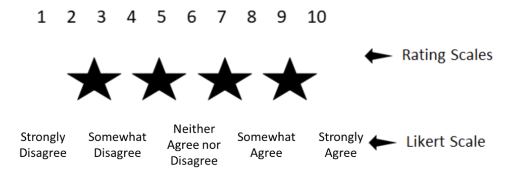
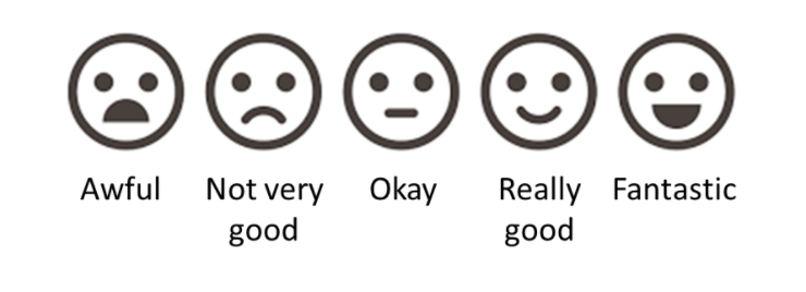
Likert scales have some great advantages, including the options to use icons or faces for children or others who may have difficulty reading:
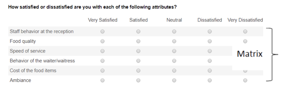
They are also great for formatting into a matrix when you are designing your survey, making it take up less space and easier for the respondent to fill in.
Common Questions about Using the Likert Scale
Like other surveys, a Likert scale survey is still susceptible to the pitfalls of poor survey design: e.g., you still can’t have a double-barreled question. In fact, there are a few additional concerns, or at least conversations, that swirl around the Likert scale:
-
Do you have to use an odd number of ratings (with a middle point)?
-
How many anchor points should I use: 3, 4, 5, 6, 7?
-
How do I report a Likert scale survey?
-
How do I analyze the data?
-
Can you combine ratings?
-
I’ll tell you right now, I don’t have clear answers for any of these 3 questions. But I can help to lay out the arguments for you so that you can make an informed decision.
Does a Likert scale have to have an odd number of choices?
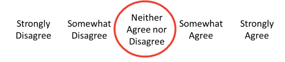
Most Likert scales you come across will have a middle point that offers a neutral selection choice:
Do you have to include this? No. If you don’t, you’re created what’s called a “forced choice” Likert scale. That is, you’re forcing the respondent to choose a side without the option to be neutral. Many resources advocate for the middle point but if you’re not sure, some questions to ask yourself in consideration include:
-
Are you working with sensitive subject matter where respondents may be reluctant or feel uncomfortable in a forced choice? (if yes, include the middle point)
-
Is it possible that neutrality is a valid option? (if yes, include the middle point)
-
Is there potential that respondents will be reluctant to answer negatively and bias towards a mid-point? (if yes, exclude the middle point)
Sometimes that middle point gives respondents a way to answer quickly without thinking more deeply about their selection, leading to the potential that the collected data are not accurate. Interpretation of the middle point can also be problematic: does it reflect true neutrality or just indifference? Did the respondent not understand the question? Forced choice can offer more declarative data and reporting, but it can also turn off respondents who may genuinely be in that middle ground. Statistically, removing the middle point does not affect the validity or reliability of your data.
Ultimately (and perhaps unfortunately?) it’s up to you. There is no right or wrong choice.
Keep in mind that “not applicable” or “don’t know” are still valid considerations whether or not you have a neutral point. Neutrality and “not applicable” are not the same thing. Consensus is that including a “don’t know” also does not affect the reliability and validity of your data.
Another thing to watch out for is an unbalanced scale. You can remove the middle point, but you can’t offer more choices on one side than the other. In fact, you can’t do this whether the middle point is there or not.

How many anchor points should I use? (and a side conversation about polarity)
Again, there is no right or wrong answer here, but certainly the most common number is 5. In general, the more anchor points you have, the more sensitive your data are and the more variance you have (which is a good thing!). Some research has shown that reliability and validity are highest with a 7-point scale when it is bipolar, but unipolar scales are optimized at 5-points.
A side conversation about polarity
Unipolar scales measure the amount of one factor, whereas bipolar scales offer two opposing views:
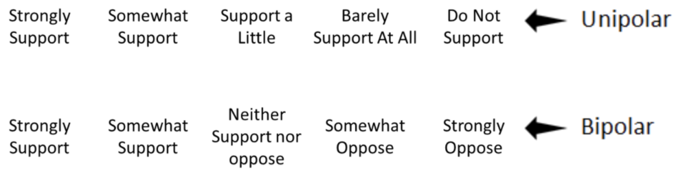
Unipolar scales can be used wherever there is the possibility of expressing all or none of dimension. Unipolar scales have less need for that middle point discussed above, whereas bipolar scales have a more natural midpoint. Bipolar scales create more cognitive load on the respondent – having to decide which end of the spectrum they align with, and then where on that spectrum they fall. But bipolar scales can be problematic when there is the potential for interpretation about “opposite”. For example, is “dark” the opposite of “light” or perhaps “bright”? Psychometric testing suggests that where possible, a unipolar scale is the better option for improved scale reliability.
Back to the question of how many anchor points: consensus is that anything above 7 doesn’t provide additional variance in your data. So then, what about 3 points? Arguments against using only 3 anchor points is that it provides less discrimination – which is kind of the whole point of using a Likert scale. However, if you are surveying a topic with little expected variance and are hoping for a quick survey option, 3-points can be a valid option.
Another factor to consider is about the method of administration: doing a phone survey and keeping a 7-point scale in your head is likely to be confusing!
How do I report a Likert scale survey?
How to report a Likert scale is as equally an important conversation as creating the scale itself. There is lots of debate swirling around the most appropriate statistical methods to use. This debate centres on the question: can you assume equal distance between the anchor points? That is, are the data ordinal or interval?
Generally, psychometrists seem to agree that a Likert Scale is ordinal (rank) and approximates an interval data set. To analyze Likert scales, many suggest median (or mode) and range (as opposed to mean and standard deviation). Personally, I’m a big fan of reporting the median in a Likert scale for a few reasons: 1) you don’t have to try to interpret what 3.4 means on a 5-point scale – the median will be a whole number that is found on your scale and 2) it isn’t skewed by outliers. Graphically, Likerts can be depicted in bar charts, or any number of great data viz options.
If you’re looking to do some statistical analysis on a Likert scale survey, the rule of thumb is to use non-parametric tests, which mean Spearman’s r for correlations, and Wilcoxon Signed-Rank (in place of the paired t-test) or Mann Whitney (in place of the independent samples t-test). There is debate, however, about whether a Likert approximates interval data well enough to use parametric tests, especially if you are looking at overall questionnaire data (as opposed to a single Likert scale question). Some reports have shown little difference in parametric and non-parametric analyses, so you may be justified in selecting either, particularly if your data follow a normal distribution and you have an adequate sample size. If your data are skewed (as many Likert scales are), best to stick with non-parametric.
Now that we can analyze the data, how do we report it? A personal pet peeve of mine is reports that have data from a 5-point scale and then report it as a 3-point scale, combining the two ends of the scale:
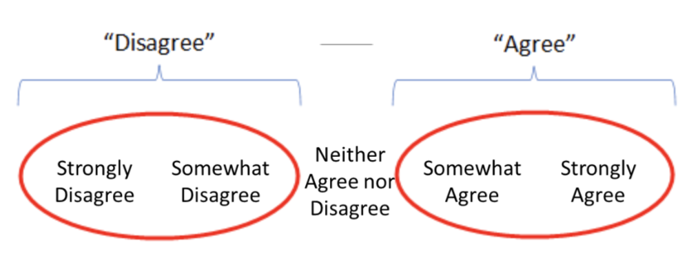
The purpose of a Likert scale is to add discrimination to your data. Combining these scales removes that discrimination. I’m sure you’ve all seen reports that read “x% of respondents either agreed or strongly agreed with the statement.” So, is this ok or not?
Again, the answer is it depends. If you are performing statistical analysis on your tool, absolutely do not combine any of the anchor points – this greatly reduces the value of using the Likert scale to begin with! If, however, you are reporting to a lay audience and are aiming for clear, simple reporting, combining items on a scale can help your audience with interpretation and perhaps make the data more actionable.
Some final tips when drafting or reviewing your scale:
-
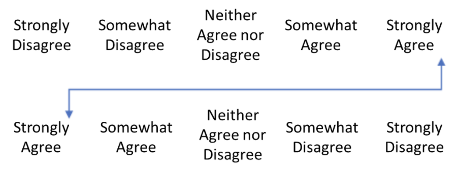
Primacy and recency effects apply to Likert scales, like any other scale. Ideally, you would have two versions of your survey – one where the positive side is on the left and one where it is on the right – and you would distribute these versions randomly to your sample. Some survey platforms can actually do this for you! You’ll need to pay close attention to this when analyzing your data to avoid any mistakes!
-
As in any survey, there are several respondent biases that come into play, including confirmatory bias and social desirability bias. Good survey design, including allowing for anonymity and clear instruction, can mitigate some of this risk. To avoid confirmatory bias (this is when respondents have a bias toward accepting the statement or agreeing with the question) add variance into your survey (i.e., more anchor points!). You can also try including some question reversals, where the negative statement is used: e.g., “I don’t like the workshop.” This can also help you identify those who are just answering down in a straight line, selecting “agree” down the whole column to get through the survey quickly. Like above, reversals can be tricky in analysis. Communication about reversal statements is required, and likely it’s best to do a double check to ensure the data were analyzed properly.
-
Pilot test! Though it takes a bit of time and resources, pilot testing any survey (Likert or not) is helpful. You can ask your respondents about any confusing language, measure the amount of time it takes to complete the survey, and assess if the response options reflect the respondents’ desired response.
I’m confident that as an evaluator, Likert scales are part of your toolkit. Hopefully, we’ve shared some relevant tips about how to use and report them effectively.
Let us know some other tools in your toolkit that you have questions about! Are there some templates that would be helpful? Comment on this article or connect with us on LinkedIn or Twitter!
Sign up for our newsletter
We’ll let you know about our new content, and curate the best new evaluation resources from around the web!
We respect your privacy.
Thank you!