• Skip to main content
  • Skip to footer
  • Home

The May 13 Group

the next day for evaluation

  • Get Involved
  • Our Work
  • About Us
You are here: Home / Archives for cplysy

cplysy

Dec 16 2021

A Beginner’s Guide to PivotTables


If you work with data in Excel, whether frequently or infrequently, learning the basics of PivotTables will improve your ability to quickly explore and analyze raw data. PivotTables can transform your raw data into meaningful insights and reports in minutes. And the best part: creating PivotTables does not require any prior knowledge of Excel’s built-in formulas. With a few clicks of the mouse, you can generate fast, accurate results. 

With PivotTables you will be able to quickly: 

  • Summarize data (e.g., averages, counts, sums) 

  • Sort data (e.g., alphabetically, numerically) 

  • Group data (e.g., dates by month) 

  • Filter data (e.g., by department, by region) 

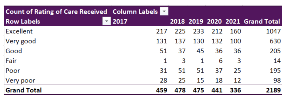
PivotTables let you go from rows and columns of raw data to results in just a few clicks (see the table below). Creating meaningful data summaries is a breeze with PivotTables, and once you understand the basics, you will not have to go back to using manual formulas for most of your reporting needs. Just let PivotTables do all the work for you. 

This article will walk you through the basics of working with PivotTables, using sample data from patient surveys conducted in medical clinics.


Preparing your data

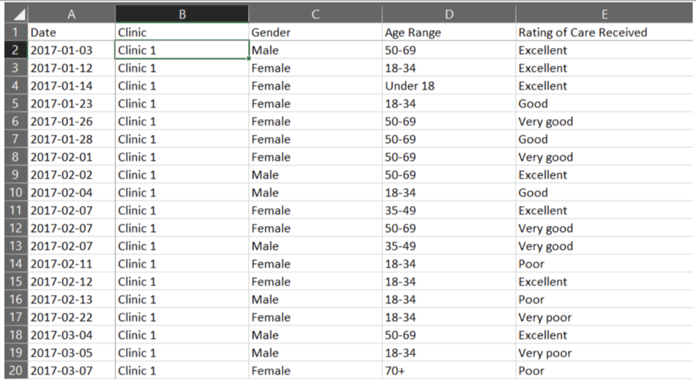
Before jumping into working with PivotTables, we need to take care of some basic housekeeping. While there are several ways of entering data into an Excel spreadsheet, data should be entered in a tabular format such that: 

  • The first row contains a clear header describing the data in the columns 

  • Each column should only contain data of a single type (e.g., a Date column should only contain dates) 

  • Each row should only contain data from a single time point (e.g., a program participant may answer a survey on two different dates, but each survey should be entered into its own row) 

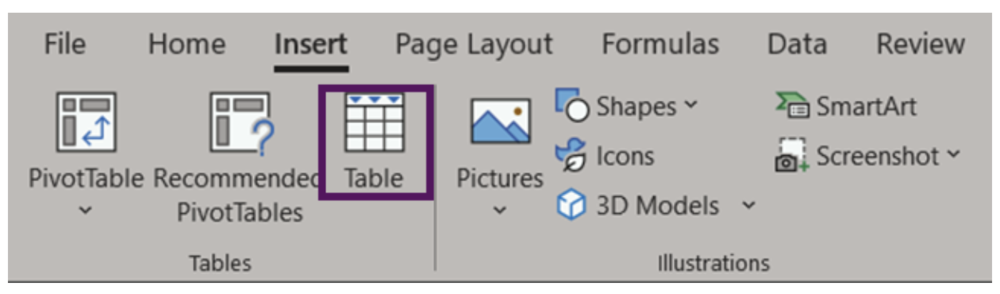
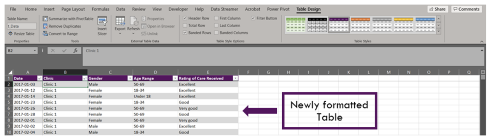
The data are now ready to be used in a PivotTable. It is possible to create a PivotTable using the as formatted above. However, if you were to enter new data to the spreadsheet, the PivotTable would not automatically update with the new data. Luckily, there is an easy fix for this: convert the data range into an Excel Table (Insert > Table OR Ctrl + T). An Excel Table organizes the data and makes it easy to sort, filter, and format.

The appearance of your Tables can be edited within the Table Design tab. Within this tab you can change appearance of your Table with preset Table Styles, or even opt to remove all formatting completely. You may also want to give your Table a name (located on the left of the Table Design tab). Naming the spreadsheet becomes important when you are working with many data Tables and PivotTables, as these names will allow for easy reference.


Inserting a PivotTable

With data organized into a Table, it is time to insert a PivotTable. There are a couple of options: 

1. Insert > PivotTable 

  • Click anywhere within your Table 

  • Navigate to the Insert Tab (top left of Excel spreadsheet) 

  • Select ‘PivotTable’ (or ‘Recommended PivotTables’)* 

2. Table Design > Summarize with PivotTable 

  • Click anywhere within your Table 

  • Navigate to the Table Design tab (top right of Excel spreadsheet) 

  • Select ‘Summarize with PivotTable’ 

 *‘Recommended PivotTables’ will provide recommendations for summarizing your data in a PivotTable. This is a good option if you are unsure of how to summarize your data.  


Both options will bring up the ‘PivotTable from table or range’ pop-up box. Within this box, you can select your Table or Range, if you have not done so already; the name of your Table would show here if you converted your data into a Table prior to inserting a PivotTable. You can also select where the PivotTable will be placed: (1) to a New Worksheet or (2) to an Existing Worksheet.  

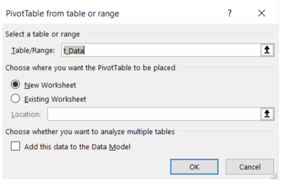
Note: ‘Add this data to the Data Model’ will allow you to perform more complex tasks on your PivotTable, including the ability to create your own formulae within a PivotTable or the ability to link two or more PivotTables together based on a common attribute. However, these are more advanced skills and are not covered in this article.


Getting familiar with PivotTables

Unless you used the ‘Recommended PivotTables’, your PivotTable will not look like much. You will be presented with an empty PivotTable located within the spreadsheet and a PivotTable Fields menu on the right-hand side of your workbook. We will start with the PivotTable Fields menu to really get started working with PivotTables.

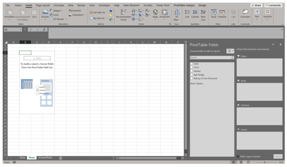
There are many ways to organize your data within a PivotTable. Using the data presented above, let’s look at the ‘Rating of Care Received’ first. 


Summary of ‘Rating of Care Received’ 

  • Within the PivotTable Fields menu toggle on ‘Rating of Care Received’ (or click and drag) 

  • ‘Rating of Care Received’ will be added to the Rows field 

  • Navigate back to ‘Rating of Care Received, and click and drag the option down to the Values field 

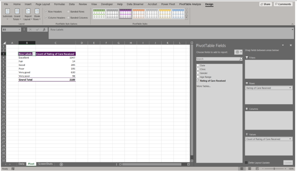
Note that as you drag and drop data into their respective field, the table in the spreadsheet will update. This provides you within instantaneous feedback. If you drop data into the wrong field, simply click and drag the data outside of the box and it will be removed from the PivotTable. 


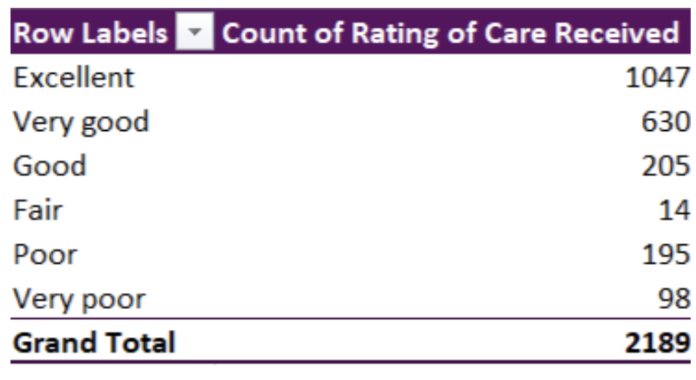
We now have a basic summary of the Counts of survey participants based on their response to the ‘Rating of Care Received’ question. However, you’ll notice that the Row Labels are ordered alphabetically. PivotTables will automatically organize text date alphabetically; numbers will be ordered numerically, and dates will be ordered chronologically. This is likely not the order that you’d prefer the data to be organized in. To reorder the Row Labels, you can click on a label (e.g., Very good) and drag it to the desired location (e.g., below Excellent). 

The data are currently summarized at the aggregate level. That is, all survey responses, regardless of Date, Clinic, Gender, or Age Range are summarized in the PivotTable. But you would probably like to summarize the data at a more granular level. 


‘Rating of Care Received’ by Date 

  • Click and drag the Date data into the Columns field 

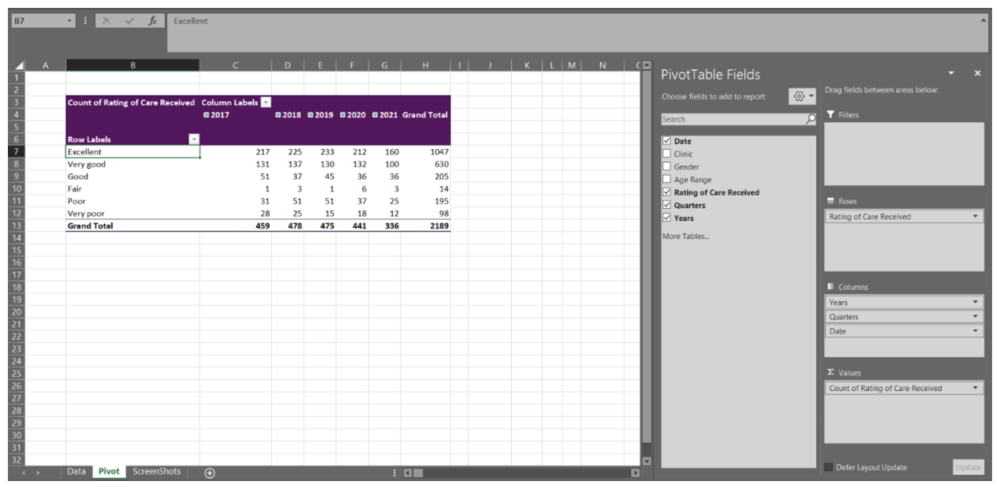
Immediately, you will notice that when you drag the Date data into the Columns field, the Columns field populates with Years, Quarters, and Date. This will occur automatically for dates (if the data are formatted properly as dates). But you may not want all these additional levels added to the PivotTable. For undesired labels, simply click and drag to remove. In this example, we want only Years and will remove the Quarters and Date information.

Note: Dates can be grouped by Seconds, Minutes, Hours, Days, Months, Quarters, and Years. By right-clicking on the Date labels in the PivotTable you will get a menu with the option ‘Group’. This will open a menu where you can select the grouping level you desire. If you do not want the data grouped, right-click on the Date labels in the PivotTable and click the ‘Ungroup’ option from the menu. 

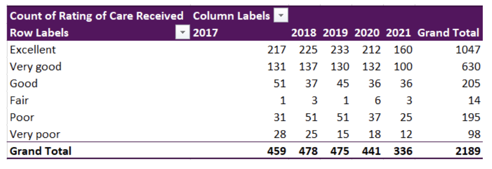
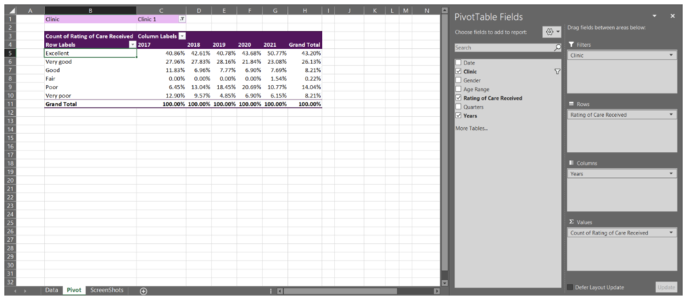
We now have the Counts of each response from 2017 to 2021. This may be good enough, but having the percent response rate will allow for better comparisons between years. 

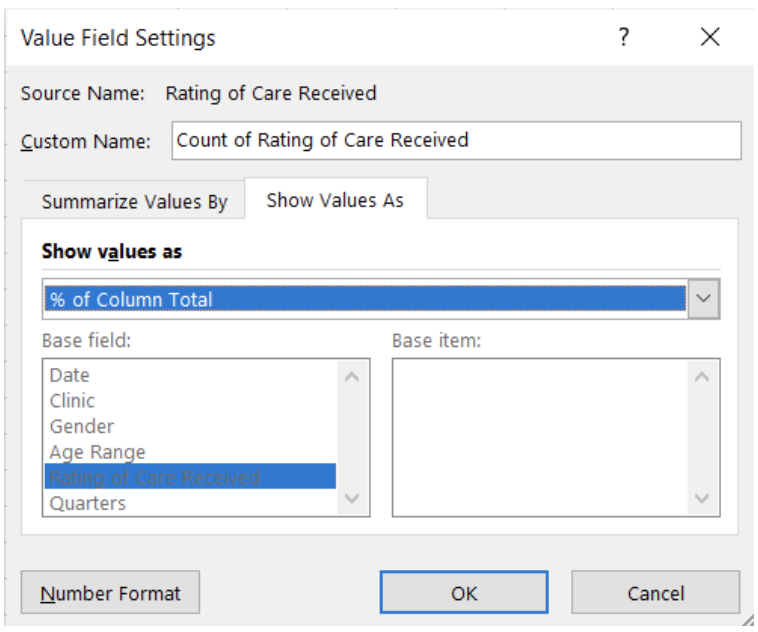
Counts to Percent of Column Total 

  • Within the PivotTable Fields menu, click the arrow of Count of Rating of Care Received within the Values field 

  • Select Value Field Settings from the pop-up menu 

  • Select Show Value As within the Value Field Settings menu 

  • ‘Show value as’ the % of Column Total 

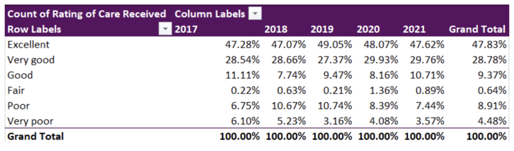
The ‘Rating of Care Received’ data will now be summarized as the percent of the column total (i.e., summarized by Year).

Again, these results may be sufficient for your reporting needs. However, you may be asked to break the data down by a specific group. This can be accomplished with Filters and Slicers. A Filter is a built-in drop-down menu within the PivotTable, while a Slicer is a separate filter menu that moves independently of the PivotTable. Both are used to filter data based on one or more variables. However, a Slicer has the added benefit of being able to link to multiple PivotTables. Selecting a filter option within a Slicer can apply the filter across multiple, linked PivotTables at the same time.

Adding a Clinic Filter 

  • Drag the Clinic data into the Filters field 

Adding a Clinic Slicer 

  • Navigate to the PivotTable Analyze tab at the top right of the workbook 

  • Select ‘Insert Slicer’ 

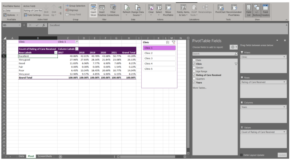
You now can actively filter your data using either the Filter or Slicer option. This is beneficial when you do not need to present all clinics’ data at the same time. It also offers interactivity within the spreadsheet, where different clinic results can be prepared with a few clicks.


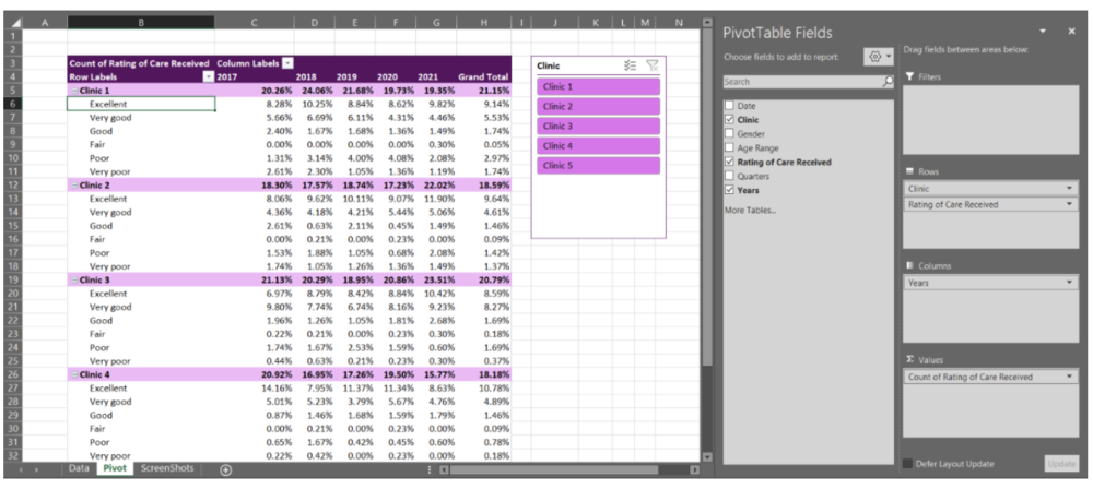
Adding multiple variables to PivotTable fields

With the previous example, we only entered a single variable per PivotTable field (Filters, Rows, Columns, and Values). However, you can add as few, or many, variables as needed in each field. Note that with Columns, Rows, and Values the data will become nested and the PivotTable can become expansive quickly. For example, by pulling the Clinic data out of Filters and moving it into the Rows field, we can get a summary by clinic within the same PivotTable.

Because PivotTables update quickly as you drag and drop variables into the different fields, I recommend experimenting with your PivotTables in the beginning. With experience and experimentation, you will get a better feel for how PivotTables should be organized to best summarize your data. PivotTables are powerful tools, and this quick walkthrough only scratches the surface of what PivotTables can do.


Up your PivotTable game
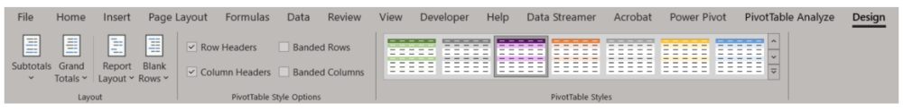
Design 

 If desired, you can accept the default PivotTable format. But, if you’re anything like me, you will want to change the PivotTable design as soon as possible. Luckily, this is simple. When clicked within your PivotTable, a Design tab will appear at the top right of the Excel workbook (next to PivotTable Analyze). Within this tab, you have the option of changing the style and colours of your PivotTable. You also have the option to insert headers, banded rows, and banded columns. Further, you have options to include or exclude data summaries (e.g., row or column totals). 

 The Design tab will drastically improve the look of your PivotTables. Match to your company or clients’ colours or select a design that distinguishes between different datasets. Or, if you prefer, remove all design formatting for a less distracting appearance. 

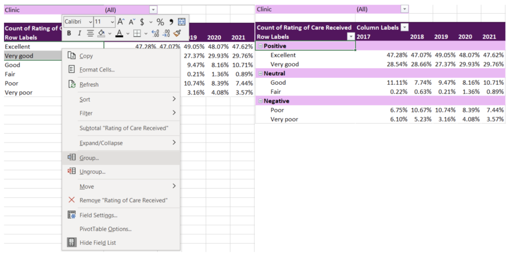
Grouping non-date data 

 I briefly discussed how dates are grouped within PivotTables. Just as with dates, other variables can be grouped too. For example, with the ‘Rating of Care Received’ row labels, you may want to group the responses into fewer categories (e.g., Positive responses = Excellent, Very good; Neutral responses = Good, Fair; Negative responses = Poor, Very poor). To group the labels, highlight the labels you wanted grouped (e.g., Positive responses = Excellent, Very good) and right click. Navigate to the ‘Group’ option within the menu. This will group these labels under ‘Group 1’, which can be changed to any group title you want by simply writing within the group label cell. 

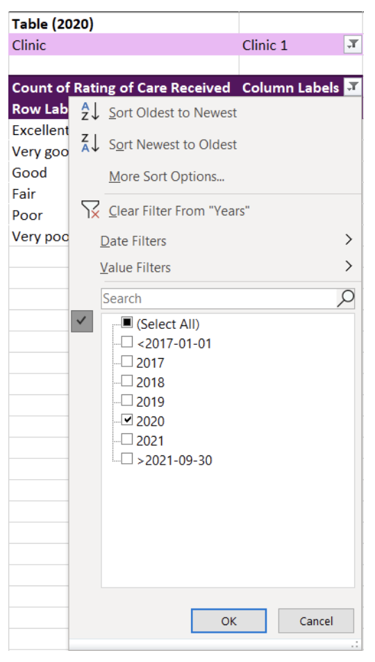
Using Slicers to connect two or more PivotTables 

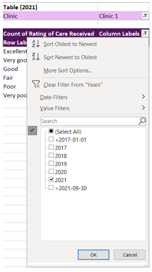
 Like I mentioned previously, it is possible to link multiple tables to the same Slicer. With the Slicer already created in the previous example, adding an additional linked PivotTable is easy. For this example, I copied the original PivotTable creating two identical PivotTables. For simplicity, I filtered the Column Labels to present only 2020 in the first PivotTable and 2021 in the second PivotTable. 

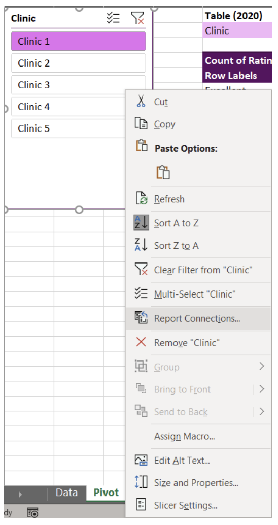
To link a Slicer to the two PivotTables, right click a Slicer that you have already created. From our example, this is the Clinic Slicer. From the menu, navigate and select Report Connections to bring up all potential connections for the Slicer. The list of Report Connections will list the different PivotTables for which it can connect. Simply toggle on all PivotTables you want to connect to the Slicer.

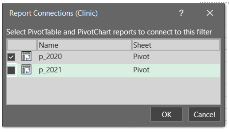
You will now have two PivotTables that can be filtered simultaneously with the click of button. Select any option within the Slicer and both PivotTables will update. You can use this approach to link several PivotTables and can be useful for designing interactive dashboards within Excel.


You should now have the fundamentals to begin working with PivotTables. With no background knowledge of Excel formulas required, PivotTables offer a fast, accurate, and intuitive alternative to organize and analyze your data.

The ease and flexibility of PivotTables encourages experimentation. And the best method for mastering PivotTables is to jump in and experiment with your data. Soon you’ll be able to tie in all these fundamentals to generate insights with ease.


Sign up for our newsletter

We’ll let you know about our new content, and curate the best new evaluation resources from around the web!


We respect your privacy.

Thank you!


Written by cplysy · Categorized: evalacademy

Dec 16 2021

Never Released 2020 Holiday Cartoons

I drew most of these cartoons in 2020 (one in 2019) but I’m not sure I ever shared. I certainly never created a blog post.

Honestly, last year around this time, I think I was just a little bit burnt out. And it shows in some of the cartoons.

Presents are Outputs

This is a cartoon I redrew in 2019 from an earlier iteration. Not sure it ever made it into a post.

Cartoon by Chris Lysy
"Before we open any gifts, remember, presents are just outputs. It's the outcomes that really matter."

Christmas Tree Chart

I believe this chart type may be a default in Excel.

Cartoon by Chris Lysy
"So I created this chart using a dual axis mix of a scatterplot and a line graph...The data is meaningless but it looks like a super cute Christmas tree, so I thought I would share."

Virtual Christmas

This cartoon is probably a good representation of my headspace last Christmas.

Cartoon by Chris Lysy
"Dear Santa, This year I encourage you to switch to a virtual Christmas. I know it won't be the same, but the numbers keep going up and since you are super old you must be in a high risk group. Stay safe so we can return to normal next Christmas. Send my love to Mrs. Clause and the elves. Love, M"

When PJs are Business Casual

I live in NC, we don’t have enough snow days.

Cartoon by Chris Lysy
"Every year I would look forward to our first snowy day. It was an excuse to just hang out at home in our PJs, not daring the roads to go into the office. But this year it doesn't feel quite the same."

Virtual Snow Day

I loved snow days as a kid in Maryland. And when everything was switching to virtual, the idea of snow not stopping school just sounded wrong.

Cartoon by Chris Lysy
"Dad, how many inches of snow does it take to shut down the internet? I want a snow day."

Want this year’s batch, including a few favorites from past years?

You can find them here: Evaluation Christmas Cartoons 2021 (my favorite is the elf one)

Written by cplysy · Categorized: freshspectrum

Dec 15 2021

How to convert Canva reports into Microsoft Word.

As my diydatadesign workshoppers know, Canva is one of my favorite visual reporting tools. It just makes the process of creating high quality visual reports much faster and easier.

Cartoon by Chris Lysy.
"Check out this visual report template I created for our next report."
"Wow, looks amazing. But I just learned it needs to be delivered in MS Word. Can you build this there?"

But there are still times when you’re working with a team that moving outside of Microsoft Word is a non-starter. And while you can create nice looking reports in Word, it just takes a bit more work and time. But what if you could jumpstart your report template using Canva then transition it to Word?

Here is how you can do that.

FYI, this method does require access to a licensed Adobe Acrobat Pro. I’m a designer so I pay for Adobe Creative Cloud monthly (which gives me Acrobat Pro). Even if you have no use for the full Adobe CC, depending on how much time you spend reporting, a license for Acrobat Pro might be a worthwhile investment.

Step 1. Jumpstarting your report template in Canva

So I use Canva for all sorts of documents (including activity books, worksheets, executive summaries, one-pagers, and visual reports). Usually when it’s just me designing the document, I’ll simply create it in Canva then export to PDF for sharing with others.

But there is no reason why you can’t just create the basic framework of a report in Canva, then do the rest of the report design work using Word. Basically we are going to adopt a basic template and bring that template into Word (as a docx).

Screenshot of creating an Annual Report Template using Canva.

Use Canva’s templates to find one a style that you like. Then adjust the colors, fonts, and supporting visuals to meet your own company style guide needs. You don’t need to have a finished version of a report, this can be a first step before even writing anything.

Here are just some of the pages you’ll want to have in your template.

  • Cover Page
  • Table of Contents
  • Section Breaks
  • Spacing Pages
  • Any Specialty Pages (i.e. case studies, chart pages, table pages, etc.)

Step 2. Download your report template as a PDF from Canva

Now that you have your basic template, it’s time to download it as a PDF.

Screenshot of downloading a Canva document as a PDF.

Just click the download button in Canva. You’ll have the option to download as PDF Standard or PDF Print.

The PDF Print version is going to have a larger file size. If your main report is going to be shared mostly via the web (which most reports are these days), you can go ahead and just download the standard. It’s still going to print just fine for those that print.

Now if you are working with a print shop and want to have the highest quality printed report, definitely go ahead and download as PDF Print!

Step 3. Open your PDF in Adobe Acrobat Pro and Export into Word

This step is really easy as long as you have Adobe Acrobat Pro.

Screenshot of sharing a PDF document as a Word document.

Just open up your PDF using Acrobat Pro.

Then go to File > Export To > Microsoft Word > Word Document.

Change to whatever file name you want and save it as a DOCX.

Step 4. Check your template in Word.

Anytime you export a file from one file type into another, it’s a good idea to check the results before sharing.

Screenshot of our original Canva document opened up in Word.

Things to check.

  • Did any of the fonts change (for example, the one I’m sharing above used a League Spartan font that isn’t on my computer)? In the Word version that font became Tahoma.
  • Do any of your pages look wonky? Changes in fronts can also really make a page look wonky and require some tweaking.
  • What happens if you try to edit a page?

Your goal in all of this is to make something that your team can edit and use. So make sure they can. Either tweak the Word document until it’s easy, or go back to your original Canva template and add a lot more filler text.

Written by cplysy · Categorized: freshspectrum

Dec 15 2021

Lessons Learned: Understanding DEAI as a Daily Practice

As we look toward 2022 and beyond, many museums are working to implement their new or existing missions, values, and initiatives that embrace and foreground diversity and inclusion. As an emerging museum professional and a Black woman who has often felt excluded from institutional spaces, this is heartening to me. But, at the same time, I wonder how museums will fulfill their promises. As someone who has felt the lasting sting of exclusion and microaggressions, I want accountability and action. How will museums invest time in communities, create inclusive spaces, and prompt staff and visitors to question the very systems of power that have built museums? Importantly, how will this work exist as DAILY truths and practices?

In fact, I believe that DEAI is activated not only by long-term goals, but also by DAILY acts. In the museum field, how are we making more inclusive museum programs, content, and spaces through everyday practices? After all, genuine DEAI work affects each employee and department daily (as my former supervisors Dionne Custer Edwards at the Wexner Center for the Arts and Sarah Durkee at the National Gallery of Art taught me). As Shades Collective states, it is a “complete lifestyle and mindset change.”

For this blog post, I discuss lessons I learned throughout my academic and professional career for implementing daily, long-standing DEAI goals. I ponder how DEAI practices are not simply initiatives but daily practices we embody.

A group of adults standing at a museum. The photo is taken from overhead looking down on them. The person in the center is clear, while the others are blurred around them, as if they are moving.

Analyze the systems around you

White supremacy and institutional racism are not abstract concepts – they live in laws and daily decisions. Therefore, we must be critical of the systems that affect our daily lives. As a college art student, I asked why art historical canons did not showcase artists that looked like me. As an English teacher, I encouraged my students to critically analyze contemporary and historical sources. As a graduate student, I researched how policies and practices (written by human authors) construct and reaffirm race through material and visual cultures.

Eventually, this analytical mindset became a daily tool for assessing museum work, whether it be in community engagement or interpretation. During an interpretive strategy meeting, I would contemplate, what art historical sources have shaped our understanding of this artist? How might these sources be biased or tell one facet of an artist and their work? How can we empower visitors to participate in discussions about exclusionary histories and power imbalances?

Learn definitions, embrace uncertainty, and lead with questions

To embrace DEAI in our daily lives, we must be life-long learners. Museum educators often share definitions with their visitors and use inquiry-based learning in their approaches. As a graduate school instructor, I learned how to ground discussions in definitions; for example, in my courses on social identity, we would spend the first week defining terms such as “cultural identity.” I realized that inquiry was essential for engaging students in conversations about social issues: inquiry-based learning, importantly, requires students to take a personal interest in and responsibility for their learning and encourages them to live with uncertainty. By following their own questions and interests, they realized how discrimination and institutional racism were part of their daily lives. Similarly, we must take ownership of our learning (i.e., researching and knowing definitions such as critical race theory) and lead with questions (i.e., acknowledging that the definitions we find are starting points – we can always learn more).

Understand your multifaceted identity and explore its relation to others  

Self-awareness is essential for DEAI work: we must recognize difference; then, we can seek collaboration through that difference. Each day, we must consider the multiple identities we hold and how they intersect with the people around us. This encourages us to reflect on how we treat others and consider how identity lives through objects and performances. For example, as an intern at the Wexner Center for the Arts, I participated in diversity training led by Dr. Melissa Crum’s Mosaic Education Network. In the workshop, we discussed our identity markers, biases, and internal conflicts. This reflective work, which acknowledged people’s different realities, was an important first step for openly discussing how inequity, privilege, and intersectionality manifest in museums.

Engage, respect, and empower multiple perspectives

Conversations about re-envisioning museum collections and programs are truly discussions about power. Who gets to contribute? Who gets to speak? How are we practicing not simply equality but equity? How are these multiple perspectives valued, listened to, and incorporated into interpretive and programmatic efforts? Here, I find the “leaderful model” applicable. The leaderful model, used by organizers in the Black Lives Matter movement, embraces horizontal, de-centralized leadership, encouraging everyone to be involved.

Who gets to contribute? Who gets to speak? How are we practicing not simply equality but equity?

In 2015, myself, students, faculty, staff, and community organizers gathered to form the OSU Coalition for Black Lives. We used this leaderful model, rotating administrative and agenda-setting duties. This allowed us to challenge traditional hierarchies and not simply listen to, but empower, multiple perspectives. Entering the museum world as an intern for the Wexner Center’s Shumate Council (a leadership group dedicated to engaging Black audiences and contemporary art), I saw first-hand how the council’s decentralized leadership allowed council decisions to be a collaborative process. These decisions built a sense of community and shared responsibility.

Certainly, a leaderful model is antithetical to museums’ traditionally hierarchical structures. But we need to listen to the knowledge that organizers, community leaders, and social activists have developed over many years: multiple voices must be empowered to have substantial change. Thus, in our weekly meetings, we can ask, especially when engaging in community-based work, are we collaborating and partnering with organizations and groups outside of our immediate networks? Are we incorporating their thoughts and ideas into design and interpretive processes? Are we collaborating with groups across several initiatives, not just for a singular exhibition or event?

Be an active listener and a humble learner 

We need to be active listeners and humble learners in everyday life. In education and communication, we often hear about the benefits of “active listening,” a concept that recognizes listening as a “conscious activity.” (Here, I am also thinking of “active listening” not solely as an auditory activity, but rather an experiential one.) An active listener approaches communication with an open attitude and a willingness to understand and adapt. Significantly, I believe that, in daily life, active listening goes hand-in-hand with what Ann Hernandez describes as “humble learning.” A humble learner approaches situations with self-awareness and observation, making sure to check their norms at the door and adapt when necessary. Humble learning, similar to active listening, infuses vulnerability and social awareness into communication and collaboration. By being an active listener and humble learner, you can approach knowledge as a shared activity and recognize the limits of your expertise, aspects that are prerequisites for DEAI work. 

Living Out Our DEAI Goals

In this post, I have discussed some ways (but certainly not all ways) for integrating DEAI work into daily life. I want to stress that daily DEAI work, while it can encompass self-reflective exercises, cannot only be internalized work. Thoughtful DEAI practices enact self-reflection and ground-shifting changes in institutional commitments, workflow processes, and funding. There must be tangible, concrete plans for restructuring: inclusive hiring practices; pay for docents; equitable pay and safety for museum educators, frontline staff, and security guards; repatriation; acquisition of more diverse works; reexamination of funding; more diverse boards; decision-making parity with descendants; reinterpretation of museum collections; collaborative community engagement; and more. As a wary but hopeful emerging museum professional, I ask, how can we support these goals every day?

Helpful Resources

  • Current News and Assessments in the Field
    • Smithsonian’s Initiative for Social Change, “Our Shared Future: Reckoning with Our Racial Past”
    • “Table Setting: The work before the work” by Levon Williams  
    • Center for the Future of Museums’ 2021 “TrendsWatch: Navigating a Disrupted Future”
    • Alliance of American Museums’ Facing Change: Advancing Museum Board Diversity & Inclusion
    • Montpelier: “‘Structural Parity’ in Unprecedented Board Restructuring”
  • DEAI Resources
    • Reopening with Equity in Mind: Opportunities for Cultural Relevant Practice in Museums (webinar hosted by the Cultural Competence Learning Institute)
    • Creative Reaction Lab’s Equity-Centered Community Design
    • MASS Action: Museum as Site for Social Action
    • International Coalition of Sites of Conscience
    • Museums Are Not Neutral

The post Lessons Learned: Understanding DEAI as a Daily Practice appeared first on RK&A.

Written by cplysy · Categorized: rka

Dec 15 2021

Comentario en El Diálogo, como entendimiento mutuo, base de la Gestión del Conocimiento III (final) por 13. Sugestões – Análise ao Projeto Fasti Online

[…] https://triplead.blog/2019/05/20/el-dialogo-como-entendimiento-mutuo-base-de-la-gestion-del-conocimi… […]

Me gustaMe gusta

Written by cplysy · Categorized: TripleAD

  • « Go to Previous Page
  • Go to page 1
  • Interim pages omitted …
  • Go to page 148
  • Go to page 149
  • Go to page 150
  • Go to page 151
  • Go to page 152
  • Interim pages omitted …
  • Go to page 304
  • Go to Next Page »

Footer

Follow our Work

The easiest way to stay connected to our work is to join our newsletter. You’ll get updates on projects, learn about new events, and hear stories from those evaluators whom the field continues to actively exclude and erase.

Get Updates

Want to take further action or join a pod? Click here to learn more.

Copyright © 2026 · The May 13 Group · Log in

en English
af Afrikaanssq Shqipam አማርኛar العربيةhy Հայերենaz Azərbaycan dilieu Euskarabe Беларуская моваbn বাংলাbs Bosanskibg Българскиca Catalàceb Cebuanony Chichewazh-CN 简体中文zh-TW 繁體中文co Corsuhr Hrvatskics Čeština‎da Dansknl Nederlandsen Englisheo Esperantoet Eestitl Filipinofi Suomifr Françaisfy Fryskgl Galegoka ქართულიde Deutschel Ελληνικάgu ગુજરાતીht Kreyol ayisyenha Harshen Hausahaw Ōlelo Hawaiʻiiw עִבְרִיתhi हिन्दीhmn Hmonghu Magyaris Íslenskaig Igboid Bahasa Indonesiaga Gaeilgeit Italianoja 日本語jw Basa Jawakn ಕನ್ನಡkk Қазақ тіліkm ភាសាខ្មែរko 한국어ku كوردی‎ky Кыргызчаlo ພາສາລາວla Latinlv Latviešu valodalt Lietuvių kalbalb Lëtzebuergeschmk Македонски јазикmg Malagasyms Bahasa Melayuml മലയാളംmt Maltesemi Te Reo Māorimr मराठीmn Монголmy ဗမာစာne नेपालीno Norsk bokmålps پښتوfa فارسیpl Polskipt Portuguêspa ਪੰਜਾਬੀro Românăru Русскийsm Samoangd Gàidhligsr Српски језикst Sesothosn Shonasd سنڌيsi සිංහලsk Slovenčinasl Slovenščinaso Afsoomaalies Españolsu Basa Sundasw Kiswahilisv Svenskatg Тоҷикӣta தமிழ்te తెలుగుth ไทยtr Türkçeuk Українськаur اردوuz O‘zbekchavi Tiếng Việtcy Cymraegxh isiXhosayi יידישyo Yorùbázu Zulu