• Skip to main content
  • Skip to footer
  • Home

The May 13 Group

the next day for evaluation

  • Get Involved
  • Our Work
  • About Us
You are here: Home / Archives for cplysy

cplysy

Oct 01 2024

How to Apply Your Brand Colors in Dataviz

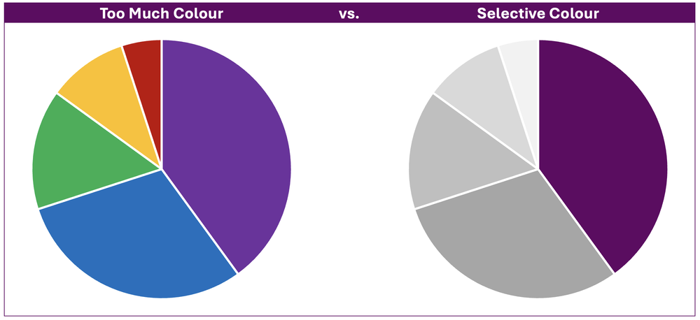
Colors can make or break a chart.

Colors direct our eye movements, and therefore our brains and attention.

It’s up to you: will you help or hinder your reader’s understanding?

Step 1: Start with Your Brand Colors

Otherwise, your graphs, slides, and dashboards will be Frankensteined.

I’ve written about brand colors and brand presents in other posts.

Some of those resources include:

  • Examples of organizations’ brand colors used in graphs
  • How to read color codes in style guides
  • How to enter your custom color codes in Excel

Step 2: Do Your Accessibility Testing

I’ve written about colorblindness, color contrast, grayscale printing in other posts.

Some of those resources include:

  • An official color contrast test
  • An official colorblindness and grayscale printing test

Then, your accessibility testing “results” should go inside your organization’s Dataviz Style Guide.

Step 3: Apply Those Brand Colors According to the Data & Variables

Now, it’s time to apply those branding colors to ensure that your graph is intuitive.

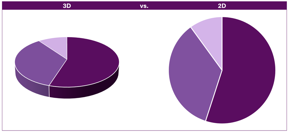
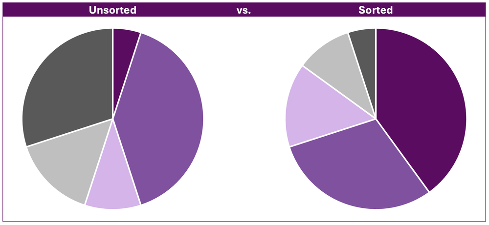
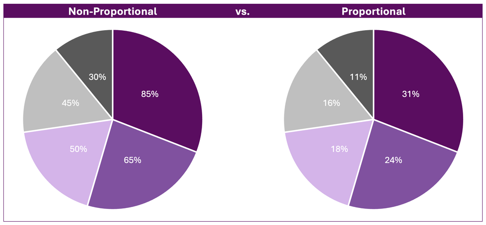
Look at your graph: Is your variable binary, sequential, diverging, or categorical?

Or, do you want to tell a story with a dark-light contrast?

Binary Variables Get Binary Color Schemes

Binary variables include yes/no data, such as:

  • yes/no survey questions
  • people who speak Portuguese as their primary language vs. people who don’t
  • people who own a home vs. people who don’t
  • people who graduated from program on time vs. people who didn’t
  • people diagnosed with an illness vs. people who don’t have it

For binary variables, choose one brand color. The “presence” of the attribute gets the darker color, and the “absence” of the attribute gets the lighter color.

Here’s an example:

Sequential Variables Get Sequential Color Schemes

a.k.a. ordinal

Sequential variables have a natural order.

Examples include:

  • age ranges (5-9 year olds, 10-14 year olds, and 15-19 year olds)
  • income levels
  • highest educational level completed (some high school, high school diploma, some college, etc.)
  • years (Year 1, Year 2, and Year 3 of a project)
  • semesters (fall, spring, fall, spring…)
  • cohorts (first cohort of participants, second cohort, etc.)

For sequential variables, choose one brand color, and use a light-dark gradation of that color.

Here’s an example:

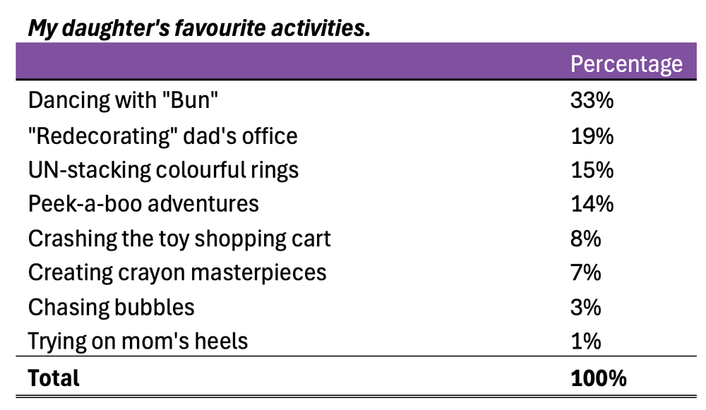
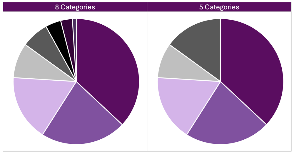
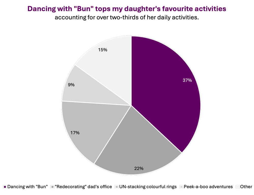
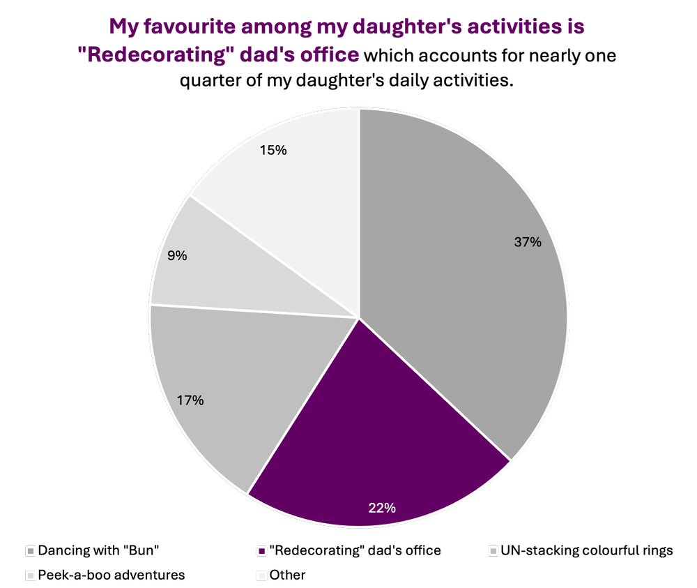
Categorical Variables Get Categorical Color Schemes

a.k.a. nominal

Categorical variables include:

  • race/ethnicity (African American, Asian, Hispanic/Latin@, White, etc.)
  • gender (male, female, nonbinary, genderfluid, etc.)
  • chapters of a report
  • sections of a presentation
  • categories of a dashboard

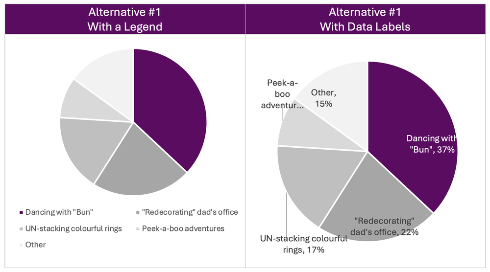
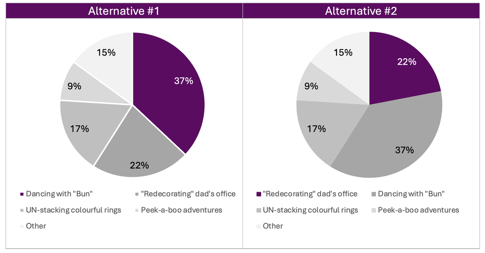
For categorical variables, use a different brand color for each category.

Here’s an example:

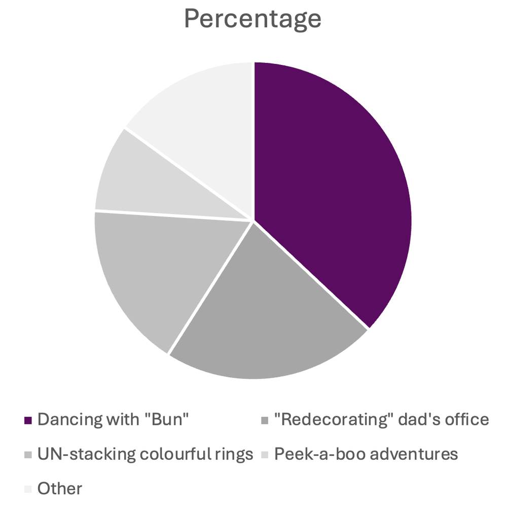
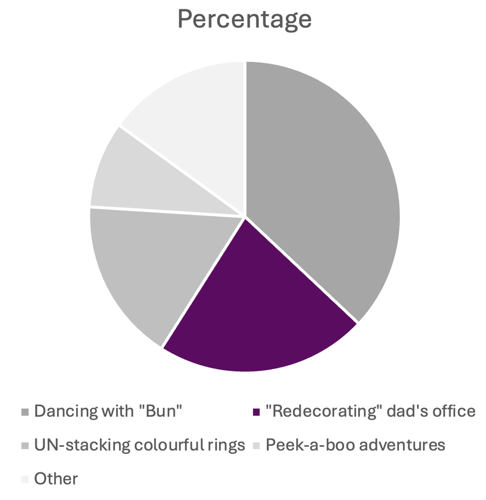
Diverging Variables Get Diverging Color Schemes

Diverging variables are opposites.

Examples include:

  • agree/disagree scales on surveys
  • changes over time (e.g., “50 percent decrease” or “70 percent increase”)

For diverging variables, choose two brand colors, and place the darkest shades on the poles.

Here’s an example:

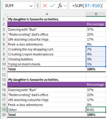
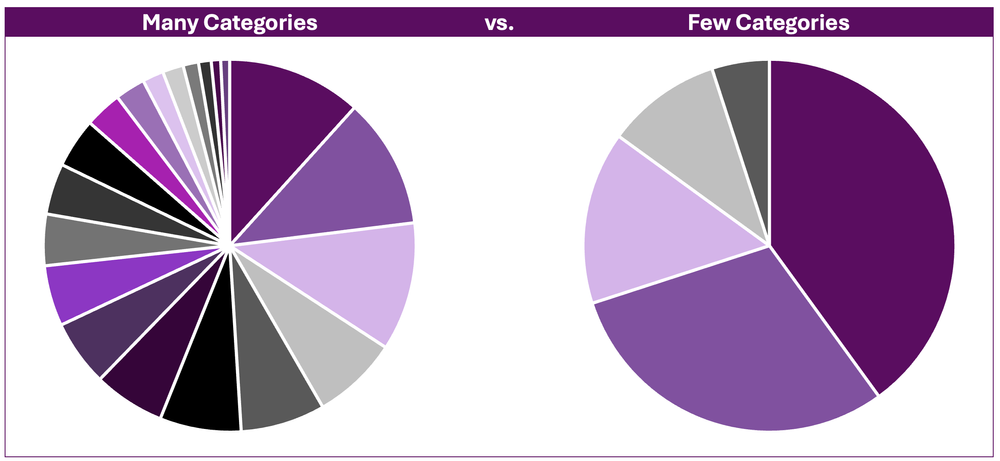
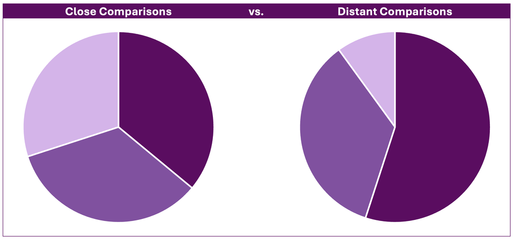
Combining these Techniques

In most real-life projects, we need to combine these color techniques.

In this map makeover, for example, we needed to:

  • use brand colors, not software defaults;
  • use two brand colors, one for each category; and
  • apply a dark-light gradation to each map, because these are ordinal variables.

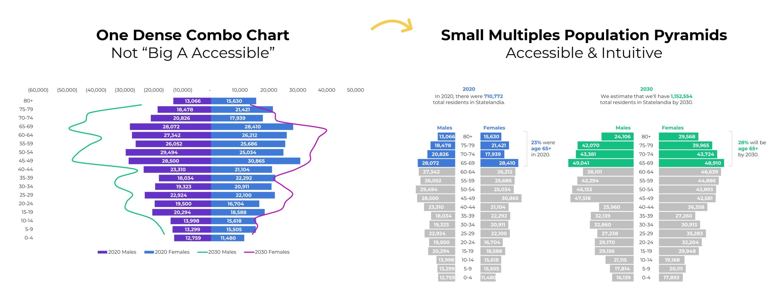
In this population pyramid makeover, we needed to:

  • use two brand colors, one for each timeframe, and
  • apply a dark-light storytelling emphasis to each pyramid.

Your Turn

What types of color questions do you have? Comment below..

Written by cplysy · Categorized: depictdatastudio

Oct 01 2024

Renegotiating Your Yes in Evaluation

The post Renegotiating Your Yes in Evaluation appeared first on Elizabeth Grim Consulting, LLC.

Written by cplysy · Categorized: elizabethgrim

Sep 27 2024

Data Visualization Applications: Pie Charts

This article is rated as:


Pie charts are useful for visualizing proportions of a whole, making it easy to compare the relative sizes of categories. However, pie charts have a somewhat bad reputation because of their potential to misrepresent data, especially when there are too many categories or when differences between slices are subtle. This leads to visual clutter that is difficult to interpret. That said, pie charts can still be effective when applied properly. They work best with few, distinct categories, where differences between slices are visually apparent. When used sparingly and appropriately, pie charts can be an effective means of visualizing categorical data. 


When used appropriately, pie charts offer several benefits:

  • Simplicity: They present data in a straightforward, familiar format that can be quickly understood.

  • Visual Appeal: Pie charts are often visually engaging, making data presentation more appealing.

  • Quick Insights: They provide immediate insights into data composition, highlighting categories with the largest proportions.

Here we’ll show you how to use pie charts effectively to improve your data storytelling and avoid common but inappropriate uses. For this article, I have compiled some real-world data inspired by the current state of my office. I have created a list of my daughter’s favourite activities, including – “Redecorating” dad’s office – as he attempts to write this article.


For reference, we have several additional resources, including a “Data Viz Decision Tree Infographic”, on Eval Academy to assist in selecting the appropriate data visualization and preparing data for effective data visualization:

  • The Data Cleaning Toolbox

  • Let Excel do the Math: Easy tricks to clean and analyze data in Excel

  • How to combine data from multiple sources for cleaning and analysis

  • A Beginner’s Guide to PivotTables


Data Preparation

This article assumes that data are already prepared in a clean and organized format (see below). It is important that the sum of all categories equal 100%. Pie charts are ineffective at visualizing data exceeding 100%, as they are designed to present data as a proportion of a whole.


To get the most out of your pie chart, sort your data from largest to smallest proportion. This will improve the look of the pie chart (even before we clean and improve the default Excel output).

  1. Highlight the data table.

  2. Navigate to Data > Sort.

  3. Sort by > Percentage from largest to smallest.


Initial Chart Selection

  1. Highlight the data to be included in the pie chart.

  2. Navigate to Insert along the top ribbon of Excel.

  3. Within Insert go to Charts > 2-D Pie > Pie (a basic Excel-formatted chart should appear).

IMPORTANT: Never use the 3-D Pie chart option. 3-D charts are rarely a good idea, and 3-D Pie charts, particularly, hinder interpretation as relative proportions are more difficult to distinguish.


Applying Data Visualization Best Practices

We now have a pie chart. However, this initial pie chart can be significantly improved using data visualization best practices.

Improve the Appearance

Aggregate Categories

You’ll immediately notice that this example has too many slices. Pie charts are much better at visualizing data with fewer slices. This can be accomplished by aggregating categories into broader, overarching categories (i.e., aggregating like categories together) or combining smaller percentages into an “Other” category to improve visualization (e.g., the smallest proportions to bring categories to five or fewer). For this example, we’ll use the latter approach to aggregate some of the smaller categories into an “Other” category.

  1.  Create a new table keeping the top four categories as is.

  2. Type in Other as the fifth category.

  3. Use the SUM function to sum up the bottom four categories.

Note: You do not need to have five categories. However, more than five categories usually detract from the message being delivered in a pie chart. It is better to have fewer slices and to highlight a few categories.

 4. Repeat the steps from Initial Chart Selection

Highlight Key Data Points (& Mute Other Data Points)

With categories reduced, I will provide an additional two alternatives for presenting the data: (1) highlight my daughter’s favourite activity and (2) highlight dad’s “favourite” activity. The largest proportion is often most important, but not always. Sometimes smaller proportions, or specific categories, are of most interest.


Alternative #1: Daughter’s Favourite Activity

  1. Click on the pie chart and navigate to Chart Design > Change Colors.

  2. Select a monochromatic greyscale palette.


Note: This is a quick approach to quickly mute all slices. However, you may want more contrast in the muted cells. For this, you may select each slice individually and select a specific shade of grey or another muted (i.e., low saturation) colour of choice.

3. Now right-click on the largest slice and change the colour to your primary colour of choice.


Alternative #2: Dad’s “Favourite” Activity

  1. The same as Alternative #1, click on the pie chart and navigate to Chart Design > Change Colors.

  2. Select a monochromatic greyscale palette.

  3. Right-click on the largest slice and change the colour to your primary colour of choice.


Improve the Legend

For many charts, I would typically recommend deleting the Legend and labelling directly onto the chart or creating a custom legend. This includes pie charts when labels are short and categories few (e.g., a survey with Yes, No, and Unsure response categories). However, pie charts are one of the few charts that benefit from a legend when data labels are long or slices many to avoid overcrowding the slices with labels.

  1. You may wish to move the legend depending on the space available. To accomplish this, right-click on the legend below the pie chart.

  2. Go to Format Legend… and select the Legend Position that works best for your chart.


Insert Data Labels

One of the pitfalls of a pie chart is that it is difficult to distinguish the relative difference in size between slices. Therefore, it is beneficial to label all slices with their relative sizes (i.e., count or proportion).

  1.  Navigate to Chart Elements and toggle on Data Labels.


Resize the Chart

  1.  Left-click on the chart and navigate to the Format tab at the top of the spreadsheet.

  2. Resize the Shape Height and Width to improve the look of the chart.


Adjust Fonts

1. Left-click on the chart to highlight the pie chart.

2. In the Home tab, select your Font of choice.

  • Sans serif fonts are best for charts. Ideally, chart fonts will match the rest of a report/ presentation to ensure consistency.

3. Adjust the Font Size to at least 9 pt.

  • 9 pt is our recommended minimum font size for charts.


Improve the Chart Title

The column heading (in this example, “Percentage”) will automatically default as the chart title. Update the chart title with something that is both descriptive and informative.

 1. Left-click on the Chart Title.

2. Type in your improved title and hit Enter.

  • The chart title may be edited within the function bar at the top of your spreadsheet.

  • You may also opt to right-click on the chart title and Edit Text to improve the chart title.

  • You can enter a subtitle by using Alt + Enter to move down a line.

3. Emphasize the chart title by increasing the main title to 14 pt font.

  • A subtitle, if you have one, can be deemphasized using a slightly smaller 12 pt font.

  • When drafting the title within the line chart, you will have to highlight the specific section of text for which you wish to apply changes. Otherwise, all changes to the font will apply to the whole title.

4. Use your primary colour to further emphasize the main point within the chart title.


Alternative #1


Alternative #2


Final Thoughts

Pie charts are a useful tool for visualizing proportions when used appropriately. They excel when dealing with data that has a limited number of categories, less than five is best. They offer simplicity, visual appeal, and the ability to provide quick insights into data composition. However, they should be used sparingly and with intention to gain the most impact, and never ever in 3D!

Written by cplysy · Categorized: evalacademy

Sep 27 2024

Is Good Program Design Essential for a Quality Evaluation?

This article is rates as:


I have asked myself this very question. Can I design and deliver a quality evaluation on a program or project that isn’t well designed or implemented or maybe isn’t managed appropriately? There are lots of reasons these may be true, and I’m not trying to throw project managers under the bus, but I have found myself in the situation of trying to evaluate projects that aren’t going well.

Of course, formative, process, implementation, or even developmental evaluation may all be very helpful to get an errant program back on track, but let’s think about outcome evaluation. Can an evaluator comment on whether or not a program has achieved its intended outcomes if it wasn’t implemented as intended?

I will say that good program design, which I also encounter often, lays the foundation for a quality evaluation. With good program design and implementation, the learnings presented in the evaluation are usually confidently accurate and actionable. If good program design and implementation makes good evaluation so easy, what impact does the opposite have?


Program Design and Impact on Evaluation

A good design serves as a blueprint that guides the implementation process and aligns the efforts of all partners. Here are some key elements that constitute a good program design (and implementation), and how they impact your evaluation:

Elements of Good Program Design Impact on Evaluation
Clear, Attainable Objectives: Programs must know what they are trying to achieve and have agreement on that understanding. These objectives (or goals or targets or aims or outcomes) provide direction against which progress can be measured. I worked on a project where one partner group thought the primary goal of the project was to test a new implementation approach so that it could be used for future innovations, while another thought the goal of the project was to assess the effectiveness of this particular innovation in a specific setting. These are different objectives. After learning mid-project about this divergence in understanding, my evaluation scrambled and tried to do both but ultimately fell short of some partner expectations. The divergence in understanding also led to different priorities amongst the project team, leading to a less-than-cohesive implementation strategy. Without clear, agreed upon objectives evaluators may struggle to determine what constitutes success, leading to ambiguous or inconsistent evaluations. Similarly, programs with vague, overly broad, or clearly unattainable objectives make it difficult to measure success and may lead to subjective or inconclusive findings.
Logical Framework: No, I don’t mean a logic model or theory of change, although those would check this box, but at the very least, good program design should be able to link the activities to the objectives: knowing that if they engage in X activities that Y is a reasonable outcome. Doing 100 jumping jacks is unlikely to improve your math skills, but sometimes it feels like that’s what evaluators are asked to measure. By clearly linking inputs, activities, and outcomes, evaluators can better determine the cause-and-effect relationships. This is crucial for understanding what aspects of the program are effective and why. Without this logical framework evaluators may find it hard to determine whether observed changes are due to the program or other external factors.
Leadership: Good projects need good project leaders. There are a couple of important points here: 1) that a project leader exists at all ensures that the project has the attention it needs to stay on track, and 2) an experienced project lead is likely skilled at identifying and mitigating risks, proactively planning for anticipated challenges and having clear answers for roles, responsibilities, or other project questions. A dedicated project lead can work with an evaluator to provide guidance that the evaluation is meeting their needs, to provide feedback about feasibility, and to champion the evaluation with staff or team members. A good project lead enables data collection by making connections, opening opportunities, and knowing who to go to for what. Poor or non-existent leadership can be difficult to overcome for evaluators. Evaluators require a dedicated point-person or liaison, someone who is tasked with being the decision-maker. Poor leadership may leave evaluators to make decisions that are unfeasible or take the evaluation in the wrong direction. Inexperienced leads may also introduce ethical risk as well, which may come into play around data sharing or putting participants at risk.
Engagement: Good program designs include engagement: who and when. Good program designs will have communication plans or even a RACI matrix (or something similar) so that everyone knows what they need to know, when (or before!) they need to know it. Very little can be done without engagement. I once evaluated a project in healthcare. When it came time to ask the frontline staff what they thought of this novel program, most of them had never heard of it. I couldn’t believe it. How could an entire program be implemented in their day-to-day setting without their knowledge? Poor engagement was the answer. The project team hadn’t focused on communication and engagement. As you can imagine, it’s hard to get the perspective of a key population group when they have no idea what you’re asking about. From a program perspective, poor engagement likely means poor implementation. These projects will likely lack people who buy-in and are willing to follow protocols or do the extra step. From an evaluation perspective, poor engagement can make it difficult to gather key perspectives, to access the right people, and even to access the right data.
Proper Resource Allocation: Adequate and appropriate allocation of resources, including time, money, and personnel, is essential. Sure, the budget for evaluation may be smaller than we’d like but we know, and often agree to that going in. One of the challenges around budgets is when clients start asking, or expecting!, more than the original agreement. We all know that things change, and plans are rarely followed exactly. It can be difficult for an evaluator to manage a budget when implementation plans go too far off track. Sometimes it all comes down to capacity. Human capacity to manage evaluations can be a hugely limiting factor. Availability can make or break a quality evaluation. Without that leadership discussed earlier, the evaluation will flounder. Without feedback from those doing the work, the evaluation is at risk of missing the mark or going off track. And time. I’d guess maybe 80% of my projects underestimate the time it takes to get things done. Share data? No problem, we’ll send that over … until three months pass and you’re trying to put together privacy impact assessments and still no data. Poor resource allocation leads to incomplete evaluations. The planned data capture activity is cancelled because we ran out of time. Or the document reviews don’t happen because no one took time to share them with you.
Plans to Use the Evaluation: Ok, I may be getting a little too evaluation focused here, but I do believe that good program design has an actual plan for the evaluation they’ve commissioned. That is, evaluation is not a box-checking exercise because it was mandatory in the grant agreement. I can usually tell when a project team actually cares about an evaluation because they have good answers to questions, and solid rationales. They’re quick to tell me things like “No, that’s not something I need” and also “How are you going to get this particular piece of information that I will need?” These are the groups that are on board with data parties or sense-making sessions. These are the groups that know, when you’re creating your evaluation plan, what deliverables they want. A well-designed program ensures that the evaluation addresses relevant questions and lead to actionable insights. It aligns the evaluation with the goals and needs of partners, making the findings more likely to be used for decision-making and improvement. On the other hand, when a group isn’t familiar with evaluation or doesn’t have a clear plan, you’ll find them saying yes to anything you propose, risking your evaluation timeline and budget. You’ll find these are the groups that spring asks on you unexpectedly, “Hey, uh, can you do a presentation to the board next week?” or “I just had the thought that maybe we should do a public survey!” Without a plan for the evaluation, your evaluation gets blown around in the wind, trying to accommodate whims.

So, what do you do if you think the project you have been tasked with evaluating is poorly designed, implemented or managed?

Of course, the obvious answer is that we report these things. We can always report that no, outcomes were not achieved, or that there was no implementation fidelity.

“But to me, the question is actually about the role of the evaluator: is it within the scope of our role to raise these issues? ”

My background is heavy in quality improvement, with light touches in implementation science so it’s second nature to me to want to marry these lenses with my evaluation lens.

My answer to these questions is often then same: it depends. It may depend on whether or not there is a person you could even raise it to. Without a clear person in charge, your concerns may have nowhere to land. It may depend on your relationship with that person. It may depend on what stage of program design and implementation the evaluation was brought in; being at the design table, it makes far more sense to share concerns than if you’re brought in right at the end!

I think one strategy is to play the fool. As Shelby writes, it is our job to ask questions. It’s likely that you can raise your concerns in the form of a question, “Can you share your communication strategy with me? I want to make sure the survey I send to frontline staff covers all the ways you engaged them.” This may be a subtle(?) way to highlight that there is no communication or engagement strategy for frontline staff.

Another strategy is to use your evaluation tools to highlight any of these risks or gaps. Engaging the team in developing a logic model or theory of change will help commitment to obtainable objectives and ensure a logical framework. Developing a stakeholder matrix may help to ensure adequate oversight and engagement with partners.

Good program design isn’t essential for a good evaluation, but it does provide the necessary foundation for clear, consistent, and relevant evaluations that produce actionable insights. A well-designed program knows what it wants to achieve, has a clear workplan supported with leadership and resources, engages and communicates with all partners, and has a mind toward ‘what next?’. Evaluations can support this type of program with evidence to support decision-making, continuous improvement, and greater impact.


Do you have a story of evaluating a poorly designed or poorly implemented program? Share it with us!

Written by cplysy · Categorized: evalacademy

Sep 27 2024

Common Pie Chart Misuses (and How to Fix Them)

This article is rated as:


Pie charts are a widely and (often) inappropriately used form of data visualization. Their simplicity makes them appealing to visualize parts of a whole. However, pie charts are often misused, leading to the misinterpretation or distortion of data. Below, I’ll outline some common misuses of pie charts and offer practical suggestions for improving your data visualizations.


Too Many Categories

A common misuse of the pie chart is presenting too many categories (or slices) in a single chart. Pie charts with numerous slices quickly become cluttered and difficult to read. This inhibits interpretation of the chart, making it impossible to discern between slices or to compare between slices accurately.

The Fix

If you decide to use a pie chart, consider grouping smaller categories or like categories together to reduce the number of slices in the pie chart and improve its readability. However, sometimes aggregating data together is not appropriate. For these data, consider bar and column charts as better alternatives, as they more effectively display categorical data.


Close Comparisons

Pie charts are not well suited to presenting data requiring precise comparisons between categories. That is, slices that are close in size are difficult to distinguish between. This is because angles are more difficult to interpret (Skau, D. and Kosara, R., 2016) relative to lengths (e.g., as in the bars in bar charts).

The Fix

Bar or column charts are more suitable for visualizing close comparisons between categories. Bars allow for easier comparison, as the length of each bar is easily interpreted relative to distinguishing between similar angles in a pie chart.


3D Pie Charts

Using 3D pie charts further distorts our ability to read them. The 3D perspective can make some slices appear disproportionately larger due to their relative position within the visual. That is, segments that are closer appear larger relative to slices farther back, regardless of their actual proportions.

The Fix

This fix is simple: do not use 3D charts. Standard 2D charts are superior in visualizing data (for all chart types, including pie charts) compared to 3D charts. Use 2D pie charts for easier interpretation.


Unsorted Categories

Another issue in pie charts is when categories are plotted in a seemingly random order. Without the logical ordering of categories (e.g., largest to smallest) it becomes difficult to extract meaningful insights from the data.

The Fix

Ordering categories from largest to smallest improves the readability of pie charts. The intent is to draw attention to the largest categories first, which are often the most important.


Non-Proportional Data

Pie charts are useful for visualizing the proportions of a whole. Using pie charts to visualize non-proportional data (i.e., proportions exceeding 100%) often leads to confusion as it is designed to represent a complete whole only.

*While identical in appearance, the above example illustrates how misleading non-proportional data are when visualized using pie charts. The first slice, 85%, clearly does not represent 85% of the total pie chart. Therefore, it is difficult to gain meaningful insights from a chart the requires the reader to both interpret the overall percentage of each slice and the relative proportion of each slice relative to the rest of the pie chart.

The Fix

Use alternative data visualizations, such as bar or column charts. These visualizations are better suited to display non-proportional data, as they show individual values without suggesting a proportional relationship between categories.


Too Much Colour

Too much colour in a pie chart can detract from the message of the pie chart. Colour is important for distinguishing between slices, but its overuse can be overwhelming and hard to interpret. Additionally, certain colour combinations can be difficult to distinguish, especially for those with colour vision deficiencies.

The Fix

Use colour strategically to highlight the most important point in your pie chart. Applying muted tones, such as greyscale, to less relevant data allows the primary colour and key message to stand out allowing your pie chart to clearly communicate its main point.


Final Thoughts

Pie charts can be effective when used appropriately. However, they are less effective in visualizing complex data or data requiring close comparisons. Before defaulting to a pie chart, consider alternative data visualizations (such as bar charts) that may be more suitable for communicating the message of your data.

The key to effective data visualization is clarity. Avoiding these common pie chart pitfalls and selecting the right chart type for your data will ensure that your visualizations communicate information both accurately and effectively.

Written by cplysy · Categorized: evalacademy

  • « Go to Previous Page
  • Go to page 1
  • Interim pages omitted …
  • Go to page 32
  • Go to page 33
  • Go to page 34
  • Go to page 35
  • Go to page 36
  • Interim pages omitted …
  • Go to page 304
  • Go to Next Page »

Footer

Follow our Work

The easiest way to stay connected to our work is to join our newsletter. You’ll get updates on projects, learn about new events, and hear stories from those evaluators whom the field continues to actively exclude and erase.

Get Updates

Want to take further action or join a pod? Click here to learn more.

Copyright © 2026 · The May 13 Group · Log in

en English
af Afrikaanssq Shqipam አማርኛar العربيةhy Հայերենaz Azərbaycan dilieu Euskarabe Беларуская моваbn বাংলাbs Bosanskibg Българскиca Catalàceb Cebuanony Chichewazh-CN 简体中文zh-TW 繁體中文co Corsuhr Hrvatskics Čeština‎da Dansknl Nederlandsen Englisheo Esperantoet Eestitl Filipinofi Suomifr Françaisfy Fryskgl Galegoka ქართულიde Deutschel Ελληνικάgu ગુજરાતીht Kreyol ayisyenha Harshen Hausahaw Ōlelo Hawaiʻiiw עִבְרִיתhi हिन्दीhmn Hmonghu Magyaris Íslenskaig Igboid Bahasa Indonesiaga Gaeilgeit Italianoja 日本語jw Basa Jawakn ಕನ್ನಡkk Қазақ тіліkm ភាសាខ្មែរko 한국어ku كوردی‎ky Кыргызчаlo ພາສາລາວla Latinlv Latviešu valodalt Lietuvių kalbalb Lëtzebuergeschmk Македонски јазикmg Malagasyms Bahasa Melayuml മലയാളംmt Maltesemi Te Reo Māorimr मराठीmn Монголmy ဗမာစာne नेपालीno Norsk bokmålps پښتوfa فارسیpl Polskipt Portuguêspa ਪੰਜਾਬੀro Românăru Русскийsm Samoangd Gàidhligsr Српски језикst Sesothosn Shonasd سنڌيsi සිංහලsk Slovenčinasl Slovenščinaso Afsoomaalies Españolsu Basa Sundasw Kiswahilisv Svenskatg Тоҷикӣta தமிழ்te తెలుగుth ไทยtr Türkçeuk Українськаur اردوuz O‘zbekchavi Tiếng Việtcy Cymraegxh isiXhosayi יידישyo Yorùbázu Zulu