• Skip to main content
  • Skip to footer
  • Home

The May 13 Group

the next day for evaluation

  • Get Involved
  • Our Work
  • About Us
You are here: Home / Archives for cplysy

cplysy

Oct 24 2022

Stop Using Tiny, Grainy Photos in PowerPoint!!!

It’s not 1995.

Last week, I was leading a post-conference workshop with CQI professionals in California. You can learn more about their annual conferences here.

An attendee asked about best practices for adding photographs to our PowerPoint presentations.

Before

Let’s pretend that you’re giving a presentation about young children and physical fitness.

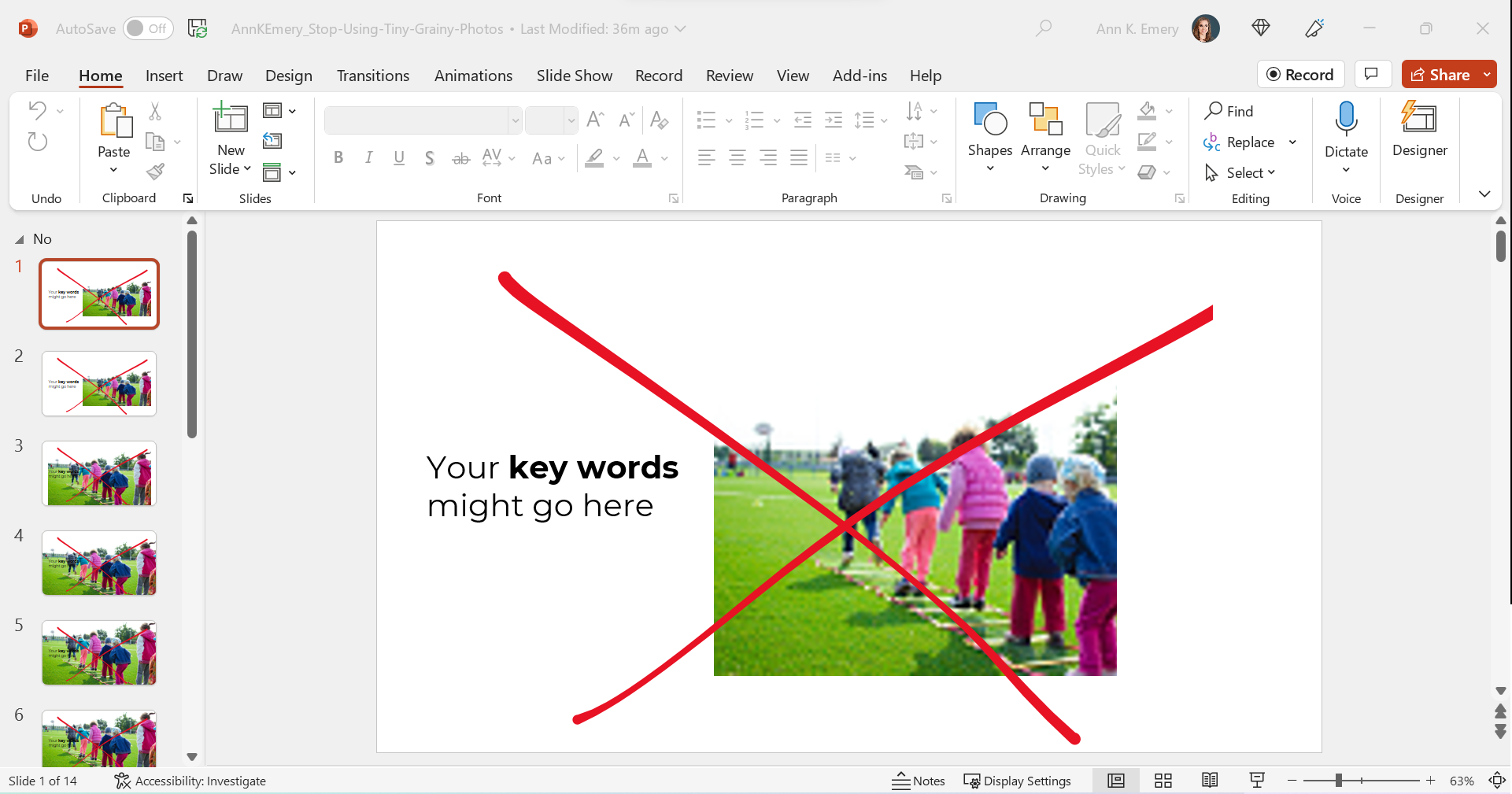
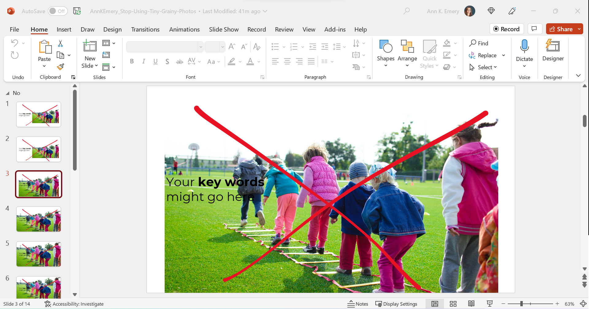
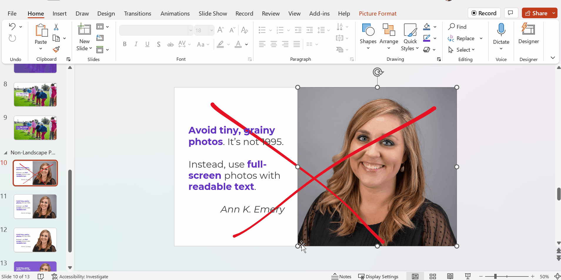
Avoid Tiny, Grainy Photos

Here’s what I often see: small, low-resolution photos.

It gets The Big Red X.

I want your presentations to look professional, but this one’s giving outdated, unprofessional vibes.

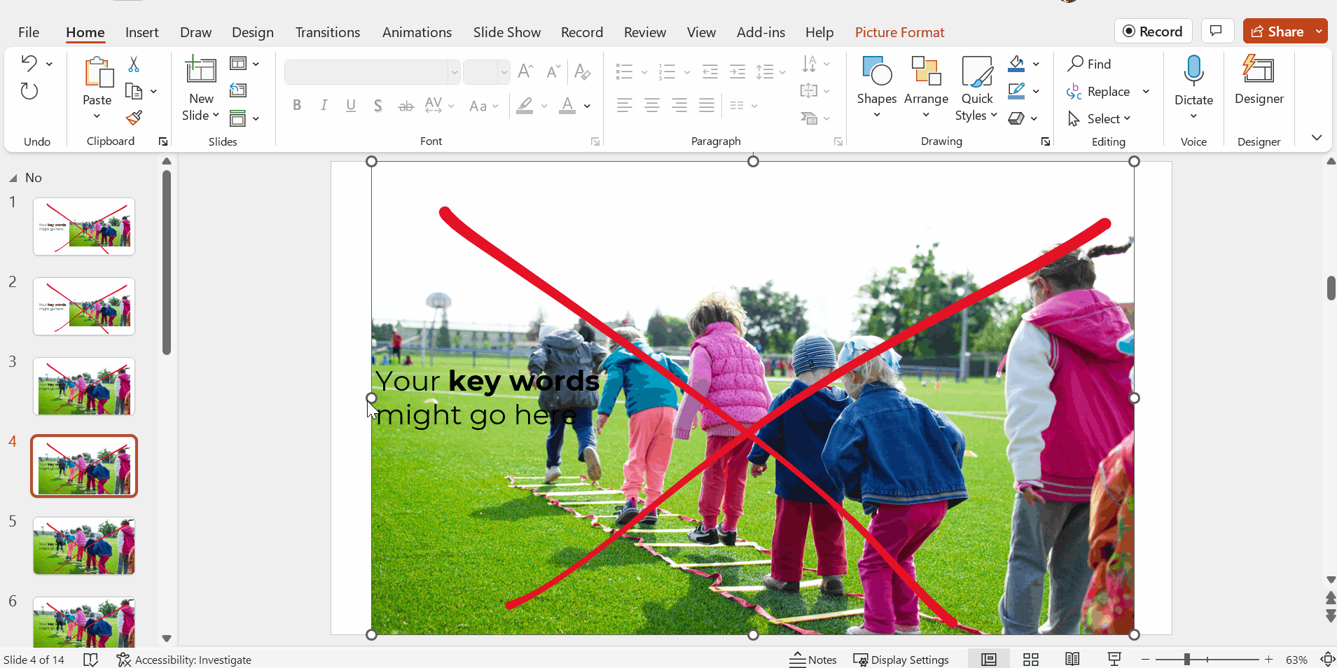
Avoid Small, High-Resolution Photos

Nowadays, it’s easier than ever to find high-resolution photos.

I’ve tried dozens of photo sites, and my favorite is still Pexels.com.

All of their photos are free for both commercial and educational use.

You don’t need to create an account to download their photos (one less username and password to remember!).

You don’t need to add citations to your photos (so your slides stay uncluttered).

Over the past couple years, they’ve added more photos from international photographers, so you’ll see beautiful skin tones and hairstyles showcased among the models.

Here’s the next draft with a high-resolution photo:

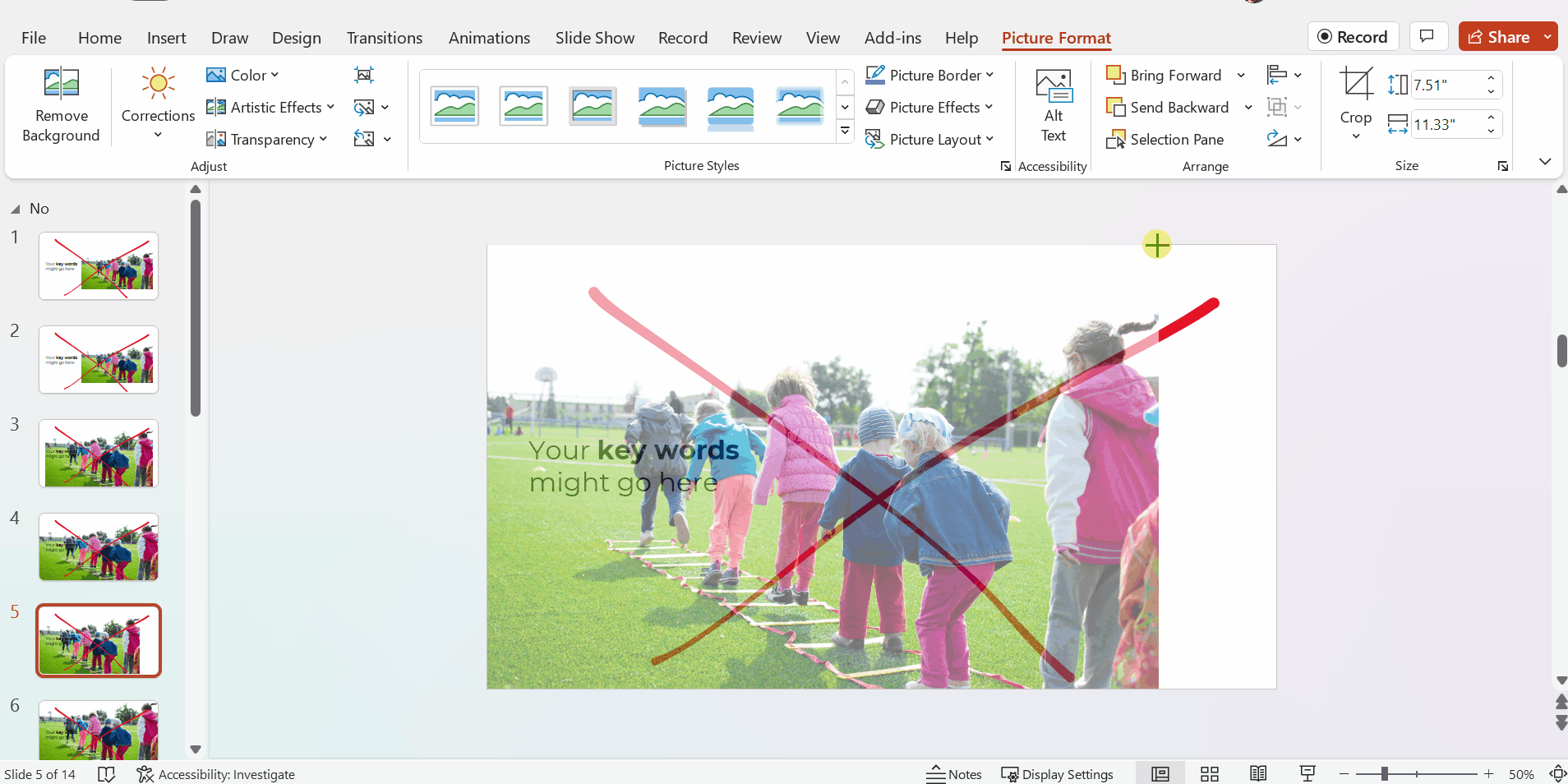
Avoid Awkwardly-Enlarged Photos

We’ve solved the grainy issue.

Next, let’s solve the size issue.

I often see slides like this, where the photo is placed awkwardly on the slide.

We can’t keep those white slivers along the sides.

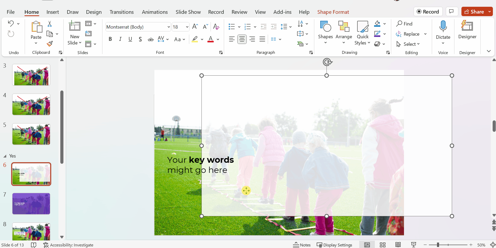
Avoid Stretched Photos

Please please please don’t stretch photos.

Yes, we want full-screen photos. But we must keep the aspect ratio (the proportions) intact.

Be careful if you’re manually dragging the sides, top, or bottom of the photo, as shown below.

The stretching is hardly recognizable on this particular photo, since it shows the backs of young children. But if you stretched a photo of someone’s face, it would be immediately noticeable (and it would look unprofessional).

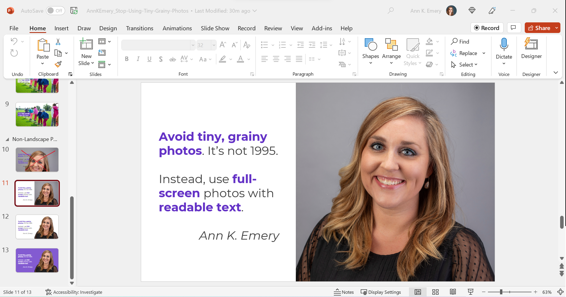
Avoid Full-Screen Photos with Unreadable Text

As you’re enlarging photos to fill the entire screen—so the audience feels like watching the action from the 50-yard line, not the nosebleeds—make sure you grab the corner.

Grabbing the corner will ensure that photo doesn’t get stretched awkwardly (i.e., it maintains the aspect ratio).

Full-screen photos often fall off the edges of the slide, like this. That feels weird at first! Don’t worry; the audience will only see the completed version, with the beautiful full-screen photo. They won’t know that, behind the scenes, an inch of the photo is falling off the edge of the screen.

After

We’ve got a full-screen photo, woohoo!

Next, let’s make sure the words are readable (i.e., that we have enough contrast to meet official accessibility guidelines).

Full-Screen Photos with a White Overlay

To make sure the words are readable, try adding a white overlay.

Go to Insert –> Shape and draw a large rectangle over the entire slide. Then, adjust the transparency. This one has 15% transparency.

Your audience will easily read the large, 32-point font. And they’ll see the photo peeking out from behind, too.

In this example, the words are the star, and the photo is the sidekick.

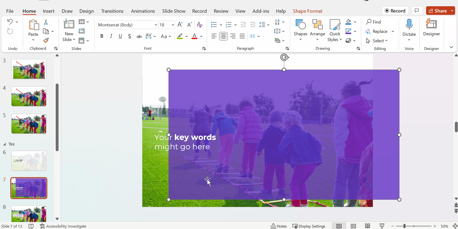
Full-Screen Photos with a Colored Overlay

You can use brand-colored overlays, too.

The words are still the star, and the photo is still the sidekick.

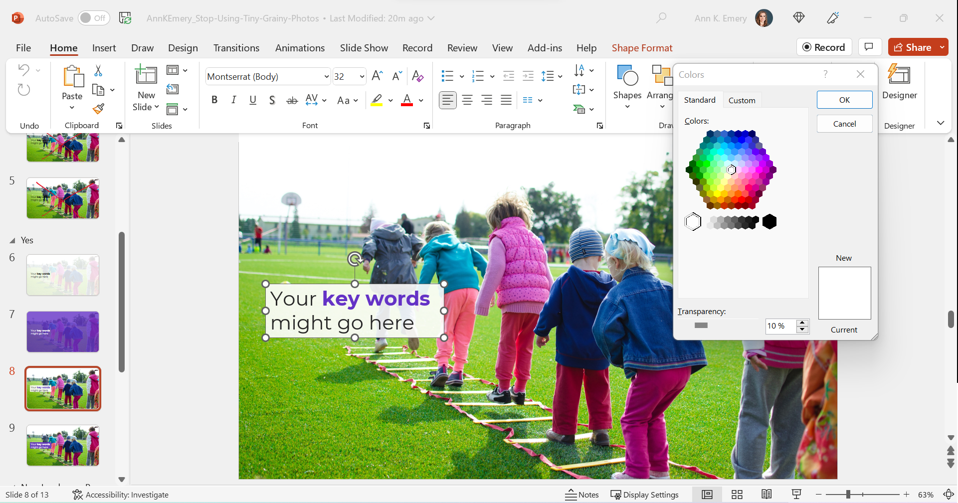
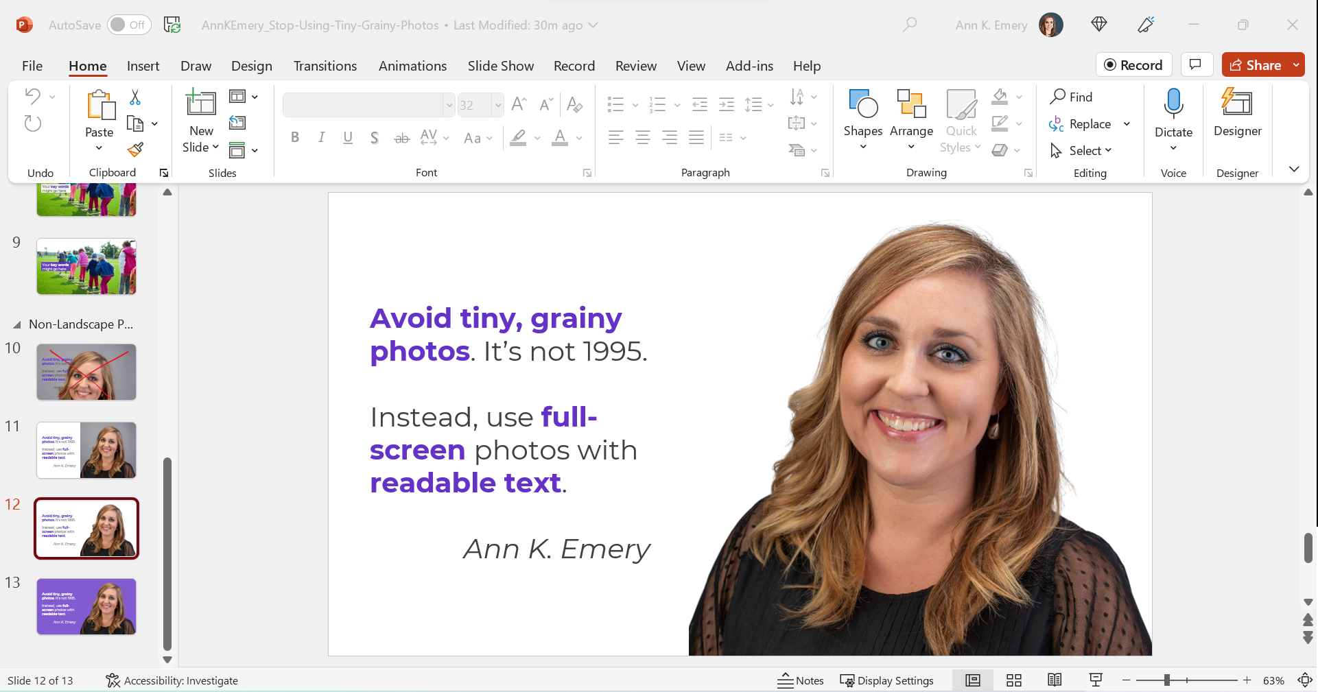
Full-Screen Photos with White Text Boxes

In this example, I kept the photo’s original colors.

The text box is filled with white (with a 10% transparency so you can slightly see the photo peeking through the text).

The photo is the star now, and the words are the sidekick.

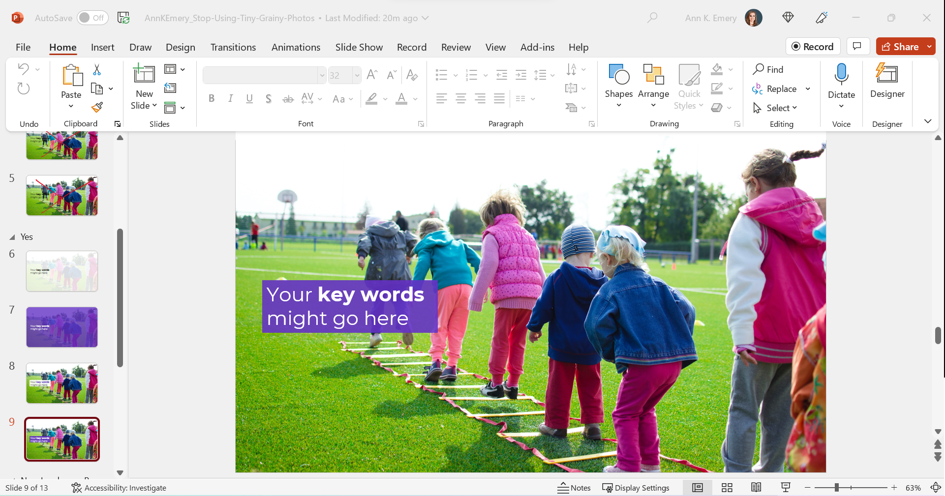
Full-Screen Photos with Colored Text Boxes

I think you get the idea by now.

You could also fill the text box with one of your brand colors, like this:

Phew! In these redesigned slides, our full-screen photos put the audience in the middle of the action, and the text is readable.

What If My Photo Isn’t Landscape?

We can’t always find landscape photos to fit our landscape slides.

Maybe the photo we want is square, circular, or portrait-oriented, like this one.

We can’t expand those pictures to fill the slide, or they might get too big.

Enlarge the Photo to Fit the Height (or Width) of the Slide

I often enlarge those photos to fill the height of my slide, even if they don’t fill the width of the slide, like this:

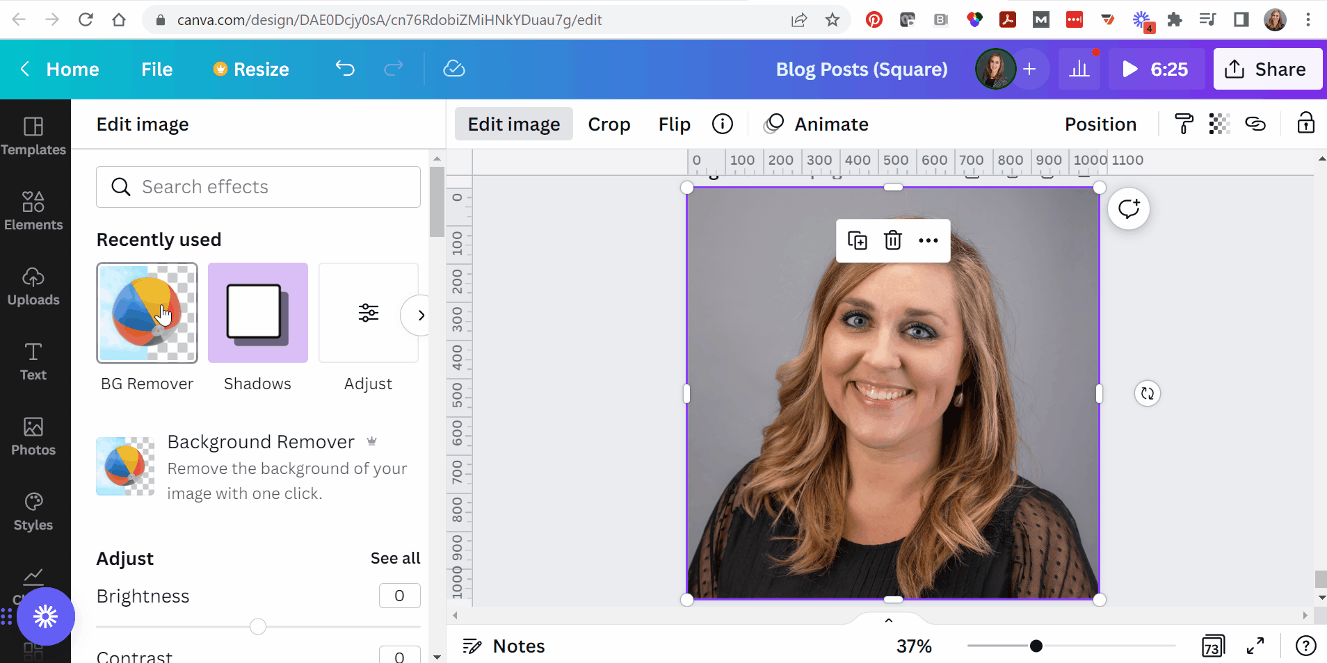
Experiment with Removing the Background

When I’m adding headshots to slides, sometimes I remove the background.

(This rarely works with non-headshot photos, like the photo of the children playing. Computers get confused, and they often mix up the background and foreground.)

PowerPoint does have a Remove Background button (!). To use it, click on the picture to activate it, then go to Picture Format à Remove Background.

But PowerPoint’s Remove Background button is meh. It’s a newish feature and Microsoft still has some fine-tuning to work out.

Instead, I upload the photos to Canva, remove the background, download the edited version, and insert that into PowerPoint.

Canva gives me the correct results 90% of the time, whereas Microsoft gives me correct results 10% of the time.

Now, the photo and the words flow better, since they’re both against a white background.

Finally, you can try colored slide backgrounds, like this. You’d use your brand colors, not mine.

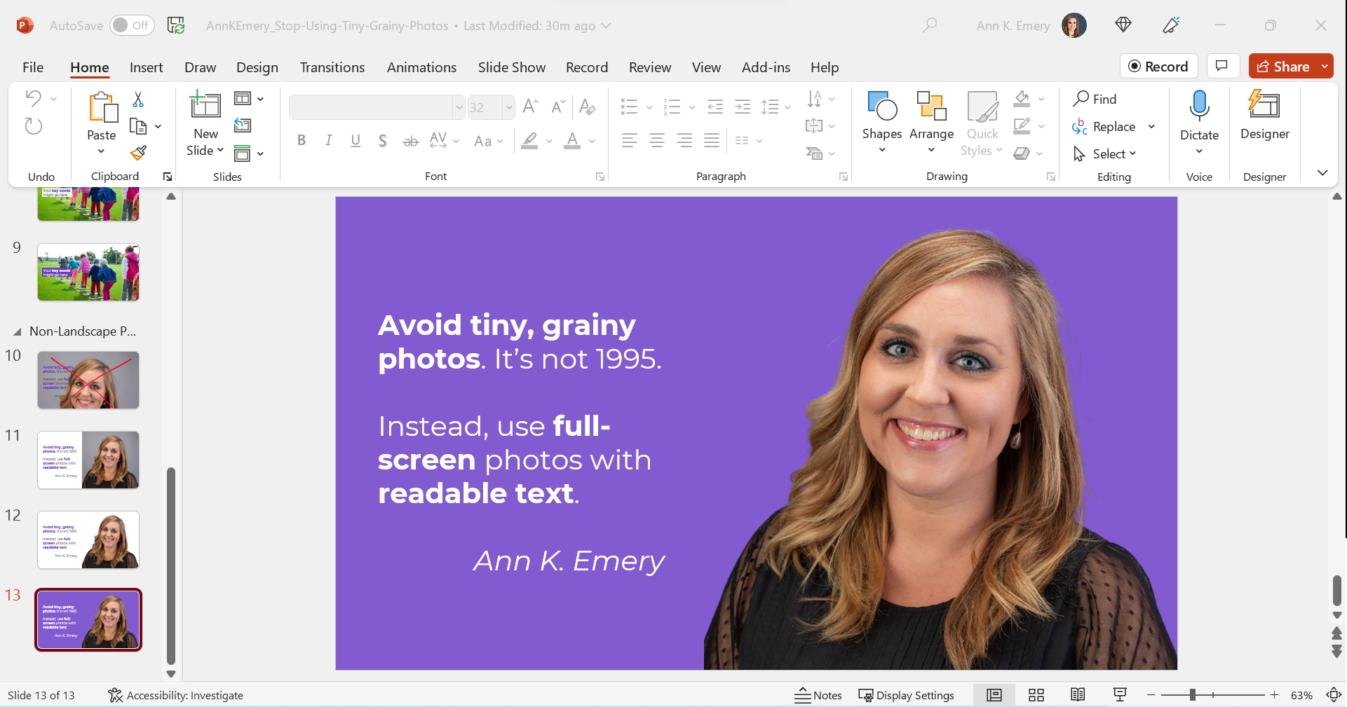
I think this final design might be my favorite of the batch.

All of these redesigns are better than the tiny, grainy original, don’t you agree?

Download My Slides

Want to explore these slides? Download them here.

Written by cplysy · Categorized: depictdatastudio

Oct 22 2022

Action Planning for Coalitions – Strategic Doing

Written by cplysy · Categorized: connectingevidence

Oct 19 2022

Make Dissemination Easy

Sharing our work well takes skill and experience. But not every data person has these skills. Should they?

Qualified to Do the Work ? Qualified to Share the Work

The vast majority of PhD and MA programs are not going to give their students enough training around digital dissemination to make them experts in sharing their work online. It’s just not how the programs are designed. Their dissemination focus is on sharing work via academic journals, conference presentations, and traditional reports (aka documentation).

Subsequently, there are a LOT of highly qualified researchers & evaluators who do not have the qualifications necessary to properly share their work over the web.

This isn’t a dig, there is a lot that you need to know in order to do the work. And you don’t need to know how to share the work to do the work. And for a large share of academics, the web is still, more or less, uncharted territory. We have to stop pretending otherwise.

Far too often government agencies, large Non-Profits, and NGOs trust highly educated PIs and project directors to lead the public dissemination of their work. And because of that, millions upon millions of public dollars go into projects that ultimately get shared poorly.

It doesn’t have to be that way.

Cartoon person sitting at desk thinking, "This project cost taxpayers millions of dollars. But our report has only been read by a handful of people. Oh well, we did the best we could."

Right information, wrong format.

In a nutshell, sharing requires more than just the right information.

Information needs also extend to the format of the information shared. One large well designed PDF is insufficient to meet modern information sharing needs.

Your reports should be diverse collections of micrographics, infographics, slidedocs, GIFs, videos, short visual reports, and, yes, long PDFs. This is the only way they can really meet broad audience needs.

Don’t add a step, add a role (or a partner).

There are people who have the skills necessary to create reports fast enough to make creating more reports feasible. Yes, I am one, and I also train others to do this kind of work.

If you’re struggling to create a bunch of different types of reports, it’s because you don’t yet have the skillset or the team that is needed to do the reporting work effectively and efficiently. This is a capacity problem.

But you should also stop thinking about dissemination as the last step in the research or evaluation process. If your project is big enough, you should have a person on your team (or multiple persons) who have the responsibility for disseminating your work. And that person (or persons) should have the qualifications necessary to perform this role.

The Easy Dissemination Process

You want to know the easy dissemination process?

  1. Do the work.
  2. Then have someone with the right qualifications share the work.

It can be that simple.

The person who shares is responsible for understanding your audience’s needs and adapting your work to meet those needs. They are the ones who know how to quickly create micrographics, infographics, slidedocs, gifs, videos, interactives, visual reports, and all the other things modern audiences desire.

And if you want to be that person who know how to do those things. Put some time and effort into learning the skills and developing the qualifications necessary to take on that role.

Want Help?

  • Hire me.
    -or-
  • Learn from me.

Written by cplysy · Categorized: freshspectrum

Oct 17 2022

Do You Need a Single Map, or Several Maps?

Here’s a counterintuitive dataviz principle:

Sometimes, it’s easier to understand several small graphs than a single graph.

I was recently working with an organization to visualize which states were using their software programs.

States might use:

  • Software A
  • Software B
  • Or, both software A and B

Before: A Single Multicolor Map

Here’s what their visualization looked like.

They had a single U.S. map with one color for each scenario:

  • one color for states using Software A
  • another color for states using Software B, and
  • another color for States using A and B.

Fairly straightforward, right?

It took us a while to spot patterns, though. Three colors is a lot to understand at once. It’s not impossible, but we had to think about it for a moment.

Multicolor (well, multi-hue) maps take a while to interpret.

Multi-hue maps aren’t colorblind-friendly. Here’s a simulation of what the map would look thanks to https://www.color-blindness.com/coblis-color-blindness-simulator/.  

Multicolor maps aren’t grayscale-friendly, either.

After: Small Multiples Maps with One Color Each

In lieu of a multicolor map, try small multiples!

In the redesign, we created three maps instead of one.

Now, we’re showing a single variable on each map, so the audience can understand it at a glance.

Small multiples binary maps (your dark brand color + light gray) are often faster to read than mutli-hue maps. It’s counterintuitive, I know. We’re asking people to read three maps instead of one. But, three fast maps will beat one slow map any day of the week.

Small multiples binary maps are colorblind-friendly. Everyone can spot the dark brand color vs. the light gray.

Finally, small multiples binary maps are grayscale-friendly. Everyone can distinguish the dark gray vs. light gray.

Side-by-Side Comparison

Both styles fit on a single page (a goal in their project).

Both styles have room for explanatory sentences (something I recommend in all one-pagers).

Only the small multiples version is colorblind-friendly and grayscale-friendly. I’d argue that the small multiples version is faster to read, too.

Download the Files

Want to explore my Excel file and Word doc?

You’ll see:

  • How I formatted the Excel table that feeds into the maps
  • How I arranged everything inside good ol’ Word

Download them here: https://depictdatastudio.gumroad.com/l/SmallMultiplesMapsInExcel

Your Turn

Have you split your multicolor map into small multiples?! Get in touch when you apply this technique to your own projects.

Written by cplysy · Categorized: depictdatastudio

Oct 13 2022

Designing a Seesaw Graph with Canva and Flourish [Walkthrough]

So welcome to a new series of blog posts. Each will be a type of design walkthrough. In these posts I will start with a chart or piece of information found in a real report and adapt it into something different (not always better, but always different).

I’ll walk you through my design process as I go and show you my reasoning throughout.

Designing a Seesaw Graph featured image.

My starting point. A 2022 NAEP Long-Term Trend Assessment Report.

So I was strolling through some report highlights from a recent National Assessment of Educational Progress (NAEP) report (Reading and mathematics scores decline during COVID-19 pandemic) when I came across this chart.

Chart from the NAEP report.

It kind of looks like some version of 5 string guitar tablature and it took me a minute to decipher. It’s a little busy but all in all it does deliver a little story if you can figure out how to read the chart.

Basically reading scores for 9 year old students dropped between 2020 and 2022. The drop was bigger for lower performing kids. Students in the 10th percentile scored 10 points lower in reading in 2022 compared to how students in the 10th percentile scored in 2020.

The gist: COVID happened and the NAEP reading scores went down, but it was worse for lower performing students.

Same was true for math, but for this adaptation I’m going to stick with just reading.

Are the percentiles hiding the story?

So the drop of scores from 2020 to 2022 across all percentiles is pretty clear. On the NAEP page they shared this through a line graph starting in 1970. Across that entire span the numbers don’t change very often or by very much.

There is only a total 12 point shift between 1970 and 2020, and most of the changes were gradual. Except for last year. That’s an interesting story all on its own, but for the graphic I want to create I’m going to focus on the differences between low performers and high performers.

Chart from the NAEP report showing Reading scores over time.
https://www.nationsreportcard.gov/highlights/ltt/2022/

One thing I learned early in my career is that it’s a good idea to start with the basics, even if they feel completely clear. In this case, since I’ll be zooming in on 2020 to 2022 for the percentiles, it’s a good idea to just start with a matching chart that just shows the overall 2 year average drop.

Now that I have that one, it’s time to break down the data into the percentiles. While the original NAEP chart is accurate, the focus we really want is on the differences between 2020 and 2022 for each of the percentile groups. So separating each percentile into its own chart will help provide that focus.

Can you see how simply splitting up a chart can make it easier to process the information? We already know by default that the 90th percentile is going to have higher scores than the 10th, we don’t need to see them in the same chart to confirm that point.

Is that a seesaw?

Alright, that’s the boring stuff, now let’s play a little.

So after scrolling down the page, I noticed they had other charts as well.

Chart from the NAEP report showing a breakdown of the data.
https://www.nationsreportcard.gov/highlights/ltt/2022/

Essentially it’s a two data point line graph. Some people will call this a slope graph.

Given that we’re looking at just the averages we could probably zoom in a little on the actual data by reducing the range on the Y axis.

They ended up using the same scale for all the charts in the report (which I understand). But the average doesn’t vary that much over time so you only get a little bit of a drop. The scale is larger because of the larger range between the 10th and 90th percentiles.

So to make the point a little clearer as to how much of a drop happened, they put the number in bold in the middle above an arrow in a circle. It definitely calls attention to the change.

These ones seem very reminiscent of a seesaw…which gave me an idea.

A little seesaw graph.

The seesaw graph. Yes, technically you could call it a line graph or a slopegraph. But do they have little children on each end? I think not.

The difference though is that my goal with this one is to present year to year change. And since I’m visualizing change, and not specific scores, I can go ahead and put all the percentiles on the same plane.

As with all line graphs & slopegraphs (and charts in general) the actual comparative size of the y-axis and x-axis is going to make a big difference.

A 5 part seesaw graph.

Even if you couldn’t see the story quickly before, I’m sure you can now. That’s quite a difference between the lower performing percentiles (10th & 25th) and the higher performing percentiles (75th & 90th).

And in defense of my more extreme comparison, a ten point difference is extreme when you consider that the average scores didn’t fluctuate more than 12 total points in the last 50 years.

Pulling it all together into a Micrographic.

Micrographics can be little illustrated stories like this one, that you can easily share on social media. If you’re interested, I have a free 10 part email course on Micrographic design.

Here is the micrographic I pulled together from today’s charts.

Canva NAEP Reading Seesaw Graph Template by cplysy

Want the Canva & Flourish Templates from Today’s Post?

All my templates are available exclusively to members of my Designing with Chris workshop. If you’re in the workshop, here is the link for the set of templates.

If you’re not in the workshop, just know it’s always open, and you can join us today!

Written by cplysy · Categorized: freshspectrum

  • « Go to Previous Page
  • Go to page 1
  • Interim pages omitted …
  • Go to page 114
  • Go to page 115
  • Go to page 116
  • Go to page 117
  • Go to page 118
  • Interim pages omitted …
  • Go to page 304
  • Go to Next Page »

Footer

Follow our Work

The easiest way to stay connected to our work is to join our newsletter. You’ll get updates on projects, learn about new events, and hear stories from those evaluators whom the field continues to actively exclude and erase.

Get Updates

Want to take further action or join a pod? Click here to learn more.

Copyright © 2026 · The May 13 Group · Log in

en English
af Afrikaanssq Shqipam አማርኛar العربيةhy Հայերենaz Azərbaycan dilieu Euskarabe Беларуская моваbn বাংলাbs Bosanskibg Българскиca Catalàceb Cebuanony Chichewazh-CN 简体中文zh-TW 繁體中文co Corsuhr Hrvatskics Čeština‎da Dansknl Nederlandsen Englisheo Esperantoet Eestitl Filipinofi Suomifr Françaisfy Fryskgl Galegoka ქართულიde Deutschel Ελληνικάgu ગુજરાતીht Kreyol ayisyenha Harshen Hausahaw Ōlelo Hawaiʻiiw עִבְרִיתhi हिन्दीhmn Hmonghu Magyaris Íslenskaig Igboid Bahasa Indonesiaga Gaeilgeit Italianoja 日本語jw Basa Jawakn ಕನ್ನಡkk Қазақ тіліkm ភាសាខ្មែរko 한국어ku كوردی‎ky Кыргызчаlo ພາສາລາວla Latinlv Latviešu valodalt Lietuvių kalbalb Lëtzebuergeschmk Македонски јазикmg Malagasyms Bahasa Melayuml മലയാളംmt Maltesemi Te Reo Māorimr मराठीmn Монголmy ဗမာစာne नेपालीno Norsk bokmålps پښتوfa فارسیpl Polskipt Portuguêspa ਪੰਜਾਬੀro Românăru Русскийsm Samoangd Gàidhligsr Српски језикst Sesothosn Shonasd سنڌيsi සිංහලsk Slovenčinasl Slovenščinaso Afsoomaalies Españolsu Basa Sundasw Kiswahilisv Svenskatg Тоҷикӣta தமிழ்te తెలుగుth ไทยtr Türkçeuk Українськаur اردوuz O‘zbekchavi Tiếng Việtcy Cymraegxh isiXhosayi יידישyo Yorùbázu Zulu