• Skip to main content
  • Skip to footer
  • Home

The May 13 Group

the next day for evaluation

  • Get Involved
  • Our Work
  • About Us
You are here: Home / Archives for cplysy

cplysy

Sep 23 2022

Are you reporting or documenting?

Do you know why so many research and evaluation reports are super long and boring? I have a theory.

Freshspectrum Cartoon.
"Wow, that's a lot of words."
"Can you believe I was able to fit my entire masters' thesis on a single research poster?"

One nice thing about putting all of your ideas into a book is that it makes it easier to chat about those ideas with others. And I’ve had the opportunity to participate in a bunch of chats about The Reporting Revolution.

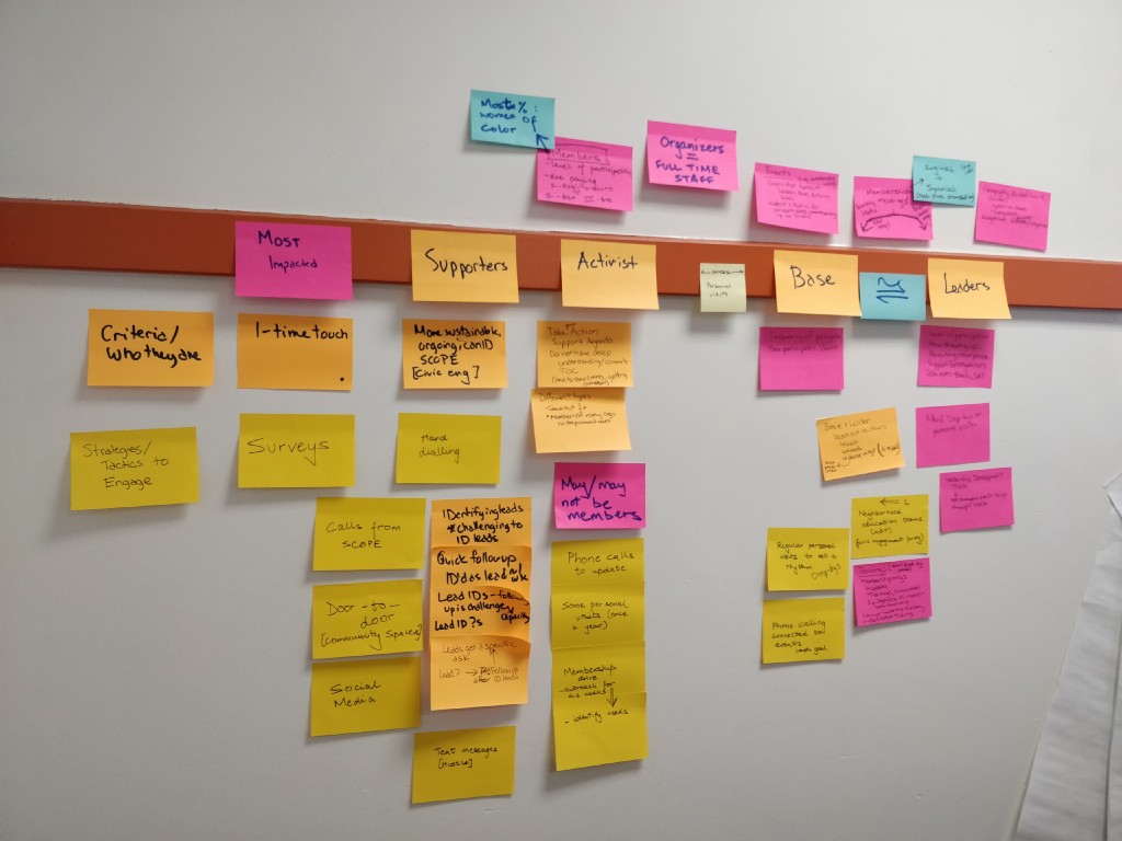
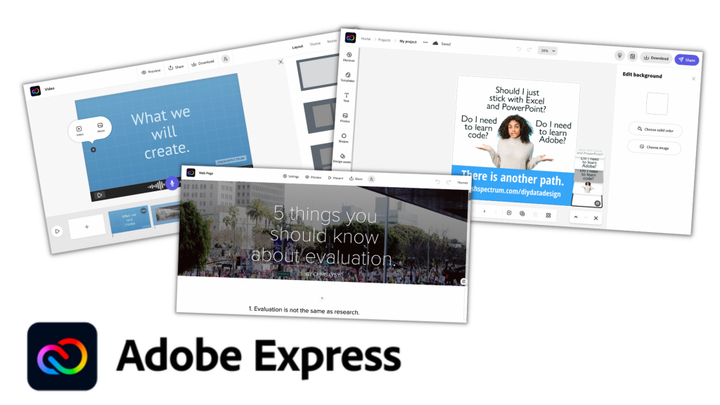
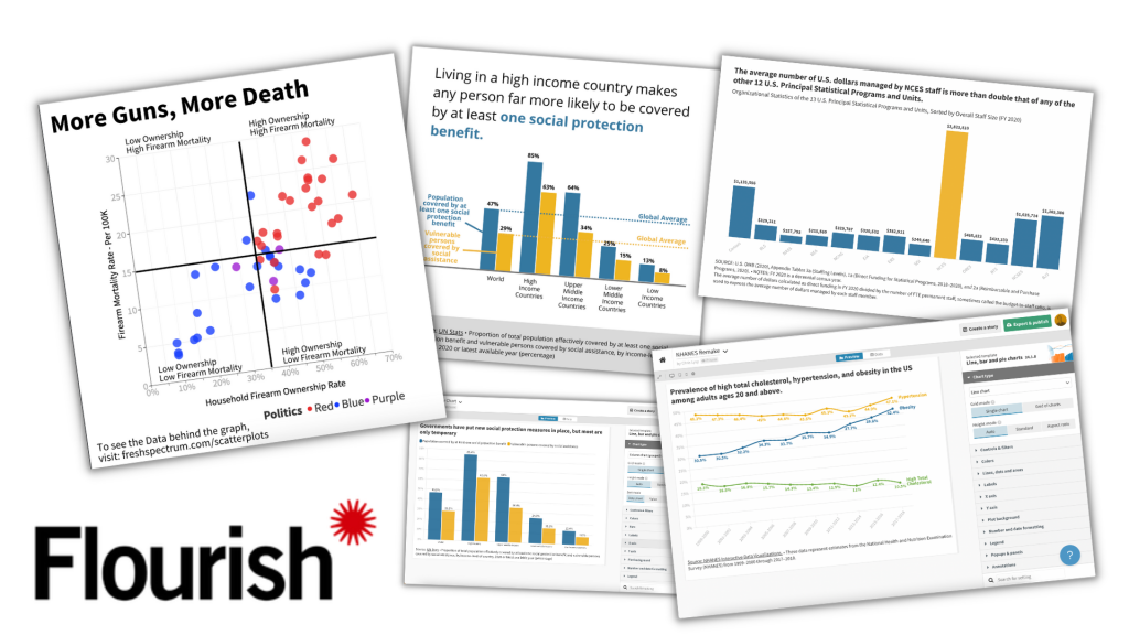
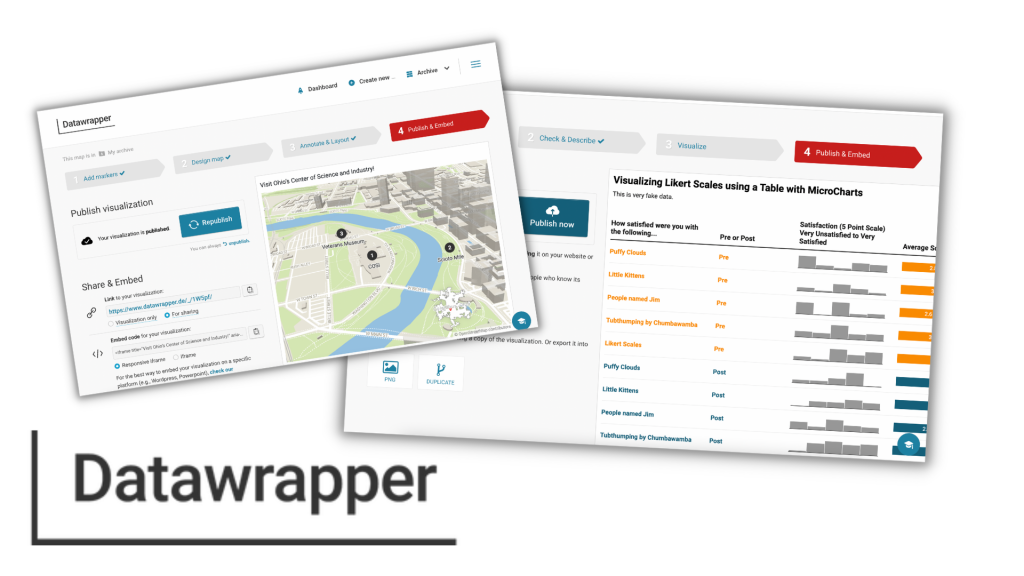
A point that I make in the book is that it’s probably better to have 10 pretty good reports that reach 10 unique audience needs than to have 1 amazing report. I also talk a lot about different types of micro-reports (i.e. social media featured images, infographics, slidedocs, etc.).

This gets a little pushback, but not because I’m suggesting creating lots of little reports. Instead, it’s the idea that we shouldn’t create one big report. Because we need that report to do other things.

For example, we need the report as a historical record of the work that we’ve completed. Something that walks systematically through the methods we’ve used, talks about how we approached our analysis, and goes over any complications or considerations. Not because there is someone who specifically needs that information right now, but because somebody might need that information at some point in the future.

Freshspectrum cartoon - 
"Of course I "read" your report."
"Why the air quotes?"

Reporting versus Documentation

My love of little reports does not mean that I am against long reports. I have even written in defense of long 200 page reports.

Not only do long reports provide a historical record of our work, but they also help us to think through our work and let us write non-comprehensive short reports without the fear of missing something.

But merited or not, are these long brain dumps really reports?

Yes, we call them reports. But we don’t really create these things for people. We create these things to document our work.

We report for audiences.

Freshspectrum cartoon -
"Do you think I created too many types of reports?"
"Well, personally, I would have stopped at 25"

What would happen if you started calling your longer reports documentation?

If you give up the idea that you’re actually writing for an audience, the whole “formerly known as long report” thing gets easier to write. Because you’re just capturing your work.

And if you stop treating that documentation as the only way you report your work, you can start creating real reports. The ones designed to serve your audiences.

Written by cplysy · Categorized: freshspectrum

Sep 20 2022

Mapping community organizing models: An adapted journey mapping approach

Before the pandemic, Innovation Network partnered with Community Change to document the community organizing models of the nine local grassroots organizations in their Power in Places initiative. One common feature of the organizations (nine grassroots groups across eight states) we worked with is that they were always adapting their community organizing model. Whether they came from an Alinsky tradition or designed their own approach, they were modifying and adapting to fit the needs of the current day and unique makeup of the people in their communities.

When we were asked by Community Change, a national intermediary organization for these organizations, to write down these unique approaches and adaptations, we did not anticipate how useful it would become for the organizations themselves.

Organizers appreciated time to reflect on their model. Organizers are busy strategizing, researching, knocking on doors, and building relationships. They often don’t have time to stop and reflect on why and how what they are doing is working. We heard from organizers that just the act of reflecting and articulating their organizing model was helpful.

Organizing models support peer learning. Although the groups we worked with organized in different states and contexts, they often faced similar challenges, such as organizing across difference and finding a balance between building their membership and growing leaders. When organizations read each other’s models, they were able to identify and connect with other groups addressing similar challenges and come up with fresh ideas.

Documentation helps validate community organizing approaches. Community organizing is undervalued and poorly understood. Formal documentation of the strategies and complexities embedded in community organizing can help funders and partners understand and appreciate the role of organizing in social change. Organizers can share their organizing models with staff during orientation, in proposals for grant writing, and with partners to describe their role in coalitions.

Our site visit with organizers was the one time we would be together in person to deeply understand their unique models of collective action. We wanted to find out and document exactly what their models for building the power of everyday people looked like. We have outlined our process for documenting organizing models, along with some insights, below.

Post-its describing one organization’s model cover the wall during a site visit

Our goal was to get descriptive detailed information, to understand what a person would experience from the time an organizer knocked on their door (in one possible scenario of outreach) to the time that person becomes a member and leader of the community organization. Ultimately, we decided to use an adapted Journey Mapping approach. Journey Mapping is a process adapted from Silicon Valley for designing the user experience of people who engage with apps and websites. We used a similar process to map the experience of a person who connects with and builds their leadership through community organizing.

We found that this style of approach — using post-its and plotting them on the wall — helped us gain more clarity than a traditional interview. Organizers were able to clarify and add more detail when they saw what was written on the wall. And it helped move us along when we placed an empty post-it and asked organizers to fill it in.

Our process included five steps:

  1. Define whose experience you are exploring
  2. Identify stages of the journey
  3. Explore each stage
  4. Reflect on the “growing edges”
  5. Write it up!

While we used this process to find a common model of community organizing, this approach could easily be used for any evaluation that seeks to capture a progressive model, e.g., increasing person or organizational capacity, member engagement, etc.

1. Define whose experience you are exploring

It’s hard to understand someone’s journey before you have a better understanding of who they are, what influences them, and the context in which they live. In our case, we were curious about the members of grassroots organizations whose journeys we mapped. Before we mapped the organizing models, we spent time learning about members and the communities they come from.

Although organizing looked different in each of the nine organizations we worked with, their members experienced similar challenges of being disproportionately impacted by racial, social, and economic inequities and injustice. Their strengths were unique: members in some states were connected to strong churches or local groups, while others have a history of civic involvement. One community organized in California had a strong grounding in the civil rights movement and has long fought against oppression. Understanding the world in which members lived helped us see how the model to organize them was constructed to respond to the needs and strengths of its members.

Questions for exploring the “who”:

Tell us about the community you organize. Who lives in the community? Who are the types of people you organize? Where do they live?

What is the demographic makeup of the community?

What challenges are they experiencing right now?

What are the strengths of this community?

Post-its describing one organization’s model cover the wall during a site visit

2. Identify stages of the journey

By identifying stages of a person’s journey you are creating a framework for the model that you will fill in later. You can start mapping stages at any point of a person’s journey. It doesn’t have to be the beginning, just a common experience of members. Start where there is energy. In our case, organizers we spoke with mentioned outreach activities to engage new members so we started there.

Write the stage on a post-it and place it on the wall or somewhere visible. You could do this virtually using tools such as Mural or Jamboard. Continue to add stages by asking what members experienced after, or leading up to, the plotted stage.

As we plotted stages, grassroots organizations described their work as linear, cyclical… even as a “tornado.” We did our best to place post-its in a way that represented the structure they described. If you’re limited by the wall space you have — don’t worry. Just get the stages down and take note of the structure discussed so you can capture it later.

For example, one organization outlined five stages of their organizing model: Listening, issue assembly, research, action assembly, and campaign.

NOTE: In a few cases, we had two parallel stages for different arms of the work. For example, one organization organized individuals as well as congregations, and had different approaches initially for getting members involved and building leadership. It was key to listen to organizers and map the process as they described it, in this case showing two parallel sequence of stages rather than one.

Questions for identifying stages:

What is a key stage or benchmark in people’s development and engagement, e.g., “first contact” with community members?

How do members go from first contact to becoming a leader? What milestones do they accomplish in between?

(If it is difficult to identify specific stages) Can you tell me the story of a specific community member that illustrates your approach to organizing? Walk us through what your organizing looked like from that person’s experience.

Post-its describing the detail of the leadership development aspect of one partner’s organizing model

3. Explore each stage

Take time to explore the specific strategies and tactics that organizers use to develop community members into leaders. Write these down on different color post-its and place them around the stage you are describing. This provides important details to understand what a person experiences that motivates them to continue to the next stage of the model.

Our goal was to get at a common model — not the small changes made day-to-day by unique organizers for unique members. This meant we had to stay within a specific timeframe, usually the most recent campaign conducted. We also framed the features of stages as what most members experienced. For example, if one member opted for conducting house parties as a part of their outreach but it was not a common practice, we did not include it in our model.

Questions for exploring stages:

What is the goal for this stage? What does successful engagement look like?

What does a community member’s engagement with the organization look like in this stage?

What qualities or requirements are expected of a person in this stage?

What strategies and tactics do you use for recruiting/developing members into leaders?

NOTE: Alternatively, you can dig into each stage as you identify it. We did a little of both and allowed the conversation to flow — capturing the stages, probing deeply as we went. Then we filled in the gaps once we had all the stages on post-its on the wall.

Some of the challenges, or “growing edges” identified by one partner in the process

4. Reflect on the “growing edges”

Once you have a good understanding of the major stages, strategies, and tactics, take a step back and reflect on the model overall. Often there are overarching elements that are helpful to explore, particularly what new strategies the organizations were experimenting with, and the challenges they were adapting around (the “growing edges”). These can be written on another color post-it on each side of the model.

Questions for reflecting on the model:

Which elements of your approach are newer or experimental?

What led to these adaptations (probing for challenges affecting the organizing model)?

Draft organizing model, showing the trajectory from base-building, to developing chapters, to building leadership
Image of a draft organizing model for one organization built in PowerPoint. Visuals were accompanied by a more detailed narrative description.

5. Write it up!

When you have the full story, snap pictures of the post-its on the wall. Use these with notes from your conversation to create a product that describes the model you’ve captured. Models can be captured in any format! (Don’t be afraid to get creative — if a traditional report works for your audience that’s great, but consider alternative formats too, such as a cartoon strip, video, or SlideDoc.) Whatever you use, remember to describe the model using the same language (e.g., tornado!) that organizations use.

We created two products from this journey mapping exercise: a) a narrative detailing each stage and the “growing edges,” and b) a one-page visual depiction of the model to understand members’ experience at a glance. Organizers worked with us through a couple rough drafts before we came to agreement on a final version.

NOTE: We designed the narrative in Microsoft Word and the visual in PowerPoint. We knew that organizations’ models would continue to change and wanted to give them a tool that they had the power to update and use as they wished. Several organizers shared with us that they appreciated this foresight!

We shared the compilation with all nine organizations, hoping they would identify with others’ models and use them as an opportunity to connect. We created a set of guiding questions to think about as they read over each other’s models, and some questions to help them think about how they can use their own model as well, captured below.

Questions for learning from the model:

How has the model changed over time? What do these changes reflect about your approach or your community?

How can this model be used to educate new members, organizers, and funders?

What can you learn from others’ organizing models?

Have you tried participatory approaches to capture organizing or other community-based models? Please share your own ideas and experiences in the comments!

Mapping community organizing models was part of a larger evaluation that contributed to a framework for building people power. The framework and evaluation findings were published in the report, Power Building in the Community Change Power in Places Initiative: Framework & Strategies, and a New Directions Article written by my colleagues Katie Fox and Margaret Post, Evaluating Power Building.


Mapping community organizing models: An adapted journey mapping approach was originally published in InnovationNetwork on Medium, where people are continuing the conversation by highlighting and responding to this story.

Written by cplysy · Categorized: innovationnet

Sep 14 2022

Comment on Tools I use to Be Productive—And Maintain My Sanity by Managing my Research Pipeline using Todoist

[…] been writing for a long while about how Todoist is my brain. I’ve been using it since 2014 and every year it has gotten better and better at doing what I […]

Written by cplysy · Categorized: danawanzer

Sep 14 2022

Powered by our values: Equity, Curiosity, Growing Possibility, Community, and Authenticity

This blog post is part of a series of posts about Innovation Network’s transformation towards equity.

“Innovation is progress in the face of tradition” — Divad @ThereBeKulture

Over the last few years Innovation Network has undergone significant changes that sought to incorporate developments into our organizational structure that have been brewing for years. This included incorporating equity and inclusion in how we function as an organization. This collective and horizontal work encouraged us to rethink our values to more accurately reflect both the work we had been doing and the work we consciously wanted to pursue.

We led with the perspective that values are not simply statements for a website, but rather an ethos to think, work and live by. As a team, we are committed to uplifting projects aligned with our mission: to facilitate meaningful learning and evaluation with and for our partners to advance social justice through equity. Projects where we can actively and proudly embed our values which include equity, curiosity, growing possibility, community, and authenticity.

This is why our first step when reading through, considering, and submitting proposals for any project is to ask ourselves whether these align with our mission and values. Do these projects center and seek to advance social justice and equity? If so, then our work will be purposeful and we will continue by embedding equity and our values within every step of our efforts. Not because we have to, but because our values are a reflection of our team’s beliefs and principles as individuals. This is the first valuable lesson we learned through this transformation process to ensure our team embodies our organization’s mission, vision, and values.

Once we have projects whose mission and objectives seek to advance social justice, our associates, project leads, and project advisors work to implement our values every step of the way. Some key strategies we use to implement these values include the following:

1 We are cognizant of power dynamics and how they affect our work. As external evaluators, navigating power dynamics is not new. However, visualizing those power dynamics and talking about them openly is a new practice that has helped us make changes in the way we do our work to alleviate common marginalization that occurs because of power dynamics. Our team thrives, through our values of equity and authenticity, when we are transparent about the power each of us holds and invite new knowledge and perspectives, no matter how uncomfortable it may be, because we know that diverse perspectives challenge our biases and enrich our projects and findings.

In practice, all our incoming team members are required to undertake the We All Count Foundations of Data Equity training; in addition to other important learning, the training provides them with the tools to create Evaluation Power Maps (check out this example by Heather Krause). For one evaluation that looked at a cross-state coalition, the Evaluation Power Map helped us start a conversation about who is involved and who gets to design the evaluation. We identified that advocates had initially been omitted, which prompted us to create an Evaluation Advisory Group that included advocates as collaborators to design mutually beneficial evaluation questions. The questions developed as a result were far different from what we had expected, centering on the desire of coalition members to explore the purpose of the coalition.

2 We utilize a participatory evaluation design. While we have always taken a collaborative approach with our clients, usually foundations and larger nonprofits, we have shifted to seek out contribution, and compensate whenever possible, the participation of actors involved in the project. This is particularly important to us because historically evaluation and learning have existed in traditionally hierarchical power structures, that not only leave behind but also overburden low-resourced organizations, particularly grantees of funders who may have hired us for an evaluation that involves their grantees. This is problematic because it is the evaluation participants who are doing the vital groundwork to further social justice and have the most experience, yet are often the least engaged in agenda creation and decision making. Our values of community and equity are our guiding lights throughout this strategy, encouraging us to include grantees in the participatory type of work we have always done with our clients

We are working with a Foundation to help them redesign their evaluation and learning objectives and practices to directly benefit their grantees We created a participatory learning agenda and included both grantees and community members throughout the project. We also created an ongoing feedback loop where evaluation participants could share thoughts and concerns about the execution and direction of the project. This was especially helpful as it allowed us to make shorter-term adjustments to the project from both the Foundation and the grantees’ perspectives. Our participatory approach allowed us to ensure the results truly reflected the concerns, desires, and needs of all parties impacted by the Foundation’s work.

3 We aspire to create a culture of trust. To ensure our partners are able to participate actively, we ensure every person is treated with respect, dignity, and empathy. Some strategies to create a culture of trust revolve around the way we listen to each other, ask for opinions and feedback, respond to comments or questions, and provide support to our partners. This effort to be both participatory and create a culture of trust is also why we prefer to call those involved in the evaluation project learning partners. It is a change that shifts our mindset to one of a horizontal and mutually beneficial relationship that recognizes partners as experts of their own experiences with both authority and agency. This strategy highlights our ongoing efforts to live by our values of growing possibility, community, and authenticity.

A clear example of this is our recognition of the evolving process of evaluation and learning during the data collection and sensemaking process of a particular project. In this stage, we found that identified interviewees had felt taken advantage of by someone involved in the initiative we were evaluating and disagreed with the framing in our draft report. We immediately took a step back with humility and empathy, providing space and time for the interviewees to share their concerns. Our team recognized the issue and gave collaborators the power to question the process. We were able to better understand their experience and rework the draft report before presenting it to their funders. This allowed us to have a much more honest and authentic final result and allowed for genuine growth.

4 We embed transparency and knowledge sharing in the evaluation process. We continuously update our partners and collaborators, sharing notes, data, insights, and learning logs. This ensures all involved in the project are on the same page, have equal access to resources, and most importantly, that we have a transparent evaluation and learning process. Ensuring everyone is able to participate actively through honest feedback contributes to an ongoing learning strategy centered around using data for action. This transparency also helps us challenge hierarchical relationships, shifting power towards grantees and community members who are encouraged to participate, co-create and learn with us, highlighting our values of curiosity, growing possibility, and authenticity.

In some of our projects, we create learning logs that capture insights and assumptions that are made accessible, updated, and re-shared to crystallize learnings from each session. Partners have access to a written record of their learning that they can access, at any time, long before any formal report is presented. Learning logs also ensure that those partners that could not join a session are included and given the opportunity to learn and contribute throughout the project.

5 We ensure those who contribute to the evaluation own their data and the way their experiences are portrayed. It is important to think about who is doing the reflection, who is missing from the table, and understand what voices and insights are important to elevate. We want to make sure the final project, and deliverable, is useful for both our client and other evaluation participants. We commonly hold sensemaking sessions to accomplish this. In a sensemaking session, we invite our partners to help us interpret the findings of the evaluation and bring in additional perspectives and insights. This process makes us check our biases, prioritize what is important, and is a facilitated space where partners translate learning into how it can be acted on to improve their work. These efforts highlight, above all, our value of equity as we strive to ensure collaborators have a say in this process, and the findings themselves.

During one sensemaking session, we took particular care to invite the people we had interviewed. The participants pressure-tested the insights we presented during the Sensemaking, weighing in and challenging those that did not align with their experience. Thanks to their active participation, we were able to integrate all perspectives in the final report and create a powerful and comprehensive strategy for the Foundation with recommendations that put forth collective goals that would not only serve the Foundation but also the field of advocacy in the state.

As a team, we have been incorporating many of these strategies for years, but only recently has a critical reflection on our work and a deep organizational transformation helped us distill our efforts into our core values of equity; curiosity; growing possibility; community; and authenticity.

We know that implementing these values with our clients is not enough; we are committed to incorporating our values internally, and today, our team is actively building a culture of trust and intentional, collective, transparent, and horizontal decision-making processes, where everyone’s opinion, independently of their level is respected and leveraged to make decisions.

While we have shared our work ethos and some of our strategies here, we have many more that we currently implement, or are experimenting with that demonstrate the positive impact of a values-based approach, and we know you do too. We encourage you to share and respond to how you incorporate your values into your work or what different strategies you implement to make evaluation and learning more equitable.

Stay tuned to our blog for more ways in which we incorporate our values into our work, reflections, and lessons learned from this transformation process.


Powered by our values:
Equity, Curiosity, Growing Possibility, Community, and Authenticity
was originally published in InnovationNetwork on Medium, where people are continuing the conversation by highlighting and responding to this story.

Written by cplysy · Categorized: innovationnet

Sep 14 2022

5 Tools that Make Reporting Easier AND Better

In today’s post I’ll share my five favorite reporting tools. And no, my list doesn’t include Excel, PowerPoint, Word, R, Illustrator, D3, Tableau, or PowerBI.

My Quest.

I think I’ve been on a quest. Now I didn’t know I was on a quest.

It was more like something was missing but I didn’t know it. And it occurred the other day as I was re-opening my workshop, just what that missing thing was.

The four pathways.

Over the last decade I came to believe that most data people interested in better data design tend to follow one of four paths.

  • You could take a coder’s path. Learning things like R, Python, SQL, and Javascript. Maybe you start calling yourself a data scientist or data engineer.
  • You could take a graphic designer’s path. Learning tools like Adobe Illustrator, Photoshop, and InDesign. Perhaps you take a position in a small boutique design agency.
  • You could take a BI dashboard developer’s path. Learning tools like Tableau and PowerBI. Here you can get a job in finance or healthcare and join Tableau’s data fam.
  • OR…you could take the most common path and just stick with trying to create better charts and reports using Excel and PowerPoint. There is nothing wrong with this path, as modeled by Stephanie Evergreen and Ann K Emery, you can do amazing things with these mainstream tools.

As a jack of all trades, I personally tried to take all the paths…

And yes, I learned a lot. Now I can do a little bit of just about everything.

I have worked as a programmer, developing websites and applications, and know a little bit of code. I have designed and illustrated reports for NGOs and nonprofits. I’ve created data dashboards for state agencies and universities. And I’ve also created a lot of Excel charts and PowerPoint presentations for all sorts of clients.

And I thought…well maybe that’s just the kind of data designer I am. The kind that knows a bit about everything. From that vantage point I can help steer others down the right path for them. So I started a workshop all about data design where I could do just that.

I accepted that I didn’t have a straightforward path. But then by accident, I discovered a fifth pathway.

The fifth pathway.

The fifth pathway is a data communications path.

You don’t need code. You don’t need to learn complicated design software. You are hardly ever communicating large enough datasets to need data dashboards.

What you need, is to be able to create professional visual reports and infographics fast. That way you can communicate with a large range of audiences, fill up a social media posting calendar, or just spend less time creating better reports.

The fifth pathway is a mix of UX design, human centered design, agile project management, and template-based design. It requires learning a set of tools developed for social media teams, data journalists, and UX/UI designers.

It’s not a mix of the other pathways. It’s something different.

And long story short, that brings us to…

My five favorite reporting tools.

All five of these tools are nimble and web-based. They all offer free plans that can be used to create viable pro designs.

With these tools you can design professional social media illustrations, one pagers, infographics, slide docs, executive summaries, print reports, presentations, GIFs, videos, interactive web reports, and simple interactive data dashboards. Even on the free plans none of the five tools expose your designs to the public, unless you intentionally decide to share the designs publicly.

These five are increasingly becoming the tools where I spend almost all of my time as an information designer.

Number 1. Canva

Canva for me is most everyone else’s Microsoft Office. I design almost everything in Canva. It’s where I design social media images, infographics, slide decks, and print reports. I even use Canva to develop online course videos. Oh, and I also used Canva to fully design my both of my print books.

Canva isn’t a design tool with some supporting digital assets (icons, photos, and videos). It is a full asset collection that just so happens to also be a design tool. It’s templates and asset libraries that make design faster.

You can do a ton with Canva free, but for the cost and what you get I think Canva Pro is will worth the money (I’m a partner because I love the tool, so that’s an affiliate link). If you’ve been following this blog, you’ll know I don’t do that often.

Number 2. Adobe Express

Adobe Express used to be called Adobe Spark. And spark was an old favorite of mine as tool to create videos, interactive digital reports, and the occasional illustration. But for years Adobe kind of just let Spark just exist without many updates or new features.

I think Canva’s success has pushed Adobe into reinvesting more into Adobe Express. Because lately the tool seems to be getting better. There are now a few things that you can do for free in Adobe Express that are only part of the paid plan in Canva, like a background remover. Adobe can also draw upon its huge collection of stock images and other assets.

While Adobe Express isn’t taking much of my time away from Canva, it is a viable tool that hopefully should be getting better and more competitive with time. Also, if you already have a licensed Creative Cloud account, you already have a pro Adobe Express account.

Number 3. Flourish

Canva has a native chart builder. But…it leaves a lot to be desired. I think that is one of the reasons Canva acquired Flourish.

Flourish is a chart building tool designed for data journalists but totally useful for any of us. With the tool you can create the kind of simple interactive charts you see attached to major news articles. Unlike Excel, which often feels like you have to break in order to create a good chart, Flourish helps you create better charts faster.

The pro version of Flourish is expensive, it really is set up for use by newsrooms and larger organizations. But luckily the free version allows you to do almost everything and is completely viable even without a pro account.

Number 4. Datawrapper

Datawrapper is in the same class as Flourish regarding target market and general use. I think in some ways it’s a little easier to use but without as many features. It’s free plan is also slightly less good with no SVG export 🙁

That said, Datawrapper can easily do some things that Flourish cannot. Datawrapper is a pretty awesome map making tool. It’s also really nice for tables with microcharts. And since there is still a ton you can do with the free plan (SVG downloads aside), it’s also worth your time trying it out.

Number 5. Figma

When I started writing this post I almost left Figma off the list. It is an amazing tool, but it’s not a template based tool like the other four.

Figma is a UX/UI design tool similar to tools Adobe XD and Sketch. But Sketch is Mac-only (and costs money) and Adobe XD requires a download (it has also been increasingly hiding its free version). I’ve used all three tools, and each has its positives. But I put Figma here because it is entirely web-based and the free plan is full-featured.

Figma is not a tool that will necessarily make your workflow faster. But what it CAN do, is allow you to tweak the things that are hard to tweak using the other tools. For instance, if you save a Flourish chart as an SVG, you can drop that chart into Figma and pick the image apart. Meaning you can get rid of elements, change colors of individual elements, and add annotations.

It gives you the kind of freedom you miss when using template-based tools, which makes it an ideal finishing tool.

Want to learn more about Data Communications?

My workshop is open again for new registrations!

It includes…

  • Weekly Sessions (every Wednesday)
  • Session Recordings (50+ hours and growing)
  • Self-Paced Courses (in the process of recording more, all will be included)
  • Private DiY Data Design Newsletter (once a week with tips and inspiration)
  • Data Design Template Library (also will be growing soon)

And if you can’t afford the $99/month ($999/year), I have three no ask necessary scholarships for 25% off, 50% off, and even 75% off.

Click here to learn more about the workshop, the scholarships, and to register.

Written by cplysy · Categorized: freshspectrum

  • « Go to Previous Page
  • Go to page 1
  • Interim pages omitted …
  • Go to page 116
  • Go to page 117
  • Go to page 118
  • Go to page 119
  • Go to page 120
  • Interim pages omitted …
  • Go to page 304
  • Go to Next Page »

Footer

Follow our Work

The easiest way to stay connected to our work is to join our newsletter. You’ll get updates on projects, learn about new events, and hear stories from those evaluators whom the field continues to actively exclude and erase.

Get Updates

Want to take further action or join a pod? Click here to learn more.

Copyright © 2026 · The May 13 Group · Log in

en English
af Afrikaanssq Shqipam አማርኛar العربيةhy Հայերենaz Azərbaycan dilieu Euskarabe Беларуская моваbn বাংলাbs Bosanskibg Българскиca Catalàceb Cebuanony Chichewazh-CN 简体中文zh-TW 繁體中文co Corsuhr Hrvatskics Čeština‎da Dansknl Nederlandsen Englisheo Esperantoet Eestitl Filipinofi Suomifr Françaisfy Fryskgl Galegoka ქართულიde Deutschel Ελληνικάgu ગુજરાતીht Kreyol ayisyenha Harshen Hausahaw Ōlelo Hawaiʻiiw עִבְרִיתhi हिन्दीhmn Hmonghu Magyaris Íslenskaig Igboid Bahasa Indonesiaga Gaeilgeit Italianoja 日本語jw Basa Jawakn ಕನ್ನಡkk Қазақ тіліkm ភាសាខ្មែរko 한국어ku كوردی‎ky Кыргызчаlo ພາສາລາວla Latinlv Latviešu valodalt Lietuvių kalbalb Lëtzebuergeschmk Македонски јазикmg Malagasyms Bahasa Melayuml മലയാളംmt Maltesemi Te Reo Māorimr मराठीmn Монголmy ဗမာစာne नेपालीno Norsk bokmålps پښتوfa فارسیpl Polskipt Portuguêspa ਪੰਜਾਬੀro Românăru Русскийsm Samoangd Gàidhligsr Српски језикst Sesothosn Shonasd سنڌيsi සිංහලsk Slovenčinasl Slovenščinaso Afsoomaalies Españolsu Basa Sundasw Kiswahilisv Svenskatg Тоҷикӣta தமிழ்te తెలుగుth ไทยtr Türkçeuk Українськаur اردوuz O‘zbekchavi Tiếng Việtcy Cymraegxh isiXhosayi יידישyo Yorùbázu Zulu