• Skip to main content
  • Skip to footer
  • Home

The May 13 Group

the next day for evaluation

  • Get Involved
  • Our Work
  • About Us
You are here: Home / Archives for cplysy

cplysy

May 11 2022

Create a Line Graph Infographic with Canva and Flourish

In today’s post I’ll share the steps I used in creating a line graph centered infographic.

The more I use Flourish, the more I like Flourish. Canva is a super easy tool for infographic design, but its chart builder leaves a lot to be desired. But since there is a native connection to Flourish, there is not really a reason why I should ever need to use Canva’s chart builder.

Canva and Flourish Infographic - Putin's war and inflation.
This is the infographic I’ll walk through creating in this post.

Starting with the Data

Before we can create an infographic we need a story to tell.

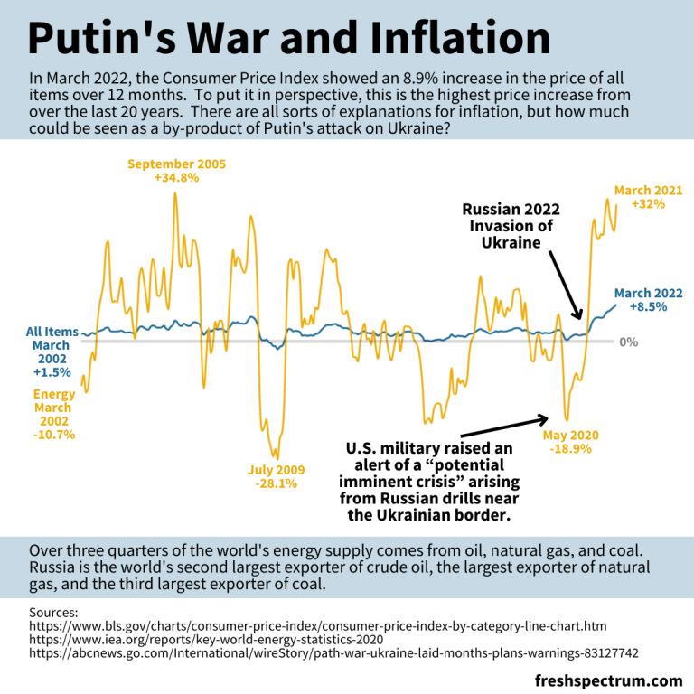
Inflation is in the news with rising prices across the globe.

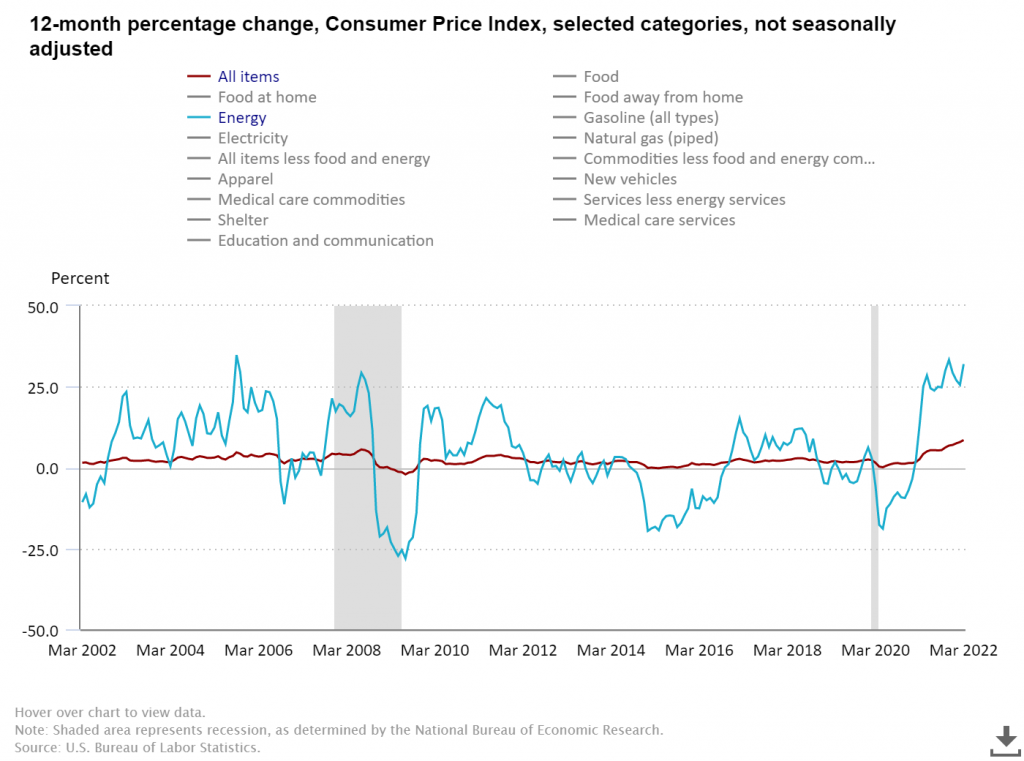
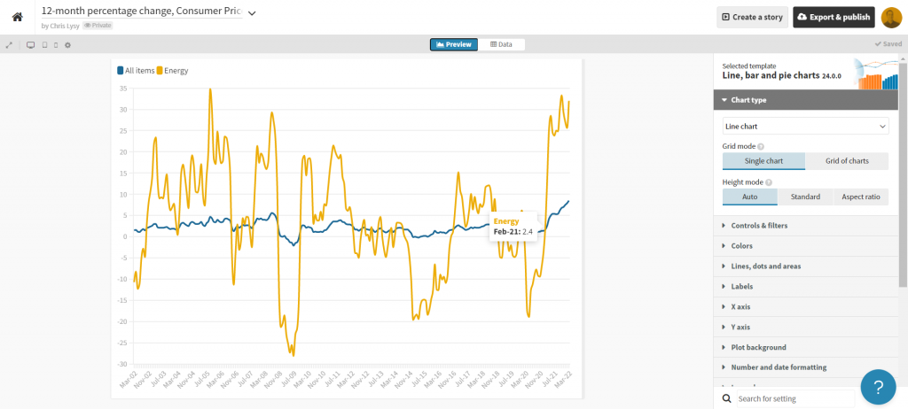
Here in the US we track this data through the Bureau of Labor Statistic’s Consumer Price Index. The most recent numbers that show pricing data through March of 2022 puts us at a 20 year high for prices across all items.

There is a longstanding connection between energy prices and everything else, and when you search the data you can see the correlation.

BLS chart showing CPI data.
12-month percentage change, Consumer Price Index, selected categories – Accessed, May 10, 2022

The argument I’m going to make in my infographic is that Russia’s expanded invasion of Ukraine sparked a rise in energy costs. And with the energy price’s rapid rise, all items have followed.

Total energy supply chart from IEA Key World Energy Statistics.
Key World Energy Statistics 2020 – IEA

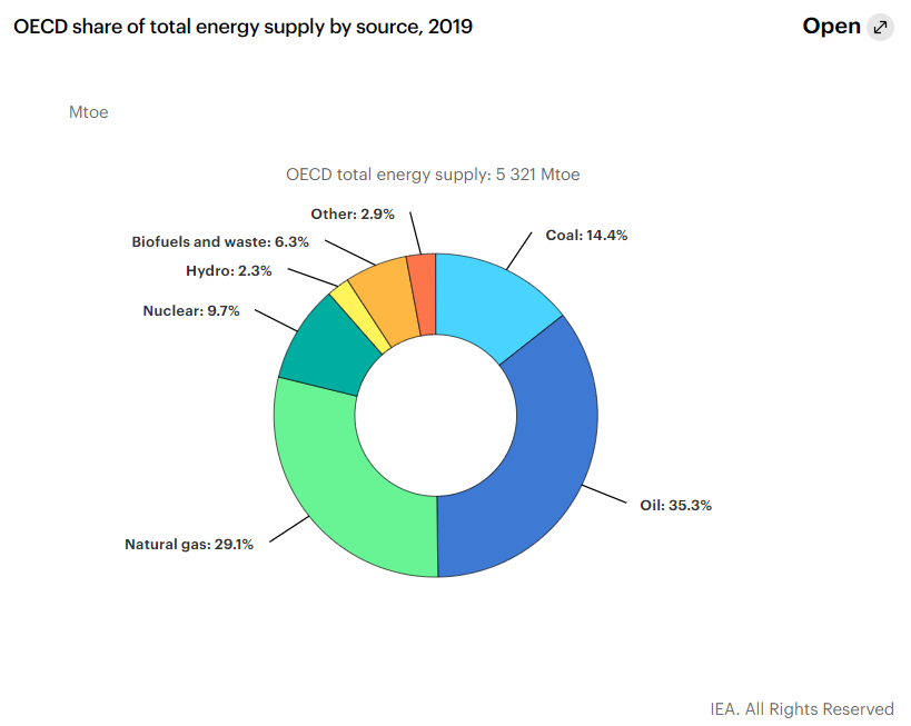
According to data from the international energy agency most of the world’s energy comes from three sources, oil, natural gas, and coal. Globally, Russia is the second largest exporter of crude oil, the biggest exporter of natural gas, and the third largest exporter of coal.

So as the war continues, and sanctions bring increased isolation of Russia from the global economy, energy prices continue their rise.

Creating a line graph using Flourish

For this infographic I’m going to redraw the Consumer Price Index line graph shared above using Flourish.

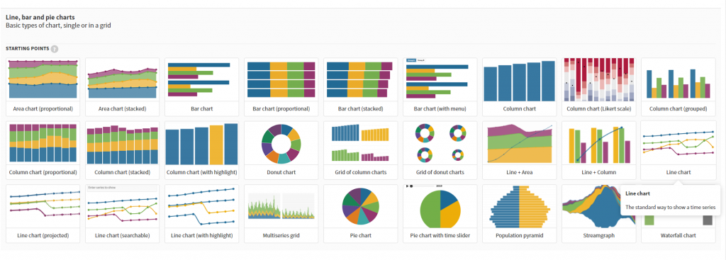
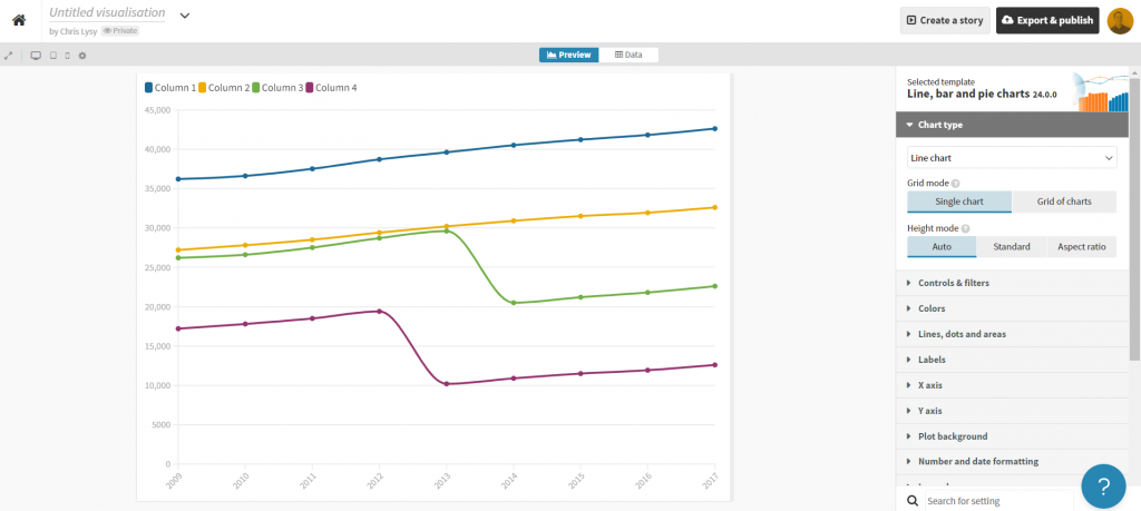
In Flourish, we’ll use the simple Line Chart starting point.

Every time you start a new visualization in Flourish, your first step is to choose a template starting point.

Flourish chart templates.

After selecting the template, Flourish will give us a chart with dummy data.

Flourish default line graph.

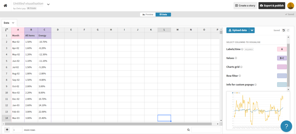
Click on the “Data” tab and you’ll see how the line graph data is structured.

Flourish default line graph data structure.

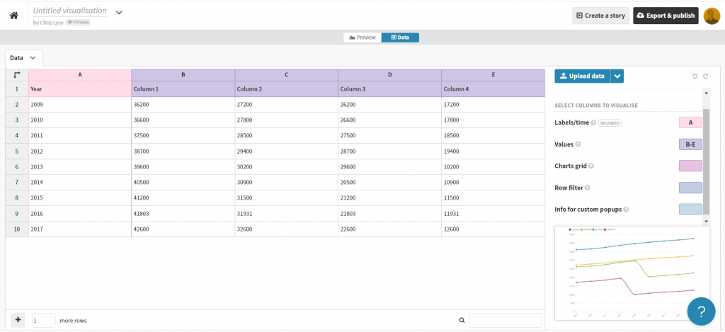
Depending on how your own data is structured, you might simply need to copy/paste. Unfortunately our data needs just a little cleaning.

Preparing our data in Excel for Flourish

So our BLS chart does come with a data table. But in its current format a simple copy/paste into Flourish won’t work. Sometimes you need to try a few things to get your data into the format you need.

BLS "show table" screenshot.

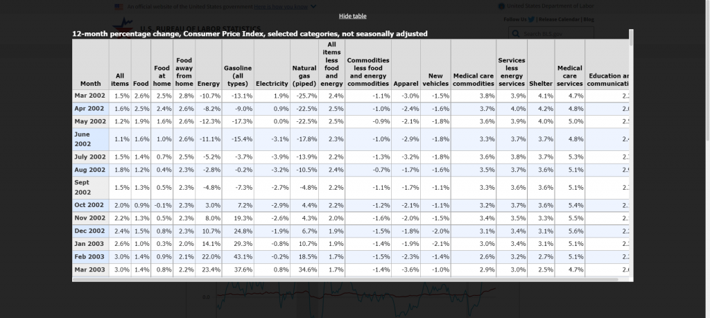
With this table I found I just needed to click on the “Show Table” button. Then use CTL “A” to highlight all the data on the page. Then I just pasted everything into an Excel worksheet.

Pasted data in Excel spreadsheet screenshot.

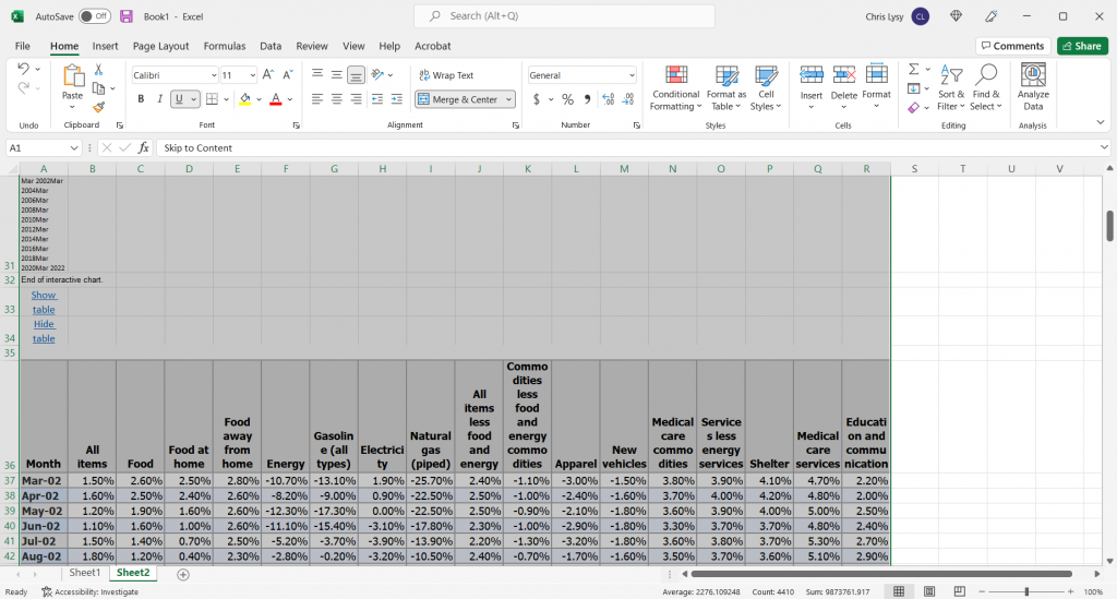
The copy action took more than just the table, so I just have to delete some rows and extraneous info. And since I really only want to plot two lines I cut the data down to just “All items” and “Energy.”

Cleaned Excel spreadsheet CPI data.

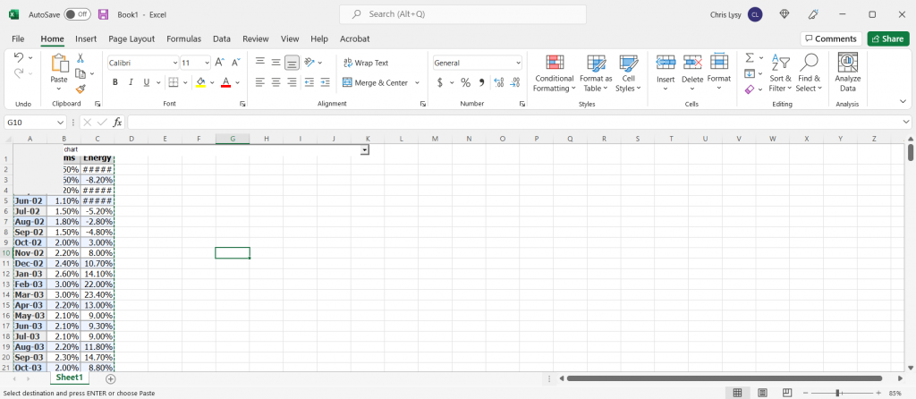
This isn’t a perfect worksheet, but that doesn’t matter. I just wanted to get the data to this point, where I can copy it and paste it right into Flourish.

Creating the line graph in Flourish

Our job now is to paste the data into Flourish, and delete any extraneous rows.

BLS data pasted into Flourish

That’s all I had to do to have a pretty solid starting line graph in Flourish. If my goal was to create an embeddable interactive line graph I might take some more time tweaking the style. But I want to turn this chart into an infographic.

Flourish line chart of BLS CPI data

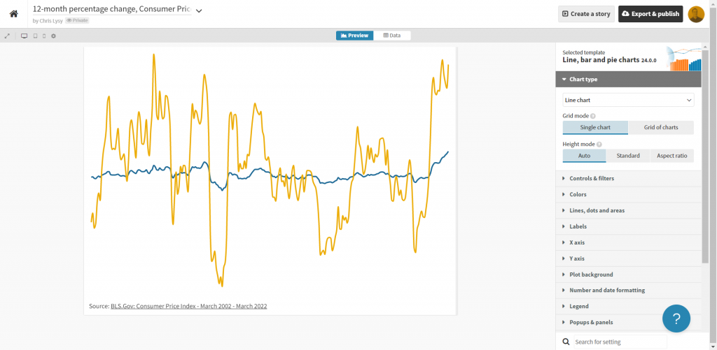
So instead of making the chart a self-contained finished product, I’m going to strip it down to the bare essentials. Then I’ll take it into Canva.

Clean Flourish chart ready to be opened in Canva.

Turning the Flourish line graph into an infographic using Canva

First thing is to choose the style of infographic I want to create in Canva. I decided just to create a square, so I used a blank Instagram post.

Yes, there is an infographic category in Canva, but I don’t really like the long image format.

Canva instagram post templates

Once I’m in the Canva design app, I’ll venture down to the “More” menu button on the bottom left of the page and find the “Flourish” app.

Canva Flourish App

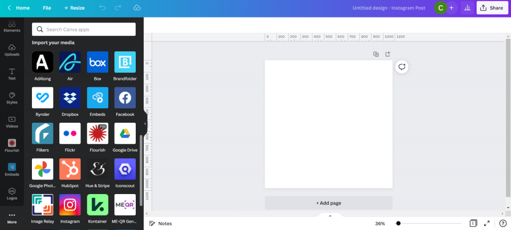
This let’s me import in visuals I created in Flourish.

Canva with Flourish line graph.

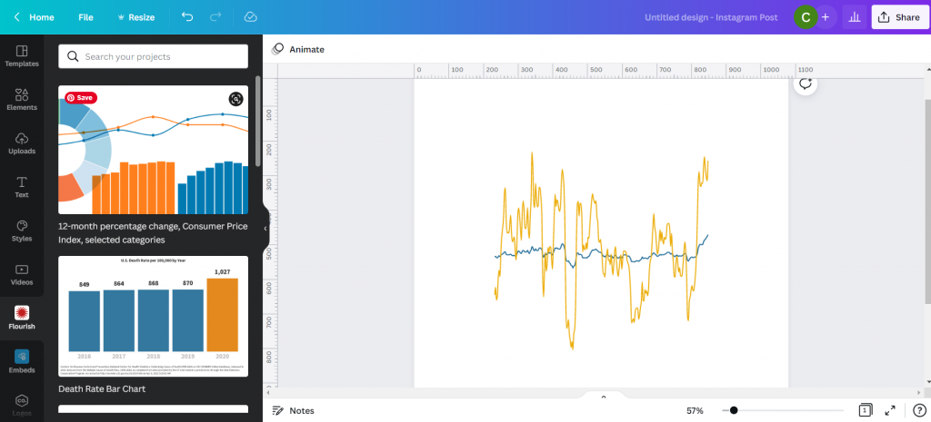
This isn’t simply an image right now, but an embedded interactive graph. I can adjust the size without distorting the visual right within Canva. I can also double click the box to interact with the visual, which lets me see individual data points.

Canva with Flourish line graph.

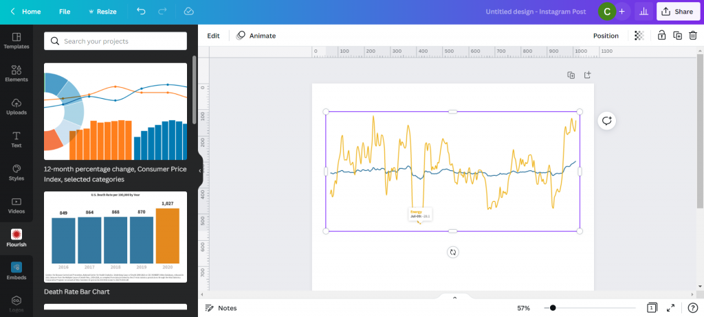
With my infographic style chart I’m not worried about showing the numbers for all the data. I just want to make sure I label the high point, low point, beginning, end, and any other spot that would be instrumental in telling my story.

I just the eyedropper in document colors to adjust the labels color to match each specific line (All items or Energy).

Canva showing eyedropper color finding tool.

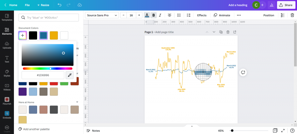
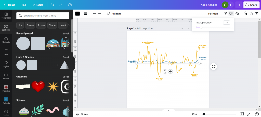
I also went ahead and dropped in a gray heavily transparent line to show where 0% would be in my line graph. I’m not worried about going any deeper because I’ll also share a link to the underlying data source.

Canva line graph labeled.

My next step will be to add annotations to tell the story. You’ll notice that I’m not really being super direct, more inferring the relationship. There is certainly a relationship between the war in Ukraine and the rise in inflation, and while it’s definitely not the only plausible explanation, there is enough of a connection to make for an interesting infographic.

Canva line graph labeled and annotated.

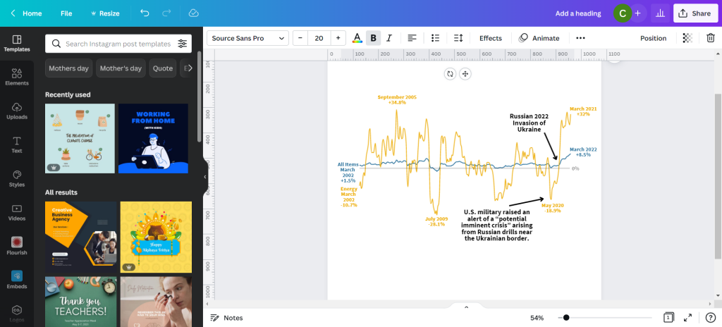
My next step is to just tell a little bit of the story and what we are looking at in the chart. Just because an infographic is a visual thing doesn’t mean we have to rely solely on the graph.

Canva infographic with narrative text.

Not sure if this is an improvement or not, but I ended a few square color blocks to create a little more separation. I think it makes the chart look a little like a widescreen movie and helps to draw your eyes.

Canva infographic with narrative text.

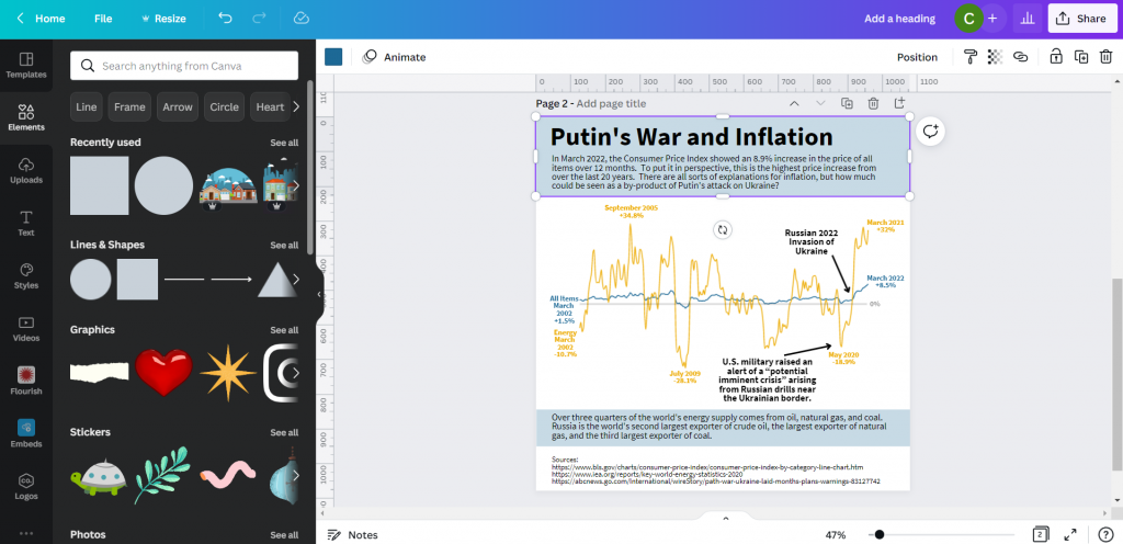
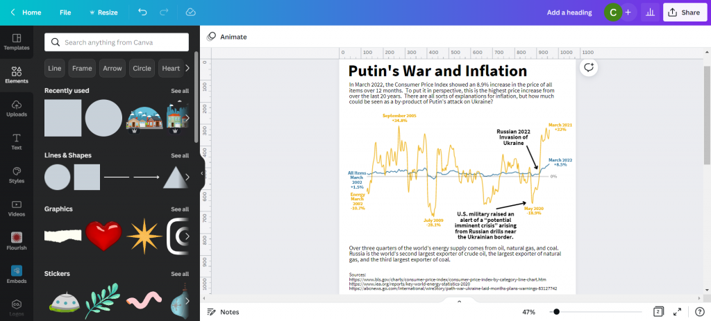
And here is my final infographic.

Canva and Flourish Infographic Line Graph on Putin's War and Inflation.

Written by cplysy · Categorized: freshspectrum

May 10 2022

Practical Systems Thinking: The Cynefin Framework

The Cynefin Framework is among the most widely used frameworks for understanding how systems are organized. It might be the most practical means of bringing systems thinking to life. A system, after all, is simply an organization of things within some constraint or boundary.

We rely on The Cynefin Framework (pronounced /kəˈnɛvɪn/ kuh-NEV-in) as a central platform in our training and consulting work for strategy, evaluation, and design. The reasons are many, but its utility is the most important of them.

What makes the Framework so useful is that people can relate to the stories we tell about systems using it. Perhaps the best story comes from the Framework’s founder and chief advocate, Dave Snowden in describing how to organize a children’s party using systems thinking*.

This video has been our most widely-referred source for teaching the fundamentals of systems thinking since it was first made.

The Framework has also been an inspiration informing the development of a centre for studying and intervening in complex systems based in Wales. It’s also developed into a burgeoning practice and learning community centred around the model.

The video below adds detail to help explain how the Cynefin Framework functions and where it came from.

We recommend reading Chris Corrigan’s excellent update on the Cynefin Framework. Chris has been one of the leading practitioners contributing to the thinking on the Framework’s use and development.

Using the Framework

Unlike many other Frameworks, Cynefin is useful throughout a project life cycle, not just at a particular stage.

In the beginning, we recommend using it to orient yourself to the situation you’re facing. What kind of problem situation do you find yourself in? What elements of the situation are complicated, complex, or simple? These questions aided by the Framework can help you identify key aspects of the system and complement systems mapping work.

As you move through the project, the Framework can help serve as a wayfinding tool. When you know where you are, it is easier to see where you are going. Social systems are dynamic, so while we may find ourselves in a quadrant at one stage, this can shift during the project or at particular moments.

The Framework can also be used as an evaluation tool by helping frame the questions you ask and the strategies that link your actions to your outcomes. By inquiring about the way your work and activities are organized within systems, we can ask better questions and assess real influence and possible impact.

We recommend starting any evaluation with the Cynefin Framework.

We also recommend using the framework as part of a strategic assessment approach to planning and sensemaking. The framework can help you to determine the role of evidence and practice — when to look for ‘best evidence‘, practice-based evidence, and innovative problem-solving options.

Moving Forward with Cynefin

We recommend using Cynefin Framework to anyone working in applied systems thinking, check it out. There is a global community of scholars, practitioners, and policy-makers who are working on advancing, testing, and documenting the use of it in practice. A recent book has been published that provides further examples and can be of use to anyone looking to get into Cynefin.

It’s worth the effort to explore – and we think you’ll agree.

* It is worth noting that our use of the term systems thinking is just that: thinking about systems and how they are organized and function. We recognize there are many different definitions and models of systems thinking including those used by Dave Snowden that may not fully subscribe to ours.

If you want help in applying lessons from the Cynefin Framework or building up your systems thinking capacity for action and strategy, reach out and let’s have a coffee meeting. We can help.

Image credit: Mitchell Luo on Unsplash; Snowded, CC BY-SA 3.0 https://creativecommons.org/licenses/by-sa/3.0, via Wikimedia Commons

The post Practical Systems Thinking: The Cynefin Framework appeared first on Cense Ltd. .

Written by cplysy · Categorized: cameronnorman

May 09 2022

Using Dashboards to Make a Family Trivia Event Even Better

Emily Ross recently finished her PhD in health services research and is now as a junior evaluation consultant at Ference & Company Consulting. She enrolled in our Dashboard Design course and is sharing how she used her new skills in her personal life. Thanks for sharing, Emily! –Ann

—

When COVID-19 pushed many events online, I decided to host a virtual Christmas trivia event for my family.

Participants answered questions over four different rounds in teams of three to six people. The rounds each had five questions and all questions were Christmas- or New Year-themed.

Before: Compiling the Data in a Spreadsheet

To support scorekeeping, teams had an individual score sheet where they wrote and marked their own answers.

I had a master score sheet that would automatically pull their scores together so all teams scores were combined into one page.

I’d then show this master score sheet via screen share at half-time and at the end of the event.

The master score sheet looked like this:

I had a master score sheet that would automatically pull their scores together so all teams scores were combined into one page. This is what it looked like.

While it brought all the scores into one place, it wasn’t very easy for my participants to quickly pull out the key information (i.e., how well their team was doing).

I decided to apply some of the lessons I learned in the Dashboard Design course to make the sheet more accessible.

After: My Trivia Night Dashboard

First, I had to decide what type of dashboard I wanted to make.

In the course, Ann provided a handy Dashboard Cheat Sheet that helped me see different options.

I decided because I had one time point and wanted to compare categories (i.e., teams) that bars would likely be best.

I also decided to convert the numerical scores into percentages because not all rounds had the same number of possible points. Percentages would be a more consistent indicator.

Now it was time to make the dashboard.

It was easy to follow along step by step with Ann’s stacked bar dashboard video tutorial.

I made the following dashboard using the Data Bars feature in Microsoft Excel:

This dashboard compares teams' trivia scores across each round as well as their total score.

What I Learned about Dashboards and Excel

Not only were the steps easy to follow, but I also learned about better dashboard and Excel practices.

These tips help make your life easier and your dashboards more editable and readable.

Some of my lessons learned include:

  • Always put a title, subtitle, and date on the dashboards.
  • If your text is in a colour, make it bold so it is easier to read.
  • Add a white border around cells to add white space.
  • Use cell styles and Theme Colours to make formatting more consistent and easier to edit (I somehow did not know about this in Excel even though I use it regularly in Word).
  • Give yourself a bit of time to do the final editing to make it sure fits on a page

With this dashboard, I found it much easier to see:

  • How well teams did in each round (e.g., team 6 struggled with Round 4, but excelled in Round 3).
  • How teams compared to each other.
  • How hard each round was (e.g., Round 2 was on average harder than Round 3).

Designing a Second Dashboard

Encouraged by my dashboard attempts, I decided to try one more dashboard.

I wanted to know within each round, which questions did teams get right and wrong.

This would help me identify which questions were too easy and which were too hard. It’s a fine balance to get when hosting trivia!

I thought about including it in the same dashboard above, but I then I watched one of Ann’s videos about the four types of dashboards.

This reminded me that it’s okay (and even better) to make different dashboards for different audiences.

I had to do a bit of data cleaning first. I ended up with a table that showed for each question in each round the percent of teams that got that question fully correct:

I made this dashboard to show the percent of teams that got a question correct, but I found it hard to identify any patterns or the take home message.

While it had the information that I needed, I found it hard to identify any patterns or the take home message.

I remembered that in the Dashboard Design course Ann had a video on how to compare categories using heatmaps. (Here’s a blog post tutorial you can read.)

I used the steps to create this:

This dashboard shows what percent of teams got each question correct by round.

What I Learned from My Second Dashboard

As with the first dashboard, there were some great tricks.

Essentially, if you’re doing something manually (like changing the text colour to white on the darker cells or individually colouring cells) there is almost always a better way! You can use Excel’s conditional formatting to automatically color-code background fills and/or font colors.

I found it much easier to identify patterns both within round and across rounds.

For example, teams generally had a harder time with questions in Round 2 than they did with Round 3 (there are more lighter cells).

Using this dashboard, I could easily pick out questions which were too hard and too easy.

Questions That Were Too Hard

Round 1 – Question 4: What is the name of this dish and where is it eaten on January 6? (Answer: Rosca de Reyes; Mexico)

Image of food dish Rosca de Reyes, traditionally eaten in Mexico.
Image source: Elizabethcasasola, CC BY-SA 4.0, via Wikimedia Commons

Round 2 – Question 2: What is the highest grossing Christmas movie (according to Wikipedia)?

Options: a. The Grinch b. Krampus c. The Polar Express d. Elf

(Answer: The Grinch)

Questions That Were Too Easy

Round 4 – Question 2: What fruit is a traditional stocking stuffer?

(Answer: Citrus fruit like an orange, mandarin, clementine)

Round 3 – Question 4: What performance is this song played in? (Bonus: Who is the composer?)

(Answer: The Nutcracker; Tchaikovsky)

(Sound clip source: Dance of the Sugar Plum Fairy Kevin MacLeod (incompetech.com)

Licensed under Creative Commons: By Attribution 3.0 License, via Wikimedia Commons)

I really enjoyed how approachable and practical the videos in this course were.

I can’t wait to continue to apply the tips and techniques I learned both at work and for fun!

Maybe at next year’s trivia I’ll have to test some of the dashboard designs for comparing change over time.

Connect with Emily

LinkedIn: https://www.linkedin.com/in/emilysross/

Written by cplysy · Categorized: depictdatastudio

May 04 2022

Using Decision Canvases

You might have noticed that the world seems to be awash in canvases these days. The canvas model owes much of its popularity to the work of Alex Osterwalder and Yves Pigneur and their Business Model Canvas.

A canvas is a form of system mapping that visualizes critical aspects of a system and organizes them. A canvas uses visual conventions like boxes and arrows to lay out key assumptions, resources, actors, and value claims.

Three examples of popular canvases include:

  1. Business Model Canvas
  2. Value Proposition Canvas
  3. Social Lean Canvas

Andi Roberts has pulled together a massive list of fifty different types of canvases that cover issues ranging from value chain analysis, ethics, and strategy, to project management and more.

Some popular canvases like the Business Model Canvas are even pre-loaded as templates in visual thinking tools like Miro and Mural.

There is even a tool called Canvasizer that can help you create your own personalized canvas.

But how do we use these in practice?

Canvas Application

Most of these canvases rely on a similar structure. The simple form of using 8-12 boxes organized in an essentially linear format. This is a strength and weakness of the approach. The reason? It reduces complexity and interdependence, favouring a simplified organizational approach.

The simplification makes it attractive to people and relatively easy to use. The difficulty is the risk of oversimplifying the situation and confusing the model with reality.

It is for both of these reasons that we use canvases with caution. Canvases can be helpful in the following circumstances:

  1. When a project team is unsure where to start. A canvas reduces complexity and can help people start getting things on the page. Just getting started can be an enormously powerful reason to use canvases. Too often, organizations pause because they do not know where to begin. This can nudge that process forward.
  2. When the research hasn’t been entirely done or organized while the need to move forward is high in its absence. Sometimes, there are holes in the research (what we know about a situation) and plotting key themes or issues on a canvas can help us to hypothesize more clearly what else we need, know, or ought to consider.
  3. In times when there isn’t a budget to support in-depth research and sense-making. Canvases can help us to anticipate what a situation has present and available. In the absence of data, we can imagine what might be needed. This isn’t faking data and should be used when research is used to guide, not to prove or validate.
  4. When the number of anticipated themes and key variables for consideration is relatively tiny. Massive systems with many variables don’t fit well, but in many situations, we are not dealing with large, massive, complicated systems — they are small and complex. There are a few key categories and for these, canvases can work well.
  5. When there’s coaching time available. Canvases shouldn’t be used for client work without sense-making and coaching. We see many people confuse the map and model with the landscape and reality.. Plotting out data on a canvas is relatively simple and can be done with little time. What takes time is making sense of what it means and how it can inform strategy. Designing a strategy from a canvas takes time, care, and attention. Doing this is where the value of a canvas comes in.

Canvases are useful. Find or create one, and you can focus your team on what’s most important, organize it, and help foster the kind of conversations needed to assess what to do and how we might do it in the future. Canvases are design tools, and if you consider their advantages and limitations, you can become a great organizational designer.

We use canvases and many other tools. If you want some help setting this up, applying it, or learning other tools and methods, let’s have a coffee and talk about your needs and how we can help.

The post Using Decision Canvases appeared first on Cense Ltd. .

Written by cplysy · Categorized: cameronnorman

May 04 2022

Using Canvases

You might have noticed that the world seems to be awash in canvases these days. The canvas model owes much of its popularity to the work of Alex Osterwalder and Yves Pigneur and their Business Model Canvas.

A canvas is a form of system mapping that visualizes critical aspects of a system and organizes them. A canvas uses visual conventions like boxes and arrows to lay out key assumptions, resources, actors, and value claims.

Three examples of popular canvases include:

  1. Business Model Canvas
  2. Value Proposition Canvas
  3. Social Lean Canvas

Andi Roberts has pulled together a massive list of fifty different types of canvases that cover issues ranging from value chain analysis, ethics, and strategy, to project management and more.

Some popular canvases like the Business Model Canvas are even pre-loaded as templates in visual thinking tools like Miro and Mural.

There is even a tool called Canvasizer that can help you create your own personalized canvas.

But how do we use these in practice?

Canvas Application

Most of these canvases rely on a similar structure. The simple form of using 8-12 boxes organized in an essentially linear format. This is a strength and weakness of the approach. The reason? It reduces complexity and interdependence, favouring a simplified organizational approach.

The simplification makes it attractive to people and relatively easy to use. The difficulty is the risk of oversimplifying the situation and confusing the model with reality.

It is for both of these reasons that we use canvases with caution. Canvases can be helpful in the following circumstances:

  1. When a project team is unsure where to start. A canvas reduces complexity and can help people start getting things on the page. Just getting started can be an enormously powerful reason to use canvases. Too often, organizations pause because they do not know where to begin. This can nudge that process forward.
  2. When the research hasn’t been entirely done or organized while the need to move forward is high in its absence. Sometimes, there are holes in the research (what we know about a situation) and plotting key themes or issues on a canvas can help us to hypothesize more clearly what else we need, know, or ought to consider.
  3. In times when there isn’t a budget to support in-depth research and sense-making. Canvases can help us to anticipate what a situation has present and available. In the absence of data, we can imagine what might be needed. This isn’t faking data and should be used when research is used to guide, not to prove or validate.
  4. When the number of anticipated themes and key variables for consideration is relatively tiny. Massive systems with many variables don’t fit well, but in many situations, we are not dealing with large, massive, complicated systems — they are small and complex. There are a few key categories and for these, canvases can work well.
  5. When there’s coaching time available. Canvases shouldn’t be used for client work without sense-making and coaching. We see many people confuse the map and model with the landscape and reality.. Plotting out data on a canvas is relatively simple and can be done with little time. What takes time is making sense of what it means and how it can inform strategy. Designing a strategy from a canvas takes time, care, and attention. Doing this is where the value of a canvas comes in.

Canvases are useful. Find or create one, and you can focus your team on what’s most important, organize it, and help foster the kind of conversations needed to assess what to do and how we might do it in the future. Canvases are design tools, and if you consider their advantages and limitations, you can become a great organizational designer.

We use canvases and many other tools. If you want some help setting this up, applying it, or learning other tools and methods, let’s have a coffee and talk about your needs and how we can help.

The post Using Canvases appeared first on Cense Ltd. .

Written by cplysy · Categorized: cameronnorman

  • « Go to Previous Page
  • Go to page 1
  • Interim pages omitted …
  • Go to page 128
  • Go to page 129
  • Go to page 130
  • Go to page 131
  • Go to page 132
  • Interim pages omitted …
  • Go to page 304
  • Go to Next Page »

Footer

Follow our Work

The easiest way to stay connected to our work is to join our newsletter. You’ll get updates on projects, learn about new events, and hear stories from those evaluators whom the field continues to actively exclude and erase.

Get Updates

Want to take further action or join a pod? Click here to learn more.

Copyright © 2026 · The May 13 Group · Log in

en English
af Afrikaanssq Shqipam አማርኛar العربيةhy Հայերենaz Azərbaycan dilieu Euskarabe Беларуская моваbn বাংলাbs Bosanskibg Българскиca Catalàceb Cebuanony Chichewazh-CN 简体中文zh-TW 繁體中文co Corsuhr Hrvatskics Čeština‎da Dansknl Nederlandsen Englisheo Esperantoet Eestitl Filipinofi Suomifr Françaisfy Fryskgl Galegoka ქართულიde Deutschel Ελληνικάgu ગુજરાતીht Kreyol ayisyenha Harshen Hausahaw Ōlelo Hawaiʻiiw עִבְרִיתhi हिन्दीhmn Hmonghu Magyaris Íslenskaig Igboid Bahasa Indonesiaga Gaeilgeit Italianoja 日本語jw Basa Jawakn ಕನ್ನಡkk Қазақ тіліkm ភាសាខ្មែរko 한국어ku كوردی‎ky Кыргызчаlo ພາສາລາວla Latinlv Latviešu valodalt Lietuvių kalbalb Lëtzebuergeschmk Македонски јазикmg Malagasyms Bahasa Melayuml മലയാളംmt Maltesemi Te Reo Māorimr मराठीmn Монголmy ဗမာစာne नेपालीno Norsk bokmålps پښتوfa فارسیpl Polskipt Portuguêspa ਪੰਜਾਬੀro Românăru Русскийsm Samoangd Gàidhligsr Српски језикst Sesothosn Shonasd سنڌيsi සිංහලsk Slovenčinasl Slovenščinaso Afsoomaalies Españolsu Basa Sundasw Kiswahilisv Svenskatg Тоҷикӣta தமிழ்te తెలుగుth ไทยtr Türkçeuk Українськаur اردوuz O‘zbekchavi Tiếng Việtcy Cymraegxh isiXhosayi יידישyo Yorùbázu Zulu