• Skip to main content
  • Skip to footer
  • Home

The May 13 Group

the next day for evaluation

  • Get Involved
  • Our Work
  • About Us
You are here: Home / Archives for cplysy

cplysy

Oct 18 2021

Geological Context of Climate Change: Implications for Public Understanding and Museum Relevance

By: Emlyn Koster

With climate change and extreme weather frequently in the news and in light of the upcoming UN COP26 Conference, Emlyn taps his geological insights to point out what is often missing from society’s knowledge and which therefore warrants the museum sector’s urgent attention.

Prehistoric Climate Changes

Growing up in the UK where chatting about variable weather is a pastime, I was fascinated to learn about the alternating climates of glacial advance and interglacial retreat stages that occurred during an Ice Age from about 2.5 million years ago to about 12,000 years ago. Whether the UK’s temperate climate is part of an ongoing interglacial stage or in the aftermath of the Ice Age is, as I also learned, unknowable. It is however clear that over the tens, hundreds and thousands of millions of years in Earth history, not only has climate continuously changed, including with other ice ages, but so have the positions of, and ecosystems on, each continent. Homo sapiens are but a blink in the geological eye!     

‘The Great Acceleration’ and the ‘Anthropocene’

When I was born in 1950 the human population of 2.5 billion was a third of today’s 7.9 billion and the astronomer Fred Hoyle of Big Bang fame had just anticipated that the first photography of the Earth from space would transform perspectives about human history. How right he would turn out to be!

Cover page of the 2017 National Geographic supplement on climate change. Features a large image of the earth, with the words "National Geographic" above the earth and "7 Things You Need to Know About Climate Change Now" underneath.

In 1953 the leading climatologist Helmut Landsberg noted in Scientific American: “The big question on Earth is the influence of human activity on the atmosphere. There is some evidence that industrial life has increased the amount of carbon dioxide in the air…”. It would take almost half a century to amass and publicize evidence for human-caused climate change. However, it was only within two decades of Hoyle’s prediction that NASA’s Apollo missions enabled the first color photos of the Earth from space: these revealed the beauty—but also the potential fragility—of our wafer-thin atmosphere. In 2006, the acclaimed film ‘An Inconvenient Truth’ by the former US vice president Al Gore warned of dire consequences from global warming. In 2017, National Geographic issued a supplement with these summary points: “The world is warming… It’s because of us… We’re sure… Ice is melting fast… Weather is getting intense… Wildlife is already hurting… We can do something about it”.

With preliminary versions in 2004 and 2010, in 2015 the Future Earth network affirmed that ‘The Great Acceleration’ of 12 Earth System trends and 12 socio-economic trends began in the mid-20th century: “Human activity, principally the global economic system, is now the prime driver of change in the Earth System—the sum of our planet’s interacting physical, chemical, biological and human processes”. In turn, The Great Acceleration paved the way for the ‘Anthropocene’ which was proposed in 2002 by Nobel laureate Paul Crutzen as a guide to society. The International Science Council recently stated: “For the first time in a relationship spanning 300,000 years, instead of the planet shaping humans, humans are shaping the planet”. I describe the Anthropocene as a much-needed recognition that humanity, the world’s dominant species, has extensively detached itself in a geological nanosecond from the natural state of the Earth System (see Emlyn Koster, 2020. Anthropocene: transdisciplinary shorthand for human disruption of the Earth System. Geoscience Canada, 47:1-2, 59-64).

Climate Change and Extreme Weather

Graph entitled "The world has been getting warmer" that shows the annual mean land temperature above or below average (celcius) between 1800-2000. The graph shows a dramatic rise in annual mean land temperature after about 1950.

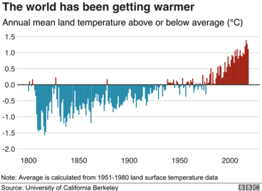
The UN Framework Convention on Climate Change in 2015, known as the Paris Agreement, catapulted anthropogenic warming of the atmosphere into a global anxiety. The tipping point to a perilous future, widely stated as a maximum further increase of just 1.5°C (2.7°F) by 2030, frames many profound challenges. Here are three examples. The first surrounds society grasping the massive difference between a seemingly tiny increase in average global temperature over many decades versus local daily and seasonal variations commonly 5-10 times this amount. The second is that a focus on temperature obscures the consequences of sea-level rise in planning for the future of coastal cities (see here, here, and here for examples). The third concerns communities, often poor ones, on deltas and islands where occupation is already or soon will be unfeasible, thereby creating a situation of climate refugees.

What began as the greenhouse effect, the labels for climate change have evolved―global warming, climate crisis, climate emergency, and climate justice. In my geological view, each of these has interpretative limitations. Change?: which direction and how fast? Warming?: what about wetter, stormier and drier trends? Crisis?: should the concern be upgraded to existential, meaning anxiety over the future of human existence? Emergency?: do unforeseen circumstances warrant an immediate response? Justice?: does a moral violation needs a new public policy focus? Today’s talk about climate change uses success-sounding adjectives such as addressing, combatting, fighting and overcoming. But resilience and sustainability are only buzzwords if the reality of many irreversible adverse trends is not confronted. At a recent Youth4Climate summit in Italy, Sweden’s Greta Thunberg again described the efforts of world leaders as too little and too late.

Atmospheric warming is an imperceptibly slow whole-planet process whereas record-breaking weather involves sudden local phenomena. The following examples remind us that headline-making events often lack ultimately more vital wide-angle contexts:

  • Superstorm Sandy in October 2012, mostly of sub-hurricane strength, caused an overnight 14-foot surge in New York Harbor and left $70 billion of damage. As restoration proceeded, an opportunity was missed to make known that irreversible sea-level rise by 2100 AD is estimated to be as much as 5 feet which will radically alter shorelines and where people can live and work.
  • NOAA rated the snowfall and power cut in Dallas last February as the nation’s costliest winter storm. Dalhart, 440 miles NW of Dallas, received the most snow with 8 inches. It would have been pertinent for the public to also know that Houston had 20 inches on Valentine’s Day in 1895 which was the Texas record until a 26-inch fall near Dallas on December 20-21, 1929.
  • Last summer’s drought-caused, record-breaking wildfires in California coincided with New York City’s near-normal monthly temperature averages but these were jolted by two record-breaking one-day (and also record-breaking one-hour) rainfalls: 4.45 inches (1.94 inches) from Tropical storm Henri on August 22 and 8.8 inches (3.1 inches) from Hurricane Ida on September 1.  

The Earth System

While dangerous weather grabs public attention, climate change in relation to other major changes in the Earth System is often missing from news coverage. For example, the Earth’s biosphere also functions as a virosphere in which pandemic diseases are exacerbated by climatic change. The American Journal of Managed Care recently stated: “All the negative health outcomes associated with increased heat, pollution exposure, and natural disasters call into question whether existing infrastructure—and particularly health care systems—will be equipped to handle the rising demand for care”. Other consequences of Earth System disruptions include a stunning loss of natural biodiversity and a prediction that about half of the world’s people will likely suffer from water insecurity by 2050.

I wish that, starting in the late 20th century, formal education had included the Earth System as a core subject to equip society to ecologically grasp the interconnectedness and susceptibility of the planet’s controlling forces.

Museum Sector Response

My first career stage as a geologist, and starting a decade ago also as an advocate for the Anthropocene, led to past-present-future links being a frame of reference in my second career stage as a museologist. At the Ontario Science Centre where I was preceded as its director by the renowned J. Tuzo Wilson of seafloor spreading and plate tectonics fame, this institution partnered with the Canadian Institute for Advanced Research in 1996 to convene ‘The Earth System: Geology Lessons for Our Future’ as a pioneering international conference in the public eye.

Museum literature on climate change has been relatively light. In 2015, Fiona Cameron and Brett Neilson co-edited ‘Climate Change and Museum Futures’ and in 2017, Jennifer Newell, Libby Robin and Kirsten Wehner co-edited ‘Curating the Future: Museums, Communities and Climate Change’: Australia deserves a shoutout for these initiatives. In the US, the Journal of Museum Education in March 2020 focused on ‘The Climate is Changing: Why Aren’t Museums?’ and AAM’s Exhibition journal in spring 2021 asked ‘Can Exhibitions Save the Planet?: Tackling Climate Change and Environmental Threats’. A recent issue of Museum & Society, published by the University of Leicester, included a review on Anthropocene-focused exhibitions. Noting that all but nine of the 41 it discovered were/are in art museums, the Danish authors remarked: “… most exhibitions appear to deliberately exclude significant controversies about the Anthropocene and the predicament of the world from their arenas for reflection”. A new international development is The Anthropocene Project based in Toronto.

Last spring, I contributed to the ‘Crisis and Resilience’ issue of AAM’s Exhibition journal with an article advocating for a paradigm shift to illuminate humanity’s pervasive impacts on the Earth System. In this month’s thematic issue of the Informal Learning Review about what the museum sector has learned from the pandemic, my focus is on the continued sidelining of external relevance. In particular, I am concerned that the far-reaching challenges of climate change are understated due to a scarcity of wide-lens and long-view perspectives. I therefore fervently hope that the museum sector responds to the inevitable clarion calls when the UN COP26 Climate Change Conference convenes from October 31 to November 12, 2021 in Glasgow, Scotland.

About the Author

Emlyn Koster, PhD integrates the vantage points of geology, humanism and museology for a holistic past-present-future, nature-and-culture lens. During CEO appointments at the Royal Tyrrell Museum of Paleontology, Ontario Science Centre, Liberty Science Center with The New York Times and Wall Street Journal profiling his philosophy, and the NC Museum of Natural Sciences, he was 50th anniversary board chair of the Geological Association of Canada, a member of the Committee for the Public Understanding of Science for the AAAS, and the inaugural chair of ICOM’s Anthropocene Working Group. His presentation to the UN Framework Convention on Climate Change contributed to the addition of museums as a public education agency in Article 12 of the Paris Agreement and he is involved in UNESCO’s new Language of the Anthropocene project. He welcomes comments and inquiries at koster.emlyn@gmail.com. You can read his previous blog posts for RK&A here.

The post Geological Context of Climate Change: Implications for Public Understanding and Museum Relevance appeared first on RK&A.

Written by cplysy · Categorized: rka

Oct 15 2021

Decision Making Model for Nonprofits

Written by cplysy · Categorized: connectingevidence

Oct 13 2021

Ask Nicole: Prepping for Your Consultant/Partner Discovery Call

Have a question you’d like to be featured? Let me know. After searching the internet, asking your networks for referrals, and scouring social media, you’ve finally found someone or a team that you can see your organization working with. Checking out their website, social media presence, and testimonials is the first step. The next step […]

The post Ask Nicole: Prepping for Your Consultant/Partner Discovery Call appeared first on Nicole Clark Consulting.

Written by cplysy · Categorized: nicoleclark

Oct 12 2021

Data Dictionary: the what, why and how


Technological advances have resulted in the collection of large amounts of data and the availability of data continues to skyrocket. To give you a perspective, more data has been collected in the past two years (2019 & 2020) than the entire human history before that.

This post isn’t about big data – we know there are more than enough articles about big data out there. Here, we’ll focus on how evaluators can (and should) clarify details about the data being used for evaluation. In other words, how and why build an evaluation-specific data dictionary.


What is a Data Dictionary?

Definitions of “data dictionary” vary but it is generally understood to be a common language for quantitative data. Data dictionaries provide a precise vocabulary for specific data elements and help to standardize a dataset and ensure that the relevance, and quality of data elements, are the same for all users. Data dictionaries describe the meaning and purpose of data elements within the context of a project and provide guidance on interpretation.

Why Use a Data Dictionary?

It is ideal to have a data dictionary whenever you have quantitative data that will be used and shared by multiple people or groups. Without precise definitions, it is very easy to arrive at different results while using the same dataset. Confusions can be avoided by documenting data definitions and parameters and sharing them with all stakeholders.

Although creating a data dictionary is time-consuming, having precise documentation that can be used by all stakeholders promotes efficiency. Look at the following example for an online health education program:

  • The program team defines the “number of program participants per week” as the total number of participants that completed the online module per week.

  • The IT team defines the “number of program participants per week” as the total number of participants that accessed the online module per week.

As evaluators, if we didn’t examine the definition of “number of program participants per week” meant, we might draw some incorrect conclusions, and risk making unreliable or even dangerous recommendations.

A data dictionary that is prepared collaboratively between the evaluator and stakeholders can prevent confusion and promote alignment. In short, data dictionaries can:

  • Provide consistency in the collection and use of data across multiple users;

  • Make data analysis easier;

  • Promote usability of data; and

  • Increase confidence in the data, results, and decisions.

How to Prepare a Data Dictionary

Before embarking on the task of creating a data dictionary, ask the program team if there’s an existing data dictionary for the dataset. It is a common practice to share a dataset with the data dictionary if there is one. However, the project team/client might not think to share the data dictionary with you. If there is a common, vetted, and documented data dictionary, it may not be necessary to create a new one.  

 The built-in active data dictionary can be used in most data management systems including MS Access and SPSS to generate documents as needed. Below is an image of a simple SPSS codebook output.  

Image Source: https://libguides.library.kent.edu/SPSS/Codebooks

Image Source: https://libguides.library.kent.edu/SPSS/Codebooks

Alternatively, if your data set is in MS Excel, you can use MS Excel or Word for documentation. Creating and managing a data dictionary is an iterative process; the definitions for the data dictionary categories and the relationships need to be revised regularly. Often data dictionaries in program evaluation contain the following:  

  • A list of data objects: names, metrics (measurement units) and definitions; 

  • Inclusion and exclusion criteria: specify cases to be included or excluded; 

  • Data Source(s): specify the source of data;  

  • Data Update: state how frequently the data is updated and available (e.g., weekly, monthly, annually);  

  • Limitations: specify any considerations that would impact the use of the indicator (can comment on reliability and validity of the data and include any other detail); 

  • Missing data: state if there are any missing values and how they were handled;  

  • Technical notes: provide technical details which help interpret the data presented; and 

  • Approval and sign-off: a data dictionary should be created collaboratively with approval from all those that will use the dictionary. After revisions and edits, and it should be signed off by the team leads to finalize the document.   

Screen Shot 2021-10-12 at 3.02.26 PM.png

In summary, a data dictionary is a great evaluation tool for projects with quantitative data. A data dictionary is time-consuming to prepare; however, it can promote efficiency and accuracy in the long run. Try building one for your next evaluation project.

While you’re creating definitions, check out our Performance Measures Definitions template.  


Sign up for our newsletter

We’ll let you know about our new content, and curate the best new evaluation resources from around the web!


We respect your privacy.

Thank you!


Written by cplysy · Categorized: evalacademy

Oct 12 2021

Dashboards for 10-Year-Olds: Connecting Data to Students’ Lived Experience

Bob Coulter is the director of the Litzsinger Road Ecology Center, a 38-acre field site in suburban St. Louis. He’s also a Depict Data Studio student and when he shared his work in our graduation ceremony, I knew it needed to be showcased. Keep up the great work Bob! – Ann

__________________________

For the past few months, I’ve been developing dashboards to support students’ understanding of local ecology and equip them to use that local understanding as a baseline to explore the rest of the world.

Imagine, for example, being a 10-year-old in St. Louis.

Your neighborhood has plenty of trees since you’re at the western edge of the forests typical of the eastern US. This can only happen because the temperature is warm enough and there is enough precipitation to support tree growth.

Heading west from here the ecology shifts pretty quickly to grasslands, with the grass getting shorter as you approach the Rocky Mountains. A quick look at the data shows decreasing levels of precipitation as you head west.

For a more extreme contrast, Yuma, Arizona is much hotter, but the area gets about 10% of the precipitation St. Louis does. How is this heat and lack of precipitation reflected in the plants and animals in southern Arizona?

All of this learning is wrapped under the heading “What’s It Like Where You Live?” – a program I used as a 4th grade teacher 25 years ago, developed by the Missouri Botanical Garden and now undergoing a major reworking.

As we flesh out the curriculum, we’ll be supporting kids’ local field work with dashboards synthesizing climate data and images of plants and animals typically found in different ecoregions.

First Forays

At a basic level, students can compare temperature and precipitation data for their local community with data for other cities around the world. Is it warmer or cooler, wetter or drier?

A simple table or a scatter plot serves the purpose quite well. The limit in this approach is the image students often develop when data from one city represents “the desert” or “the rainforest.”

At a basic level, students can compare temperature and precipitation data for their local community with data for other cities around the world.

Resolving this conundrum has opened the door to some exploratory work crafting dashboards which encompass both similarities and variation within an ecoregion. (Mostly I’ve just been geeking out with the data, but “exploratory research and development” sounds so much better!)

Refinements

Taking the data visualizations further has pushed me to walk a fine line between interesting visualizations and the developmental capacities pre-teen students bring to the task.

Most kids have limited experience with data tables and graphs, and what work they have done is pretty specific (such as graphing pizza preferences among class members).

Graphs showing means (or even means of means) risks becoming too abstract without the right supports.

After exploring a few options, I settled on a representation which captured both the spread of data typical of cities in a given ecoregion and the mean value of these cities.

After exploring a few options, I settled on a representation which captured both the spread of data typical of cities in a given ecoregion and the mean value of these cities.

Major thanks are due here to Ann Emery for streamlining the look and feel of this version. Her focused, uncluttered design aesthetic is a perfect match for this work.

Major thanks are due here to Ann Emery for streamlining the look and feel of this version. Her focused, uncluttered design aesthetic is a perfect match for this work.

I’ve tested this out with a few kids with good results, but COVID restrictions have kept me from seeing how a broader pool of students make sense of this display. I’m hopeful that restrictions will be lifted in the new school year so we can move forward with some pilot testing.

Going Further

To be sure students remain connected to their local base, I needed an anchor which is ideally movable so that students in other areas can use the materials.  For this, I’m indebted to Jon Schwabish of the Urban Institute and PolicyViz.

While participating in a workshop he led, a couple of techniques we were using came together. By combining a single point scatter plot and error bars, a reference line can be inserted to mark local conditions.

If this strategy proves useful in our pilot testing, I expect that we will be able to support localization so that students anywhere could enter their own data and have VLOOKUP or a similar procedure to change my St. Louis reference line to one appropriate for any student’s home city.

The work so far has been an enjoyable way to explore data and apply the many things I’ve learned in Ann’s workshops and elsewhere. I’m looking forward to seeing how students use the data when we begin pilot testing. 

Written by cplysy · Categorized: depictdatastudio

  • « Go to Previous Page
  • Go to page 1
  • Interim pages omitted …
  • Go to page 158
  • Go to page 159
  • Go to page 160
  • Go to page 161
  • Go to page 162
  • Interim pages omitted …
  • Go to page 304
  • Go to Next Page »

Footer

Follow our Work

The easiest way to stay connected to our work is to join our newsletter. You’ll get updates on projects, learn about new events, and hear stories from those evaluators whom the field continues to actively exclude and erase.

Get Updates

Want to take further action or join a pod? Click here to learn more.

Copyright © 2026 · The May 13 Group · Log in

en English
af Afrikaanssq Shqipam አማርኛar العربيةhy Հայերենaz Azərbaycan dilieu Euskarabe Беларуская моваbn বাংলাbs Bosanskibg Българскиca Catalàceb Cebuanony Chichewazh-CN 简体中文zh-TW 繁體中文co Corsuhr Hrvatskics Čeština‎da Dansknl Nederlandsen Englisheo Esperantoet Eestitl Filipinofi Suomifr Françaisfy Fryskgl Galegoka ქართულიde Deutschel Ελληνικάgu ગુજરાતીht Kreyol ayisyenha Harshen Hausahaw Ōlelo Hawaiʻiiw עִבְרִיתhi हिन्दीhmn Hmonghu Magyaris Íslenskaig Igboid Bahasa Indonesiaga Gaeilgeit Italianoja 日本語jw Basa Jawakn ಕನ್ನಡkk Қазақ тіліkm ភាសាខ្មែរko 한국어ku كوردی‎ky Кыргызчаlo ພາສາລາວla Latinlv Latviešu valodalt Lietuvių kalbalb Lëtzebuergeschmk Македонски јазикmg Malagasyms Bahasa Melayuml മലയാളംmt Maltesemi Te Reo Māorimr मराठीmn Монголmy ဗမာစာne नेपालीno Norsk bokmålps پښتوfa فارسیpl Polskipt Portuguêspa ਪੰਜਾਬੀro Românăru Русскийsm Samoangd Gàidhligsr Српски језикst Sesothosn Shonasd سنڌيsi සිංහලsk Slovenčinasl Slovenščinaso Afsoomaalies Españolsu Basa Sundasw Kiswahilisv Svenskatg Тоҷикӣta தமிழ்te తెలుగుth ไทยtr Türkçeuk Українськаur اردوuz O‘zbekchavi Tiếng Việtcy Cymraegxh isiXhosayi יידישyo Yorùbázu Zulu