• Skip to main content
  • Skip to footer
  • Home

The May 13 Group

the next day for evaluation

  • Get Involved
  • Our Work
  • About Us
You are here: Home / Archives for cplysy

cplysy

Oct 12 2021

Slide Style Infographics – 4 Takeaways [and a free-to-watch workshop session]

Have you ever created an infographic?

No? Why not? Infographics can be a fun way to deliver information to different audiences. They can also be really easy to put together.

Yes? Which type? There are all sorts of different infographic styles and formats.

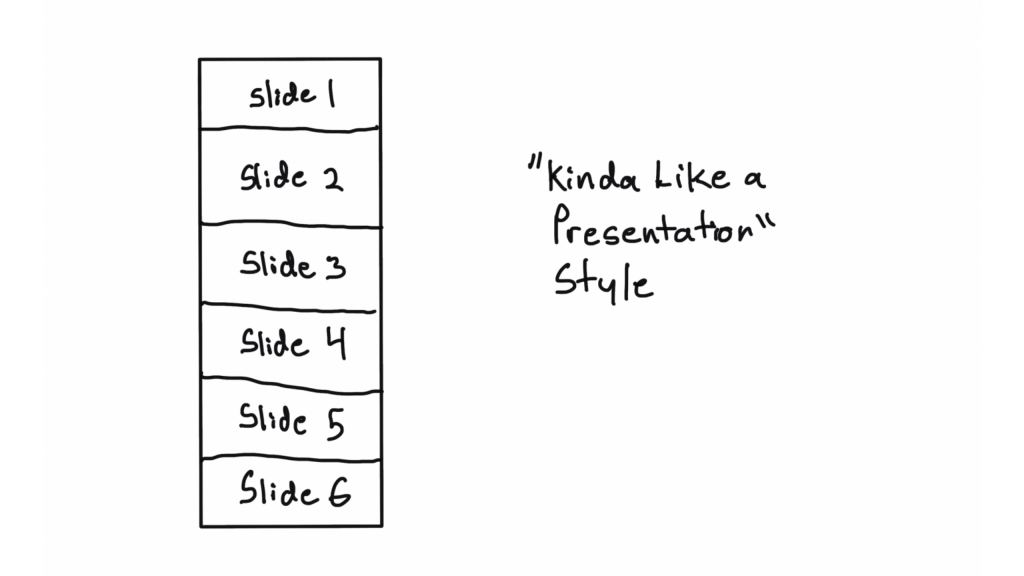
Today’s post features highlights from one of my pro workshop sessions. During the 33 minute session we walked through the design process for a particular kind of infographic that I call slide style.

  • If you read through this post, I’ll get right to the takeaway points.
  • But I also opened up this particular session recording because I hope it will give you a better idea of how these workshops are structured.
  • To access the session recording, you can find it free-to-watch by clicking this link.
Free-to-Watch Workshop Recording. Slide Style Infographics. Featured Image.
Click here for a free-to-watch version of this session.

Don’t want to watch?

That’s okay, you’ll get the gist by scrolling through this post.

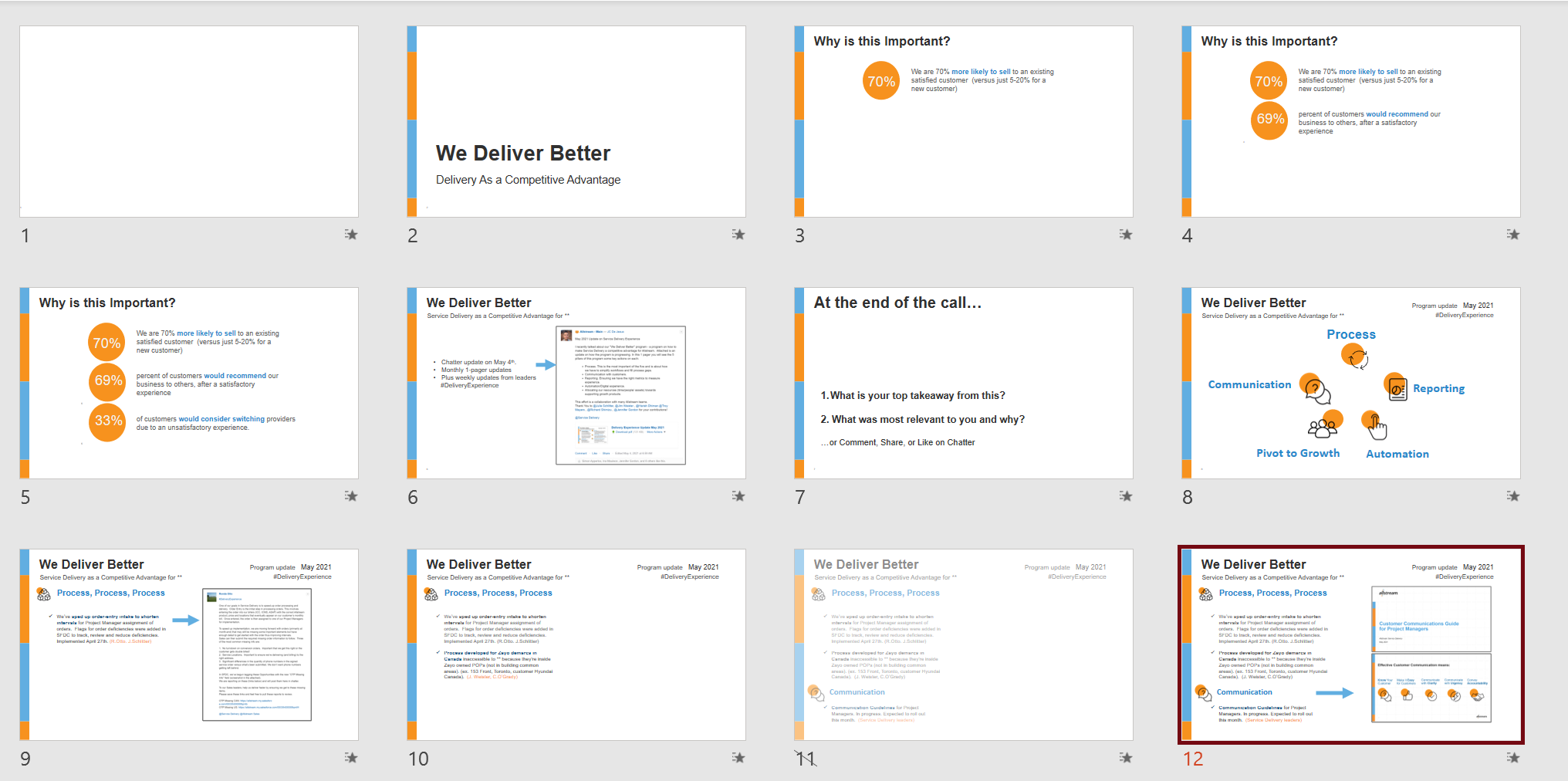
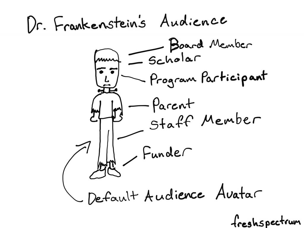
Takeaway #1 An infographic is an audience connection device. Not a report replacement.

Illustrated Image. "Every audience member is different."

One of the biggest mistakes I see a lot is when an organization tries to reach all of their audiences with one report.

People complain, asking for something more visual. So the organization responds by making one infographic. [Facepalm]

Yes, your report was probably super boring. But it likely also was built for either a non existent audience (something I refer to as Dr. Frankenstein’s Audience) or a very specific audience that does not include the person complaining.

Stop trying to serve everyone with one report.

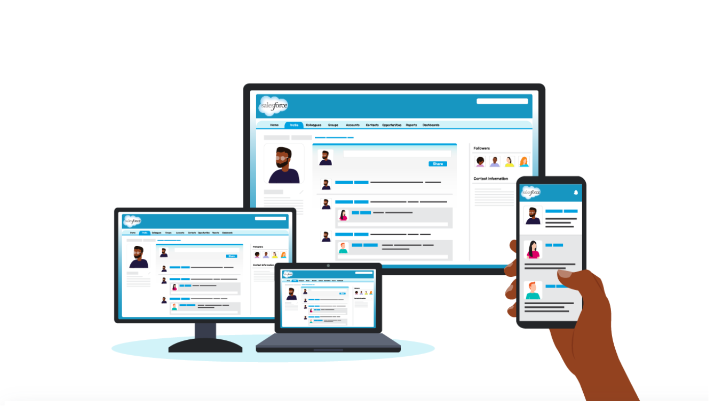
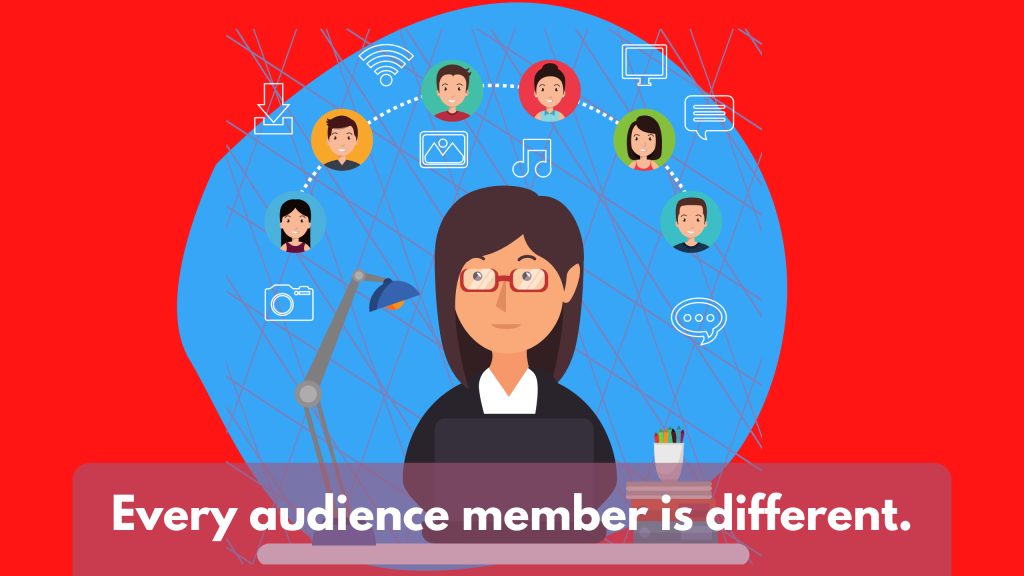
One of the easiest ways to deliver multiple visual reports is to create a string of infographics designed to meet the needs of separate individual audiences.

Cartoon by Chris Lysy.  Dr. Frankenstein's Audience. Board Member, Scholar, Program Participant, Parent, Staff Member, Funder. All represented as a Default Audience Avatar that looks like Frankenstein's monster.

Takeaway #2 Most infographics are designed using a formulaic process.

Kinda like a presentation style illustration.  Shows a sequence of 6 slides.
This is just one style of infographic, there are many more. And this won’t be the last time we talk infographics in this workshop.

Have you ever watched a cable TV cooking show, home design show, game show, or pretty much any mass production TV program?

It can get pretty formulaic, can’t it?

For example, every episode of house hunters. Realtor meets with couple searching for home. Shows three homes. One is definitely not what they were looking to find. The second is what they asked for but probably not what they really need, and it’s also way over budget. The third is perfect, just a little over budget but they can stretch…

Formulas are just conventions and structures that make it easier to produce something creative on a deadline. Most infographics are not going to be genre twisting award winners. And unless you’re building a fancy creative portfolio, let your infographics be purposeful communication tools.

6 Example infographics.
We walk through a string of example sub-types in the full session.

Takeaway #3 Constraints can be useful tools. Especially for something open like an infographic.

An example of an infographic breakdown.
Another thing we do is walk through a section by section template breakdown and talk about how you can use that to make a group design infographic process easier.

It’s hard to start with a blank canvas. Especially when that blank canvas can be any orientation or size that you can imagine.

Even as someone who spends his life creating stuff, I try to avoid the blank canvas. I also think that adding some constraints can make the design process much easier. Especially for something like infographics.

Looking for examples you like, and breaking down the components, can give you the proper foundation for a good infographic. This is also an effective strategy when working with a team.

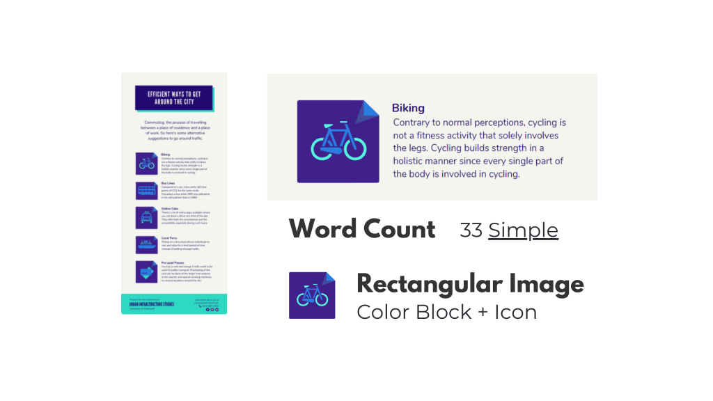
Pull some examples, ask the team what they like. After they pick their favorites, tell them the exact word counts they should try not to go over if they want something similar. Also remind them that academic-speak and other jargon tend to have way more characters than the example infographic they probably chose.

Takeaway #4 A simple narrative can also guide your infographic creation.

A story, in five frames.
This is who I am now.
When I was a kid.
Gradual changes.
AND THEN THIS HAPPENED.
Charting a new future.
This is a simple story setup we walk through in the workshop. I use it to create my own infographic.

We hear a lot about telling a story with data visualization. But it’s actually really hard to tell a story in just one frame. Usually you need at a least a few frames to properly set the story and then deliver the twist.

Infographics are hardly ever one frame, and this format gives you a lot of room to build. Considering there is rarely a limit on infographic length (unless you self-impose) you can take your time and develop a full narrative.

Creating and telling good stories takes practice, whether or not you use an infographic. But even telling a simple story can really boost the power of a report.

A picture illustrating how to download a PNG in Canva.
This is just showing how to download an infographic from Canva as a PDF. If you want to read my full example infographic, I share it alongside the workshop session.

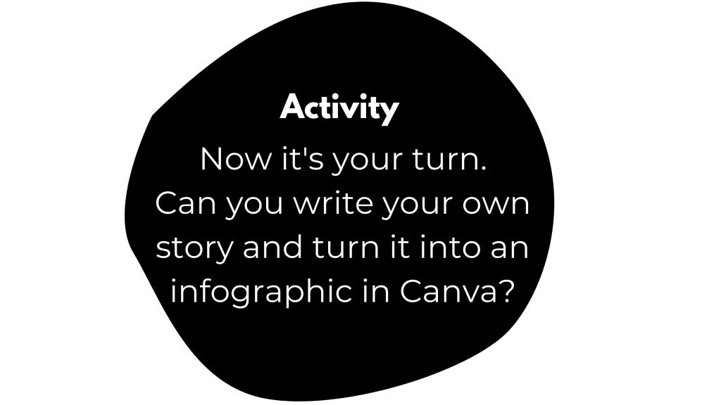
Activity – Create your own infographic.

Activity - Now it's your turn. Can you write your own story and turn it into an infographic in Canva?

If you do watch the video and decide to create your own infographic, I would love to see it.

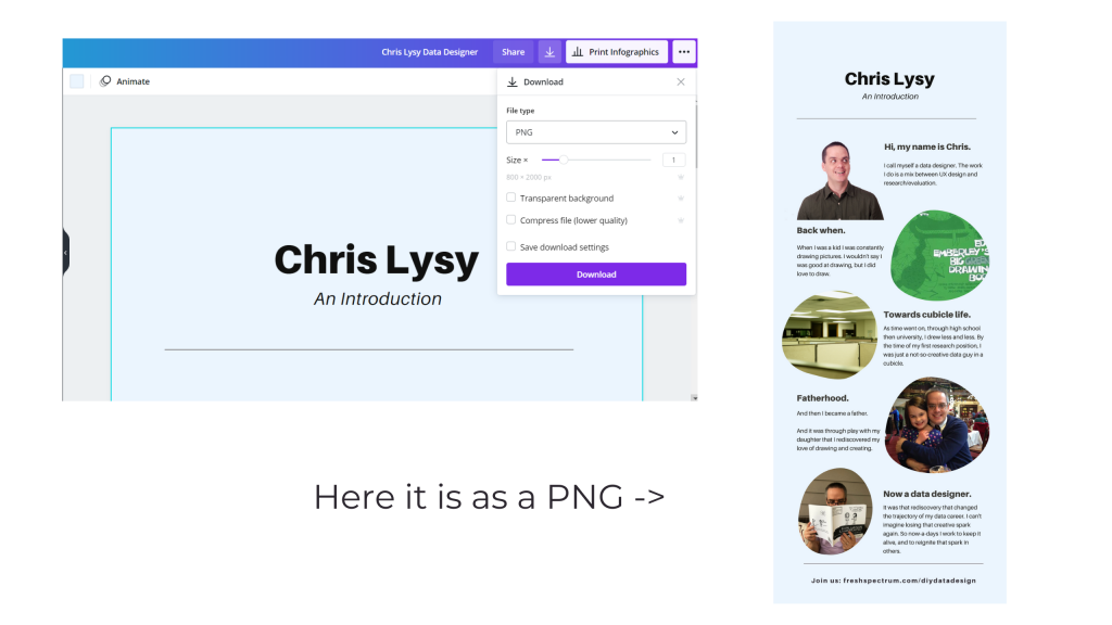
Download it as a PNG and then share it on Twitter or LinkedIn. Mention my twitter handle (@clysy on twitter) or mention my name on LinkedIn (linkedin.com/in/clysy/). You can also just share a link in the comments.

DiY Data Design Workshop News

On Wednesday, October 13, we’ll have our 6th session (Splash Model Content Strategy). That means there are 5 other sessions you can watch right now if you join (~2.5 hours of content).

  • Featured Images
  • External Analytics
  • Tableau One-Filter Dashboards
  • Funnel Content Strategy
  • Slide Style Infographics

I’ve also released the next 4 sessions. My plan with this workshop is to just keep presenting, 4 times every month. My goal is to create a large self-paced library with a wide range of workshop sessions you won’t find anywhere else. Then pair it with the kind of community and personal attention you rarely find at this price point.

Upcoming Sessions.

  • 10/13 – Splash Model Content Strategy
  • 10/20 – UX/UI Design Tools
  • 10/27 – Social Media Insights
  • 11/3 – Cartoon Illustration
  • 11/10 – Slidedoc Reporting
  • 11/17 – Personas and User Stories
  • 11/24 – Thanksgiving Break
  • 12/1 – Evaluating Resource Websites

Right now you can still join us at anytime. And at the moment, you can still lock in 20% off. This discount won’t last forever, so join us now!

Written by cplysy · Categorized: freshspectrum

Oct 11 2021

Selecting a Coach: Lessons and Tips for Performance

An interesting thing happened to Emma Raducanu, the teen tennis star who came from being ranked 150th in the World to winning the U.S. Open in 2021, in the first tournament she competed in since that win: she lost in straight sets. Raducanu had steamrolled through the entire US Open seemingly out of nowhere to win the tournament by beating Layla Fernandez, another young woman also having a remarkable run from being almost unknown to the finals.

What happened? For starters, she fired her coach. This was the same coach that had helped her to get to the podium in New York. The reason? She believed she needed a coach to help her stay at the top, not just get there.

While it’s too early to tell what the implications of Raducanu’s decision was it seems to mirror what happened to another promising young tennis star, Eugenie Bouchard, who did something similar after tasting some early success and has since fallen far down the world rankings never to recapture that early success (yet). An effective coach can make a substantial difference in the performance of a person or an organization but only if there is a clear-eyed view to what a coach does and does not do.

The decision to fire or hire a coach can have lasting effects on performance and yet these effects are often misunderstood. Here we break down what you can expect from a good coach and what to look for when things don’t go well.

Knowledge

Coaches bring together three kinds of knowledge together in working with their clients: process knowledge (how to get things done), technical knowledge (specific knowledge about skills, tools, and their application), and content knowledge (knowledge about the topic that we’re trying to address).

Combined with praxis (creating learning through action loops) a coach weaves this all together with their client.

Knowledge Practice

Practically, knowledge involves having a coach with experience and an ongoing commitment to learning. It’s why we call it practice, it’s about ongoing work to keep up on the latest knowledge and sharpening skills. A strong coach should be doing this with their work and supporting you in doing this with yours.

Strategy

Coaching can involve a variety of factors that can facilitate performance. The first of these is strategy. It is here that we often see the tangible effects of coaching with athletes, other individuals, and organizations. Here, the coach is involved in developing a strategy or in its execution. If you change the coach, you may very well change the strategy. Good strategy is alignment of purpose, vision, resources, and execution and a coaching change might shift how any or all of these are realized in practice.

Strategic Design

Strategy is about design – it’s a conscious intentional plan made into reality. Good coaching is about ensuring that there is a plan, the plan is executed, that it is adaptive and developmental, and that there are sufficient evaluation mechanisms to help you learn and grow. You cannot have a strong strategy without an evaluation plan to know whether you’re moving closer or farther from your goal.

Focus

Related to strategy is focus. Coaches often help their clients focus on specific things and away from others. This is done often by learning about what is holding attention in the first place. What is an organization focused on — both fears and hopes? This is very much about training for a mindset, not just a skill set. There is a big difference in avoiding what you fear compared with moving toward what you want.

An organization with a defensive mindset might be more likely to focus on how to protect market advantages or the avoidance of risks.

An organization with a opportunity mindset may still acknowledge risks and fears, but may focus its energy on getting to where it wants to go in spite of the challenges.

Mindsets for Change

Assess your coach on their ability to build the kind of relationship that allows them to learn how best you learn, how you see the world, and to create a profile of your mindsets. No coach should assume you have any particular mindset or that you use it consistently in the situations that matter. Great coaches pay attention to what you do and why you do it.

Motivation & Systems

Another coaching issue is motivation. This is the soft-skill process of keeping someone energized and brings together all of the other components within a system or structure. Motivation is about cultivating a ‘spark’ or ‘fire’ in someone to encourage them to take action. Systems are in place to help create habits so you don’t have to rely on motivation. Motivation requires a lot of energy and the benefits are many, but good systems are even better because they make behaviour change easier to do because they scaffold and anchor behaviours on to habits.

For example, people don’t usually have to feel motivated to brush their teeth or drink water when they are thirsty.

Coaches put in good systems and create a means to motivate their clients when those systems aren’t in place or when they are not enough.

Motivational systems

Combining the right kind of inspiration with systems that sustain that energy over time so you don’t have to rely on it all the time is key. Avoid coaches who focus only on motivating without creating systems to reduce the reliance on high-energy things like motivation to carry you forward.

Selection

We lastly want to say that a coach is a partner in your success. A great coach succeeds when you succeed. They are to be partners in your success, not just a consultant. As such, relationships are very important as much as anything else in this list. Find the fit and recognize that it might take some time to find that fit and to put the practices into place.

For Emma Raducanu, this initial setback might be a bump in the road to finding the right coach and the right fit. It could also be the start of a fall backward like we saw with Genie Bouchard. Time and good care will tell.

Coaching is part of what we do and we take it seriously. If you’re looking for someone to help see things differently to better do things differently, we can be your partner. If that’s what you need as a leader or an organization, let’s talk.

Photo by Moises Alex on Unsplash, Josephine Gasser on Unsplash, and Hermes Rivera on Unsplash

The post Selecting a Coach: Lessons and Tips for Performance appeared first on Cense.

Written by cplysy · Categorized: cameronnorman

Oct 07 2021

Stop Reporting Like it’s 1999

Today’s post is a reflection on contemporary reporting, and how for many organizations, it looks almost identical to the approaches we used in the late 90s.

In today’s post:

  • Why I think it’s time to kill the “let’s just stick a pdf on a resource page” information sharing paradigm.
  • What has changed in the digital world since 1999.
  • The rise of social media and the attention competition.
  • Smartphones, tablets, big monitors, and the need for responsive design.
  • The evolution of UX/UI design and a new set of software tools.
  • Big data and easy access analytics.
  • The big takeaway.
Freshspectrum Cartoon by Chris Lysy. 
"I have an idea. What if we turn our report into a PDF, then share it on our resources page?"
"Sort of like what we have always done over the last two decades?"

Time to kill the “let’s just stick a pdf on a resource page” information sharing paradigm.

So back in 1999, if you wanted to share a report, you would either create an html version of the report or (increasingly at the time) share a downloadable PDF.

Flash forward to 2021. Now if you wanted to share a report, most organizations simply share a downloadable PDF (or occasionally put together an html version).

This is what I call the “let’s just stick a pdf on a resource page” information sharing paradigm. It’s how countless organizations share their research and evaluation reports. And I think it’s time to evolve.

A snapshot of the CDC’s Morbidity and Mortality Weekly Report from late 1990s.
A snapshot of the CDC’s Case Surveillance News from 2020.
A UNICEF Planning, Research, and Evaluation PDF Newsletter Series from 1999
One of many evaluation PDF reports found in the UN’s current digital library.

What has changed since 1999?

  • Social Media. For instance, Twitter and Facebook didn’t exist until the 2000s. In 1999, Mark Zuckerberg was still in high school.
  • Smart Phones and Flat Screen Monitors. The range of screen sizes you have in your home is incredibly wide compared to 1999.
  • UX Design as a Web Design Paradigm. User experience design predates 1999, but it did not have anywhere near the reputation it has now-a-days.
  • Big Data and Easy Access Analytics. Google Analytics didn’t launch until 2005, lots of websites still had hit counters in 1999.

1. The rise of social media and the attention competition.

Social media didn’t look nearly the same back in 1999. Blogger was launched that year and WordPress was a few years away. The now defunct GeoCities was the 3rd largest site one the web. As for peer to peer, it was pretty much email, old school internet forums, and AOL instant messenger.

It’s kind of amazing to think about how much social media has grown over the past two decades. There are so many ways for people and organizations to share their thoughts with the world today that just didn’t exist back then.

People are not losing their attention spans, they are just experiencing an overwhelming amount of new information. And the people who have monetized attention are playing hard, and not always fair. It means, if you really care about sharing, you need to up your own game.

Freshspectrum Cartoon by Chris Lysy. 
"Hey Sweetheart, what you workin on?"
"Grandpa needed help setting up his new computer. He said that all his important files are on this thing. What is it? It looks like the save button."

2. Smartphones, tablets, big monitors, and the need for responsive design.

The iPhone wasn’t released until 2007. We had cell phones, but definitely not smart phones. As for the monitors on our desks, they were boxy picture tubes that could only get so big. Which was okay, because our computers could only power so much and nobody had the internet bandwidth we have now.

Today I often bounce back and forth between an iPad, a large PC laptop, an old MacBook, and my iPhone. The screens are wildly different, and so is the experience.

PDF technology really helped our field get their print reports onto the web. You didn’t have to learn web design to share a report. It looked like it did on paper and that worked more or less okay on old school computers. Not so much in our now multi-responsive world.

Freshspectrum Cartoon by Chris Lysy. 
"When I was your age, sure we had the internet, but there was no Google. We had AOL. And for our family, AOL was the internet."

3. The evolution of UX/UI design and a new set of software tools.

When I think back to the late 90s I remember a lot of ugly websites. And as time went on, they started to get prettier but also more confusing.

In 1993 Don Norman coined the term “user experience” for his group at Apple Computer. (Watch Don explain the history of “UX” and what he thinks of how people use his word now.) But the field is older than the term.

A 100-Year View of User Experience – Nielsen Norman Group

In today’s software and web design worlds it is hard to miss the influence of user experience design. At the most basic level, it’s not so much a methodology as it’s a shift in perspective.

The original question, “what do we intend with this site and how does it perform?,” has been replaced with “what does the user experience and how can we improve that experience?”

It might not seem like much, but the simple shift in perspective changes so much in how we design. And the product is so much more relevant and useful.

Freshspectrum Cartoon by Chris Lysy. 
"Do you think there is a server somewhere that holds the remnants of my friendster profile?"
"Maybe. I have had this recurring dream where some future archeologist stumbles upon my livejournal."

4. Big data and easy access analytics.

In the early days of the web you would track web traffic based on how many times your server delivered data to a user. With these numbers you could pickup on things like, “how many times was a page visited?” or “how often was this pdf downloaded?”

Over time, analytics became more sophisticated. With web cookie based analytics programs like Google Analytics you can track just about every keystroke. You also get access to more information, sophisticated algorithms, and clean reports. There are also other external analytics data sources we can tap into.

All of this data provides us with a greater ability to influence strategy. But that assumes we have a strategy beyond, “let’s just stick our pdf on our report page.”

The big takeaway: It’s time for a change in strategy.

So to recap.

  • Audience attention is finite, and there is more competition than ever.
  • Our information viewing context has changed dramatically.
  • We have new sets of methods we can use to understand audience needs and experience.
  • We have sources of analytics that can directly guide our reporting strategy.

I am not against PDFs. Even super big PDFs that few people will ever read have their place in a larger strategy. But I think we can do better with how we share our research, evaluation, and other data than to default to same style of reporting we’ve been doing for the past 20+ years.

Instead, I advocate for strategic, thoughtful, and systematic approaches to information design. In a future post I’ll share my approach, a strategy that I call the splash model.

Written by cplysy · Categorized: freshspectrum

Oct 06 2021

Comentario en El concepto de escucha activa por La escucha activa – Tareas del instituto

[…] “TripleAD”: Aprendiendo a Aprender para el Desarrollo. (s.f.). El concepto de escucha activa. Recuperado el 18 de agosto de 2021, de https://triplead.blog/2017/09/03/el-concepto-de-escucha-activa/ […]

Me gustaMe gusta

Written by cplysy · Categorized: TripleAD

Oct 05 2021

Communicating with Your Audience More Effectively

Depict Data Studio full courses always end with a graduation ceremony where students share the progress they’ve made. I’m always amazed by the transformations that take place and I can’t help but want to share their wonderful work!

Today you’ll learn from JC De Jesus, Vice-President of Service Delivery for an internet-provider based in Canada. Thanks for sharing, JC! –Ann

—–

“The world rewards people who are best at communicating ideas, not the people with the best ideas”

@david_perell

The ability to communicate effectively is a key skill in any venture, business or personal. Depending on your specific situation, effective communication skills can vary, and cover a wide range of topics. 

A student presenting in class with a set agenda topic and visual aids will communicate very differently from, say, a company CEO or a manager leading a team through a complex project over several weeks or months.

Communicating via Salesforce Chatter

In our company, Salesforce Chatter is one tool for effective communication. 

In our company, Salesforce Chatter is one tool for effective communication. 

Chatter is like a social-media platform but for business.  You follow co-workers to see their posts (like Twitter or LinkedIn), you can join groups and see group updates (like Facebook).  It also has a top-notch mobile app.  

And as you can imagine, just like any social-media app, your newsfeed can get really, really busy!

For a leader sharing an update to the team or the entire company, it’s important for your update to be as concise and engaging as possible for it to be effective.

Using a 1-Pager to Effectively Communicate Internally

I run a large team and share updates in Chatter. One of the things I find to be effective is using 1-pagers. 

Instead of dense and text-heavy presentations, I minimize the text to include only the main points and actions I need from my team. This way, the 1-pager can be read in 2 minutes or less.

Here’s a 1-pager I’ve posted recently. This is for an ongoing project with many stakeholders. 

Instead of dense and text-heavy presentations, I minimize the text to include only the main points and actions I need from my team. This way, the 1-pager can be read in 2 minutes or less.

Notice some of the key elements:

  • Headers. The header “We Deliver Better” is in large, bolded font.
  • Page Layout. The layout is a 2-column format, which makes the sentences appear shorter and easier to read.
  • Outline. Notice the five-topic outline with icons. Those 5 topics stand out because of the larger font size and font color (blue) that’s different from the rest of the text.
  • Visual Framework. The icons emphasize each of the 5 topics. These are also used in slidedeck presentations for consistency.
  • Branding. It uses our corporate brand colours and logo.
  • Divider Lines. There are no divider lines between rows and columns. Those are not needed if we give the page a lot of white space, which I’ve attempted to do here by cutting down on text.  Cutting down on text while getting the full message is the hardest part in putting this together!
  • Skimmability. Key phrases are in bold to make it more scannable.
  • Hashtag. And, of course, the hashtag #DeliveryExperience on the top right.

My goal was to write something that can be read in 2 minutes or less by a wide audience (100+ people), and the 1-pager format helps me achieve exactly that.

And for anyone who wants to get into more detail, we also have a 30-minute slidedeck. It uses many of the same elements as the 1-pager.

And for anyone who wants to get into more detail, we also have a 30-minute slidedeck. It uses many of the same elements as the 1-pager.

By having a variety of approaches in communicating, I’m able to appeal to and share information with my audiences much more effectively.

Connect with JC

LinkedIn: http://www.linkedin.com/in/jc-dejesusus

Twitter:  @technophone

Written by cplysy · Categorized: depictdatastudio

  • « Go to Previous Page
  • Go to page 1
  • Interim pages omitted …
  • Go to page 159
  • Go to page 160
  • Go to page 161
  • Go to page 162
  • Go to page 163
  • Interim pages omitted …
  • Go to page 304
  • Go to Next Page »

Footer

Follow our Work

The easiest way to stay connected to our work is to join our newsletter. You’ll get updates on projects, learn about new events, and hear stories from those evaluators whom the field continues to actively exclude and erase.

Get Updates

Want to take further action or join a pod? Click here to learn more.

Copyright © 2026 · The May 13 Group · Log in

en English
af Afrikaanssq Shqipam አማርኛar العربيةhy Հայերենaz Azərbaycan dilieu Euskarabe Беларуская моваbn বাংলাbs Bosanskibg Българскиca Catalàceb Cebuanony Chichewazh-CN 简体中文zh-TW 繁體中文co Corsuhr Hrvatskics Čeština‎da Dansknl Nederlandsen Englisheo Esperantoet Eestitl Filipinofi Suomifr Françaisfy Fryskgl Galegoka ქართულიde Deutschel Ελληνικάgu ગુજરાતીht Kreyol ayisyenha Harshen Hausahaw Ōlelo Hawaiʻiiw עִבְרִיתhi हिन्दीhmn Hmonghu Magyaris Íslenskaig Igboid Bahasa Indonesiaga Gaeilgeit Italianoja 日本語jw Basa Jawakn ಕನ್ನಡkk Қазақ тіліkm ភាសាខ្មែរko 한국어ku كوردی‎ky Кыргызчаlo ພາສາລາວla Latinlv Latviešu valodalt Lietuvių kalbalb Lëtzebuergeschmk Македонски јазикmg Malagasyms Bahasa Melayuml മലയാളംmt Maltesemi Te Reo Māorimr मराठीmn Монголmy ဗမာစာne नेपालीno Norsk bokmålps پښتوfa فارسیpl Polskipt Portuguêspa ਪੰਜਾਬੀro Românăru Русскийsm Samoangd Gàidhligsr Српски језикst Sesothosn Shonasd سنڌيsi සිංහලsk Slovenčinasl Slovenščinaso Afsoomaalies Españolsu Basa Sundasw Kiswahilisv Svenskatg Тоҷикӣta தமிழ்te తెలుగుth ไทยtr Türkçeuk Українськаur اردوuz O‘zbekchavi Tiếng Việtcy Cymraegxh isiXhosayi יידישyo Yorùbázu Zulu