• Skip to main content
  • Skip to footer
  • Home

The May 13 Group

the next day for evaluation

  • Get Involved
  • Our Work
  • About Us
You are here: Home / Archives for cplysy

cplysy

Mar 14 2023

Leveraging Language Models like ChatGPT for Evaluation

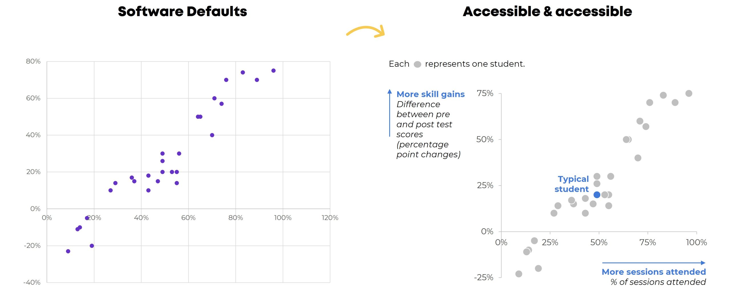
With algorithms, automation, and AI here to stay, I have been wondering what this partnership with AI might look like for consultants, clients, and colleagues. How might we leverage AI to support our data and evaluation work?

The post Leveraging Language Models like ChatGPT for Evaluation appeared first on Elizabeth Grim Consulting, LLC.

Written by cplysy · Categorized: elizabethgrim

Mar 14 2023

Algorithms, Automation, and AI, Oh My!

Algorithms, automation, and AI (artificial intelligence). What do you think of when you hear those terms? What images come to mind? How do they feel in your body? If you’re like me, you may feel equal parts excited and concerned. Excited about the possibilities for new discoveries and insights, and concerned about what this means for the future of evaluation consulting, data privacy, and human connection. I can enter the rabbit hole of fear pretty quickly when I don’t fully understand something, feeling the worry tighten my shoulders and shorten my breath.

The post Algorithms, Automation, and AI, Oh My! appeared first on Elizabeth Grim Consulting, LLC.

Written by cplysy · Categorized: elizabethgrim

Mar 09 2023

Your report is not broken.

Is nobody reading your report?

Have you put tons of work into something then shared it out to the world, only to hear nothing in return?

It might be easy to think that you’re to blame. If only you knew how to design a better report or create better charts, everything would be different…

But there is another possible reason why nobody is reading your report.

Most people don’t actively look for reports to read.

Are you old enough to remember back to the early 2000s when the whole world was switching from CDs to MP3 players?

It’s not because the quality of mp3 music was better. It was just more convenient.

In 2001 when the first iPod was released, Apple boasted that you could put 1,000 songs on it. That’s 100 times more than your standard CD. Which was great, because you could fill it with all that music you illegally downloaded off of Napster.

Even the most well designed reports with the best charts and the nicest formatting are kind of annoying to read on a smartphone. You can do it, but chances are you won’t.

It’s not because all reports are bad, plenty have gotten better. But there are way more convenient media channels you can use to learn about the organizations you are interested in learning about.

Here are just a few:

  • Blog posts
  • Social media threads
  • Youtube videos
  • Webinars
  • Email newsletters

Every single one of those you can consume just as easily on a smart phone as you can on any other device. They are way more convenient compared to your standard PDF report (or even fancy HTML reports and dashboards).

It’s not what you report but how you report.

This is my biggest gripe with many data visualization courses.

They will help you improve the quality of your charts and reports. But having the ability to create nice looking reports offers no guarantee that anyone will read them.

You don’t just need to be more creative in what you report, you need to be more creative in how you report. In other words you need to change your mindset from the noun report to the verb report.

It’s why I teach information design and run the academy.

Because while it’s good that the quality of reports are getting better, what our field needs is more people who can successfully inform, engage, inspire, and convince.

Resource Library Updates

Just as any FYI, my free resource library is going to be updated regularly. I will be adding more free resources, but also taking resources I currently offer away.

For instance, I just added my You can do creative things eBook. And 80 of you have downloaded it this last week. This will stay up for at least a few months, so you can wait a little if you don’t feel like downloading it now.

About 144 of you have taken my 10 part free email course on micrographics over the last 5 months. At the end of this month it will become an exclusive just for members of my information design academy.

So if you want to take the free course while it’s still free, I’d suggest doing that now!

Written by cplysy · Categorized: freshspectrum

Mar 08 2023

Why Staff Are Struggling with Your Programs

For a long time, I prioritized program participants, because I thought, without participants there would be no program. Now, drawing on the voices of staff (as well as my personal experiences being on staff) I see the need for more balanced considerations in what participants experience in the program and what staff experience when implementing […]

The post Why Staff Are Struggling with Your Programs appeared first on Nicole Clark Consulting.

Written by cplysy · Categorized: nicoleclark

Mar 03 2023

How to Make Great Graphs in Excel: 4 Levels of Excel Vizardry

Are you drowning in the deep end of Excel?

First, dip a toe in. And then another.

You’ll be swimming confidently before you know it.

4 Levels of Excel Vizardry

I’ve taught data visualization in Excel a dozen different ways over the years.

Nowadays, I teach Excel dataviz based on the degree of behind-the-scenes hacking needed to produce that chart.

We start easy. Then, we work up to harder battles.

Here are the 4 Levels of Excel Vizardry:

  • Level 1: Exploratory Viz
  • Level 2: Overused Native Charts
  • Level 3: Underused Native Charts
  • Level 4: Non-Native Charts

Level 0 would be Data Visualization Best Practices, like articulating which chart to use, when. I can’t get into the nitty-gritty details hacking Excel to make population pyramids… if someone’s never heard of a population pyramid before. That’s a separate course altogether.

Level 5 would be adapting those charts for specific contexts, like for interactive dashboards. That’s a separate course, too.

Let’s go through some of the Excel secrets in more detail.

Level 1: Exploratory Viz

We can make sparklines, data bars, and heat tables within seconds.

These miniature charts help us spot key patterns instantly.

Easy to make! And an instant payoff!

I love starting private workshops and online courses with exploratory viz.

I’ve blogged about these skills over and over and over because they’re the perfect launchpad. Here’s my latest tutorial.


Level 2: Overused Native Charts

These are the familiar faces:

  • Pies
  • Donuts
  • Bars and columns
  • Clustered bars and clustered columns
  • Stacked bars and stacked columns
  • Line graphs

What are Native Charts?

“Native” charts mean they’re available from our menu with just a few clicks:

What’s Wrong with Overused Charts?

There’s nothing wrong with a bar chart here or there… but any chart gets boring when we show it over and over and over and over and over and over.

There’s also the issue of analytical depth — or lack of depth.. If we’re only using bar charts… then we’re only showing totals and averages. There are dozens more statistical approaches!

Snooze. And no analytical depth.

Beware! Formatting Needed

Stacked bar charts, for example.

They’re easy to make.

But we still have to:

  • enlarge the font;
  • darken the font (to pass official Accessibility rules for color contrast);
  • directly label the data (so viewers aren’t relying on the colored legend alone — another Accessibility rule);
  • outline the touching shapes in white (which helps with colorblindness and grayscale printing);
  • show fewer increments in the scale (so it’s not so busy);
  • decide whether to apply a dark-light contrast — or not (learn about data storytelling here); and
  • adjust the gap width (if you want) to nudge the bars closer together.

Level 3: Underused Native Charts

This is where it starts getting fun!!

Excel can make:

  • Combo charts (e.g., a column chart with a target line, as shown below)
  • Overlapping Bars
  • Area charts (where you shade the area underneath the line for better oomph and high color contrast)
  • Slopes (a line chart with exactly 2 points in time, like pre and post)
  • Small Multiples Lines (to combat the spaghetti line graph)
  • Bumps (for rankings)
  • Scatter plots (x and y)
  • Bubble charts (x, y, and z)
  • Tree maps (for nested categories)
  • Heat Maps
  • Sunbursts (nesting)
  • Box and Whisker (to go beyond averages and show the min, quartile 1, median, quartile 3, and max)
  • Waterfall (how pieces add to a net number)
  • Radar (to compare several ordinal categories at once)
  • Icons & Symbols (to make our graphs easier to navigate — and more memorable!)

Yes, These are Native Charts 🙂

Well… if you’re using the latest version of Excel.

If you’re on outdated software, (most of) these charts are still possible. They just get harder to make, i.e., they’re in Level 4 territory.

Yes, Underused Native Charts Add Variety (and Analytical Depth)

We’re not just adding variety for variety’s sake.

(Although common sense — and hundreds of consulting projects — has shown me that dataviz novelty is one of the best ways to increase engagement.)

Most importantly, we’re adding analytical depth. For example, a regular ol’ bar chart just compares the average or total of several categories. What if we compare them by location, too? Now we’ve got a heat map! We can spot geographical patterns, which would’ve been impossible in a bar chart.

Beware! Formatting Needed

Scatter plots are easy to make.

But we still have to:

  • enlarge the font;
  • darken the font (to pass official Accessibility rules for color contrast);
  • add a key (that each dot represents one student);
  • label the scales (with everyday language, like More skills gains, because scatter plots are notoriously difficult to read for people who don’t stare at graphs all the time); and
  • decide whether to add a dark-light contrast.

Level 4: Non-Native Charts

Have you mastered Levels 1, 2, and 3? Are you already using a variety of charts? Have you actually analyzed your data (beyond averages, and beyond totals)? Can you adjust the gap width, annotate the data, and apply colors strategically in your sleep?

Then you’re ready for Level 4!

With behind-the-scenes elbow grease, you can make:

  • Stream graphs
  • Waffles
  • B’Arcs
  • Small Multiples Bars
  • Population Pyramids
  • Diverging Stacked Bars
  • Lollipops
  • Dots
  • Swarm
  • Tile Grid Maps
  • Sankey Diagrams

What are Non-Native Charts?

You won’t find any buttons that automatically make these charts.

Instead, we have to insert one chart type…

…and disguise it as something else.

For example, we have to insert a stacked bar chart… and disguise it as a waffle chart.

(You’ll need a Magic Table behind the scenes, too.)

A stacked bar chart gets disguised as a population pyramid.

Yes, you’ll need a Magic Table with placeholder values.

A scatter plot gets disguised as a dot plot, and so on.

Each value gets assigned a x-y placeholder location inside the Magic Table.

Do these maneuvers turn your brain inside out and upside down? You’re not alone.

Learn More

If you’re consistently making, editing, and applying graphs from Level 4, you’re already a vizard. Get in touch so I can send work your way!

If you’re in Level 1, 2, or 3, you’ll love Great Graphs in Excel. We’re meeting LIVE for 10 weeks this spring. In our very first class, you’ll make the Exploratory Viz from Level 1. Then, you’ll make graphs from Levels 2, 3, and 4. You’ll go slow and steady so you don’t feel overwhelmed. You’ll dip your toe in… and then you’ll be swimming in the deep end in no time.

Written by cplysy · Categorized: depictdatastudio

  • « Go to Previous Page
  • Go to page 1
  • Interim pages omitted …
  • Go to page 96
  • Go to page 97
  • Go to page 98
  • Go to page 99
  • Go to page 100
  • Interim pages omitted …
  • Go to page 304
  • Go to Next Page »

Footer

Follow our Work

The easiest way to stay connected to our work is to join our newsletter. You’ll get updates on projects, learn about new events, and hear stories from those evaluators whom the field continues to actively exclude and erase.

Get Updates

Want to take further action or join a pod? Click here to learn more.

Copyright © 2026 · The May 13 Group · Log in

en English
af Afrikaanssq Shqipam አማርኛar العربيةhy Հայերենaz Azərbaycan dilieu Euskarabe Беларуская моваbn বাংলাbs Bosanskibg Българскиca Catalàceb Cebuanony Chichewazh-CN 简体中文zh-TW 繁體中文co Corsuhr Hrvatskics Čeština‎da Dansknl Nederlandsen Englisheo Esperantoet Eestitl Filipinofi Suomifr Françaisfy Fryskgl Galegoka ქართულიde Deutschel Ελληνικάgu ગુજરાતીht Kreyol ayisyenha Harshen Hausahaw Ōlelo Hawaiʻiiw עִבְרִיתhi हिन्दीhmn Hmonghu Magyaris Íslenskaig Igboid Bahasa Indonesiaga Gaeilgeit Italianoja 日本語jw Basa Jawakn ಕನ್ನಡkk Қазақ тіліkm ភាសាខ្មែរko 한국어ku كوردی‎ky Кыргызчаlo ພາສາລາວla Latinlv Latviešu valodalt Lietuvių kalbalb Lëtzebuergeschmk Македонски јазикmg Malagasyms Bahasa Melayuml മലയാളംmt Maltesemi Te Reo Māorimr मराठीmn Монголmy ဗမာစာne नेपालीno Norsk bokmålps پښتوfa فارسیpl Polskipt Portuguêspa ਪੰਜਾਬੀro Românăru Русскийsm Samoangd Gàidhligsr Српски језикst Sesothosn Shonasd سنڌيsi සිංහලsk Slovenčinasl Slovenščinaso Afsoomaalies Españolsu Basa Sundasw Kiswahilisv Svenskatg Тоҷикӣta தமிழ்te తెలుగుth ไทยtr Türkçeuk Українськаur اردوuz O‘zbekchavi Tiếng Việtcy Cymraegxh isiXhosayi יידישyo Yorùbázu Zulu