• Skip to main content
  • Skip to footer
  • Home

The May 13 Group

the next day for evaluation

  • Get Involved
  • Our Work
  • About Us
You are here: Home / Archives for cplysy

cplysy

Mar 02 2023

Information design is not data visualization.

Referring to data visualization as information design is like referring to survey design as evaluation.  Yes, evaluators tend to design surveys.  But there is way more to being an evaluator than designing a survey.

Learning how to be an information designer requires more than learning how to create nice looking charts, infographics, presentations, and reports.  And while designing all these different things usually falls into the realm of information design, there is so much more you can learn.

A few non-dataviz information design challenges…

  • How do I get my boss to give me the go-ahead on creating a new design?
  • When should I not use a chart?
  • How do I inspire an audience?
  • How do I simplify this information?
  • What communication forms could I use to share this information?
  • How do I find stories in this information?
  • I have access to lots of things, where do I even start?
  • How do I do creative work when I’m not inspired?
  • When should I keep things complicated?
  • How can I limit iterations and feedback loops?
  • Can I adapt this long report into a website?
  • Can I turn this website into a string of social media infographics?
  • How do I shepherd a team-based creative project to completion?
  • How do I know if my designs are working?
  • Do I have access to the right tools?
  • How do I make this more accessible?
  • How do I get better feedback from my team or boss?
  • What would make this report interesting?
  • How do I cocreate this design with my audience?
  • How do I deal with rejection?
  • Do I need to listen to this feedback?
  • Could this dashboard be an email?
  • How do I win a design argument with my boss?
  • How do I test my design?
  • When should I use a grid?
  • What fonts should I use?
  • Is this a good color?

Information design is not one thing but lots of little things.

For data people like us, data visualization is certainly part of information design. It’s just not anywhere near all of it.

When I started teaching information design I thought I could build out a series of self-paced modules to answer a lot of the questions I was getting asked.  Then I could just teach a few tools and that would create enough value to be worth buying.

But the more I talked to data people about their struggles and challenges the more little questions I would find myself answering.  It’s why my workshop is now an academy built around a community. It’s why I teach live.  Because developing your information design skills isn’t about learning one big skill or tool but learning lots and lots of little things.

And whenever anything requires lots and lots of little things, the best thing you can do for yourself is to find a supportive community.  Preferably one with a facilitator who really really cares about your progression and wants to see you find your best.

Because a good information designer can create nice looking charts, infographics, presentations, and reports. 

A great information designer can inform, engage, inspire, and convince.

We need more great information designers.

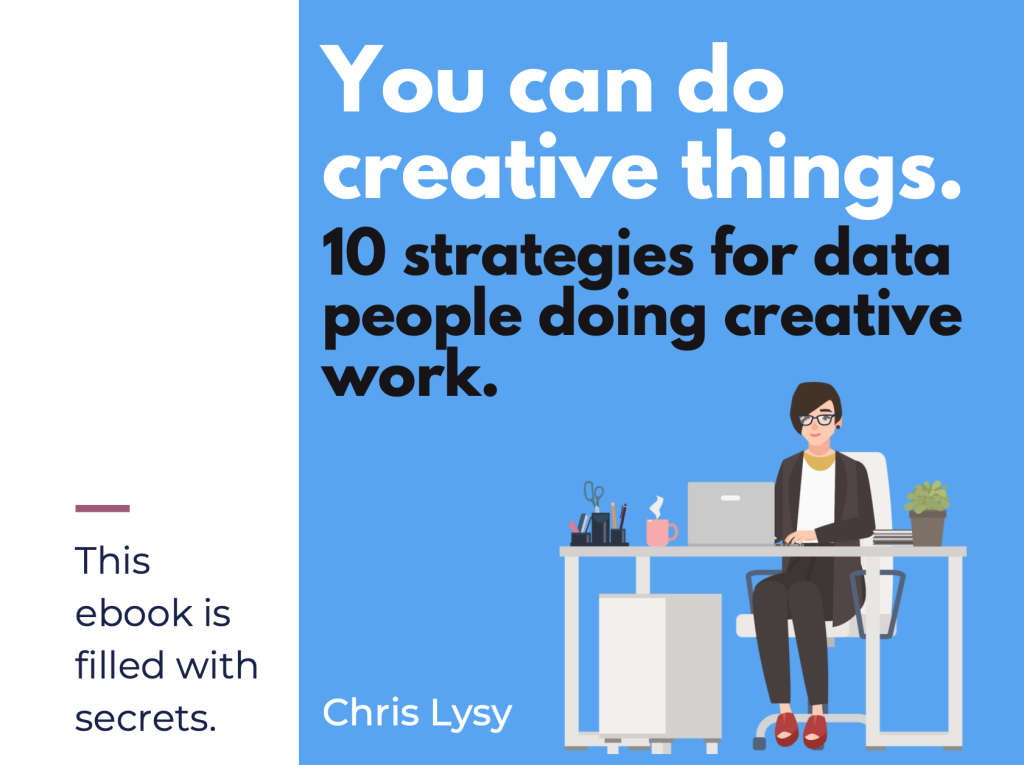
My latest eBook on doing creative things.

Over the last decade I’ve learned a lot about doing creative work professionally.  I tried to think about the things that were the same whether I was designing charts, drawing cartoons, or developing online learning communities. It takes more than just technique and artistic talent to create on a deadline.

I decided to put 10 of my favorite tips and strategies into an eBook.

The eBook is free, you can download it here.

Click here to get the eBook.

Written by cplysy · Categorized: freshspectrum

Mar 01 2023

Take of Tour of the “Excel How-To’s” Templates

Remember those “Excel for Dummies” books?

I’d go to the public library, grab a dog-eared book off the shelf, and flip through the grayscale images trying to match the author’s screenshots to my own computer.

They were always using a different version of Excel than me.

I couldn’t find the buttons from their blurry screenshots.

I had to zig-zag my eyes back and forth between the book and my screen.

That’s how I learned Excel. And it was terrible.

Introducing the Excel How-To’s Templates

That’s why I spent hours and days and weeks making the Excel How-To’s templates for you.

Rather than having a separate book open, you’ll learn directly from Excel.

All the instructions are typed directly into Excel for you – alongside the living, breathing graphs – so you can save precious time.

Or, if you’re not interested in learning all the how-to steps, you can use the completed templates for your own project. There are notes telling you exactly where to type your own numbers and percentages so that they’ll show up in the finalized charts. No need to reinvent the wheel.

What’s Inside: 28+ Templates

There are 28+ templates so far.

I make updates and additions a few times a year, and send the latest Zip folder to everyone to make sure they’ve always got the latest version.

Chart Chooser

In addition to the graphing instructions, you’ll see my 2-page Chart Chooser, which’ll help you narrow down which chart to try.

Theme Colors and Theme Fonts

You’ll also get step-by-step instructions for setting up your organization’s brand colors and brand fonts. Themes save time and help you look professional.

Available In

Inside each template, you’ll learn which version of Excel that chart’s available in.

Most charts can be made on most computers.

There are some exceptions here and there, which is why it’s explicitly spelled out for you.

Uses

You’ll learn what that chart type’s best for.

And, I’ve added notes about where that chart is most or least common. In practice, we don’t see every chart in every workplace. Some charts are pretty much only seen in peer-reviewed journal articles. Other charts are pretty much only used by accountants. And so on.

Real-Life Examples

Inside each of the templates, you’ll see links real-life examples. Then, you can see how that chart has been used in reports, slideshows, dashboards, infographics, and websites by other agencies like yours.

Before-After Editing Example

Then, you’ll get a preview of the before-after transformation that you’re about to create.

For example, in the bump chart tutorial, you’ll transform a regular ol’ line chart into a ranking chart.

Below, you’ll get ideas for how you’d adapt that busy bump chart for a presentation (by graying everything out and highlighting one category at a time).

Step 1: Set Up the Table

You’ll walk through step-by-step instructions to make and edit all the 28+ charts.

Step 1 is setting up your data table that’ll feed into the chart.

For native charts – bar charts, pie charts, line charts, etc. – the table set-up is extremely straightforward.

But for non-native charts, we have to get creative.

For example, in the population pyramid tutorial, you’ll see:

  • the original table, and
  • the magic table.

I’ve added notes to help you figure out what goes where.

The gray area gets pulled directly into the chart, so those are the values you’ll tweak when you’re making population pyramids for your own projects.

Step 2: Insert a ___ Chart

As we’re building non-native charts, we have to fool Excel.

We often insert one chart type… and disguise it to look like a different chart.

This took me nights and weekends, over several years, to figure out on my own. Let’s get you up to speed immediately! No need to waste your time fighting with Excel on your nights and weekends.

You’ll see explicit instructions about which chart type to add.

For example, to create a waffle chart (a.k.a. square pie), you’ll need to insert a 100% stacked bar chart first.

Step 3 (and onward): Format Format Format

This is where you’ll learn about Excel’s lesser-known features.

For example, you’ll learn how to adjust the primary and secondary axes’ Series Overlap and Gap Width, which makes our bars overlap.

I don’t find these edits to be intuitive at all. Quite the opposite! That’s why I’ve added screenshots for you – so you don’t have to memorize which buttons to click.

Variations

Finally, you’ll see variations of each chart.

For example, in the dot plot tutorial, you’ll see how to set up:

  • 2 sets of circles with a line connecting them
  • 2 sets of circles without a line connecting them
  • 1 set of circles (a lollipop)
  • Smaller dots with labels above or beside the dots
  • Arrows
  • Arrows, sorted (my personal fav)

Get the Excel How-To’s Templates

They’re included with your Great Graphs in Excel tuition.

Written by cplysy · Categorized: depictdatastudio

Mar 01 2023

Ask Nicole: What is a Public Health Social Worker?

Have a question you’d like to be featured? Let me know. There are two things I know for sure about social work and public health: One: Social work and public health are naturally complimentary fields, perfect partners in improving community health and wellbeing. Two: People are just as confused about what public health is as […]

The post Ask Nicole: What is a Public Health Social Worker? appeared first on Nicole Clark Consulting.

Written by cplysy · Categorized: nicoleclark

Feb 27 2023

New Tip Sheet: Tips for Conducting Interviews

This article is rated as:

I'm new to eval EA Traffic Light.jpg

I do some eval EA Traffic Light.jpg


Eval Academy just released a new Tip Sheet, “Tips for Conducting Interviews”

Who’s it for?

If you will be conducting interviews in your evaluation, then this tip sheet is for you! Whether you’re new to the process or have conducted interviews before, this tip sheet provides a good overview and refresher to make your next interview experience a great one.

What’s the purpose?

This tip sheet highlights our 5 top tips to ensure:

  1. Your interviews collect rich data.

  2. Your interviewees have a good experience.

It also includes links to other Eval Academy resources to guarantee informed consent within your interviews.

What’s included?

A printable 1-page tip sheet that defines our 5 top tips.


Get the tip sheet


Learn more: related articles and links

You can learn more about collecting qualitative data on Eval Academy through the following links:

  • How to conduct interviews

  • How to use Calendly to schedule interviews like a pro

Some helpful Eval Academy resources to collect and track your qualitative data include:

  • Interview Tracking Log Template

  • Excel Interview Tracking Log Template

  • Standard Interview Guide Template

  • Standard Interview Information Letter Template

  • Standard Interview Consent Form Template

  • Standard Interview Templates Bundle


What do you think of our new tip sheet? Let us know in the comments below!

Written by cplysy · Categorized: evalacademy

Feb 27 2023

New Infographic: Qualitative Data Saturation

This article is rated as:

I'm new to eval EA Traffic Light.jpg

I do some eval EA Traffic Light.jpg

Eval is my main role EA Traffic Light.jpg


Eval Academy just released a new infographic, “Qualitative Data Saturation”

Who’s it for?

This infographic is for those who collect or who will be collecting qualitative data and are looking to support the validity of their results. It’s a helpful resource for those who are both new and experienced in evaluation!

What’s the purpose?

This infographic defines qualitative data saturation, lists why it is important and identifies how you know when you’ve reached saturation. It also includes links to further resources for those who are looking to dive a little deeper into the theoretical concept of qualitative data saturation.

What’s included?

A printable 1-page infographic that outlines qualitative data saturation.


Get the infographic


Learn more: related articles and links

You can learn more about qualitative data on Eval Academy through the following links:

  • How to conduct interviews

  • How to “Quantify” Qualitative Data

  • How to Transcribe Interviews Like a Pro

  • Interpreting themes from qualitative data: thematic analysis

  • How to use Calendly to schedule interviews like a pro

  • 3 Easy Ways to Quantify your Qualitative Data

  • Sampling and Recruitment 101

Some helpful Eval Academy resources to collect and track your qualitative data include:

  • Interview Tracking Log Template

  • Excel Interview Tracking Log Template

  • Standard Interview Guide Template

  • Standard Interview Information Letter Template

  • Standard Interview Consent Form Template

  • Standard Interview Templates Bundle

  • Focus Group Information Letter and Consent Form Template

  • Focus Group Moderation Guide Template


What do you think of our new infographic? Let us know in the comments below!

Written by cplysy · Categorized: evalacademy

  • « Go to Previous Page
  • Go to page 1
  • Interim pages omitted …
  • Go to page 97
  • Go to page 98
  • Go to page 99
  • Go to page 100
  • Go to page 101
  • Interim pages omitted …
  • Go to page 304
  • Go to Next Page »

Footer

Follow our Work

The easiest way to stay connected to our work is to join our newsletter. You’ll get updates on projects, learn about new events, and hear stories from those evaluators whom the field continues to actively exclude and erase.

Get Updates

Want to take further action or join a pod? Click here to learn more.

Copyright © 2026 · The May 13 Group · Log in

en English
af Afrikaanssq Shqipam አማርኛar العربيةhy Հայերենaz Azərbaycan dilieu Euskarabe Беларуская моваbn বাংলাbs Bosanskibg Българскиca Catalàceb Cebuanony Chichewazh-CN 简体中文zh-TW 繁體中文co Corsuhr Hrvatskics Čeština‎da Dansknl Nederlandsen Englisheo Esperantoet Eestitl Filipinofi Suomifr Françaisfy Fryskgl Galegoka ქართულიde Deutschel Ελληνικάgu ગુજરાતીht Kreyol ayisyenha Harshen Hausahaw Ōlelo Hawaiʻiiw עִבְרִיתhi हिन्दीhmn Hmonghu Magyaris Íslenskaig Igboid Bahasa Indonesiaga Gaeilgeit Italianoja 日本語jw Basa Jawakn ಕನ್ನಡkk Қазақ тіліkm ភាសាខ្មែរko 한국어ku كوردی‎ky Кыргызчаlo ພາສາລາວla Latinlv Latviešu valodalt Lietuvių kalbalb Lëtzebuergeschmk Македонски јазикmg Malagasyms Bahasa Melayuml മലയാളംmt Maltesemi Te Reo Māorimr मराठीmn Монголmy ဗမာစာne नेपालीno Norsk bokmålps پښتوfa فارسیpl Polskipt Portuguêspa ਪੰਜਾਬੀro Românăru Русскийsm Samoangd Gàidhligsr Српски језикst Sesothosn Shonasd سنڌيsi සිංහලsk Slovenčinasl Slovenščinaso Afsoomaalies Españolsu Basa Sundasw Kiswahilisv Svenskatg Тоҷикӣta தமிழ்te తెలుగుth ไทยtr Türkçeuk Українськаur اردوuz O‘zbekchavi Tiếng Việtcy Cymraegxh isiXhosayi יידישyo Yorùbázu Zulu