• Skip to main content
  • Skip to footer
  • Home

The May 13 Group

the next day for evaluation

  • Get Involved
  • Our Work
  • About Us
You are here: Home / Archives for allblogs / depictdatastudio

depictdatastudio

Mar 17 2020

How to Look Professional on Camera While Suddenly Working from Home

How are you doing? Seriously. Comment and let me know.

Outwardly, my life looks very similar: I’m still delivering webinars, building online courses, and managing consulting projects with a remote team. Inwardly, I’m definitely thrown off.

I can’t fix most of the scary things happening in the world right now. But I can help you as you transition into a work-from-home lifestyle.

Are you suddenly working from home? With barking dogs and screaming kids? With less-than-desirable tech equipment–or none at all?

“Luckily” I’ve been in your shoes.

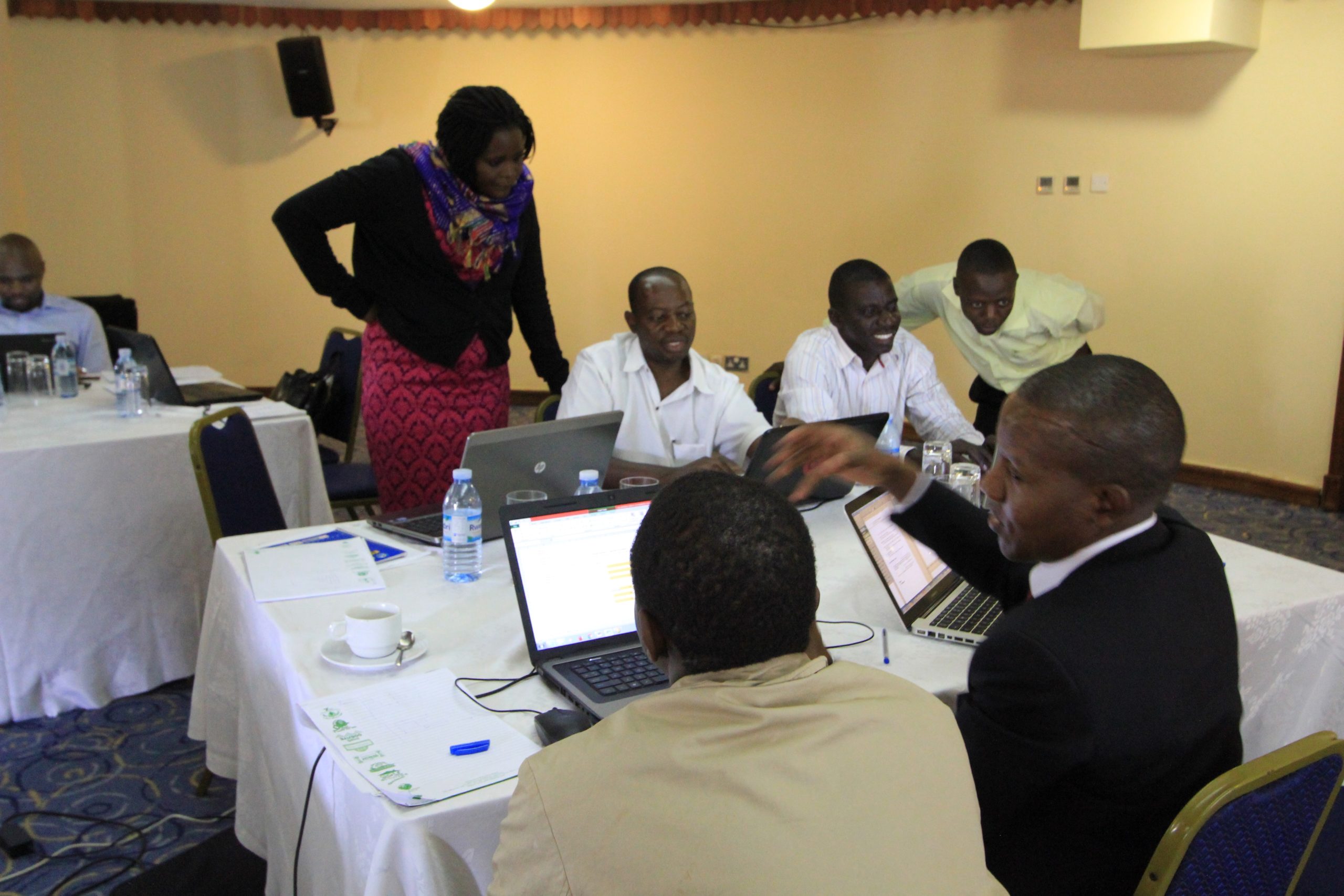
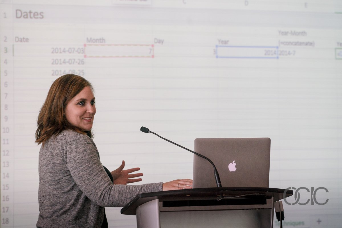
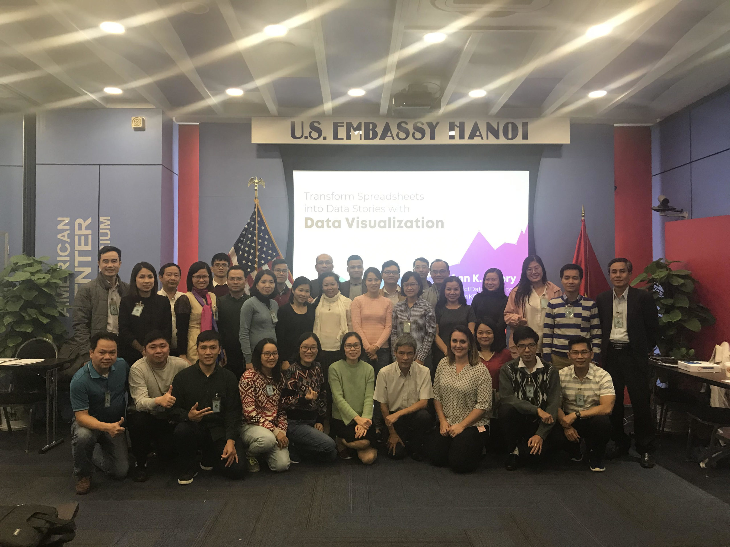
Over the past year, I’ve set up “home” offices in a dozen states and nine countries. I’ve led a virtual team… delivered keynote speeches… recorded podcasts… and created hundreds of lessons for my online courses. From the U.S., Canada, Guatemala, Zambia, Taiwan, Thailand, Vietnam, Japan, and Korea. In a new apartment or hotel every week.

These behind-the-scenes tours were designed as bonus lessons for students in my Powerful Presentations course, but given the immediate need for my friends everywhere to figure out how to work from home, I’m releasing them now for a limited time.

I made a complimentary mini course for you: https://depictdatastudio.teachable.com/p/look-prof…

This mini course has 8 quick lessons.

  1. My Webinar Tech Set-Up (5:40) <– I started recording these behind-the-scenes tech tours in January.
  2. My Podcast Process (5:34)
  3. What It’s Really Like to Record Online Courses… (3:22)
  4. My Online Course Tech Set-Up (3:26)
  5. My Video Interview Tech Set-Up (0:58)
  6. My In-Person Interview Tech Set-Up (5:27)
  7. My “Talking Head” Tech Set-Up (4:35)
  8. How to Look Professional on Camera — Even in a Makeshift Home Office (6:57) <– The latest lesson, which I recorded last Thursday.

Flatten the curve. Work from home. With the most professional tech setup possible in the middle of the mayhem.

–Ann

Written by cplysy · Categorized: depictdatastudio

Mar 03 2020

10+ Tips from an International Dataviz Speaker

I was on a podcast–finally! My friend Jon Schwabish of PolicyViz has asked me to be on his podcast at least ten billion times and I finally agreed.

Maybe I was afraid he’d grill me–he did.

Maybe I was afraid he’d ask something to get me in trouble–he did!

Maybe I was just too busy–I was.

I’m so glad I finally sat down to talk with Jon for a proper podcast!

We thought it’d be fun to video-record our convo, too. You can listen to the podcast through Jon’s site or watch the video below.

About Jon

Don’t know Jon yet?

Jon is an economist, writer, teacher, and creator of policy-relevant data visualizations. He is considered a leading voice for clarity and accessibility in how researchers communicate their findings.

We’ve known each for nearly a decade already, and even tell the funny story of how we met in the podcast.

The PolicyViz podcast logo, which is navy, orange, and white, and features a microphone in the center.

10+ Tips from an International Dataviz Speaker

After traveling all over the world to provide data visualization training for the past six+ years, I’ve made list of tips from the point of view as an international dataviz speaker.

A photo of seven data analysts in Kampala working together on their laptops at a conference room table
Speaking in Kampala in 2014

(We recorded this podcast in January 2020 and you’ll hear me say that I was about to travel to China. That trip is postponed indefinitely for obvious reasons.)

These are the things I wish I knew sooner about adapting my U.S.-centric trainings so that they’re not so U.S.-centric; working with foreign language interpreters; and even translating from Fahrenheit to Celsius.

Tip #1: Talk to the Person, not to the Interpreter

I’ve worked with sign language interpreters at universities and government agencies. More recently, I worked with foreign language interpreters in Hanoi (in which the attendees were wearing headsets so they can hear the interpreters translating my words).

The best practice is to look at the attendees, not at the interpreters. For example, if someone in the audience asks a question, the speaker should look at the audience member the entire time–not at the interpreter.

Making eye contact with the attendees is not only respectful, but helpful to both of you. Communication involves words, but communication also involves eye contact, body language, and the speed and tone of your speech. By looking at the attendee, you can pick up on all the nuances of his or her facial expressions and body language, which you would miss if you solely looked at the interpreter.

Speaking in Ontario in 2016

Tip #2: Share the Training Material with Interpreters in Advance

Sharing materials in advance is so helpful for the interpreter and the person needing the interpretation. It allows them the time to review the materials, become familiar with the topic, and also to know your key words and new vocabulary. For example, a sign language interpreter or foreign language interpreter may not have heard the terms “data visualization” or “dataviz” before your talk.

Sharing materials in advance also helps the interpreters to see how you’re planning to structure and organize your talk.

I don’t follow scripts, so I don’t have a script or speaking notes written out for the interpreters to read ahead of time. They’ve told me they simply like having a “head’s up” about the topics and vocabulary.

I usually share handouts during the presentation and then share a PDF’d copy of my slides after the presentation. Sharing materials in advance was new for me. It involves a little more prep time for the speaker, and forces you to finish your prep work much earlier than you normally would’ve, but the payoff for the attendees needing the interpreters makes it worth it.

Tip #3: Talk with the Interpreters Ahead of Time

I always try to talk to the interpreter ahead of time–and not just at 8:59 am for a 9:00 am presentation.

The first time I worked with sign language interpreters was at a university in a big hall. Knowing they would be there ahead of time was so helpful to me. I met with them about an hour before and went over my slides with them, gave them the overall format of my talk. That way, they know when I’ll break for an activity, etc. They also know when they’ll need to spell out terms like d-a-t-a-v-i-s-u-a-l-i-z-a-t-i-o-n or find a synonymous sign.

Hiccups happen though, and sometimes the interpreter shows up at 8:59 am for a 9:00 am presentation. In those cases, I give a quick rundown and start a few minutes late. The time spent with the interpreters is worth it, even if it means starting a few minutes late, because it means the day will go so much better for the attendees needing the interpreters.

Tip #4: Try to Avoid Slang and Idioms

This is hard one: Try to avoid slang or idioms. They’re everywhere, so this is tough!

For example, I might say, “At the end of the day…”

But what does that mean to a Vietnamese speaker for whom English is their third or fourth language? What this phrase really means is, “The most important thing I want you to remember is…”

Or, a “low-hanging fruit edit” would instead be “the easiest edit to make to your graph is…”

It was hilarious–and humbling–to listen to this podcast recording! I heard a dozen more idioms and slang terms throughout my conversation with Jon.

Over the years I’ve had to unlearn my bad academic habits of speaking way too formally. I actually used to try to sound like a textbook with perfect speech and sentence structure. Argh, how boring and awkward!! Now, my speech is intentionally imperfect and conversational in workshops. That style is perfect for English speakers, but it’s a huge challenge for everyone else. I’ve given hundreds of talks to English-speaking audiences, but only a dozen talks to non-native English speakers, so this is something I’m still working on. Sigh. I’ll get there!

Ann K. Emery at the United Nations
My third trip to speak at the United Nations in Geneva in 2017

Tip #5: Try to Avoid Contractions

Try not to speak in contractions.

Instead of saying “don’t do this thing,” say “do not.”

For a lot of us, the “t” in “don’t” is nearly silent… or there’s a noise in the room… and our attendees will only hear the “do.”

I’ve learned to instead say “do not” and make sure to put an emphasis on the “not” with both my voice and my hands to ensure that the meaning is clear.

I even do this in the U.S. because most training settings have poor audio quality. There’s construction noise outside… someone’s phone rings… the door slams shut… there are conversations outside in the hallway… coughs… sneezes… shuffles of papers… the list goes on.

Saying “do not” instead of “don’t” is more than just a speech pattern; it’s forced me to become more clear on my dataviz recommendations. 

Ann K. Emery in Guatemala
Speaking in Guatemala in 2019

Tip #6: Try to Avoid Religious Phrases

Since speaking in Southeast Asia, I have actively tried to avoid using religious phrases.

For example if I’m holding my laser pointer, and it flies out of my hand (which happens more than you think!), my instinct would be to say “oh my goodness!” or “oh my gosh!”  

That phrase has zero translation to someone who’s not in a Judeo-Christian culture.

Interpreters will translate everything in an effort to make it feel more real and natural. What do interpreters make of the phrase “oh my goodness?” Does that mean it’s literally good that I dropped my laser pointer? What a confusing phrase.

Ann K. Emery speaking in Vietnam
Speaking in Hanoi in 2019

Tip #7: Try to Use Your Clearest, Accent-Free Voice

This may be a little controversial… but try to avoid speaking with an accent.

I’m from Virginia and don’t have a southern accent, in my opinion… except when I’m around people from the south. Then, I can get a little southern-sounding.

When
I’m around fellow millennials, I can get a little millennial-sounding.

You have to turn all that off. You have to speak in the purest, accent-free version of yourself.

Ann K. Emery speaking in Zambia
Speaking in Lusaka in 2019

Tip #8: Use Body language

As I said earlier, communication is not just words. Body language is also another way we communicate with each other and it can be so helpful (or harmful) in a presentation.

Body language and cues matter because if an attendee is listening to an interpreter there’s often a delay in what I say and then what they hear. During that time though they’re looking at me and can see from my body language if what I’m saying is positive or negative.

If
you’re asking them to start using a new dataviz practice…

  • nod your head
  • smile with your mouth and with your eyes
  • give a thumbs up
  • give an “okay” sign

If
you’re asking them to avoid using a dataviz practice…

  • Shake your head “no” from side to side
  • Use your facial expressions to indicate “no”
  • Give a thumbs down
  • Make an “x” motion with your arms

Talking with your hands isn’t just for decoration. And it doesn’t have to be distracting. You can use your hands productively to reinforce what you’re saying with your voice.

Ann K. Emery in Thailand
Speaking in Bangkok in 2019

Tip #9: Find Non-U.S. Graphs and Maps

When you’re speaking in another country, make sure you’ve got examples from that country.

For example, if you’re showing currency, use the currency symbol for the country you’re speaking in.

When showing how to color code maps, I use a U.S. map in the U.S. but a South American map if speaking in South America.

Tip #10: Adjust the Agenda to the Culture You’re In

You have to adjust the agenda to the culture you’re in. In the podcast, Jon shared an example where one of our speaker friends was giving a training in the United Arab Emirates. That speaker needed to account for planned prayer time during his training agenda. There are cultural differences that you need to build in to your agenda and be considerate of.

I’ve worked with several religious groups in the U.S. who incorporate prayer time and religious services into the workday. They’ve always told me about prayer time in advance, which is helpful. Then I can plan the rest of the content around those scheduled blocks.

Tip #11: Translate Between the 12-Hour or 24-Hour Clock

Speaking of agendas… Remember that many countries follow the 24-hour clock, which Americans sometimes refer to as military time.

If I have a slide showing the day’s agenda, or a printed agenda, I’ll quickly translate the times between 12-hour and 24-hour time before the session.

View this post on Instagram

A post shared by Ann K. Emery 📊 (@annkemery) on Feb 2, 2020 at 5:14am PST

Tip #12: Learn to Translate Fahrenheit to Celsius

Here’s another tip that I remembered at the very end of the podcast–Fellow Americans, we have to learn to translate Fahrenheit to Celsius!

I’ve needed this translation in the most practical ways. For example, I remember sitting in a way-too-cold training room in Guatemala, and I was having trouble adjusting the wall thermostat by myself. I needed to call the hotel staff and request a new temperature–in Spanish, and in Celsius. Room temperature in the U.S. is around 70 degrees Fahrenheit, which is around 21 degrees Celsius. This 70-to-21 temperature translation is honestly the only one I can remember, but it’s the most practical and important for my work.

View this post on Instagram

A post shared by Ann K. Emery 📊 (@annkemery) on Dec 28, 2019 at 8:43pm PST

Formatting Reports

In the podcast, Jon surprised me when he asked about formatting reports. I always thought everyone was concerned with formatting reports, and I never really realized how many blog posts I’ve devoted to this topic before.

I work with a lot of different types of groups: for-profits, non-profits, big, small, etc. In a perfect world, they would all have very short, succinct reports in addition to many other formats (slideshow, handouts, info graphic, social media, press release, etc). And while that’s the case in some groups, for most it’s not in process and not happening yet. But they all do have a report of some kind, so my plan is always to take that and make it a great report.

Color-Coding Reports by Chapter

Jon and I talked about one of my favorite dataviz techniques, which is color-coding reports by chapter.

The idea behind this is you might have a long report but we still need to make it easy for people to find what they’re looking for.

I recommend people use their branding colors rather than picking at random.

So Chapter 1 is brand color 1, Chapter 2 is brand color 2 and so on.

And everything in that chapter is the same color: the headings, the graphs, the call-out boxes, and even the bullet points.

When the reader sees a new color, they know that a color change = a content change.

Size your fonts according to their importance. A text hierarchy tells your viewers which information is most important (headings) and which information is least important (the regular ol' paragraphs).

You can view more examples of color-coding by category here.

If you only have a few hours to edit your report, color-coding by chapter is, by far, the best use of your editing time.

Using Everyday Software in Reports + Dataviz

I’m not a huge fan of specialized software, I use everyday products to make great reports. Word, Excel and PowerPoint are the common denominators when you’ve got many people working on the same report. Creating reports in a software everyone is familiar ensures that they will continue to use the report even when I’m gone.

Controversial Dataviz Advice

Jon loves to get me in trouble, so he asked me whether I have any controversial dataviz advice!

There are definitely some topics that are debated in the data viz world. Here’s my stance on just a couple of controversial topics.

Pie Charts Are Okay

I teach that pie charts are okay–in certain situations. I have a whole blog post with a list of seven rules for using pie charts.

A million people in the dataviz community disagree and say that we should never use pie charts. But, they never follow up with advice on what to do instead. It’s SO unhelpful to bash pie charts without offering better alternatives, which is where all my pie chart makeover blog posts come in.

There are several ways to transform a pie chart. For example, you can use a stacked bar/column chart, a slope chart, or a dot plot.

Whether Bar Charts Should Start at Zero

There’s differing opinions on whether bar charts should start at zero (also known as a zero axis or zero baselines). I would suggest you listen to Jon’s PolicyViz podcast episode #66 with Jessica Witt. She’s an expert on this and I think her recommendation is a good guideline to follow.

In my workshops, I am very clear that you must label your minimum and maximum. I wasn’t always to clear on this but I changed my tune after the last election cycle because I felt like graph-makers were purposely being misleading by not starting charts at zero–and also not labeling their scales.

Your Turn

I brainstormed a dozen ways that we need to adapt our training styles when speaking in our home country vs. when visiting another country… but there are probably a dozen more. Someday, in all my “spare” time, I’ll write a follow-up blog post with additional tips. In the meantime, what am I missing?

Written by cplysy · Categorized: depictdatastudio

Feb 25 2020

How to Enter Cleaner Data AND Automate the Entire Analysis and Visualization Process

This is a brand new bonus module for current and past students in my data analysis course, Simple Spreadsheets: From Spreadsheet Stress to Superstardom with Microsoft Excel. The once-a-year registration period is open this week only! Register by Friday, February 28, 2020–or wait ’til next year.

—

“How can I get cleaner data???”

This is one of the most common questions I get.

Let’s pretend you’re entering “workplace setting.” And you’re supposed to type “hospital” as one of the categories. But you, or someone else, enters “hospitals.” Plural, argh!

Later on, you have to do all this data cleaning… and you have a mess of entries.

It’s impossible to enter perfectly clean data when you’re doing it by hand.

Common Data Sources

I realize you might not be hand-entering all your data. Your spreadsheets might come from…

  • Email attachments
  • Downloading a csv file from your agency’s database (where the data was already entered into a form)
  • Downloading a file from a website (like a government website with public data)
  • Manual data entry

Oftentimes, at least some spreadsheets are entered by hand.

Typos Are Not Inevitable!!!

You can get a virtually clean spreadsheet with a little but of upfront planning.

You work hard, a little bit, in the beginning.

And then your Future Self gets to sit back and enjoy the fruits of your labor.

What You’ll Learn

I’m going to teach you how to use:

  • data validation
  • drop-down menus
  • pivot tables
  • formulas
  • pivot charts
  • regular charts, and
  • quickie charts

to set up foolproof data entry spreadsheets.

You set up your structure first. Then, someone else goes off and enters data for you. And then it’s automatically tallied—and visualized!

This might sound hard if you’ve never done it before, but it’s not! It’s easy. Let’s get started.

How to Enter Cleaner Data AND Automate the Entire Analysis and Visualization Process

With a little upfront planning, you can automate the rest of the analysis and visualization process. Here’s how.

(Current and past students in Simple Spreadsheets: Log in here >> https://depictdatastudio.teachable.com/p/simple-spreadsheets/ << and watch the video version of this lesson. You can also download two spreadsheets and practice alongside me. It’s 37 minutes of some of my favorite techniques I’ve ever taught. I promise that the 37-minute time investment will compound and save DAYS of your time.)

Step 1. Label the Columns

First, label the columns. This is a fictional spreadsheet, but we’re pretending we want someone to enter peoples’ first names, last names, birthdates, organization names, work settings, and roles.

Step 1. Label the Columns

Step 2. Enter Some Sample Data

I like to add a few sample entries at the very beginning. It helps the data entry person later on.

For now, let’s just enter the person’s First Name, Last Name, and Organization Name. We’ll address the Work Setting and Role variables in a moment.

And because this happens in real life all the time, we’ll pretend our data entry person entered my last name in ALL CAPS, ha! I’ll show you how to clean that up in a moment.

Step 2. Enter Some Sample Data

Step 3. Apply an Excel Table

An Excel Table is not a regular table. An Excel Table is a certain type of formatting that is magical. I wish I would’ve learned these earlier!

To apply an Excel Table:

  • Click on the upper left corner of your spreadsheet (usually cell A1, if you started typing your variable names into the first row of your spreadsheet).
  • Go to the Insert tab.
  • Click on Table.

Excel Tables can future-proof your datasets. They allow you to continue entering data later on and keep all your beautiful formulas and linkages.

Step 3. Apply an Excel Table

Step 4. Add Data Validation

Data validation is one of your strongest weapons against typos.

How to add data validation:

  • Click on the cell that you want to edit (“validate”).
  • Go to the Data tab.
  • Go to the Data Validation icon.
  • Under Settings, you can Allow a Whole Number, Decimal, List, Date, Time, or Text Length. You can also set Minimum and Maximum values.
  • Optional! Under Input Message, write instructions for the person who will be entering data. This is the message that the data entry person will see when they click on the cell.
  • Optional! Under Error Alert, write custom error messages. This is the message that the data entry person will see if they make a mistake while typing.

In this example, I’m adding a data validation rule that prevents you from entering weird dates.

Step 4. Add Data Validation

Step 5. Create Drop-Down Menus

If there’s a set list of categories that someone should be entering, then that’s when you need a drop-down menu!

Here’s how you create drop-down menus:

  • Insert a new sheet called Drop-Down Menus. Type a list of the response options.
  • Go back to your original data entry spreadsheet. Click on the cell where you want to create a drop-down menu.
  • Go to the Data tab.
  • Go to the Data Validation icon.
  • Allow a List.
  • Tell your computer where the list is located.
  • Hit OK. If needed, drag your new format downwards so that it fills the entire column.
  • Hide the Drop-Down Menus sheet so it doesn’t distract the person who’s entering the data.

In this example, I’m adding a list of work settings.

Step 5. Create Drop-Down Menus

Step 6. Add Formulas for Recoding Data

Try to anticipate what type of cleaning and recoding may be necessary. Then, enter those formulas off to the right.

For example, will you need the names in Last, First format? If so, write a formula that concatenates the first and last names together. Don’t forget to transform the messy uppercase and lowercase letters into proper case.

Will you need the birthdates to be transformed into ages? If so, write a formula that calculates how many years old the person is based on today’s date and their birthdate.

I realize your spreadsheet won’t look exactly like this. You might not be dealing with demographic data like names and ages at all. But the concept is the same: Your data entry person will enter data on the left, and then those variables will automatically get cleaned and recoded in new columns off to the right.

In my real life projects, I might have 10, 20, or 30 columns off to the right with all the data cleaning formulas I need.

Step 6. Add Formulas for Recoding Data

Step 7. Pre-Summarize the Data with Pivot Tables and/or Formulas

You’ve got two choices:

  • Summarize the data with pivot tables
  • Summarize the data with formulas

Pivot tables are often easier for novices because you don’t have to memorize any formulas.

I prefer formulas because they give me more control over formatting (and more control over the charts that I’ll create in the next step).

Step 7. Pre-Summarize the Data with Pivot Tables and/or Formulas

Step 8. Pre-Visualize the Data

Whoa! This is where it gets really fun.

We haven’t even entered the data yet.. but we’ve already got the analysis finished. And we’re about to get the visualization finished, too.

You’ve got three choices for visualizing data:

  • Pivot charts
  • Regular charts
  • Quickie charts

Pivot charts are linked directly to the pivot tables you already created in the previous step. Pivot charts are fine… but they’re not fancy. You can only make some chart types. And your formatting control is limited. They’re a good starting point but I never use them in practice.

I usually make regular ol’ charts, which are linked to the formulas I wrote in the previous step. Charts linked to formulas give me SO MUCH editing power. I can customize the chart exactly how I need it.

And I make quickie charts (data bars, heat tables, spark lines, etc.) whenever possible because they’re, well, quick! They’re often sufficient for my quick turnaround reporting needs as well.

Step 8. Pre-Visualize the Data

Your Turn

Reply and let me know:

Are you already following this process for all your projects? Where you set up the skeleton of your spreadsheet beforehand, and then sit back and relax as the automatically-cleaned-analyzed-and-visualized data comes in? I love meeting fellow time-saving spreadsheet users! Reply and let me know what your workflow looks like.

Or, is this process brand new to you? I had to learn this automation process the long, hard way, so don’t feel bad if you haven’t been exposed to it yet.

Reply and let me know where you’re at. Our team reads every message.

Ann

P.S. Enrollment closes on Friday, February 28, 2020 for our data analysis course. If you can teach this process in your sleep, then the course isn’t for you, ha! But if some of these terms were new for you, or you have to do a lot of tedious data cleaning in your projects, then this is the course for you! Register: https://depictdatastudio.teachable.com/p/simple-spreadsheets/

P.P.S. Current Simple Spreadsheets students–what other bonus modules would you like to see? There are three case studies based on your requests. There are two bonus data analysis modules based on your requests. There’s a Getting Started with Dataviz module based on your requests. Keep the requests coming! You’re grandfathered-in to all future updates and additions.

Written by cplysy · Categorized: depictdatastudio

  • « Go to Previous Page
  • Go to page 1
  • Interim pages omitted …
  • Go to page 35
  • Go to page 36
  • Go to page 37

Footer

Follow our Work

The easiest way to stay connected to our work is to join our newsletter. You’ll get updates on projects, learn about new events, and hear stories from those evaluators whom the field continues to actively exclude and erase.

Get Updates

Want to take further action or join a pod? Click here to learn more.

Copyright © 2026 · The May 13 Group · Log in

en English
af Afrikaanssq Shqipam አማርኛar العربيةhy Հայերենaz Azərbaycan dilieu Euskarabe Беларуская моваbn বাংলাbs Bosanskibg Българскиca Catalàceb Cebuanony Chichewazh-CN 简体中文zh-TW 繁體中文co Corsuhr Hrvatskics Čeština‎da Dansknl Nederlandsen Englisheo Esperantoet Eestitl Filipinofi Suomifr Françaisfy Fryskgl Galegoka ქართულიde Deutschel Ελληνικάgu ગુજરાતીht Kreyol ayisyenha Harshen Hausahaw Ōlelo Hawaiʻiiw עִבְרִיתhi हिन्दीhmn Hmonghu Magyaris Íslenskaig Igboid Bahasa Indonesiaga Gaeilgeit Italianoja 日本語jw Basa Jawakn ಕನ್ನಡkk Қазақ тіліkm ភាសាខ្មែរko 한국어ku كوردی‎ky Кыргызчаlo ພາສາລາວla Latinlv Latviešu valodalt Lietuvių kalbalb Lëtzebuergeschmk Македонски јазикmg Malagasyms Bahasa Melayuml മലയാളംmt Maltesemi Te Reo Māorimr मराठीmn Монголmy ဗမာစာne नेपालीno Norsk bokmålps پښتوfa فارسیpl Polskipt Portuguêspa ਪੰਜਾਬੀro Românăru Русскийsm Samoangd Gàidhligsr Српски језикst Sesothosn Shonasd سنڌيsi සිංහලsk Slovenčinasl Slovenščinaso Afsoomaalies Españolsu Basa Sundasw Kiswahilisv Svenskatg Тоҷикӣta தமிழ்te తెలుగుth ไทยtr Türkçeuk Українськаur اردوuz O‘zbekchavi Tiếng Việtcy Cymraegxh isiXhosayi יידישyo Yorùbázu Zulu