• Skip to main content
  • Skip to footer
  • Home

The May 13 Group

the next day for evaluation

  • Get Involved
  • Our Work
  • About Us
You are here: Home / Archives for allblogs / depictdatastudio

depictdatastudio

Jun 16 2020

How to Plan for and Edit Your Own Two-Pager

This week’s dataviz tips come from Tyler Mason, who I met several years ago while leading a training in Indiana. Tyler and I have stayed in touch and he enrolled in additional virtual training with us. Check out how he’s created a two-pager for his program! Great work, Tyler. –Ann

Hi, I’m Tyler Mason, a Juvenile Justice Strategist with the Indiana Juvenile Detention Alternatives Initiative (JDAI). 

This two-pager that I have created was born out of Ann’s “chose the right format” training from her Great Graphs course:

This two-pager that I have created was born out of Ann’s “chose the right format” training from her Great Graphs course.

Here’s how I developed this two-pager.

Know Who Your Audience Will Be

It is vital that you know who your audience will be when developing your charts.

If you don’t follow this critical piece, you may completely miss your audience, and at that point, you may have lost the story you were trying to convey to them.

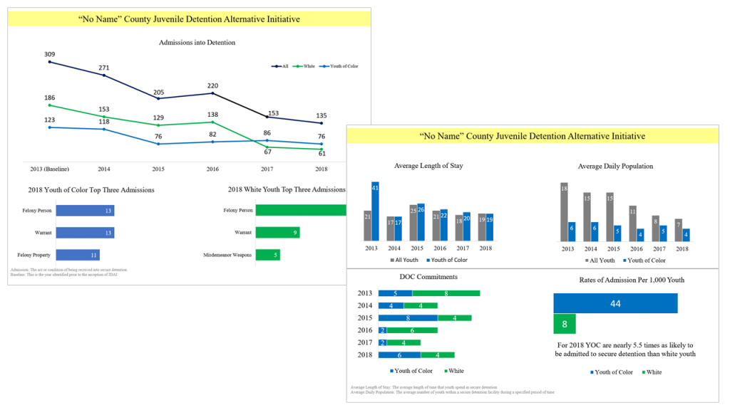
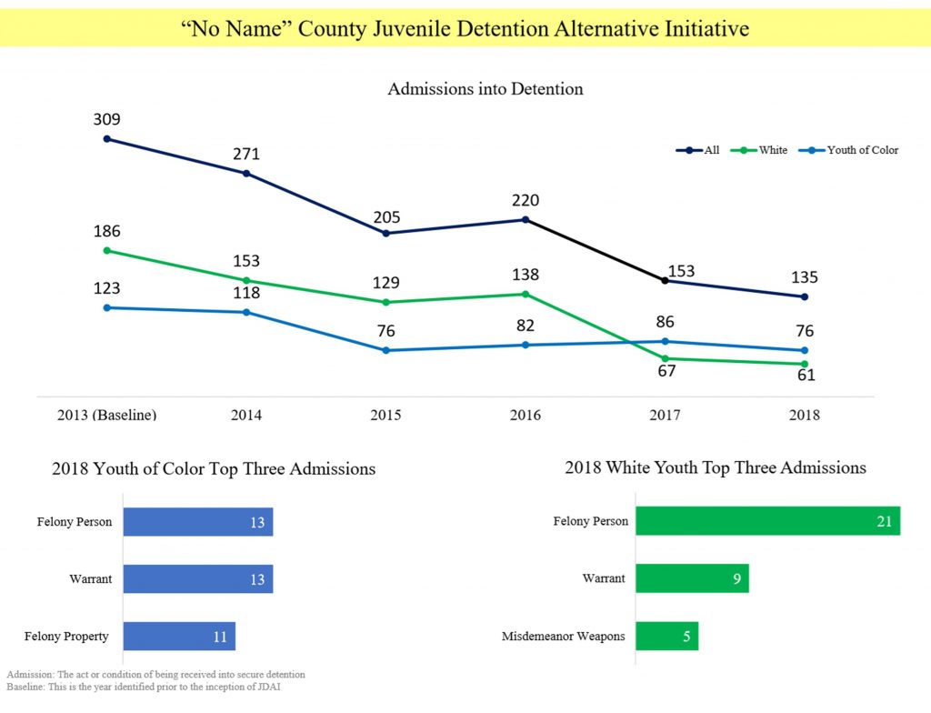
You will notice with the two-pager I am attempting to communicate the essential data points that I can in a concise way given “one” sheet of paper. 

Select the Right Type of Graph

By utilizing the “choose the right chart” lessons in Ann’s online course, I was able to use the chart that made the most sense with creating the data story.

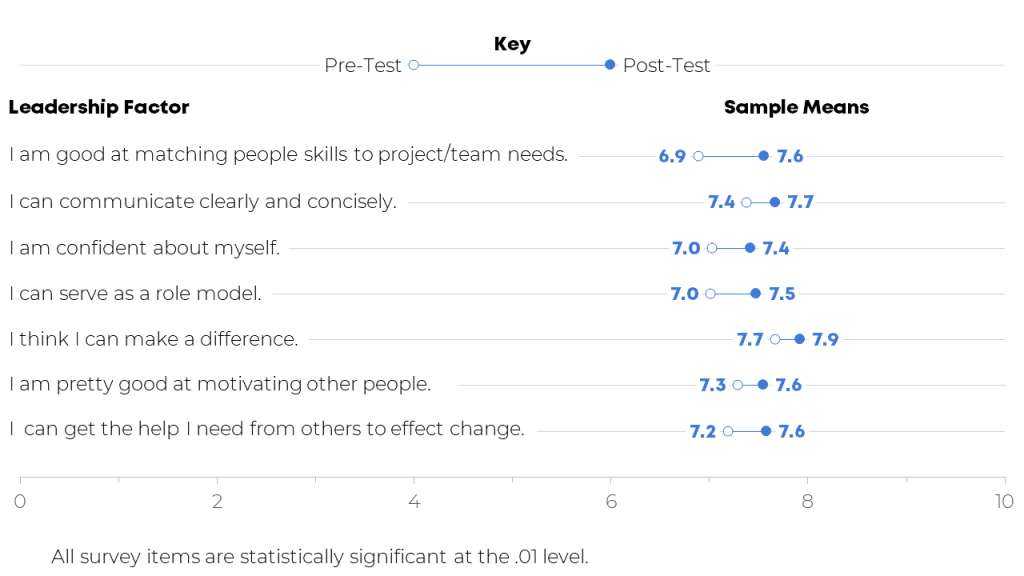
You will notice that different charts were utilized to tell the data story. For example, we included line charts, bar charts, stacked bar charts, and clustered bar charts.

By utilizing the “choose the right chart” lessons in Ann’s online course, I was able to use the chart that made the most sense with creating the data story.

The first thing as Ann spells out is either draft what you envision on a piece of paper or start brainstorming in your mind.

Through the brainstorming and utilizing Excel, my graphs were born.

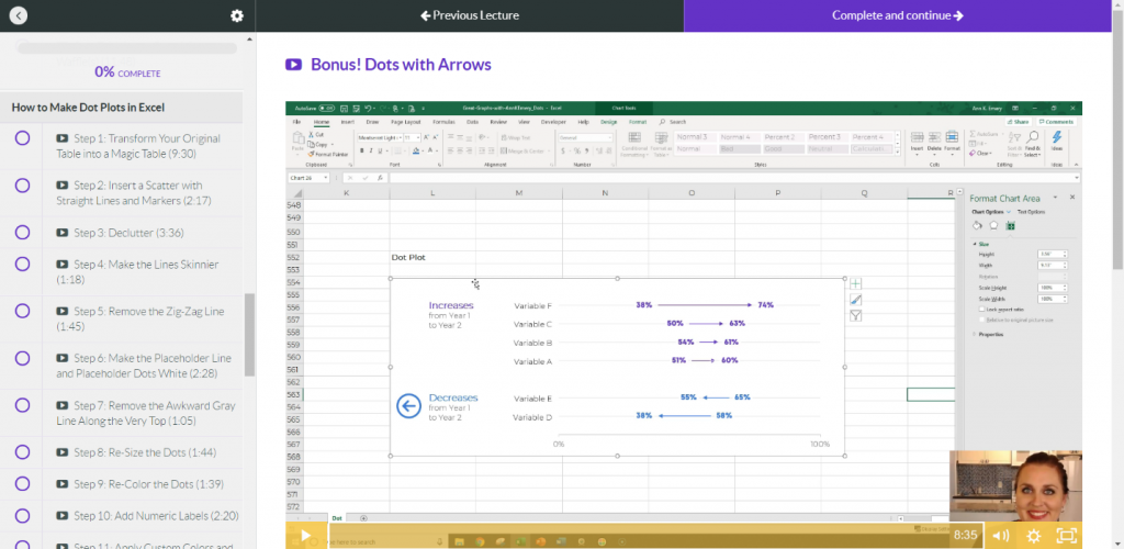
Create and Format the Charts on Your Computer

Entering the data and creating the charts is the hardest part, then comes the formatting, which can be the same.

The Less Noise, the Better

One thing as Ann mentions often is the less noise, the better. So, be sure to remove all the noise in the Excel graphs.

Using PowerPoint for Easy Layout Options

Once I had my charts created, I then utilized PowerPoint to lay them out and start telling the story from starting big picture to breaking out what was seen in 2018 for said county on the first page.

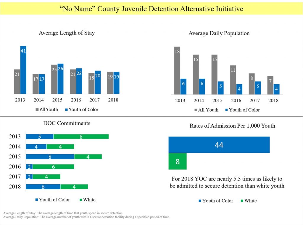
When you look at the other side of the page, I start to dig a little deeper into the data and what was seen with length of stay and average daily population.

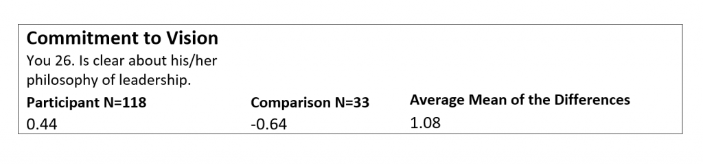
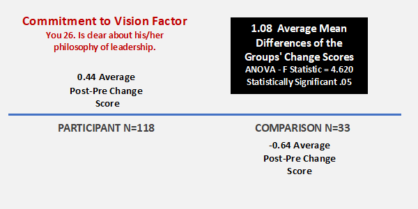
The last two charts at the bottom are to tell a story about the work that still needs to be done.

Once I had my charts created, I then utilized PowerPoint to lay them out and start telling the story from starting big picture to breaking out what was seen in 2018 for said county on the first page.

How to Frame Your Two-Pager

As a recap, here’s what I considered in my project:

  1. What data are you planning to present?
  2. Who will be your audience, and what is their knowledge level of the data?
  3. Brainstorm ideas to develop your charts from this point forward
  4. Utilize whatever platform you like. I like to use Tableau or Excel. For this current project, I used Excel and PowerPoint.
  5. Start drafting your charts. I also find it valuable to bounce your ideas of your coworkers and what they think of the charts and the story you are trying to tell. I find asking a coworker what they think my data story is trying to tell. If they guess correctly, you’re on the right path. 
  6. Do not forget the formatting of your charts. The less noise, the more people will be engaged. Simple is ideal. Also, another important thing to consider and not forget about is what will my charts look like in black and white and if I used color, are they legible for people with color vision deficiencies. I find that is something that is often overlooked that is also a very vital piece to this equation.
  7. You’re done! Good luck, and as always, be prepared for questions.

The Great Graphs course has been phenomenal and I highly recommend it for anyone needing guidance on how to create the best graphs for your audience.

I hope you find this information worthwhile. Good luck creating your data story.

Written by cplysy · Categorized: depictdatastudio

Jun 09 2020

Visualizing Equity in Education

In this article, guest author Molly Hanlon shares how she uses data to create visualizations and stories that help school staff make decisions to better serve their students. Please comment below with your own tips! Let’s learn with each other. –Ann

We use stories to affirm our beliefs. This is especially true in conversations about equity.

Over many years, I’ve observed countless situations in which school administrators were presented data that showed unjust equity in their system. Most often, administrators told themselves stories to justify that result. A common story was, “That data is confusing, and it can’t be right.”

Many school systems are not using data to make informed decisions. Too often, they are making decisions on what feels right to them, based on a story that isn’t consistent with the evidence. My goal is to use data to create visualizations and stories that are consistent with the evidence, and to help staff focus on how to make schools more equitable and just for all students.

It has felt so gratifying to me to create and share data visualizations that help people accept stories consistent with the evidence. Those stories empower them to identify and accept the challenges faced by their systems, and to inform possible solutions.

Producing Data Visualizations for the Seattle Public Schools

In 2019, I was tasked with presenting data to an Advanced Learning taskforce within the Seattle Public Schools.  Advanced Learning programs are designed for students who demonstrate an exceptional ability or potential to learn and reason beyond their same-age classmates. 

The taskforce examined disparities among students of color who participated in the program, how students were selected for the program, the program’s delivery, and institutional best practices.

The following two examples are a small sample of the visualizations I provided the taskforce, to help them understand the demographic student populations in the advanced learning programs.

Visualizing White vs. Non-White Students

This first visualization illustrates the percentage of white versus non-white students in the Seattle Public Schools Advanced Learning program over time. 

These graphs were presented in-person to the taskforce, and then included into a “fact pack” for later reference. 

Before: A Clustered Column Chart with Default Software Settings

Here’s what our graphs used to look like: a clustered column chart with default software settings.

Here’s what our graphs used to look like: a clustered column chart with default software settings.

After: A Stacked Column Chart with a Takeaway Title

Here’s what our graphs look like now.

Here's what our graphs look like now: a stacked column chart with a takeaway title.

Here are the improvements we made. We:

  • changed the font and color schemes to match the Seattle Public Schools style guide;
  • wrote a more descriptive title;
  • eliminated the superfluous legend, which distracts the viewer’s attention;
  • changed the chart type from a clustered column to a 100% stacked column for easier reading;
  • increased the font size of percentages for easier reading; and
  • eliminated the border and x-axis line, which introduced unhelpful visual distractions.

Visualizing Disparities of Students of Color

The second example shows the disparities of students of color compared to their overall representation in the district.  

Before: A Clustered Column Chart with Default Software Settings

Here’s what our graphs used to look like:

Before our graphs were a clustered column chart that used default software settings.

After: Adding Color-Coded Annotations

Here’s what our graphs look like now:

Now our charts use color-coded annotations that make them easier to read and understand.

Here are the improvements we made. We:

  • changed font and color schemes to match the Seattle Public Schools style guide;
  • wrote a descriptive title and inserted a text box to further explain the significance of the data;
  • eliminated or used a lighter shade for the data that wasn’t as significant;
  • increased the font of the percentages that were more significant;
  • eliminated the legend by coloring the font in the descriptive text box; and
  • eliminated the border and x-axis line.

The Impact of Intentional Data Visualization

These graphs challenged the task force to think about the inequities in Advanced Learning programs given the change in district demographics.

Collect with Molly

Connect with Molly Hanlon on LinkedIn: https://www.linkedin.com/in/molly-hanlon-b701305a/

Written by cplysy · Categorized: depictdatastudio

Jun 02 2020

Teaching + Knowledge = Passion for Data Viz

One of the primary reasons for taking Ann’s data visualization course, Great Graphs, was to learn better ways to use Microsoft Excel as a visualization tool.

I am so excited to share how grateful I am to Ann and her colleagues for putting together an online training to share their talents with me. 

In return, I am paying it forward by teaching my Advanced Excel students at Central Washington University a tiny portion of how they can use Excel as a data viz tool and application. 

Here’s how my own work and my students’ work evolved after taking the data visualization course.

My Own Challenges to Communicating Results

One of the biggest challenges I faced as an evaluator was to show “differences” between “pre & post” or “before & after” an intervention other than a typical table of numbers.

Most evaluation reports were made up of narrative and making references to tables of results. When I heard about Ann K. Emery and how she used Excel to produce dynamic and creative stories about programs, I was all about learning more and so I enrolled in Simple Spreadsheets and Great Graphs last year.

Before: Tables to Show Pre-Post Differences

Here’s what my own work looked like before taking two of Ann’s courses—a table with key statistics.

Here’s what my own work looked like before taking two of Ann’s courses—a table with key statistics.

After: Dot Plots to Show Pre-Post Differences

I used several of Ann’s lessons in Great Graphs to create more visually appealing and easier to read charts to show differences in the intervention of leadership education for teens.

For example, I used Ann’s step-by-step process to create a dot plot chart to show the pre- to post-test difference.

She provided a template that walked me through each step of creating the dot plot and now I have the template to keep creating dot plots:

For example, I used Ann’s step-by-step process to create a dot plot chart to show the pre- to post-test difference.

Here’s what my work looks like now:

Here’s what my work looks like now after using Ann's methods.

Editing My Own Visuals

In addition to the dot plots, Ann provided clear instructions for how to work create, edit, declutter, and place charts in a variety of reporting formats.

Before: A Black and White Table with Little Font Size Variation

The next example is related to an individual survey item which was statistically significant between the participant and comparison group.

Before: A Black and White Table with Little Font Size Variation

After: Using Dark Colors and Larger Font Sizes to Highlight Key Details

The same information is included in each chart, but hopefully the “After” is easier on the eyes!

The same information is included in each chart, but hopefully the “After” is easier on the eyes!

Training University Students on Data Visualization

I also wanted to expose these tools and applications to students that are enrolled in the Advanced Excel Spreadsheets course at Central Washington University.

First, I require students to sign up for Ann’s Soar Beyond the Dusty Shelf Report mini course so they can get acquainted with what data visualization is and how they can use Excel beyond just pivot tables, what if statements, and business intelligence applications.

Next, there is one assignment for the students to use an existing set of data (i.e. work-related, volunteer project for non-profit, or choose a data set I provided for them) and create a “before” and “after” data viz using the tools and techniques from the mini course and an extensive review of Ann’s blog.   

A University Student’s Before-After Transformation

One of my students, Kelly, volunteers for a small newly organized non-profit organization. They needed help developing an overview of their organization and information showing how they are good stewards of financial donations.

Before: A Table

Here’s what the information used to look like: a table.

Here’s what the information used to look like: a table.

After: A One-Pager with Graphs and Narrative

Kelly provided a one-page document that briefly explained the organization’s mission and program, along with their non-profit status. 

She included two column charts as the data visualization portion of the document representing dashboard of finances (income) and stewardship of funds (expense/costs) to clearly define the majority of the contributions are in direct support of immigrant families. 

She also included small narrative blocks to briefly highlight grant and corporate donors, in the first block, and that the majority of funds raised go to directly support immigrant families.  Both corporate contributions and direct support of immigrant families were the two items that this organization wanted clearly stated.

After: A One-Pager with Graphs and Narrative

I love to learn and one of my professional goals continues becoming a better communicator of information using data visualization tools and techniques.  I am going to continue seeking out opportunities with Ann and her team and learn more about data viz every day! 

Connect with Lori

Connect with Lori Thompson on LinkedIn: https://www.linkedin.com/in/lori-a-thompson-ph-d-8023b85a/.

Written by cplysy · Categorized: depictdatastudio

May 25 2020

We Sold (Nearly) Everything to Travel the World with Our 2 Kids. Here’s What Happened Next.

I felt like I had to choose: Be a world-traveling data visualization speaker. Or be a mother.

In spring 2018, we started brainstorming about a lifestyle change.

My speaking opportunities were taking me all over the world—a dream!

But, meanwhile, I had a cute kid at home. And another baby on the way. I didn’t want to miss bath time or bedtime stories.

If only my husband and kids could come along on my trips, I sighed.

Sure, my husband had vacation time. But I traveled almost every single week. Sometimes I’d city-hop, speaking in two, three, or four cities consecutively before heading back home. I wanted to be with my family all the time.

Should I quit my job entirely? We considered it.

Should my husband quit his job entirely? We considered it.

We did the spreadsheet math a dozen times. My husband’s job came with benefits, a pension, and a top secret security clearance. Should he really give up his career… for mine? Would he regret it? Would he resent me? These were months-long discussions.

In the end, my job was more than a job. And his wasn’t.

Realizing We Could Live Anywhere

It took another year of planning until my husband resigned.

Why so long? Freedom can freeze you. With his job out of the picture, we realized we could live anywhere.

We considered staying put in our suburb of Washington, D.C. But after 30 years there, we were both ready for a change.

We considered moving back into our two-bedroom condo in Charlottesville, Virginia. We bought the condo as college students in 2007, and we had rented it out since then, paying extra until it was paid off entirely. It was tempting to move into our paid-off condo, be able to pay the rest of our bills simply off my YouTube money, and just sit around and enjoy life. We entertained this idea for months. In the end, we wanted a new adventure, and decided to sell our condo entirely.

There was also the key issue of my speaking schedule. It didn’t make sense to have a home base if I’d be in a new city every week.

I’ve practically lived out of suitcases for six years, and I’ve loved it. Some people need roots. Others need wings.

We considered full-time RVing. Who doesn’t love the great outdoors?? I dreamed about the national parks we could visit with our kids. We’d taken four cross-country motorcycle trips together in our twenties and the open road was calling. The only obstacles to RVing: I need 24-hour internet. And, I didn’t have the luxury of time to drive around from city to city; I needed to fly between cities.

We wanted to live like RVers… but without the RV.

In January 2019, we decided to become full-time Airbnb-ers! The plan was to travel wherever my job took us for at least two years—until our older daughter started kindergarten. We had the perfect window. We decided to go for it.

Downsizing Our Belongings

In spring 2019, much to our surprise, our rental property and our primary residence both sold within weeks of listing them for sale.

We sold, donated, and discarded as much as possible. We listed items on Facebook Marketplace and Craigslist. We held “indoor yard sales” in our garage on the weekends. We’d been downsizing for five years, since discovering minimalism, but still had so much remaining.

We thought about the handful of items that we’d be willing to pay to store for the 2+ years we’d be traveling, and pared our belongings down to a handful of favorites. My husband’s toolbox. Quilts our mothers had made for us.

We sold our motorcycles. Our bicycles. Nearly all of the kids’ toys (they’d developmentally grow out of those toys after two years of traveling). Couches. Rugs. Picture frames. Two TVs.

We sold my office furniture. My filing cabinets. That spare box of electronics wires that was sitting in the closet for years. I used the dining room table as my desk for two months.

We sold the mattress out from under us, and then slept on camping mats for a week.

I KonMari-d my clothes until my walk-in closet was down to carry-on luggage + a few bins of seasonal items for our storage unit.

I went from dozens of pairs of shoes to three: a pair of everyday tennis shoes, a pair of flip flops, and a pair of black leather shoes for speaking events. I’d been downsizing my closet for years, but there was still so much remaining.

In April 2019, we waved farewell to Dakota’s preschool and said hello to “Daddy School,” aka #WorldSchooling,  which is the term for homeschooling that takes place in and around the world.

A person sitting at a table

Description automatically generated

We practice-packed our Jeep to see whether our one-bag-and-one-backpack-each stuff would even fit…

… and we fit all our bags into our Jeep with space to spare. Phew!

We even had space for a box of books…

… and a bin of toys.

We survived carrying the world’s heaviest washer and dryer down three flights of stairs (with only one little knick in the drywall)… and into a trailer… and across town to their new owners.

We pushed carts and carried stuff and carried backpacks and carried babies x 1 million to get our remaining stuff into a 10x10x6 storage unit.

Then we closed the door to our storage unit.

We waved goodbye to our home.

And we drove away for the last time.

May 2019: The Beginning of Full-Time Travel

It was time for our biggest adventure yet!

We’d always loved Florida since honeymooning there years earlier. And who doesn’t love Disney? Florida was the perfect place to start our trip.

We spent our first five weeks in Daytona Beach, where I continued running Depict Data Studio from my “home” office at our Airbnb on the beach. I’d work during the day while my husband took the girls on field trips to nature preserves, museums, and libraries.

I took days off so we could visit Disney together.

We watched the minor league baseball team on $1 beer nights.

We toured the local chocolate factory more times than I can count because they always give you free samples at the end. 🙂

We watched a SpaceX launch from our balcony.

Our four-year-old learned to hold her breath underwater in the pool.

We buried ourselves in sand.

We danced along the beach every night.

And I woke up next to my angels every morning.

We spent a week in Boise for a conference and a client training.

I flew to Indianapolis by myself for a quick 24-hour trip.

We spent two weeks watching the dolphins swim in the bay in St. Petersburg, Florida.

I finished building my Great Graphs: Design Principles course from the Airbnb during the day, and we relaxed in the hot tub at night.

We spent a week in New York while I was there speaking; fell in love with “Lady Liberty;” and still mimic her pose today.

We drooled on our chin in Central Park.

We went back to the D.C. area for my job.

We spent three consecutive weeks in downtown Atlanta while I was there speaking—our fourth trip to Atlanta that year—and took field trips to the most amazing aquarium we’ve ever been to.

We flew to Guatemala to teach data visualization.

I took a day off to ride horses up the side of Volcan Pacaya, and we roasted marshmallows at the top with our new German friend.

I took another day off to skip rocks in Panajachel.

We carried the world’s heaviest children through Tikal because there were just too tired to walk another step.

Our children felt their privilege. A few hours later, we got food poisoning.

We flew back to Atlanta again.

We celebrated my husband’s birthday in Zambia while I was there teaching data visualization. And then he got food poisoning. On his birthday.

We let the Zambian kids touch our girls’ “yellow hair” when they asked, because they’d never felt that texture before.

We flew from Africa to Canada so I could speak with a few groups there. I had–you guessed it–food poisoning. I remember looking at my bloated-so-bad-it-hurts stomach and thinking: “Oh, this what the term distended means.”

We celebrated our girls’ birthdays in Nova Scotia.

We rented a house along the beach, and roasted marshmallows in our fire pit every night.

My dad flew from D.C. to Nova Scotia to spend time with us for two weeks.

I designed and recorded my entire Report Redesign online course while looking out at the ocean.

I woke up next to my angels every morning.

We flew back to Washington, D.C. for work and to see family.

We went trick-or-treating in downtown Madison, Wisconsin while I was there speaking.

We explored childrens’ museums in Illinois while I was there keynoting a conference.

We drove to Chicago and I took a day off for exploring, and then we started our four-month-adventure in Southeast Asia. (!!!)

We packed the essentials. One carry-on suitcase and one backpack each, plus our stroller and baby carrier. We left everything else in our Jeep, which we parked at my dad’s house for the winter.

We enjoyed a stopover in Taipei.

We took the kids on tuk tuks on three different continents.

We watched Frozen 2–several times–at the movie theaters in Thailand.

We took them on field trips to museums and aquariums.

We ate breakfast, lunch, and dinner together every day from food carts.

We learned Thai dancing.

We went to carnivals.

Fish nibbled on our feet.

We celebrated my birthday and Thanksgiving.

I designed and recorded my entire Dashboard Design online course in Bangkok.

We assumed we’d take weekend trips to Thai beaches, but stayed in Bangkok for an entire month straight, because it was that magical.

We made friends in downtown Hanoi while I was there teaching data visualization.

View this post on Instagram

A post shared by Ann K. Emery 📊 (@annkemery) on Dec 7, 2019 at 2:23am PST

We washed our clothes and hung them on the balcony to dry.

Then it started pouring before we put the clothes away, so we re-washed and re-dried again and again and again.

I spent 30 minutes working up the nerve to cross the street to walk to work each morning because there really is that much traffic.

We spent a weekend cruising in Ha Long Bay.

View this post on Instagram

A post shared by Ann K. Emery 📊 (@annkemery) on Dec 9, 2019 at 3:38am PST

I took a day off work to explore the Golden Bridge outside of Da Nang.

View this post on Instagram

A post shared by Ann K. Emery 📊 (@annkemery) on Dec 14, 2019 at 6:39am PST

We made best friends in every city.

We spent our December evenings strolling along the beaches in Da Nang.

We soaked up the magical lanterns in Hoi An.

We figured out Tokyo’s subway system, the most advanced public transportation system we’ve ever seen.

We bought hats and gloves, because after spending the past two months in Thailand and Vietnam, Japan’s winter was freezing.

We cooked dinner on our one-burner stove in our Tokyo apartment.

We didn’t have an oven for our entire four months in Southeast Asia. We had no idea how to cook with the local ingredients. The grown-ups each lost 25 pounds. (Then we gained it back during quarantine.)

We spent Christmas Day in Tokyo Disneyland. And then went back four more times because it was that magical.

We went up the Tokyo Tower, which our four-year-old still refers to as the Eiffel Tower, oops.

I started designing and recording my Powerful Presentations online course.

I woke up early and stayed up late to speak on podcasts and do client consulting calls.

We spent New Year’s Day in Osaka.

View this post on Instagram

A post shared by Ann K. Emery 📊 (@annkemery) on Jan 1, 2020 at 3:51am PST

We drank butter beer at the Wizarding World of Harry Potter in Osaka.

We got our adrenaline pumping in Japan’s reptile cafes.

View this post on Instagram

Practicing living fearlessly, one python at a time 🐍

A post shared by Ann K. Emery 📊 (@annkemery) on Jan 19, 2020 at 4:30am PST

We flew to Seoul and instantly felt at home in the Washington, D.C.-esque vibe.

We marveled at the enormity and sophistication of Seoul.

I recorded more lessons for Simple Spreadsheets in between client consulting projects.

Our four-year-old joined the scooter gang at the playground across the street from our apartment.

We marveled at the parents’ patience as they taught us to say Korean greetings.

We felt so at home in Korea that we considered staying an entire year and enrolling our kids in school there.

And then, as soon as it began, it was time to cut out trip short and come home.

In January, we had become aware of the virus when our trip to Beijing was abruptly canceled.

By early February, Seoul started shutting down. Our Airbnb closed, along with most hotels, and we had nowhere to go. Delta booked us an immediate flight home, we shoved our clothes in our suitcases, and left a few hours later.

We spent three weeks in Oregon to visit my husband’s family.

I recorded interviews with data experts during the day while my husband ran Daddy School and visited his grandma and cousins.

We flew to California where I keynoted a conference, making sure to visit downtown San Francisco for a few hours before we headed to the airport.

I led workshops in the Washington, D.C. area.

Then the world paused.

We hunkered down in Orlando where our healthcare plan is based. If/when we need a hospital stay during this hellish pandemic, it’ll be cheaper to be sick here than anywhere else.

And then we hunkered down some more.

I never had big dreams to collect passport stamps. It was simply more practical to bring the family around the world with me on work trips vs. be homesick and feel like I was missing everyday moments like bath time. So we may not be traveling anywhere exotic right now… but that was never the point.

View this post on Instagram

A post shared by Ann K. Emery 📊 (@annkemery) on Apr 15, 2020 at 8:15pm PDT

What It’s Like Not Having a Home… During a Pandemic

We had initially planned to travel for two years (until our oldest daughter starts kindergarten).

But, one year into our two-year journey, this chapter has closed.

Am I frustrated that the virus ended my dreams of traveling with my family? Yes.

Am I grateful that we had the opportunity to travel at all? Absolutely.

It’s difficult for any family to hunker down and stay indoors for months, but it’s even more difficult when you’re in a rental that’s not your own. I need basic things, like a desk.

With nowhere to go, we’re buying a house!

We envisioned buying a house in Florida after two years of travel, so our timeline has simply been pushed up a year.

Do you see the window above the garage? Say hello to the new Depict Data Studio world headquarters! I can’t wait to start remodeling the studio space.

My Goal

I’m not here to convince anyone to sell all your stuff and travel the world.

This lifestyle is a perfect fit for my family. It could be a terrible fit for you.

My goal is to open your eyes about what’s possible.

Five years ago, I listened to a podcast where the guests were able to live anywhere they wanted because they could work remotely from their laptops. I was exposed to the terms “geoarbitrage,” “digital nomads,” and “full-time travel” for the first time.  

I remember thinking, “Oh, that’s nice. For them. But that’s n/a for me.”

But then… surprise! A few years later, as we were brainstorming how to continue doing my traveling job and have quality family time, the solution was simple: Geoarbitrage. Digital nomads. Full-time travel.

It’s also terribly sad to close this chapter of our lives so abruptly, and I want to commemorate it before moving on the next stage.

Frequently Asked Questions

Do you have health insurance? Yes, through healthcare.gov. It’s hella expensive, and was the #1 factor that kept my husband in his salaried job for so long. In the end, we decided that life is short. He resigned, and we paid for healthcare out of pocket.

How do you get mail? We pay for a mail forwarding service. There are dozens of companies that handle mail forwarding for nomadic families like RVers and cruise ship employees.

Do you have a driver’s license? Yes, we have domicile in Florida.

Florida—so you don’t pay state income taxes? And we get discounted Disney tickets.

Isn’t it expensive to travel full-time? No, it’s the same price as our previous life in a suburb outside of Washington, D.C. Some things are more expensive and other things are less expensive. For example, Airbnbs cost less than our old mortgage, and we don’t pay for any utilities since they’re included in the Airbnb fee. But healthcare is more expensive. I’m a spreadsheet person so I’ve tracked our household budget for years, and the overall cost of regular life vs. full-time travel is almost identical.

Isn’t it hard to travel with two young kids?? Sometimes, but they’ve figured it out. Kids are stronger and more resilient than we give them credit for.

Aren’t your kids… missing out??? Lololololololololololl what?

You look like you’re actually happy? Because I am.

It doesn’t seem like the pandemic has affected you much. No, aside from stealing my livelihood, cutting my dream of world travel in half, and fearing for the health and safety of everyone on the planet, I’m doing fine.

How did you figure all this out? YouTube and Instagram.

Wait, what? I still have so many questions. I share the behind-the-scenes details of what it’s like to travel and run a business in my Instastories: https://www.instagram.com/annkemery/

Was It Worth It?

I don’t miss our houses.

I don’t miss our cars.

(I do miss my bicycle! And my desk.)

I don’t miss the DVDs or TVs.

I don’t miss my pantyhose, purses, or shoes.

But I would’ve missed their childhood.

A few months of hustling to downsize our belongings… for a lifetime of dancing together on the beach. What a fair trade.

Written by cplysy · Categorized: depictdatastudio

May 12 2020

Visualizing COVID-19 Data Responsibly: An Interview with Amanda Makulec

In April, I sat down with Amanda Makulec, one of my longtime data and evaluation friends, to learn about visualizing COVID-19 responsibly.

Amanda is the Data Visualization Capability Lead at Excella; a co-organizer for Dataviz DC; and the Operations Director for the Data Visualization Society (DVS).

She’s also one of the most knowledgeable people around when it comes to visualizing COVID-19 data.

Listen to Our Conversation Here

What’s Inside: Amanda’s Career Path

“Ten years ago, when I finished graduate school, I couldn’t have guessed that this would be my full-time job and I could wear as many hats as I do in the data viz world. Now I think it’s really exciting because there are a lot of paths into data viz,” Amanda told me.

Excella

Amanda is currently the Data Visualization Capability Lead at Excella, a technology consulting firm. She works with organizations from the CDC to Fortune 500 companies.

“It’s been a really transformational learning experience for me to see not just different ways data and tech get used, but the different ways projects get managed. I’ve learned a lot more about Agile processes and software development and thinking about how some of those same practices actually apply when we’re building different analytical applications like dashboards,” Amanda said.

Amanda Makulec is currently the Data Visualization Capability Lead at Excella, a technology consulting firm.

Previously, she worked in global public health.

DataViz DC

Amanda is also involved with DataViz DC. They focus on bringing people together from various disciplines, from graphic designers to software developers. They host monthly meet-ups, which have included hands-on workshops, guest speakers, and career panels. It’s a great way to connect in the DC area- there are over 8,000 members!

Amanda Makulec is also involved with DataViz DC. They focus on bringing people together from various disciplines, from graphic designers to software developers.

Data Visualization Society

Amanda is the Operations Director for the Data Visualization Society.

They are focused on bringing people together across the world and serve as a global, professional organization for dataviz professionals at any level. They have over 13,000 members from more than 130 countries around the world. They communicate through Slack, email and Fireside Chats with panels of dataviz experts.

Amanda told me that the Data Visualization Society is “a great space for actually bringing together different disciplines. Instead of focusing on one tool or tech stat, we instead said, ‘How do we bring together the people that are individually engaged in Tablueau groups? Power VI groups? R groups? Graphic designers? How do we bring all those people together and create a space for people early in their career or looking to change careers and do data visualization as their full-time job and create a space for them to grow and learn and share best practices?’”

She continued, “While we use different tools and technologies in different data viz disciplines and roles, I think there are so many cross cutting best practices that once you learn and master them in one tool, it’s really easy to think about how they are used and applied in other spaces. DVS tries to create that central space to bring people together and really advance the data viz discipline as a practice profession.”

Amanda Makulec is the Operations Director for the Data Visualization Society.

Visualizing COVID-19 Data Responsibly

Next, I asked Amanda to share tips for visualizing COVID-19 data responsibly.

She wrote “Ten Considerations Before You Create Another Chart About COVID-19” on the Data Visualization Society’s blog in March 2020, and I also wanted to know whether her guidance had evolved or shifted since writing the article.

Amanda Makulec wrote “Ten Considerations Before You Create Another Chart About COVID-19” on the Data Visualization Society’s blog in March 2020.

Amanda said, “There are different points in which we make decisions about how and what we visualize, and then how we publish and share. What are we creating and doing more for our own exploration and understanding? And what are doing so that we can share it with the public to help others make sense of information?”

Amanda went through some of the top considerations, from data quality, to data collection, to remembering the people behind the data, to color choices.

COVID-19 Data Quality Issues

Amanda said, “Consider the fact that even though the dataset are very accessible right now, does not mean it is high quality data.”

“There are so many issues and challenges with the different ways that COVID-19 cases are counted in different states or countries. Are we including only cases that have been lab confirmed with a swab test that came back positive? Or are we also including probable cases or diagnostically confirmed cases?

How those cases are counted are very different in some states and countries. It’s really hard to make these apples to apples comparisons, as easy as it might seem since the data is so accessible.”

Understanding COVID-19 Data Collection

Amanda said, “If you’re going to dabble in COVID-19 data in some way, try to really understand how the data gets collected so that you have a firm understanding of what that process looks like and why there might be issues with the accuracy, timeliness or completeness of those datasets.”

She continued, “Make sure you understand how the data got collected. Just because it’s there as a nice shiny, analyzable table doesn’t mean it’s not something you should try to understand the underbelly of.

In your choices around how you analyze and design certain visualizations, be mindful that the data that we have is really incomplete. The case data is really a function of how many tests are being done.  As a result, where we have more certainty on the death counts, deaths are also a function of cases.

So we have to think about the fact that we have a lot of cases not represented in that data. We’re seeing that come out more and more in some of the retroactive reporting being done in countries that are farther along in their epidemic curves.

Remember that there’s a lot of uncertainty in the data and it’s not uncertainty that we can represent visually well. We can’t always quantify that uncertainty.

Make sure that you’re considering the ways in which your visualizations could be misinterpreted or misused.”

Be Careful with Comparisons and Reference Points

Amanda said, “One of the common comparisons I’ve seen is comparing COVID-19 to the flu.

We’ve seen that in the media and early on even public health folks were trying to make sense of this disease by comparing it to the flu.

When we look at how we collect data on the flu in the US, we have routine, structured reporting systems for that data with better quality data. We have a disease that comes in seasonally and we understand what that seasonality looks like. We don’t know that about COVID-19.

So comparing cases in March for COVID-19 and the flu [doesn’t make sense]. We’re in a very different point of that epidemic curve for COVID-19. It really isn’t an apples to apples comparison. We’d need a whole year of COVID-19 data to start to make that comparison.

So be cautious in how you start to try to create those reference points which can help us enable understanding, but also can mislead.”

Remembering the People Inside the COVID-19 Datasets

Amanda said, “Remember that every single case and every single death represents a person. As we visualize and think about health-related data, thinking about that fact that each of those cases and each of those deaths represents a person and their story, makes it really important to be thoughtful and mindful about how we’re presenting that information.”

COVID-19 Data Visualization Color Choices

Amanda said, “Those red, big bubble maps can be hard to interpret, but the color choice also creates such a visceral, angry, sad response. I hope we can be thoughtful in the ways our visualizations can create emotional responses especially when visualizing such sensitive data.”

Connect with Amanda Makulec

  • Data Visualization Society: DataVisualizationSociety.com/Join
  • Slack Workspace: DataVizSociety.Slack.com
  • Twitter: @ABMakulec

Written by cplysy · Categorized: depictdatastudio

  • « Go to Previous Page
  • Go to page 1
  • Interim pages omitted …
  • Go to page 33
  • Go to page 34
  • Go to page 35
  • Go to page 36
  • Go to page 37
  • Go to Next Page »

Footer

Follow our Work

The easiest way to stay connected to our work is to join our newsletter. You’ll get updates on projects, learn about new events, and hear stories from those evaluators whom the field continues to actively exclude and erase.

Get Updates

Want to take further action or join a pod? Click here to learn more.

Copyright © 2026 · The May 13 Group · Log in

en English
af Afrikaanssq Shqipam አማርኛar العربيةhy Հայերենaz Azərbaycan dilieu Euskarabe Беларуская моваbn বাংলাbs Bosanskibg Българскиca Catalàceb Cebuanony Chichewazh-CN 简体中文zh-TW 繁體中文co Corsuhr Hrvatskics Čeština‎da Dansknl Nederlandsen Englisheo Esperantoet Eestitl Filipinofi Suomifr Françaisfy Fryskgl Galegoka ქართულიde Deutschel Ελληνικάgu ગુજરાતીht Kreyol ayisyenha Harshen Hausahaw Ōlelo Hawaiʻiiw עִבְרִיתhi हिन्दीhmn Hmonghu Magyaris Íslenskaig Igboid Bahasa Indonesiaga Gaeilgeit Italianoja 日本語jw Basa Jawakn ಕನ್ನಡkk Қазақ тіліkm ភាសាខ្មែរko 한국어ku كوردی‎ky Кыргызчаlo ພາສາລາວla Latinlv Latviešu valodalt Lietuvių kalbalb Lëtzebuergeschmk Македонски јазикmg Malagasyms Bahasa Melayuml മലയാളംmt Maltesemi Te Reo Māorimr मराठीmn Монголmy ဗမာစာne नेपालीno Norsk bokmålps پښتوfa فارسیpl Polskipt Portuguêspa ਪੰਜਾਬੀro Românăru Русскийsm Samoangd Gàidhligsr Српски језикst Sesothosn Shonasd سنڌيsi සිංහලsk Slovenčinasl Slovenščinaso Afsoomaalies Españolsu Basa Sundasw Kiswahilisv Svenskatg Тоҷикӣta தமிழ்te తెలుగుth ไทยtr Türkçeuk Українськаur اردوuz O‘zbekchavi Tiếng Việtcy Cymraegxh isiXhosayi יידישyo Yorùbázu Zulu