• Skip to main content
  • Skip to footer
  • Home

The May 13 Group

the next day for evaluation

  • Get Involved
  • Our Work
  • About Us
You are here: Home / Archives for allblogs / depictdatastudio

depictdatastudio

Apr 27 2020

Learn Data Visualization at Home with Ann K. Emery

Are your takeaway findings getting lost?

Bad graphs can slow down the viewer’s comprehension… increase cognitive load… and fail to inform decision-making processes.

Dusty Shelf Reports Aren’t Inevitable

With intentional editing, you can design visualizations that inform and inspire.

I Was Going to Wait…

I was going to wait and open registration for our dataviz course in a few more months, once things get back to “normal.”

But the general public is craving clear, reliable visuals. Media outlets are reporting that their COVID-19 data visualizations are their most viewed pages. Ever.

I don’t need to tell you how badly policymakers need clear, reliable visuals to guide their decisions right now.

You may not be producing visualizations for the general public or for policymakers. Maybe you need to make one-pagers, slideshows, dashboards, or infographics for your supervisor or funder.

I don’t need to tell you that nobody has spare time right now. Before, we might’ve been hopeful that our organization’s leaders would spend time reading our graphs. But now… I can’t imagine that anyone who’s working and homeschooling has that luxury of time. Clear, concise visuals matter more than ever.

Great Graphs: Design Principles is open for registration the week of April 27, 2020 through May 1, 2020.

I have moments where I want to crawl under a blanket. But now’s not the time to hide. Will you step up to the plate with me?

What’s Included in Great Graphs: Design Principles

This is our flagship data visualization course.

Watch 125+ videos whenever it’s convenient for you. Pause the videos. Re-watch them as many times as you need. Practice along with me using the spreadsheets, handouts, and ebook.

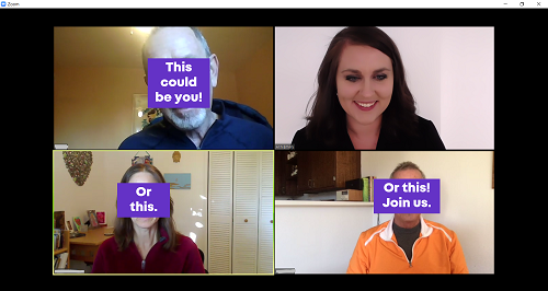
Then, join live Office Hours webinars twice each month. We meet over Zoom. Get targeted feedback on your draft visualizations.

Here’s everything that’s included:

  • 125+ recorded lessons to watch at the day and time of your choosing
  • 12+ hours of video, the equivalent of a 2-3 day training
  • Instant access to all the recorded lessons
  • Live Office Hours sessions twice a month
  • Downloadable resources like handouts and cheat sheets
  • Software-agnostic data visualization principles
  • Before/after makeovers inspired by research, evaluation, and analytics teams like yours
  • Examples from a variety of industries (public health, government, education, grantmaking, international development, hospitals, universities, and more)
  • License for the 200+ page ebook
  • Weekly messages to encourage you and keep you on track
  • The students-only Facebook community
  • Lifetime access
  • All future updates and additions

This is a best practices course, not a software how-to course. You won’t see videos about “First, click this button” and “Then, click this button.” That being said, you’ve got to use some software program. All the training examples have been made with everyday software you already own, like Excel, PowerPoint, Word, and other low-cost tools. You don’t have to be a computer programmer or a graphic designer to be a great communicator.

Register by May 1st.

What’s New for 2020

This is the third time we’ve offered this course: 2018, 2019, and 2020.

New for 2020! Live Office Hours sessions, new modules, lifetime access, guest speakers discussing COVID-19 data, & more.

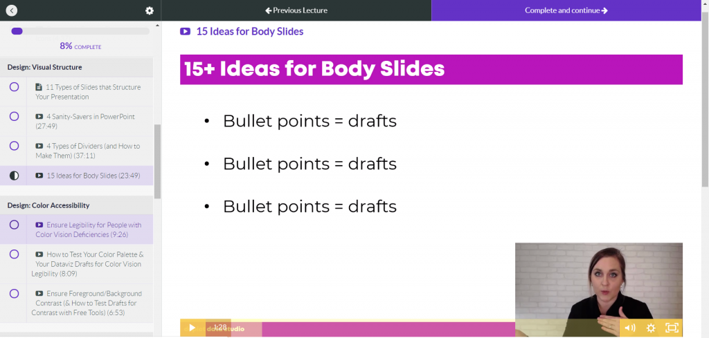
What’s Inside Each of the Modules

Data visualization isn’t supposed to feel daunting. We’ll walk through a step-by-step design process that you can apply to your own projects.

Welcome (10 min)

In this introductory module, you’ll get information about our live Orientation Session; a lesson on distinguishing between mediocre graphs from great graphs; links to download the handout and the 200-page ebook; an invitation to share your mailing address so I can send you dataviz swa in the mail; and an invitation to join the students-only Facebook community.

Module 1: Analyze Your Audience (6 lessons; 19 min)

There’s no such thing as a one-size-fits-all visualization. You’ll need to tweak, tweak, tweak to get the approach right for each of your difference audience types. You’ll learn what types of questions to ask during the planning phase of your project, like whether your viewers are technical or non-technical, what types of comparison data points could be provided, and whether your audiences are expecting a story.

Module 2: Choose the Right Dissemination Format (4 lessons; 11 min)

You’ll think about which format–a report, dashboard, infographic, one-pager, etc.–is best for each type of audience that you’re trying to reach. You’ll get downloadable worksheets like my Audience Crosswalk and Communications Plan.

Module 3: Choose the Right Chart (3 lessons; 15 min)

Chart-choosing is such an important skill, and it’s a skill that must be practiced over time (not learned overnight). In this module, you can download our 2-page Chart Chooser, which you can use as a handy reference guide.

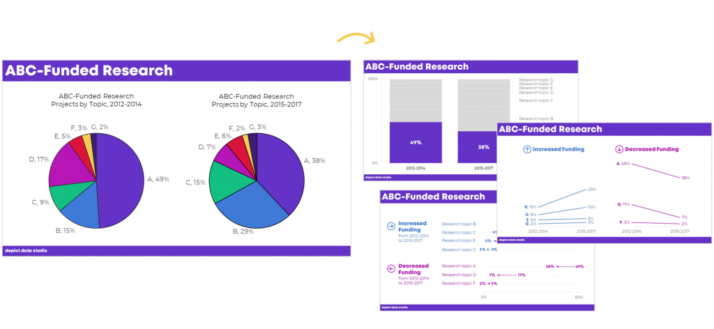
Module 4: Pies, Donuts, Square Pies, and Waffles (9 lessons; 45 min)

It’s easy for us–and a little lazy–to say “Never use pie charts!” It’s much more challenging to know which alternatives to use instead. In this module, you’ll learn the seven criteria that must be met in order to use a pie or donut. Then, you’ll learn about my love of square pies and waffles. You’ll see three before/after pie chart transformations, and then you’ll put your skills into use with two “Your Turn” activities.

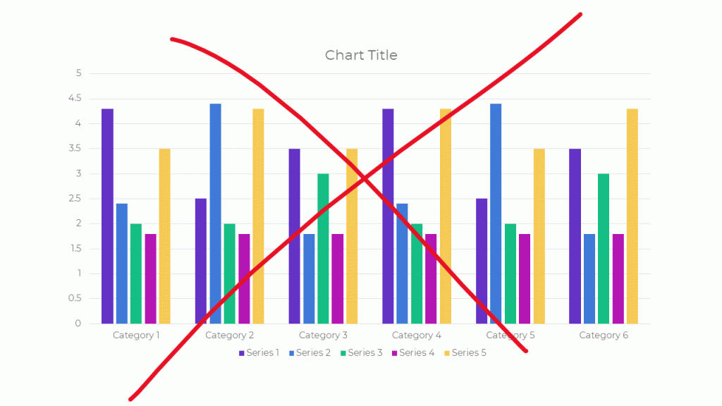
Module 5: Bar Charts (3 lessons; 25 min)

You’ll master the finer points of bar charts. Learn about scaling, shading, collapsing categories, and building diverging or small multiples charts. Then, learn alternatives like area graphs, square area graphs, and tree maps. Finally, learn how to use storyboarding during live presentations so that your dense bar charts are easier to follow.

Module 6: Choose the Right Chart, continued (8 lessons; 39 min)

Transform tables into visuals; avoid a (boring) report that’s just full of bar charts; and experiment with new-ish chart types like tile grid maps and Sankey diagrams.

Module 6: Visualizing Qualitative Data (12 lessons; 54 min)

You’ve probably heard that word clouds are outdated, but are you familiar with all the other options yet?

Module 7: Chart-Choosing Practice (6 lessons; 28 min)

By popular demand! We’ve got six examples specific to surveys. You’ll learn how to visualize yes/no questions, check-all-that-apply questions, rating scales, open-ended comments, demographic data on survey respondents, and pretest-posttest results. You can download the PowerPoint slides and Excel files that accompany these examples.

Module 8: Select a Software Program (12 lessons; 21 min)

I’ll provide an overview of my favorite software programs so you can understand the strengths and weaknesses of the major players in the market. New for 2020, we’ve got some info on getting started with Canva.

Module 9: Tell a Story (2 lessons; 14 min)

Data storytelling is a different type of storytelling than reading your kids fiction books at bedtime. In this module, you’ll learn exactly what’s meant by the term “storytelling” as it applies to preattentive attributes.

Module 10: Declutter (14 lessons; 1 hr 6 min)

Decluttering is addition through subtraction. I’ll give you permission to delete a lot of unnecessary ink! You’ll also learn about the finer points of decluttering that I never have time to cover during workshops, like decluttering visuals for scientific journals.

Module 11: Color (22 lessons; 1 hr 42 min)

You’ll get a behind-the-scenes peek into designer jargon like RGB, HEX, PMS, and CMYK codes. You’ll learn how to read your existing style guide. I’ll also cover techniques that I never have time to cover during workshops, like how to choose color palettes from scratch for your reports, slideshows, and dashboards if you don’t have a style guide. You’ll also learn about 508 compliance, like how to test your visuals for sufficient foreground/background contrast, colorblindness legibility, and grayscale legibility using accessibility checkers.

Module 12: Text (14 lessons; 35 min)

You’ll learn the basics like writing titles, subtitles, and annotations that encapsulate your key finding. You’ll also learn advanced nuances, like when to use right, left, centered, or justified text; when to use title case, sentence case, or all caps; and how to strategically place text beside graphs (rather than making viewers search through long paragraphs to find your key phrases). We’ll also measure your draft’s reading grade level and practice translating the research methods terminology we learned in grad school for the non-researchers who are using our data.

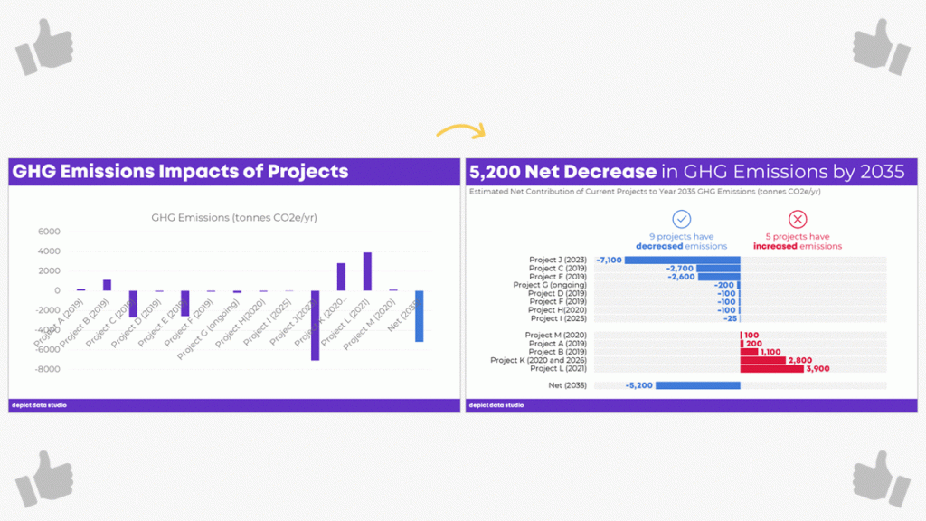
Module 13: Before/After Data Visualization Makeovers (9 lessons; 1 hr 17 min)

We’ll apply the skills you’ve learned in previous segments. You’ll see “before” graphs that are similar to graphs I’ve encountered while consulting to foundations, nonprofits, universities, and government agencies over the past decade. Then, you’ll see how I choose different chart types, declutter, and apply color and text strategically to complete overhaul each graph. Five of these examples were added for 2020.

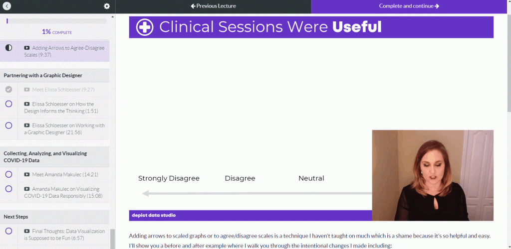
Module 14: Partnering with a Graphic Designer (3 lessons; 33 min)

New for 2020! Whether to DIY or partner with a graphic designer is different for every organization and every project. You’ll also get tips for working with graphic designers. If you hold a few productive planning calls at the beginning of your project, then you’re so much more likely to get the end result you want.

Module 15: Collecting, Analyzing, and Visualizing COVID-19 Data (3 lessons; 30 min)

New for 2020! I interviewed Amanda Makulec about collecting, analyzing, and visualizing COVID-19 data responsibly. I’ll be adding more interviews here over the next few weeks.

Module 16: Next Steps (3 lessons; 7 min)

I’ll share my final thoughts; a list of recommended resources; and invite you to complete the course evaluation survey.

Register by May 1st.

No Fancy Software Needed

This is a best practices course, not a software how-to course.

You won’t see videos about “First, click this button” and “Then, click this button.”

That being said, you’ve got to use some software program. All the training examples have been made with everyday software you already own, like Excel, PowerPoint, Word, and other low-cost tools.

You don’t have to be a computer programmer or a graphic designer to be a great communicator.

Feedback On Your Projects

You’ll get instant access to 125+ recorded lessons that you can watch anytime and two live Office Hours sessions every month to get targeted feedback on your visualizations.

What Students Are Saying

2,500+ researchers, evaluators, and analysts have taken online courses with us.

Here’s what some recent students are saying.

“This time last year I was struggling to decide (i) whether to spend money on a course to help me improve my data visualization skills and (ii) which one. Ann’s Great Graphs course exceeded my expectations and helped me improve my Excel skills as well. The course is well paced. The extra material in the monthly webinars was a super how-to to put the tools into practical use and provided the opportunity to ask questions. Having access to the webinars allowed me to go back and catch a few nifty Excel tricks that I hadn’t noticed during the webinar, saving me tonnes of time and frustration. Ann is fast and efficient! The course is well worth the time and money. Be prepared with your ideas and set aside time to follow along. You will be amazed at how much you can learn as the year flies by. Thank you Ann!”

- Judi Ekkert, Environmental Health Officer, Interior Health

“I would often see charts, graphs, and other data visuals in journal articles, and think to myself, ‘Wow, this is horrible; I have no idea what I am supposed to learn from this!” But I had no idea how to make it better or offer constructive suggestions. After just the first few weeks of Great Graphs, I learned about how to select the best type of graph and how to make it visually appealing to the intended audience. My own publications and posters have also benefited—no more hard-to-read charts filled with clutter! The videos were easy to follow along and the detailed blog posts with Excel hacks saved me a ton of time. Thank you Ann and I cannot wait to take your next course!”

- John R. Heberger, Epidemiologist, Centers for Disease Control and Prevention

“Thanks to Great Graphs, gone are the days of each of us taking the time to adjust Microsoft’s default formats by removing vertical and horizontal bars, shrinking gap widths, increasing data label font sizes and alignment, and the list goes on and on.”

– Courtney Sims, Sharp Insight

“I am in the process of completing Great Graphs. It has been so valuable to my work. The course encompasses everything from working with data, to presenting the data in reports and making presentations… After taking this course, I have much more confidence in making decisions about design elements in my work. Like many of you, I was trained in data analysis, not presentation. I have so many more tools to choose from for working in Excel, Word, and PowerPoint to ensure I get my point across to my audience. This has reduced my stress levels, increased my confidence, and freed up my mental energy to focus on the meaning of the data.”

– Cheryl Davis, Willamette Education Service District

“We’ve been so inspired in the past two years that we’ve written several reports using PowerPoint instead of Word. To tell you the truth, I wasn’t sure how our clients would receive this new format. The first time we wrote a report in PowerPoint, I was terrified the client would hate it and ask us to create a whole new traditional, text-heavy report. Luckily, that didn’t happen. Instead, the Foundation President told us it was the best evaluation report he had seen in 17 years!”

– Ann Webb Price, Community Evaluation Solutions

Register by May 1st.

FAQs

How long do I have access to the course?

Indefinitely. I used to limit access to just 12 months. I wanted to encourage you to get in here and learn with me, but instead it just stressed you out, so I’m not cutting off your access anymore.

What if I have questions about my individual dataset?

Join the live Office Hours sessions, which are held twice a month. If you can’t make the live sessions, you can submit questions in advance, and then watch the recording later to see how I addressed your question.

What if I am unhappy with the course?

We would never want you to be unhappy! If you are unsatisfied with your purchase, contact us in the first 30 days and we will give you a full refund.

I know you’re a perfectionist and always update your courses.

Yes, and you’ll be grandfathered-in to all future updates to this course.

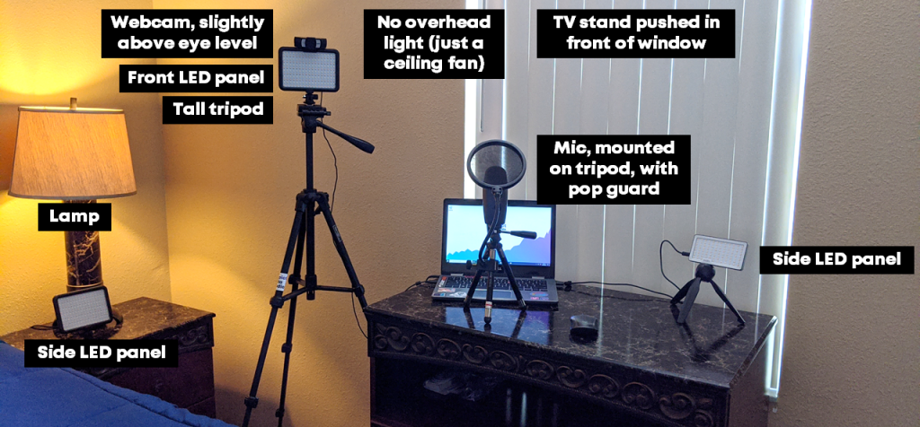
What does an online course look like inside?

I talk with you like a real person, not a monotone robot reading off a boring script.

Register by May 1st.

Register

  • $747 USD one-time purchase
  • Or, 3 payments of $249/month

See you in the course!

Ann

P.S. Wondering whether this course is right for you? Here’s a link to my secret calendar so you can chat directly with me: https://calendly.com/depictdatastudio/20min

Written by cplysy · Categorized: depictdatastudio

Apr 22 2020

Behind the Scenes with Elissa Schloesser, One of My Favorite Information Designers

“My ultimate goal was to work with organizations to help them communicate those complex things in graphic form,” Elissa Schloesser told me.

Elissa’s one of my favorite information designers.

We’ve partnered on a number of projects over the years, from full-length technical reports to one-page summaries.

I recently interviewed Elissa about her career path. Data visualization is still a fairly new area. So many women working in data, like Elissa, have blazed their own career path. I always love hearing about how others got started and what they’re up to now.

You can listen to our conversation here:

What’s Inside: Elissa’s Career Path as an Information Designer

  • The difference between a “graphic designer” and an “information designer”
  • What Elissa is currently working on
  • How she creates static graphics
  • Elissa’s favorite types of projects–“I like to take really complex, messy things and create graphics for them”
  • The types of clients she works with
  • How long Elissa worked for herself
  • What she did before owning her own company (hint: it wasn’t in design)
  • How a dashboard changed her career trajectory
  • How she went from dashboards to longer term planning projects like logic models
Example of a project from Elissa Schloesser of My Visual Voice.

Elissa’s Tips for Working with Graphic Designers or Information Designers for the First Time

In the interview, we also discussed Elissa’s tips for working with a graphic designer for the first time.

In particular, Elissa “I find that if you spend time up front talking with your designer, you’ll get a much better result,” she said.

“You don’t have to know everything when you come to the table,” Elissa stated about partnering with information designers on data projects.

“It’s really hard for somebody to describe a look and feel… ‘I want an infographic’. What does an infographic mean? It can be playful and cartoony, or much more serious and technical graphic.”

Elissa described the type of examples you can share with an information designer at the beginning of a project and where to find useful examples.

Example of a project from Elissa Schloesser of My Visual Voice.

Connect with Elissa Schloesser

Connect with Elissa:

  • My Visual Voice: Myvisualvoice.biz
  • Twitter: @myvisualvoice  
  • Instagram: @elissavisualvoice
  • LinkedIn: https://www.linkedin.com/in/elissaschloesser/

Learn Even More from Elissa

Elissa’s a guest expert in our Great Graphs: Design Principles online training program, which opens for once-a-year enrollment between Monday, April 27, 2020 and Friday, May 1, 2020.

Written by cplysy · Categorized: depictdatastudio

Apr 14 2020

Goodbye Microsoft Defaults, Hello Data Viz Toolkit!

Hi there! My name is Courtney Sims and I have the privilege of being a monitoring and evaluation Associate for Sharp Insight, LLC based in the Washington, D.C. region.

About Sharp Insight

At Sharp Insight, we support our clients wherever they are on their program evaluation path, often creating reports and presentations for funders and other key stakeholders.

The majority of my clients are youth-serving nonprofit organizations, including those that run out-of-school time programs and adolescent sexual and reproductive health initiatives. I find joy in being able to produce data visualizations that tell their own story, with one of my proud moments being when a client shared, “I just love this, it’s like it reads itself to me.” 

Producing Reports that “Write Themselves”

Of course, we all know that reports with easy-to-read visualizations and clear messaging don’t just “write themselves!” 

Our team works hard to produce meaningful deliverables with charts and graphs that honor best practices in data visualization. 

However, creating effective visuals is just one part of our jobs.  We have to balance our time in chart development with not only report writing but other key tasks including research, tool development, data analyses, site visits, and workshops. 

This led us to wonder, how can we work smarter by streamlining our internal data visualization development processes?

Developing a Data Visualization Toolkit with Examples and Templates

As a team, we knew we needed a go-to resource that would guide each of us in developing powerful visuals without (re-)creating them from scratch each time.  We also knew we needed someone to “own” this project for our team – me!  

And so, in October of 2018, I enrolled in Depict Data Studio’s Great Graphs online course, and what a meaningful, practical professional development opportunity it has been!  

Over the course of months and inspired by Depict Data Studio’s Chart Chooser, I was able to gain the skills needed to develop a comprehensive data visualization toolkit for our team, with:

  • visualizations to show big numbers,
  • approach toward a target,
  • change over time, and even
  • qualitative data visual examples and standards.   

Building on our existing visuals, I worked to generate these templates in our company branded colors, easily adapted to client colors with our handy saved color-palettes.

The Impact of Developing a Data Visualization Toolkit

Across our team, we’ve developed even more. 

Thanks to Great Graphs, gone are the days of each of us taking the time to adjust Microsoft’s default formats by removing vertical and horizontal bars, shrinking gap widths, increasing data label font sizes and alignment, and the list goes on and on.

Our new data visualization toolkit allows us to maximize our ability to exceed our clients’ expectations for visual-heavy reports while still giving us the time and energy to fulfill our numerous other tasks associated with being productive, responsible evaluators.  And for that, we are genuinely grateful!

Written by cplysy · Categorized: depictdatastudio

Mar 31 2020

Presenting Data While Working Remotely: Audio, Lighting, and Speaking Tips

I recently had the chance to talk with my friend Jon Schwabish of PolicyViz. You might recognize Jon from our earlier interview about tips for doing and teaching data visualization in cultures other than your own.

Our latest conversation was part of the Urban Institute’s Data@Urban Digital Discussions series. The intention of these talks are to connect with each other while we’re all social distancing. Check out the full line.

You can also watch our full discussion below Jon asked me some specific questions as well as opened up to the attendees for their questions and I’ll go over those below.

Want to skim the highlights from our discussion? Keep reading!

Which Data Visualization Trends Are Here to Stay?

Jon asked, what is one technique or trend that you’ve seen that you think is going to continue? What’s a challenge that you’ve seen that keeps popping up for the folks you’re working with?

Being a good writer is important, but being a great speaker just became more important than ever.

We have to connect with other people (over phone calls and video calls) while quarantined.

We have to stay in touch with fellow humans.

But we also have to get people to know, like, and trust us… so that they trust and use our data.

We can’t just write reports and make pretty slides. Reports and slides aren’t enough anymore… and have never been enough. Speaking skills matter more than ever.

What Do You Help Clients With?

When you’re working with clients, what are your main things that you’re trying to help them think about? How do you help them move past just creating the report?

Let me share an example from a recent client meeting.

A few weeks ago, I was in California to deliver a keynote speech at the U.C. Davis campus. After the keynote, I also met with a small group for a few hours to work on one of their data projects.

During that meeting, we focused on not putting all our eggs in one basket.
The group had put significant effort into developing a (really good) interactive dashboard for their website.

Dashboards are great for specific audiences. But they’re not enough on their own. Dashboards can reach some, but not all, of our intended audiences.

We pulled up the Urban Institute’s pyramid and talked about which dissemination formats are the best fit for certain audiences. As a group, we reached consensus that we needed more than just a report, or more than just a dashboard.

So while I do a lot of consulting on the specifics of reports, dashboards, presentations, and infographics, I also do a lot of consulting related to communication strategies more broadly. I want to make sure that organizations have selected the right mix or reports and/or dashboards and/or presentations and/or infographics before we spend our precious time, money, and mental bandwidth actually making or improving on those designs.

Tips for Presenting Data Over Video Calls

What are your top tips for setting up a good home office, especially for webinars and video calls?

I’ve been working from home for six years, and I’ve traveled full-time for the past year. I’ve got my “home” office set up really nicely! I can speak on podcasts, video calls, and record online courses from anywhere with minimal tech equipment.

Why Video Calls Matter

During this COVID-19 quarantine, we need quality human connection more than ever. We need to be able to see and hear each other on video calls (over Zoom, GoToMeeting Skype, etc.).

My public speaking coach taught me that only 40 percent of communication is the actual words that you use. The remaining 60 percent of communication is related to facial expressions, tone, pitch, using your hands to reiterate your main points, and so on.

You must look and sound professional during those video calls in order to get your point across. Sixty percent of your communication depends on it!

I suggest you focus on three areas:

  1. Audio
  2. Lighting
  3. Speaking skills

Audio Quality

Want to sound professional and be an effective communicator? We all need to invest in separate microphones.

You don’t need to spend a fortune. There are plenty of microphones in the USD $50 – $100 range.

I use this USB microphone and love it. It’s small so it even fits in my backpack while traveling for work, which means I can record online courses or speak on podcasts from anywhere in the world.

If you don’t have a separate microphone, then at the very least, you’ll need to use the ear buds that came with your cell phone. Those ear buds will have a built-in microphone. They won’t give you perfect audio quality, but they’ll be better for your audience than using your laptop’s built-in mic.

Lighting

Lighting is critical!

People can’t connect with you if they can’t see your face.

The number one thing to remember is: You don’t want to be backlit. Make sure your light source isn’t behind you.  

The best option is to have a natural light source (i.e., your window) in front of you. But, you also have to consider what’s behind you. For example, my current background is a spare bedroom in the Airbnb rental we’re in. Not my top choice. But we’re all making-do right now.

I’m a huge fan of separate LED lights. It doesn’t matter how amazing and life changing our dashboard, graph or presentation is, if people don’t know, like, and trust you as the presenter of that dashboard. Trust is huge with data, and that’s why I use separate LED panels. So people can see my face! I’ve used these LED panels for years and love them.

When buying a LED light panel, you want to make sure that it has:

  1. Knobs that allow you to adjust low-high brightness level. If the light is too bright, you’ll look sweaty and shiny. You’ll need to adjust the brightness level and you’ll need to adjust your distance from the lights. I make sure to stand at least an arm’s length away from my lights.
  2. Knobs that allow you to adjust the cool-warmth balance.  You need to be able to adjust it based on your skin tone and what suits you best.

Speaking into the Camera

You have to look into the camera!!! Not at yourself on your laptop screen!!!

If you can only see my eyelids, because I’m busy looking down at my own face on my laptop, then you can’t connect with me as a human being.

Ann K Emery showing how to not speak into the camera: by looking at your laptop the entire time. You can't connect if you can only see each others eyelids.

It’s much easier for your audience to connect with you when they can actually see your eyes:

Ann K Emery showing how to speak into the camera- by looking at the camera. People can connect better when they see each others eyes.

Is it weird to look into your webcam? Of course. It takes practice. But it’s worth the effort. Small sacrifice for you. Big payoff for your audience.

My preferred setup is a tripod with this webcam and LED panel mounted onto it.

Prop Up Your Webcam

Your webcam should be slightly above eye level. Mine usually hits me in the forehead.

If you’re using your laptop’s built-in webcam, then your webcam will be waaaaay too low, and you’ll get the dreaded double chin.

You’ll need to prop up your laptop with cardboard boxes, a stack of textboxes, or even by standing in front of a makeshift “desk” like a tall dresser.

You need 100% of your mental bandwidth to be focused on discussing your data on camera. You can’t waste a moment by being self-conscious, and you’ll definitely be self-conscious on camera if you’ve got a double chin!

When you know that you look your best on camera, then you don’t have to worry about how you look.

Zoom Out & Show Your Hands

Zoom your camera out and include your hands in the shot.

Or, stand far enough away from your webcam so that your hands are included in the shot.

There’s lots of promising research about how your audience rates you as being more trustworthy when they can see your hands.

You don’t want to wave your hands around wildly, but you can use your hands to:

  • Count things off (idea 1, idea 2, etc.)
  • Indicate sizes (large, small, etc.)
  • Use your hands near your heart to express empathy
  • Show chronology (point down for ‘happening now’ or point behind you for ‘in the past’)

Pregnant? Show Your Beautiful Belly! (Or Not…)

If you look back at some of my older videos, they are purposefully only showing my head and shoulders. I was trying to block out my pregnant belly.

I didn’t want clients to know I was pregnant. Pregnancy discrimination in the workplace is real. I didn’t want to lose paying clients because they knew I was pregnant.

During both of my pregnancies, I got several emails from prospective clients along the lines of, “We were going to have you come speak but, heard your great news! We know you’re expecting, so we found another speaker instead.”

What a frustrating experience. To be fired before you even got the job.

If you choose to hide your belly while on camera, I get it. I’ve been there too.

My Makeshift Home Office

Here’s my latest set-up, from the Airbnb outside of Orlando that we’re calling home for a few weeks (or months?).

Picture of Ann K Emery's current home office set up that includes  a webcam, LED light panels, tripods, microphone and different light sources.

Lessons Learned from Teaching Online Courses

My question is about your lessons learned from your online training courses. There are lot of platforms out there, I’m curious about your experience and what’s worked for you.

This is a day-long conversation. 😊

I have learned so much about developing online data visualization training.

I’ve been speaking forever (well, since I started giving conference presentations about ten years ago). Then, I started working for myself six years ago. Two years ago, I finally listened to my friend Chris Lysy and started developing online courses.

Over the past two years, I’ve developed:

  • Simple Spreadsheets, my data analysis course;
  • Great Graphs: Design Principles, my software-agnostic course about data visualization best practices;
  • Great Graphs: Excel How-Tos, my behind-the-scenes course about advanced Excel charting tricks;
  • Dashboard Design, my course on making static one-pagers in spreadsheet programs like Excel;
  • Powerful Presentations, my deep dive on presenting visualizations in slideshows, staff meetings, and webinars;
  • Report Redesign, my deep dive on reporting best practices;
  • Soar Beyond the Dusty Shelf Report, my complimentary mini course about getting started with dataviz; and
  • Look Professional on Camera, our latest complimentary mini course, with behind-the-scenes tech tips for speaking on podcasts, recording online courses, and being interviewed on camera.

There are currently 540 lessons (!) inside these courses. So, it’s safe to say that I’ve learned a thing or two about what works—and what doesn’t—when it comes to teaching online.

Online Course Platform: Teachable

I use Teachable as my online course platform.

I use Teachable because I asked about 10 of my friends who make their living teaching online—meaning they make a full salary from their online course revenue alone, not just a couple hundred bucks her and there—and they all used Teachable.

That was a good enough endorsement for me!

I’m not an affiliate, just a very happy customer.

Their founder, Ankur Nagpal, also gives me a lot of confidence in their product. Ankur and his team are constantly improving. They interview instructors like me and they listen to our feedback. I love that. Sure, there are technical glitches once in a while, just like any software platform would have. But the Teachable team is constantly improving and iterating for their creators.

I also like Teachable because it’s user-friendly for students. Students log in, see the syllabus listed along the left, and see the video in the main screen. Underneath the video, you can add descriptions, images, quizzes, discussion boards, and attachments.

Screenshot of Ann K Emery's schools on the Teachable platform.

Video Player: Wistia

Teachable also uses a video player called Wistia, which is a bit cleaner than YouTube. It just has a play button and a couple of settings. I’m always aiming to make the students learning experience as easy and simple as possible.

Wistia also adjusts the resolution based on your internet speed for students and will play the best version for what your internet is like that day. I have students located in offices all over the world—I’m thinking of my international development and public health professionals in rural villages in Bangladesh—and I know they can participate even with slower internet speeds.

How to Create Content

Moving online was fairly seamless for me because I’d already been doing in-person trainings.

I see people creating courses from scratch and that’s really difficult.

But if you already have a 30- to 60-minute conference presentation that you’ve given, you can absolutely record that and turn it into a mini course.

Recording Tools: Screencast-O-Matic and Camtasia

For recording, I used to use Screencast-O-Matic . I liked it because you just hit record. It’s affordable and there’s only a little bit of minor editing to do.

A few months back I switched to using Camtasia to have more control over the editing. I’m not a master editor. I still mostly record my screen with my webcam in the corner. But now I can add text boxes, animations, and sounds.

Video Length: Varies on Purpose

Video length varies.

I used to think having a bunch of 2-minute videos was better than having a single 10-minute video. And honestly I’m still torn over this.

I’m monitoring the data behind the scenes to see what my students like the best. Right now, I purposely have a mix of anywhere from 2 minutes to 45 minutes.

Starting NOW with Online Training

I wish I started teaching online even earlier.

I started YouTubing way back in 2012, but it wasn’t until 2018 that I finally figured out that online courses were a “thing.”

Online learning doesn’t replace in-person learning. They’re apples and oranges; different formats with different strengths.

If you’re thinking about starting, then start today! You’re not behind. Now’s the time. 

Using Icons Within Reports

I noticed one of the key features of your reports is to use icons to make things a little bit more intuitive. I used the nounproject.com to get icons to use in my reports. Are there any other resources you’d suggest for icons?

I’ll list out the options from worst to best:

Google Search

Don’t do a Google search for download free icons. This gets you in copyright jail. There are better options.

Microsoft Office

If you’re using Office365, then you’ve got free icons in PowerPoint, Word, and Excel.  Just go to Insert àIcons. You can customize the color, the size, and so on.

The Noun Project

The Noun Project has both free and paid versions.

The free version…

  • Gives you access to thousands of icons
  • Only lets you download the icons in black
  • Requires that you cite your icon source

The paid version—which is a whopping $40/year, what a steal!!—is such a great resource. The paid version…

  • Gives you access to ALL their icons
  • Lets you download the icons in the custom color (RGB, Hex, etc.) of your choosing to match your brand guidelines
  • Doesn’t require that you cite your icon source (One less thing to remember; One less chance of going to Copyright Jail)

Custom Made Icons

The top tier is to hire a graphic designer to create custom icons for your organization.

I’m starting to see a lot more organizations do this and am always suggesting this to my clients.

A designer can come up with a couple dozen icons that your organization can use over and over again. The designer can also ensure that your icons match—that they all have the same edges (square vs. rounded), the same line thickness, and so on. These are small details that will make a report look as professional as possible.

A professional graphic designer might charge you anywhere from a few hundred to a few thousand dollars for this, depending on what you need.

Your Turn

How are you coping with presenting data while working remotely? Do you have your own audio, lighting, and speaking tips to share?

Written by cplysy · Categorized: depictdatastudio

Mar 24 2020

Advice for Early-Career Data Visualization Freelancers: Ann’s Interview with Jane Zhang

When Jane Zhang wanted to interview me for her article for
the Data Visualization Society, I agreed!

We decided to record our conversation so that even more
people could benefit from learning about the business behind my business.

This conversation might be especially helpful for early-career data visualization freelancers—or those contemplating the switch from a salaried job into a freelancing job. If that’s you, welcome to the dataviz community! And enjoy this video interview.

What’s Inside

  • How I got started six years ago
  • Whether I’d planned to work for myself from the
    beginning
  • The critical turning points in my
    decision-making process
  • What type of advice I received from mentors
    early on
  • How the work I’ve done has shifted over the past
    six years
  • All of the correct ways to make a living with
    data visualization
  • How my previous workplaces were so supportive of
    data visualization
  • Whether I think anyone can teach
  • What High Schooler Ann thought she’d be when she
    grew up—and how my career path isn’t that different from what I originally
    planned
  • How I found my earliest clients
  • How blogging for several years before going solo
    unintentionally became a solid portfolio
  • How professional volunteering on boards built my
    network and helped/helps me find projects that are a good fit for me
  • Why I always recommend that early-career dataviz
    enthusiasts start blogging
  • Where my income comes from (the percentage from
    in-person training, online training, consulting, keynotes, and other sources)
  • Why I’m trying to do even more online training
  • How I manage traveling in the U.S. and
    internationally with my family
  • How I’ve moved mountains for the right work-life
    balance
  • Why you need to niche-down for your own sanity
  • How you actually decide what to specialize in
  • What my staffing structure has looked like in
    the past, and what it looks like now
  • Why I’ll never, ever hire full-time employees
  • How I learned how to run a business
  • Why so many people hesitate to run their own
    business
  • How little I understand about my own visibility
    and presence
  • What I’m really aiming for during my training—which
    is often much different than the workshop objectives written out on paper
  • Why it’s critical to give yourself a Dabbling
    Year(s) when you’re first starting out
  • What Jane’s currently working on

Listen to Our Convo

Resources Mentioned

Jane’s article on quitting her salaried job to pursue freelancing.

This book about running a lean, minimalist business.

This book about setting your rates as an independent consultant.

This scheduling tool that keeps me sane.

This Data Vizard t-shirt.

Connect with Jane Zhang

Connect with Jane:

  • Jane’s blog: janezhang.ca/
  • Jane’s articles on Medium
  • Twitter: @janezhgw
  • Instagram: @janezhgw
  • The project she posted on Instagram and her first-ever client saw it: https://janezhang.ca/posts/designto-2019/
  • The travel guide post that helped Jane land her second client: https://janezhang.ca/posts/toronto-summer-guide/

Your Turn

Did anything surprise you about our conversation?

What additional questions do you have for me?

What additional tips do you have for early-career dataviz
freelancers?

Comment and let us know!

Bonus: Read the Full Article

Jane’s full article just got published! Read about her interviews with RJ Andrews, Alli Torban, Matt Baker and I: https://medium.com/nightingale/how-self-employed-data-visualization-designers-make-a-living-23dc00ea5264

Written by cplysy · Categorized: depictdatastudio

  • « Go to Previous Page
  • Go to page 1
  • Interim pages omitted …
  • Go to page 34
  • Go to page 35
  • Go to page 36
  • Go to page 37
  • Go to Next Page »

Footer

Follow our Work

The easiest way to stay connected to our work is to join our newsletter. You’ll get updates on projects, learn about new events, and hear stories from those evaluators whom the field continues to actively exclude and erase.

Get Updates

Want to take further action or join a pod? Click here to learn more.

Copyright © 2026 · The May 13 Group · Log in

en English
af Afrikaanssq Shqipam አማርኛar العربيةhy Հայերենaz Azərbaycan dilieu Euskarabe Беларуская моваbn বাংলাbs Bosanskibg Българскиca Catalàceb Cebuanony Chichewazh-CN 简体中文zh-TW 繁體中文co Corsuhr Hrvatskics Čeština‎da Dansknl Nederlandsen Englisheo Esperantoet Eestitl Filipinofi Suomifr Françaisfy Fryskgl Galegoka ქართულიde Deutschel Ελληνικάgu ગુજરાતીht Kreyol ayisyenha Harshen Hausahaw Ōlelo Hawaiʻiiw עִבְרִיתhi हिन्दीhmn Hmonghu Magyaris Íslenskaig Igboid Bahasa Indonesiaga Gaeilgeit Italianoja 日本語jw Basa Jawakn ಕನ್ನಡkk Қазақ тіліkm ភាសាខ្មែរko 한국어ku كوردی‎ky Кыргызчаlo ພາສາລາວla Latinlv Latviešu valodalt Lietuvių kalbalb Lëtzebuergeschmk Македонски јазикmg Malagasyms Bahasa Melayuml മലയാളംmt Maltesemi Te Reo Māorimr मराठीmn Монголmy ဗမာစာne नेपालीno Norsk bokmålps پښتوfa فارسیpl Polskipt Portuguêspa ਪੰਜਾਬੀro Românăru Русскийsm Samoangd Gàidhligsr Српски језикst Sesothosn Shonasd سنڌيsi සිංහලsk Slovenčinasl Slovenščinaso Afsoomaalies Españolsu Basa Sundasw Kiswahilisv Svenskatg Тоҷикӣta தமிழ்te తెలుగుth ไทยtr Türkçeuk Українськаur اردوuz O‘zbekchavi Tiếng Việtcy Cymraegxh isiXhosayi יידישyo Yorùbázu Zulu