• Skip to main content
  • Skip to footer
  • Home

The May 13 Group

the next day for evaluation

  • Get Involved
  • Our Work
  • About Us
You are here: Home / Archives for allblogs / depictdatastudio

depictdatastudio

Apr 11 2025

Line Chart to Small Multiples – Remaking a NSF Graduate Research Fellowship Program Graph

I recently saw this graph on LinkedIn.

The topic caught my attention, but I was worried that the internet weirdos would ignore it because the axis doesn’t start at zero.

People will create all sorts of excuses to ignore data and facts.

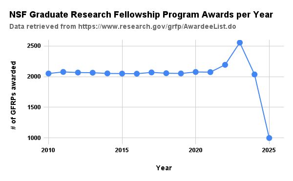
I also wanted to try a column chart.

And someone else commented on LinkedIn that the number of honorable mentions – which increased this year – could be helpful to see.

In all my “spare” time on a Friday afternoon, I re-made it:

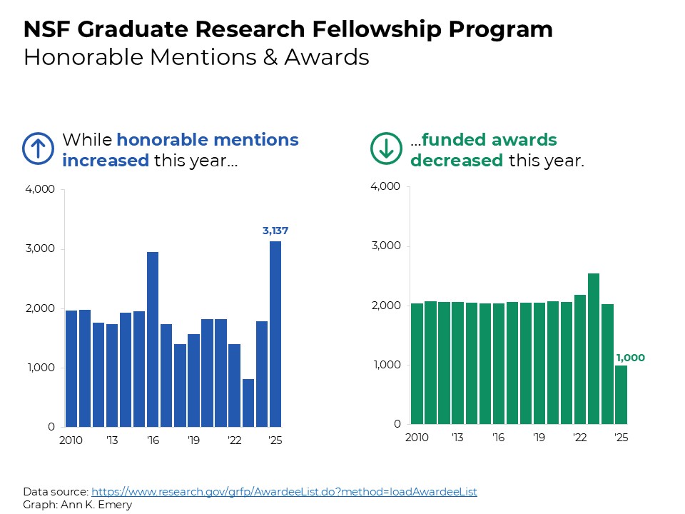
The dot dot dot title for small multiples graphs… swoon. <3

I love using takeaway titles that extend across the page (to help readers see how the graphs are connected).

Behind the Scenes

More info about my thought process, and some Excel and PowerPoint how-to’s.

What’s Inside

  • 0:00 Welcome
  • 0:20 The original line chart
  • 1:38 The edited column chart
  • 2:18 What about honorable mentions?
  • 3:00 Ann’s drafts
  • 4:30 Finished product – the small multiples column chart
  • 6:23 Behind the scenes in PowerPoint
  • 6:40 Questions? Comments?

Download the Excel File

It’s here: https://depictdatastudio.kit.com/remaking-nsf-graph

Written by cplysy · Categorized: depictdatastudio

Mar 31 2025

6 Examples of Interactive Dashboards Made in Microsoft Excel

Excel can do a lot—formulas, pivot tables, charts, static one-pagers, and even interactive dashboards!

In this article, you’ll see a few examples and how-to tips to get you started.

YouTube Stats

Are you brand new to Excel dashboards?

This YouTube video’s about the how-to process at a glance.

Colonoscopy Screening Compliance

Want a little more how-to info?

In this video, you’ll see me describing the process to my 3rd grader.

I recently worked with the National Association of Chronic Disease Directors. These are made-up numbers, but inspired by their datasets.

Demographics

Want a full-length tutorial?

This is a recording of a 30-minute conference session.

Inside, you’ll see pretend demographic data, inspired by my work at a youth center back in the 2010s.

Grantmaking

This YouTube video is about contiguous datasets–the first and most important piece of interactive dashboards.

I work with a variety of foundations. This is nobody’s real data, but inspired by the types of variables that most foundations keep track of, like grantee names and funding amounts.

State Snapshots

This YouTube video’s about the state icons, but you’ll see a state snapshot example.

Hospital Outpatient Procedures

I recently worked with a healthcare system to visualize their outpatient procedures. We started experimenting with two different layouts.

I don’t consider these visuals to be finished-finished, so there’s no YouTube video or in-depth tutorial about them.

Here’s the first idea, which focuses on market share (which hospitals are performing the most procedures). The user can drill-down by county, city, or service line (the type of procedure).

Here’s the second idea, which focuses on county-level data, not hospital-level data.

Your Turn

What types of how-to questions do you have for me?

Comment below and I’ll answer as many questions as I can!

Written by cplysy · Categorized: depictdatastudio

Mar 24 2025

Re-Sorting Categories in Pivot Tables

By default, Excel will sort categories alphabetically or chronologically.

But we can use the “brackety compass rose” to customize our pivot tables… which lets us customize our graphs.

For example, with this technique, we can re-sort Agree, Disagree, Neutral, Strongly Agree, Strongly Disagree…. into Strongly Agree, Agree, Neutral, Disagree, Strongly Disagree.

Learn how in this lesson:

What’s Inside

  • 0:00 Intro
  • 1:18 Re-Sorting Months in Pivot Tables
  • 6:26 Re-Sorting Survey Response Options in Pivot Tables

Related Resources

  • What are Helper Cells?
  • How to Sort Your Bar Charts

Written by cplysy · Categorized: depictdatastudio

Mar 23 2025

What are Helper Cells?

What are Helper Cells, exactly?

In this video, you’ll see 3 examples of these intermediate cells, which give you full editing control over your graphs, maps, and tables.

What’s Inside

  • 0:00 Intro
  • 1:28 What are Helper Cells? Regular Table — Intermediate Table — Graph
  • 1:57 Population Pyramid Example
  • 5:04 Recoding Example
  • 7:15 Map Example

Related Resources

  • How to Make Population Pyramids in Excel
  • Troubleshooting Excel Maps

Written by cplysy · Categorized: depictdatastudio

Mar 04 2025

How to Make Online Courses

I just finished re-recording Dashboard Design!

I’ve had 10,000+ students in my online courses since 2018, and I get a lot of questions about this process, like…

  • How did you turn your keynote into a full-length online course?
  • How did you turn your private, on-site workshop into an asynchronous online course?

In this video, you’ll go behind the scenes and learn about the course creation process.

What’s Inside

First, you’ll see the student’s perspective:

  • 0:00 Intro
  • 0:31 Student Perspective: Inside the Videos and Lessons via Teachable
  • 2:25 Student Perspective: Private Community via LinkedIn
  • 2:38 Student Perspective: Weekly Messages via Kit
  • 3:39 Student Perspective: Live Office Hours via Zoom

Then, you’ll learn about the instructor’s perspective:

  • 5:10 Instructor Perspective: Step 1 – Make the Content
  • 6:54 Instructor Perspective: Step 2 – Record (via Camtasia)
  • 7:15 Instructor Perspective: Step 3 – Edit
  • 7:35 Instructor Perspective: Step 4 – Upload (e.g., captions and transcripts via Descript)
  • 9:36 Instructor Perspective: Step 5 – Get People to Register
  • 10:45 Who’s Involved (Outsourcing)
  • 11:43 How Long it Takes

Resources Mentioned

  • https://teachable.com/
  • https://kit.com/
  • https://www.techsmith.com/store/camtasia
  • https://web.descript.com/
  • https://zapier.com/

Written by cplysy · Categorized: depictdatastudio

  • « Go to Previous Page
  • Go to page 1
  • Interim pages omitted …
  • Go to page 3
  • Go to page 4
  • Go to page 5
  • Go to page 6
  • Go to page 7
  • Interim pages omitted …
  • Go to page 37
  • Go to Next Page »

Footer

Follow our Work

The easiest way to stay connected to our work is to join our newsletter. You’ll get updates on projects, learn about new events, and hear stories from those evaluators whom the field continues to actively exclude and erase.

Get Updates

Want to take further action or join a pod? Click here to learn more.

Copyright © 2026 · The May 13 Group · Log in

en English
af Afrikaanssq Shqipam አማርኛar العربيةhy Հայերենaz Azərbaycan dilieu Euskarabe Беларуская моваbn বাংলাbs Bosanskibg Българскиca Catalàceb Cebuanony Chichewazh-CN 简体中文zh-TW 繁體中文co Corsuhr Hrvatskics Čeština‎da Dansknl Nederlandsen Englisheo Esperantoet Eestitl Filipinofi Suomifr Françaisfy Fryskgl Galegoka ქართულიde Deutschel Ελληνικάgu ગુજરાતીht Kreyol ayisyenha Harshen Hausahaw Ōlelo Hawaiʻiiw עִבְרִיתhi हिन्दीhmn Hmonghu Magyaris Íslenskaig Igboid Bahasa Indonesiaga Gaeilgeit Italianoja 日本語jw Basa Jawakn ಕನ್ನಡkk Қазақ тіліkm ភាសាខ្មែរko 한국어ku كوردی‎ky Кыргызчаlo ພາສາລາວla Latinlv Latviešu valodalt Lietuvių kalbalb Lëtzebuergeschmk Македонски јазикmg Malagasyms Bahasa Melayuml മലയാളംmt Maltesemi Te Reo Māorimr मराठीmn Монголmy ဗမာစာne नेपालीno Norsk bokmålps پښتوfa فارسیpl Polskipt Portuguêspa ਪੰਜਾਬੀro Românăru Русскийsm Samoangd Gàidhligsr Српски језикst Sesothosn Shonasd سنڌيsi සිංහලsk Slovenčinasl Slovenščinaso Afsoomaalies Españolsu Basa Sundasw Kiswahilisv Svenskatg Тоҷикӣta தமிழ்te తెలుగుth ไทยtr Türkçeuk Українськаur اردوuz O‘zbekchavi Tiếng Việtcy Cymraegxh isiXhosayi יידישyo Yorùbázu Zulu