• Skip to main content
  • Skip to footer
  • Home

The May 13 Group

the next day for evaluation

  • Get Involved
  • Our Work
  • About Us
You are here: Home / Archives for allblogs / evalacademy

evalacademy

Jan 14 2022

Grab the cake, it’s time for a data party! Benefits of and how to run your own

So you’ve successfully gathered the data you need to evaluate your program. But how do you engage stakeholders and partners to ensure a thorough understanding of the results? A data party could be part of the answer!


What is a data party?

A data party is a gathering that allows stakeholders to increase their understanding of findings and provide input into data sense-making. A data party is a process of participatory data analysis with program stakeholders. During a data party, stakeholders come together to interact with and interpret the data and provide input into final conclusions and recommendations. This process often leads to different views and perspectives of the results to be discussed.  


Why host a data party?

A data party promotes a culture of participation and collaborative data interpretation. Often, evaluators collect, analyze, and interpret evaluation data with minimal program staff and program service recipients’ involvement, which can lead to gaps in the interpretation and a missed opportunity to gain their insights on the main findings. A data party addresses this gap and involves program staff and service recipients in interpretation and sense-making.  

One way of increasing stakeholder and community participation is through collaborative data interpretation. In program evaluation, it is difficult to implement a true participatory method as most projects have a limited timeline and budget for evaluation. A data party provides an opportunity for engagement to groups that are often left out of discussions.  

Engaging stakeholders in data interpretation enhances the acceptance of the evaluation findings and recommendations. It also provides context and expertise that the evaluator may be missing and helps to ensure the evaluator’s interpretation and resulting recommendations are appropriate and feasible. A data party creates a platform to combine specific data points with personal experience and helps to better explain challenges in programs (e.g., where and why programs are falling short). The discussion during the event empowers stakeholders, provides a learning opportunity, and enhances engagement.  


How to successfully throw a data party

Like all other parties, each data party is unique. There are many ways to organize a successful data party depending on the project context, the type of available data and the stakeholder groups. We’ve included a few points below to get you started.

1. Purpose

Clearly stating the objectives of the data party will shape the event and will make planning easier. Identifying the purpose will determine the content of data presented, and the discussion questions.  

2. Invitation

Identify the different stakeholder groups you want to involve and the number of participants from each group. Having a clearly stated purpose can support this. Offer support so that all stakeholder groups, including program service recipients, can attend (e.g., cover travel costs, and if necessary, offer translation services, etc.)  

 3. Venue

Depending on what’s convenient within the project context, it can be organized in person or online. If it is virtual, provide the dataset or summaries in advance to ensure all participants have access.  

4. Timing

The ideal time to organize a data party is after you have collected and analyzed all the evaluation data and before you draft the final report. When scheduling, consider the availability of all participants.  

A data party can take several hours depending on the complexity and size of the evaluation. Since understanding and sense making of the data takes a bit of time, it is important to allocate sufficient time to give participants a chance to review the data completely and get the dialogue flowing across diverse perspectives. In a small project, a data party may be just 1-2 hours. For more complex projects with lots of data, your party may take 3 hours or more. 

5. Mix it up

If you have a large group of participants (more than 8), use break-out rooms to organize them into smaller sub-groups (4-5). Mix stakeholder types in each sub-group to promote the exchange of different perspectives. Have an evaluation team member facilitate the discussion and take notes for each sub-group.    

6. Data

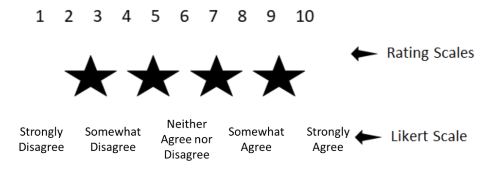
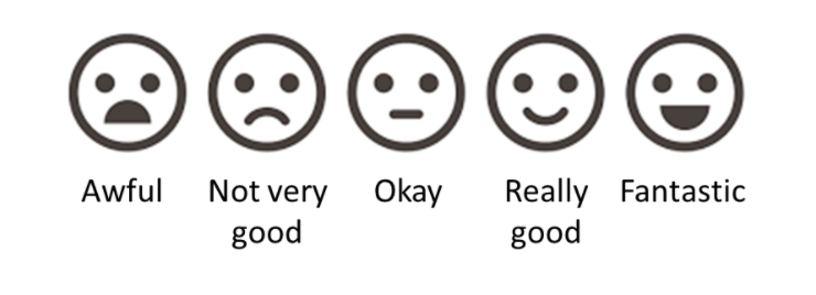
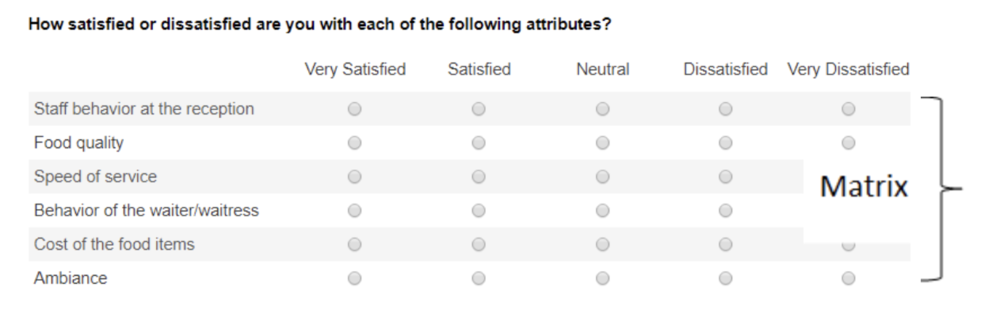
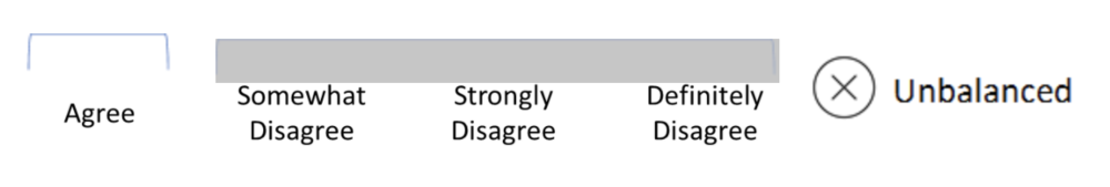
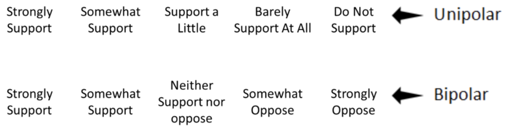
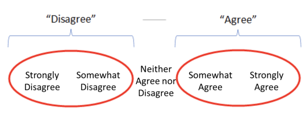
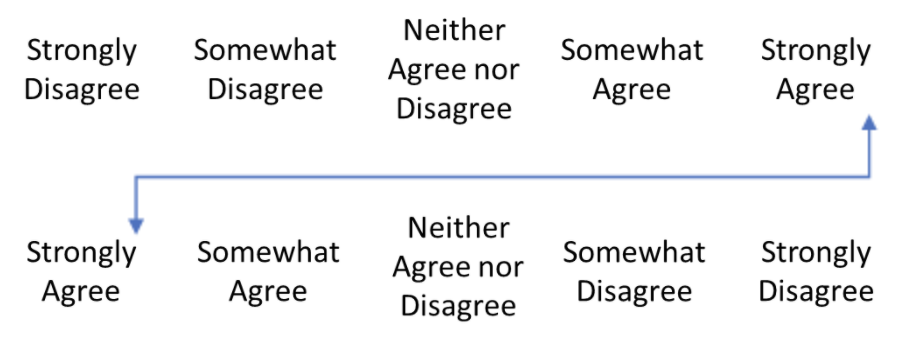
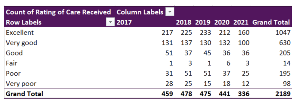
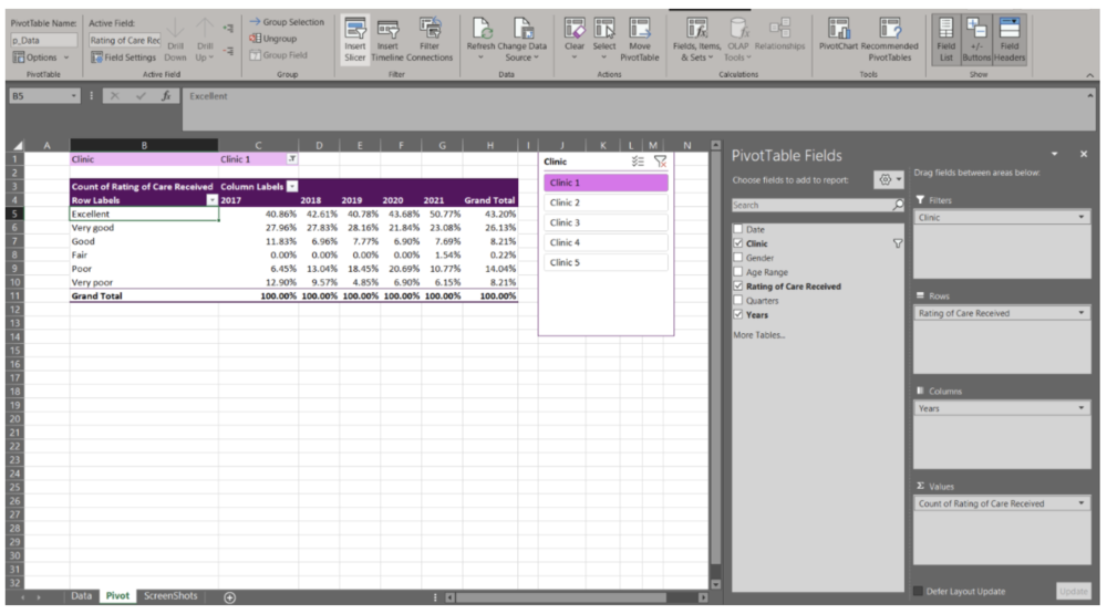
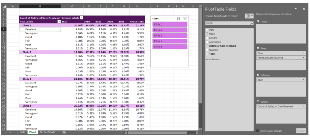
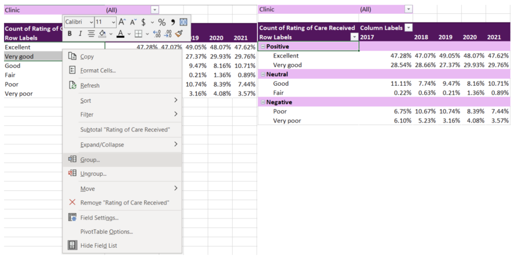
Including the right data is critical for the success of a data party, so select your content carefully while considering the purpose of the event (e.g., data that needs verifying, outliers, etc.). Provide accessible information and prepare the findings in a way that is easily understood by all stakeholder groups for meaningful participation. Use various approaches to share the main findings to keep participants engaged (e.g., posters – where participants walk around the room in groups and look at data; data placemat – a document showing quantitative and qualitative data using visuals, graphs, word clouds etc.).  

7. Probe

If stakeholders disagree, probe and inquire to gather as much context to clarify how they have understood the data and where they are coming from. The purpose is to co-create meaning and explore new ways of looking at things, not to gather support for existing interpretations.  

8. Discussion Questions

Prepare questions in advance and facilitate the discussion within each sub-group. Sample discussion questions include:  

  • What is the data telling you about (insert topic)? 

  • What stands out for you? Are there any surprises? 

  • What would you be interested to explore and/or discuss further?  

  • What is missing in the data that you thought you would see?  

  • What actions would you take as a result of these findings? 

If you have draft recommendations as a result of your analysis you would like to discuss with stakeholders, consider the following questions:  

  • What response do you think is required here?  

  • How viable are these recommendations? 

  • Which feel most doable? 

  • How might we best communicate these findings to decision-makers? 

9. Reporting

Don’t forget to write about your data party in your report – highlight your approach in the methods section, and in the results and recommendation sections don’t forget to credit ideas to stakeholders (you can use call-out boxes to distinguish findings).   

10. Fun

Try to make your data party fun and engaging.  Some ideas include offering food (can we suggest cake?) setting an energetic tone by designing a cool invitation, starting the event with a short but fun icebreaker, and sharing the evaluation findings in a creative way (also maybe with cake!). 


Have you organized a data party? How did it go?  Let us know your experience in the comments.  


Sign up for our newsletter

We’ll let you know about our new content, and curate the best new evaluation resources from around the web!


We respect your privacy.

Thank you!


Written by cplysy · Categorized: evalacademy

Dec 16 2021

Everything You Need to Know about Likert Scales


Evaluators love a good survey. And why shouldn’t we? They are a cost-effective, quick method for capturing good data! However, not all surveys are awesome – we’ve all come across poorly crafted surveys. Maybe it’s full of double-barreled questions. Maybe the questions are loaded, or leading. Or maybe the response options don’t match how you would choose to respond.  

The Likert scale (check this out for a debate on how to pronounce it! Personally, I’m on the LIKE-ert side of this one) is one of the more commonly used rating scales in surveys. As evaluators, we should know a thing or two about it, and how to navigate some of the decisions involved in using a Likert scale.


What are Likert Scales? 

Likert scales were named after Rensis Likert, a social scientist, who developed the scale as a way to assess a person’s attitudes or feelings. There are many factors that can be assessed using a Likert scale, including (but not limited to): 

  • Level of agreement, satisfaction, concern, acceptability, support, importance, difficulty, and awareness 

  • Frequency 

  • Valence/Quality 

  • Likelihood 

The Likert scale is an important move away from binary-only responses (i.e., yes/no) and helps the evaluator assess a respondent’s feelings or thoughts on a range or spectrum, allowing for a better, more nuanced understanding. Statistically, this offers more variance or discrimination in your data. 

Notably, as opposed to rating scales the Likert rating scale uses labels – actual words – for each rating.

Likert scales have some great advantages, including the options to use icons or faces for children or others who may have difficulty reading:

They are also great for formatting into a matrix when you are designing your survey, making it take up less space and easier for the respondent to fill in.


Common Questions about Using the Likert Scale

Like other surveys, a Likert scale survey is still susceptible to the pitfalls of poor survey design: e.g., you still can’t have a double-barreled question. In fact, there are a few additional concerns, or at least conversations, that swirl around the Likert scale: 

  1. Do you have to use an odd number of ratings (with a middle point)? 

  2. How many anchor points should I use: 3, 4, 5, 6, 7? 

  3. How do I report a Likert scale survey? 

    • How do I analyze the data? 

    • Can you combine ratings? 

I’ll tell you right now, I don’t have clear answers for any of these 3 questions. But I can help to lay out the arguments for you so that you can make an informed decision. 

Does a Likert scale have to have an odd number of choices?

Most Likert scales you come across will have a middle point that offers a neutral selection choice:

Do you have to include this? No. If you don’t, you’re created what’s called a “forced choice” Likert scale. That is, you’re forcing the respondent to choose a side without the option to be neutral. Many resources advocate for the middle point but if you’re not sure, some questions to ask yourself in consideration include: 

  • Are you working with sensitive subject matter where respondents may be reluctant or feel uncomfortable in a forced choice? (if yes, include the middle point) 

  • Is it possible that neutrality is a valid option? (if yes, include the middle point) 

  • Is there potential that respondents will be reluctant to answer negatively and bias towards a mid-point? (if yes, exclude the middle point) 

Sometimes that middle point gives respondents a way to answer quickly without thinking more deeply about their selection, leading to the potential that the collected data are not accurate. Interpretation of the middle point can also be problematic: does it reflect true neutrality or just indifference? Did the respondent not understand the question? Forced choice can offer more declarative data and reporting, but it can also turn off respondents who may genuinely be in that middle ground. Statistically, removing the middle point does not affect the validity or reliability of your data. 

Ultimately (and perhaps unfortunately?) it’s up to you. There is no right or wrong choice. 

Keep in mind that “not applicable” or “don’t know” are still valid considerations whether or not you have a neutral point. Neutrality and “not applicable” are not the same thing. Consensus is that including a “don’t know” also does not affect the reliability and validity of your data. 

Another thing to watch out for is an unbalanced scale. You can remove the middle point, but you can’t offer more choices on one side than the other. In fact, you can’t do this whether the middle point is there or not.

How many anchor points should I use? (and a side conversation about polarity)

Again, there is no right or wrong answer here, but certainly the most common number is 5. In general, the more anchor points you have, the more sensitive your data are and the more variance you have (which is a good thing!). Some research has shown that reliability and validity are highest with a 7-point scale when it is bipolar, but unipolar scales are optimized at 5-points.

A side conversation about polarity 

Unipolar scales measure the amount of one factor, whereas bipolar scales offer two opposing views: 

Unipolar scales can be used wherever there is the possibility of expressing all or none of dimension. Unipolar scales have less need for that middle point discussed above, whereas bipolar scales have a more natural midpoint. Bipolar scales create more cognitive load on the respondent – having to decide which end of the spectrum they align with, and then where on that spectrum they fall. But bipolar scales can be problematic when there is the potential for interpretation about “opposite”. For example, is “dark” the opposite of “light” or perhaps “bright”? Psychometric testing suggests that where possible, a unipolar scale is the better option for improved scale reliability.

Back to the question of how many anchor points: consensus is that anything above 7 doesn’t provide additional variance in your data. So then, what about 3 points? Arguments against using only 3 anchor points is that it provides less discrimination – which is kind of the whole point of using a Likert scale. However, if you are surveying a topic with little expected variance and are hoping for a quick survey option, 3-points can be a valid option. 

Another factor to consider is about the method of administration: doing a phone survey and keeping a 7-point scale in your head is likely to be confusing! 

How do I report a Likert scale survey?

How to report a Likert scale is as equally an important conversation as creating the scale itself. There is lots of debate swirling around the most appropriate statistical methods to use. This debate centres on the question: can you assume equal distance between the anchor points? That is, are the data ordinal or interval? 

Generally, psychometrists seem to agree that a Likert Scale is ordinal (rank) and approximates an interval data set. To analyze Likert scales, many suggest median (or mode) and range (as opposed to mean and standard deviation). Personally, I’m a big fan of reporting the median in a Likert scale for a few reasons: 1) you don’t have to try to interpret what 3.4 means on a 5-point scale – the median will be a whole number that is found on your scale and 2) it isn’t skewed by outliers. Graphically, Likerts can be depicted in bar charts, or any number of great data viz options. 

If you’re looking to do some statistical analysis on a Likert scale survey, the rule of thumb is to use non-parametric tests, which mean Spearman’s r for correlations, and Wilcoxon Signed-Rank (in place of the paired t-test) or Mann Whitney (in place of the independent samples t-test). There is debate, however, about whether a Likert approximates interval data well enough to use parametric tests, especially if you are looking at overall questionnaire data (as opposed to a single Likert scale question). Some reports have shown little difference in parametric and non-parametric analyses, so you may be justified in selecting either, particularly if your data follow a normal distribution and you have an adequate sample size. If your data are skewed (as many Likert scales are), best to stick with non-parametric. 

Now that we can analyze the data, how do we report it? A personal pet peeve of mine is reports that have data from a 5-point scale and then report it as a 3-point scale, combining the two ends of the scale: 

The purpose of a Likert scale is to add discrimination to your data. Combining these scales removes that discrimination.  I’m sure you’ve all seen reports that read “x% of respondents either agreed or strongly agreed with the statement.” So, is this ok or not? 

Again, the answer is it depends. If you are performing statistical analysis on your tool, absolutely do not combine any of the anchor points – this greatly reduces the value of using the Likert scale to begin with! If, however, you are reporting to a lay audience and are aiming for clear, simple reporting, combining items on a scale can help your audience with interpretation and perhaps make the data more actionable. 

Some final tips when drafting or reviewing your scale: 

  • Primacy and recency effects apply to Likert scales, like any other scale. Ideally, you would have two versions of your survey – one where the positive side is on the left and one where it is on the right – and you would distribute these versions randomly to your sample. Some survey platforms can actually do this for you! You’ll need to pay close attention to this when analyzing your data to avoid any mistakes!

  • As in any survey, there are several respondent biases that come into play, including confirmatory bias and social desirability bias. Good survey design, including allowing for anonymity and clear instruction, can mitigate some of this risk.  To avoid confirmatory bias (this is when respondents have a bias toward accepting the statement or agreeing with the question) add variance into your survey (i.e., more anchor points!). You can also try including some question reversals, where the negative statement is used: e.g., “I don’t like the workshop.” This can also help you identify those who are just answering down in a straight line, selecting “agree” down the whole column to get through the survey quickly. Like above, reversals can be tricky in analysis. Communication about reversal statements is required, and likely it’s best to do a double check to ensure the data were analyzed properly. 

  • Pilot test! Though it takes a bit of time and resources, pilot testing any survey (Likert or not) is helpful. You can ask your respondents about any confusing language, measure the amount of time it takes to complete the survey, and assess if the response options reflect the respondents’ desired response. 


I’m confident that as an evaluator, Likert scales are part of your toolkit. Hopefully, we’ve shared some relevant tips about how to use and report them effectively.

Let us know some other tools in your toolkit that you have questions about! Are there some templates that would be helpful? Comment on this article or connect with us on LinkedIn or Twitter!


Sign up for our newsletter

We’ll let you know about our new content, and curate the best new evaluation resources from around the web!


We respect your privacy.

Thank you!


Written by cplysy · Categorized: evalacademy

Dec 16 2021

A Beginner’s Guide to PivotTables


If you work with data in Excel, whether frequently or infrequently, learning the basics of PivotTables will improve your ability to quickly explore and analyze raw data. PivotTables can transform your raw data into meaningful insights and reports in minutes. And the best part: creating PivotTables does not require any prior knowledge of Excel’s built-in formulas. With a few clicks of the mouse, you can generate fast, accurate results. 

With PivotTables you will be able to quickly: 

  • Summarize data (e.g., averages, counts, sums) 

  • Sort data (e.g., alphabetically, numerically) 

  • Group data (e.g., dates by month) 

  • Filter data (e.g., by department, by region) 

PivotTables let you go from rows and columns of raw data to results in just a few clicks (see the table below). Creating meaningful data summaries is a breeze with PivotTables, and once you understand the basics, you will not have to go back to using manual formulas for most of your reporting needs. Just let PivotTables do all the work for you. 

This article will walk you through the basics of working with PivotTables, using sample data from patient surveys conducted in medical clinics.


Preparing your data

Before jumping into working with PivotTables, we need to take care of some basic housekeeping. While there are several ways of entering data into an Excel spreadsheet, data should be entered in a tabular format such that: 

  • The first row contains a clear header describing the data in the columns 

  • Each column should only contain data of a single type (e.g., a Date column should only contain dates) 

  • Each row should only contain data from a single time point (e.g., a program participant may answer a survey on two different dates, but each survey should be entered into its own row) 

The data are now ready to be used in a PivotTable. It is possible to create a PivotTable using the as formatted above. However, if you were to enter new data to the spreadsheet, the PivotTable would not automatically update with the new data. Luckily, there is an easy fix for this: convert the data range into an Excel Table (Insert > Table OR Ctrl + T). An Excel Table organizes the data and makes it easy to sort, filter, and format.

The appearance of your Tables can be edited within the Table Design tab. Within this tab you can change appearance of your Table with preset Table Styles, or even opt to remove all formatting completely. You may also want to give your Table a name (located on the left of the Table Design tab). Naming the spreadsheet becomes important when you are working with many data Tables and PivotTables, as these names will allow for easy reference.


Inserting a PivotTable

With data organized into a Table, it is time to insert a PivotTable. There are a couple of options: 

1. Insert > PivotTable 

  • Click anywhere within your Table 

  • Navigate to the Insert Tab (top left of Excel spreadsheet) 

  • Select ‘PivotTable’ (or ‘Recommended PivotTables’)* 

2. Table Design > Summarize with PivotTable 

  • Click anywhere within your Table 

  • Navigate to the Table Design tab (top right of Excel spreadsheet) 

  • Select ‘Summarize with PivotTable’ 

 *‘Recommended PivotTables’ will provide recommendations for summarizing your data in a PivotTable. This is a good option if you are unsure of how to summarize your data.  


Both options will bring up the ‘PivotTable from table or range’ pop-up box. Within this box, you can select your Table or Range, if you have not done so already; the name of your Table would show here if you converted your data into a Table prior to inserting a PivotTable. You can also select where the PivotTable will be placed: (1) to a New Worksheet or (2) to an Existing Worksheet.  

Note: ‘Add this data to the Data Model’ will allow you to perform more complex tasks on your PivotTable, including the ability to create your own formulae within a PivotTable or the ability to link two or more PivotTables together based on a common attribute. However, these are more advanced skills and are not covered in this article.


Getting familiar with PivotTables

Unless you used the ‘Recommended PivotTables’, your PivotTable will not look like much. You will be presented with an empty PivotTable located within the spreadsheet and a PivotTable Fields menu on the right-hand side of your workbook. We will start with the PivotTable Fields menu to really get started working with PivotTables.

There are many ways to organize your data within a PivotTable. Using the data presented above, let’s look at the ‘Rating of Care Received’ first. 


Summary of ‘Rating of Care Received’ 

  • Within the PivotTable Fields menu toggle on ‘Rating of Care Received’ (or click and drag) 

  • ‘Rating of Care Received’ will be added to the Rows field 

  • Navigate back to ‘Rating of Care Received, and click and drag the option down to the Values field 

Note that as you drag and drop data into their respective field, the table in the spreadsheet will update. This provides you within instantaneous feedback. If you drop data into the wrong field, simply click and drag the data outside of the box and it will be removed from the PivotTable. 


We now have a basic summary of the Counts of survey participants based on their response to the ‘Rating of Care Received’ question. However, you’ll notice that the Row Labels are ordered alphabetically. PivotTables will automatically organize text date alphabetically; numbers will be ordered numerically, and dates will be ordered chronologically. This is likely not the order that you’d prefer the data to be organized in. To reorder the Row Labels, you can click on a label (e.g., Very good) and drag it to the desired location (e.g., below Excellent). 

The data are currently summarized at the aggregate level. That is, all survey responses, regardless of Date, Clinic, Gender, or Age Range are summarized in the PivotTable. But you would probably like to summarize the data at a more granular level. 


‘Rating of Care Received’ by Date 

  • Click and drag the Date data into the Columns field 

Immediately, you will notice that when you drag the Date data into the Columns field, the Columns field populates with Years, Quarters, and Date. This will occur automatically for dates (if the data are formatted properly as dates). But you may not want all these additional levels added to the PivotTable. For undesired labels, simply click and drag to remove. In this example, we want only Years and will remove the Quarters and Date information.

Note: Dates can be grouped by Seconds, Minutes, Hours, Days, Months, Quarters, and Years. By right-clicking on the Date labels in the PivotTable you will get a menu with the option ‘Group’. This will open a menu where you can select the grouping level you desire. If you do not want the data grouped, right-click on the Date labels in the PivotTable and click the ‘Ungroup’ option from the menu. 

We now have the Counts of each response from 2017 to 2021. This may be good enough, but having the percent response rate will allow for better comparisons between years. 

Counts to Percent of Column Total 

  • Within the PivotTable Fields menu, click the arrow of Count of Rating of Care Received within the Values field 

  • Select Value Field Settings from the pop-up menu 

  • Select Show Value As within the Value Field Settings menu 

  • ‘Show value as’ the % of Column Total 

The ‘Rating of Care Received’ data will now be summarized as the percent of the column total (i.e., summarized by Year).

Again, these results may be sufficient for your reporting needs. However, you may be asked to break the data down by a specific group. This can be accomplished with Filters and Slicers. A Filter is a built-in drop-down menu within the PivotTable, while a Slicer is a separate filter menu that moves independently of the PivotTable. Both are used to filter data based on one or more variables. However, a Slicer has the added benefit of being able to link to multiple PivotTables. Selecting a filter option within a Slicer can apply the filter across multiple, linked PivotTables at the same time.

Adding a Clinic Filter 

  • Drag the Clinic data into the Filters field 

Adding a Clinic Slicer 

  • Navigate to the PivotTable Analyze tab at the top right of the workbook 

  • Select ‘Insert Slicer’ 

You now can actively filter your data using either the Filter or Slicer option. This is beneficial when you do not need to present all clinics’ data at the same time. It also offers interactivity within the spreadsheet, where different clinic results can be prepared with a few clicks.


Adding multiple variables to PivotTable fields

With the previous example, we only entered a single variable per PivotTable field (Filters, Rows, Columns, and Values). However, you can add as few, or many, variables as needed in each field. Note that with Columns, Rows, and Values the data will become nested and the PivotTable can become expansive quickly. For example, by pulling the Clinic data out of Filters and moving it into the Rows field, we can get a summary by clinic within the same PivotTable.

Because PivotTables update quickly as you drag and drop variables into the different fields, I recommend experimenting with your PivotTables in the beginning. With experience and experimentation, you will get a better feel for how PivotTables should be organized to best summarize your data. PivotTables are powerful tools, and this quick walkthrough only scratches the surface of what PivotTables can do.


Up your PivotTable game

Design 

 If desired, you can accept the default PivotTable format. But, if you’re anything like me, you will want to change the PivotTable design as soon as possible. Luckily, this is simple. When clicked within your PivotTable, a Design tab will appear at the top right of the Excel workbook (next to PivotTable Analyze). Within this tab, you have the option of changing the style and colours of your PivotTable. You also have the option to insert headers, banded rows, and banded columns. Further, you have options to include or exclude data summaries (e.g., row or column totals). 

 The Design tab will drastically improve the look of your PivotTables. Match to your company or clients’ colours or select a design that distinguishes between different datasets. Or, if you prefer, remove all design formatting for a less distracting appearance. 

Grouping non-date data 

 I briefly discussed how dates are grouped within PivotTables. Just as with dates, other variables can be grouped too. For example, with the ‘Rating of Care Received’ row labels, you may want to group the responses into fewer categories (e.g., Positive responses = Excellent, Very good; Neutral responses = Good, Fair; Negative responses = Poor, Very poor). To group the labels, highlight the labels you wanted grouped (e.g., Positive responses = Excellent, Very good) and right click. Navigate to the ‘Group’ option within the menu. This will group these labels under ‘Group 1’, which can be changed to any group title you want by simply writing within the group label cell. 

Using Slicers to connect two or more PivotTables 

 Like I mentioned previously, it is possible to link multiple tables to the same Slicer. With the Slicer already created in the previous example, adding an additional linked PivotTable is easy. For this example, I copied the original PivotTable creating two identical PivotTables. For simplicity, I filtered the Column Labels to present only 2020 in the first PivotTable and 2021 in the second PivotTable. 

To link a Slicer to the two PivotTables, right click a Slicer that you have already created. From our example, this is the Clinic Slicer. From the menu, navigate and select Report Connections to bring up all potential connections for the Slicer. The list of Report Connections will list the different PivotTables for which it can connect. Simply toggle on all PivotTables you want to connect to the Slicer.

You will now have two PivotTables that can be filtered simultaneously with the click of button. Select any option within the Slicer and both PivotTables will update. You can use this approach to link several PivotTables and can be useful for designing interactive dashboards within Excel.


You should now have the fundamentals to begin working with PivotTables. With no background knowledge of Excel formulas required, PivotTables offer a fast, accurate, and intuitive alternative to organize and analyze your data.

The ease and flexibility of PivotTables encourages experimentation. And the best method for mastering PivotTables is to jump in and experiment with your data. Soon you’ll be able to tie in all these fundamentals to generate insights with ease.


Sign up for our newsletter

We’ll let you know about our new content, and curate the best new evaluation resources from around the web!


We respect your privacy.

Thank you!


Written by cplysy · Categorized: evalacademy

Dec 14 2021

The 10 Metrics Your Evaluation Consultancy Should Track


Part of the job of an evaluator is to identify and define metrics for our clients. But what about you? Are you as disciplined when it comes to defining and tracking metrics for your own business?  

At Three Hive Consulting, we track a variety of metrics – some of the metrics are KPIs we review each week and some we monitor less frequently. The following list provides an overview of some of the metrics we track and the types of decisions they inform in our organization. Your metrics and how often you monitor them should be customized to your business’ decision-making needs.    


1. Number of Sales Conversations

The number of leads generated is a common metric in business. It is used to monitor the number of prospective clients. Many businesses will measure “leads,” but we found that definition didn’t fit our needs; we aren’t cold calling potential clients or investing deeply in marketing, so the majority of our “sales” come from RFPs, limited competitions, and direct requests for quotes.

Instead, we count the number of sales-related conversations our Sales Lead has as one of our weekly KPIs. We define a “sales conversation” broadly; it includes emails, phone calls, LinkedIn chats, in-person conversations, proposal or quote submissions. It is easy to measure and is a good leading indicator of how active sales are in our organization.


2. Total Proposals Submitted

This indicator is the total number of proposals for work submitted in a certain time period, which includes public RFP, sole source, or limited bid competitions. It is helpful to look at this indicator over time to see if there are trends when people are seeking evaluation support. For example, our data shows that February is a busy proposal month for us, so we need to consider additional resources for proposal development in that month.

3. Win Rate

We track how much work we actually win! This means we take the number of clients who have signed contracts within a specified time period and divide it by the number of project proposals that we bid on and quotes we submit during the same time period.

We can also look at our win rate according to type of competition (sole source, RFP, and limited competition) and the sector/topic area to see where we are most successful. Examining our win rate has helped us decide on which projects make the most sense for us to bid on and which projects we should pass on.

4. Total Contract Amount Won

We also track the total amount of contract dollars we have won by adding up the contract amounts for the proposals we won in a certain time period. We like to look at this over time to make sure it is going up!

5. Total Contract Amount Lost

Similarly, we want to know how much we have left on the table. We track the total amount lost by adding up the contracts amounts for the proposal we were not successful on. Ideally, this amount is going down; however, it also needs to be interpreted with the average contract amount and with consideration for how much we might be stretching beyond our more successful content areas on some proposals.

6. Average Contract Length

This a new metric we are starting to collect. We are often trying to forecast how to resource projects. Documenting and monitoring the length of our projects will help with this decision-making. It is simply the total number of months for all our successful contracts divided by the number of successful contracts for a certain time period.

7. Utilization Rate

In consultancies we spend time on project work, but also non-project work like accounting, administration, marketing, sales, team meetings and training. It is important to understand how much time people are spending on project work (i.e., work that you get paid for!).

Our employees enter and report their utilization time each week: the number of billable client hours within a specific time period divided by the total available hours. We have a target, and if our employees are consistently under that target we know we need to take a closer look at the other sales-related metrics to bring in more work.

This number is easily tracked through a time tracking software we use called Harvest (Refer to Business Tools You Need to Run Your Evaluation Consultancy for more information).

8. Client Satisfaction

Most companies collect and track this metric through a client survey. As part of our project closing process, we send a survey to collect quantitative data on our client experience. However, we don’t want to wait until the end of a project to hear from our clients. Instead, we collect this information qualitatively through regular client check-in meetings.

We also have a weekly agenda item on our team meetings where team members report back client feedback (the good and the bad). If it is bad feedback, then we discuss ways to resolve it as a team.

9. Gross Margin

We like to understand if and how profitable our business is. It is important to understand our company’s profit to help us decide if we have money to invest in other areas of our business (i.e., hiring employees, employee compensation, marketing, etc.). We use QuickBooks Online. It has an online dashboard and built-in reports to easily monitor our financial metrics.

10. Project Margin

We also want to understand if and how profitable certain projects are. We can monitor this in real-time through our time tracking software, Harvest. Harvest shows the billable amount and internal costs of the projects, so Project Leaders can monitor and have conversations with clients if it looks like the project is going to deviate from the estimated budgets.

We also record and monitor this indicator across projects to see if certain types of projects have different margins, which then informs our sales and estimating processes.


Want to put some of these metrics into practice? Download our proposal dashboard template to help get you started tracking your own metrics.


Sign up for our newsletter

We’ll let you know about our new content, and curate the best new evaluation resources from around the web!


We respect your privacy.

Thank you!


Written by cplysy · Categorized: evalacademy

Dec 14 2021

What conversations do you need to have at the start of an evaluation?


Every evaluation project, from small to large scale, has similar processes or phases. There is the initiation stage, followed by planning, data collection, analysis, reporting, and project-close-out phases. I find the planning stage the most exciting and challenging since it requires quick learning of the program and attention to detail.  

At the planning stage, there are multiple meetings with the program team to decide on the evaluation approach, timelines, and goals. Although it is impossible to have a meeting agenda template that works for every meeting, I have an Evaluation Kick-off Meeting Agenda Template that I often use at the start of a new evaluation project.  


1. Introductions and role clarity

The first thing on my agenda is introductions of the program and evaluation team members. Knowing the program team members who will participate in the evaluation will help ensure the involvement of the appropriate team members from the start.

Similarly, knowing the roles of the evaluation team members will save the program team time and energy when trying to get evaluation information. It is also a good idea to include a brief ice-breaker activity to help meeting attendees relax and ease into the work.


2. Program Goals

The purpose of a program provides the direction for the program. In addition, the program purpose and goals are the foundation upon which other program elements are defined, including the evaluation. It is, therefore, essential that the evaluation team understands the program’s purpose, goals, and objectives.

The evaluation team will have other opportunities to examine in detail the program’s objectives, such as during logic model or theory of change activities, however understanding the broader goal, the evidence, philosophy and/or rationale behind it helps brainstorm evaluation approaches.

3. Evaluation Goals

A big challenge at the planning phase is undefined evaluation goals. Sometimes the program team members don’t know what exactly they want from the evaluation, or they can’t agree. When the goals aren’t clear, it’s difficult to manage the project.

Scoping the evaluation, i.e., having an open discussion about the purpose of the evaluation and how the program team plans to use the evaluation results, will help tailor the evaluation design and deliverables.

4. Communication and information exchange

Lack of communication or miscommunication can be a challenge in evaluation. Although it is likely unnecessary to prepare a communication strategy for a small to medium scale evaluation project, it is still important to identify key approaches such as: 

  • designated contact person for both the program and evaluation  

  • preferred way to reach the program contacts  

  • format and recipients of status updates  

  • meeting frequency  

  • availability of team members and preferred timeline for meetings/activities 

  • data exchange (e.g., set up a shared drive/ Teams channel, etc.)  

5. Evaluation Timelines

Poor evaluation scheduling is also a common challenge in evaluation. Not allocating sufficient time for planning may result in evaluation methodology that is not suitable for the program.

Similarly, insufficient time for data collection, analysis, or reporting can lead to bias, error, poor quality, and disappointment in the deliverables. Although it may not be possible to identify the timeline for each evaluation activity at this stage, important program events and high-level evaluation timelines should be discussed.


In conclusion, effective start to program evaluation will make the work more efficient and easier. Project management in evaluation requires diligence, and simplifying the process makes it easier to plan and execute.  

We are passionate about starting an evaluation right!  Check out our other article HOW TO KICK OFF YOUR EVALUATION KICK OFF MEETING.


Sign up for our newsletter

We’ll let you know about our new content, and curate the best new evaluation resources from around the web!


We respect your privacy.

Thank you!


Written by cplysy · Categorized: evalacademy

  • « Go to Previous Page
  • Go to page 1
  • Interim pages omitted …
  • Go to page 23
  • Go to page 24
  • Go to page 25
  • Go to page 26
  • Go to page 27
  • Interim pages omitted …
  • Go to page 43
  • Go to Next Page »

Footer

Follow our Work

The easiest way to stay connected to our work is to join our newsletter. You’ll get updates on projects, learn about new events, and hear stories from those evaluators whom the field continues to actively exclude and erase.

Get Updates

Want to take further action or join a pod? Click here to learn more.

Copyright © 2026 · The May 13 Group · Log in

en English
af Afrikaanssq Shqipam አማርኛar العربيةhy Հայերենaz Azərbaycan dilieu Euskarabe Беларуская моваbn বাংলাbs Bosanskibg Българскиca Catalàceb Cebuanony Chichewazh-CN 简体中文zh-TW 繁體中文co Corsuhr Hrvatskics Čeština‎da Dansknl Nederlandsen Englisheo Esperantoet Eestitl Filipinofi Suomifr Françaisfy Fryskgl Galegoka ქართულიde Deutschel Ελληνικάgu ગુજરાતીht Kreyol ayisyenha Harshen Hausahaw Ōlelo Hawaiʻiiw עִבְרִיתhi हिन्दीhmn Hmonghu Magyaris Íslenskaig Igboid Bahasa Indonesiaga Gaeilgeit Italianoja 日本語jw Basa Jawakn ಕನ್ನಡkk Қазақ тіліkm ភាសាខ្មែរko 한국어ku كوردی‎ky Кыргызчаlo ພາສາລາວla Latinlv Latviešu valodalt Lietuvių kalbalb Lëtzebuergeschmk Македонски јазикmg Malagasyms Bahasa Melayuml മലയാളംmt Maltesemi Te Reo Māorimr मराठीmn Монголmy ဗမာစာne नेपालीno Norsk bokmålps پښتوfa فارسیpl Polskipt Portuguêspa ਪੰਜਾਬੀro Românăru Русскийsm Samoangd Gàidhligsr Српски језикst Sesothosn Shonasd سنڌيsi සිංහලsk Slovenčinasl Slovenščinaso Afsoomaalies Españolsu Basa Sundasw Kiswahilisv Svenskatg Тоҷикӣta தமிழ்te తెలుగుth ไทยtr Türkçeuk Українськаur اردوuz O‘zbekchavi Tiếng Việtcy Cymraegxh isiXhosayi יידישyo Yorùbázu Zulu