• Skip to main content
  • Skip to footer
  • Home

The May 13 Group

the next day for evaluation

  • Get Involved
  • Our Work
  • About Us
You are here: Home / Archives for allblogs

allblogs

Jan 11 2023

Thinking like a UX Designer: UX Problems

Do you know how to identify a UX Problem with your reports or communication designs?

It’s not all that hard.

But first, a story.

The door without the handle

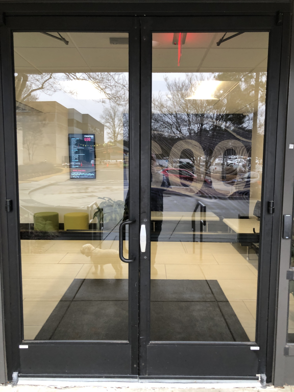
I took this picture last week on my way back into the office after taking my dog for a walk. What you might not see at first is that the right door is missing a handle.

I know what you’re thinking, “well, just use the left door then.”

But the left door was locked. The left door is ALWAYS locked. The right door is the only one that can be opened from the outside.

So to open the door I had to awkwardly grip that little metal piece on the right door and pull it enough to get my fingers in between the doors and then pull it the rest of the way open.

This was the second time that week that the door handle simply disappeared. It was reported to the facilities crew and eventually (a few hours later) the right hand door handle was replaced.

What is a UX Problem?

I like to think of the door thing as a UX problem. It’s something that is incredibly easy to experience, and sometimes incredibly easy to fix, but often very hard to predict.

How to experience the door problem.

  • Walk up to the door and try to open it from the outside.

Possible fixes for the door problem.

  • Replace the handle.
  • Prop the door open.
  • Unlock the left door.
  • Have someone sit by the door and open it when someone walks up.

How to predict and prevent the door problem?

  • You don’t.
  • Seriously, who could have predicted that at some point the door handle would have just disappeared?
  • I mean I’m still really curious as to how this happened twice, but I’m just a tenant in a co-working space and don’t actually know the facilities people.
  • Well, sure you could prevent it by welding the handles and make them really impossible to take off, but this kind of seems like overkill for an incredibly rare problem.

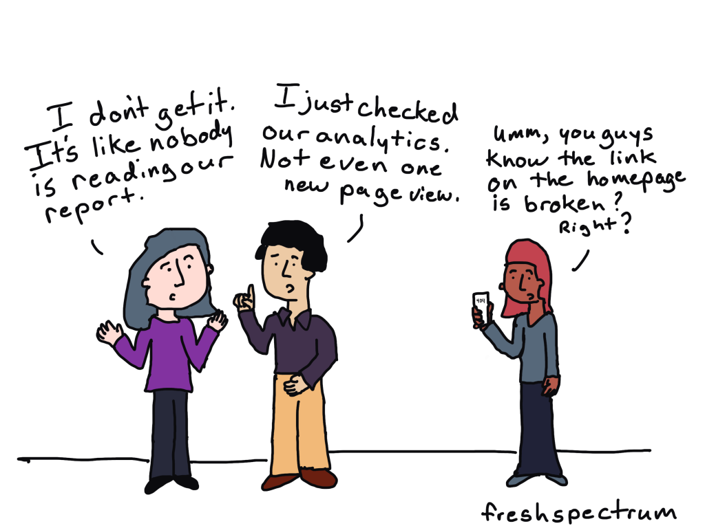
UX Problems don’t usually fix themselves.

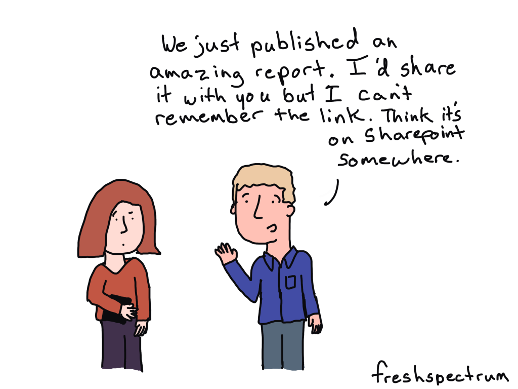
Let’s say you have a newsletter that you send out. And anytime someone goes to click on one of the links in your newsletter, they get taken to the wrong place.

Very few people will ever tell you. They’ll just shrug and move on with their days.

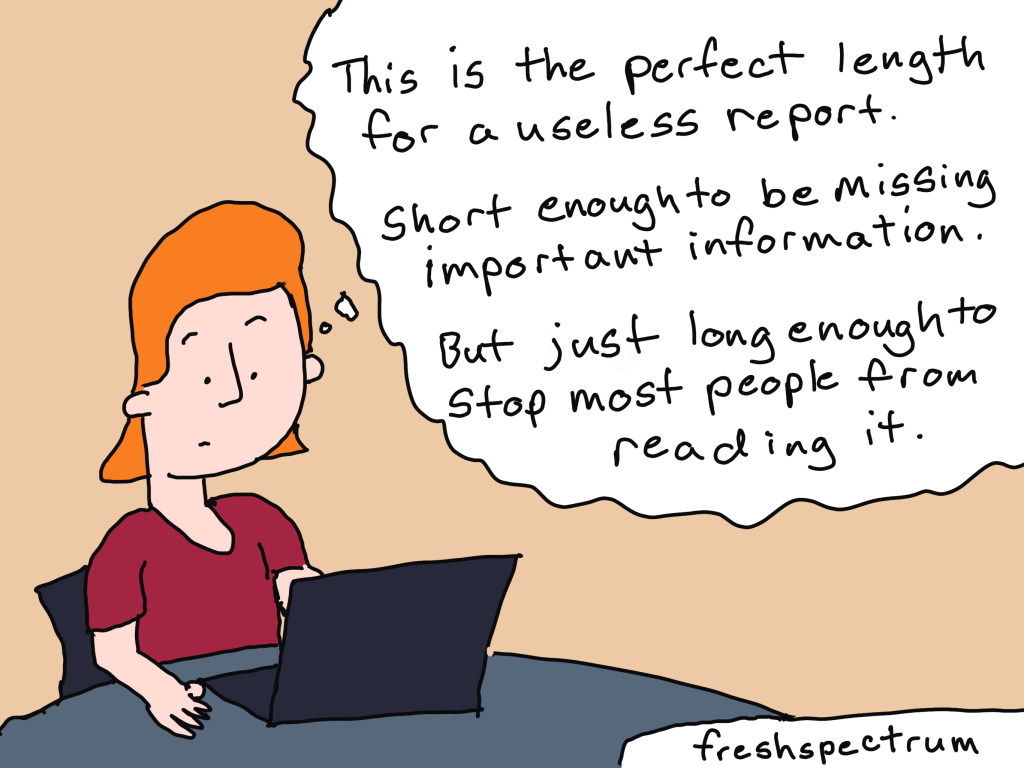
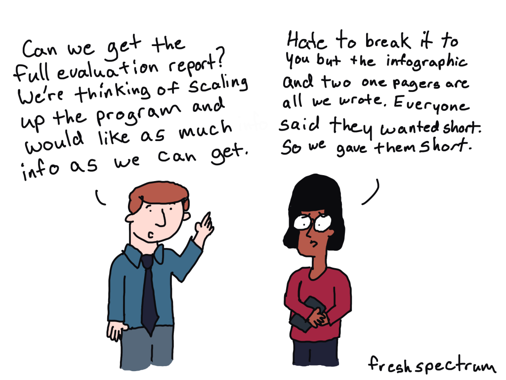
Same thing goes for a confusing section of a report. Very few people are ever going to complain that they don’t understand what you are talking about. The vast majority will just stop reading.

So how do you find your UX problems?

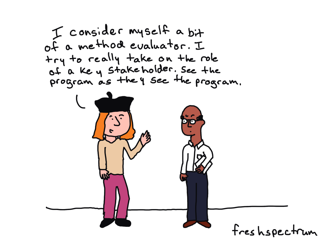
Look at your reports through a reader’s eye view.

UX problems might be hard to predict, but they’re usually incredibly easy to experience.

The ideal way is to test your designs with real people. Even if it’s not a person who is actually a part of your primary audience. You can ask a coworker to read your report or design and tell them to pretend they were a member of your target audience.

At the very least, you should read your reports from an audience perspective. And not just before they’re published but after they’re published too.

Because most of the UX Problems that happen with reports are not because of how the reports are written but how they are published and shared. And we rarely check our work once we pass it on to the web & communication’s teams or share it on social.

Want to go deeper?

I’m currently recruiting participants for the spring cohort of my information design academy. You should consider joining us!

Written by cplysy · Categorized: freshspectrum

Jan 11 2023

How “Sending the Elevator Back Down” Promotes Equity

How can “sending the elevator back down” promote equity? January is National Mentorship Month, highlighting the power of mentorship and its benefits. Mentoring fosters trust and understanding between a more experienced person (mentor) and someone with less experience (mentee). Ideally, mentoring is mutually beneficial, provides routine exchange of perspectives, and builds. Mentorship between students and educators […]

The post How “Sending the Elevator Back Down” Promotes Equity appeared first on Nicole Clark Consulting.

Written by cplysy · Categorized: nicoleclark

Jan 09 2023

Looking Ahead to 2023: What’s Coming to Depict Data Studio 

Wondering what I’ve got planned this year? 

Here’s what’s in store for 2023 related to: 

  • Online Courses, 
  • Private Training, 
  • Conference Keynotes,
  • Data Visualization Consulting, and 
  • My Personal and Professional Goals. 

Online Courses 

I have courses on 6 different topics.

Here’s the calendar:

  • Great Graphs in Excel, my Excel-specific dataviz course: Registration closes on Friday, March 3. The first live class is Tuesday, March 7.
  • Report Redesign, my deep dive on creating reports that people actually read: May 2023.
  • Dashboard Design, my deep dive on building static and interactive dashboards: September 2023.
  • Powerful Presentations, my public speaking and slide design course: ​ November 2023.
  • Simple Spreadsheets, my data analysis course: March 2024.
  • Great Graphs, my software-agnostic dataviz course: May 2024.

Tuition

Registration is $997/participant for 2023.

No price increases for the third year in a row.

We also have group rates available. 

Private Training 

Want to bring me in to speak to your team? 

Each year, I lead ~200 private sessions for foundations, nonprofits, universities, and government agencies who work on social good issues. 

Here’s more info about my workshops, which can be held virtually or in-person. 

Option 1: Private Training

What’s included:

  • 8 Hours of Live, Custom Training for up to 25 People. The most popular scheduling option is two half-day sessions (eg., 12 – 4 pm, two afternoons in a row).
  • Review of Sample Materials. I’ll review 5 of your sample materials ahead of time (participants’ reports, slideshows, dashboards, infographics, etc.).
  • Customized Agenda. After I review your sample materials, I’ll customize the agenda to fit your team’s current skill level. For example, we might skip over beginner-level topics and move right into advanced techniques. Or, we might focus on maps, qualitative data, or before-after graphs. I have 6 full-length classes that we can pull topics from.
  • Zoom Set-Up and Hosting. I’ll handle the behind-the-scenes Zoom setup. You’ll simply send your staff a link to RSVP for the sessions. I’ll also host the Zoom trainings so you don’t have to worry about it.
  • Recordings. I’ll post the recordings to a password-protected site. Each participant will receive a username and password for the site. I’ll keep this site up for an entire year.
  • Slides. Each participant will receive the PDF’d slides from the sessions.
  • Handouts. Each participant will receive a handout with checklists of key points.
  • Ebooks. Each participant will receive a license for our 250-page ebook with even more examples and tips.
  • Excel How-To’s. Our templates and step-by-step instructions for making 25 advanced graphs.
  • Recommended Resources. You’ll get a resource list with our favorite books, websites, and tutorials for learning more.
  • Certificates of Completion. After the training, each participant will receive a Certificate of Completion.
  • Satisfaction Surveys. I’ll administer a satisfaction survey and share the feedback to help with future planning.
  • Email Recaps. I’ll also send emails before and after the sessions to keep the conversations going.
  • Data Vizards Community. Everyone will be invited to our students-only LinkedIn group, where you can network, post drafts, and get feedback from others.

Option 2: Private Training + Longer-Term Support

New for 2023!

By popular request, I’m adding an option for longer-term support.

What’s included:

  • Everything from the Private Training package.
  • Course access. All 25 staff will get lifetime access to one of my online courses, which goes broader and deeper than our training together.
  • Makeovers. We’ll create 3 quick makeovers of your work. For example, we’ll transform your report’s cover, revamp a text-heavy slide, etc.
  • Accessibility Audit. We’ll meet for 60 minutes over Zoom and review one of your publications, slideshows, dashboards, etc. for both “Big A Accessibility” (508 Compliance) and “little a accessibility” (making sure it’s easy to understand).
  • Style Guide Consultation. We’ll meet for 90 minutes over Zoom and review your existing branding materials, like style guides, brand colors, brand fonts, photographs, and/or icons. Then, we’ll set up chart templates to make sure staff know exactly how to format their charts, tables, and diagrams to meet your branding standards. We’ll also go through my Dataviz Style Guide Checklist to get ideas for how you might improve branding resources in the future, whether you’re branding for the first time, re-branding entirely, or just making some minor tweaks.
  • Office Hours. All 25 staff will be invited to weekly 60-minute Q&A sessions for an entire year. These are group “consulting lite” sessions where I’ll review your draft dashboards, reports, and slides.

Want to learn more about private training? Book a call.

Conference Keynotes

I’m looking forward to providing keynote speeches, pre-conference workshops, and breakout sessions at a variety of in-person and virtual conferences this year.

Want to learn more about conference keynotes? Book a call.

Data Visualization Consulting 

Want me to create your report, slideshow, dashboard, or infographic? 

Get in touch!

Please note: Availability is very limited.

If I can’t personally work on your project, I’ll refer you to a trusted colleague.

Personal Goals 

I’m going to continue working the K12 school calendar. When my kids are home from school, the Depict Data Studio office is closed. (No courses or private trainings over spring break, summer break, Thanksgiving, winter holidays, etc.)

Last year, I got really into edible gardening. I planted papayas, oranges, avocados, mangos, blueberries, raspberries, blackberries, sour sops, guavas, pineapples, and an assortment of veggies. As an absolute beginner, I ran into a massive learning curve. I had tons of luck with fruit trees and berry bushes, but the veggies were tougher. (Super hot in Florida, so much rain, etc.) Hopefully I’ll get more veggies growing this year!

Professional Goals

I’m going to focus on blogging this year. Little to no YouTubing, podcasting, guest lectures in universities, free talks, etc. My time’s limited, and blogging is the most efficient one to many structure.

In past years, my goal was 24 blog posts (about 2 per month). I was also producing new videos, podcasts, etc. This year, I’ll try to publish 36 blog posts (about 3 per month). Since I’m taking off the entire summer again, this means I’ll need to blog every week during the work year to make up for zero blog posts over the summer. Whew! Can I do it??? TBD.

(I’ve posted some amazing tips on Instagram, Twitter, and LinkedIn over the years… but they’re impossible to find later on. Those social media posts should’ve been blog posts.)

(I have a MASSIVE folder of blog post drafts. I suppose I’ll have to actually finish those. 🙂 So maybe 36 blog posts is feasible??? TBD.)

I’ve considered really learning Tableau, R, and/or InDesign for years. I might attend the Tableau conference or take David Keyes’ R in 3 Months course, but… let’s be honest… I probably won’t. It’s much better for my career to focus on Excel than spread myself thin. In my experience, the niched, specialized consultants have the easiest time keeping their businesses booming. I need to find some advanced Excel courses to take. Recommendations?? It could be online or in Orlando. Let me know.

Speaking of Excel… a very, very, very aspirational project is to get Microsoft to improve their default settings so that they’re Accessible and accessible. I might write blog posts on the topic, post on their message boards, try to get in touch with the right people (who????), or maybe even join some sort of committee. This would practically put me out of a job. GOOD!!! I want to spend even more time with my kids. 🙂

I doubt I’ll take on any other projects this year. I don’t aspire to write a book in 2023. I won’t be starting a podcast in 2023. Etc. My private client trainings and my online courses keep my brain energized. I don’t have time or interest in starting other new projects this year. Life’s near-perfect already. Why change it?

Administrative & Logistical Tasks

I hesitated to mention these, since they’re so boring.

Are you interested in behind-the-scenes details??

If so, here’s what’s also on my radar:

  • Lean staffing. I let my virtual assistant go last year. She was excellent!! But I didn’t need administrative support anymore. I’ve automated the vast majority of tasks (thanks to software like Zapier, ConvertKit, etc.).
  • Accounting. In 2021, I upgraded from H&R Block to an accountant. In 2022, with my accountant’s support, I switched accounting software platforms. I also switched business structures (LLC to S corp). In 2023, we’ll investigate mega backdoor Roths, plus fine-tune some additional tax details.
  • Website. In 2012, I started a DIY blog. In 2017, I hired a company to design my website. In 2022, I re-hired them to update the website. In 2023, we’ll make a few more tweaks (e.g., describing what’s included in my courses and workshops a bit better).
  • Newsletters. I’ll continue sending newsletters ~weekly throughout the year; scrubbing the list; A/B testing the subject lines; and keeping the open rate and click-through rates high.
  • Digital resources. I’ll continue posting digital resources, like ebooks and chart templates, on Gumroad.
  • Social media. Like many others, I’ll be decreasing my Twitter time and increasing my time on LinkedIn and the Data Visualization Society’s Slack channel. I’ll continue making Instagram images, too (which are embedded here). I’ve learned a lot about sharing micro-content with Canva-made images over the past year, and there’s always more to learn.
  • Swag shop. In 2020, I started providing swag (shirts, mugs, stickers, etc.) to participants in my online courses. In 2022, I opened the shop to anyone and shared it on my YouTube channel. In 2023, I’ll likely add some new designs to the shop. I’ll donate 100% of the proceeds for Giving Tuesday again, too.

Your Turn 

What are you focused on in 2023?  

Are you hoping to learn a new software program? Achieve a personal goal?  

Comment anytime and let me know! 

Written by cplysy · Categorized: depictdatastudio

Jan 04 2023

Ask Nicole: What To Do with Ineffective Board Members?

Have a question you’d like to be featured? Let me know. The board of directors is a governing body for an incorporated organization, consisting of individuals that provide strategic governance and support to an organization’s leader, staff, and stakeholders. Here in the United States, in order to maintain 501(c)3 nonprofit status, an organization needs to […]

The post Ask Nicole: What To Do with Ineffective Board Members? appeared first on Nicole Clark Consulting.

Written by cplysy · Categorized: nicoleclark

Jan 04 2023

The two types of report.

Without fail, this question would come up when I would present to evaluation teams on why they should consider changing the way they report.

It would usually come from a senior member of the team. Likely one that had never heard of me before another team member suggested they bring me in for a conversation. The question would go something like this…

“Well, I can see how shorter reports would be easier to read and share online. But we have a responsibility to document our work for our clients. How does the way you suggest reporting meet that requirement?”

And here’s the thing…

it doesn’t.

Because that’s not the kind of report I think needs a fundamental change.

The two types of reports and one of our biggest mistakes.

Okay, there are way more than two types of reports. But for the sake of argument, and for this blog post, let’s pretend that there are only two.

The two types of reports:

  • The kind of report that systematically documents your work.
  • The kind of report that you use to present your findings to an audience.

One of the biggest mistakes I see organizations make when it comes to reporting is that they think they can do both things with the same report.

This is the easiest way to fail at both.

Here is the usual story. A team has been writing the same kind of documentation style report for decades. It’s boring, long, and comprehensive.

The report walks you through the team’s work in painstaking detail, talking through the research or evaluation questions, walking through the program model, giving an overview of the methodological choices the team made, highlighting different quirks in the data collection process, explaining how the team analyzed the findings, and then writing out all the conclusions that were reached.

Then someone decides that this report is way too boring, long, and comprehensive to be read by senior management. They want something shorter, more visual, and more interesting.

So the next time this team goes to create a report, they try to do all the stuff they did before but make it shorter, more visual, and more interesting.

All of a sudden most of that detail is gone. In its place is a report that’s shorter, and more visual, but still too detailed to be interesting for most audiences. And it’s also too brief to provide good enough documentation of the project.

So now everyone is unhappy.

Creating a “Documenting Your Work” Report

Be boring.

Seriously, when documenting, your goal is not to create a report that people will be itching to read cover to cover. Your goal is to systematically document all the things. As a professional data person, this documentation is important. Maybe nobody will read it, or only a very few will read it, but it should exist.

Let this report be boring.

Let this report be long, if that’s what it wants to be.

Also, and I know this will be tempting, don’t try to make it more visually appealing or better designed. Just write it in Word or Google Docs. Don’t even bother prettying up the charts, you can do that later in your presentation report(s).

The more time and money you spend trying to pretty up your documentation report, the less time and money you have to spend creating reports for people.

Creating a “Presenting to an Audience” Report

This is the report (or reports) designed to communicate your findings (or other important information) to an audience.

The cool thing about having already documented your project with a boring report is that now you can really get focused on reporting the stuff your audience wants or needs.

Here is the advice I give my workshop peeps. You can get way more value out of creating a string of five small PowerPoint slide sized micrographics than you ever would by spending more time redesigning your long report. The sad part is that the latter is where most large organizations use their design budget while almost completely ignoring the former.

Want a simple, don’t want to think about it, approach? Do this.

Step 1. Create at least 5 micrographics (i.e. annotated charts or small infographics) each designed to reach very specific members of your audience.

Step 2. Create a slidedoc report of about 30 slides to use as an executive summary style report. You’ll likely integrate your micrographics into this slidedoc.

Step 3. Then adapt those 30 slides into a presentation deck (same thing as the slide doc but without most of the words). This is what you will use for any presentation or webinar where you will be appearing with the slides. You can offer the slidedoc version as a download following the presentation.

Step 4. Then if you have time and budget, create a 25 – 30 page visual PDF report. This is your final visual report that might not cover EVERYTHING, but does a good job summarizing the big points.

What are your thoughts?

  • Do you already separate documentation from presentation with your own reports?
  • If you already create visual reports, how do you document your work?
  • Do you have any go-to report styles for your presentation reports?

Written by cplysy · Categorized: freshspectrum

  • « Go to Previous Page
  • Go to page 1
  • Interim pages omitted …
  • Go to page 105
  • Go to page 106
  • Go to page 107
  • Go to page 108
  • Go to page 109
  • Interim pages omitted …
  • Go to page 310
  • Go to Next Page »

Footer

Follow our Work

The easiest way to stay connected to our work is to join our newsletter. You’ll get updates on projects, learn about new events, and hear stories from those evaluators whom the field continues to actively exclude and erase.

Get Updates

Want to take further action or join a pod? Click here to learn more.

Copyright © 2026 · The May 13 Group · Log in

en English
af Afrikaanssq Shqipam አማርኛar العربيةhy Հայերենaz Azərbaycan dilieu Euskarabe Беларуская моваbn বাংলাbs Bosanskibg Българскиca Catalàceb Cebuanony Chichewazh-CN 简体中文zh-TW 繁體中文co Corsuhr Hrvatskics Čeština‎da Dansknl Nederlandsen Englisheo Esperantoet Eestitl Filipinofi Suomifr Françaisfy Fryskgl Galegoka ქართულიde Deutschel Ελληνικάgu ગુજરાતીht Kreyol ayisyenha Harshen Hausahaw Ōlelo Hawaiʻiiw עִבְרִיתhi हिन्दीhmn Hmonghu Magyaris Íslenskaig Igboid Bahasa Indonesiaga Gaeilgeit Italianoja 日本語jw Basa Jawakn ಕನ್ನಡkk Қазақ тіліkm ភាសាខ្មែរko 한국어ku كوردی‎ky Кыргызчаlo ພາສາລາວla Latinlv Latviešu valodalt Lietuvių kalbalb Lëtzebuergeschmk Македонски јазикmg Malagasyms Bahasa Melayuml മലയാളംmt Maltesemi Te Reo Māorimr मराठीmn Монголmy ဗမာစာne नेपालीno Norsk bokmålps پښتوfa فارسیpl Polskipt Portuguêspa ਪੰਜਾਬੀro Românăru Русскийsm Samoangd Gàidhligsr Српски језикst Sesothosn Shonasd سنڌيsi සිංහලsk Slovenčinasl Slovenščinaso Afsoomaalies Españolsu Basa Sundasw Kiswahilisv Svenskatg Тоҷикӣta தமிழ்te తెలుగుth ไทยtr Türkçeuk Українськаur اردوuz O‘zbekchavi Tiếng Việtcy Cymraegxh isiXhosayi יידישyo Yorùbázu Zulu