• Skip to main content
  • Skip to footer
  • Home

The May 13 Group

the next day for evaluation

  • Get Involved
  • Our Work
  • About Us
You are here: Home / Archives for allblogs

allblogs

Jan 25 2023

How to Use Design for Innovation

#InnovationDesignCoffee

Design is a human-powered field of practice that combines imagination, certain ways of thinking, and making things. There’s a lot of myth-making and mystery language associated with design, so don’t let that confuse or lose you. Design is a field made of disciplines, but it’s also the discipline of innovation. That’s how we see it.

How can we use design to innovate (create something new that adds value and improves our situation)?

In a series on Censemaking, Cameron Norman introduces us to design, design thinking, and critical design – the three cornerstones of the field of design practice. But how do we use it?

The Design Helix

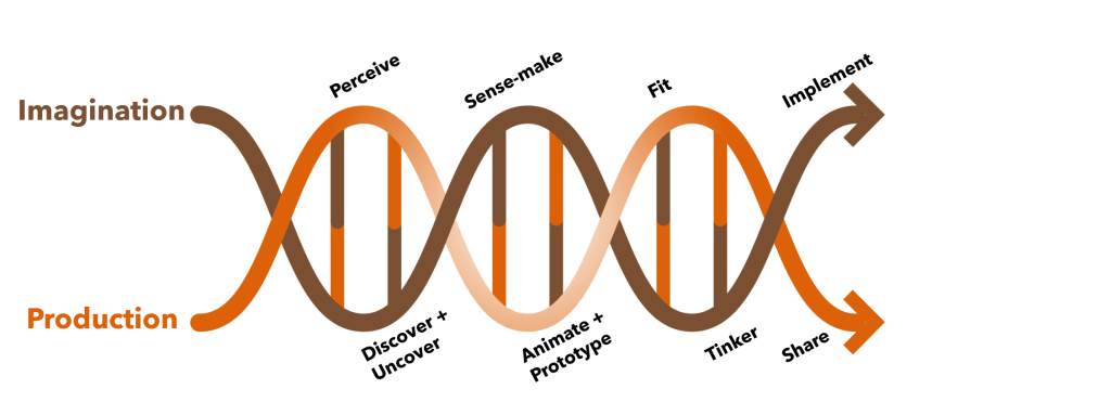
We developed the Design Helix as a model to explain the activities that go into design. Like any good model, it’s meant to guide, not prescribe, design work.

You can start by identifying a problem or situation you want to change. Nearly every organization faces situations they want to see improved, avoided, or enhanced. What’s sometimes called Problem Finding is a big part of design, because we often tackle the wrong problem.

People don’t want a quarter-inch drill, they want a quarter-inch hole”

Theodore Leavitt (attributed)

The above quote illustrates a common issue of people confusing the problem with a solution. Purchasing a drill to create a hole is one solution. But what is the hole for? If it’s to hang a picture, then ask yourself if there are other ways to hang the picture? Do you need a picture? Could a change of paint or a houseplant do the same thing? Is the point of the drill the hole, what the hole does, or whether the hole is a means in a chain to beautify a room? Your solution might be to purchase a drill, but it could be many other things.

The technique known as the 5-Whys is one of the ways we can get closer to the root of the situation and better define the problem at hand. This is part of doing design. The Design Helix guides us through two parallel, intertwined processes: imagination (envisioning what might be) and production (creating what is or will be).

Problem Defined, Solution Imagined

Innovators are interested in solutions — they want something better than before. Design is the means to create and sustain that. Defining a better problem is a big step toward developing that better solution.

Focus is a great benefit here. Most organizations have so much going on that focusing becomes difficult. They spend too much time focused on irrelevant or inconsequential problems. Once we have our problem or situation clarified, design allows us to walk through steps to address it.

That begins with research to reveal and explore what we know about our situation. This helps us to see if a solution exists and has yet to be implemented or whether there are aspects of a solution available to us that we can combine to address our problem or situation. Research will 1) optimize what is known, 2) spot opportunities in what’s already in place, 3) assess whether a solution can be achieved, 4) avoid costly development time and resources chasing an unsolvable issue, or 5) lead us down the innovation path.

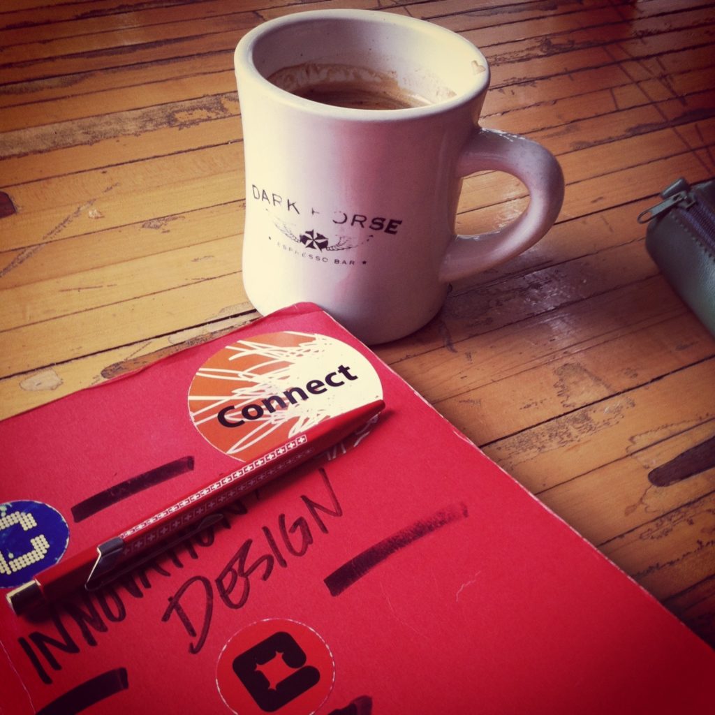
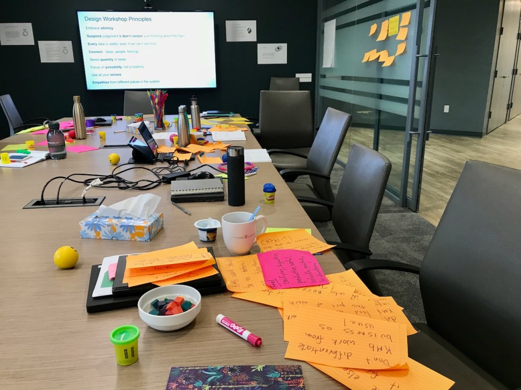
This is where we combine what we know with what we can imagine. It’s where the many tropes and (often) misleading models of design thinking come to mind, like people using sticky notes and whiteboards to brainstorm. In truth, this does happen sometimes. But the means to surfacing and generating ideas are many. At Cense, we use all those tools (and more) and also virtual spaces and dashboards and embed the idea-generation process in imagining possible futures and connecting it with strategy.

It’s part of a conversation about what you want, where you are, and where you want to go. We make better conversations by design.

Make Sense, Make Change

#DesignThinkinginAction

By sensemaking — a structured process of going over what we know, checking our assumptions, and matching it all with resources — we can figure out what we need to do next. Sensemaking takes our ideas and winnows them into possibilities that we can turn into innovations.

Next, we make things. Try these ideas out and make prototypes — mock-ups of the solution — in physical form, digital form, or even as a thought experiment. This helps innovation by testing our hypotheses, learning by doing, and also helps de-risk our ideas. By testing them out in limited form before deploying them widely, we can find bugs, correct assumptions, and make enhancements before they become live. This is a structured and very safe process, but it requires a willingness on the part of those designing. Usually, our designs could be better at the beginning. We make things better over time with iterative development, refinements and care.

This means you end up with a new product or service and a means to understand your market.

The alternative? Come up with a “good idea” and hope it works. Design is systematic, thorough, and focused on what people will use, not just what people want. That focus on the product and the consumer, customer, client, or citizen (whoever you’re designing for) and understanding how it fits within a system is what design is all about.

Are you interested in learning more about how this design process works and how it can help you? You can check out the design series on Censemaking, our blog archives, and, of course, contact us if you want help doing more to do better.

The post How to Use Design for Innovation appeared first on Cense Ltd. .

Written by cplysy · Categorized: cameronnorman

Jan 25 2023

How to use AI to make your reports readable [ChatGPT & the Hemingway App]

Are you a little hesitant about all this AI stuff? Me too. But these new AI tools can actually be pretty dang useful and easy to use.

For the most part I’m a new tech skeptic. Before I add another tool to my personal toolkit, I want it to be beyond that early adoption phase. So when everyone started getting excited about AI writing tools like ChatGPT and AI design tools like DALL-E I didn’t immediately hop on the bandwagon.

But after a bit of play, it’s hard not to be impressed by ChatGPT. Not because of its future potential but because of its immediate practical usefulness. This post is going to be about one of those practical uses.

How can we use AI tools to make long “academic” reports and guides a little more readable?

“This is too easy to understand” -Said no one ever.

Before we get into the challenge, let’s start with an underlying assumption. There is no value in making anything harder to read.

Or, in other words, just because many in your audience have advanced post graduate degrees does not mean you should be writing for a post graduate reading level.

The Challenge – Starting with a Guide

Using Education Indicators: A Forum Guide for State and Local Education Agencies

In order to find a report or guide for this challenge I just picked a US government agency at random. I then scrolled down the publications list and picked the first large report-like thing I could find. This guide from the Department of Education’s National Center on Education Statistics met that criteria.

My challenge is to pick a section of the report and then use free AI tools to:

  • assess the readability
  • and rewrite the section to make it shorter and more readable.

Picking a Section – Why Education Indicators Matter

So the following text comes from page 2 (part of the guide’s introduction). This is a space where you want the guide to be easily readable and somewhat free from Jargon. I don’t think that’s the case here. This section can definitely be shorter and more readable.


Why Education Indicators Matter 

Education indicators are critical to multiple areas of agency activities. They allow agencies to monitor student achievement and goals, identify gaps in student performance for potentially vulnerable populations, and evaluate the effectiveness of new policies and practices. Indicators inform important analyses, such as benchmarking, comparing groups, and assessing the benefits of funding allocations. They can offer greater transparency to stakeholders by providing easily accessible information and offering a means of clearer communication. 

Education agencies use indicators for varied strategic purposes. For example, districts trying to fill course vacancies need workforce and staff data about teachers, such as certifications or professional development, to help ensure effective placement. By providing shared metrics across the education system, indicators also help increase stakeholder understanding and lay the foundation for tools such as crosswalks to state report card data. 

Because a single assessment, such as a final exam score, rarely yields a complete picture of a student’s learning, indicators that use multiple measures and multiple types of assessment help teachers and schools realize a more complete picture of an individual student’s needs. This picture helps educators better allocate limited intensive intervention resources. Indicators also often are used to allocate resources and help direct (or redirect) funds for students and staff. 

At the classroom level, indicators can help teachers personalize instruction for groups and individuals. By collecting a range of data, analyzing them, and giving them to classroom teachers, agencies support their educators as they address specific student needs and make data-informed decisions to improve learning. 

Many advancements in education have impacted indicators, including changes to data systems (such as improved longitudinal data systems), federal data collections and accountability systems, legislation, mandatory public reporting, privacy protections and data security. In recent years, some agencies have considered adjusting their approaches to standard practices like attendance and grading, which will influence the use of indicators. Agencies also may consider making temporary changes in response to major events (such as those related to the coronavirus disease [COVID-19] pandemic) permanent. Formalizing these types of changes to indicators related to grading standards, graduation requirements, or disciplinary methods will affect data comparability. New indicators also have emerged as key sources of information for decision-making. For example, learning modality data that track whether students are attending school in person, virtually, or in a hybrid model have become increasingly important as agencies work to understand student learning conditions and outcomes. 

As the design and use of education indicators shift with agencies’ changing needs, advances in technology, and outside influences, many data experts have noted the need for a wider range of measures, including those that would address issues like social-emotional learning, engagement, expectations of teachers, rigor of assignments, alignment with grade level, and educator practices.


Assessing Readability with the Hemingway App

So my plan is to use AI tools to both assess the readability and rewrite the text.

The tool I’m going to use to assess readability is the Hemingway App. It’s simple to use (just copy paste) and doesn’t even require you register for an account. If you like it, you can also download an inexpensive desktop app version that can be used without an internet connection.

I ran the original text through for an initial assessment.

According to the Hemingway app the readability for this section is Post-Graduate. There are 457 words and 15 of the 19 sentences are very hard to read.

Rewriting with ChatGPT

The next step is to use ChatGPT to shorten the section and then increase the readability.

At the time this blog post was written ChatGPT is available as a Free Research Preview. It is also currently on its January 9 release. At the moment you need to register for an account but the tool is otherwise free to use.

I asked chat GPT to “Rewrite the following in 100 words” and then I pasted in the text I shared above. Here is what the tool gave me (the only thing I changed was to add a few paragraph breaks).


Education indicators are vital for monitoring student achievement and identifying gaps in performance for vulnerable populations. They also evaluate the effectiveness of new policies and practices and inform important analyses such as benchmarking, comparison of groups and assessing the benefits of funding allocations. They offer greater transparency to stakeholders by providing easily accessible information and clearer communication.

Indicators are used for strategic purposes such as filling course vacancies and allocating resources. They can also help teachers personalize instruction and make data-informed decisions to improve learning. Many advancements in education have impacted indicators such as changes to data systems, federal data collections, legislation, and privacy protections.

In recent years, some agencies have considered adjusting their approaches to standard practices like attendance and grading which will influence the use of indicators. Some new indicators have emerged as key sources of information for decision-making such as learning modality data. As the design and use of education indicators shift with agencies’ changing needs, advances in technology and outside influences, the need for a wider range of measures has become increasingly important.


Now that I have new text, let’s run it through the Hemingway App again.

Okay, so the text is shorter, it moved from 457 words to 177. But still not an easy read. Hemingway labeled it as post-graduate readability with 9 of 9 sentences marked as very hard to read.

Iteratively Changing the ChatGPT Prompts

So now I’m going to iterate using only the two AI tools back and forth. I’ll rewrite with ChatGPT and assess with Hemingway.

Iteration 2 – Rewrite the following in 100 words for a high school reading level

ChatGPT reply

Education indicators are important tools that help schools and other education agencies keep track of student progress and success. They allow agencies to monitor student achievement and goals, identify areas where students may be struggling, and evaluate the effectiveness of new policies and practices.

Indicators also help agencies make important decisions about how to allocate resources and support teachers. They can provide more transparency and clear communication to stakeholders. Indicators are used for various strategic purposes, such as filling course vacancies or allocating resources. They can also help teachers personalize instruction and make data-informed decisions to improve learning.

New advancements in education have impacted indicators, including changes to data systems, legislation, and privacy protections. Some agencies have considered adjusting their approach to standard practices like attendance and grading, which will influence the use of indicators. Indicators are also emerging as key sources of information for decision-making, such as learning modality data that track how students are attending school.

As the design and use of education indicators continue to evolve, experts have noted the need for a wider range of measures.

Hemingway App assessment

Readability went from Post-Graduate to Grade 15. There are still a lot of very hard to read sentences according to Hemingway.

Iteration 3 – Rewrite the following in 100 words for a middle school reading level.

ChatGPT reply

Education indicators are tools that schools use to track student progress and success. They help schools know how well students are doing, identify areas where students may need extra help, and evaluate new policies and practices.

Indicators also help schools make decisions about how to use resources to support students and teachers. They can provide more information to people who are interested in the school and make communication clearer.

Schools use indicators for different reasons, like filling open spots in classes or allocating resources. They can also help teachers personalize instruction and make decisions based on data.

Advances in education have affected indicators, like changes to data systems, laws, and privacy rules. Some schools have considered changing how they track things like attendance and grading, which will affect how they use indicators. Indicators can also be used to track new things, like how students are attending school.

Experts say that more indicators are needed to track different aspects of student and teacher performance.

Hemingway App assessment

By asking for a middle school reading level ChatGPT wrote something that the Hemingway App labels as a Grade 12 reading level. This version is down to 163 words with fewer very hard to read sentences.

Iteration 4 – Rewrite this for 4th graders.

ChatGPT reply

Indicators are like signs that schools use to check how well students are doing. They help schools see where students might need extra help and how to make new rules that work well. Indicators also help schools decide how to use resources to help students and teachers. They give more information to people who want to know about the school and make it easier to talk about what’s happening.

Schools use indicators for different reasons, like making sure there are enough teachers for all the classes or deciding where to put resources. They can also help teachers teach in a way that works best for each student and make decisions based on information.

Sometimes, new ways of doing things in school can change the way indicators are used. For example, some schools are thinking about changing how they track attendance or grades, which will affect how they use indicators. Indicators can also be used to track new things, like how students are going to school. Some people say we need more indicators to check different things about students and teachers.

Hemingway App assessment

By asking ChatGPT for 4th grade, we made it to grade 10. Now there are only 2 of 10 sentences that are very hard to read.

3 Final thoughts on this approach.

1. Tools like the Hemingway App give us a way to assess our writing “externally.”

One of the challenges we face making better reports is that the reports you are trying to improve were written by human beings. And for many of us, it’s hard to tell our fellow human beings that their work is way too long, too boring, or too jargon filled. So if that’s you, you can just let the tool tell them their stuff is hard to read.

2. ChatGPT gives you a good first revision pass (or second, or third).

It can be really tough for a person to take something that’s 450 words and bring it down to 180 words. But ChatGPT isn’t going to grumble about it. Using the tool conversationally to help you wordsmith and simplify can really take a lot of the effort out of revisions.

3. From Human to AI to Human again.

I think the biggest opportunity exists in folding AI into your overall writing process. It’s not a replacement. The stuff that ChatGPT wrote (and Hemingway assessed) could definitely be improved with a little human intervention from a good editor. But the overall amount of work involved gets cut down significantly.

What are your thoughts?

Is this something you would try? Why or why not? Let me know in the comments.

Written by cplysy · Categorized: freshspectrum

Jan 25 2023

Create Your Board of Directors Balance & Alignment Plan

Find balance AND alignment. The decisions your board of directors makes not only influences your organization’s growth, but impacts how your staff does its job. When a board can’t function, it’s due to one or more of these issues. When these issues arise, it’s time to develop a plan for addressing them. I’ve been increasingly […]

The post Create Your Board of Directors Balance & Alignment Plan appeared first on Nicole Clark Consulting.

Written by cplysy · Categorized: nicoleclark

Jan 23 2023

Watch Out for Mars! 6 Data Cleaning Steps to Save You Millions

In 1998, NASA launched the unmanned Mars Climate Orbiter to study the atmosphere of Mars.

However, the spacecraft never finished its mission. In fact, upon reaching Mars the next year, the $125 million spacecraft promptly crash landed into Mars, disintegrating in the atmosphere.

What could have caused such a crash landing?

Was it a freak meteor strike?

Faulty equipment?

ALIENS, perhaps?!?

The answer, surprisingly, is that the crash was caused by a classic case of BAD DATA.

That’s right–this spacecraft, this wonder of science, was rendered useless by bad data being entered into its flawless system. The Mars Climate Orbiter was designed to work on metric units, but unfortunately commands for the spacecraft were being sent from Earth in English units.

The result was a $125 million conversion error.

Collecting Survey Data at HOPE International

So what exactly does this have to do with spreadsheets? I’m glad you asked. I work with the nonprofit HOPE International as a Listening, Monitoring, and Evaluation Analyst. The mission of HOPE is to invest in the dreams of families in the world’s underserved communities as we proclaim and live the Gospel.

My team contributes to that by facilitating listening to those we serve, primarily through administering surveys and analyzing the data. Our surveys focus on many things–impact, experience, satisfaction, etc.–but regardless of the focus area, I always can’t WAIT to dive into the results.

When you spend so long crafting a questionnaire, translating it just right, and training enumerators to administer the survey, it’s nearly impossible to resist jumping into analysis once the results are in.

However, I’ve found that this is precisely what I must do–resist the urge to jump straight into analysis.

This is because, just as in the case of the Mars Climate Orbiter, a perfectly designed analysis system with flawless pivot tables will amount to nothing (or worse, a $125 million error) without proper data flowing into the system.

That’s right–I’m talking about DATA CLEANING.

Why Data Cleaning?

Data cleaning is an essential part of our survey process.

There have been many real-world situations where the results would have been biased or even completely incorrect had we not first taken the time to clean the data.

Here are a few situations we’ve encountered in the past:

  1. Duplicate survey responses caused by system error, or a respondent accidentally taking a survey twice.
  2. Pretest/training responses being included with the actual data from survey administration.
  3. Surveys being completed in an extremely short amount of time, where most if not all of the answer choices were blank.
  4. Data entry errors, such as accidentally copying a response in Excel across multiple rows and erasing original responses.

As you can see, the issues above would cause drastic differences if not corrected through a data cleaning process.

As tempting as it is to jump straight into crafting pivot tables and analyzing the results of the survey, engaging in a thorough cleaning and recoding of the data is vital to ensuring accurate results.

6 Data Cleaning Steps to Save You Millions

I’d like to show you what we do for our data cleaning process, and how Simple Spreadsheets helped to make this process even stronger.

In this article, you’ll learn:

  1. How to check for duplicates (for example, if someone accidentally took the same survey twice);
  2. How to check the survey for changes (for example, if translation typos were found after going live);
  3. How to check for outliers in survey duration (how long it takes someone to complete a survey);
  4. How to Use COUNTA and COUNTBLANK;
  5. How to Recode Variables with IF Statements; and
  6. How to Combine Datasets Together with VLOOKUP.

Yes, all of these data cleaning steps can be completed in Microsoft Excel.

(1) How to Look for Duplicates

One of the most important steps in our data cleaning process is to look for “duplicates.”

Duplicates are two (or more) entries that are either exactly the same, or match on a critical piece of information (like ID number or name).

It’s crucial that we identify these duplicates and resolve them before starting analysis. Otherwise, our results will not be accurate, and will instead overrepresent the duplicated entries.

Which Variable(s) Should Be Unique?

To check for duplicates, first identify the key variables in your data set that should be unique for each respondent.

For instance, our clients have an identification number which is unique to them. This field should not be duplicated in a data set.

Highlight the Duplicates in a Different Color

Once you determine your key variables, there is a simple Excel process that you can follow in order to identify and sort through your duplicates:

  • Step 1- Highlight the column of interest.
  • Step 2- In the Excel ribbon, select “Home” > ”Conditional Formatting” > ”Highlight Cells Rules” >”Duplicate Values.”
  • Step 3- In the pop-up window, choose a highlight color of your choice and press “OK.” This will highlight all of the cells in the selected column that contain duplicate values.

Once these steps have been followed, any duplicates for the criteria you selected will be highlighted.

Manually Examine Each of the Duplicate Entries

I like to then filter the column where it only contains the duplicate values, sort in ascending order, and then manually go down the list to analyze each duplicate pair (or trio, etc).

Doing this manually really helps you to get a feel for the data, and understand whether the duplicates are truly duplicates, or whether there is some other systematic issue at play.

If the duplicates match exactly in all fields in the survey, then they are “true duplicates.” We usually keep the response that was entered first and remove the other response.

If they don’t match exactly in all of the fields, then we connect with our team that administered the survey and try to determine together how to handle the entries, whether removing them entirely, keeping some, or keeping all.

(2) How to Check the Survey for Version Changes

Another important step in the process is to check survey versions for any notable changes.

When we are administering a survey, we do everything we can to test the survey beforehand, in order to not make any changes during the administration.

However, unforeseen changes to translation, wording, or even whole questions sometimes need to be made during the administration process, and it’s important to check if any of these changes could impact how data is interpreted.

For instance, if the first 10 respondents to a survey saw this question:

“How satisfied are you with the training curriculum?”

  • Very satisfied
  • Satisfied
  • Neither satisfied nor unsatisfied
  • Very unsatisfied
  • Very unsatisfied

And the rest of the respondents saw this question:

“How satisfied are you with the training curriculum?”

  • Very satisfied
  • Satisfied
  • Neither satisfied nor unsatisfied
  • Unsatisfied
  • Very unsatisfied

Then the fourth answer would mean two different things, depending on when the survey was taken.

In a large survey that is being translated into multiple languages, it is quite possible that small details like this go unnoticed, even through quality checks and testing.

Compare Spreadsheets with the “Compare Files” Add-In for Excel

In order to avoid having to meticulously analyze each version of the survey row by row in Excel, we utilize the “Compare Files” function.

This is located in the “Inquire” tab as an add-in for Excel, but I highly recommend you download it.

It saves a considerable amount of time comparing two spreadsheets.

To use this function:

  • Simply open the spreadsheets you want to compare at the same time.
  • Click “Compare Files.”
  • Choose the files you would like to compare.
  • Press the “Compare” button.

Excel will then open a third document which lists all the differences (and their categories).

Our team then goes through this document to see if any critical changes were made to the survey during administration, and we account for these changes accordingly in the analysis.

(3) How to Check for Outliers in Survey Duration

Lastly, a simple but important step in our data cleaning process is to check the duration of a survey.

Usually, we determine the average time it took to complete the survey, and then manually investigate any responses that were much faster or much slower than that average length.

These could just be outliers, or they could be surveys that weren’t finished, system errors, data entry errors, etc.

We also look for “straightlining,” which is when a respondent answers the same response to each question (usually in order to just get the survey over with faster).

Removing any responses that are errors and accounting for straightlining is an important factor in our analysis.

(4) How to Use COUNTA and COUNTBLANK in Excel

The Simple Spreadsheets course both affirmed the current steps in our data cleaning process (particularly in the area of handling duplicates), and added new tools into our toolbox!

One simple tool that I’ve found helpful is the COUNTA and COUNTBLANK functions.

These functions are two sides of the same coin.

  • COUNTA returns the number of cells that are not empty in a specified range.
  • COUNTBLANK returns the number of cells that are blank in a specified range.

We’ve used these two functions to quickly assess whether our data passes the “sniff test.”

For instance, if there is a question that we designed as mandatory for everyone in the survey but only half of the cells are populated, there is something wrong with our dataset and we need to investigate further.

Some of the possible causes could be that the question was not marked as mandatory in the survey software, the data was entered incorrectly, there was an error in translation, etc.

Basically, by using these two functions for each column in our dataset, we can get a bird’s-eye-view of the pattern of responses to each question in the survey.

(5) How to Recode Variables with IF Statements in Excel

Recoding was a game-changer for me in the data cleaning process.

Before taking Simple Spreadsheets, I didn’t know how to make the data do what we needed it to do for our analyses.

For instance, maybe the geographical information in our database was captured in cities, but I needed to organize it into regions for our stratified random sample.

Or, maybe the data contained registration dates for clients, but I needed to organize them into different categories of tenure.

I didn’t know any method to do this besides manually going through the data and recategorizing by hand.

Needless to say–WOW did Simple Spreadsheets save me time!

The IF function allowed me to recategorize data by using a simple formula.

For a practical example, I had a list of bank branches that I needed to group together into different regions. Instead of doing this manually, I was able to use the IF formula to create different groupings for the regions all at once.

(6) How to Combine Datasets Together with VLOOKUP in Excel

VLOOKUP was also an extremely helpful formula for me to get the data sets to do what we needed them to do.

Often we will have multiple datasets that we need to merge together, because we have different sources of information.

Because most of our clients have Client ID numbers, I was able to use these numbers as the common source of information in the VLOOKUP function, thus merging together datasets in minutes with confidence.

Save Yourself $125 million

I honestly can’t count the amount of times that the data cleaning process has brought us helpful insights that both ensure we have accurate results, and helped us to improve our processes in the future so that we avoid/account for any potential errors.

Simple Spreadsheets was a great help in affirming and bolstering our data cleaning process, and I hope that this article gives you a jump start into creating a similar process that suits your needs.

It’s not always the most fun process (although I’ve grown to really love it and have earned the title of “Detective” on my team 😊), but it is CRUCIAL to ensuring a good result.

Just ask NASA…a million dollar data cleaning system would still have saved them $124 million in the long run.

Written by cplysy · Categorized: depictdatastudio

Jan 18 2023

Creating Shadow Logic Models with Celestyna Galicki

Over the coming year I hope to spend a little time on this blog showcasing some of the interesting work created by members of my Information Design Academy.

In today’s post we’ll look at something created by Celestyna Galicki that we started calling a Shadow Logic Model. Most of the words (and the Shadow Logic Model design) are Celestyna’s. I only added a few quick observations (and the cartoons).

Who is Celestyna Galicki?

Celestyna is an evaluator currently working in an evaluation capacity building role in local government in New Zealand. You can learn more by visiting Celestyna’s LinkedIn profile.

So just what is a Shadow Logic Model? [Celestyna]

This term describes a situation when the programme’s official logic model does not work (outputs do not lead to outcomes) but there is an unofficial logic model that works and produces outcomes that are important and valuable for someone. “Someone” can be the intended beneficiaries of the official logic model, the funder of the programme, people implementing the programme, the local community etc.

We are not talking about corruption here – money is spent as intended and all funded activities take place. If a shadow logic model is in place, most people involved in the program, and sometimes also the funder, know about it – they want to continue the programme because they find the benefits of the shadow logic model important enough. However, funding structures, political considerations, public opinion and other factors require them to pretend that they implement the official logic model if they want to continue.

How do you discover a shadow logic model? [Celestyna]

There is palpable awkwardness at first when workshopping logic models and evaluation with teams that have a shadow logic model. Discovering the shadow logic model is one of the skills academia did not teach me and I had to develop it with practice.

The way I usually approach this as an evaluator is to acknowledge the “unintended positive outcomes” and their value and evidence alongside the intended outcomes.

One of Celestyna’s Shadow Logic Models [Celestyna]

A few quick observations from Chris

I love this concept and Celestyna’s design. Let’s take a second to break down the design.

  • First off there is a simple official logic model. This logic model is then mirrored with an unofficial logic model.
  • A volunteer story illustrated with a simple cartoon figure humanizes the program and really sets the model within the appropriate context. The shadow logic model could have existed without this piece but I don’t think it would be nearly as compelling.
  • At the bottom there is a single sentence takeaway which does a good job of ending the design with a quick “so what?”

What value exists in finding and constructing shadow logic models? [Celestyna]

The outcomes of official and shadow logic models provide important insights into what is and is not considered valuable by those who make decisions.

Common shadow outcomes include:

  • social contact and friendship for those lonely and isolated (as in the example in the illustration)
  • relationship building / relationship repair between the community and authorities or funders, signalling that the authorities care about something and take it seriously
  • outcomes valued by indigenous or migrant communities that do not fit into Western frameworks, e.g. mana enhancement
  • the benefits of basic services such as free transport or free food provided as part of the programme
  • improving the reputation of a place/neighbourhood etc.

So what do you think? Could you see yourself creating something like this for your own program?

Let us know in the comments 🙂

Written by cplysy · Categorized: freshspectrum

  • « Go to Previous Page
  • Go to page 1
  • Interim pages omitted …
  • Go to page 103
  • Go to page 104
  • Go to page 105
  • Go to page 106
  • Go to page 107
  • Interim pages omitted …
  • Go to page 310
  • Go to Next Page »

Footer

Follow our Work

The easiest way to stay connected to our work is to join our newsletter. You’ll get updates on projects, learn about new events, and hear stories from those evaluators whom the field continues to actively exclude and erase.

Get Updates

Want to take further action or join a pod? Click here to learn more.

Copyright © 2026 · The May 13 Group · Log in

en English
af Afrikaanssq Shqipam አማርኛar العربيةhy Հայերենaz Azərbaycan dilieu Euskarabe Беларуская моваbn বাংলাbs Bosanskibg Българскиca Catalàceb Cebuanony Chichewazh-CN 简体中文zh-TW 繁體中文co Corsuhr Hrvatskics Čeština‎da Dansknl Nederlandsen Englisheo Esperantoet Eestitl Filipinofi Suomifr Françaisfy Fryskgl Galegoka ქართულიde Deutschel Ελληνικάgu ગુજરાતીht Kreyol ayisyenha Harshen Hausahaw Ōlelo Hawaiʻiiw עִבְרִיתhi हिन्दीhmn Hmonghu Magyaris Íslenskaig Igboid Bahasa Indonesiaga Gaeilgeit Italianoja 日本語jw Basa Jawakn ಕನ್ನಡkk Қазақ тіліkm ភាសាខ្មែរko 한국어ku كوردی‎ky Кыргызчаlo ພາສາລາວla Latinlv Latviešu valodalt Lietuvių kalbalb Lëtzebuergeschmk Македонски јазикmg Malagasyms Bahasa Melayuml മലയാളംmt Maltesemi Te Reo Māorimr मराठीmn Монголmy ဗမာစာne नेपालीno Norsk bokmålps پښتوfa فارسیpl Polskipt Portuguêspa ਪੰਜਾਬੀro Românăru Русскийsm Samoangd Gàidhligsr Српски језикst Sesothosn Shonasd سنڌيsi සිංහලsk Slovenčinasl Slovenščinaso Afsoomaalies Españolsu Basa Sundasw Kiswahilisv Svenskatg Тоҷикӣta தமிழ்te తెలుగుth ไทยtr Türkçeuk Українськаur اردوuz O‘zbekchavi Tiếng Việtcy Cymraegxh isiXhosayi יידישyo Yorùbázu Zulu