• Skip to main content
  • Skip to footer
  • Home

The May 13 Group

the next day for evaluation

  • Get Involved
  • Our Work
  • About Us
You are here: Home / Archives for allblogs

allblogs

Aug 25 2021

Beyond Better Charts – My New Workshop on 21st Century Reporting

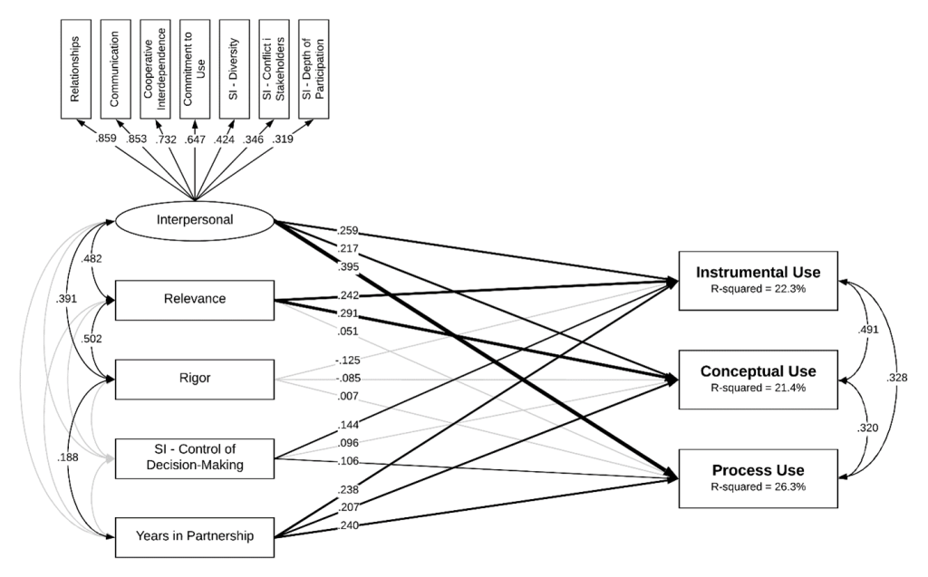
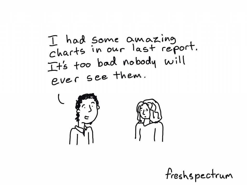
If nobody sees your amazing chart, can you still call it amazing?

For data to have an impact, it needs to be the right data, reaching the right person, at the right time, and in the right format.  

That’s a lot that has to go right. And only a little of it has anything to do with your chart choices.

freshspectrum cartoon by Chris Lysy "I had some amazing charts in our last report. It's too bad nobody will ever see them."

Do you have the skills necessary to create modern reports?

Most reports these days are created digitally, sent digitally, and experienced through a screen.  In other words, modern report design is web design. 

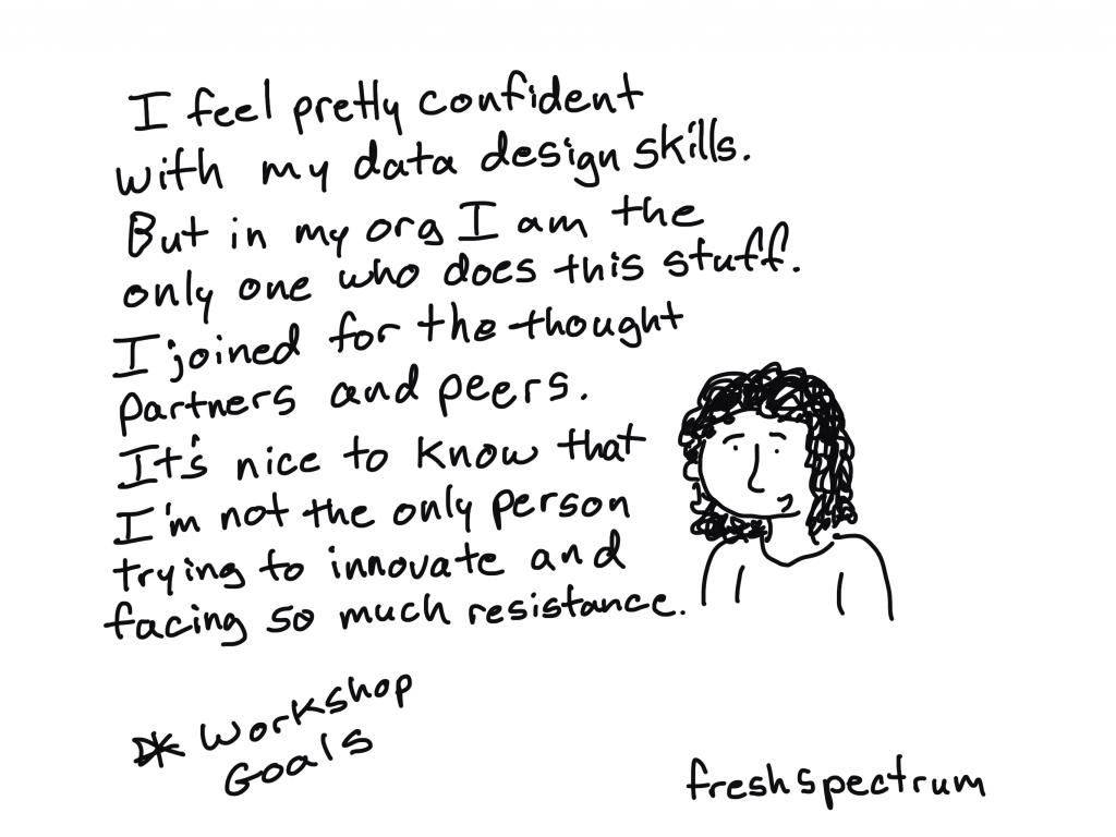
Our grad programs are still training for an analog world, not the digital one where we currently reside. So many of the 21st century skills necessary to create a modern report were not taught in grad school.

I’m launching a new virtual workshop, here is what I plan to teach.

In short, a little about a lot of things.  Generally they all fit within four categories that I believe are fundamental components of 21st century report design.

  • Creative Reporting
  • Content Strategy
  • UX/UI Design
  • Digital Evaluation

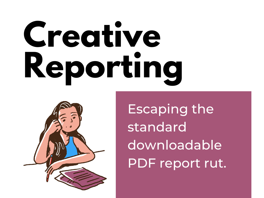
Theme 1. Creative Reporting. Escaping the standard downloadable PDF report rut.

DiY Data Design Creative Reporting - Escaping the standard downloadable PDF report rut.

The internet has brought us countless ways to reach an audience. Each channel is unique, with its own rules, design standards, and cultures.  This means that a modern report design might look very different from how it used to look.

Topics under this theme include infographic design, social media illustration, video production, slide doc creation, multimedia report development, and vector design.

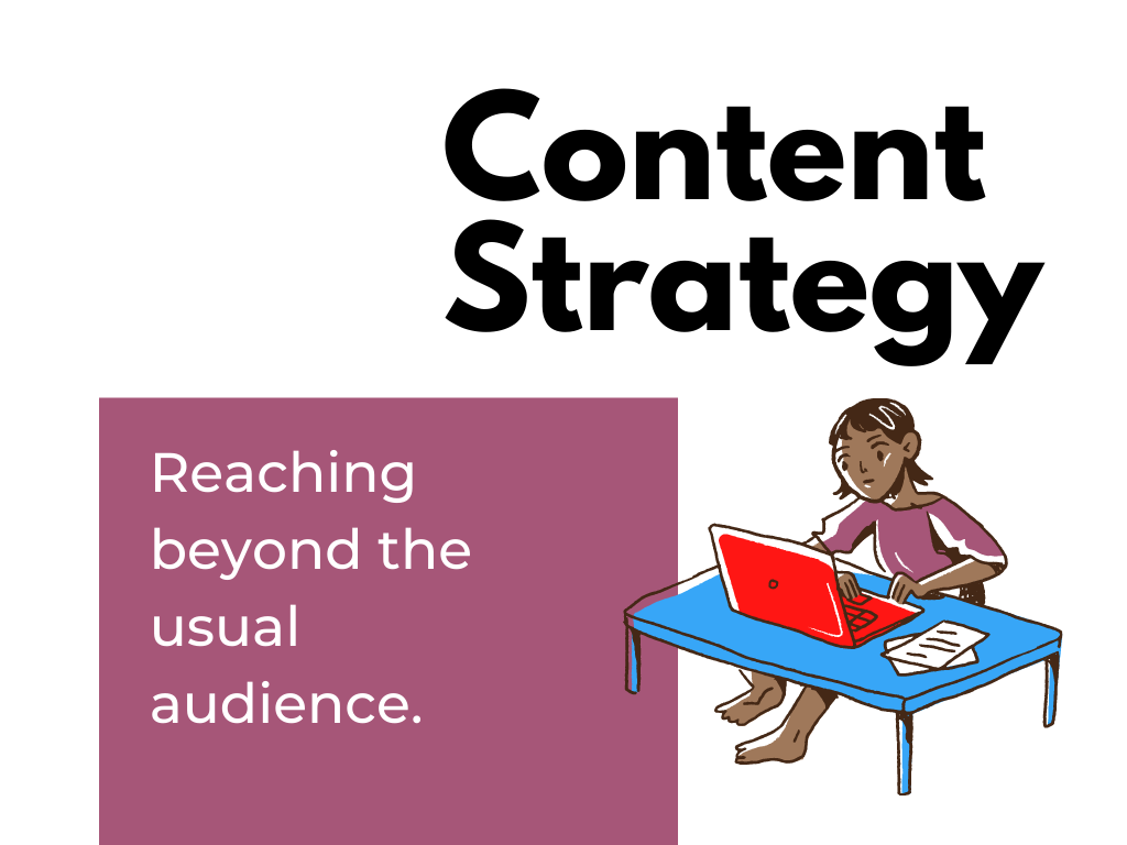
Theme 2. Content Strategy. Reaching beyond the usual audience.

DiY Data Design - Content Strategy - Reaching beyond the usual audience.

Many organizations are following the Field of Dreams model of report sharing, “if you share it on your website, they will come.” But sharing a report publicly on your website is just the absolute bare minimum. Reaching beyond the usual audience takes strategy. 

During sessions on this theme we will take on topics like content strategy, audience avatars, marketing funnels, alternative dissemination strategies, push/pull strategies, and newsletter design.

Theme 3. UX/UI Design. Making more data, less complicated.

DiY Data Design - UX/UI Design - Making more data, less complicated.

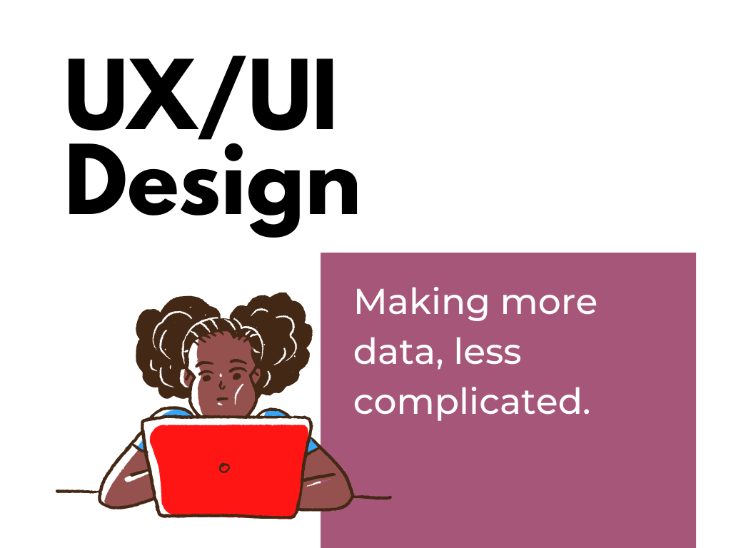
The reality of our digital world is that we now have access to more data than ever and the potential to reach more people than ever.  Unfortunately, so many of those people are just completely overwhelmed. So it puts us into a tough position, how do we present more data, while making the experience less complicated?

Topics for this theme will include things like user experience methodologies, user interface design, interactive visualization design, and report automation. 

Theme 4. Digital Evaluation. Determining what works so you can do better.

DiY Data Design - Digital Evaluation - Determining what works so you can do better.

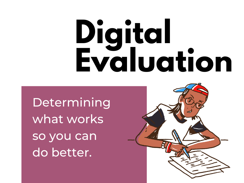
Evaluation helps us identify opportunities, assess the results of our actions, and improve our strategies. There are all sorts of ways to evaluate digital reporting efforts but the knee jerk method among most of the data people is just to send a survey. I’m not anti-survey, but there are a lot of other data sources we can leverage to improve our approaches.

Topics for this theme include web analytics, social media insights, funnel analytics, keyword analytics, backlink evaluation, and user experience evaluation.

How the workshop will be structured.

DiY Data Design workshop goals. "I joined to learn some new software and methods. But I think I get the most value from directly connecting with data people just like me."

We will meet live on Zoom for an hour, 4 times each month.  Each session will focus on a different subtopic from one of the four themes. You can expect 30-45 minutes of content with the rest of the time reserved for questions/conversation.  Every session will be recorded and available to watch later. 

What you will learn.

The goal for the workshop is to teach all the little things you need to know to improve your 21st century reporting skills.

This will include:

  • Introductions to new design software and tools.
  • Instruction on practical creative processes and methods.
  • Opportunities to practice new skills and present your work.
  • Direct support as you work to improve your skills.
DiY Data Design workshop goals. "I joined because I was overwhelmed by all the stuff I didn't know. But Chris has a way of breaking things into small pieces, making all these new methods feel accessible."

How much will the workshop cost?

The workshop has a buffet style all-you-can-learn pricing model.  The price is based on the length of your commitment.  No matter the length you choose, you get access to all live webinars and recorded sessions.

  • 3 months: $199
  • 6 months: $349 (includes a single 1 on 1 coaching call with Chris)
  • 12 months: $499 (includes two 1 on 1 coaching calls with Chris)

What if I enroll and don’t like learning from you?

Let me know within 30 days and I’ll refund your enrollment.

DiY Data Design workshop goals. "I feel pretty confident with my data design skills. But in my org I am the only one who does this stuff. I joined for the thought partners and peers. It's nice to know that I'm not the only person trying to innovate and facing so much resistance."

Will you offer scholarships for…?

Yes. Scholarships will be available and will vary based on need.

When will it launch, and where do I sign up?

DiY Data Design - Workshop Waitlist

The plan is to launch in early September.  

If you would like to be one of the first to know when registration is live, just add your name to the waitlist here: 

Written by cplysy · Categorized: freshspectrum

Aug 24 2021

3 Tips for Visualizing Social Change Data

I recently had the chance to be on the Community Possibilities® podcast with Ann Price. Ann owns Community Evaluation Solutions and helps community leaders plan and evaluate strategies to create lasting change. She started the podcast as a way to connect with community leaders to talk about root causes, dig deeper into understanding social and health inequities and to connect by talking with each other instead of at each other.  

We connected through our mutual speaking coach, Heather Sager’s Speak Up to Level Up class. We’ve since followed each other’s careers and were excited to talk together. 

Listen to the Podcast 

Watch the Conversation

3 Tips for Visualizing Social Change Data 

In the podcast, we discussed three tips for coalitions, foundations, and nonprofits that are visualizing social change data. 

Involve Others in the Data Process Early and Often 

First, get the staff, partners, and community members involved in the data sense-making process early and often.  

My favorite technique for involving others is the data placemat process, which I learned from my previous supervisor, Veena Pankaj. 

It goes like this: 

  1. First, we compile preliminary findings into a few handouts, or data placemats. Lots of ugly graphs. Lots of unformatted graphs. 
  1. Second, we share those data placemats with stakeholders during a data interpretation meeting. We ask the attendees whether they were surprised by any graphs, what additional information they need, etc. We get them to talk about the graphs in their own words. 
  1. Finally, we go back and write the final report (or design the final slideshow, or the final infographic) with the stakeholders’ interpretations of the graphs included. 

You can read more about data placemats in this article that Veena and I wrote for the American Evaluation Association. 

Share Aggregated or Disaggregated Data as Appropriate 

Next, figure out whether audiences need aggregated or disaggregated data. 

Let’s pretend that a nonprofit is running a GRE test prep program for high schoolers. As part of the program, the students take lots of practice tests to see when they’re ready to go take the actual GRE test.  

The students in the program need disaggregated data. They need to see their own individual data to determine how they’re doing and if they’re ready individually.  

A lot of times, the staff who are running the programs also care most about disaggregated data. That means they want to see data specific to each student so that they can individualize their instruction.  

There are also some aggregated summary statistics that might be helpful for those staff. For example, the staff might need to see averages.  

Current funders, prospective funders, and other collaborators will also benefit from aggregated data like averages. For example, they might want to see people in this year’s class compared to last year’s class, or this location’s class compared to a different location’s class. 

Problems can arise when there’s a mismatch.  

For example, if you only show the students the aggregated data, it feels too distant. Finding out the group’s average scores is helpful… but not as helpful as knowing your own scores. Or, if you only show the funders the disaggregated data, they’ll miss the big-picture patterns. 

Remember that Data Visualization Isn’t Supposed to be Hard 

You can use everyday software, like Excel. Just tweak the default settings to make the graphs easier to understand. 

You don’t have to learn coding or programming, unless you want to. 

You don’t need to go to school for graphic design, unless you want to. 

Stay in Touch with Ann Price 

LinkedIn: https://www.linkedin.com/in/awpriceces/ 

Twitter: https://twitter.com/annwprice  

Podcast: https://communitypossibilities.buzzsprout.com/ 

Website: https://www.communityevaluationsolutions.com/ 

Written by cplysy · Categorized: depictdatastudio

Aug 23 2021

Comment on Factors that promote use: A conceptual framework by Dissertation RQ2: To what extent do interpersonal factors relate to use beyond research factors?

[…] Factors that promote use: A conceptual framework […]

Written by cplysy · Categorized: danawanzer

Aug 23 2021

Dissertation RQ2: To what extent do interpersonal factors relate to use beyond research factors?

This blog post is a modified segment of my dissertation, done under the supervision of Dr. Tiffany Berry at Claremont Graduate University. You can read the full dissertation on the Open Science Framework here. The rest of the blog posts in this series on my dissertation are linked below:

  1. Factors that promote use: A conceptual framework
  2. Defining evidence use
  3. Overview of my dissertation study: sample, recruitment, & measures
  4. Question 1: To what extent are interpersonal and research factors related to use?  
  5. Question 2: To what extent do interpersonal factors relate to use beyond research factors?
  6. Question 3: How do researchers and evaluators differ in use, interpersonal factors, and research factors? 

The first question was simply how interpersonal and research factors were correlated with evidence use, whereas this research question examined the added variance explained of interpersonal factors above and beyond research factors. To do this, I analyzed the data using a structural equation model (SEM) looking at the latent interpersonal factor, one of the four stakeholder involvement items that did not load onto the latent interpersonal factor, the two research factors, and years in the partnership related to evidence use. This model, shown below, had a good fit: χ2 (56) = 125.20, p < .001, CFI = .848, TLI = .913, RMSEA = .059, SRMR = .059.  

When examining all five predictor variables, interpersonal factors continued to be a significant correlate of instrumental, conceptual, and process use. Relevance was only significantly correlated with instrumental and conceptual use. Control of decision-making was weakly correlated to instrumental and process use. Years in the partnership was correlated with instrumental, conceptual, and process use. Rigor was not significantly correlated with use.

Overall, my hypothesis was partially supported: interpersonal factors were more strongly related to process use, somewhat equally strongly related to instrumental use, and less strongly related to conceptual use compared to relevance whereas rigor was not a significant explanatory variable. However, the number of years in the partnership was somewhat equally strongly related to each type of evidence use compared to both interpersonal factors and relevance.

The findings of both research questions support the importance of interpersonal factors—and especially relationship quality—as well as research relevance for instrumental, conceptual, and process use. The slight variations in correlation strength among interpersonal factors and relevance with the three types of use suggest it may be important to focus on some aspects over others to promote the type of use of interest. For example, it may be more beneficial to focus on relationships and promoting a commitment to use for process use, relevance for conceptual use, and relationships and communication for instrumental use.

Written by Dana Wanzer · Categorized: danawanzer

Aug 19 2021

Opportunities & Outcomes Mapping: Moving from Confusion to Clarity

Years of working with nonprofits, community coalitions, foundations, and state agencies has taught me one thing: data is messy! But that doesn’t mean that data has to be confusing. Opportunities and outcomes mapping offers a 3-step process to help organizations reconnect with your vision and values. This process will transform your team to move from data to insight to action so you can do your good work even better.

The post Opportunities & Outcomes Mapping: Moving from Confusion to Clarity appeared first on Elizabeth Grim Consulting, LLC.

Written by cplysy · Categorized: elizabethgrim

  • « Go to Previous Page
  • Go to page 1
  • Interim pages omitted …
  • Go to page 168
  • Go to page 169
  • Go to page 170
  • Go to page 171
  • Go to page 172
  • Interim pages omitted …
  • Go to page 310
  • Go to Next Page »

Footer

Follow our Work

The easiest way to stay connected to our work is to join our newsletter. You’ll get updates on projects, learn about new events, and hear stories from those evaluators whom the field continues to actively exclude and erase.

Get Updates

Want to take further action or join a pod? Click here to learn more.

Copyright © 2026 · The May 13 Group · Log in

en English
af Afrikaanssq Shqipam አማርኛar العربيةhy Հայերենaz Azərbaycan dilieu Euskarabe Беларуская моваbn বাংলাbs Bosanskibg Българскиca Catalàceb Cebuanony Chichewazh-CN 简体中文zh-TW 繁體中文co Corsuhr Hrvatskics Čeština‎da Dansknl Nederlandsen Englisheo Esperantoet Eestitl Filipinofi Suomifr Françaisfy Fryskgl Galegoka ქართულიde Deutschel Ελληνικάgu ગુજરાતીht Kreyol ayisyenha Harshen Hausahaw Ōlelo Hawaiʻiiw עִבְרִיתhi हिन्दीhmn Hmonghu Magyaris Íslenskaig Igboid Bahasa Indonesiaga Gaeilgeit Italianoja 日本語jw Basa Jawakn ಕನ್ನಡkk Қазақ тіліkm ភាសាខ្មែរko 한국어ku كوردی‎ky Кыргызчаlo ພາສາລາວla Latinlv Latviešu valodalt Lietuvių kalbalb Lëtzebuergeschmk Македонски јазикmg Malagasyms Bahasa Melayuml മലയാളംmt Maltesemi Te Reo Māorimr मराठीmn Монголmy ဗမာစာne नेपालीno Norsk bokmålps پښتوfa فارسیpl Polskipt Portuguêspa ਪੰਜਾਬੀro Românăru Русскийsm Samoangd Gàidhligsr Српски језикst Sesothosn Shonasd سنڌيsi සිංහලsk Slovenčinasl Slovenščinaso Afsoomaalies Españolsu Basa Sundasw Kiswahilisv Svenskatg Тоҷикӣta தமிழ்te తెలుగుth ไทยtr Türkçeuk Українськаur اردوuz O‘zbekchavi Tiếng Việtcy Cymraegxh isiXhosayi יידישyo Yorùbázu Zulu