• Skip to main content
  • Skip to footer
  • Home

The May 13 Group

the next day for evaluation

  • Get Involved
  • Our Work
  • About Us
You are here: Home / Archives for allblogs

allblogs

Aug 07 2024

Ask Nicole: The Four Keys to Flexible Programs

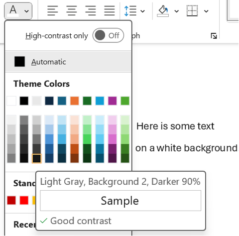
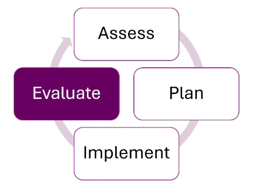
Have a question you’d like to be featured? Let me know. In the ever-changing landscape of community needs, having a solid yet adaptable framework is crucial for organizations aiming to make a significant impact. What is a framework? A framework is a strategic guide that outlines clear goals, structured plans, and collaborative efforts while leaving […]

The post Ask Nicole: The Four Keys to Flexible Programs appeared first on Nicole Clark Consulting.

Written by cplysy · Categorized: nicoleclark

Aug 06 2024

As August Turns into Autumn…

The post As August Turns into Autumn… appeared first on Elizabeth Grim Consulting, LLC.

Written by cplysy · Categorized: elizabethgrim

Aug 06 2024

Your Dataviz Icons: Too Big and Too Dark?

If your boss doesn’t like your icons… they’re probably too big and too dark.

Just like all your graphs, maps, and diagrams, your icons deserve some TLC, too.

Icons can get cartoonish or steal the show if they’re not formatted well.

What’s Inside

  • 0:00 Intro
  • 0:31 This Case Study
  • 1:47 Smaller Icons
  • 2:14 Colored or Gray Icons
  • 2:37 Review of the 4 Options
  • 3:10 How to Insert New Icons
  • 3:33 The Icon Menu in Word
  • 4:21 Editing the Default Icons
  • 5:26 Special Guest

Transcript

Ann K. Emery: [00:00:00] Your icons might be too big or too dark. In this video, I’m going to show you a few variations side by side so you can sit back and compare. And at the end, stick around if you’d like a how to tutorial, because I’m going to show you how to get started with icons that are built right inside of good old Excel and PowerPoint and Word.

I’m Ann Emery. You’re watching Dataviz On The Go, the series where I make quick tutorials for you as I’m racing around between my conferences and consulting and podcasts and blog posts and workshops. And speaking of workshops, I was just giving a half day virtual workshop. And one of the case studies that we looked at from that group looked something like this.

This obviously isn’t their real report, but the report was structured more or less like this. They had the report title right here at the top. They had a couple introductory paragraphs. And then they had looked through their whole full report and pulled out five key highlights. I love using icons like this for highlights.

I [00:01:00] just wanted to fine tune these a little bit and show them a few variations, which I’m going to show to you in a moment. Okay, these obviously aren’t their real icons, but the icons were this size. One by one inch, and this color, filled in black icons. And then below there, they had all the rest of the stuff.

And on the following pages, pages two, three, four, and so on, they had lots of graphs and maps and diagrams and all sorts of other visuals. I worried that these icons were stealing the show. I wanted them to be the main character, but not like the in your face main character. So, hence the variations. Let me zoom out and show you a couple ideas side by side, okay?

The first thing that we played around with was what if we made the icons just a little bit smaller? We go from one by one inch to half inch, so they’re still the main [00:02:00] character, just not so in your face. Okay, look at just the difference in ink, right? Now you can see all the words, you can see the little boxes underneath them a little bit better.

Let me show you a couple more options. What if instead of default black icons, we try either a brand color or gray. You would use your real brand color. I’m using the Depict Data Studio purple right here. So this would look a little bit different, of course, or a light gray.

One by one inch, solid colored black, smaller black, or my personal favorites, brand color or gray. If you ever try icons and your boss is like, I don’t like them. Get them out of there. Remove them. It’s probably because they’re too big and too dark. Nobody likes icons that are [00:03:00] too big and too dark. They almost look cartoonishly big.

So try making them smaller, try making them a brand color, or try making them lighter. In case you’re new to icons, let me give you a quick, quick 101 level tutorial. They’re here. They’re under insert, and then there’s the icons button. You have to be on the latest version of Word to see these though. So if you don’t see the icons button, you’re going to have to go update your Word to get these built in icons.

Insert icons. You click on that. You get the menu. You go through. You enjoy all the nice icons, right? There are filled versions. There are outlined versions. You’re going to pick one or the other. I picked filled. In this case, you want consistency. I wouldn’t do filled outline, filled outline. That would be weird.

There’s also a search bar in case you need it. In real life, I almost never use any of these icons. I usually use these symbols in a lot of my graphs to talk about like, [00:04:00] you know, we met the target, we met the objective, or this thing increased, this thing decreased, or I’ll do numbered lists with these fancy icons.

The numbers with the circle around them. Okay. Insert icons, pick your icon. Let’s pick the barn. Why not? Let’s go with the barn for today. I’m feeling in a barn mood. By default, look, it gives you the size that it gives you. It gives you one by one inch icons and it gives you black. You can edit this. When you first insert the icon, it pulls up the editing features.

You don’t have to do anything special, but in case you’re clicked off, you know, you’re editing this later. All you have to do is. Click on your icon. It’s going to pull up this graphics format tab for you. And in there, you can adjust the fill. You could make it a brand color. These are my theme colors already added into this file, or you could make it a nice gray.

You can also [00:05:00] adjust the size instead of one inch by one inch, maybe do a half inch. That’s typically the size that I pick for Word. Typically for PowerPoint, because PowerPoint is going to be a bigger screen, one inch is typically okay on PowerPoint. I just want you to know you have control over this. You have control over the color and the size.

So you can make intentional design choices and not just stick with whatever Excel gives you or Word gives you by default. Don’t forget to like, subscribe, and share! Hi baby, what do you see?

Written by cplysy · Categorized: depictdatastudio

Aug 06 2024

Beyond Biases: Insights for Effective Evaluation Reporting

This article is rated as:

I just finished reading a book called Factfulness, by the late Hans Rosling, a Swedish physician and statistician who dedicated his life to promoting a more accurate and optimistic view of the world. In his book, he identifies ten common cognitive biases that distort our perception of reality and prevent us from seeing the progress and potential of humanity. He also offers practical tips on how to overcome these biases and adopt a fact-based mindset that can help us make better decisions and communicate more effectively. This was a pleasure-read book that I didn’t think had strong applications to evaluation, but by the time I finished, I couldn’t stop thinking about what these ideas meant for evaluation reporting.

As evaluators, we are constantly dealing with data, evidence, and complex problems that require critical thinking and sound judgment. We also encounter data and projects that can trigger our emotional reactions and cognitive shortcuts. I have always been interested in cognitive biases, of which there are countless versions, and how they cloud what we think is independent, objective decision-making. Rosling has a top ten, that he calls instincts, so let’s start with those and think about how we can apply the insights from Factfulness to evaluation practice.

Bias #1: The Gap Instinct

The gap instinct is the tendency to divide the world into two distinct and often conflicting groups, such as the rich and the poor, or us and them. This instinct can lead us to overlook similarities between groups and the diversity within them. It also leads us to exaggerate the differences and gaps between the two groups. Rosling suggests that we should look for the majority or the middle, rather than focusing on the extremes and the averages.

Application to evaluation: Have you ever used a Likert scale on a survey and dichotomized the responses in your reporting? For example, “75% agree and 25% disagree” or “92% were satisfied but 8% were dissatisfied”. The Gap Instinct suggests that this is possibly (or likely?) a misrepresentation, where, in reality, many of your respondents were probably somewhere in the middle, with significant overlap between the agree-ers and disagree-ers.

The Gap Instinct also applies when we compare two (or more) averages. For example, if you report “On average, Program A has 100 participants a year, and Program B has 200 participants a year” it can lead to misunderstanding and exaggeration of the differences in the two programs, when in reality, any given session of either program may have significant overlap in the number of attendees.

Accurate reporting is representative reporting, including ambivalence or indifference, and including ranges, medians or modes if they better represent reality.

Bias #2: The Negativity Instinct

The negativity instinct is the tendency to notice and remember the bad more than the good, and to assume that things are getting worse. This instinct can make us pessimistic, cynical, and fatalistic, and blind us to the positive changes and opportunities that are happening in the world. Rosling suggests that we should balance our negative impressions with positive facts and recognize that bad and good can coexist and that improvement is possible.

Application to evaluation: I recently wrote a report where my client said, “It reads as very critical of us.” I was surprised. That wasn’t my intent, nor did I think the data pointed to being overly critical. Sure, there was some room for change and improvement, but I didn’t think the key takeaway was criticism. After reading Factfulness, I now think this reaction was the Negativity Instinct in action. My client was focusing on the bad more than the good.

We’ve written before about how to present bad results. I do think it is our role to share negative and unexpected findings, but I think in the future I’ll be more cautious of this bias to focus on the negative. That doesn’t mean we need to hide bad results in overly flowery or optimistic language, but I also don’t want clients to focus only on the negative.

An overarching theme of Factfulness is that things can have room for improvement but also be improving at the same time or co-exist with good things.

Bias #3: The Straight Line Instinct

The straight line instinct is the tendency to assume that a trend will continue in a straight line, without considering the factors that might affect its direction, speed, or shape. This instinct can make us overconfident, complacent, or fearful, and lead us to make inaccurate predictions and projections. Rosling suggests that we should look for curves, bends, and levels, and remember that most trends are S-shaped, not linear. To illustrate, Rosling uses the example of global population forecasting:

Application to evaluation: I think there is a potential evaluation application anytime we present data over time. I know I often look at line chart trajectories and assume they will continue without pausing to reflect on a potential plateau or factors that may influence that trajectory, (e.g., seasonality).


My time working in quality improvement taught me that six points on a timeline indicate a non-random pattern. Simple rules of thumb like this can help in evaluation so that we are not over (or under) emphasizing trajectories.


Bias #4: The Fear Instinct

The fear instinct is the tendency to pay more attention to things that are scary, dangerous, or threatening, and to overestimate their probability and impact. This instinct can make us anxious, paranoid, and irrational, and prevent us from taking reasonable risks and opportunities. Rosling suggests that we should distinguish between risks and fears and calibrate our level of worry to the actual level of harm.

Application to evaluation: I think this applies to the decision making and action that we encourage our clients to take after an evaluation. I think we can encourage our clients to think about likelihood of and exposure to certain scenarios. Project management tools that rate risk levels and likelihood are probably helpful here.

Bias #5: The Size Instinct

The size instinct is the tendency to focus on the size or quantity of something, without considering its proportion, perspective, or relevance. This instinct can make us impressed, amazed, or alarmed, and lead us to misinterpret or misuse numbers and statistics. Rosling suggests that we should compare, divide, and contextualize, and use ratios, proportions, and comparisons to make sense of numbers.

Application to evaluation: Have you ever seen the recommendation to report a single number? It’s literally on the Quantitative Chart Chooser I have stuck to my wall. This approach to data visualization is purported to make your message memorable and sticky. Rosling, however, suggests it can be misleading without context.

If you report “90% of participants loved the program”, how does your audience know if it was 97% of last year? Or that 90% is actually only representing 10 participants that completed surveys, not the 73 total participants. Of course there are solutions, one being to ensure your data analysis itself isn’t misleading, like overweighting small sample sizes. Reporting a single big number may be appropriate in evaluation if your audience has all the necessary context, including the denominator or any key differences over time or between groups.

Another application to evaluation is when you report lists. Reporting a large list gives the impression that every item on the list is equally weighted, but in reality it’s likely that a smaller proportion have the greatest impact. For example, if you have a list of influencing factors on a specific outcome, it is likely that there are just a handful that have the greatest influence. In Factfulness, Rosling uses the example of pharmaceutical commercials that list off a dozen side effects, ranging from itchy feet to heart failure. By listing them all, the audience struggles to apply appropriate weight and meaning to each item on the list and can end up ignoring them all, leading to poor outcomes through inaction.

Bias #6: The Generalization Instinct

The generalization instinct is the tendency to categorize and label things, people, and places, and to assume that they are homogeneous, static, and typical. This instinct can make us stereotypical, prejudiced, and ignorant, and prevent us from seeing the diversity, complexity, and uniqueness of reality. Rosling suggests that we should question our categories, look for differences and changes, and beware of the majority illusion.

Application to evaluation: The key here is to look for differences. It is unlikely that your program participants are homogenous in all regards. What makes them different? And how can you understand those differences? Solutions may be about the demographic or characteristic questions you collect, or about how you stratify and analyze your data. Though some clients may not explicitly ask for a gender-based analysis or exploration into participant characteristics, these deeper dives in analysis may add valuable insights to your reporting.

Bias #7: The Destiny Instinct

The destiny instinct is the tendency to believe that things are predetermined by nature, culture, or history, and that they cannot or should not change. This instinct can make us fatalistic, resigned, or resistant, and stop us from recognizing the potential and agency of ourselves and others. Rosling suggests that we should keep track of gradual changes, acknowledge the power of human intervention, and celebrate the progress that has been made.

Application to evaluation: For me this comes into play when making recommendations. It’s likely I’ve omitted recommendations because they seem unlikely to change, perhaps governed, in my biased view, by nature, culture, or history. Even small changes can accumulate over time to big changes; perhaps, as evaluators, our recommendations don’t all have to be system-level change, or program restructuring change, but can leave the door open for small changes that slowly shift the way things are done.

Bias #8: The Single Perspective Instinct

The single perspective instinct is the tendency to adopt a single idea, discipline, or framework, and to apply it to everything, without considering other perspectives, dimensions, or angles. This instinct can make us dogmatic, narrow-minded, or biased, and limit our understanding and creativity. Rosling suggests that we should use multiple perspectives, tools, and methods, and seek out different viewpoints and sources of information.

Application to evaluation: For me, the application here is in evaluation methodology. This is the “if you have a hammer, everything is a nail” adage. I think it’s easy to get stuck in ruts as evaluators and rely on the trusted surveys, interviews and focus groups without stopping to think if other data collection strategies might be more effective. Here are a few suggestions: World Cafés,  Photovoice, Outcome Harvesting, or Arts-Based Data Collection.

Bias #9: The Blame Instinct

The blame instinct is the tendency to look for a scapegoat, a villain, or a hero, and to attribute the cause or solution of a problem to a single individual, group, or factor. This instinct can make us angry, judgmental, or naive, and distract us from the systemic and structural causes and solutions of complex problems. Rosling suggests that we should resist pointing fingers; look for causes, not villains; and look for systems, not heroes.

Application to evaluation: I have definitely fallen into this trap. I worked on a project that wasn’t implemented well and didn’t produce the outcomes it had aimed for. From my arms-length, contracted evaluator position it looked obvious to me that poor communication was a likely culprit. Sure, poor communication was a key factor, but the risk here is that I had found my thing-to-blame and stopped looking for other answers or solutions. Evaluations should be comprehensive and offer multiple perspectives.

Bias #10: The Urgency Instinct

The urgency instinct is the tendency to act quickly and impulsively, without taking the time to gather evidence, analyze data, or think critically. This instinct can make us stressed, panicked, or reckless, and lead us to make hasty and poor decisions. Rosling suggests that we should take a breath and insist on data.

Application to evaluation: The application to evaluation here may take the form of how we encourage our clients to take action with a level head, but I think there is another application. Rosling says you should always insist on data. As evaluators, we can ensure we have triangulated our data with appropriate perspectives and sample sizes to ensure that our clients are given a fulsome story on which to base their decisions.


It’s been on my to-do list for some time to write about biases in evaluation, but reading this book finally motivated me to get started. What are some biases that you keep top of mind? I’d love more direction on how evaluators can work against our biases in practice.

For more info on Rosling and his family’s work to present an accurate worldview check out https://www.gapminder.org/ and https://www.gapminder.org/dollar-street.

Written by cplysy · Categorized: evalacademy

Aug 06 2024

10 Tips for Making Your Evaluation Report More Accessible

This article is rated as:

“Accessible” content sounds like a great thing to aim for! But what does that actually mean? It can have different meanings, but “accessible” tends to refer to one of two ideas (or both at the same time):

  1. It might refer to content that is designed to be accessible for people with disabilities, where barriers have been removed so that everyone can access and understand it.

  2. It could also refer to content that is approachable to an audience, where the content is jargon-free and easy to follow.

Addressing both of these definitions of “accessible” in your written reports maximizes the reach of your work and ensures that everyone has equal access to the information in the report. It’s worth noting, however, that written reports are not the best and only way to present your findings. Depending on your audiences, there are a wide range of other creative formats you can use to share learnings, such as one-pagers, newsletters, infographics, videos, presentations, or even a podcast!

Even so, written reports are common in evaluation and may be the most suitable format for a specific project or audience. Some simple tips can help create a written report that is still engaging for all, including people with vision impairments or colour blindness, people who use assistive devices, and neurodivergent people. Accessible reports also help all readers by reducing eye strain, providing a clear structure, and communicating the message in multiple ways!


How do you make a report more accessible? Here are a few components to consider:

  • Colour: Are you using colour intentionally? Is colour the only way to make sense of something (like a legend)? 

  • Contrast: Does your text clearly stand out from its background?

  • Images: Would someone miss important content if they weren’t able to see the images and graphs?

  • Font: Would the text be comfortably legible if it were on a smaller screen or printed? 

  • Headings: Are there properly formatted headings that divide the content?

  • Logical, clear structure: Does your report flow logically from one idea to the next?

  • Language: Is your text written in language that is clear and jargon-free?

These are just some questions to get you thinking about what can impact accessibility. But don’t worry—the rest of the article will take you through some of my favourite tips for improving accessibility!


1. Colour

While colour can make documents brighter and more interesting, it may not be accessible to everyone reading your report. Using similar shades or certain colour combinations can make them challenging to distinguish, whether it’s due to colour blindness, visual impairment, computer screen quality, or greyscale printing.

Be thoughtful with the colour palette of your report. If working with a client, use their established brand colours whenever possible, as they are usually designed to offer cohesiveness and contrast. In addition, you may want to consider the meanings that certain colours have in different cultures (read more about Color Symbolism in Different Cultures Around the World). You can also use the Coblis Color Blindness Simulator to check how your colours might look to people with various colour vision deficiencies.

A general rule is to avoid relying solely on colour to communicate something. Aside from colour, you can use text, icons, labels, or positioning to help identify elements. While colour is often used in graphs for example (like in legends), it shouldn’t be the only way to read them. It’s a good idea to keep labels as close to their bars or lines as possible, so that colour legends aren’t necessary.

Another way to make charts and graphs more readable is to use contrasting colours. The next tip in this article goes into more detail about contrast, but in simple terms, use both light and dark colours to make them more distinguishable. Using white outlines (e.g., an outline of ¾ to 1.5pt weight) around any coloured objects can also help prevent neighbouring colours from “merging” if you aren’t able to switch colour palettes completely.

In the example below, I took a chart with very similar colours, applied white outlines, and moved the legend to match the bars. Even without abandoning these colours, the edited version is much easier to follow thanks to a few very simple changes.

 If you’re ever not sure about the accessibility of your colours on a page or chart, simply print it out in greyscale and you can see for yourself how easy or hard it is to read or follow!

2. Contrast

Have you ever struggled to read a website or document that uses white text on a yellow background, or black text on a dark blue background? That’s because there’s low contrast!

Certain colours are easier to detect on some background colours than others, because of the difference in brightness between the two colours (the contrast). The less contrast there is (the more similarly bright or dark the colours are), the more challenging it will be to read or understand the content. There are standard combinations we use because they make text “pop,” such as black or dark grey text on white or pale backgrounds and white or pale text on black or dark grey backgrounds.

Contrast is especially important with smaller text or objects. You might be able to use a less contrasting font colour for your bolded, 20pt heading, but you should stick to high contrasting colours in your body text or small graphics.

A general tip is to be mindful of how light and dark your text, objects, and backgrounds are. If you’re using a colour that’s lighter or closer to white, make sure to contrast it with a dark colour that’s closer to black. When you’re limited in colour choice (e.g., you’re using a client’s brand colours), try using other techniques to enhance the readability by using boxes around content, applying an outline in a higher contrasting colour to your text, or increasing the font size.

My favourite tool for this is this WebAIM Contrast Checker. You enter your foreground (text or object) colour and your background colour, and it calculates the contrast ratio. The tool suggests aiming for a ratio of 4.5:1 or even 7:1 for adequate contrast. Some Microsoft tools also guide you in choosing contrasting colours. Look for the icons below the colour sample when choosing text and highlight colours (see below images for examples).

3. Alt Text and Captions

Visual elements in your report, like images and charts, often contain crucial information; it’s important that everyone has access to it! In digital contexts, alternative text (or alt text), captions, and image descriptions therefore serve to describe visual content for people who cannot see it. A built-in alt text or similar feature should be available in most programs, including Word, PowerPoint, Canva, and Pages. 

Screen readers will announce that it’s an image, so your description doesn’t need to state this. Just aim to provide a concise summary of the image’s content so that someone could understand its purpose without seeing it—think Tweet length! For example, for the below image, the alt text might read: “A diagram showing a cycle of four stages. Clockwise starting at the top, the four stages are: assess, plan, implement, and evaluate. Evaluate is highlighted in purple.”

Images that serve a purely decorative purpose and do not contain any necessary content do not need to be described. You can choose the “Mark as Decorative” option, if available, or enter “Decorative” in the Alt Text description field. Any images, charts, or graphs that contain content that is not found anywhere in the text should have alt text. For visual elements where the content can also be found in the text, treat them as decorative images.

4. Font

The font style you choose can impact how readable your report is. Some types of fonts can be much more challenging to read, like cursive, all caps, narrow, and wide fonts. Avoid these fonts! On the other hand, certain fonts are recognized as being more accessible, such as Arial, Tahoma, Verdana, Aptos, and Calibri. In general, sans serif fonts are easier on the eyes, but familiar serif fonts (like Times New Roman) will work too.

To reduce eye strain and increase cohesiveness in your report, stick to just a few fonts. For example, you might choose one font for your body text and one font for your headings, or you might use a single font for everything. If you do use more than one font, make sure you are consistent in how you use them (i.e., don’t use your headings font to add emphasis in the middle of a section of body text).

 Read more about consistency in our article, Six Hacks for Renovating Your Evaluation Report: Consistency is Cool!

5.   Font Size

Consider your medium when choosing font sizes. For reports that will be read on computers, body text of 11pt or even 10pt font is acceptable, as readers can zoom in easily. To ensure your report can be read when printed out, aim for a font size of at least 12pt for body text. All headings and titles should be larger than your body text, increasing based on hierarchy. For example, if your body text is 12pt, you might use 14pt for Heading 4, 16pt for Heading 3, 18 pt for Heading 2, 20pt for Heading 1, and your title might be 24pt. Use consistent font sizes for the different types of text throughout your document (tip: use a style guide for this—check out our style guide template!).

These are general guidelines, but you know your audience best! You may want to go larger than the recommended body text size if you know that your readers are very likely to print out your report, are less familiar with the content or language, or may have visual impairments.

6. Text Effects

Whenever possible, it’s best to choose your words thoughtfully to add emphasis, as this is available to everyone. That said, if you do want another way to make something stand out visually, bolding is usually the most accessible text effect; italics can be hard to read, and underlining should be reserved for hyperlinks. If you choose to use text effects like italics or bolding, restrict yourself to only one or two. Using too many text effects can make your document look overwhelming and cluttered. It’s also important to be consistent in the meaning, so if you use italics to indicate definitions, then italics should only be used for definitions.  

A note on bold text: Some people use bolding to highlight main ideas in a paragraph, as I have done in this article. It creates focal points on the page that draw and direct a reader’s eyes (read our hack for making things pop). When used thoughtfully, this can help your audience, including people with cognitive or learning differences, navigate written text. Just make sure to be intentional about it and only bold the most important points! 

7. Headings

A common way to make quick headings is to put them on a separate line and bold them (or underline, or use a different font, etc.). When a screen reader or text-to-speech program reads these headings, however, they can’t necessarily identify that it’s a heading. It might read it out as part of the following sentence, making it hard to understand.

Did you know that Microsoft Word has built-in heading styles that you can customize however you’d like? This is a great way to provide structure and cohesiveness to reports and ensure that screen readers can detect and properly read out headings. It also allows people to quickly navigate to specific sections of your report.

To change the default heading styles in Microsoft Word, look for the Styles section under the Home ribbon. Right-click one of the heading styles (such as Heading, Heading 2, or Heading 3), and choose Modify. You can then edit the font, size, colour, and effects on your text to help it stand out.

8. Structure and Flow

Navigating a poorly structured report can make reading much harder and slower, for everyone! Help guide your audience through your ideas smoothly by incorporating some easy organization tips.

  • Transitions: Make sure your ideas flow clearly from one sentence to the next. It can help to use transition words and phrases like “in addition,” “similarly,” and “however” to create links between ideas.

  • Lists: Use bullet points or numbering for lists longer than three items.

  • Hyperlinks: If you have any hyperlinks, use descriptive text stating where the link leads to, rather than using an ambiguous phrase like “click here.”

  • Headings: Use headings and subheadings to logically organize different topics.

  • Paragraphs: Separate distinct ideas into different paragraphs.

  • Page breaks: Consider using page breaks when beginning a new section of the report, to avoid starting at the bottom of a page.

  • Sentences: Avoid long sentences with lots of commas. Instead, break them into shorter sentences that are easier to follow. Vary sentence length to reduce fatigue and keep readers engaged.

A good rule of thumb is that if it looks visually overwhelming or sounds long to you, it probably would to others, too!

Check out the following articles for more tips to improve the structure and flow of your writing:

9 Common Writing Mistakes in Evaluation

Practice Proximity – Six Hacks for Renovating Your Evaluation Report

9. Plain Language

Using plain language in reports benefits many types of readers! From English language learners to people with cognitive challenges to busy executives, writing in a simple, concise, and straightforward way helps people engage with your report.

Check out this article about plain language for some tips and tools for incorporating this technique into your writing!

10. Symbols and Punctuation

Using symbols, special characters, and punctuation correctly makes it easier for everyone to read your writing the way it was intended.

A common mistake is to create a bulleted list by typing symbols, like asterisks or dashes. Screen readers may or may not be designed to read these kinds of symbols out loud. As a result, they may read out the symbol itself, or they may not recognize that it is a list of items. Instead, use built-in bulleting or numbering features. 

Symbols can also create a burden for your readers. Limit unnecessary symbols or special characters, like asterisks (*), ampersands (&), number/pound signs (#), arrows (← ↑), equals signs (=), greater than or lesser than symbols (< >), and tildes (~). These symbols aren’t always read aloud by screen readers, and they make sentences harder to skim or read.

It’s best to use proper punctuation while keeping it simple. Stick to periods, commas, question marks, and colons. Use other punctuation like exclamation marks, semi colons, and ellipses sparingly. To sum up, save your audience time and effort by taking a few extra seconds to check your symbols, special characters, and punctuation marks.


It’s  a great idea to strive to make your report more accessible for everyone. There’s a lot to think about when it comes to accessibility, but even incorporating just one or two of these tips into your next report will make it more approachable and readable for your audience. You can also check the accessibility of your report by testing it out. Ask a colleague to review it for visuals, readability, and language, or try one of the following tools and techniques:

  • Test how your colours and images might look to people with various colour vision deficiencies with this Color Blindness Simulator

  • Apply a greyscale filter to images and charts to check if they are still easily understood

  • Use the WebAIM Contrast Checker to check for sufficient contrast

  • Try reading out your alt text to a colleague who isn’t looking at your image or chart. Can they understand it?

  • Hear your report for yourself by using a screen reader like VoiceOver (on Mac) or Word’s built-in screen reader, called Immersive Reader (found in the View tab)

  • Use a readability checker to check the complexity of your writing

  • Try out Word’s built-in Accessibility Assistant, which will check for colours and contrast, missing alt text, and headings


Which tips will you try out first in your next report? Let us know in the comments!


Learn more about designing reports with these templates and articles:

New Template: Style Guide Template! — Eval Academy

New Infographic: 10 tips for designing quality reports! — Eval Academy


Or read more about how to incorporate equity into all parts of an evaluation:

How can we incorporate diversity, equity and inclusion in evaluation — Eval Academy

Written by cplysy · Categorized: evalacademy

  • « Go to Previous Page
  • Go to page 1
  • Interim pages omitted …
  • Go to page 39
  • Go to page 40
  • Go to page 41
  • Go to page 42
  • Go to page 43
  • Interim pages omitted …
  • Go to page 310
  • Go to Next Page »

Footer

Follow our Work

The easiest way to stay connected to our work is to join our newsletter. You’ll get updates on projects, learn about new events, and hear stories from those evaluators whom the field continues to actively exclude and erase.

Get Updates

Want to take further action or join a pod? Click here to learn more.

Copyright © 2026 · The May 13 Group · Log in

en English
af Afrikaanssq Shqipam አማርኛar العربيةhy Հայերենaz Azərbaycan dilieu Euskarabe Беларуская моваbn বাংলাbs Bosanskibg Българскиca Catalàceb Cebuanony Chichewazh-CN 简体中文zh-TW 繁體中文co Corsuhr Hrvatskics Čeština‎da Dansknl Nederlandsen Englisheo Esperantoet Eestitl Filipinofi Suomifr Françaisfy Fryskgl Galegoka ქართულიde Deutschel Ελληνικάgu ગુજરાતીht Kreyol ayisyenha Harshen Hausahaw Ōlelo Hawaiʻiiw עִבְרִיתhi हिन्दीhmn Hmonghu Magyaris Íslenskaig Igboid Bahasa Indonesiaga Gaeilgeit Italianoja 日本語jw Basa Jawakn ಕನ್ನಡkk Қазақ тіліkm ភាសាខ្មែរko 한국어ku كوردی‎ky Кыргызчаlo ພາສາລາວla Latinlv Latviešu valodalt Lietuvių kalbalb Lëtzebuergeschmk Македонски јазикmg Malagasyms Bahasa Melayuml മലയാളംmt Maltesemi Te Reo Māorimr मराठीmn Монголmy ဗမာစာne नेपालीno Norsk bokmålps پښتوfa فارسیpl Polskipt Portuguêspa ਪੰਜਾਬੀro Românăru Русскийsm Samoangd Gàidhligsr Српски језикst Sesothosn Shonasd سنڌيsi සිංහලsk Slovenčinasl Slovenščinaso Afsoomaalies Españolsu Basa Sundasw Kiswahilisv Svenskatg Тоҷикӣta தமிழ்te తెలుగుth ไทยtr Türkçeuk Українськаur اردوuz O‘zbekchavi Tiếng Việtcy Cymraegxh isiXhosayi יידישyo Yorùbázu Zulu