• Skip to main content
  • Skip to footer
  • Home

The May 13 Group

the next day for evaluation

  • Get Involved
  • Our Work
  • About Us
You are here: Home / Archives for allblogs

allblogs

Aug 27 2024

How to Move Lines to Front or Back of the Chart in Excel

Do you have a line chart with tons of lines?

Sometimes, the line you want to highlight… is stuck all the way in the back. Nobody can see that line, because it’s all covered up. Oops!

In this video, you’ll learn how to rearrange the line chart so that the line you want your audience to see isn’t covered up.

Watch the Tutorial

What’s Inside

  • 0:00 The Problem: Excel Graphs with Covered-Up Lines
  • 0:23 Welcome to Dataviz On The Go
  • 0:31 The Dataset
  • 0:47 Another Problem: The Spaghetti Line Chart
  • 1:10 3 Fixes for Spaghetti Line Charts
  • 1:37 The Edited Graph – But Average Line Hiding and Covered Up
  • 2:06 The Solution & Where to Click in Excel
  • 2:50 Bottom of the List… Front of the Graph
  • 3:04 Download the Spreadsheet
  • 3:11 Don’t Forget to Like, Subscribe, and Share

Download the Spreadsheet

Want to download the Excel file and follow along ?Download the file here: https://depictdatastudio.ck.page/products/moving-lines-to-the-front-or-back

Read the Transcript

Ann K. Emery: [00:00:00] In this video, you’re going to learn how to bring the average line to the front of your graph. So instead of covered up and hiding, it’s just going to be in the front so people can actually see it. If this sounds like something that might be relevant to you and your workplace, stick around. I’ll give you some context about this graph, and then I’ll teach you how to fix it right inside of good old Excel.

Hi, I’m Ann Emery, you’re watching Dataviz On The Go, the series where I make jet speed tutorials as I’m racing around between my workshops and meetings. And speaking of workshops, this is the real life, sort of, table that I was working on in a workshop recently. These aren’t the real state names. These aren’t the real timeframes or the real numbers, but the graph looked more or less like this.

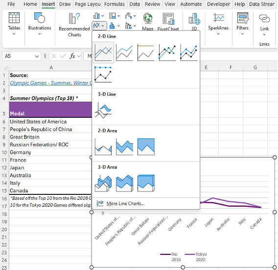
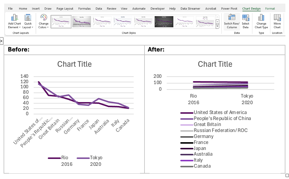
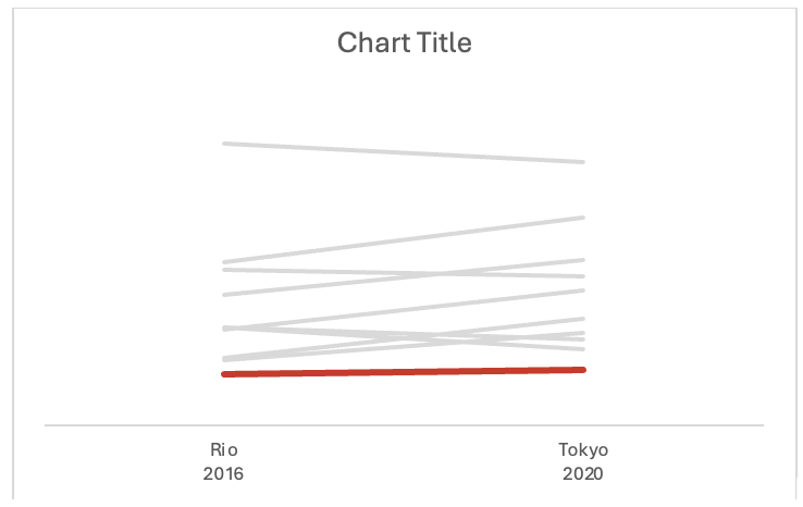
What happened was, when we highlighted the table and we Inserted the graph. We were left with Ann Emery’s least favorite chart of all time, the spaghetti graph. This happens all the time in real projects. So if you get a spaghetti [00:01:00] graph, don’t worry. There are some common fixes and just to make it super duper clear what we’re not doing.

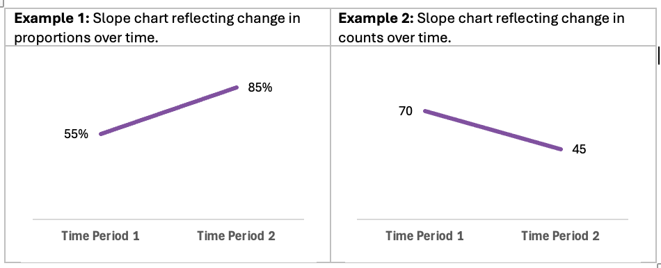
Let me just make it really, we’re just, we’re not doing this. Okay. Are we in agreement? We’re not doing this. Common fixes. Common fixes, uh, you could either gray everything out, highlight one, one line at a time, that’s what we’re going to do here. Another fix, you could do small multiples, or another fix is interactivity.

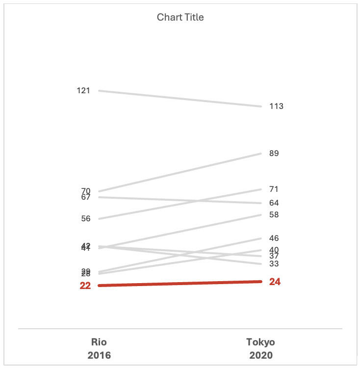
Okay, those are the three common fixes for really busy, really dense graphs. In this case, we wanted to gray everything out and highlight one line at a time so people could see the average. They could see the big picture. Here’s, on average, how all of our states are doing, but then a split second later, They could look a little bit further and they could see all the gray lines.

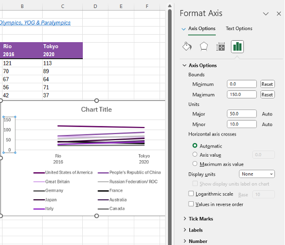
One star of the show, lots of sidekicks. But then the problem we ran [00:02:00] into is like, the average line is missing, or, not missing, but it’s hiding. It’s really hard. You can’t see it. Where’s our main character? So let me copy paste this one so we can admire them side by side. I’ll show you what to click on. You’re going to click on…

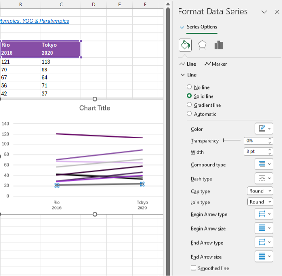
The middle of the graph. Not the side, not the top, not the bottom. Okay, the middle. You’re going to right click. You’re going to go to Select Data. I have a love- hate relationship with this menu. I think there’s a little bit of a learning curve. All you need to know is: the thing you want to be in the front of your graph needs to go on the bottom of the list.

I’ve clicked on the average here. I’m going to tap down, tap, tap, tap, tap, tap with the arrows. Is that at the bottom? Yeah. The thing that’s on the bottom of the list is going to be on the front of your graph. Bottom of the list, front of the graph. Super counterintuitive. You would have thought that Microsoft would do it the other way around, but they didn’t.

Okay. I put the average on the bottom of that list. [00:03:00] Therefore, it’s on the front of the graph so people can actually see it. If you want to download this and click around and explore some more, check below the video. I’ve got a link where you can grab it for free.

Don’t forget to like, subscribe, and share.

Written by cplysy · Categorized: depictdatastudio

Aug 26 2024

Data Visualization Applications: Slope Charts

This article is rated as:

Slope charts are an extension of line charts ideal for presenting changes over time. While line charts are effective at illustrating change over multiple time periods, slope charts excel at illustrating changes between two distinct time periods.

The benefits of opting for slope charts include:

  •  Clarity in comparisons: Slope charts allow for easy comparisons between two points in time.

  • Simplicity: By focusing on fewer data points (i.e., two time periods), slope charts simplify complex data. This makes slope charts more accessible to colleagues and clients.

  • Identification of trends: Their simplicity allows for easy identification of trends and patterns, effectively illustrating increases, decreases, or stability between time periods.

  • Enhanced storytelling: Slope charts clearly provide a visual narrative of change over time, making it easier to communicate key insights from the data.


The Paris 2024 Olympic Games inspired us to reflect on the overall medal counts for the Top 10 countries from the previous two summer Olympic Games. We will use a slope chart to highlight changes between the Rio 2016 and Tokyo 2020 Olympic Games, with an emphasis on Canada (a perfect example of selection bias – see our articles on sampling bias and bias versus confounding to help avoid bias in your own analyses).

Check out the following Eval Academy resources to assist in preparing data for effective data visualization:

  • The Data Cleaning Toolbox

  • Let Excel do the Math: Easy tricks to clean and analyze data in Excel

  • How to combine data from multiple sources for cleaning and analysis

  • A Beginner’s Guide to PivotTables

Data Preparation

This article assumes that data are already prepared. That said, data should be structured in a clean and organized table like the example below.

Note: This table has prepared the Rio 2016 and Tokyo 2020 data labels such that the year number will be presented below the hosting city. This can be accomplished by using Alt+Enter at the end of the city name to move to the next line within the same cell.

Initial Chart Selection

  1. Highlight the data to be included in the line chart.

  2. Navigate to Insert along the top ribbon of Excel.

  3. Within Insert go to Charts > 2-D Line > Line (a basic Excel-formatted chart should appear).

Applying Data Visualization Best Practices

Following this single step will have produced a line chart. This initial line chart needs to be converted to a slope chart, and improved by following data visualization best practices. This will transform the default Excel chart into an engaging visual.

Flipping Row/ Column Data

This example illustrates a common occurrence within Excel. Excel charts will often attempt to plot column headings along the x-axis of the chart (i.e., the horizontal axis) and row headings along the y-axis (i.e., the vertical axis). However, there is no need to transpose the data table to accommodate Excel’s plotting conventions. Instead, we can use the following steps to flip row/ column data within the chart.

  1. Left-click within the slope chart.

  2. Navigate to the Chart Design tab along the top ribbon of Excel.

  3. Click Switch Row/ Column.

*Alternatively, you can right-click on the chart and go through Select Data… > Switch Row/ Column > OK. This menu also provides additional options for editing the data.

Lock Y-Axis Bounds

  1. Right-click on the y-axis (i.e., the vertical axis).

  2. Select Format Axis…

  3. Under Axis Options > Bounds lock the Minimum to 0 and the Maximum to 150*

*This is not mandatory, but it can prove beneficial to lock the Bounds of a given axis. The Auto bounds will adjust with new data. However, sometimes the Bounds will become skewed as Excel tries to fit the data. That is, the Minimum Bound may exceed zero and potentially interfere with the accurate interpretation of the data.

Improve the Appearance

Remove the Legend

  1. Left-click on the legend below the slope chart.

  2. Hit Delete to remove the legend (we will improve upon this later). 

Line Thickness

  1. Left-click on the Canada line within the slope chart (Canada is ranked 10th so this will be the bottom line).

  2. Right-click the highlighted line and Format Data Series.

    • This menu can also be accessed using the Ctrl + 1 keyboard shortcut.

  3. Under Series Options > Line adjust the Width of the line to 3 pt.

  4. Complete the same process for the remaining nine (9) lines. However, we are going to mute these lines relative to the Canada line. Thus, we may opt for a slightly smaller line thickness (e.g., 2 pt).

Remove Clutter

  1. Delete the y-axis labels by left-clicking on the y-axis and hitting Delete.

  2. Delete the horizontal gridlines by left-clicking on the gridlines and hitting Delete.

    • Alternatively, you can navigate through the Chart Elements menu (the + like option when hovering over the chart) and toggle off Primary Major Horizontal gridlines.

Highlight Key Data Points (& Mute Other Data Points)

In this example, we want to highlight Canada relative to the other Top 10 countries. Therefore, we want to make the Canadian data pop relative to the other countries. Line thickness helps (completed above), but colour will further highlight the Canadian data.

  1. Right-click on the Canada line and change the Outline colour to red.

  2. Repeat this process for each line, but change the remaining country colours to grey.

Insert Data Labels

  1. Navigate to Chart Elements and toggle on Data Labels.

  2. Right-click on a data label and select Format Data Labels…

  3. For the Rio 2016 data labels, select the Left label position.

  4. For the Tokyo 2020 data labels, select the Right label position.

  5. Repeat this process for each data label.

Resize the Chart

The overlap in medal counts can clutter the chart. To help distinguish between different countries, the chart can be resized to better differentiate between each country’s respective line.

  1. Left-click on the chart and navigate to the Format tab at the top of the spreadsheet.

  2. Resize the Shape Height to add some separation between lines.

Adjust Fonts

We want to further distinguish Canada from the other Top 10 countries. This can be accomplished with font size and colour.

  1. Left-click on the chart to highlight the entire slope chart.

  2. In the Home tab, select your Font of choice.

    • Sans serif fonts are best for charts. Ideally, chart fonts will match the rest of a report/ presentation to ensure consistency. However, if a report uses a serif font, you may opt to use a sans serif font within your charts for improved readability.

  3. Adjust the Font Size to 9 pt.

    • 9 pt is our recommended minimum font size for charts.

  4. Left-click on the Canada data labels and change the Font Size to 11 pt and Bold the font.

  5. Also adjust the x-axis labels to 11 pt and Bold the font.

  6. Change all Font Color to Black.

  7. Left-click on the Canada data labels and change the Font Color to red.

Improve the Chart Title

The column heading will automatically default as the chart title. This will inevitably be uninformative. Therefore, update the chart title with something that is both descriptive and informative. 

  1. Left-click on the Chart Title.

  2. Type in your improved title and hit Enter.

    • The chart title may be edited within the function bar at the top of your spreadsheet.

    • You may also opt to right-click on the chart title and Edit Text to improve the chart title.

    • You can enter a subtitle by using Alt + Enter to move down a line.

  3. Emphasize the chart title by increasing the main title to 14 pt font.

    • A subtitle, if you have one, can be de-emphasized using a slightly smaller 12 pt font.

    • When drafting the title within the line chart, you will have to highlight the specific section of text for which you wish to apply changes. Otherwise, all changes to the font will apply to the whole title.

  4. Use your primary colour to further emphasize the main point within the chart title.

Manually Adjust Data Labels

Occasionally data labels will overlap partially or completely. This makes reading the chart difficult, but this can be improved with some manual tweaks to the chart.

  1. Left-click on the overlapping labels and drag the higher value up or lower value down to provide some spacing.

    • This may take some patience to best align the data labels.

Adding in Descriptive Labels

Currently, the chart highlights Canada, which can only be identified via the chart title. However, all other lines are indistinguishable. We can improve this by adding in the country labels for each line.

  1. Right-click on each of the right-most data labels individually.

  2. Select Format Data Labels…

  3. Under Label Options toggle on the Series Name

*Sometimes these additional labels will be too long and clutter the chart excessively. In this instance, United States of America, People’s Republic of China, and Russian Federation/ ROC were shortened to United States, China, and Russia/ ROC, respectively.

An Alternative to Descriptive Labels

To add some additional flare to your visuals, you may consider using images or icons to differentiate between data points. These data reflect medal counts by country, so the use of flags could be used to differentiate between lines within the chart. However, this approach should be used sparingly as not all charts lend well to the addition of images and some images may detract from the overall interpretation of the chart.

Final Thoughts

Slope charts are effective charts for illustrating change over time, making it easy to compare different data points. Their ability to simplify complex data and highlight trends enhances data storytelling, which will make reporting more digestible and engaging.

Written by cplysy · Categorized: evalacademy

Aug 26 2024

New Infographic: Considerations for Indigenous Evaluation

This article is rated as:


Eval Academy just released a new infographic, “Considerations for Indigenous Evaluation”!


Truth and Reconciliation Day / Orange Shirt Day is on September 30. This may inspire questions around ways evaluators can support Indigenous evaluation. This infographic provides some aspects to consider when planning an evaluation with Indigenous peoples.

Who’s it for?

This infographic is for anyone looking to learn more about Indigenous evaluation.


Stratified Sampling Tool (Single Strata)

Stratified Sampling Tool (Single Strata)

CA$0.00

What’s the purpose?

This infographic provides some aspects to consider when designing a program evaluation with Indigenous people. Indigenous evaluation uses methodologies grounded in Indigenous knowledge, values, and cultural practices. Many Indigenous methodologies employ a ‘Two-Eyed Seeing’ approach, as discussed by Elder Albert Marshall, that applies both Western and Indigenous knowledge. At Eval Academy, we have an expanded definition of Indigenous evaluation in our dictionary.


What’s included?

A one-page, downloadable infographic as a PDF file.


Learn more: related articles and links

History:

  • Truth and Reconciliation Commission’s What We Have Learned: Principles of Truth and Reconciliation (2015).

  • University of Alberta’s Indigenous Canada course available on Coursera.

  • Indigenous people’s map available on the Native Land Digital website.

  • North American Residential/Indian Day School map available on the National Centre for Truth and Reconciliation’s website.

Ethics and data ownership:

  • The First Nations Information Governance Centre’s Ownership, Control, Access and Possession (OCAP™)

  • National Aboriginal History Organization (NAHO)’s Principles of Ethical Métis Research (2011).

Indigenous Protocols:

  • Protocols for Engaging with Indigenous Peoples and Communities is available on the Downie & Wenjack Fund website to help guide schools and non-profits in work with Indigenous communities.

Indigenous research and evaluation methodologies and examples:

  • Indigenous Insights: An Evaluation Podcast is hosted by Dr. Gladys Rowe and is available on her website.

  • Dr. Janice Cindy Gaudet wrote about her research and Indigenous knowledge she used in keeoukaywin: The Visiting Way – Fostering an Indigenous Research Methodology (2019).

  • Robline Davey explored a few Indigenous research methodologies in Searching for Métis Research Methodologies: natoonikew poor ayshitotamun michif (2023).

  • Dr. Tiffany Dionne Prete wrote about her research and using Indigenous cultural teachings in Beadworking as an Indigenous Research Paradigm (2019).

Written by cplysy · Categorized: evalacademy

Aug 20 2024

Style Guides vs. Dataviz Style Guides vs. Templates

Style guides, dataviz style guides, and templates, oh my!

In this video, you’ll learn about the differences between each one, and see some quick examples, too.

https://www.youtube.com/watch?v=npGR0ND8Vf4

What’s Inside

0:00 Welcome

0:28 Ann’s Diagram re: Your Branding Resources

0:47 Variations by Company/Organization

1:27 Style Guides: What’s Typically Inside

2:07 Dataviz Style Guides: What’s Typically Inside

2:34 Templates for Slidedecks, Reports, and More

2:59 Branding Resources – Designed for YOU

3:16 What Do You Want to Learn More About?

3:31 Don’t Forget to Like, Subscribe, and Share

Transcript

Style guides, dataviz style guides, templates. That is a lot of jargon. In this video, I’m going to break it down for you. I’m going to tell you what’s what, what should ideally go inside each of these. Hi, I’m Ann Emery. Welcome back to Dataviz On The Go, the series where I make jet speed tutorials for you as I’m racing around between workshops.

And speaking of workshops, I gave a half day workshop just last week about dataviz style guides. And one of the things we covered was this diagram, which you know me, it’s made in good old Excel of all places. And I made it to show how all of these things fit together. Okay. So here is the universe, right,

of all of your branding resources that you would ideally have at your workplace. In practice, not every group has all of these. Some of them have really basic guides and templates. Some of them have really elite, really advanced guides and templates. I have seen a little bit of everything. I see about 50 to a [00:01:00] hundred style guides and dataviz style guides every year as part of my private workshop process.

So during the prep, I’ll say, “Send me your this, and send me your that, and send me your style guide and or dataviz style guide in whatever format it’s in. If it’s, you know, beginner, if it’s advanced, just show me what you’ve got and we’ll take it to the next level.” So here’s what I typically see, right.

It’s like a little bit of a few of these things. So out of all of your branding resources, you would ideally have your organization’s style guide. Now, what typically goes in inside there, it’s going to be logo guidance, your colors, your fonts. You might have some photos. You might have some writing tips.

Like, do you capitalize the F in federal government or not? Do you spell out numbers at the beginning of a sentence or not? It might have writing tips like that. It’s going to live in usually a PDF. It might be short. It might be long, depending on how big your organization is, or it might live [00:02:00] online. I see that a lot with universities.

They’ll have a few pages on their website with all of their branding resources, very public facing. Within there, ideally, if you’re a data organization, if you make graphs for any part of your work, you would ideally have a dataviz style guide with sample charts and maps and tables. And, um, And, fingers crossed, in a perfect world, you’d have data specific tips.

“We use color in this way to make sure it’s accessible. We pay attention to color contrast this way. Here’s what we do for binary, sequential, diverging variables,” and so on. Templates are a little bit different. Okay. If you make a lot of presentations, you’re going to need a slide deck template. If you make a lot of reports, you’re going to need a report template.

You’re going to need all the templates. They might live inside Excel, PowerPoint, Canva, Power BI, Tableau. They’re going to live inside that software program. It’s not just a PDF with screenshots. It should be an actual editable template that staff can type in because, after all, all of these [00:03:00] branding resources are designed for you to save you time and help you look professional so that staff aren’t just like creating everything from scratch all the time.

That would be really, uh, really messy. That would be really time consuming, right? Who wants to waste time like that? Alright, you tell me, comment below the video, what would you like to learn more about? Do you want to see sample style guides, sample dataviz style guides? I’ve got templates and rubrics for all of these things to help you take your resources to the next level.

Happy to share, happy to help.

Don’t forget to subscribe and share!

Written by cplysy · Categorized: depictdatastudio

Aug 18 2024

Impacto Transformador: Evaluaciones de Pareamiento en América Latina

Tras hacer una presentación general de diseños de evaluación de impacto, vamos a profundizar en la técnica de pareamiento (matching) para la evaluación de impacto

(a) Conceptos

Pareamiento (Matching): Es una técnica que empareja participantes del grupo de tratamiento con participantes del grupo de control que tienen características similares. Esto se hace para crear un grupo de comparación que sea lo más parecido posible al grupo de tratamiento, permitiendo así una evaluación más precisa del impacto de la intervención.

Variables No Observables: Son aquellas características o factores que no se pueden medir o no están disponibles en los datos, pero que pueden influir en los resultados. Por ejemplo, la motivación personal o el apoyo familiar. Estas variables pueden sesgar los resultados si no se controlan adecuadamente.

(b) Casos de (no) Uso

Cuándo Usarlo:

  • Disponibilidad de Datos Detallados: Cuando se tiene acceso a datos detallados sobre las características de los participantes.
  • Grupo de Comparación Adecuado: Cuando se puede identificar un grupo de comparación adecuado que sea similar al grupo de tratamiento.

Cuándo NO Usarlo:

  • Insuficiencia de Coincidencias: Cuando no se pueden encontrar suficientes coincidencias entre los grupos de tratamiento y control.
  • Variables No Observables Importantes: Cuando hay variables no observables que pueden influir significativamente en los resultados y no se pueden controlar

(c ) Ejemplos de Evaluaciones de Impacto en América Latina

  1. Bolsa Familia en Brasil
    • Nombre: Evaluación del Impacto del Programa Bolsa Familia
    • Fecha: 2003 – presente
    • País: Brasil
    • Organización: Gobierno de Brasil
    • Sector: Educación y Salud
    • Coste: Variable según el año y la extensión del estudio
    • Efectos: Mejoras en la asistencia escolar y tasas de vacunación1.
  2. Progresa/Oportunidades en México
    • Nombre: Evaluación del Impacto del Programa Progresa/Oportunidades
    • Fecha: 1997 – presente
    • País: México
    • Organización: Gobierno de México
    • Sector: Educación y Salud
    • Coste: Variable según el año y la extensión del estudio
    • Efectos: Mejoras en la asistencia escolar y salud infantil2.
  3. Impacto del Bullying en América Latina
    • Nombre: Evaluación del Impacto del Bullying en el Aprendizaje
    • Fecha: 2015
    • País: 15 países de América Latina
    • Organización: UNESCO
    • Sector: Educación
    • Coste: Variable según el alcance del estudio
    • Efectos: Impacto negativo significativo en el rendimiento académico y el bienestar emocional de los estudiantes3.

(d) Valoración de la Correcta Aplicación del Pareamiento

Para asegurarse de que una evaluación de impacto usando matching esté correctamente diseñada y aplicada, se deben considerar los siguientes factores:

  1. Calidad de los Datos: Asegurarse de que los datos sobre las características de los participantes sean detallados y precisos.
  2. Selección del Grupo de Comparación: Verificar que el grupo de comparación sea adecuado y que las coincidencias sean lo más exactas posible.
  3. Control de Variables No Observables: Identificar y controlar las variables no observables que puedan afectar los resultados.
  4. Pruebas de Balance: Realizar pruebas de balance para asegurarse de que las características de los grupos de tratamiento y control sean similares después del pareamiento.
  5. Errores Comunes:
    • Sesgo de Selección: Asegurarse de que el proceso de selección no introduzca sesgos.
    • Insuficiencia de Coincidencias: Evitar situaciones donde no se puedan encontrar suficientes coincidencias adecuadas.
    • Variables No Observables: Controlar adecuadamente las variables no observables que puedan influir en los resultados.

(e) Interpretación de Resultados

No Encontrar Diferencias entre Grupos:

  • Problema del Diseño: Puede ser un problema del diseño si no se controlaron adecuadamente las variables no observables o si el grupo de comparación no es adecuado.
  • Intervención sin Efecto: También puede indicar que la intervención o tratamiento realmente no tuvo efecto.

Corrección e Interpretación:

  • Revisar el Diseño: Asegurarse de que el diseño del estudio y la selección de los grupos de comparación sean adecuados.
  • Control de Variables: Mejorar el control de variables no observables.
  • Análisis Adicional: Realizar análisis adicionales para verificar la robustez de los resultados

Written by cplysy · Categorized: TripleAD

  • « Go to Previous Page
  • Go to page 1
  • Interim pages omitted …
  • Go to page 37
  • Go to page 38
  • Go to page 39
  • Go to page 40
  • Go to page 41
  • Interim pages omitted …
  • Go to page 310
  • Go to Next Page »

Footer

Follow our Work

The easiest way to stay connected to our work is to join our newsletter. You’ll get updates on projects, learn about new events, and hear stories from those evaluators whom the field continues to actively exclude and erase.

Get Updates

Want to take further action or join a pod? Click here to learn more.

Copyright © 2026 · The May 13 Group · Log in

en English
af Afrikaanssq Shqipam አማርኛar العربيةhy Հայերենaz Azərbaycan dilieu Euskarabe Беларуская моваbn বাংলাbs Bosanskibg Българскиca Catalàceb Cebuanony Chichewazh-CN 简体中文zh-TW 繁體中文co Corsuhr Hrvatskics Čeština‎da Dansknl Nederlandsen Englisheo Esperantoet Eestitl Filipinofi Suomifr Françaisfy Fryskgl Galegoka ქართულიde Deutschel Ελληνικάgu ગુજરાતીht Kreyol ayisyenha Harshen Hausahaw Ōlelo Hawaiʻiiw עִבְרִיתhi हिन्दीhmn Hmonghu Magyaris Íslenskaig Igboid Bahasa Indonesiaga Gaeilgeit Italianoja 日本語jw Basa Jawakn ಕನ್ನಡkk Қазақ тіліkm ភាសាខ្មែរko 한국어ku كوردی‎ky Кыргызчаlo ພາສາລາວla Latinlv Latviešu valodalt Lietuvių kalbalb Lëtzebuergeschmk Македонски јазикmg Malagasyms Bahasa Melayuml മലയാളംmt Maltesemi Te Reo Māorimr मराठीmn Монголmy ဗမာစာne नेपालीno Norsk bokmålps پښتوfa فارسیpl Polskipt Portuguêspa ਪੰਜਾਬੀro Românăru Русскийsm Samoangd Gàidhligsr Српски језикst Sesothosn Shonasd سنڌيsi සිංහලsk Slovenčinasl Slovenščinaso Afsoomaalies Españolsu Basa Sundasw Kiswahilisv Svenskatg Тоҷикӣta தமிழ்te తెలుగుth ไทยtr Türkçeuk Українськаur اردوuz O‘zbekchavi Tiếng Việtcy Cymraegxh isiXhosayi יידישyo Yorùbázu Zulu