• Skip to main content
  • Skip to footer
  • Home

The May 13 Group

the next day for evaluation

  • Get Involved
  • Our Work
  • About Us
You are here: Home / Archives for allblogs

allblogs

Aug 06 2024

New Template: Stratified Sampling Tool (Single Strata)

This article is rated as:


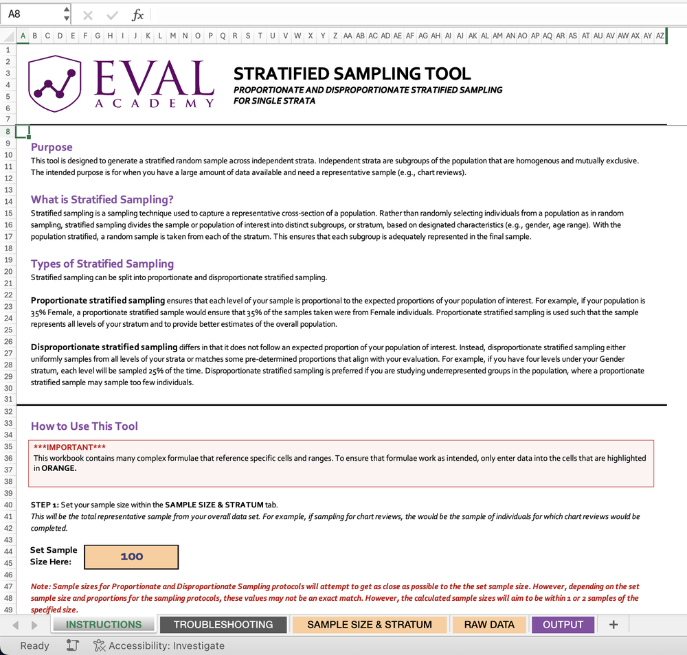
Eval Academy just released a new template, “Stratified Sampling Tool”!


Who’s it for?

The Stratified Sampling Tool is designed for researchers, evaluators, and data analysts who need to collect representative samples from large datasets. Anyone dealing with diverse populations and needing to ensure fair representation across different subgroups will find this tool invaluable.


What’s the purpose?

In the world of data analysis and evaluation, getting a truly representative sample can be challenging. This is where the Stratified Sampling Tool comes in handy.

The primary purpose of the Stratified Sampling Tool is to generate a stratified random sample across independent strata. But what does that mean in practice?

  • Representative Sampling: It helps you capture a representative cross-section of a population, ensuring that all subgroups are adequately represented in your final sample.

  • Flexibility: The tool supports both proportionate and disproportionate stratified sampling, allowing you to tailor your approach based on your specific needs.

  • Precision: By dividing the population into homogeneous subgroups, it increases the precision of your sample, leading to more accurate results.

  • Studying Underrepresented Groups: With disproportionate sampling, you can focus on underrepresented groups that might be overlooked in simple random sampling.

  • Efficiency: It’s especially useful when you have a large amount of data available and need a manageable, yet representative sample.

What is Stratified Sampling?

Stratified sampling is a sampling technique used to capture a representative cross-section of a population. Rather than randomly selecting individuals from a population as in random sampling, stratified sampling divides the sample or population of interest into distinct subgroups, or stratum, based on designated characteristics (e.g., gender, age range). With the population stratified, a random sample is taken from each of the stratum. This ensures that each subgroup is adequately represented in the final sample.


What’s included?

Our Stratified Sampling Tool includes 2 Excel files:

  • Stratified Sampling Tool for Single Strata – Sample Data Version (a non-editable example to show you how the tool is supposed to work)

  • Stratified Sampling Tool for Multiple Stratum – Data Input Version

The Stratified Sampling Tool file comes with an instructions tab for how to input your data and use the tool. Step-by-step instructions are included.


Learn more: related articles and links

You can learn more about sampling in evaluation on Eval Academy by checking out the following links:

  • Template: Sample Size Calculator

  • Sampling and Recruitment 101

  • Sampling bias: identifying and avoiding bias in data collection

Written by cplysy · Categorized: evalacademy

Aug 06 2024

Research and Evaluation – The Article

This article is rated as:

Early in my studies in health sciences, I was under the impression that research and evaluation were largely the same – after all, many of the job postings I saw were for ‘research and evaluation analysts’. To me, it seemed that evaluation was a sub-branch of research looking at one specific program or intervention, while research aimed to identify areas in need of programming and compare outcomes across programs to understand best practices for different demographic groups. As I progressed through my program, I came to learn that this was not the case!

In this article, I summarize some key differences between research and evaluation in terms of their purpose, methods, dissemination, and implications.

[If you’re pressed for time, bookmark this article to read later and check out our brief infographic on differences between research and evaluation instead!


Goals and Purpose

  1. Research

  • Purpose: The primary goal of research is to generate new knowledge, test theories, and contribute to the academic body of literature. Research seeks to answer specific questions or hypotheses.

  • Product: Research outcomes are usually published in academic journals and are intended to advance scientific understanding and theory.

  • Evaluation

    • Purpose: The main purpose of evaluation is to assess the effectiveness, efficiency, and impact of programs or interventions. Evaluation aims to inform decision-making, improve programs, and guide policy.

    • Product: Evaluation outcomes are often actionable recommendations for program improvement, detailed in reports for individuals involved in the program’s development and delivery, including program managers, funders, and policymakers.


    Flexibility and Adaptation

    1. Research

    • Flexibility: Research methods are generally less flexible, with a strong emphasis on maintaining methodological consistency and control to ensure validity and reliability, and to allow for replication by other researchers in the field.

    • Adaptation: Research designs are usually pre-specified and less likely to change once the study begins.


    1. Evaluation

    • Flexibility: Evaluation methods are more flexible and can be adapted as the evaluation progresses to better suit the needs of the program and those involved in its development and delivery.

    • Adaptation: Evaluators may adjust their approaches based on ongoing feedback and emerging findings, making the process more responsive and dynamic.


    Data Collection Methods

    1. Research

    • Design: Research design is often rigid and follows a predefined methodology to ensure replicability and validity. This might include controlled experiments, longitudinal studies, or cross-sectional surveys.

    • Sample Selection: Sampling strategies in research are usually aimed at generalizability, ensuring that findings can be extrapolated to a larger population. Researchers will often try to obtain as large of a sample as possible to justify extrapolation and minimize the influence of bias.


    1. Evaluation

    • Design: Evaluation design is more flexible and adaptive and is often tailored to the specific context and needs of the program being evaluated. Depending on the needs of the program, data may be collected through surveys, observations, interviews, or focus groups. There are different types of evaluation approaches, which include formative, summative, developmental, most significant change, and principles-focused evaluations, among others.

    • Sample Selection: Sampling in evaluation is typically purposive, focusing on individuals and groups directly involved in or affected by the program to gain relevant insights. Some examples of individuals you may want to collect data from for an evaluation may include individuals directly served by the program, members of the community for which a program serves, and staff or facilitators involved in the implementation of a program.


    Analytic Methods

    1. Research

    • Quantitative Analysis: Involves statistical methods to test hypotheses, identify patterns, and establish correlations or causations. The primary focus of quantitative analysis in research is to determine whether outcomes are statistically significant, or in other words, unlikely to be due to random chance or forms of bias. Common tools include SPSS, R, Stata and SAS, among others.

    • Qualitative Analysis: Uses methods like thematic analysis, grounded theory, or discourse analysis to interpret textual or visual data. The goal of qualitative analysis in research is to generate or identify common or impactful narratives, theories, or phenomena among the population from which participants were sampled. Software like NVivo or ATLAS.ti are often used to aid in the analytic process.

    • Multi- and Mixed-Methods Analysis: Researchers may use a combination of different quantitative and/or qualitative approaches to data collection and analysis, often to address a specific research question or aim.  


    1. Evaluation

    • Quantitative Analysis: Similar methods to research analyses may be used but are often applied to assess program outcomes, efficiency, and impact. The focus is on practical significance rather than just statistical significance; in other words, quantitative analysis in program evaluation aims to determine whether the program contributed to positive changes for those it serves, not whether those changes are statistically significant.

    • Qualitative Analysis: Involves methods like content analysis, case studies, and thematic analysis to provide actionable insights and recommendations.

    • Multi- and Mixed-Methods Analysis: The use of multiple methods is common in evaluation, where one or more quantitative and/or qualitative approaches to data collection and analysis are used to address various evaluation questions or aims. The use of multiple methods allows evaluators to conduct a comprehensive evaluation capturing both the practical impacts of a program as well as the perspectives and experiences of the individuals receiving or delivering the program.


    Reporting and Dissemination

    1. Research

    • Format: Research findings are typically reported in academic articles, dissertations, or conference presentations. The focus is on theoretical contributions, methodological rigor, and scholarly discourse. Often, these reports adhere to strict word limits, specific formatting rules, and limited creative freedom in visualizing data compared to evaluation reports.

    • Audience: The primary audience for research reports includes academics, scholars, and students in the relevant field.


    1. Evaluation

    • Format: Evaluation findings are presented in practical, accessible reports that include recommendations for program improvement. These reports often incorporate easily digestible graphs and infographics to enhance readers’ understanding. Compared to research reports, reporting findings from evaluations often provides more leniency regarding formatting which is often based on the depth of evaluation findings and the specific needs of the program. 

    • Audience: The audience for evaluation reports includes program managers, funders, policymakers, and other impacted community members. The focus is on actionable insights and practical recommendations. Since evaluation reports are intended to be read by audiences from a wider range of academic and practical backgrounds, it is often beneficial for evaluators to create a variety of deliverables (including comprehensive reports, executive summaries, infographics, slide decks, etc.) to tailor to the needs of particular audience members.


    Conclusion

    While both research and evaluation involve systematic data collection, analysis, and reporting, their goals, methods, and outcomes differ greatly. Research aims to generate new knowledge and advance theory, using rigid methodologies and targeting an academic audience. In contrast, evaluation focuses on assessing and improving programs, employing flexible and adaptive methods to provide practical recommendations for impacted and involved parties. Despite differences in goals, methods, and outcomes, both research and evaluation are crucial in driving change and improving health and social well-being for individuals and communities.


    Did we miss any key differences between research and evaluation? Let us know in the comments!

    Written by cplysy · Categorized: evalacademy

    Jul 31 2024

    What is Qualitative Data Visualization?

    What do you think of when I say, “qualitative data visualization?”

    Do you just pull up a picture of a word cloud in your head, or does something else come to mind?

    For years I would just say that good qualitative data visualization is really just illustration. But you could say the same thing about quantitative data visualization. So after digging in a bit over the last few years my definition started to become a bit more nuanced and specific.

    In today’s post:

    • My definition of qualitative data visualization.
    • The reason why the usual definition of data visualization doesn’t work as well for qualitative.
    • How to use graphics to facilitative and enhance the communication of qualitative information and data.
    • And what I think are the four primary goals of qualitative data visualization.
    What is qualitative data visualization? 

Definition: Qualitative data visualization is the use of graphics to facilitate or enhance the communication of qualitative information and data.

    Re-defining Qualitative Data Visualization

    Qualitative data visualization is the use of graphics to facilitate or enhance the communication of qualitative information and data.

    This is how I define qualitative data visualization.

    Here is something I’ve learned over the course of my career. The regular old definition of data visualization, and the way most of us think about data visualization, is just not helpful when it comes to qualitative data. Take for instance this definition that comes from tableau.

    Data visualization is the graphical representation of information and data. 

    What Is Data Visualization? Definition, Examples, And Learning Resources

    If we’re talking about a bar chart or a line graph, this definition is perfect. We have turned a bunch of numbers into a picture. And the picture helps us understand the numbers. Without the graphical representation it would be much harder to see what’s going on with the data.

    This is why quantitative data visualization is really most similar to descriptive statistics. Just like data viz, descriptive stats help us understand numbers and see things we would not see by just looking at the data table.

    So why is qualitative data different?

    There are some times when a graphical representation of qualitative information can help us see the data in new ways. Even a simple word cloud that counts and visualizes frequencies can be helpful at times. But I would argue that it’s not the main benefit of qualitative data visualization.

    Take an interview, a focus group conversation, or a case study. Most of the time you won’t need visuals to help you understand this kind of data. Because the problem is not that the information is hard to interpret.

    The problem for most qualitative data is that there is just so much of it. The thing that gives qualitative data value, the depth and richness of the information, makes it harder to share with audiences too overwhelmed to take the time to read it and process what they’ve read.

    How to use graphics to facilitative and enhance the communication of qualitative information and data.

    At this moment I’m working on a new course on qualitative data visualization (my goal is to have it ready by early fall). In the course I talk about my O.S.E.E. approach to qualitative data visualization.

    O.S.E.E. is the acronym I give to the four main goals of qualitative data visualization.

    1. Organize

    The digital world is a visual world. Just about every article on every major website has at least one featured image. This serves a functional purpose beyond aesthetics. These images are modern navigational tools that help us process information and travel from page to page.

    So everything we share needs pictures. Even if that information is not destined for the web, web design has completely altered our expectations for print design.

    I start with organize, because even basic stock photos, generic icons, or other simple images can provide value in facilitating communication.

    Here is a page of case studies on the Design Kit website. Notice how every individual case study has a featured image.

    2. Spotlight

    When someone picks up a report, they’ll probably skim it first. And in that skim they are most likely to look the pictures before reading the words (even the headers). So if you want to make sure someone comes away from your qualitative report with certain pieces of information stuck in their head, spotlight that information with a visual.

    A simple illustration, like this one in UNICEF’s State of the World’s Children report, can break you out of a skimming trance and deliver a quick message.

    3. Engage

    Time is precious, it’s why most people will skim before they read. With an engage visual you are not just sharing information, you are inviting the viewer to read more. These types of images help create curiosity gaps which propel your reader forward into your analyses.

    For example, most of my comics are purposefully designed to be engagement tools.

    If you want good examples of Engagement visuals, check out YouTube thumbnails or book covers. These videos were on the Gates Foundation YouTube page. Who doesn’t want to click on the image that says Better Toilets Better Students or the one that says Better Cows Better Grades?

    4. Enhance

    Qualitative data visualization isn’t just a chore. It’s an opportunity to integrate other pieces of information, or re-arrange what has already been shared, in order to enhance communication. Enhancement visuals can often take more work, but they also provide a lot of extra value.

    Visuals like timelines and maps can both illustrate your work and offer additional enhanced value. Like this one from the World Food Programme’s 2023 annual report.

    What are your thoughts?

    How do you conceptualize qualitative data visualization? Leave me a comment and let me know!

    Written by cplysy · Categorized: freshspectrum

    Jul 30 2024

    How to Make Maps in Excel (& File to Download)

    This tutorial was inspired by a foundation I work with.

    We were brainstorming what type of map to make.

    • Maybe a color-coded map, showing how many grants they gave out in each state?
    • Maybe a one-color map, showing which states they worked in at all?

    Both of these maps are possible in good ol’ Excel. Here’s how.

    What’s Inside

    • 0:00 Welcome
    • 0:09 What You’ll Learn: 2 Types of Maps in Excel
    • 0:49 1st Map: Setting Up the Table
    • 1:05 The “Convert to Geography” Button
    • 1:53 Inserting the Brand New Map
    • 2:19 Recommended Edits for Color-Coded Maps
    • 2:46 2nd Map: One-Color Map
    • 3:14 Recommended Edits for One-Color Maps
    • 4:01 The Finished Products
    • 4:08 Get In Touch

    Download the File

    Download the Excel file here: https://depictdatastudio.gumroad.com/l/MapsInExcel

    Transcript

    [00:00:00] Hi, I’m Ann Emery. Welcome back to Dataviz On The Go, the series where I make quick tutorials for you in my spare moments between workshops.

    And in this tutorial, we’re going to make this two different types of maps inside Excel. This is fake data, but inspired by a real project, inspired by a foundation that I work with, and we were brainstorming what type of map we wanted to make.

    So I’m going to show you how to make maps in Excel. They’re new ish. A lot of people don’t even know that they exist. So I’m going to give you the gist of what you need to do behind the scenes to make this work. And I’m going to show you how to make a color coded map with a dark light contrast. And a one color map.

    As you can see from the tables up above, we have to set up the tables a little bit differently to get these two different types of maps. All right, on to the demo. So here’s what we’re going to do. We’re going to set up our table and we’ll pretend that we’re working in these different states. And [00:01:00] which one should I do?

    I don’t know. It doesn’t, it doesn’t matter. Well, let’s do like Washington state. We can do California. And then the key thing is after you type the third one, You’re gonna cross your fingers. You’re gonna hope that you see this magical button right here. Do you see it? I know it’s small on my screen. Can you see it?

    It says convert to geography ding ding ding That’s the one we want you’re gonna click that button because without it the map might not work Might not work. Okay, so click that magic button. It’s gonna add these little map icons that are Again, the key, the magic that you need to avoid any issues. Okay.

    And then we’re going to call this like number of grants funded, something like that, you know, whatever your number is, whatever your percentage is, whatever your currency is in real life. And let’s just put in some sample placeholder data here. Then you’re going to highlight your whole table. You’re going to go up to the insert tab and you’re going to grab [00:02:00] a filled map, AKA color coded map, heat map, choropleth map, uh, filled map is Excel’s lingo for this, where it gives you a dark light gradation, right?

    It draws attention to the darker colors here. You have to do a little bit of formatting for this. You would probably want to. You know, make the font bigger, make the font darker. You get to choose where you put the legend. You can fill in your own brand colors here. You can decide if you want the states where you didn’t work to be gray, maybe you want them to be white, you get editing power over all that.

    If you have questions about the edits, What’s possible, how to do it. Comment below this video. I will help you out. I’ll make a longer tutorial on this if you want. Okay. And then the other type of map would be if you just want to show states where you worked, you know, which is different. Like it’s like where we worked versus didn’t, you have to put in the same number for every state.

    You can do a one, one [00:03:00] means, yeah, we worked there versus zero would mean. We didn’t. We didn’t work there. It’s binary. You’re turning it into a binary data set, therefore a binary map. Now on the binary maps, I do recommend a little bit of fine tuning here. Like you wouldn’t, why would you have a legend for the binary map?

    That would be really weird. Why would you just have a one here? That’d be silly. And then by default, Excel is going to choose kind of a, a mid. Shade, this is my brand purple. My theme colors are filled in, of course. By default, it’s going to be kind of light, which I don’t think stands out enough against the gray.

    So I’d recommend right clicking on any of these filled states. You go to the bottom of the menu, format data series. And then when you open up the series color toggle, you get to choose what fills in. I’m going to choose the main. Accent one color for the lowest and the highest because I just want it to be a one color map, right?

    Check out that color contrast. Isn’t that a [00:04:00] little bit nicer your finished products again with a little bit more fine tuning and editing? Would look something like this. Give it a try. Let me know what types of issues do you run into? What types of maps are you curious about making? And then of course, for when you make these for your real data, get in touch.

    I’d love to see how you adapt this for your workplace. 3, 2, 1 Don’t forget to like, subscribe, and share!

    Written by cplysy · Categorized: depictdatastudio

    Jul 26 2024

    Seeking your dream job & why artistry and creativity are not the same (Cartoon Q&A with Alli Torban)

    Welcome to episode 003 of my cartoon Q&A series.

    Technology and the web have really changed what it means to be a modern data professional. The way forward is mostly uncharted. Through these chats with a wide range of creative data professionals, I hope to share a vision of what’s possible.

    In today’s conversation I chat with Alli Torban, who is an information designer, a podcaster at dataviz today, and a data literacy advocate. Alli is also the author of Chart Spark, a book that will show you how to harness your creativity in data communication to stand out & innovate.

    Among other things, we talk about the difference between artistry and creativity, how podcasts can act as a conversation lifeline, how to go about teaching yourself to illustrate, and why pursuing your dream job might just lead you to a surprising destination. It was a fun conversation that inspired the set of 8 new comics, which you’ll see below (and appear throughout the video).

    You can learn more out Chart Spark (Alli’s book) here:
    https://www.chartsparkbook.com/

    You can check out Data VIZ Today (Alli’s podcast) here:
    https://dataviztoday.com/

    The Comics from the Q&A

    Beyond a valuable button pusher.

    Getting chart input from the next generation.

    Podcasting to learn.

    Artistry and creativity are not the same thing.

    Libraries are for learning.

    Taking the first imperfect step.

    Dream destination plot twist.

    Complicated was the point.

    Written by cplysy · Categorized: freshspectrum

    • « Go to Previous Page
    • Go to page 1
    • Interim pages omitted …
    • Go to page 40
    • Go to page 41
    • Go to page 42
    • Go to page 43
    • Go to page 44
    • Interim pages omitted …
    • Go to page 310
    • Go to Next Page »

    Footer

    Follow our Work

    The easiest way to stay connected to our work is to join our newsletter. You’ll get updates on projects, learn about new events, and hear stories from those evaluators whom the field continues to actively exclude and erase.

    Get Updates

    Want to take further action or join a pod? Click here to learn more.

    Copyright © 2026 · The May 13 Group · Log in

    en English
    af Afrikaanssq Shqipam አማርኛar العربيةhy Հայերենaz Azərbaycan dilieu Euskarabe Беларуская моваbn বাংলাbs Bosanskibg Българскиca Catalàceb Cebuanony Chichewazh-CN 简体中文zh-TW 繁體中文co Corsuhr Hrvatskics Čeština‎da Dansknl Nederlandsen Englisheo Esperantoet Eestitl Filipinofi Suomifr Françaisfy Fryskgl Galegoka ქართულიde Deutschel Ελληνικάgu ગુજરાતીht Kreyol ayisyenha Harshen Hausahaw Ōlelo Hawaiʻiiw עִבְרִיתhi हिन्दीhmn Hmonghu Magyaris Íslenskaig Igboid Bahasa Indonesiaga Gaeilgeit Italianoja 日本語jw Basa Jawakn ಕನ್ನಡkk Қазақ тіліkm ភាសាខ្មែរko 한국어ku كوردی‎ky Кыргызчаlo ພາສາລາວla Latinlv Latviešu valodalt Lietuvių kalbalb Lëtzebuergeschmk Македонски јазикmg Malagasyms Bahasa Melayuml മലയാളംmt Maltesemi Te Reo Māorimr मराठीmn Монголmy ဗမာစာne नेपालीno Norsk bokmålps پښتوfa فارسیpl Polskipt Portuguêspa ਪੰਜਾਬੀro Românăru Русскийsm Samoangd Gàidhligsr Српски језикst Sesothosn Shonasd سنڌيsi සිංහලsk Slovenčinasl Slovenščinaso Afsoomaalies Españolsu Basa Sundasw Kiswahilisv Svenskatg Тоҷикӣta தமிழ்te తెలుగుth ไทยtr Türkçeuk Українськаur اردوuz O‘zbekchavi Tiếng Việtcy Cymraegxh isiXhosayi יידישyo Yorùbázu Zulu