• Skip to main content
  • Skip to footer
  • Home

The May 13 Group

the next day for evaluation

  • Get Involved
  • Our Work
  • About Us
You are here: Home / Archives for cplysy

cplysy

Sep 07 2022

Stop it with the Interactive Dashboards

So your organization gave you a Tableau license. Or perhaps you attended a half-day PowerBI workshop. Now you’re ready to use your new tools and make some of your data interactive.

But should you?

Cartoon person looking at data dashboard thinking, "this could have been an infographic"

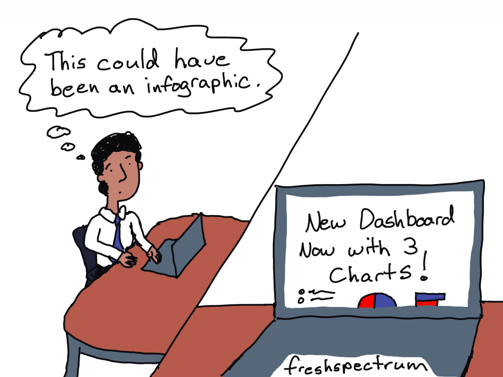
Not everything should be interactive!

Tools like Tableau and PowerBI give you the ability to pack a lot of data into a small space. This can be incredibly useful when you have a lot of data that you want to open up for exploration.

Good interactive visualization can reduce the overwhelm felt by the data user. It does this by layering the data and presenting just little bits at a time. Because when you have thousands upon thousands of rows of data you need to simplify the experience.

But when you only have a little bit of data, creating an interactive dashboard does more harm than good. Instead of opening up a large dataset, you end up hiding data from your dashboard user. In order to find all the data that could easily fit on a single page, they need to click, and click, and click.

Example: The National Health and Nutrition Examination Survey (NHANES) Interactive Visualizations

NHANES is a big multi-year multi-million dollar CDC study that has collected lots of data over the years. And according to their website, they have some new interactive visualizations.

Screenshot of NHANES Data Products Page
NHANES data products page.

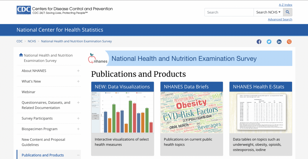
Their visualizations are some basic Tableau dashboards showing the prevalence of high total cholesterol, hypertension, and obesity in the US across ten points in time. The data is also filterable by Sex, Age Group, and Race and Hispanic Origin.

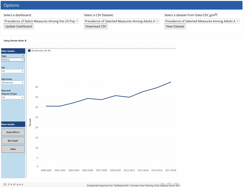
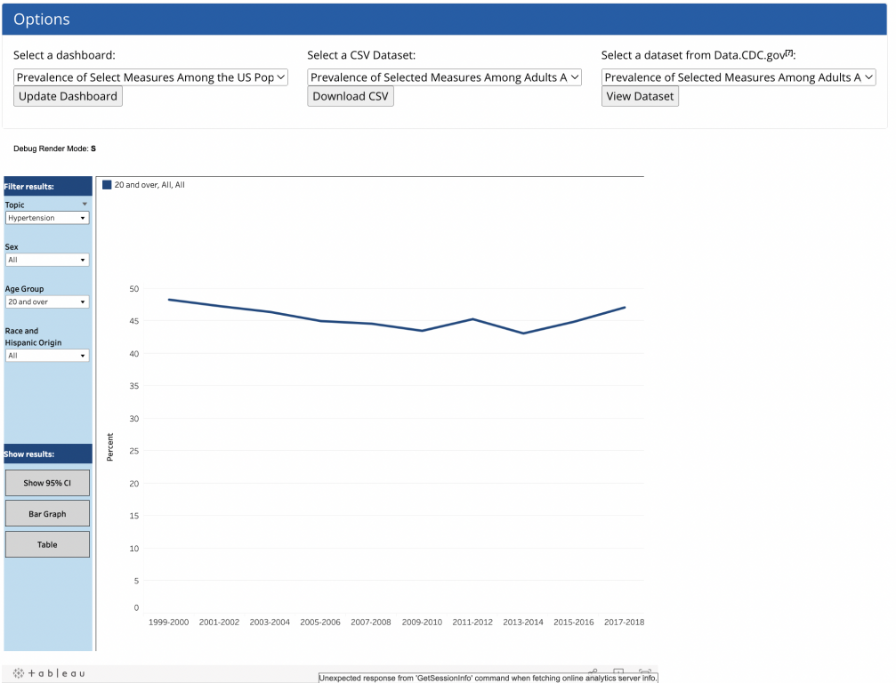
The initial visual we are given is a line graph showing high total cholesterol representing all adults 20 and over.

Screenshot of NHANES Data Dashboard
NHANES Interactive Visualization

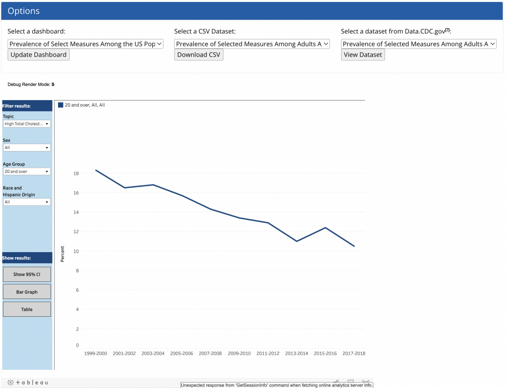
For all its options and buttons, this is a small set of data for a dashboard. You find that out quickly if you download the CSV file.

The data for all three topics, sex, and age groups fits within 6 columns and 360 rows of data.

Screenshot of CSV file download

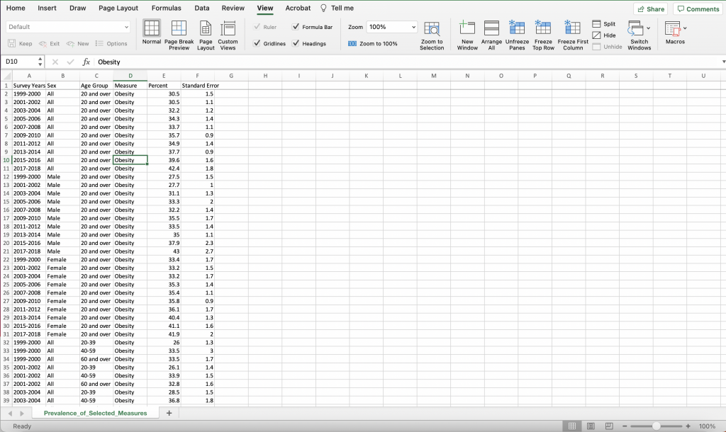
The race and hispanic origin data was not found inside the CSV, but it really doesn’t add a ton of data to the overall dashboard. Especially since the data is not broken down for every age group and there are some missing values due to low sample sizes for those groups.

Screenshot of Race and Hispanic Origin table.

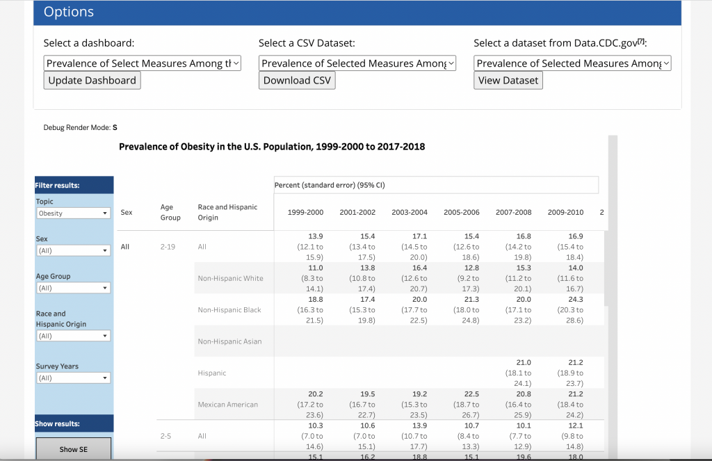
All in all, the data represents hundreds of rows not thousands.

An alternative: create a series of charts.

The alternative I would pitch would be pretty simple. Instead of creating an interactive dashboard this data could be presented in a simple series of charts. Then you add narrative around each giving additional explanation and context.

For instance here are the charts for all adults 20 and over for each of the three topics (high cholesterol, hypertension, and obesity).

Screenshot of NHANES dashboard obesity line chart
You can see the full dashboard using this link.
Screenshot of NHANES dashboard hypertension line chart
screenshot of NHANES dashboard cholesterol line chart

These same three charts could easily be visualized in a single chart. We can even use some subtle interactivity through a tool like Flourish. Here is an example of the same data represented in the above three dashboard views but in a single chart.

I embedded the chart here, if it’s not loading you can find the original using this link.

One chart will not replace the full dashboard.

That would just be the initial chart.

I would then split up the three topics. And for each topic, I would show the data split by sex, age, and race.

In total, it would be ten charts with supporting narrative. None of the data would be hidden, and you wouldn’t need an explanation about how to explore the data. The page would feel more like reading a news article.

The Takeaway.

If your interactive dashboard would need 100s of charts to show the same amount of data, then a dashboard is the right call. But if your interactive visualization could be replaced using a handful of charts, you should just use the handful of charts.

Written by cplysy · Categorized: freshspectrum

Sep 06 2022

From Peaks to Print: Visualizing My Hiking Journey

Recently I completed a personal hiking milestone. So in true nerdy evaluation fashion, I wanted to honor my experience with a data visualization. This post shares three tips for creating engaging visuals: Incorporate icons, use color intentionally, and label directly.

The post From Peaks to Print: Visualizing My Hiking Journey appeared first on Elizabeth Grim Consulting, LLC.

Written by cplysy · Categorized: elizabethgrim

Aug 30 2022

Stop Speaking for the Data

It’s late August, and are into another hot week here in North Carolina. So yet again I was outside with the hose watering our little vegetable garden. And in that meditative moment I thought about The Lorax.

I am the Lorax. I speak for the trees. I speak for the trees for the trees have no tongues.

The Lorax by Dr. Seusss

"I am the lorax, I speak for the trees."
"Sorry, one sec, I'm responding to a text."

Even as a kid I really felt that story. And I think it connects with what we do when we report, but maybe not in the way you might think.

By now you might be sick about me talking about my book (The Reporting Revolution, now on Amazon). But honestly, even though it does have almost everything to do with my consulting work, the book was still a passion project. I believe that if we want our work to stay relevant we need a mindset change when it comes to reporting.

We don’t need to speak for the data.

"Thanks to new AI technology our data can now speak for itself."
"Well, first off, I pronounce my name "Day-Ta" not "Dah-Tah."

When a lot of researchers and evaluators talk about reporting, they’re really talking about documenting.

Don’t get me wrong, there is a real need to document our work. To write down everything about our methods, our analyses, our findings, and our recommendations. This is why I don’t despise 100 pagers. They have a role to play, it’s just not as a report.

Reporting is different than documenting. Reporting is less about capturing and more about communicating. Communicating is about connecting with real life people.

When you spend a lot of time with your work you start to believe that it needs an advocate. For example, if you have dedicated your last few years to collecting data, you will likely feel a responsibility to advocate for that work.

But our data work is a means, not an end. Data is only valuable in so much that’s it’s useful. And useful requires a user.

We do need to advocate for the people.

Reading a long report is like talking to an oversharer at a party.
"To start I want to tell you about alllll my methods. Actually, first let's talk about the methods we didn't choose and why."

Thinking about your audience as you are documenting your work is not enough. You need to be an advocate for the people who could use your work.

Unlike trees, people have tongues. But most potential data users do not have a seat at the table as you collect and analyze your data. So they don’t have a voice in the decisions you make when sharing your work.

Being an advocate for your audience means seeing your data through their eyes, not your own.

This is why a report can be 1 pager or an infographic. Because the goal for these designs is rarely to document a project but communicate something of value for a specific audience.

If you can, join me tomorrow.

It’s a launch party, it’s going to be informal and fun. It’s also free with door prizes!

Register on Eventbrite

Written by cplysy · Categorized: freshspectrum

Aug 24 2022

The Reporting Revolution – Virtual Book Launch Party & Book Tour

The proof copy is on its way and if everything goes right, I will have The Reporting Revolution up on Amazon next week. So what now? It’s time for a party!

The Reporting Revolution Book Launch Party Flyer

First, Thank You!

All told over 450 of you downloaded a free draft version of the book. I decided to share the book before it was finished because I knew it would help drive me to write, heighten my audience focus, and receive some good feedback.

I was not wrong.

The support and interest definitely helped me bring this book to market lightning fast.

Virtual Book Tour

This fall I want to have a modern virtual book tour and I could use your help.

I would like to virtually visit with:

  • Local Association Groups
  • Non-profits
  • Evaluation Classrooms
  • Evaluation Agencies
  • Podcasts (as a guest)
  • Blogs (as a guest poster)
  • and anywhere else where I can talk to at least a handful of interested evaluators and researchers.

(I bring my own Zoom room but can also use your own meeting platforms)

If you’re interested please send me an email (chris @ freshspectrum.com), message me on LinkedIn, or DM me on Twitter (I have opened up access so you can DM me even if we don’t follow each other).

Launch Party

Next Wednesday I’m having a book launch party. We’ll have fun with a Q&A, games, cartoons, and course/consulting giveaways worth hundreds of dollars.

If you think you can make it, Please RSVP. You have to show up to win prizes.

Register on Eventbrite

Written by cplysy · Categorized: freshspectrum

Aug 24 2022

Try This: Assess Staff & Board Buy-In

Try this and let me know how it goes for you. This post is a follow up to What’s in it for Me? Evaluating Stakeholder Engagement, where I shared, “If [the question] “What’s in it for me?” sounds self-serving, it’s because it is. In order to increase engagement, communities and the people driving the actions […]

The post Try This: Assess Staff & Board Buy-In appeared first on Nicole Clark Consulting.

Written by cplysy · Categorized: nicoleclark

  • « Go to Previous Page
  • Go to page 1
  • Interim pages omitted …
  • Go to page 117
  • Go to page 118
  • Go to page 119
  • Go to page 120
  • Go to page 121
  • Interim pages omitted …
  • Go to page 304
  • Go to Next Page »

Footer

Follow our Work

The easiest way to stay connected to our work is to join our newsletter. You’ll get updates on projects, learn about new events, and hear stories from those evaluators whom the field continues to actively exclude and erase.

Get Updates

Want to take further action or join a pod? Click here to learn more.

Copyright © 2026 · The May 13 Group · Log in

en English
af Afrikaanssq Shqipam አማርኛar العربيةhy Հայերենaz Azərbaycan dilieu Euskarabe Беларуская моваbn বাংলাbs Bosanskibg Българскиca Catalàceb Cebuanony Chichewazh-CN 简体中文zh-TW 繁體中文co Corsuhr Hrvatskics Čeština‎da Dansknl Nederlandsen Englisheo Esperantoet Eestitl Filipinofi Suomifr Françaisfy Fryskgl Galegoka ქართულიde Deutschel Ελληνικάgu ગુજરાતીht Kreyol ayisyenha Harshen Hausahaw Ōlelo Hawaiʻiiw עִבְרִיתhi हिन्दीhmn Hmonghu Magyaris Íslenskaig Igboid Bahasa Indonesiaga Gaeilgeit Italianoja 日本語jw Basa Jawakn ಕನ್ನಡkk Қазақ тіліkm ភាសាខ្មែរko 한국어ku كوردی‎ky Кыргызчаlo ພາສາລາວla Latinlv Latviešu valodalt Lietuvių kalbalb Lëtzebuergeschmk Македонски јазикmg Malagasyms Bahasa Melayuml മലയാളംmt Maltesemi Te Reo Māorimr मराठीmn Монголmy ဗမာစာne नेपालीno Norsk bokmålps پښتوfa فارسیpl Polskipt Portuguêspa ਪੰਜਾਬੀro Românăru Русскийsm Samoangd Gàidhligsr Српски језикst Sesothosn Shonasd سنڌيsi සිංහලsk Slovenčinasl Slovenščinaso Afsoomaalies Españolsu Basa Sundasw Kiswahilisv Svenskatg Тоҷикӣta தமிழ்te తెలుగుth ไทยtr Türkçeuk Українськаur اردوuz O‘zbekchavi Tiếng Việtcy Cymraegxh isiXhosayi יידישyo Yorùbázu Zulu