• Skip to main content
  • Skip to footer
  • Home

The May 13 Group

the next day for evaluation

  • Get Involved
  • Our Work
  • About Us
You are here: Home / Archives for allblogs / depictdatastudio

depictdatastudio

Jul 28 2020

Can Your Dataviz Have an Influence on School Reopening Plans?

Our organizations collect all this data—through surveys, assessments, interviews, and so on—and then what? 

The default: The data just sits there inside a Dusty Shelf Report.  

But what if your data could actually inform real-life decisions?  

I recently sat down with Vivian Jefferson from Loudoun County Public Schools, a growing district in the Washington, D.C. metro area.   

Vivian and I are both members of the same Facebook group (a community for everyone taking data visualization training with me).  

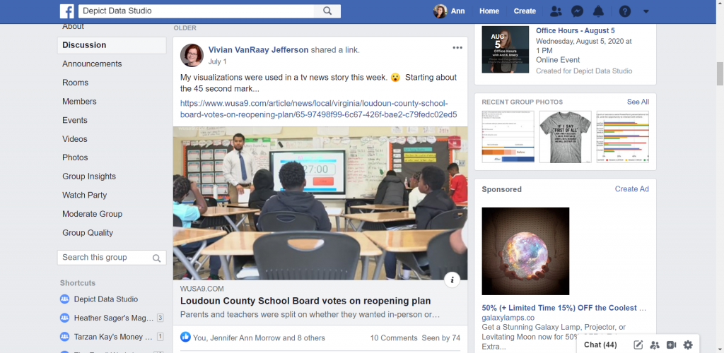
A couple weeks ago, Vivian mentioned that her graphs had been featured on the news (!!!).  

Vivian Jefferson shares how her graphs where used in a news story.

The topic was school reopening plans for the 2020-2021 academic year. Vivian and her colleagues had collected surveys from parents and teachers to gauge their opinions.  

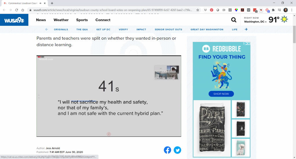
Watch the Conversation Below 

Vivian and I talked about the 52,000 surveys that her office designed, administered, cleaned, and visualized within a two-week timeframe.  

She’ll teach you how they visualized the data, making sure to have detailed reports for technical audiences and a storytelling slideshow for a school board meeting with hundreds of attendees.  

And, she’ll tell you how her graphs ended up being featured inside a news story for an even broader audience. 

About Vivian Jefferson 

Vivian works in the research office of Loudoun County Public Schools in Virginia. The district is one of the largest in the state, with 83,000 students and 94 school facilities (and counting–they open a new school almost every year!). They average about 2,500 new students each year.  

Loudoun County Public Schools in Virginia is one of the largest districts i the state with 83,000 students and 94 school facilities.

The research office is a four-person team consisting of a program analyst, data analyst, office supervisor, and Vivian, who manages surveys.  

How Vivian’s Role Has Shifted Due to COVID-19 

Vivian noted that the data requests have been more urgent and bigger in size as the leadership tries to make decisions quickly. Loudoun County Public Schools closed in early March but was able to implement some online learning using existing tools.  

“The leadership wanted to monitor how that was going: Are students logging in, are they engaged? What we found was that the tools that we had couldn’t necessarily collect all of that data. We could tell how many students were logging in, but not if that were completing the activities or for how long they were logged in,” said Vivian.  

Vivian and her colleagues have been doing more surveys to try and find where people stand and what their concerns are.   

Vivian also said that the biggest impact she feels has been on what they haven’t been able to do.  

In the spring, they usually conduct assessments to see how students have progressed. They haven’t been able to do that, so they don’t know if the interventions they had in place worked. They also don’t know what the student needs and strengths are going into the next school year.  

“We won’t have the whole last quarter of data to be able to compare with previous years. Anytime we see trend data for 2020, it’s going to have an asterisk that it’s showing only three-quarters of the data. And I think that’s probably happening all over with school districts across the country,” Vivian said.  

Designing the School Reopening Surveys 

Let’s dive into the survey that was featured on the news. 

A local new station featured Vivian Jefferson's graphs in their story about Loudoun County Public Schools reopening plan during COVID-19.

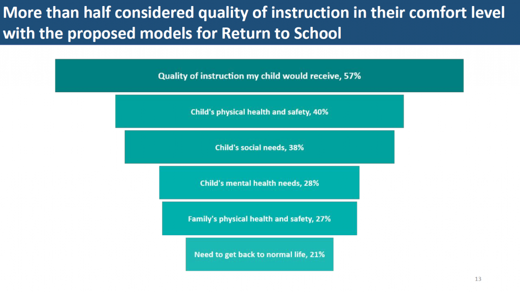
School leaders requested a “survey of families and staff to see where their comfort level is with these three models that we’ve developed, what they’re concerned about and their needs are.” The school system was considering three models: 100% in-person, 100% virtual, or a hybrid. 

Vivian’s office designed and administered two surveys: one for parents and one for all school-based staff, such as administrators, office staff, and other professionals in addition to teachers. 

They reviewed similar surveys from other school districts, and then added questions specific to their own county. 

Parents were asked about their spring 2020 online learning experience; which of the three reopening models they preferred; whether they had computer access for distance learning; and more. 

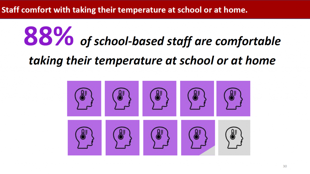
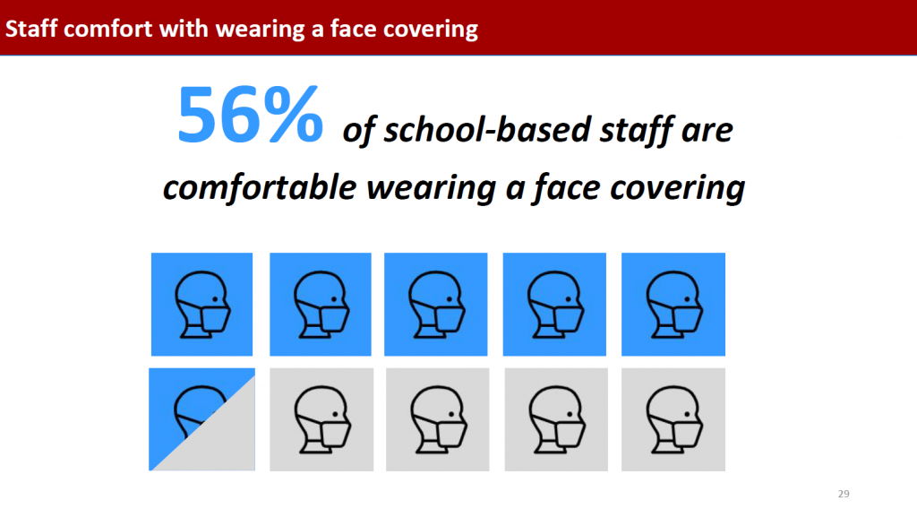
Staff were asked whether they received the support and resources they needed in spring 2020; whether they would be comfortable being inside a classroom with physical distancing measures in place; and whether they were comfortable taking their temperatures and wearing face coverings. 

Then, the surveys were translated into Spanish, and links were emailed to parents and staff, and further promoted on social media.  

Collecting the Survey Responses 

Vivian said, “We knew we were going to get a lot interest in it because it’s such a hot topic. We do a school climate survey every spring for staff and parents. The parent survey usually gets 11,000 to 12,000 responses. This survey had 46,000 parents respond. And then about 6,000 staff responded (usually only a couple thousand respond). It was huge.”  

Vivian’s office designed the surveys, collected 52,000 responses, and compiled the data into reports and a slideshow within just two weeks. 

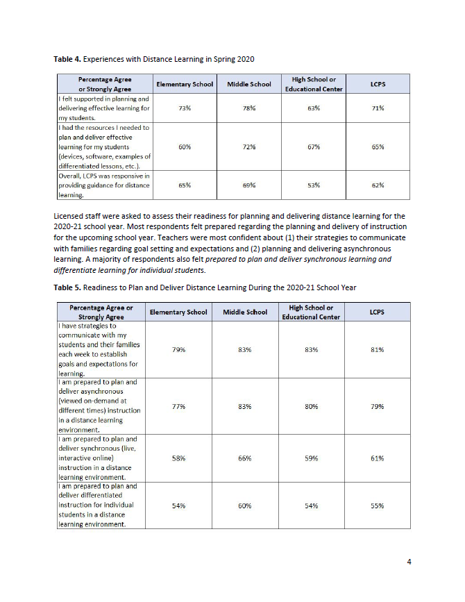
Visualizing the Data 

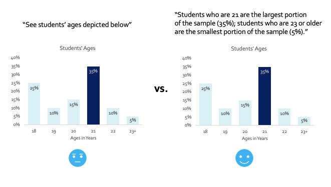
Vivian color-coded the data to make the categories easier to navigate. For example, they consistently used teal for elementary schools, orange for middle schools, gold for high schools, and blue for the county. 

Vivian Jefferson color-coded the data to make the categories easier to navigate. For example, they consistently used teal for elementary schools, orange for middle schools, gold for high schools, and blue for the county.

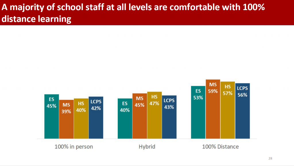
Vivian also drew attention to key findings by making pieces of the visuals darker or lighter: 

Vivian Jefferson also drew attention to key findings by making pieces of the visuals darker or lighter such as this graphs that showed 88% of school-based staff are comfortable taking their temperature at school or at home.

Vivian also said that, “On the titles of the slides, I tried to pull out what the main finding was, to highlight what they should be looking for.” 

Vivian also said that she tried to pull out what the main finding was such as in this graphs that shared that more half of parents considered quality of instruction in their comfort level with the proposed return to school models.

The Reporting Model 

I personally love the reporting model that Vivian’s office followed. 

They developed two detailed reports plus a slideshow with key findings. And, the news story provided a high-level overview. There’s something available for every type of audience. 

Vivian and her colleagues have evolved their communications strategy. “When I first started there 14 years ago, we were doing the full Dusty Shelf Reports.  Over the past few years, we’ve realized that our decision makers need data to make policy and decisions within a few weeks. They don’t have time to wait for a year long, in-depth program evaluation. We’ve been kind of gearing up for a fast response model of reporting anyway, but this was really fast.” 

Two 13-Page Technical Reports 

Vivian’s office shared detailed results within two 13-page reports, one for the parent survey and one for the staff survey. 

Vivian Jefferson’s office shared detailed results within two 13-page reports, one for the parent survey and one for the staff survey.

These reports contained tables of both quantitative and qualitative survey results. 

The reports contained tables of both quantitative and qualitative survey results.

The Slideshow 

Vivian and her colleagues also developed a slideshow, which would be presented at a school board meeting. The slideshow was viewed by school board members, administrators, staff, and parents. 
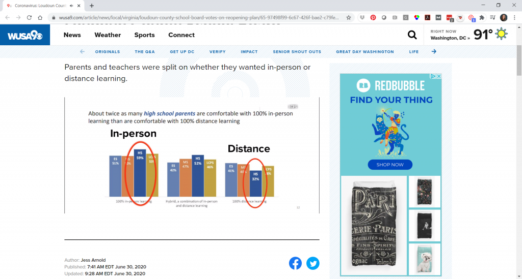
Vivian and her colleagues also developed a slideshow, which would be presented at a school board meeting. This slide shared that 56% of school-based staff are comfortable wearing a face covering.

The News Story 

Finally, the news article and 90-second video provided a high-level overview of the survey results. 

Vivian said she was very surprised to see that someone on a Facebook group she’s a member of linked to the new story and said, “LCPS was on the news today!”  

Vivian Jefferson said she was very surprised to see that someone on a Facebook group she’s a member of linked to the new story and said, “LCPS was on the news today!”

“I thought, ‘I wonder what they said?’ And I clicked on it, and watched it, and I almost fell out of my chair, literally. They had used the graphs from my presentation!” she said.  

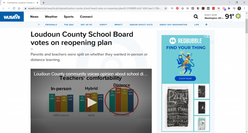
The news station used several of Vivian’s graphs, even enhancing one by circling one set of columns that they wanted to draw attention to.  

The news station used several of Vivian Jefferson's graphs, even enhancing one by circling one set of columns that they wanted to draw attention to.

The news story combined the survey’s quantitative data with audio clips from the public comment portion of the school meeting: 

The news story used audio clips from the public comment portion of the school meeting, including one person's statement of, "I will not sacrifice my health and safety, nor that of my family's, and I am not safe with the current hybrid plan".

“I knew that people would be looking at the report, but I thought mainly like the school board, people who tuned in to watch the school board meeting,” Vivian mentioned. “But I didn’t realize that people would take anything from it and use it in a different way.” 

Reactions from the School Board and Parents 

And, a couple days after the school board meeting, Vivian was out shopping in a store and overheard a couple parents discussing statistics from the report. 

The school board also gave Vivian’s office good feedback on the data. 

Loudoun County Public Schools had considered three models for the 2020-2021 academic year: 

  1. 100% in-person 
  1. 100% virtual 
  1. A hybrid model 

The school system opted for the hybrid model, in which half the students would be in school at a time. Parents will also have the option to opt-out and follow 100% virtual learning.  

Note: Vivian reached out to let us know that “as typical of the times we are in, this week the school board and superintendent changed the reopening plan to be all distance learning at first, with a phased approach to the hybrid model. You can see their revised plan here: Revised Plan for 2020-21.  

Learn More about Vivian’s Survey 

The survey results were shared publicly on the school board’s site.  

  • The slides that were presented at the school board meeting in June 2020.
  • The tables from the parent survey.
  • The tables from the staff survey.

Read the WUSA 9 story, Loudoun County School Board votes on reopening plan, and watch the 1.5-minute video where Vivian’s work was featured.

Connect with Vivian Jefferson on LinkedIn.

Your Turn 

Comment below. Let us know which part of the conversation resonated with you the most.  

Written by cplysy · Categorized: depictdatastudio

Jul 14 2020

How to Create a Data Visualization Style Guide to Tell Great Stories (Part 2)

Did you see Sara DeLong’s post on Why You Need to Create a Data Visualization Style Guide to Tell Great Stories? You’ll love Part 2. –Ann

—

So you decided your organization needs a style guide to save lots your team lots of time when creating charts, enhance brand cohesion, and improve trust with your stakeholders.

In my previous post I described how to identify if your team needs a Data Visualization Style Guide, how to secure buy-in from leadership and your coworkers, and some great resources to review before you get started.

This post will outline the key components of your Data Visualization Style Guide and how to ask for feedback that will make this new resource actionable.

GIF showing different examples of charts and how they should look.

Every guide might be a little different depending on your field and your data.

Here are the key components of my Data Visualization Style Guide.

Note: The instructions in green type in the pictures below are for style guide users. These instructions help the user better understand the components of each chart type.

Chart Structure

This is a general overview of how charts should look for your team. This includes some of the basics of each chart, such as formatting for figure numbers, chart titles, chart subtitles, and axes.

This is a general overview of how charts should look for your team. This includes some of the basics of each chart, such as formatting for figure numbers, chart titles, chart subtitles, and axes.

Chart Typography

I used Amy Cesal’s Sunlight Foundation Data Visualization Style Guide and Jon Schwabish’s Urban Institute Style Guide as my starting points for choosing font size for different components of our charts. I was redesigning our reports at the same time I was making my style guide, so through trial and error my team determined what font sizes worked for different kinds of materials, e.g., reports vs. PowerPoints.

I was redesigning our reports at the same time I was making my style guide, so through trial and error my team determined what font sizes worked for different kinds of materials, e.g., reports vs. PowerPoints.

Color Palette

If you have agency colors, you should use those as a starting point.

The picture of the color palette below shows the different colors assigned to my public health programs for HIV, STDs and HCV. Each program is encouraged to start with their main color and then use the other colors in the palette as needed.

This color palette shows the different colors assigned to my public health programs for HIV, STDs and HCV. Each program is encouraged to start with their main color and then use the other colors in the palette as needed.

Your Data Visualization Style Guide should start with the same fonts and colors from your organization’s existing branding guidelines, if they exist.

If you need to create your own color palette or add colors to your agency’s color palette, here are some great tools:

  • For inspiration on color combinations used by other businesses: https://brandcolors.net/
  • To test out your color combinations, adjust your palette, and identify tints (lighter versions of your main color and shades (darker versions of your main color): https://coolors.co/.

Identifying Tints and Shades

Here is how I identified the tints and shades for each color in my color palette.

Step 1: Once you have your color palette identified, select the symbol inside the yellow circle below:

Step 1: Once you have your color palette identified, select the symbol inside the yellow circle.

Step 2: Then use a system to select the additional tints and shades for your style guide. By system, I mean I selected every other color (see the arrows and instructions in the picture below) for my tints and shades. I repeat steps one and two with each color in my color palette.

Step 2: Then use a system to select the additional tints and shades for your style guide.

Check for Sufficient Foreground/Background Color Contrast

To ensure your colors are contrast compliant based on the Americans with Disabilities Act, here is an accessibility checker: https://webaim.org/resources/contrastchecker/.

Including Lots of Color Codes

Ideally, a Data Visualization Style Guide should be user friendly with several different kinds of chart-making software.

By including all the different color codes, it minimizes the number of steps a person has to take to convert a color into the code they need (e.g. from RBG to HEX).

Also, maybe your whole team just uses RBG and CMYK color codes now, but by including all three, you are increasing the sustainability of this style guide if your team adds new software that uses a different color code in the future.

Ideally, a Data Visualization Style Guide should be user friendly with several different kinds of chart-making software. By including all the different color codes, it minimizes the number of steps a person has to take to convert a color into the code they need (e.g. from RBG to HEX).

Recommended Color Combinations

This was really important to my team members. Some people don’t want to spend lots of time making decisions about colors. Providing color combination recommendations in the style guide saves my coworkers lots of time, but still allows room for creativity and autonomy.

Fewer decisions to make = timer saver.

This was really important to my team members. Providing color combination recommendations in the style guide saves my coworkers lots of time, but still allows room for creativity and autonomy.

Map Color Palette

We determined through trial and error that the overall color palette in the style guide could not be applied as is to maps because we needed colors with higher contrast between one another.

The viewer has to be able to tell the difference between the colors when they are in close proximity to one another.

I adjusted the colors slightly for my map color palette to ensure they would be distinguishable from one another when the colors are close together.

I adjusted the colors slightly for my map color palette to ensure they would be distinguishable from one another when the colors are close together.

Map labeling is tricky. We ran into many different opinions about how maps should be labeled. It’s easy to over label a map, especially when you are dealing with small spaces, such as counties in a state. Also sometimes there are limitations with the mapping software when it comes to colors and labels. The maps above were made in GIS.

It’s important to ask yourself if the audience is really going to look for the label on each county, or do they just need to get a sense of the color scale.

Ask the question, what do I want my audience to understand from this map? How will the map be presented? Presentation? Report? Online? Interactive?

Example Charts

This is one of the most important sections!

Example charts are very important!

This section can feel like a big undertaking. Start by looking at your organization’s existing data documents. Identify the chart types that your colleagues use regularly and then consider adding a few other chart types to increase chart variation options for your staff. For example, include a lollipop chart in addition to a bar chart, and a waffle chart in addition to a pie chart. This section can include as many or as few charts as you see fit for your organization.

This is another example where the trial and error process is so important. Because we created this style guide while redesigning large data reports, we were able to test different sample charts for the style guide. We adjusted line and dot thickness, label placement, chart sizes, and font size to figure out what worked best. Then we used the style guide to standardize our decisions for future data deliverables. Our decision process was a balance of data visualization best practices, the story we were telling with our data, and my colleagues’ input.

Other Data Visualization Resources

If you think your team is interested in other data visualization information, then you could include additional resources at the end of the document.

List of data visualization resources

How to Ask for Feedback about Your Data Visualization Style Guide

**This is really important.**

About halfway through the development process of my Data Visualization Style Guide, I sent the guide around for feedback from coworkers I knew were going to use it. I asked for specific feedback on what is working and not working. Am I on the right track? Is this resource useful and clear?

Then I incorporated their feedback and created an almost final draft of the guide.

When I had an almost final draft I asked for even more feedback! What doesn’t make sense? What would make this resource more useful to you? What should be included to make this useful to a future new employee of our team?

In this final feedback stage, it was important to share our evolving style guide with team members who hadn’t seen earlier drafts and maybe were only going to make charts occasionally. These folks could provide feedback on what made sense and where guidance was missing. Ideally, a new employee could pick up our new Data Visualization Style Guide and use it to make charts that align with the program’s brand without needing additional guidance.

Reminder: Don’t ask for feedback unless you plan to use a good percentage of it. It wastes people’s time and sends a message that you don’t value their opinions. Not using their feedback at all could reduce the number of people who use your guide because your colleagues don’t feel invested in it.

How We’ve Used Our Data Visualization Style Guide

Here are some examples of data materials created using our Data Visualization Style Guide:

  1. Wisconsin HIV Annual Data Report
  2. Wisconsin HIV Data Two-Page Summary
  3. Wisconsin Hepatitis C Annual Data Report
  4. Wisconsin Hepatitis C Data Two-Page Summary

Key Takeaways for Creating Data Visualization Style Guides

Here are three lessons learned.

  • Before you create a Data Visualization Style Guide it is crucial to secure buy-in from leadership and the majority of your colleagues who will be using the style guide. This buy-in will help ensure this document is relevant and will be used for future data-intensive materials.
  • Before you start creating this resource, ask future Data Visualization Style Guide users: “What should be included in our style guide that would make this resource useful to you and increase the chances that you will use this tool to guide chart creation?” This is key because it ensures that you include what is important to your data team.
  • Create a style guide as you are redesigning data documents. Don’t try to create a style guide and then apply it to lots of documents. Working on the style guide and data materials side by side will ensure you create a resource guide that actually works. This will set you and your new tool up for success.

The Benefits of Having a Data Visualization Style Guide

Designing a Data Visualization Style Guide may sound like a lot of work, but the benefits for your organization are enormous.

You will:

  • Save your colleagues valuable time when designing data deliverables
  • Enhance your organization’s brand, communications, and professionalism
  • Increase the accessibility and communication of your data to key stakeholders because of your consistent use of data visualization best practices.

Bonus: Purchase Our Guide

The ideas and examples shared here and my previous post should give you all the tools you need to get started.

Or, save time and download our guide.

Buy the Guide

Written by cplysy · Categorized: depictdatastudio

Jul 07 2020

Why You Need to Create a Data Visualization Style Guide to Tell Great Stories (Part 1)

I met Sara DeLong a few summers ago when I led a dataviz training at her agency. We’ve stayed in touch, and she’s contributed fantastic articles like Could Your Long Report Become a City Billboard? and Report Redesign Tricks That Really Work. In this two-part series, Sara will teach us how to create data visualization style guides. Thanks for another time-saving resource, Sara! –Ann

Is this you?

  • Different members of your team are working with data and creating charts.
  • All of your charts look a little different.
  • You would like to redesign or improve your upcoming data reports, presentations, and dashboards to better align with data visualization best practices and your agency’s brand.
  • You would like to build trust with your stakeholders and tell clearer stories using your data.

A Data Visualization Style Guide is a great tool to enhance brand cohesion and save you and your co-workers lots of time in the long run. This resource will reduce the number of decisions your team members have to make about font, font size, line thickness, color, and chart size each time you make a chart. Maybe creating a Data Visualization Style Guide sounds really exciting to you (like me!) or maybe you would prefer to put it at the bottom of your to do list right after scanning and filing all your paper documents (nice in thought, but really never going to happen). I am here to tell you, if you follow these steps and create a Data Visualization Style Guide, the payoff will be incredible for both you and your team.

Benefits of Creating a Data Visualization Style Guide

  1. Time Saver: You won’t have to spend 15 minutes trying to decide what colors to use in your latest chart, what font size your title should be, or the line thickness in your line chart. This style guide will already have clear recommendations on all the data visualization steps that eat up your time.
  2. Get everyone using data visualization best practices: If you are reading this blog, maybe you and some of your team members are excited about how thoughtful data visualization can improve your communication skills. However, a style guide can help get the rest of your colleagues on board to create effective charts that are accessible to a variety of audiences.
  3. Tell great stories: Incorporating data visualization best practices using a cohesive look for all your charts will improve your professionalism and help communicate your message to all your stakeholders more effectively.

Getting Started with a Data Visualization Style Guide

Here are the first steps to create a user-friendly Data Visualization Style Guide:

Identify a need for a Data Visualization Style Guide

My public health team had to redesign all our major data reports and create new data one-pagers for a variety of audiences, including the general public, nurses, doctors, and other public health professionals. Several team members analyzed the data and created charts. Our team wanted to make sure all the reports looked cohesive, while also using our limited time efficiently. I proposed creating a Data Visualization Style Guide to better align all of our upcoming reports. This avoids one person having to make all the charts or edit all the charts so they look cohesive.

Secure Team Buy-In

Before you create a Data Visualization Style Guide, it is crucial that you secure buy-in from majority of your colleagues who will be using the guide. Make sure your leadership team is also on board. Getting buy-in before you start will help ensure this document is relevant to your coworkers and will be used to create future data reports.

For example, to get buy-in, I coordinated multiple meetings with several data experts and project teams would be creating charts for our annual reports and future data presentations and dashboards. It only makes sense to create this resource if your team is generally on board and can see the benefit of developing this new tool.

In these meetings, I shared some of the existing charts from various reports to illustrate the current lack of cohesion among all our charts.

In these meetings, I shared some of the existing charts from various reports to illustrate the current lack of cohesion among all our charts.

I also showed some examples of Data Visualization Style Guides from other organizations, and explained how this kind of resource might benefit my team.

Then I asked our future Data Visualization Style Guide users: “What should be included in our Data Visualization Style Guide that would make this resource useful to you and increase the chances that you will use this tool to guide chart creation in the future?” This question is key because it ensures that you include what is important to your team of data users in this document.

Timeline

It took seven months to go from project proposal to completed resource guide because I created this document while also redesigning several data reports.

Timeline showing how it took seven months to go from project proposal to completed resource guide.

Creating this guide was a trial and error process. This meant that when I sent out the completed style guide, it had already been used to create six different published materials, which proved that it made sense and was applicable to my colleagues and their work.

A key takeaway is to create a Data Visualization Style Guide as you are editing data documents. Don’t try to create a style guide and then apply it to lots of documents. Working on a new guide and data materials side by side will ensure you create a new tool that actually works and not one you think will work with your data and the materials your team creates.

Software Used to Create a Data Visualization Style Guide

I created the charts for my style guide in Microsoft Excel and did the layout of this document in Microsoft Publisher. However, this style guide could be created in whatever Microsoft program you feel most comfortable working in, whether that is Word, PowerPoint, Excel, or Publisher.

Researching Existing Data Visualization Style Guides

Once it was clear my team was on board with using a Data Visualization Style Guide, I went to work researching the best ways to create this new resource. This research phase was extremely helpful and outlined the process for creating my guide. Here are my favorite resources to check out before you start:

  1. Amy Cesaal’s presentation on why you need a style guide. Her presentation has some great tips that helped me get started, including the advice to update documents while creating my guide.
  2. Policy Viz’s list of Data Visualization Style Guides. Take a look at how other agencies approached style guides and see what components you want to include in yours.

Coming Soon

In my next post, I’ll outline the key components of every Data Visualization Style Guide and show you how to ask for feedback, so your new resource is immediately applicable for you and your team.

Written by cplysy · Categorized: depictdatastudio

Jun 30 2020

Three Takeaways from the User Experience (UX) Field to Up Your Data Viz Game

This article–and four video lessons!–come from Brenna Butler, who researched user experience as part of her doctoral program. Thanks for your contributions to our field, Brenna! –Ann

Hi all, Brenna Butler here to walk you through what the field of User Experience (UX) is all about and how it relates to our data visualizations.

Maybe you’ve heard of UX here and there over the years and read a few articles about the field, or maybe you’ve only heard of it for the first time when you read the title of this blog post…either way is fine, as this article will provide a quick introduction on what UX is all about and how takeaways from the field can enhance our data visualizations.

What is User Experience (UX)?

UX can be thought of as evaluating something (in this case, our data visualizations) based on its effectiveness and accessibility in conveying a message.

UX is unique because it also focuses on people’s emotional reactions (such as if people are excited as much as we are about the visualizations we create).

Why Does UX Matter in Data Visualizations?

We live in a world where SO much is trying to capture our attention – emails, texts, videos, the latest social media trend – so how can you be sure that your data visualization is capturing the attention of your audience?

The field of UX is here to the rescue to show us design aspects to incorporate into our data viz to ensure they are effective, efficient, and enjoyable to view.

Overall, we can learn a few lessons from UX that can make your data visualizations and reports perform better, which are discussed in detail below.

Takeaway #1: Harness the Power of Icons in Visualizations

Icons used in visualizations, such as through simple images, pictographs, or icon arrays, can be really effective for a number of reasons.

First off, icons make your visualizations more accessible, as I explained in a guest lecturer video below:

Icons can make your data viz more accessible for people that have a color vision deficiency that have trouble distinguishing some colors from others.

Think about all of the times information is communicated in a data visualization through color…

Now think about if you couldn’t distinguish between the different colors…

It’s not very easy to understand what the main takeaways displayed in the data viz are now, right?

But what if that data viz had icons to indicate the different categories? Bingo. The message is now clearly communicated without relying on different colors. Additionally, for people that have a learning disability or difficulty, simple icons can help increase the interpretability of the visualization. The icons provide an additional “clue” as to what type of information is displayed in your data viz.

Not only do icons make your visualizations more accessible, but there’s evidence to indicate that icons also increase the memorability of your visualizations, as covered in my “Developing Memorable Visualizations” video below:

Want to make a “main takeaway” in your report really stand out in your readers’ minds? Convey that information in a pictograph or icon array – bonus points if your icons match the overall theme or type of data you’re communicating (e.g., apple icons for data on school lunches in the U.S.).

Takeaway #2: When You Think You’ve Already Said it… Say it Again

Ever find yourself repeating yourself over…and over in a report?

Research would indicate that you’re doing something right, because the more times data are repeated or main trends are restated in a report, then the more likely our audience can remember the information.

It’s also important to clearly spell out the main trends that are shown in your data visualizations. While it can be interesting to analyze a data viz to better understand all of the trends and themes occurring in the data, this takes brain power – aaand our audience might not want to invest that brain power into our visualizations. It’s best to just spell out the main takeaways shown in your visualizations somewhere in the report, or even in the title of your data viz.

Here’s another plus about stating the main takeaways of your data visualizations several times in your report – it makes the report more accessible.

There is no guessing game as to what message you’re conveying, helping people with a learning disability or difficulty better understand your message. Plus, people who are blind or visually impaired can’t see trends displayed in your data visualizations, so they will be solely relying on a screen reader to read the text of the data viz/report out loud to them. If your main takeaway isn’t explicitly stated, then people that are blind or visually impaired won’t get the message – meaning you’re not reaching a chunk of your audience.

Bar chart shown on the left with generic description in the report of the trends occurring, and bar chart shown on the right with informative description of the main trends occurring.

Takeaway #3: Get Creative with Your Data Viz Design!

Do you like to get your creative juices flowing when developing data visualizations?

If so, this is the takeaway for you, because researchers have found that what they call “embellished visualizations” are more enjoyable and more memorable than plain visualizations, as covered in my “Developing Intriguing Visualizations” video below:

What’s an embellished visualization?

It’s incorporating the overall theme of the report or data that you are depicting and adding icons into the data viz design that matches this theme.

Take a bar chart, for example. Instead of having a bar chart with plain old bars depicting the number of K-12 students enrolled at a school over the years, we would replace those bars with an icon, such as a pencil.

But here’s the catch – the icons need to relate to the theme of your data or report instead of being something random.

Double check that you can still understand the data depicted when icons are added to the data viz, too (so, control those creative juices and don’t get too out of hand with this tip!).

“Plain” bar chart shown on the left with normal bars, and “embellished” bar chart shown on the right with the bars replaced with different sized pencils.

Learn More about UX for Data Visualization

If you found this blog post interesting and want to learn more, then please check out the references below for additional information.

  • Want to learn more about UX and data visualization? Check out the study in more detail that I talked about at https://dl.acm.org/doi/10.1109/IV.2012.69
  • Link to the color vision deficiency tool featured in the video: https://www.color-blindness.com/coblis-color-blindness-simulator/
  • Tutorial on adding alt-text in Microsoft Word: https://support.office.com/en-us/article/add-alternative-text-to-a-shape-picture-chart-smartart-graphic-or-other-object-44989b2a-903c-4d9a-b742-6a75b451c669#PickTab=Windows
  • Tips for writing effective alt-text: https://cfpb.github.io/design-manual/data-visualization/accessibility.html#alt-tags
  • Want to learn more about the research behind what makes a visualization intriguing? Check out this article: https://dl.acm.org/doi/10.1145/2993901.2993903 and this article: https://firstmonday.org/article/view/6389/5652
  • Why are pictographs more intriguing than a bar chart or text alone? More information can be found at https://dl.acm.org/doi/10.1145/2702123.2702275
  • Curious to learn more about “embellished charts”? Check out https://dl.acm.org/doi/10.1145/1753326.1753716
  • Want to learn more about the research behind what makes a visualization memorable? Check out this article: https://dl.acm.org/doi/10.1145/2993901.2993903 and this article: https://ieeexplore.ieee.org/document/7740509
  • How does repeating main takeaways in a report increase the memorability of the information? Details can be found at: https://vcg.seas.harvard.edu/publications/beyond-memorability-visualization-recognition-and-recall
  • Why are “embellished charts” more memorable than “plain charts?” Learn more by checking out this article: https://ieeexplore.ieee.org/document/6327282 and this one: https://dl.acm.org/doi/10.1145/1753326.1753716

Connect with Brenna Butler

If you have any questions, or just want to say, “hello,” please feel free to email me at bberry10@vols.utk.edu or connect with me on LinkedIn at https://www.linkedin.com/in/brenna-butler-b80474b1/.

Written by cplysy · Categorized: depictdatastudio

Jun 23 2020

Learn How to Make Great Graphs in Excel with Ann K. Emery

Are your takeaway findings getting lost?

Bad graphs can slow down the viewer’s comprehension… increase cognitive load… and fail to inform decision-making processes.

Examples of bad graphs.

Dusty Shelf Reports aren’t inevitable.

With intentional editing, you can design visualizations that inform and inspire–right inside of Excel, PowerPoint, and Word.

You don’t have to be a computer programmer or a graphic designer to be a great communicator.

You don't have to be a computer programmer or a graphic designer to be a great communicator.

I started building this course three years ago.

We added to it, and added to it, and added to it.

We quadrupled the videos and templates. We added Office Hours so you can pick my brain about your individual projects. We added Discussion Boards and a Facebook group to build community. We added Guest Experts so you can learn about programs beyond Excel. We added Lifetime Access.

This Excel dataviz training is the best it’s ever been.

Great Graphs: Excel How To’s is open for registration this week only.

What’s Included in Great Graphs: Excel How-To’s

  • 142+ video lessons that you can watch anytime
  • Step-by-step instructions for making beginner, intermediate, and advanced graphs in Excel
  • 18+ templates to download and follow along
  • Discussion boards to interact with fellow dataviz enthusiasts
  • 2 Office Hours sessions every month to talk about your projects and hear from guest speakers
  • Private Facebook community of fellow participants
  • Weekly emails to cheer you on
  • Lifetime access so you don’t feel rushed
  • Examples from a variety of industries (public health, juvenile justice, museums, and more)
  • Behind-the-scenes Excel magic tricks guaranteed to make your jaw drop

This is a software how-to course. You will see videos about “First, click this button” and “Then, click this button.” I’ll share my insider tips so you know which common mistakes to avoid.

Research-based data visualization best practices are baked into the entire course. I’ll teach you how to format the graphs so they’re accessible, intuitive, and backed by research.

We believe that anyone can design amazing visualizations using everyday software you already own, like Excel, PowerPoint, and Word. You don’t have to be a computer programmer or a graphic designer to be a great communicator.

Register by Friday, June 26.

Who This Training is For

This training IS for those of us who make graphs ourselves. This course is NOT for supervisors who delegate all their graph production to someone else. (Supervisors, enroll your staff. Ask me about group rates.)

This training IS for people using everyday software like Excel, Word, and PowerPoint. This course is NOT for graphic designers who exclusively use Adobe Illustrator or Acrobat.

This training IS for people who love learning Excel magic tricks. This training is NOT for computer programmers who exclusively write code in programs like R or Python.

This training IS for people who are ready to dive deeper. This training is NOT for people just hearing about data visualization for the first time. (Not sure why a 3D pie chart with 50 slices is impossible to read? Let me train you on best practices first; then, come back and enroll in this course next year.)

This training IS for people whose time is precious. I’ve got two kids and I run a business. I’m well past the phase in life where I can afford to learn the long, hard way. This training is a one-stop-shop and a shortcut.

Register by Friday, June 26.

142+ Video Lessons

You’ll get instant access to 142+ step-by-step video lessons–the equivalent of a two-day training. You can watch these lessons anytime around your own schedule.

  • Symbol fonts (4 lessons; 40 minutes)
  • Spark lines (8 lessons; 34 min)
  • Data bars (7 lessons; 39 min)
  • Heat tables (8 lessons; 42 min)
  • Bar charts (11 lessons; 57 min)
  • Waffle charts (7 lessons; 33 min)
  • Dot plots (18 lessons; 1 hr)
  • Small multiples bar charts (14 lessons; 55 min)
  • Population pyramids (12 lessons; 45 min)
  • Line charts (12 lessons; 54 min)
  • Slope charts (13 lessons; 40 min)
  • Small multiples line charts (8 lessons; 36 min)
  • Tile grid trendline maps (4 lessons; 31 min)
  • Geographic heat maps (4 lessons; 34 min)

Register by Friday, June 26.

Step-by-Step Instructions

You’ll learn exactly how to create symbol fonts, spark lines, data bars, heat tables, bar charts, waffle charts, dot plots, small multiples bar charts, population pyramids, line charts, slope charts, small multiples line charts, tile grid trendline maps, and geographic heat maps.

Variety of Graph Types

You’ll create familiar charts like bar charts and line charts, but I’m most excited about teaching you about Excel’s lesser-known secrets.

18+ Templates to Download and Follow Along

You can download and keep all 18+ Excel spreadsheets that accompany the video lessons.

You can download and keep all 18+ Excel spreadsheets that accompany the video lessons.

Discussion Boards to Ask Questions

Every module includes discussion boards where you can ask questions, comment on the lessons, and share your own tips with the community.

Every module includes discussion boards where you can ask questions, comment on the lessons, and share your own tips with the community.

Live Office Hours Twice a Month

We’ll share screens and work through your drafts together.

We'll share screens and work through your drafts together.

Guest Speakers in Office Hours

Sometimes we invite guest experts to speak with us during Office Hours. You’ll be able to access recordings from our sessions with Elizabeth Grim (about Connecticut’s COVID-19 response), Ione Farrar (about Tennessee’s COVID-19 response), and Brenna Butler (about user experience). You’ll also be invited to upcoming sessions with Jane Zhang, Chris Lysy, Sara Vaca, Esther Nolton, and Jason Melchi.

Sometimes we invite guest experts to speak with us during Office Hours.

By Popular Demand! 6 Live Trainings

Office Hours are open to everyone who’s taking online courses with me. By popular demand, we’ll also hold six additional Live Trainings just for the participants in this course.

  1. Monday, June 29, 2020 from 4 – 5 pm EST
  2. Monday, July 27, 2020 from 4 – 5 pm EST
  3. Monday, August 31, 2020 from 4 – 5 pm EST
  4. Monday, September 28, 2020 from 4 – 5 pm EST
  5. Monday, October 26, 2020 from 4 – 5 pm EST
  6. Monday, November 30, 2020 from 4 – 5 pm EST

The sessions will be recorded in case you can’t make it live.

Private Facebook Community of Fellow Participants

You’ll be invited to join our private Facebook community, where I offer additional Facebook lives. You can also post your own questions and get feedback from me.

You'll be invited to join our private Facebook community, where I offer additional Facebook lives.

Weekly Emails to Cheer You On

I know you’re going to skip straight to the juicy dataviz magic tricks, but I’m going to email you on Mondays around 11 am EST and pretend like we’re working through the course one module at a time.

I know you’re going to skip straight to the juicy dataviz magic tricks, but I’m going to email you on Mondays around 11 am EST and pretend like we’re working through the course one module at a time.

Once-a-Year Registration

Mark your calendars! This course only opens once a year for registration. The 2020 enrollment window is Monday, June 22nd through Friday, June 26th. When it’s open, it’s open. When it’s closed, it’s closed.

We’ve also got special Early Bird Bonuses for the earliest registrants.

First 25 People

The first 25 people to register will receive a Swag Bag with a dataviz shirt, stickers, buttons, and magnets.

First 10 People

The first 10 people to register will ALSO receive verbal feedback on their graph, report, dashboard, or infographic. The feedback will be recorded and posted as a case study inside the course.

First 5 People

The first 5 people to register will ALSO receive an Excel makeover. You’ll send me your spreadsheet, report, or slide. Then, I’ll work on it directly during one of the Live Trainings with the 2020 cohort. This is a great opportunity to have me consult on your project.

What Participants Are Saying

3,390+ researchers, evaluators, scientists, and analysts have taken online courses with us.

Here’s what recent participants are saying.

“Having attended Ann’s keynote address at the 2017 Southeastern Library Assessment conference, I learned a few quick tricks to transform a stock Excel graph to something better. Once I moved into an assessment role full-time, I knew I would be writing more reports and wanted to up my game with Excel graphs and charts so I knew just where to go for help. Ann’s course in Great Graphs offered that and so much more. When I had to write a summary of a laptop loan program survey, I transformed the plain, ordinary graphs to uncluttered, with clearly understandable graphs of the survey results. Ann takes you beyond the basic Excel charts and graphs to learn how to make super cool waffle charts and icon arrays and adding spark lines and bars to a spreadsheet for quick visual analysis. Two of my favorite tips were learning how to create new theme colors to input the color brand from my organization and using bold colors to highlight your point with the remaining graph in gray or lighter tones. I found this course to be very practical with beneficial tips to use immediately in my work and would recommend it to anyone desiring to up their game with charts and graphs for data visualization.”

– Lee Ann Lannom, Assessment Librarian, Jean & Alexander Heard Libraries, Vanderbilt University

“The Great Graphs tutorials are exactly what I was looking for in learning data design techniques in Excel, especially using examples that makes sense in a nonprofit and philanthropic setting. I like the short snippet format where I can quickly learn about a technique and then instantly apply it. For instance, I was working on multiple data tables showing the number of services delivered and number of clients accessing housing services by quarter across multiple homeless services programs. Program leadership wanted a quick scan of the numbers by quarter for the entire fiscal year. They were used to looking at numbers this way. I decided to add sparklines to the data tables so that program leadership can also quickly visualize the trend over time. I quickly reviewed the Great Graphs tutorial on sparklines and added trends to the data tables. I also learned other tips to create sparklines quicker and add other visual features such as high and low points in the data. A data analyst I was working with on this project was amazed that this could be done in Excel. He was used to doing all his analysis in python or R, and wasn’t too familiar with data design techniques in Excel. Thank you, Ann, for creating these quick tutorials that anyone can follow, especially those in the nonprofit sector.”

– Rocele Estanislao, Assessment & Evaluation Analyst, Kaiser Permanenete Bernard J. Tyson School of Medicine

Register by Friday, June 26.

Frequently Asked Questions

How long do I have access to the course?

Indefinitely. I used to limit access to just 12 months. I wanted to encourage you to get in here and learn with me, but instead it just stressed you out, so I’m not cutting off your access anymore.

I know you’re a perfectionist and always update your courses.

Yes, and you’ll be grandfathered-in to all future updates to this course.

What if I am unhappy with the course?

We would never want you to be unhappy! If you are unsatisfied with your purchase, contact us in the first 30 days and we will give you a full refund.

Register

  • $747 USD one-time purchase
  • Or, 3 payments of $249/month

See you in the training program!

Ann

P.S. Wondering whether this course is right for you? Here’s a link to my secret calendar so you can chat directly with me: https://calendly.com/depictdatastudio/20min

Written by cplysy · Categorized: depictdatastudio

  • « Go to Previous Page
  • Go to page 1
  • Interim pages omitted …
  • Go to page 32
  • Go to page 33
  • Go to page 34
  • Go to page 35
  • Go to page 36
  • Go to page 37
  • Go to Next Page »

Footer

Follow our Work

The easiest way to stay connected to our work is to join our newsletter. You’ll get updates on projects, learn about new events, and hear stories from those evaluators whom the field continues to actively exclude and erase.

Get Updates

Want to take further action or join a pod? Click here to learn more.

Copyright © 2026 · The May 13 Group · Log in

en English
af Afrikaanssq Shqipam አማርኛar العربيةhy Հայերենaz Azərbaycan dilieu Euskarabe Беларуская моваbn বাংলাbs Bosanskibg Българскиca Catalàceb Cebuanony Chichewazh-CN 简体中文zh-TW 繁體中文co Corsuhr Hrvatskics Čeština‎da Dansknl Nederlandsen Englisheo Esperantoet Eestitl Filipinofi Suomifr Françaisfy Fryskgl Galegoka ქართულიde Deutschel Ελληνικάgu ગુજરાતીht Kreyol ayisyenha Harshen Hausahaw Ōlelo Hawaiʻiiw עִבְרִיתhi हिन्दीhmn Hmonghu Magyaris Íslenskaig Igboid Bahasa Indonesiaga Gaeilgeit Italianoja 日本語jw Basa Jawakn ಕನ್ನಡkk Қазақ тіліkm ភាសាខ្មែរko 한국어ku كوردی‎ky Кыргызчаlo ພາສາລາວla Latinlv Latviešu valodalt Lietuvių kalbalb Lëtzebuergeschmk Македонски јазикmg Malagasyms Bahasa Melayuml മലയാളംmt Maltesemi Te Reo Māorimr मराठीmn Монголmy ဗမာစာne नेपालीno Norsk bokmålps پښتوfa فارسیpl Polskipt Portuguêspa ਪੰਜਾਬੀro Românăru Русскийsm Samoangd Gàidhligsr Српски језикst Sesothosn Shonasd سنڌيsi සිංහලsk Slovenčinasl Slovenščinaso Afsoomaalies Españolsu Basa Sundasw Kiswahilisv Svenskatg Тоҷикӣta தமிழ்te తెలుగుth ไทยtr Türkçeuk Українськаur اردوuz O‘zbekchavi Tiếng Việtcy Cymraegxh isiXhosayi יידישyo Yorùbázu Zulu