• Skip to main content
  • Skip to footer
  • Home

The May 13 Group

the next day for evaluation

  • Get Involved
  • Our Work
  • About Us
You are here: Home / Archives for allblogs / evalacademy

evalacademy

Oct 28 2020

Practice Proximity


Six Hacks for Renovating Your Evaluation Report

Part 3

This series of posts walks you through how to reno your evaluation reports using six of Canva’s design lessons. Part 1 focused on how to take your audience on a journey using storytelling techniques. Part 2 focused on how to format your report with a consistent, cohesive look using colour and font. Part 3 in this six-part series focuses on formatting your report by grouping and spacing elements in your report to enhance readability.

In this blog series we have talked a bit already about how our brains like to consume information. In a nutshell, human brains crave visual cues – they are constantly searching for patterns to make learning easier. Let’s dig a bit deeper into human perception and explore how simply arranging elements on a page can make all the difference when it comes to engaging your audience in your report.


Gestalt Principles

Does this image look familiar? 

Picture1.png

The image above is called Rubin’s Vase; it can either be seen as a vase-like object or as two faces. The Rubin Vase was made famous by Gestalt psychologists. Gestalt psychologists are known for their research that attempts to understand perception and how the human eye perceives visual elements. In fact, they have come up with a number of principles that describe how the human eye perceives visual elements. Gestalt principles explain how our eyes perceive shapes as a single, unified form rather than separate elements. Rubin’s Vase is an example of that – our brains tricking our eyes into perceiving interesting wholes out of seemingly meaningless individual elements. The figure below illustrates the Gestalt principles. The principle we are going to focus on in this article to create more accessible, readable reports is, you guessed it, proximity!


The Principle of Proximity

The principle of proximity states that objects that are close together are perceived as a group. The shapes of the left appear to have no relation, but when we organize them together, they are no longer viewed as separate objects but groupings. We can easily leverage this principle in our reporting by 1) grouping like things together, and 2) embracing white space. Let’s take a look at how we reno’d a recent report using proximity principles. 

Screen Shot 2020-10-27 at 1.21.23 PM.png


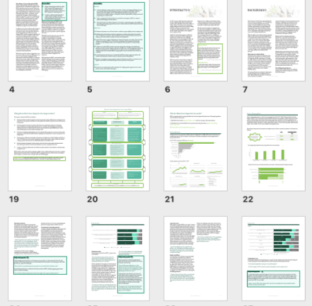
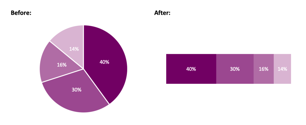
Grouping Like Things

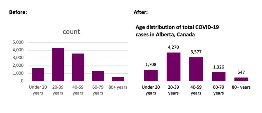
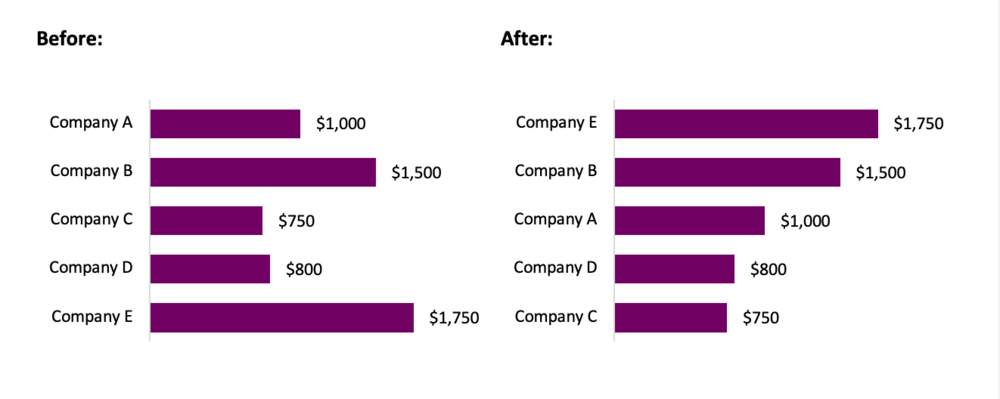
Reports are often comprised of text. Grouping text is best done through sensible paragraph use – one topic with one objective to prove. Below are two images from a recent report we drafted.

The image on the left shows the initial draft of a recent report where we dumped a bunch of text onto the page as part of our writing process. When we went to format the draft, we took that text and used the proximity principle to separate the text into three topic areas. As discussed in the last article, headings help with readability; however, even without the headings you can see the grouped text in separate paragraphs helps our reader understand that the information grouped together is similar but different from the other paragraphs.  

Screen Shot 2020-10-27 at 1.22.07 PM.png

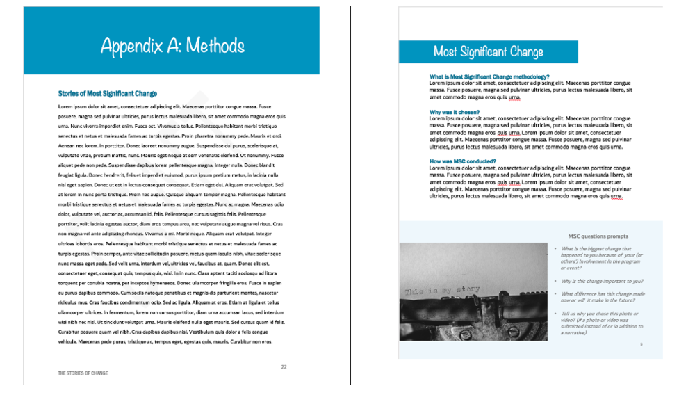
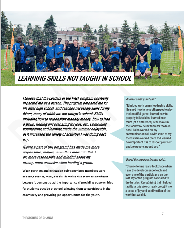
The image on the right also illustrates how call out boxes can be used to delineate information by grouping it to one area of a page. We wanted our readers to know the questions we asked participants and so we grouped the questions in a call-out box and then grouped each question together in a bullet within the call-out box. By grouping the questions together into a bulleted list, readers can easily identify each question as opposed to including them in a paragraph above.

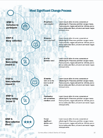
In addition to describing the most significant change (MSC) methodology we wanted to show how we implemented it. The image below illustrates our MSC process. You can see that we didn’t use borders around the steps or lines connecting the descriptions to the steps. We didn’t need to clutter up the illustration with those elements because we used the proximity principle. Our eyes can look at the groupings of text on the right and see that they are separate steps because they are separated by space.

Picture4.png


Embracing White Space

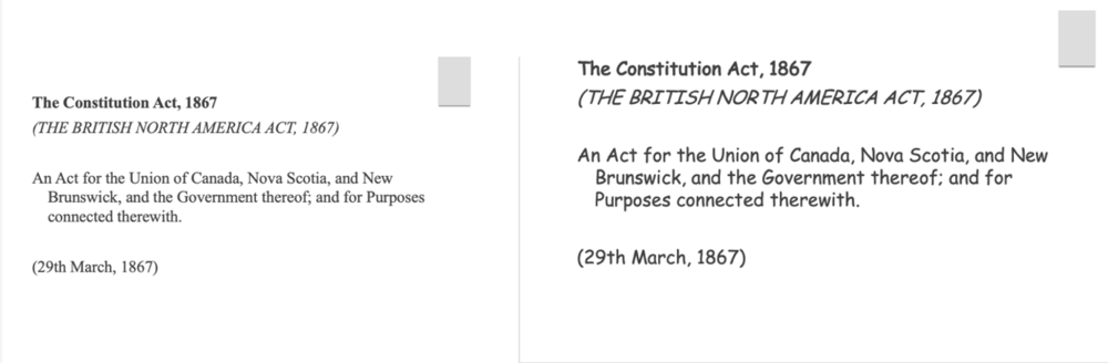
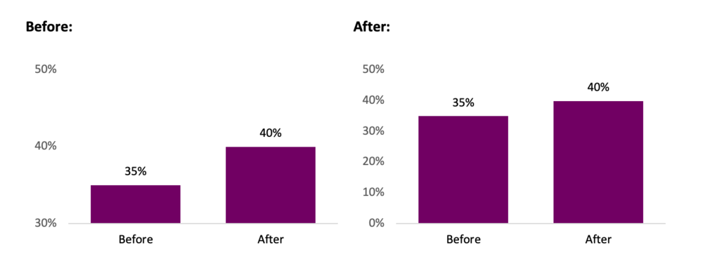
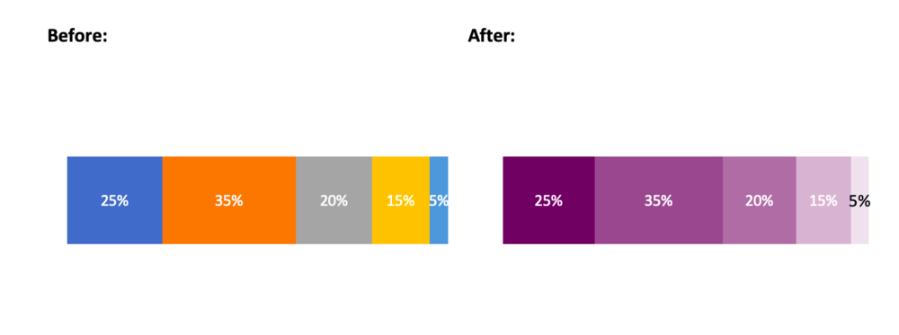
The second way to practice proximity is to embrace white space. We want to practice proximity, but not to the point where we group too many things together and end up with a busy report. White space is your counterbalance to report busyness; it is the areas between the elements on a page. When I open a report and there are pages and pages cramped with text, graphs and other items, I want to close it as quickly as I opened it. I get the same feeling when I enter a room full of furniture, pictures and other clutter – overwhelmed and wanting to leave. White space creates the visual breathing room your audience needs to capture and hold your audience’s attention.

Picture5.png

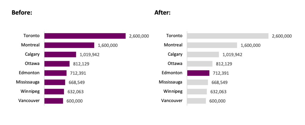
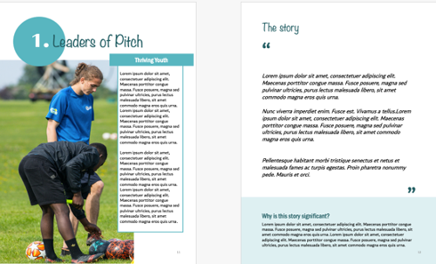
Creating white space is perhaps one of the easiest but most effective ways I use to format a report. The following images show the same report described above. The image on the left shows the original page from a draft of the report. You can see there was a lot going on.

The two pages below illustrate how we infused some white space to simplify how the same information was communicated. It can sometimes add length but since it helps to engage my audience I make that trade-off every time.

Picture6.png


Take a look at some of the reports you are creating. Are there opportunities to practice proximity? Try it out and make sure to stay tuned for the fourth article in our six-part series, “Make it pop” where I show you how to highlight the most important takeaways in your report by playing up differences.

Article thumbnail image source: Canva


Sign up for our newsletter

We’ll let you know about our new content, and curate the best new evaluation resources from around the web!


We respect your privacy.

Thank you!


Written by cplysy · Categorized: evalacademy

Oct 15 2020

Cleaning Messy Text Data is a Breeze with OpenRefine


We’ve all been there – you get some data from a client or a survey you’ve run, and you can’t wait to start answering your evaluation questions. But you find one of your data columns is a complete mess because it was an open-ended text field. Maybe you asked respondents to enter their province, job title, or favourite Halloween candy. And they answered your question, but everyone spelled things a little bit differently, some capitalized each word, others used all caps, some included their town and province, others entered the abbreviation for their province. The list of ways your open-ended text fields can become messy goes on and on.

Now, when you want to analyze the data from that text column you need to go through and clean the data so that everything is consistent. This can be a day-ruining, brain-melting task, especially if you have to go through and clean up hundreds or even thousands of data points. But this doesn’t have to ruin your day – I’m going to show you how to use OpenRefine to make this task a million times easier. And because it’s October, we’re going to talk about Halloween candy!

Polina Tankilevitch on Pexels

What is OpenRefine?

OpenRefine is a free, open-source program designed for data cleaning and transformation (a.k.a. “data wrangling”). It has many features, which you can learn about on their website, but for this tutorial we will focus on using it to clean the kinds of messy, inconsistent text data I mentioned above. This data might come from a survey with an open text field, or perhaps administrative data being entered by program staff. Whatever the source, it needs to be cleaned and standardized before you can do any kind of summarizing.

OpenRefine Logo

The Messy Survey Data

Picture it: October, 2019. It’s a regular year and you’re getting ready for trick or treaters to come knocking. But this year, you want to make sure you are giving out the best candy in the neighbourhood. Like any good evaluator, you decide to conduct a survey asking people which candy brings them the most joy – that way, you can be sure to stock up on everyone’s favourites.

When your survey is complete, some of the responses to “What Halloween candy brings you joy?” look something like this:

  • Little Debbie snack cakes.

  • Little Debbie snacks.

  • Little shot bottles of booze

  • Pay day, sweettart ropes, mentos

  • Payday

  • Payday Bar

  • Payday bar, Ferrero Rocher,

  • PayDay Bars


Of course, with any large survey you’re bound to get some jokesters (like little bottles of booze)! But more importantly, how are we going to know how many people want Payday when it’s all spelled differently? Excel won’t be able to recognize them as the same chocolate bar to add up. Let’s download OpenRefine so we can fix this.

If you’d like to follow along, download the 2017 Candy Hierarchy data here (credit to the University of British Columbia).


Step 1: Import data to OpenRefine

When you start OpenRefine, it opens in your web browser. Don’t worry, your data won’t be connected to the internet – it is all kept locally on your computer. The web browser is just the interface used to run the program.

Once you’ve launched the program, click Create Project (1), then Get data from… This computer (2). Choose a file, navigate to your spreadsheet of choice (in this case, our candy data), and click Next.

Make sure the data looks right in the preview window, give your project a name (3), and click Create Project (4).

Step 2: Split columns with lists of candy

The first transformation we’ll do is split up cells containing more than one candy. For example, we need the computer to recognize “Payday bar, Ferrero Rocher” as 1 vote for Payday, and 1 vote for Ferrero Roche. To do this, navigate to the relevant column in your data (in our example it’s Q7), click the down arrow on the column header to open the menu (5), select Edit cell, then Split multi-valued cells… (6).

In the dialogue box that appears, leave the default, which is to separate cells by comma (7), and click OK (8). This tells the program “Everywhere you see a comma in this column, split the text into a new cell.”

Before we did this, we had 2460 rows, and now we have 3267 rows. This is because each item is now in its own row instead of being listed with commas between. For example, “Payday, Fererro Roche” becomes:

Payday
Ferrero Roche


Step 2: Merge similar candy names together

Now that we have separated lists of candies into individual candies, we can start to clean the text by grouping similar candies together. For example, we need to change pay day, payday, PayDay, and payday bars all to “Payday.” Without OpenRefine, this would be a manual task of searching through the list and fixing them.

OpenRefine can do this automatically using a facet. Facets are like filters that allow you to summarize and clean entire chunks of your data. First, go back to that dropdown menu on the Q7 column (9), choose Facet, then Text facet (10).

The text facet we just created on the Q7 column appears in the panel on the left side of the window. It shows each value of Q7 and how many times it appears. You can see some of the different variations of Payday that people entered, and lots of them show a 1 beside them, meaning only one person entered that exact answer. We’re going to change that though. The cluster button in the facet pane allows us to group together similar responses and rename them as a batch.

Click Cluster (11). Ta da! This is the part that gets me really excited as a data nerd – the program uses “fuzzy matching” to take a best guess at which pieces of text actually refer to the same thing. You can play with the Method and Keying Function to change the type of algorithm used to fuzzy match – but we’ll leave the defaults for this tutorial.

The Values in Cluster column shows you which values it thinks belong together. The first one looks good, it’s just a bunch of variations on “Almond Joy.” To clean all of these values in the dataset, we will check the box under Merge? (12) and make sure the New Cell Value is correct (13). Now, every item in Values in Cluster will be updated to the New Cell Value.

Continue going through the list in the same way, checking the box for clusters you’d like to merge, and when you’re done, click Merge Selected and Close (14). Before we started merging, there were 1489 different values in the Q7 column. Now there are 1257, meaning we were able to automatically clean 232 values from the dataset!

The program does a great job of matching the correct values, but as with anything automated, you should go through and look at your data for any discrepancies. For example, “Payday” now has 9 entries, and “Payday bars” has 7 because the algorithm doesn’t know these two actually refer to the same thing (we would simply manually merge these two categories).

When you are done cleaning, you can export your data back to Excel by clicking the Export button in the top-right, then do a little happy dance for all the time you saved!

Summary

Using OpenRefine, we took some messy (and delicious) Halloween candy survey data, separated the cells by comma, then used fuzzy matching to cluster and rename batches of values. Now we have data that is in much better shape for any final cleaning or analysis.

If you try OpenRefine on your own messy text data, tell us about it on Twitter or the comments below!


Sign up for our newsletter

We’ll let you know about our new content, and curate the best new evaluation resources from around the web!


We respect your privacy.

Thank you!


Written by cplysy · Categorized: evalacademy

Oct 07 2020

Six Hacks for Renovating Your Evaluation Report Part 2: Consistency is Cool


This series of posts walks you through how to reno your evaluation reports using six of Canva’s design lessons. Part 1 focused on how to take your audience on a journey using storytelling techniques. Part 2 in this six-part series focuses on how to format your report with a consistent, cohesive look using two formatting elements: colour and font.


Patterns make learning easier

Human brains love taking in information. Visual information is our brains’ favourite information – it is our brain’s priority sense. Because of our brains’ proclivity for information they are constantly searching for visual cues (e.g. shapes) and particular attributes of those cues (e.g. colour, size, texture, angle, etc.). When our brains see those cues, they try to process that information as easily and efficiently as possible. Over the years our brains have evolved to adapt the ‘work smarter, not harder’ mentality; our brains look for patterns because it makes learning easier.

We need to take advantage of our lazy (but evolved) brains with our evaluation reporting. Let’s make reading our reports as easy as possible by giving our brains some consistent patterns that increases the chances our readers will more easily learn the information we are trying to convey. Two easy ways you can create a consistent cohesive look in your evaluation report is through the consistent use of colour and font.


Using colour consistently

When you are using colour in your report you want to think about two things: 1) Creating a strong palette and 2) Considering colour theory. There is no need to reinvent the colour wheel. You can find strong colour palettes using sites like Coolors, ColourLovers, or Adobe Color. My colour palette is often inspired by an image I used for my report. Most of the sites I just mentioned will allow you to upload an image and create a palette based on the colours in that image. 

Evaluation report image and associated colour palette


The image above was used for a report I did where the outcomes were focused on women’s wellness and well-being. Using that image, I developed a colour palette that focused mainly on the greens in the picture. I chose green because green is often associated with concepts like nature, peace, growth and health – concepts related to the intended outcomes. Being intentional about your choice of colour and the mood it conveys is being considerate of colour theory, but also helping our brain with pattern recognition.

Once you’ve decided on your palette you can create a custom palette in Microsoft and use it throughout your report to create a consistent, cohesive look to your report. The image below shows how I used the colour palette throughout the report (i.e. in tables, graphs and call out boxes), along with the cropped sections of the main image, to create consistency throughout the report.

Example of using a colour palette in an evaluation report

Using font consistently

Another way to create consistency throughout your report is with fonts. Similar to colour, fonts should be used purposefully to signal important elements. The best way to do this is to create hierarchies in your report. This means your titles, subtitles and heading levels have different fonts, formatted differently, but used consistently throughout your report to create a report hierarchy (see below).

Use heading levels to create consistency in evaluation reports

An easy way to make sure you are using your fonts consistently is to use the style pane in Microsoft and set up your font hierarchy. You can also do it manually using a table like this:

For each heading style (e.g., Title, Sub-title, Heading 1) include information on font type, font size, font RGB (colour), and font style.

For each heading style (e.g., Title, Sub-title, Heading 1) include information on font type, font size, font RGB (colour), and font style.


You want to make sure that the fonts you choose accurately reflect the mood you want to portray. Similar to colour, our brains have ingrained ideas of fonts and the personality each represent. In our storytelling with data workshop we illustrate this by showing words to our constitution act in two different fonts (see below). As you can see, the comic sans font on the right looks more appropriate as a note to a child.

A comparison of Canada's constitution in a serif font vs. comic sans

A comparison of Canada’s constitution in a serif font vs. comic sans

Remember, creating consistency in our reporting isn’t just about formatting elements consistently throughout your report, but choosing elements (e.g. colour and font) that are consistent with what your audience expects. 

Try it out and make sure to stay tuned for the third article in our six-part series, “Practice Proximity” where I show you how I reno’d an evaluation report just by grouping and spacing information.


Sign up for our newsletter

We’ll let you know about our new content, and curate the best new evaluation resources from around the web!


We respect your privacy.

Thank you!


Written by cplysy · Categorized: evalacademy

Oct 01 2020

Evaluation Roundup – September 2020


Welcome to our September roundup of new and noteworthy evaluation news and resources – here is the latest.

Have something you’d like to see here? Tweet us @EvalAcademy or connect on LinkedIn!


Virtual conference resources


Conference season is upon us! Ordinarily most of us would be looking forward to hopping on a plane to meet up with our peers in some exotic (and sometimes not so exotic) place. Instead, we are forced to join yet one more Zoom meeting from home. Below are some resources for presenters and attendees to make virtual conference season an enjoyable one.


Amplifying your message with help from Duarte

Duarte (@duarte) is a firm of expert communicators. I took the Duarte VisualStory workshop years ago and have been singing their praises since. Not only that, I continue to use the workbook and resources that were included as part of the workshop. It may be too late to register for one of their workshops in time for your upcoming conference presentation, but they do offer individual and team trainings as well. Besides their courses and training, they have a resource section on their website where you can access a number of guides and tool to make your presentation a memorable one. My favourites are:

Slidedocs template

Your presentation shouldn’t be a list of narrative and text for people to look at. What goes on your slide should be a visual aide that enhances what you are speaking about. The problem is if people are interested in what you are saying then they will want a document to read and reference afterward; hence, the age-old, “can I get a copy of your slides?” If you are designing your slides correctly they should be a useless reference for people after the fact – all the meat and details should come from you and not text on a slide. To bridge this gap, Duarte suggests a Slidedoc, “a visual document intended to be read and referenced instead of projected.” The Slidedoc template can be downloaded for free – it guides you through how you can design a Slidedoc for your presentation that is visually appealing and user friendly.

Duarte’s Slidedoc template

Duarte’s Slidedoc template

Diagrammer

One aspect of an effective presentation is using visuals to show relationships and linkages between information. Another important aspect is having a cohesive look to each of your slides. Duarte’s Diagrammer is a visualization system that contains various diagrams to communicate relationships all with a consistent colour palette (think SmartArt on steroids.) It is free to download, and you can modify as much or as little as you want. See below for a sneak peek of some of the available designs.

Duarte’s Diagrammer

Duarte’s Diagrammer

Creating Potent Presentations

If you are an evaluator you are likely more familiar with the presentation resources the American Evaluation Association has developed under its Potent Presentations Initiative (p2i). This initiative was developed to explicitly help evaluators improve their presentation skills. The initiative has a series of free checklists and worksheets you can download, along with webinars and slides to help you craft a presentation that effectively delivers the message you are trying to get across. Sheila Robinson (@sheilabrobinson) and Stephanie Evergreen (@evergreendata) are a few who have developed resources. I find the Messaging Model Handout particularly useful when planning a presentation. Don’t be that person who spends the entire presentation talking about the background and methods and then frantically flips through the results and next steps because you ran out of time!

AEA Messaging model handout

AEA Messaging model handout

Public speaking tips for evaluators

Now that you have designed a perfectly crafted presentation and corresponding reference material, you need to actually deliver the presentation. Check out Ann Emery’s (@annkemery) recent blog with Isaac Castillo (@isaac_outcomes) where they talk about public speaking. His advice for not running out of time with your presentation: prepare half as much content as you think you need.


Facilitating a virtual workshop

What about if you’re conducting your first virtual workshop? Workshop guru Stephanie Evergreen (@evergreendata) recently posted a blog outlining five shifts workshop facilitators should consider when moving online. It covers everything from filling up dead space, adjusting slides for online audiences, break times, and the importance of interactivity. In this blog she also directs readers to Mike Morrison (@mikemorrison) who has some sage advice on conference posters.


Your poster needs to change – here’s how

Mike Morrison’s (@mikemorrison) twitter profile reads “trying to speed up science with #UXDesign.” If you look at his manifesto video he talks about how academia has an antiquated and ineffective way of sharing knowledge and proposes how this needs to change. One place to begin changing how knowledge is presented and consumed is changing those oh so horrible conference posters. Check out his entertaining video on YouTube, “How to create a better research poster in less time (including templates)”. He provides a funny overview on why they are so horrible, but more importantly walks us through how to reinvent our posters so people actually want to look at them and can take in the key learnings.


Attending a virtual conference? Make the most of it

If you are not presenting or facilitating a workshop at a virtual conference, then maybe you are attending one for the first time? If so, check out EvaluATE’s recent blog that talks about making the most of a virtual conference, but from an evaluator’s perspective. In this blog Lyssa Wilson Becho (@LyssaBecho) talks about how we can put on our evaluative thinking hat to define what it is we want to get out of the conference; from there, we can be more intentional about making those outcomes come to fruition.


New and Noteworthy — Courses, Events and Webinars


October 2020

Most Significant Change (MSC)

Sponsor: Clear Horizon Academy
Date: October 12
Venue: Online course 

Evaluation 2020

Sponsor: American Evaluation Association
Dates: October 27 – 30
Venue: Virtual Event 

Participatory Evaluation: Community-Based Assessment + Strategic Learning Practices

Sponsor: Tamarack Institute
Date: October 20
Venue: Virtual Workshop 

November 2020

Using data analysis and visualization to drive social impact

Sponsor: Clear Horizon Academy
Date: October 12
Venue: Online course


Keep the roundups coming? Sign up for our monthly roundup here:

Subscribe to Our Newsletter

Sign up with your email address to receive news and updates from Eval Academy every month.


We respect your privacy.

Thank you!


Written by cplysy · Categorized: evalacademy

Sep 16 2020

7 Tips for Better Data Visualizations


Data visualization is an effective approach for improved data comprehension. Seeing the data presented in a clear, concise fashion drives your overall message home much better than cluttered tables. In this article I outline seven simple tips that will help to improve your visuals.


1. Choose the correct chart

There are a multitude of charts that may adequately represent your data. However, before selecting a chart, you need to be clear on what you, and your data, are trying to communicate. Consider the message you want to convey to your audience and select your chart accordingly.

As a side note, 3D graphics are never the correct chart. They distort the data and reduce the comprehension of your chart.

Instead of a pie chart, try a stacked bar chart.

Instead of a pie chart, try a stacked bar chart.


2. Opt for simplicity

After you have selected the chart that tells the story of your data, it is time to visualize your data. In Excel, the default chart is accompanied by excess gridlines, uninformative titles, and poorly positioned legends. The goal: remove anything that does not support the message you are communicating to your audience.

Simplifying your chart will help your message shine through. You want your audience to focus on what is important. Therefore, remove what is not crucial for understanding your data. Excess gridlines and axis labels can be removed if you have labeled data points. Your chart title can be re-written to highlight the core message of the data. Legends can be deleted in favour of a custom-made legend that better aligns with the theme of your chart.

Simplify your chart to let the message shine through.  Source: https://www.alberta.ca/stats/covid-19-alberta-statistics.htm

Simplify your chart to let the message shine through.
Source: https://www.alberta.ca/stats/covid-19-alberta-statistics.htm


3. Order data

Ordering data improves the overall comprehension of your chart. By ordering data, random data points can be reorganized in such a way that is meaningful for your audience. This allows for the clear interpretation and understanding of the data.

Categories should be ordered both logically and consistently. Categories independent? Order by value. Categories sequential? Order sequentially. Ordering by value or sequentially does not quite work? Order alphabetically. Regardless, the ordering should improve the comprehension of your chart.

Order your data in a logical way.

Order your data in a logical way.


4. Include a zero baseline

Truncating axis baselines is an efficient method to lie with data. Truncated axes skew visual comparison, exaggerating differences within your chart. As a result, minor differences appear larger and more significant.

To avoid errors in interpretation, include a zero baseline in your charts. This allows for more accurate interpretation of results. This improves the overall comprehension of your chart and better communicates your overall message.

There are exceptions to the rule, although most often, it is suggested that you use a zero baseline. Line charts are used to compare between lines and a truncated y-axis may be opted for to emphasize differences between lines. If highlighting clear variations between your lines is the goal, truncating the axes may be an option. In this case, clearly identify to your audience that you are using a non-zero baseline.

Avoid misleading with your data by including a zero baseline.

Avoid misleading with your data by including a zero baseline.


5. Use colour to highlight the important information

Colour is a great way to highlight important data within your chart. While you should be mindful to use like colours for like data, it is often beneficial to use accent colours to emphasize a point. These accent colours will pull the reader’s attention and help them focus in on the core message of the chart.

Use an accent colour to highlight important information.  Source: https://www.geonames.org/CA/largest-cities-in-canada.html

Use an accent colour to highlight important information.
Source: https://www.geonames.org/CA/largest-cities-in-canada.html

6. Select an appropriate colour palette

Avoid using mixed colour palettes. While a mixed palette may provide ample contrast between your data, it also reduces the efficacy of your chart. Instead opt for different shades of the same colour. Use darker shades to emphasize important data (based on value, hierarchy, etc.) and lighter shades for less important data.

Choose a cohesive colour palette.

Choose a cohesive colour palette.


7. Experiment, revise and edit

Initially, all charts are limited in their ability to communicate the desired message. However, with simple tweaks, you can create charts that are clean and comprehensible. Plus, data visualization should be fun. Seek inspiration from the many great visualizations online and experiment with your own charts. Through experimentation, revision, and editing, your charts will be able to “wow” both colleagues and clients.


Conclusion

Simple changes to the default Excel chart can lead to significant improvements in your data visualizations. Following the tips outlined above will help you get started creating better charts that will both impress and inform.


Some Data Visualization resources

Chart Selection:

Data Viz Project: https://datavizproject.com/

The Data Visualization Catalogue: https://datavizcatalogue.com/


Inspiration:

Information is beautiful: https://informationisbeautiful.net/

Depict Data Studio: https://depictdatastudio.com/

Evergreen Data: https://stephanieevergreen.com/


Sign up for our newsletter

We’ll let you know about our new content, and curate the best new evaluation resources from around the web!


We respect your privacy.

Thank you!


Written by cplysy · Categorized: evalacademy

  • « Go to Previous Page
  • Go to page 1
  • Interim pages omitted …
  • Go to page 33
  • Go to page 34
  • Go to page 35
  • Go to page 36
  • Go to page 37
  • Interim pages omitted …
  • Go to page 43
  • Go to Next Page »

Footer

Follow our Work

The easiest way to stay connected to our work is to join our newsletter. You’ll get updates on projects, learn about new events, and hear stories from those evaluators whom the field continues to actively exclude and erase.

Get Updates

Want to take further action or join a pod? Click here to learn more.

Copyright © 2026 · The May 13 Group · Log in

en English
af Afrikaanssq Shqipam አማርኛar العربيةhy Հայերենaz Azərbaycan dilieu Euskarabe Беларуская моваbn বাংলাbs Bosanskibg Българскиca Catalàceb Cebuanony Chichewazh-CN 简体中文zh-TW 繁體中文co Corsuhr Hrvatskics Čeština‎da Dansknl Nederlandsen Englisheo Esperantoet Eestitl Filipinofi Suomifr Françaisfy Fryskgl Galegoka ქართულიde Deutschel Ελληνικάgu ગુજરાતીht Kreyol ayisyenha Harshen Hausahaw Ōlelo Hawaiʻiiw עִבְרִיתhi हिन्दीhmn Hmonghu Magyaris Íslenskaig Igboid Bahasa Indonesiaga Gaeilgeit Italianoja 日本語jw Basa Jawakn ಕನ್ನಡkk Қазақ тіліkm ភាសាខ្មែរko 한국어ku كوردی‎ky Кыргызчаlo ພາສາລາວla Latinlv Latviešu valodalt Lietuvių kalbalb Lëtzebuergeschmk Македонски јазикmg Malagasyms Bahasa Melayuml മലയാളംmt Maltesemi Te Reo Māorimr मराठीmn Монголmy ဗမာစာne नेपालीno Norsk bokmålps پښتوfa فارسیpl Polskipt Portuguêspa ਪੰਜਾਬੀro Românăru Русскийsm Samoangd Gàidhligsr Српски језикst Sesothosn Shonasd سنڌيsi සිංහලsk Slovenčinasl Slovenščinaso Afsoomaalies Españolsu Basa Sundasw Kiswahilisv Svenskatg Тоҷикӣta தமிழ்te తెలుగుth ไทยtr Türkçeuk Українськаur اردوuz O‘zbekchavi Tiếng Việtcy Cymraegxh isiXhosayi יידישyo Yorùbázu Zulu