Six hacks for renovating your evaluation report
PART 5
This article is Part 5 in a six-part series that walks you through how to reno your evaluation reports using six of Canva’s design lessons.
-
Part 1 focused on how to take your audience on a journey using storytelling techniques.
-
Part 2 focused on how to format your report with a consistent, cohesive look using colour and font.
-
Part 3 dove into grouping and spacing elements in your reporting.
-
Part 4 explored how to make elements in your report pop using focal points.
Speaking of focal points, let’s talk more about how to use images as focal points in your reports.
Why you should use images in your reports
Images are naturally dominant elements. In Part 4 of this series, we talked about the importance of dominance, but in a nutshell dominant elements tell our eyes where to look. Directing your audience’s eyes to an image is important because images convey stories. Like we talked about in Part 1, stories are important because they help us store information in our memory for future use. A good example of using images to convey a story is the Save the Children “Lottery of Life” campaign. We know just by looking at two images what is means to win the lottery in life.
)
Save The Children – Lottery of Life Campaign (Image 1)
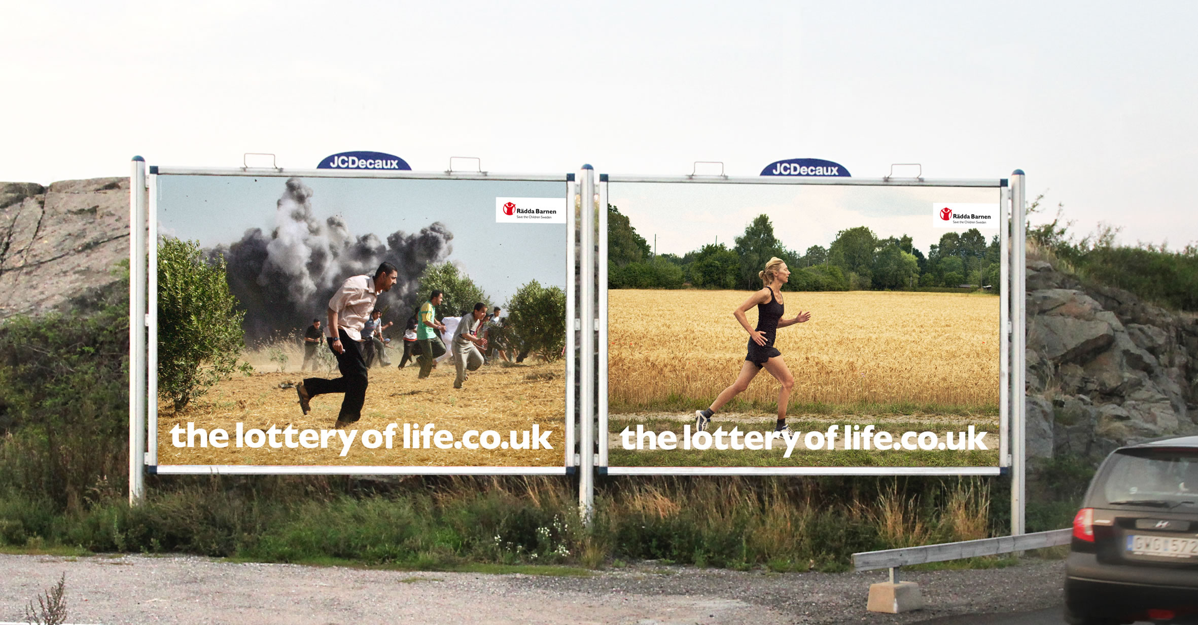
Save The Children – Lottery of Life Campaign (Image 2)
How to select images for your report
Strong imagery
When selecting images, it is important to consider strong imagery. Strong images are simple, clear, and sincere images, like those used in the Lottery of Life campaign. The images are not overly complicated or cluttered. The images are also not grainy or blurred. In addition, the images don’t give off that cheesy stock photo vibe. It’s true that some stock images are definite no-go’s; however, with a discerning eye, you can often find some beautiful images.
We use iStock to find images and illustrations. If you can’t spend money to buy an image there are other options out there, you just might need to spend more time digging to find what you’re looking for. Sometimes Google Images is a good place to look, but make sure to use the ‘tools’ function filter using the appropriate ‘usage rights’ (e.g., creative commons licenses). Pixabay and Flickr are other sites to use for free images. Also, don’t forget your own photo library. You will be surprised at the photos you can find when looking back into your albums. Or, embrace your inner photographer and shoot some images for your report. We used the image below in a report. The picture is art from the side of a building that I took a photo of using my iPhone.
Example of using your own photography in your reporting
Relevance
Strong images also need to be relevant to the story you are trying to convey. When drafting my evaluation reports I think about the outcomes that the program is trying to achieve and then search for images that convey those outcomes. It is also important to think about representativeness in your images. If your evaluation takes place in a diverse population then your imagery should represent the diversity of that population. CreateHERstock is a site that was created after realizing “there was a big problem with stock imagery and the lack of representation.” It is a free stock image library focused on representing Black women. Whether it is race, gender or age, make sure the imagery aligns with your narrative. When you have chosen your image(s), send it to your stakeholders to review the image. I once chose an image and designed an entire report around it, only to find out that the image didn’t resonate with my clients.
How to use images in your report
While it is nice to use various images to convey your message, you may not have the budget for that. Not to worry! The following are some tips for how to incorporate and use that image in your report.
Starting and ending with an image
Two of the easiest ways to incorporate images into your reporting are to insert an image on the first and last pages. There is nothing worse than looking at a report that has nothing but a white background and tiny black writing. Inserting a picture on the cover instantly grabs the audience’s attention and gets them thinking about what is inside. Putting the same image on the back page is also a nice way to tie the report together.
Cover Page

Back Page
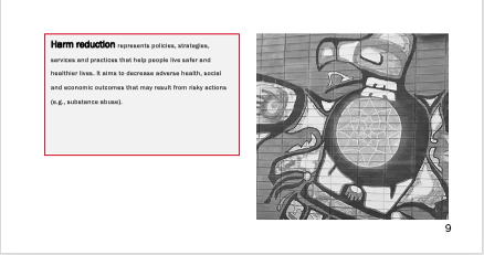
Call-out boxes
We have talked in previous posts about the importance of breaking up text in your report; I often will do that with call out boxes and sidebars. To help draw the eyes to these areas I will sometimes insert a picture, again to help people understand what is in the box and why it is important
Example of a call-out box with an image
Backgrounds
Another idea is to take the image and add it as a background to certain pages in your report. The image below shows how we took the same cover image used in the rest of the report but used it as a background for a process we wanted to illustrate.
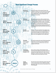
Example of a background image
Don’t be afraid to crop, scale, re-colour and play with transparency. With some quick manipulations, you can use one image throughout your report without it looking stale. Rather, it looks like you have a report that looks cohesive and engaging.
Take a look at some reports you are creating. Are there opportunities to make incorporate some photo love? Try it out and make sure to stay tuned for the sixth article in our six-part series, “Dial Down Your Data” where I talk about simplifying your data, so it conveys what matters most.
Sign up for our newsletter
We’ll let you know about our new content, and curate the best new evaluation resources from around the web!
We respect your privacy.
Thank you!