• Skip to main content
  • Skip to footer
  • Home

The May 13 Group

the next day for evaluation

  • Get Involved
  • Our Work
  • About Us
You are here: Home / Archives for allblogs

allblogs

Nov 27 2022

The result chain: a beginner’s guide

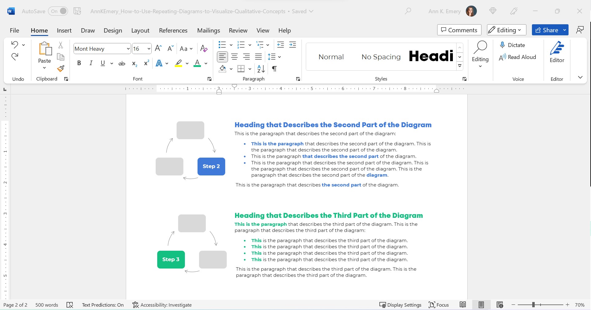
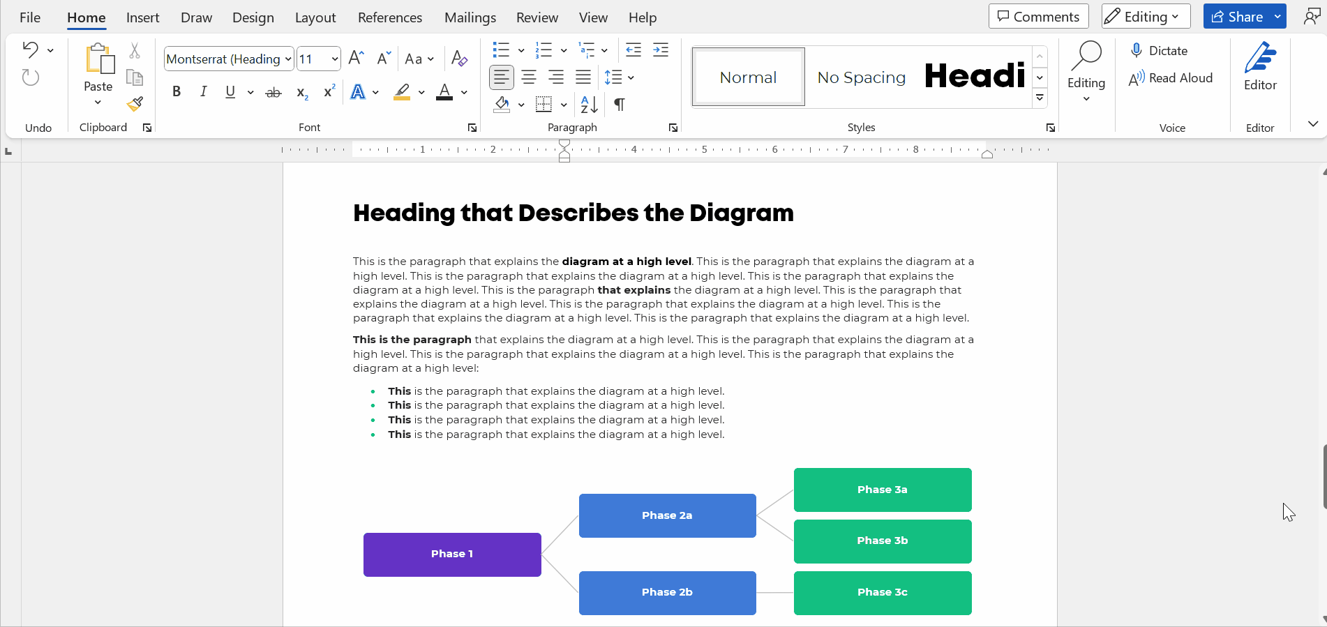
Monitoring and Evaluation is about measuring and tracking results. That is why it is important to understand what results are, and how to distinguish between different levels of the results chain. In general, a “result” is something that happens or exists because of something else that has happened: the results of a football game the final value of a mathematical calculation, or the outcomes of an election. In development and governance, […]

The post The result chain: a beginner’s guide appeared first on Dr. Thomas Winderl.

Written by cplysy · Categorized: thomaswinderl

Nov 25 2022

Strategy as Conversation

A great strategy is designed. This means it was planned, implemented, and evaluated in ways that are aligned with the vision of the organization. Poor strategy neglect some or all of this.

We’ve seen many strategies poorly planned, not implemented, never evaluated and misaligned with the values and vision of the organization.

However, because we are dealing with human systems — complex, living systems — a strategy can’t be rigid and inflexible. This means creating the capacity to design, learn, and implement in a flexible, adaptive way.

We approach strategy as a conversation.

This means listening, reflecting, and speaking (projecting) in dialogue with the circumstances your organization finds itself in. Good conversations might have an explicit purpose, but there is an element of emergence that makes them attractive. Great conversations have aspects of curiosity, discovery, and serendipity.

We never know what a conversation will bring, even if we know what kind of information we wish to share. This metaphor and approach are particularly salient now. We are seeing such global transformation, disruption and uncertainty that taking a curious approach to what we see and do is a way to facilitate this adaptation.

Conversation Practice

What does this mean in practice?

  • It means viewing strategy as a process as much as an outcome.
  • Build a developmental approach to both design and evaluation.
  • Engage in — and set aside time and space for — sensemaking regularly.
  • Promise to learn absolutely and execute based on learning, not set plans.

These are simple steps but powerful in their impact. We help organizations do this by creating — by design — space to talk and learn. Make sure you create space to do this and view strategic conversations as something you regularly have, not every 5 years.

We love a good conversation. We also love good coffee, too. They go together well, so if you want to have both, reach out and let’s talk.

Image credit:  Gary Butterfield on Unsplash

The post Strategy as Conversation appeared first on Cense Ltd. .

Written by cplysy · Categorized: cameronnorman

Nov 16 2022

Reader-Focused Report Assessment

How do you tell a good report from a bad report? That’s what I hope you’ll be able to do with my new quick 2 page assessment.

So a little while ago I created a resource, it was a short 18 page eBook that walked through a 6 step process. If you’re interested you can grab it here: UX Evaluation: How to Evaluate Dashboards, Reports, and Data Visualization.

But truthfully, whether or not they should, most people are not going to go through that much effort. And you really don’t have to go through that much effort to learn a lot about the effectiveness of your report. So I decided to make something a little easier.

Reader-Focused Report Assessment Featured Image
You can download the assessment by clicking this link.

There are three basic steps.

Step 1. What is your goal?

You would think it would be obvious, but a lot of people don’t take the time to put this into words. But why you are sharing your report or presentation is really fundamental to your design approach.

So I start by asking you to write a sentence or two on the goal.

Step 2. Describe 3 audience members?

Breaking your audience down into 3 groups is a really nice way to help you imagine “the who” in your audience. The 3 audience approach is central to my client design work, which is why I talk about it early in my book.

While all audiences are different, interest level plays a huge role in choosing the right type of report. Because if you try to serve everyone with the same style of report you are going to fail. Shorter visual reports work better for casual audiences. High interest audiences often want far more substance. And your executives (and probably your boss), they usually land somewhere in the middle.

Taking a little time to identify a person who can represent each group can really improve how you see your own reporting. It’s also fundamental to what I’ll ask you to do on page 2.

The people you choose here can be fictitious, but you should be able to validate your assumptions by talking to real people who match your descriptions.

Step 3. Rating on Relevance, Usefulness, Interest, and Confusion.

The second page gives you a chance to role play each one of your 3 identified audience members and rate your report accordingly. What might be highly relevant to one audience member might not be relevant for another. A report could be interesting but not all that useful. It could also be potentially useful but really confusing.

There is no getting all As on this assessment. If you find yourself saying everything is highly relevant, useful, and interesting while also not being confusing for everyone…you might be a little delusional.

Cartoon person 1, "This report reads like it was written just for me."
Cartoon person 2, "That's because it was."

How to use.

This is the kind of assessment you have several people run through. Then you meet together in a conference room (or Zoom room) and talk about your findings.

If there are disagreements, or your reports are really important, find real people who match your audience descriptions. Have them read the report. Then ask the questions on page 2 (over Zoom or a cup of coffee).

Do your assumptions on how your audience would see your report align with real world user experience?

Download the Assessment.

Click on the following link to download the assessment.

Download the assessment button.

Written by cplysy · Categorized: freshspectrum

Nov 14 2022

How to Use Repeating Diagrams to Visualize Qualitative Concepts

This is the status quo.

But it doesn’t have to be!!!

Let’s stop hiding important qualitative concepts inside Text Walls that no one reads.

Step 0: Take Pride in Your Report’s Formatting

We’ll use landscape so that it’s easier to see on a landscape computer screen.

We’ll add the organization’s Theme Colors and Theme Fonts so that the document looks professional and enhances branding.

We’ll add a Text Hierarchy. Instead of a single Heading 1, we need to add several Heading 2s. We also need to enlarge all the font sizes. No more puny size 12 or 14 for headings!!

In this example:

  • the Heading 1 is size 24 bold in a brand color,
  • the Heading 2s are size 16 bold in a brand color, and
  • the body font is size 11 in dark gray. (Not black, which causes eye strain and makes people think of funerals, at least according to my graphic design friends.)

Step 1: Choose Your Diagram

I like to scroll through SmartArt for ideas.

You can also browse Diagrammer, which is SmartArt on steroids.

Here are the most common diagrams I’ve used to visualize qualitative concepts in research and evaluation projects:

Processes

Processes are for linear, step-by-step concepts. There’s a defined start and end.

Examples:

  • A lot of my own training programs, where I teach how-to instructions for dataviz.
  • Logic models.
  • Research methods (e.g., we recruited participants, and then they did this, and then they did this).

Cycles

Cycles are for processes that loop around and around until infinity.

Example:

  • The program evaluation lifecycle, in which you plan for the evaluation, collect the data, analyze the results, use the data to inform decisions… and then start the process all over again.

Concentric Circles

Concentric circles are for spreading concepts and for inner, middle, and outer layers.

Example:

  • An agency made a plan to improve diversity, equity, and inclusion. They identified three layers of changes needed: at the individual level, at the departmental level, and at the agency level.

Components

Components are for pieces of the whole—when you want to show that all these random things aren’t so random; they’re connected. They’re just not connected as a linear process or as a cycle.

Examples:

  • In my master’s thesis, I researched how nonprofit organizations were using data to have a bigger impact on the community. In the literature review, I identified ~10 specific examples of data use, which were all related to the broader theme of data use.
  • The U.S. Surgeon General’s Framework for Workplace Mental Health & Wellness (scroll down a bit here).

Pyramids

Pyramids, or ladders, are for concepts that build upon one another. The base layer is the foundation, the middle layer builds upon it, and you’re aiming for the pinnacle at the very top.

Example:

  • In my Report Redesign classes, I organized the techniques into a pyramid. Participants learn the foundational skills, then the slightly narrower skills, then the nitty-gritty details that pull everything together.

Matrices

Matrices are fancy tables or plots.

Examples:

  • This blog post about four types of dashboards.
  • Lots of diagrams from McKinsey.

Venn Diagrams

Venn Diagrams are for interwoven, overlapping components.

Examples:

  • A project involving several groups of people, who all come together to advocate for their issue.
  • The U.S. Surgeon General’s Framework for Workplace Mental Health & Wellness (scroll down a bit here). It’s a venn diagram plus components.

Honeycomb

Honeycombs, meh. I don’t love these. They’re overused, along with the gears. If you’re not sure what else to use, this is still better than a Text Wall.

Step 2: Introduce Your Diagram

Show the fully-colored diagram.

Don’t cram too much text on the diagram itself. In this example, I’m pretending we’re describing three steps, which repeat over and over.

Add a paragraph or two to explain the diagram at a high level.

Make sure there’s plenty of color contrast by using bold white or bold black text against your brand colors. Use this color contrast checker to figure out which font color to use.

Step 3: Repeat Your Diagram

Here’s the important part: Repeat your diagram as you explain each segment in more detail.

Copy and paste the diagram.

Then, gray everything out, and just highlight the segment you’re explaining in a dark brand color.

For bonus points, you can color-code the Heading 2s to match the diagram.

Make sure your colors are consistent with what you introduced earlier!!! You wouldn’t want Step 1 to be purple, and then blue, and then green.

I usually delete the words from the diagram that I’m not currently explaining. For example, when explaining Step 1, I delete the words Step 2 and Step 3 from the diagram. I don’t want any issues with color contrast; the white font wouldn’t be legible against the light gray diagram, so I simply delete it.

Make sure there’s plenty of white space between sections. I use at least 0.5 inches of white space (e.g., between the diagram and its paragraph, between the paragraphs).

For bonus points, break up the paragraphs into points and bold a few key words. Long paragraphs are dated. Readers expect short, skimmable paragraphs these days.

Check out the paragraphs in this blog post, for example. They’re 1-4 sentences long. There are lots of headings. There’s bolding to increase skimmability.

This blog post is also written at a 7th grade reading level.

Peek at the document with the gridlines on. Make sure the diagrams are aligned with each other.

The Final Product: Repeating Diagrams

I don’t care that it takes up two pages instead of one.

Two great pages will beat one lousy page any day of the week.

Yes, your boss might give you a made-up page limit. “Make sure everything fits on a page!” Those limits were created because bosses got tired of Text Walls. And, because we used to print a lot.

Nowadays, people don’t print as much. I think the pandemic was a major turning point. With everyone working remotely, nobody had access to the office printer anymore. Any who wants to pay to print at home??

I’ve never, ever heard complaints about two accessible pages vs. one inaccessible page. The word count is the same. (Well, I added some headings.) But the information is richer because we’ve added a diagram and then explained it piecemeal.

Adapt as Needed

Use can use any diagram you need—a cycle, linear process, pyramid, or concentric circles.

You can do this in Word.

You can do this in PowerPoint.

You can do this in Canva.

You can do this in Publisher.

I’m software-agnostic. I don’t care which software program you use. When formatted well, you’ll get the same high-quality end result regardless of which program you’re using.

In this example:

  • The diagram was wide, so when I introduced it, it needed the full width of the page.
  • When I repeated the diagram, none of the words (“Phase 1”) fit, so I deleted them.

Adapt as needed!!!

Download My Word Document

Bonus!

Want to see how I arranged everything inside of Word?

You can download the document here: https://depictdatastudio.gumroad.com/l/UseRepeatingDiagrams

Written by cplysy · Categorized: depictdatastudio

Nov 10 2022

How to create carousels with Canva

A carousel is like a social media slide deck. The format has been around for years, but it’s making a comeback. In today’s post I’ll show you how to create one using Canva.

How to Create a Carousel - Featured Image

Do you remember slideshare? Basically it was a site that let you put your slidedecks on the web.

Like a lot of web things, it never really went away. LinkedIn bought it and owned it for a bit, and then recently Scribd bought it from LinkedIn. But for years now you have been able to directly embed PowerPoints and Google Slides, so the tool became a bit redundant.

Social media carousels are like slideshares built into different social media platforms. Posting a handful of photos that you can peruse by scrolling horizontally has been a native feature on tools like Instagram, but it just wasn’t something you would see often on platforms like LinkedIn or Twitter.

But that’s changing.

Here is an Example from the United Nations

I’ve seen new carousels popping up all over the place, but here is an example carousel post from the UN. You can find the post on LinkedIn, but they also shared the same post on Twitter and a similar one previously on Instagram.

How to Create a Carousel using Canva

So a carousel is just a sequence of images.

Depending on the social media platform you’ll either share your carousel as a set of images, or in the case of LinkedIn, a PDF.

Luckily with Canva it doesn’t really matter because you can turn any design into a collection of images or a PDF. You have some flexibility on size, but I like just going with a social media square.

How to Create a Carousel - Canva Screenshot

Picking and laying out your content.

A lot of the carousels I’ve seen lately are listicles (Buzzfeed style numbered lists).

I decided to do the same thing and share some of my old cartoons. I picked 8 audience favorites from my archives to act as my starting point. My cartoons are rectangles, so the square format will give me some space to caption each one.

I have 8 cartoons but want an intro image and closing image, so that gives me 10 images. My plan is to share this on LinkedIn so that will work just fine. Most platforms have limits on their carousels, so check out the requirements before you design (currently Twitter 6; Facebook 10; Instagram 10; LinkedIn 300!).

On my first page I put in a zoomed in version of one of my cartoons as a background. If you want to actually read the cartoons you’ll need to scroll through the carousel. I also put a big white arrow on the cover because it’s not always immediately obvious on LinkedIn that you’re looking at a carousel.

How to Create a Carousel - Canva Screenshot

Think Slidedoc, not Slidedeck

So carousels are more like a slidedoc than a slide deck. You’re not going to be standing in front of them walking through each slide. So it needs to be readable, not just viewable.

This is also meant for social media, so I want any text I use to be pretty large and fairly short. For my cartoon carousel I did a numbered list and put a personal caption under each cartoon.

How to Create a Carousel - Canva Screenshot

Download your Carousel

If you’re planning on using the carousel on LinkedIn, you’ll want to download your image set as a standard PDF. If you’re planning on using the carousel on Facebook, Twitter, or Instagram, you’ll want images.

How to Create a Carousel - Canva Screenshot

Publishing the Carousel on your Chosen Platform.

Sharing a Carousel on LinkedIn is simple.

You really just click on “Add a document” and then choose your pdf.

How to Create a Carousel - LinkedIn Screenshot
  • Sharing a Carousel on Instagram is also super easy. You can even make it seamless!
  • Sharing a Carousel on Twitter and Facebook are both do-able, but a little more annoying. Especially with Twitter as you can only do it right now through their Ad platform.

Want to see my final cartoon Carousel?

Here it is, I shared it on my LinkedIn account.

Written by cplysy · Categorized: freshspectrum

  • « Go to Previous Page
  • Go to page 1
  • Interim pages omitted …
  • Go to page 111
  • Go to page 112
  • Go to page 113
  • Go to page 114
  • Go to page 115
  • Interim pages omitted …
  • Go to page 310
  • Go to Next Page »

Footer

Follow our Work

The easiest way to stay connected to our work is to join our newsletter. You’ll get updates on projects, learn about new events, and hear stories from those evaluators whom the field continues to actively exclude and erase.

Get Updates

Want to take further action or join a pod? Click here to learn more.

Copyright © 2026 · The May 13 Group · Log in

en English
af Afrikaanssq Shqipam አማርኛar العربيةhy Հայերենaz Azərbaycan dilieu Euskarabe Беларуская моваbn বাংলাbs Bosanskibg Българскиca Catalàceb Cebuanony Chichewazh-CN 简体中文zh-TW 繁體中文co Corsuhr Hrvatskics Čeština‎da Dansknl Nederlandsen Englisheo Esperantoet Eestitl Filipinofi Suomifr Françaisfy Fryskgl Galegoka ქართულიde Deutschel Ελληνικάgu ગુજરાતીht Kreyol ayisyenha Harshen Hausahaw Ōlelo Hawaiʻiiw עִבְרִיתhi हिन्दीhmn Hmonghu Magyaris Íslenskaig Igboid Bahasa Indonesiaga Gaeilgeit Italianoja 日本語jw Basa Jawakn ಕನ್ನಡkk Қазақ тіліkm ភាសាខ្មែរko 한국어ku كوردی‎ky Кыргызчаlo ພາສາລາວla Latinlv Latviešu valodalt Lietuvių kalbalb Lëtzebuergeschmk Македонски јазикmg Malagasyms Bahasa Melayuml മലയാളംmt Maltesemi Te Reo Māorimr मराठीmn Монголmy ဗမာစာne नेपालीno Norsk bokmålps پښتوfa فارسیpl Polskipt Portuguêspa ਪੰਜਾਬੀro Românăru Русскийsm Samoangd Gàidhligsr Српски језикst Sesothosn Shonasd سنڌيsi සිංහලsk Slovenčinasl Slovenščinaso Afsoomaalies Españolsu Basa Sundasw Kiswahilisv Svenskatg Тоҷикӣta தமிழ்te తెలుగుth ไทยtr Türkçeuk Українськаur اردوuz O‘zbekchavi Tiếng Việtcy Cymraegxh isiXhosayi יידישyo Yorùbázu Zulu