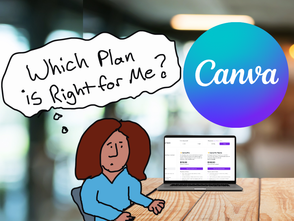
“Ann, how can I make my graphs more accessible??”
Accessibility means different things to different people.
I see two main types: Big A and little a.
- Big A Accessibility means that our graphs meet official accessibility guidelines so that they’re understandable for people with disabilities. In the United States, that means 508 Compliance.
- Little a accessibility means that our graphs are understandable for non-technical audiences; skimmable; and generally not a garbage heap of jargon.
Both Big A and little a are central in my work.
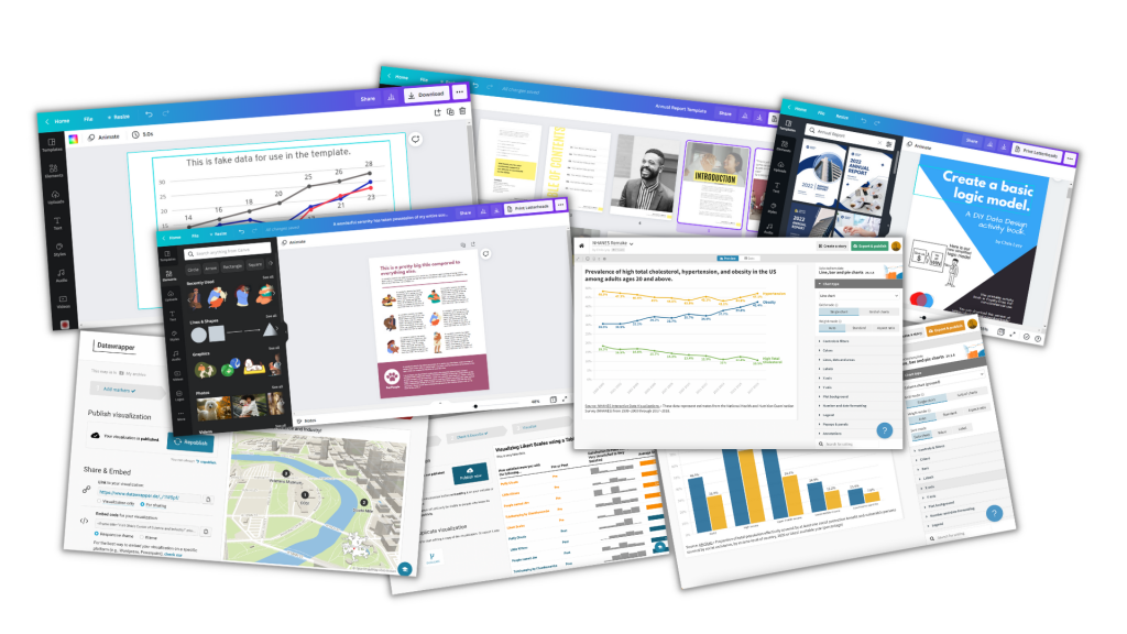
Here’s where you can learn more.
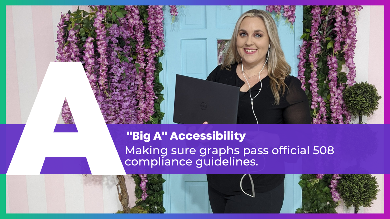
Big A Accessibility
Here’s a (partial) list of everything you’d need to do to pass 508 compliance guidelines.
Directly Label
Remove legends and directly label the data.
Add White Outlines
Outline the touching, filled shapes with white borders (i.e., cells in a heat map, slices in a pie chart, locations in maps, rectangles in stacked bar charts).
Make Sure Graphs are Legible for People with Color Vision Deficiencies
Red-green colorblindness isn’t the only type, but it’s most common.
And, it’s the most problematic for data visualization. We love to use “stoplight coding,” especially in dashboards. We’ve all seen dashboards where green means “we met the target” and red means “we didn’t.”
For people with color vision deficiencies, those reds and greens just look like yellows all blended together.
Tips:
- Avoid red-green color combos (try red-blue, orange-green, or orange-blue for stoplight coding instead).
- Use direct labels.
- Test your drafts.
Make Sure Graphs are Grayscale-Friendly
Printing is less common nowadays, especially with so many people working from home indefinitely. Who wants to pay for their own color ink?!
Your infographics, reports, slideshows, and reports might still be printed.
And they might be printed in grayscale.
Let’s plan for grayscale printing ahead of time to make sure the visuals will still be legible, just in case they’re printed.
Tips:
- Use direct labels.
- Add white outlines.
- Test your draft.
Use Plenty of Color Contrast
The other night, as I was reading my 4-year-old a bedtime story, I was struggling to read the words on the page. The book used colored font against a colored background, and the words were kinda small. Those were all fixable problems!
Tips:
- Don’t use colored text against a colored background. Here’s how to place text on top of photos so that it’s legible.
- Make sure all your colored text (e.g., for headings) is bold.
- Make sure your grays are dark enough. Software defaults are terrible at this. Enlarge and darken those defaults!!
Use Larger Fonts
Increase the font size (I recommend 11+ for documents and 18+ for slideshows, not Excel and Tableau’s puny size 9 defaults).
Again, the software defaults don’t help us here. Their defaults are usually way too small.
Add Alt Text
Add alt text to all images for standalone documents (reports, dashboards, infographics, etc.), including graphs.
Molly Burke’s Instagram is my favorite alt text inspo.
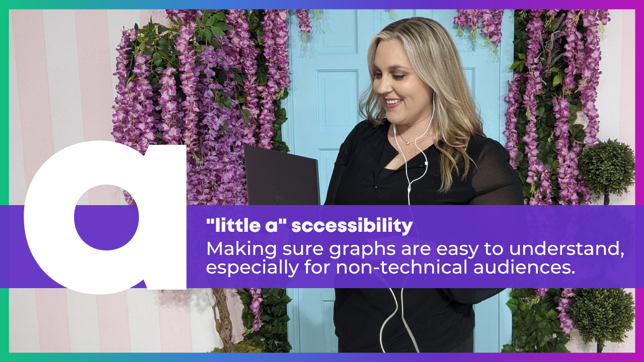
little a accessibility
These are techniques that won’t necessarily help you pass official accessibility guidelines… but are still a good idea if you want to make charts that people actually understand and use.
Actually Use Graphs
Use less text and more graphs!!!
Add graphs alongside those boring bullet points.
Choose the Right Chart
Use Data Storytelling
Use data storytelling, which I define as:
- writing takeaway titles instead of topical titles and
- highlighting one key finding at a time in a darker color.
Color-Code by Category
One of my favorite techniques of all time.
Color-coding by category helps us chunks the information into manageable pieces.
We can color-code in presentations, reports, dashboards, and one-pagers.
Lower the Reading Level
I’ve written about reading levels several times:
- In this blog post, you’ll see a re-written chart title for a conference slide.
- Here are some common data phrases, re-written.
- Here are some common research methods phrases, re-written.
Lower the Numeracy Level
Use a Consistency Text Hierarchy
Make sure all the Heading 1s match, all the Headings 2s match, and so on.
Use Horizontal Text
It’s faster to read than diagonal and vertical text.
Avoid Underlines
Only use underlines for hyperlinks (not for headings).
Avoid ALL CAPS
It feels like shouting and takes longer to read than mixed case letters.
Place Text Next to the Graph
Not on the next page so that it’s faster to read.
Add Symbols and Icons
They make graphs easier to navigate and they boost the memorability of our findings.
- Here’s an example with state icons.
- Here’s how to use the StateFace font.
- Here’s an example with realistic human icons (instead of gingerbread people).
- And the realistic human icons, in a GIF!
Presentation-Specific Techniques
Talk about one thing at a time so that what your audience is hearing and seeing match.
Use a microphone!!! In-person and online. I don’t care if you think your voice can fill the room. It can’t, especially for people who are hearing-impaired. For virtual presentations, purchase a microphone. Or, at the bare minimum, wear the earbuds that came with your phone (because they likely have a built-in microphone). Tinny, echo-y sounds are hard for all of us.
Report-Specific Techniques
Follow the 30-3-1 approach. Limit the body to 30 pages (or less!), and then create a separate 3-pager and 1-pager.
Use visual appendices instead of black and white appendices to make the patterns more obvious.
Dashboard-Specific Techniques
Don’t expect busy, non-technical audiences to interact with your dashboards.
Involve the End Users
Involve the end users in the sensemaking process, e.g., by using data placemats and by following the Choose Your Own Adventure method in presentations.
Listen to what users say they need… but give them what they actually need.
Remember the Humans Behind the Data
Your Turn
Which of these techniques are you already using?
Why techniques might you try in the future?