• Skip to main content
  • Skip to footer
  • Home

The May 13 Group

the next day for evaluation

  • Get Involved
  • Our Work
  • About Us
You are here: Home / Archives for allblogs

allblogs

Oct 28 2021

What is a Slidedoc?

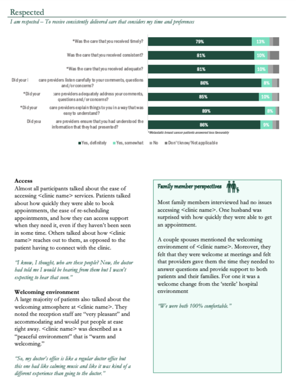
Slidedocs are versatile reporting tools that are an almost ideal format in the visual heavy digital world.

In today’s post.

  • What is a Slidedoc?
  • What is a Slideument? Is it the same thing?
  • The advantages of creating a slidedoc.
  • The disadvantages of creating a slidedoc.
  • Tips for Creating Slidedocs
  • A few example Slidedocs.
  • Shortcut: Creating Slidedocs Using Canva
  • Additional Slidedoc Resources
Freshspectrum cartoon by Chris Lysy.
"Wow, is that the new hire with the shades? Heard that she's really cool."
"Oh, she totally is. I mean I hear she creates her reports in PowerPoint instead of Word. What a rebel!"

What is a Slidedoc?

Slidedocs are visual documents developed in presentation software that are intended to be read and referenced instead of projected.

Slidedocs – Nancy Duarte

Every time I think about slidedocs I get this little tune in my head from schoolhouse rock. “A man and a woman had a little baby.” But instead it becomes, “a slidedeck and a document had a little baby.”

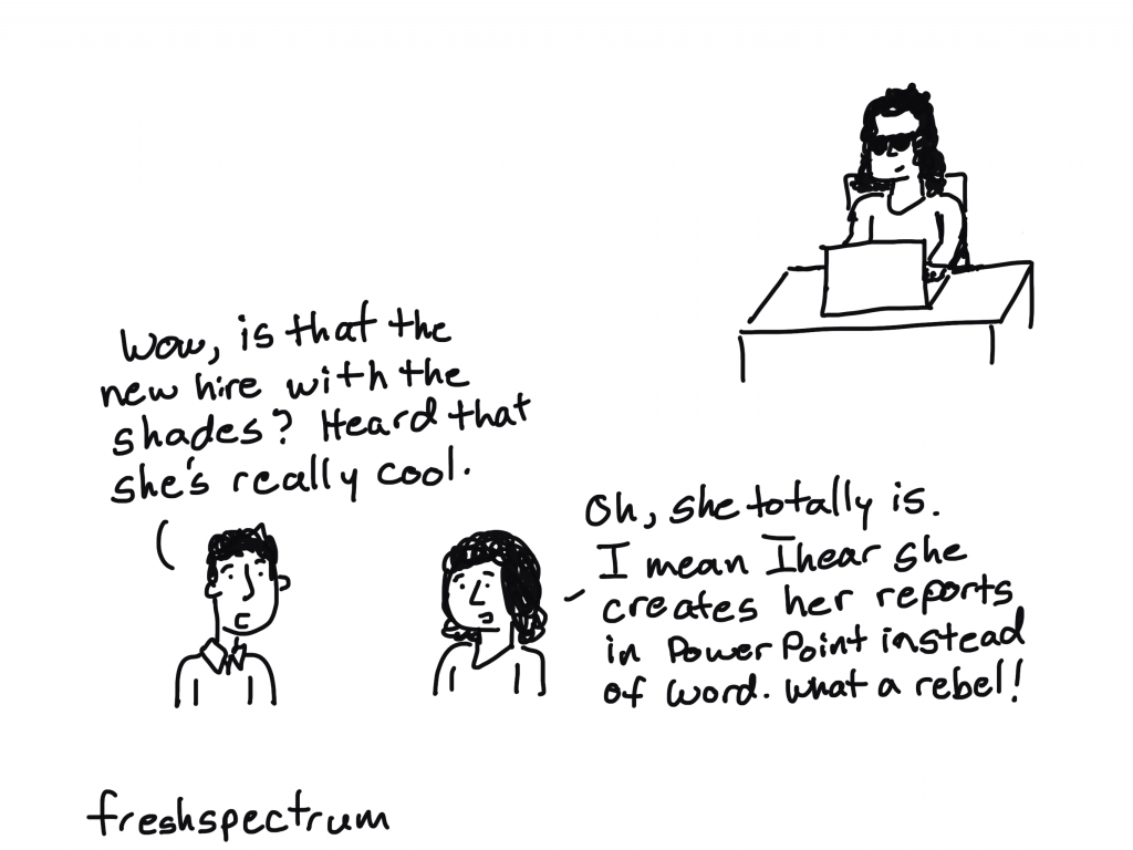
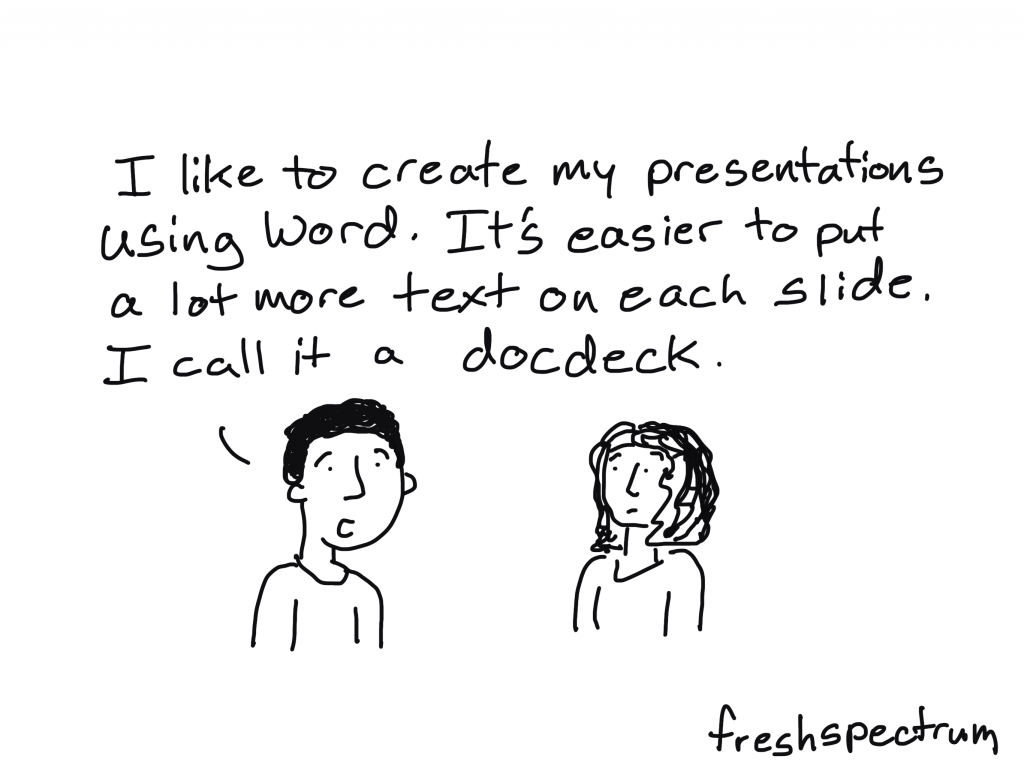
Slidedocs are reports created with PowerPoint. They’re designed to be read, not seen behind a presenter on a stage.

Freshspectrum cartoon by Chris Lysy.
"I like to create my presentations using Word. It's easier to put a lot more text on each slide. I call it a docdeck."

What is a Slideument? Is it the same thing?

So both terms merge two words, slides and documents. But they refer to two different things.

Slideuments, as discussed in 2006 by Garr Reynolds, are by-products of a pretty common conference organizer request. You know when you give a presentation and the conference organizer asks for your slides?

Slides are slides. Documents are documents. They aren’t the same thing. Attempts to merge them result in what I call the “slideument” (slide + document = slideument). Much death-by-Powerpoint suffering could be eliminated if presenters clearly separated the two in their own minds before they even started planning their talks.

“Slideuments” and the catch-22 for conference speakers – Presentation Zen

Modern presentation slidedecks are visual and rely on the presenter to deliver the words. So when a presenter gets asked to share those slides, it can make them feel like they need to up the number of words on the slides or else they are just delivering a bunch of out of context images. This results in a bullet heavy slidedeck that is not quite a report and not quite a presentation.

A Nancy Duarte Slidedoc is a type of visual report. It is intentionally created using presentation software and designed to act as a stand alone report. It is not designed as a presentation.

Freshspectrum cartoon by Chris Lysy.
"The conference prep email said to upload our decks a week ahead. What if we don't plan to use slides?"
"Oh, just upload a blank power point. Attendees never really download them anyway."

The advantages of creating a slidedoc.

  • You probably already know how to use PowerPoint (you don’t need to learn new design tools).
  • It’s way easier to work with visuals in PowerPoint than it is to do so in Word.
  • PowerPoint is also Microsoft, so software conservative (we only use Microsoft stuff) organizations don’t need as much convincing to try it out.
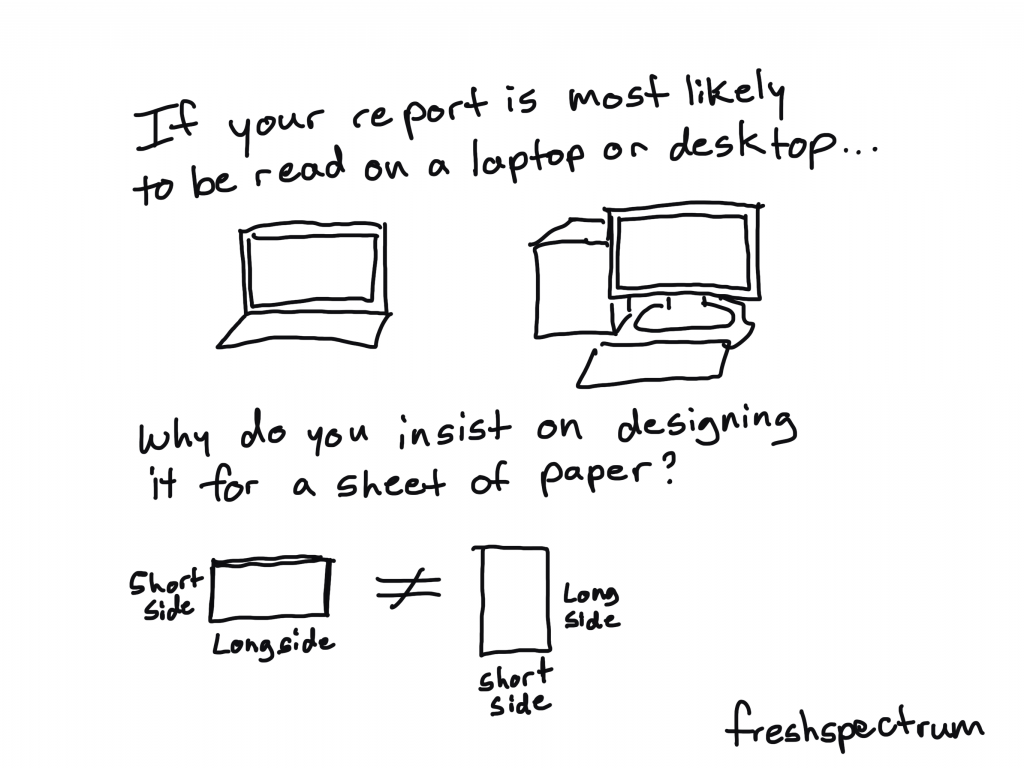
  • Presentation decks are wide format and that is a superior format when most reports are going to be read using computer screens (laptops/desktops).
Freshspectrum cartoon by Chris Lysy.
"If your report is most likely to be read on a laptop or desktop...Why do you insist on designing it for a sheet of paper?

The disadvantages of creating a slidedoc.

  • “Track changes” works better in Word than with PowerPoint or PDFs.
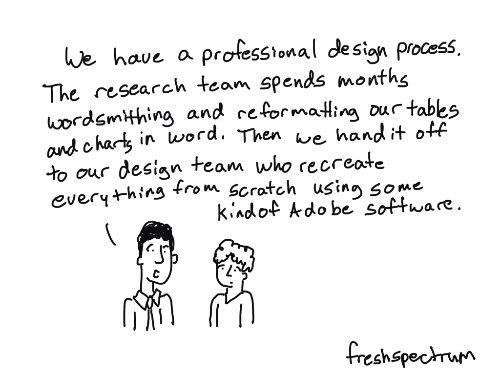
  • Lots of data people still have issues reporting visually, no matter the tool.
  • PowerPoint can be a pretty effective design tool, but it doesn’t match the power of some Adobe Creative Cloud tools.
Freshspectrum cartoon by Chris Lysy.
"We have a professional design process. The research team spends months wordsmithing and reformatting our tables and charts in Word. Then we hand it off to our design team who recreate everything from scratch using some kind of Adobe software."

Tips for Creating Slidedocs

In a Slidedoc, Ann recommends titles that contain the takeaway message. In a slide deck, you can just have the main title. The amount of text for Slidedocs she suggests is full sentences or even paragraphs as it is a report that simply happens to be made in slide software. 

Ann K Emery on Data Visualization and Slide Design [Podcast]

Here are some of my tips.

  • Think like a presenter. One idea per slide, but share enough text so that it can be read without any additional interpretation necessary.
  • Break down confusing slides into multiple slides. It’s better to have more slides that are less confusing than it is to have less slides that are more confusing.
  • Just like people skim regular word reports, they skip quickly through slidedocs. Using headers is important (with takeaway messages). If they are interested enough, they’ll stop and read the rest of the text on a slide. But if the page isn’t relevant, they’ll skip it, and that’s okay.
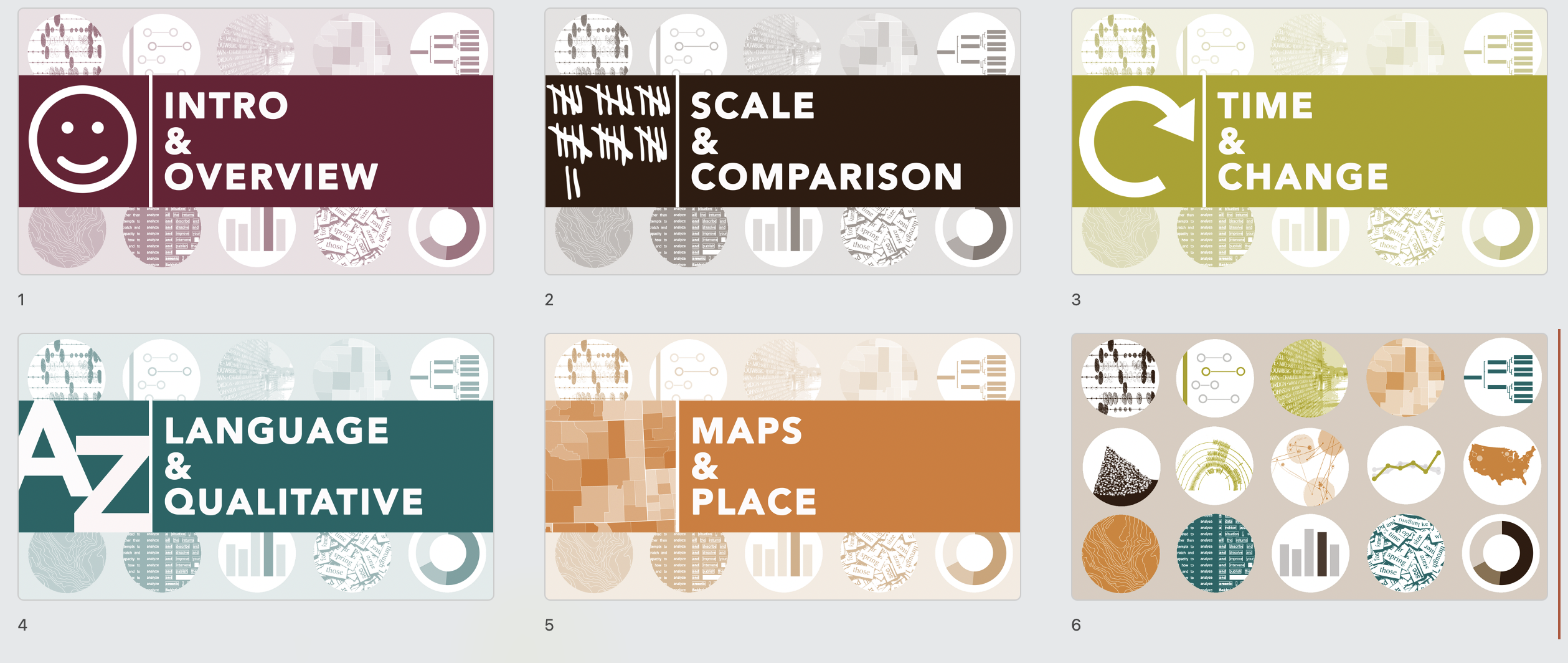
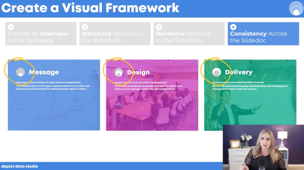
  • Use Section Breaks. Break your slidedoc into sections. When each section is about to start use a section title slide. I like to flip the background color for these title slides. It makes the report feel less like one big long narrative.
  • Export some of your slides as stand along infographics. One of the benefits of a slidedoc is that your slides are perfect featured image dimensions. So create some pages with the idea that they can be exported as stand alone featured image infographics. These are great for sharing on social.
  • Create navigation guides. It’s easy to get lost in slidedocs, so creating a little bar at the bottom of the pages that show which section you are in (and how many sections are upcoming) can be really helpful for your audience.

A few example Slidedocs.

This first example was created by a friend and former colleague, Encompass Senior Communications Specialist, Crystal Cason. I asked Crystal what advice she would give to others considering designing slidedocs.

The key thing for me when helping folks structure their content for slidedocs is to get a really clear outline before going into it. Ideally, if you can “chunk” your information into sections, and then focus on one key message per page (that ideally includes narrative + some visual element), you’ll end up with a really nice end product that users can easily digest.

Crystal Cason

USAID TRANSFORM: Primary Health Care - Slidedoc.
You can see the full pdf slidedoc here: USAID TRANSFORM: PRIMARY HEALTH CARE

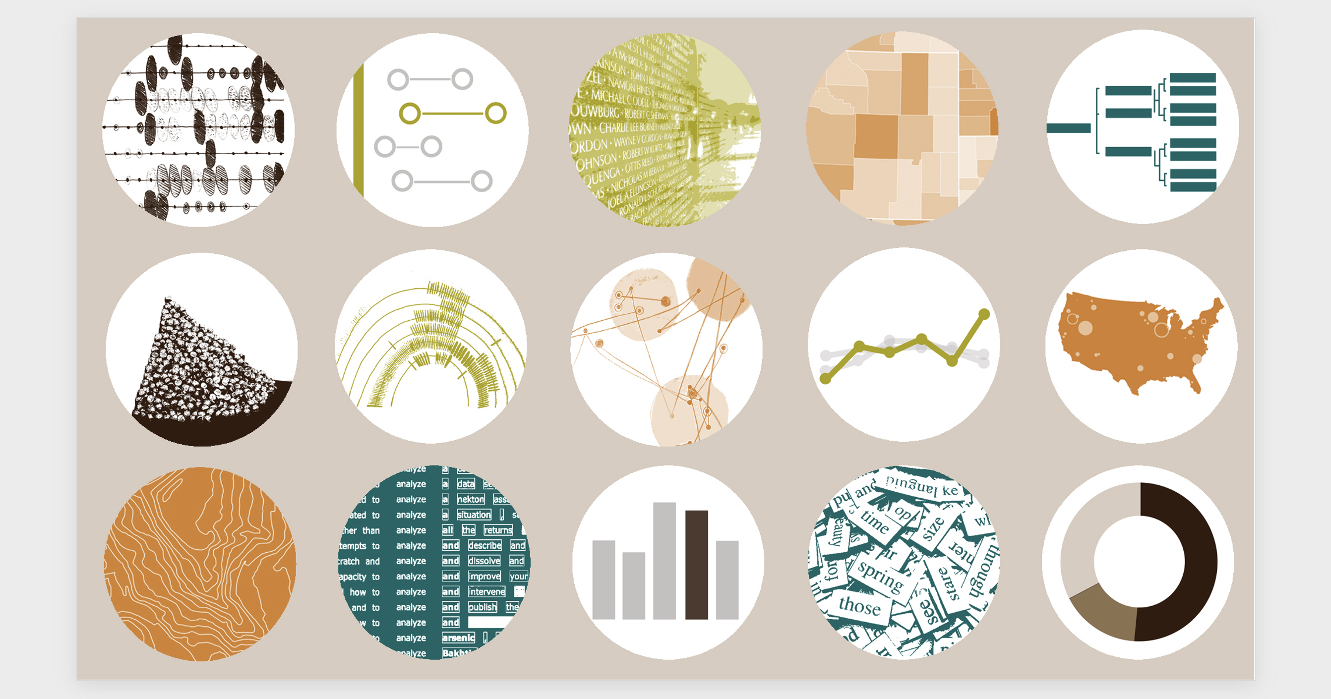
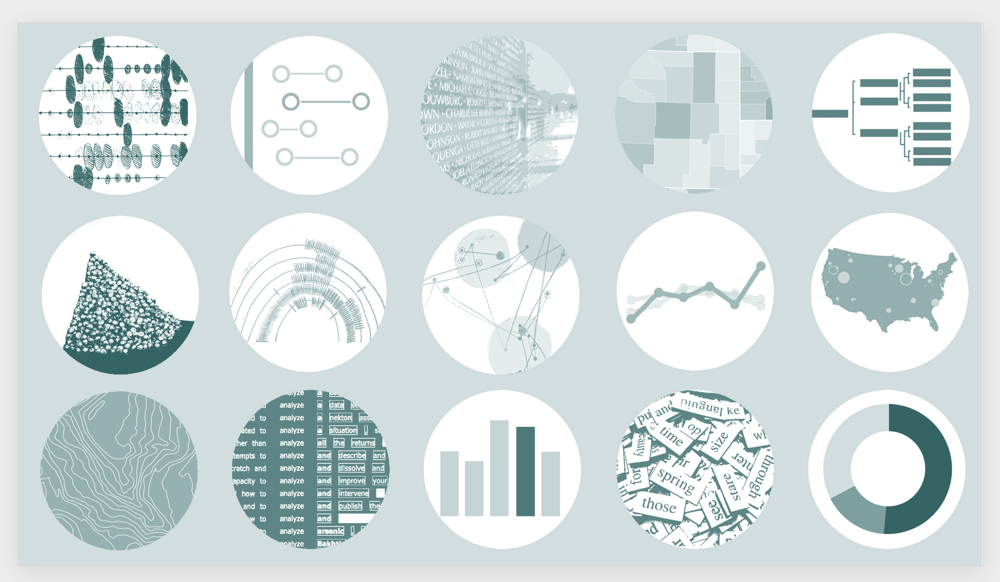
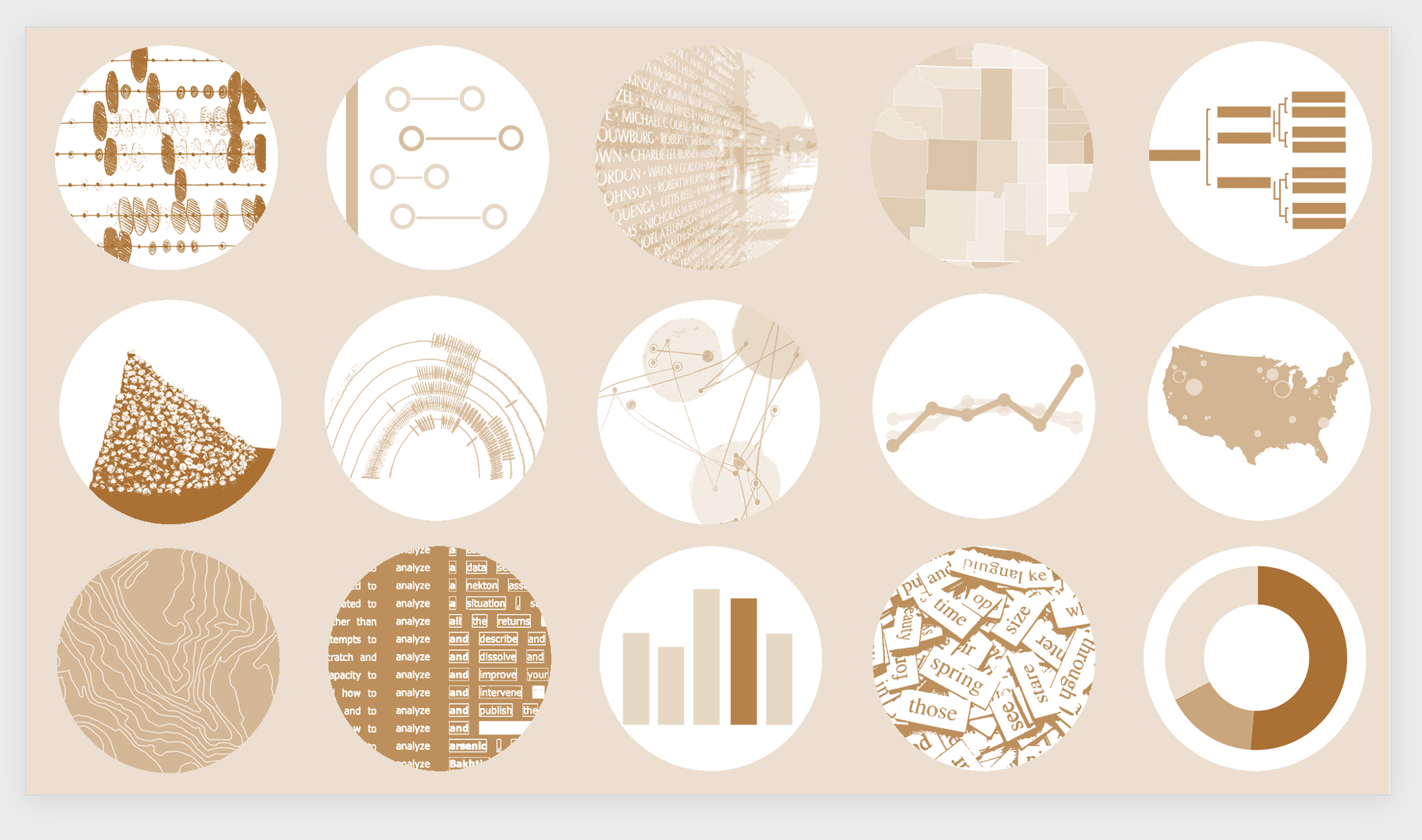
Here is a spread of pages to give you a sense of what it looks like. I really like the way Crystal uses color to differentiate text on the pages. If it were all the same color the pages would like more intimidating. She uses simple section break slides that include these little mini tables of contents. I also really like the section indicator at the bottom of the page.

USAID TRANSFORM: Primary Health Care - Slidedoc. Screen shot of internal pages.

If you want to see a little more of Crystal’s work, she was also behind this slidedoc and this slidedoc.

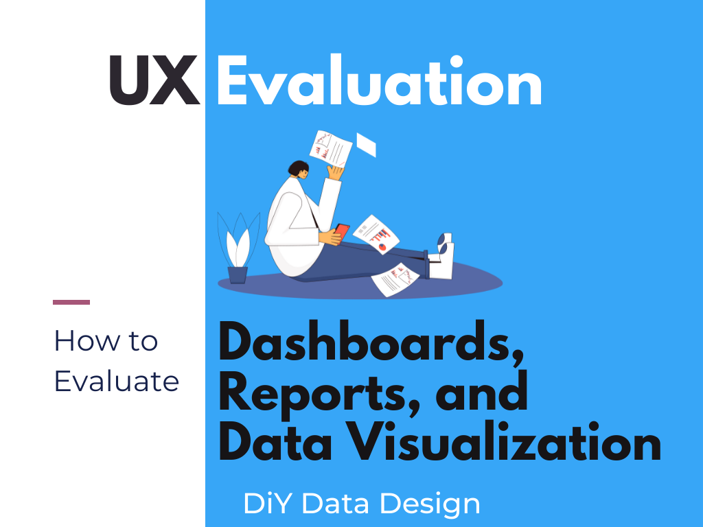
The next example is one of my own. When I create eBooks these days I usually opt for a slidedoc format. You’ll see it at play in several of my eBooks including this one on UX Evaluation.

UX Evaluation eBook Cover

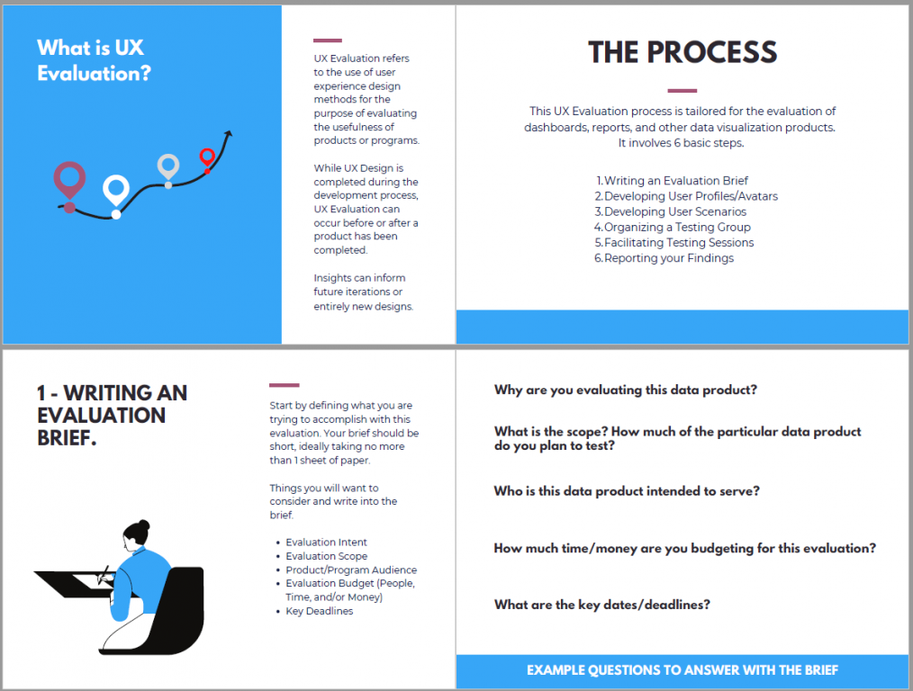
Here is a spread of pages. The format is a really simple repeating structure that features a lot of white space.

UX Evaluation eBook screenshot of internal spread.

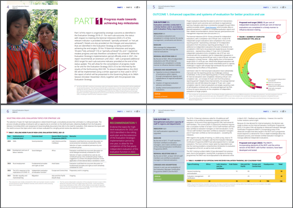
One more example would be this Annual Evaluation Report from the International Labour Organization.

ILO Annual evaluation report cover.

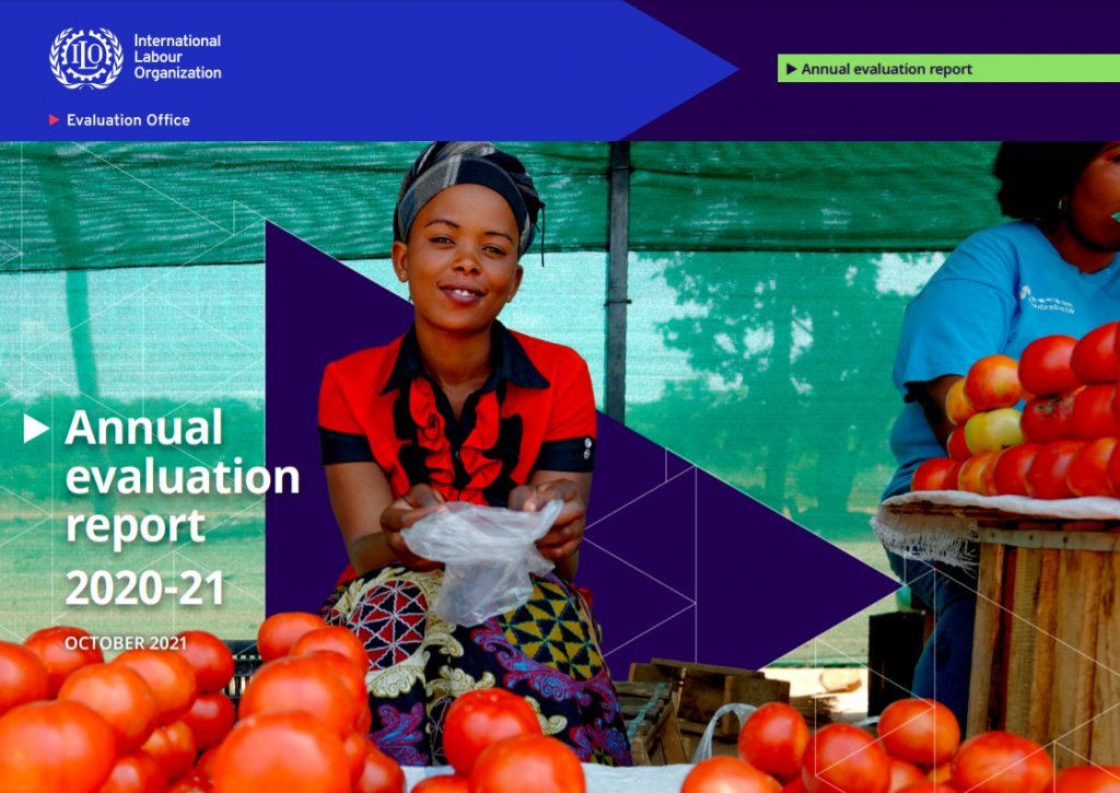
The report feels very much like a well-designed and polished annual report. Compared to the other two examples, this one features a lot more text. But it does feature repeating patterns and more charts/visuals than you would find in a lot of large organization evaluation reports.

ILO Annual Evaluation Report Internal Spread Screen Shot

Shortcut: Creating Slidedocs Using Canva

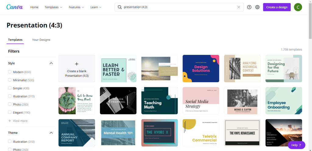
My favorite Slidedoc shortcut is to use canva.

Search Canva for presentation templates (there are a ton). I prefer to use the 4:3 presentation format (you know, the old presentation size). You could use the widescreen format, but a 4:3 prints better (if anyone does decide to print the slidedoc).

Canva Presentation Templates (Screenshot)

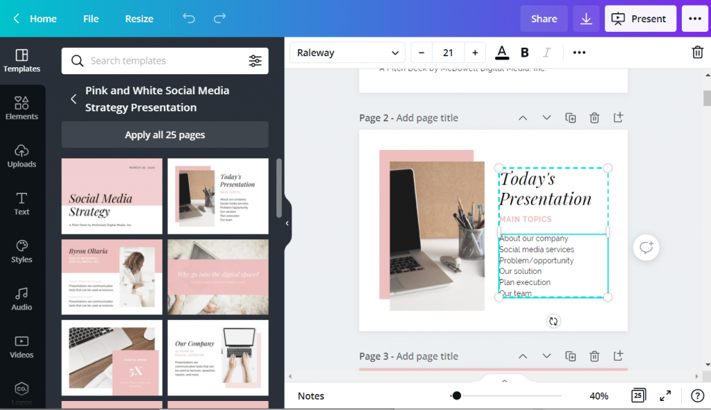
Choosing a template that includes a bunch of internal pages is the easiest way to go.

Since these templates are really designed for a traditional presentation, reduce the font size. People don’t read slidedocs while sitting far away from the screen. You can use 12 point font, but I still tend to keep the headers fairly large.

Canva, working on creating a presentation using a template. Screenshot.

The cool thing about Canva, is even if you start with Canva you don’t have finish in Canva. You can “share” your presentation as a PowerPoint, downloading it to your computer. If you do this, just remember to check it before sending it forward. Sometimes in the shift from Canva into PowerPoint the formatting will get a little askew.

If you just want something that looks exactly as you create it, you can always opt to download it as a PDF.

Canva, saving a presentation as a PowerPoint. Screenshot.

Additional Slidedoc Resources

  • Already mentioned, but definitely download Nancy Duarte’s Slidedoc on Slidedocs.
  • A few years ago Nick Visscher wrote a guest post for Depict Data Studio on How to Write Your Reports in PowerPoint Instead of Word: Nine Tips for Getting Started.
  • Speaking of Ann, she worked with then AEA ED Denise Roosendaal for an AEA Vision Slidedoc. They shared a bit about their process in this AEA365 post. DVR TIG Week: Ann K. Emery and Denise Roosendaal on Fonts, Photos, and Colors: Three Techniques that Reinforce Branding

Written by cplysy · Categorized: freshspectrum

Oct 27 2021

Try This: Prioritizing Data Findings

Try this out and let me know how it goes for you. On the road to becoming grassroots and data driven, it’s tempting to start collecting data as soon as possible to determine your impact. From funders and program participants to community leaders and policy makers, data you’ve gleaned from focus groups, informant interviews, and […]

The post Try This: Prioritizing Data Findings appeared first on Nicole Clark Consulting.

Written by cplysy · Categorized: nicoleclark

Oct 26 2021

A Trick, a Tip and a Thing to Try in Your Next Presentation

Depict Data Studio full courses always end with a graduation ceremony where participants share the progress they’ve made in the course. I’m always amazed by the transformations that take place and I can’t help but want to share their wonderful work!

In this blog post, you’ll learn from Elizabeth Dove. Elizabeth is a professor at the University of Montana who teaches art and design. She also co-directs the Innovation Factory (IF). Thanks for sharing, Elizabeth! –Ann

—–

I teach art and design at the University of Montana, and completed Ann’s Powerful Presentations course during Spring 2021.

I registered for the course because although I have advanced graphic design skills, I still thought I could make more effective presentations by working through the course’s sequential lessons of message, design and delivery.

The course was great, and I’d like to share some of what I learned! So here is one trick, one tip, and one thing to try.

Presentations Trick: Adding Perfect Shapes

Sooner rather than later you’ll need to insert a shape into your slide, and often you’ll want that shape to be a perfect circle or square.

You might have figured out how to enter height and width dimensions to get a perfect square for instance in PowerPoint:

  • Insert
  • Shape
  • Draw a squareish shape
  • Shape Format
  • Enter 2.00” for height and 2.00” for width to make a perfect 2” square

But a faster way is to:

  • Hold down the SHIFT key as you drag out a shape, and it makes it symmetrical in height and width, so you’ll get a perfect circle, square, or triangle, or star every time.

Hold down the shift key whenever you resize as it will keep whatever proportions intact for every shape, just identically scaling it larger or smaller.

I first learned this trick using Adobe software and was pleased it works in the Office suite too, so try it in whatever design software you use frequently if you haven’t already!

GIF showing the steps to make a perfect circle using the shift key.

Presentations Tip: Monochromatic Tints of Brand Colors

In the Powerful Presentations course, we learned how to set-up brand colors, brand fonts, and save them as a custom theme.

This is a time-saver and adds a sense of visual cohesion to any presentation.

Using PowerPoint, I further figured out an easy approach to making title slides where you can quickly switch between colors to tint a photograph, illustration or graphic to match your branded palette. It’s a snap.

A slide with a grid of 12 circles, each with a different image

I started with this design, a grid of 12 circles, each with a different image. My design uses four colors from the brand palette of my university, which are I already setup in PowerPoint as custom colors.

I am developing a new course called “Data Arts,” which introduces basic data visualization techniques as well as the work of contemporary data artists. While I like this design for the course’s promotional material, I found it’s a little too busy and colorful to use as a background for my presentation’s title slides.

But check out this easy alternative:

You can format a slide by right click and selecting "Format Picture".

Double Click or Right Click>Format Picture to bring up the Format Picture menu.

A slide can be formatting using the "Format Picture" menu which allows you to adjust the picture, color and transparency.

Select the Landscape Picture icon>Picture Color>Presets.

By using the preset options in the "Format Picture" menu, you can change the color of your slide.

Pick from options using your brand colors. I prefer the bottom row of options, which adds a monochromatic tint of color over the image while maintaining contrast and brightness.

A slide that has been adjusted using the "Picture Format" menu and is now a shade of green.

With one click, change to try another color.

A slide that has been adjusted using the "Picture Format" menu and is now a shade of orange.

Save and close your file as normal.

Good news – when you return to work on it days later all these choices remain, including just reverting back to your original. This is referred to as “non-destructive” editing in the digital imaging world, and it is such a great feature for experimentation and creativity, because you risk nothing!

Creating Cohesive Title Slides

I quickly created a title slide for use on all my course presentations with the same image as a background, as I think this communicates cohesion and familiarity to my students.

But each time we switch to a new section of the course, the title slides also switch to a new brand color that corresponds to that section, as follows:

Title slides that change colors to signify a different section.

This color tinting technique can be applied to apply to many image types, including screenshots and photographs, giving you a quick win for design cohesion and unity.

For additional control over the intensity of the image, try adjusting Picture Transparency in the same PowerPoint Picture Format menu.

A comparison of a picture of a table and a laptop where one picture is in full color and the other picture has had its transparency adjusted.

Thing to Try

Early in the Powerful Presentations course we had a lesson on Creating a Visual Framework.

In short, the visual framework is a design element – like an icon – that is symbolic of the organizational approach taken within the presentation.

For example, a simple Venn diagram with two parts could be your visual framework, and it would be communicating that two things are being discussed as well as their critical overlapping region.

Using this icon early in your presentation and returning to it throughout the talk or the project helps your audience know where they are in the process, and lets them absorb a lot of information without feeling overwhelmed.

It helps you – the presenter – organize and clarify your thoughts since they fit this visual model.

Simple enough, right?

Well….. kind of.

It’s simple and apparent once you pick your visual framework. But that selection is critical, and I don’t think it’s easy, but I still recommend wrestling with this task.

It is important because it’s making us think visually, so that we can then effectively communicate visually. We have to tap into the most creative part of our brains and pick a visual metaphor.

This metaphor, or framework, is an iconic shape or diagram that will resonate with your audience: maybe a pyramid, a cycle, or a ladder.

Although it is a simple shape it operates symbolically to represent the strategy and approach you are taking with the presentation as a whole. It is making the abstract concrete, its art and its design, and that is tough!

Ann coached us to dive into this territory, while acknowledging its tough. We thought broadly about our topic and what we wanted to communicate and achieve in our presentation. Are we discussing a project that is likely to cycle through sequential steps, looping to renew and begin again? Then maybe something like this circular diagram.

Are you working on a project where disparate entities are operating in tandem, but directly not partnering or collaborating while working towards a shared goal? Then maybe something like these parallel arrows each making progress left to right.

Two examples of icons that can be used: a circular diagram or parallel arrows, both in orange hues.

Does your presentation start with a shared premise and set of conditions, but is expected to branch out in unexpected or experimental ways, somewhat unevenly? Then maybe this is network icon could be the visual framework.

Does your project start with a set of broad foundational skills, that act as a layer to support successive steps, which each get more important and also more refined as you go? Then maybe a pyramid is the right visual metaphor.

Two examples of icons that can be used: a network icon or a pyramid, both in orange hues.

Hopefully you get the idea!

Simple iconic shapes like interlocking puzzle pieces, nested concentric circles, segmented donut shapes or hive-like hexagonal structures are all possible solutions – but each of these visual metaphors communicates a very different approach, strategy or experience to a viewer.

To get started, check out the free resources and download designs to get preliminary ideas from: https://diagrammer.duarte.com/.

How to Use a Visual Framework

Once you do the hard work to pick your visual framework, how do you use it?

Ann suggested four main opportunities, as follows:

  1. Providing an Overview in the Slidedeck
  2. Introducing Sections in the Slidedeck
  3. Reinforcing Sections in the Slidedeck (helps the audience oriented to where they are in the presentation)
  4. Consistency Across the Slidedoc (for branding and polish)
Ann K. Emery explains how to use a visual framework in the Powerful Presentations course.

I applied my visual framework in each of those four categories, and appreciated the icon’s value in helping me organize and improve the visual cohesion of my presentations.

But I see the significance of designing a visual framework as so much more. The effort to pick the right visual metaphor transformed the way I understood my own content and how I should be teaching it.

By thinking through the symbolism of hierarchies, nested shapes, steps or cycles I found myself inspecting the content of my course in important, deep, and insightful ways.

By asking myself to design a visual analogy – this simple icon/diagram – I had to address the themes and intentions of my projects and my approach to communication early in my process.

Vital work! Try it!

Connect with Elizabeth

LinkedIn: @elizabeth-dove-406

Website: www.elizabethdove.com

Written by cplysy · Categorized: depictdatastudio

Oct 26 2021

Fresh Start Effects and Change-Making

“The best time to plant a tree is 20 years ago. The second best time is now”

– The Internet.

The above quote points to two key truths about change-making: It’s always possible to create a new start and starting matters.

If you are looking to create change within your organization, team, or yourself you need to start somewhere. While it might be true that starting saving for your future makes a bigger difference when done early, that doesn’t negate what you can do today.

Starting and Starting Over

We don’t need elaborated moments for making change happen and waiting for the perfect opportunity to take action is usually a means of avoidance. We just need a new beginning.

The good news is that it’s available to us at any time.

Research by Katy Milkman and others has shed light on why we often use significant dates — things like birthdays, anniversaries, or calendar changes – to make a change happen. This is called the Fresh Start Effect.

Milkman’s research suggests people are much more likely to start and sustain changes if anchored to a specific date or event and that using a ‘start’ can enable them to re-start change attempts that fail. Considering that many of our change attempts end in failure, this is significant.

How To Fresh Start

What does a fresh start look like in practice? The first thing is having a date — the planned start to the change. Your date needs to be significant although that significance can be arbitrary. Whatever the reason, your date must have some meaning to you (and those you’re working with).

The second issue is commitment. Take the date seriously. It’s why anniversaries or significant cultural events (e.g., back to school, New Year’s Eve, holidays) are often chosen – they are symbolic.

The third is a need for persistence. Persistence means continually working on the change even if it starts to fail. The exception is if the change no longer is needed. If you fail, start again.

Evaluation is the last thing you need to do. Evaluate your efforts, make the feedback visible, and make changes to your strategy if it is not producing results.

Bring these together and you can create a new beginning today to create a better tomorrow.

Go plant that tree.

Do you need or want help setting this up for you and your organization? We work with leaders, managers, and founders to create change in people and organizations and create a fresh start for them. Contact us to learn more.

Photo by Johann Siemens on Unsplash

The post Fresh Start Effects and Change-Making appeared first on Cense.

Written by cplysy · Categorized: cameronnorman

Oct 25 2021

Evaluation Report Inspiration: Excerpts From A Breast Cancer Clinic Evaluation


Evaluators do not often share their evaluation reports. The organization or client that the evaluator works for usually owns the report, which can make sharing them difficult. But sometimes it can be helpful to see what and how information is presented in an evaluation report.

A few years ago, we completed an evaluation for a breast cancer clinic. In honour of Breast Cancer Awareness month, we thought we would highlight some excerpts from that report to help inspire your next evaluation report!


  1. Describing the evaluation

In our reports we like to acquaint the audience with an overview of the evaluation near the beginning of the report. In the evaluation overview, we try to provide a high level understanding of the evaluation plan and how it was developed.

For this evaluation, the stakeholders requested we include an abbreviated stakeholder matrix that we co-created at the beginning of our evaluation planning.  

 An evaluation can’t be all things to all people, and by including a stakeholder matrix identifying the primary intended users, we showed that all stakeholders were considered and involved in the evaluation in some way (as outlined in the “nature of involvement” column).

This evaluation had four focus areas:  

  1. Describing the model of care,  

  2. Reporting on patient outcomes,  

  3. Reporting on health provider outcomes, and  

  4. Describing the costs.  

Each focus area had corresponding evaluation questions. These questions were answered using mixed methods. We don’t want to overwhelm the reader by going into the detailed minutia of our methods, so usually we append that at the back of the report and include a high level overview of our data sources near the beginning of the report.

2. Describing the clinic

In this evaluation we needed to describe the clinic and its model of care (see evaluation questions under model of care). We did so using narrative and a number of figures, including the ones below.

This figure was created using PowerPoint and shows a breast cancer patient’s journey and the clinic’s role in that journey.

Logic Models can be a great communication tool to describe a program. There was a more detailed logic model created for this clinic; however, for the purposes of this report we simplified it to this one-page overview using SmartArt. (We know SmartArt isn’t for everyone! Check out this article by Dr. Echo Rivera for some SmartArt alternatives.)

3. Describing the findings

We collected survey data and interview data from patients and family members. We wanted to present that information in a cohesive way instead of using headings like “patient survey findings,” “patient interview findings,” and “family interview findings.” Instead, we used the Canadian Partnership Against Cancer’s pillars of a positive patient experience frame how the results were reported.

We showed the relevant survey findings and incorporated interview findings from both patients and family members. Family member perspectives were highlighted with a call out box and an icon to cue the reader that the information was from family members and not patients.


Unfortunately, we can’t share with you excerpts from the report where we helped interpret the findings and recommended next steps, since these are specific to the clinic and their stakeholders. However, we hope we have provided you with some inspiration to help inspire your next evaluation report. 

If you’re looking for more reporting ideas and inspiration, check out our Six Hacks For Renovating Your Evaluation Report series of articles. Or feel free to reach out to one of our Eval Academy coaches.  


Sign up for our newsletter

We’ll let you know about our new content, and curate the best new evaluation resources from around the web!


We respect your privacy.

Thank you!


Written by cplysy · Categorized: evalacademy

  • « Go to Previous Page
  • Go to page 1
  • Interim pages omitted …
  • Go to page 156
  • Go to page 157
  • Go to page 158
  • Go to page 159
  • Go to page 160
  • Interim pages omitted …
  • Go to page 310
  • Go to Next Page »

Footer

Follow our Work

The easiest way to stay connected to our work is to join our newsletter. You’ll get updates on projects, learn about new events, and hear stories from those evaluators whom the field continues to actively exclude and erase.

Get Updates

Want to take further action or join a pod? Click here to learn more.

Copyright © 2026 · The May 13 Group · Log in

en English
af Afrikaanssq Shqipam አማርኛar العربيةhy Հայերենaz Azərbaycan dilieu Euskarabe Беларуская моваbn বাংলাbs Bosanskibg Българскиca Catalàceb Cebuanony Chichewazh-CN 简体中文zh-TW 繁體中文co Corsuhr Hrvatskics Čeština‎da Dansknl Nederlandsen Englisheo Esperantoet Eestitl Filipinofi Suomifr Françaisfy Fryskgl Galegoka ქართულიde Deutschel Ελληνικάgu ગુજરાતીht Kreyol ayisyenha Harshen Hausahaw Ōlelo Hawaiʻiiw עִבְרִיתhi हिन्दीhmn Hmonghu Magyaris Íslenskaig Igboid Bahasa Indonesiaga Gaeilgeit Italianoja 日本語jw Basa Jawakn ಕನ್ನಡkk Қазақ тіліkm ភាសាខ្មែរko 한국어ku كوردی‎ky Кыргызчаlo ພາສາລາວla Latinlv Latviešu valodalt Lietuvių kalbalb Lëtzebuergeschmk Македонски јазикmg Malagasyms Bahasa Melayuml മലയാളംmt Maltesemi Te Reo Māorimr मराठीmn Монголmy ဗမာစာne नेपालीno Norsk bokmålps پښتوfa فارسیpl Polskipt Portuguêspa ਪੰਜਾਬੀro Românăru Русскийsm Samoangd Gàidhligsr Српски језикst Sesothosn Shonasd سنڌيsi සිංහලsk Slovenčinasl Slovenščinaso Afsoomaalies Españolsu Basa Sundasw Kiswahilisv Svenskatg Тоҷикӣta தமிழ்te తెలుగుth ไทยtr Türkçeuk Українськаur اردوuz O‘zbekchavi Tiếng Việtcy Cymraegxh isiXhosayi יידישyo Yorùbázu Zulu