You may have heard a data expert or two talking about data storytelling. But before you can tell a story, you need to find a story. This post walks through some strategies on how to do just that.
In today’s post.
- The Graph is NOT the Story.
- What is data storytelling?
- Being able to find good stories is as important as good storytelling.
- Sometimes the story just hits you in the face.
- Putting the data into a line graph.
- Surrounding the data with context.
- Disaggregating interesting data points.
- By viewing the chart through a single data point.

The Graph is NOT the Story.
I’ve heard lots of people say that data visualization is storytelling. But I always thought that was a bit disingenuous.
For me, data visualization is not storytelling, it’s story illustrating. The story itself is always much bigger and more meta than the chart or graph could ever hope to become.
It’s why Marvel can make millions upon millions of dollars adapting comic books into movies. Because the super hero stories don’t just make good books, they also make really good blockbuster action movies.
What is data storytelling?
While interpretations vary, most experts describe data storytelling as the ability to convey data not just in numbers or charts, but as a narrative that humans can comprehend.
The next chapter in analytics: data storytelling – MIT Sloan
There are some people in this world who tell fascinating stories.
I had a sociology professor in grad school who told some amazing stories. Talking about interviewing in opium huts or playing underground poker under the watchful eyes of the local police captain. But those great stories came from a life that was rich with experience.
Not all datasets are story rich. And while you might be able to package any data into a narrative format, that won’t make it a good story.
Good stories don’t just exist because someone knew how to tell a story. They just exist, and we need to find them before we can visualize them.
Being able to find good stories is as important as good storytelling.
In a lot of ways story finding is really just data analysis.
A good analyst has an ability to find stories in datasets. While they might not be able to package the story, they can often pull up a chart or graph and walk you through what they see.
Finding good stories in datasets is a skill that most graphic designers do not have, because it’s a skill that takes years of practice. It’s the reason that my workshop focuses on helping data people become designers and not the other way around. I find it easier to teach someone who can find data stories how to package them into stories than to show someone who can design well how to find data stories.
But no matter where you fit in that spectrum, here are some strategies for finding the stories in your data.
Sometimes the story just hits you in the face.
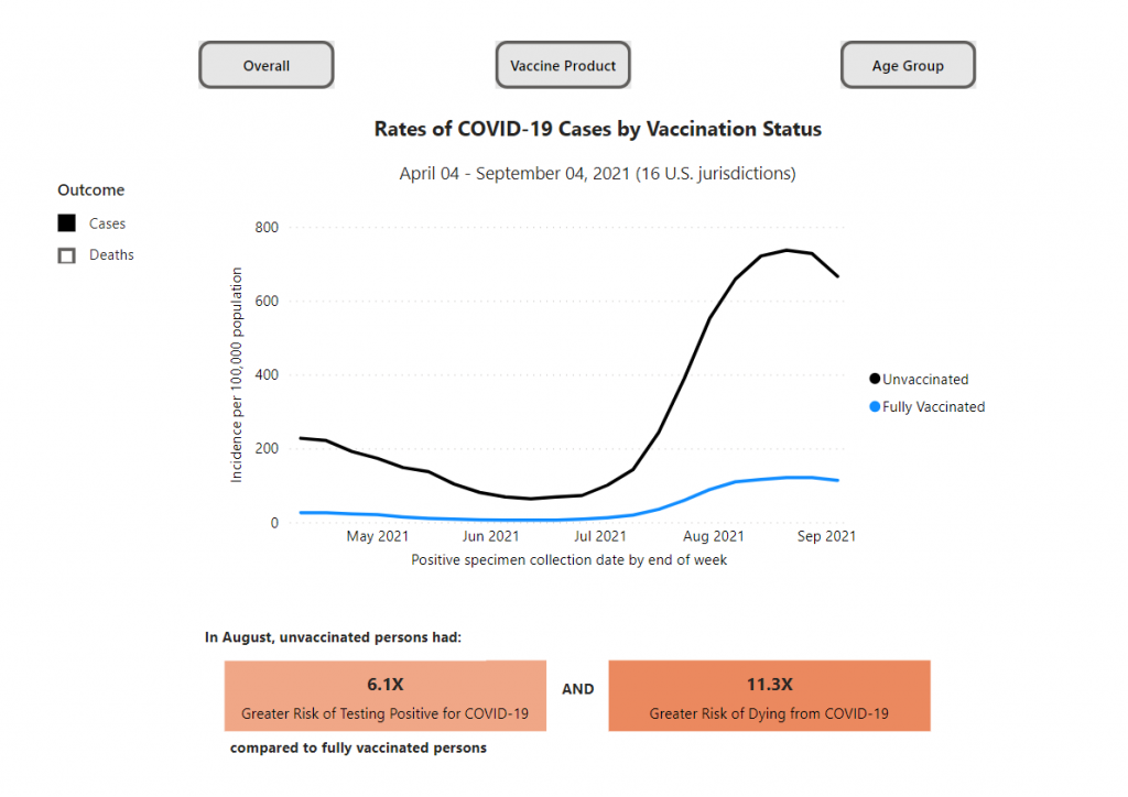
Not all data stories require a lot of additional insight to find.
Take this chart from the CDC’s COVID Data Tracker. It shows the different rates of COVID-19 cases by vaccination status. The big story is pretty simple, unvaccinated people are at a greater risk of testing positive for COVID-19 and an even greater risk of dying from COVID-19. And when we see an overall case spike, that difference gets amplified.
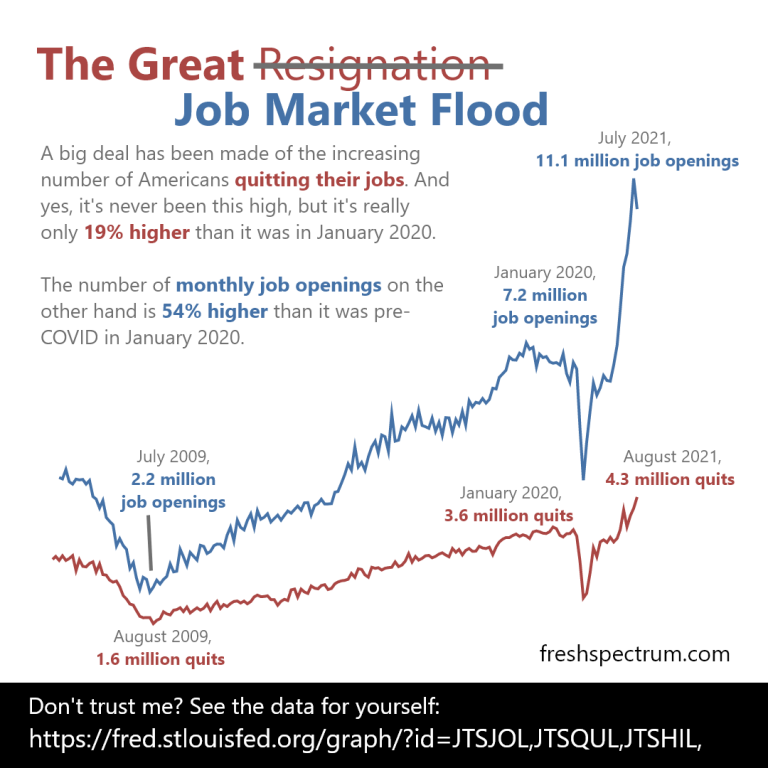
Putting the data into a line graph.
Narrative is often defined as a sequence of events. And given that line graphs are really representations of data over time, they make for really solid story telling devices.
You can find stories by putting your data into line graphs. Since the graph walks the data through time, your goal is talk through the parallel narrative. What does a spike in your line graph signify? What about a dip?
Since people are going to read your line graphs from left to right, annotations offer the chance to layout the story point by point.
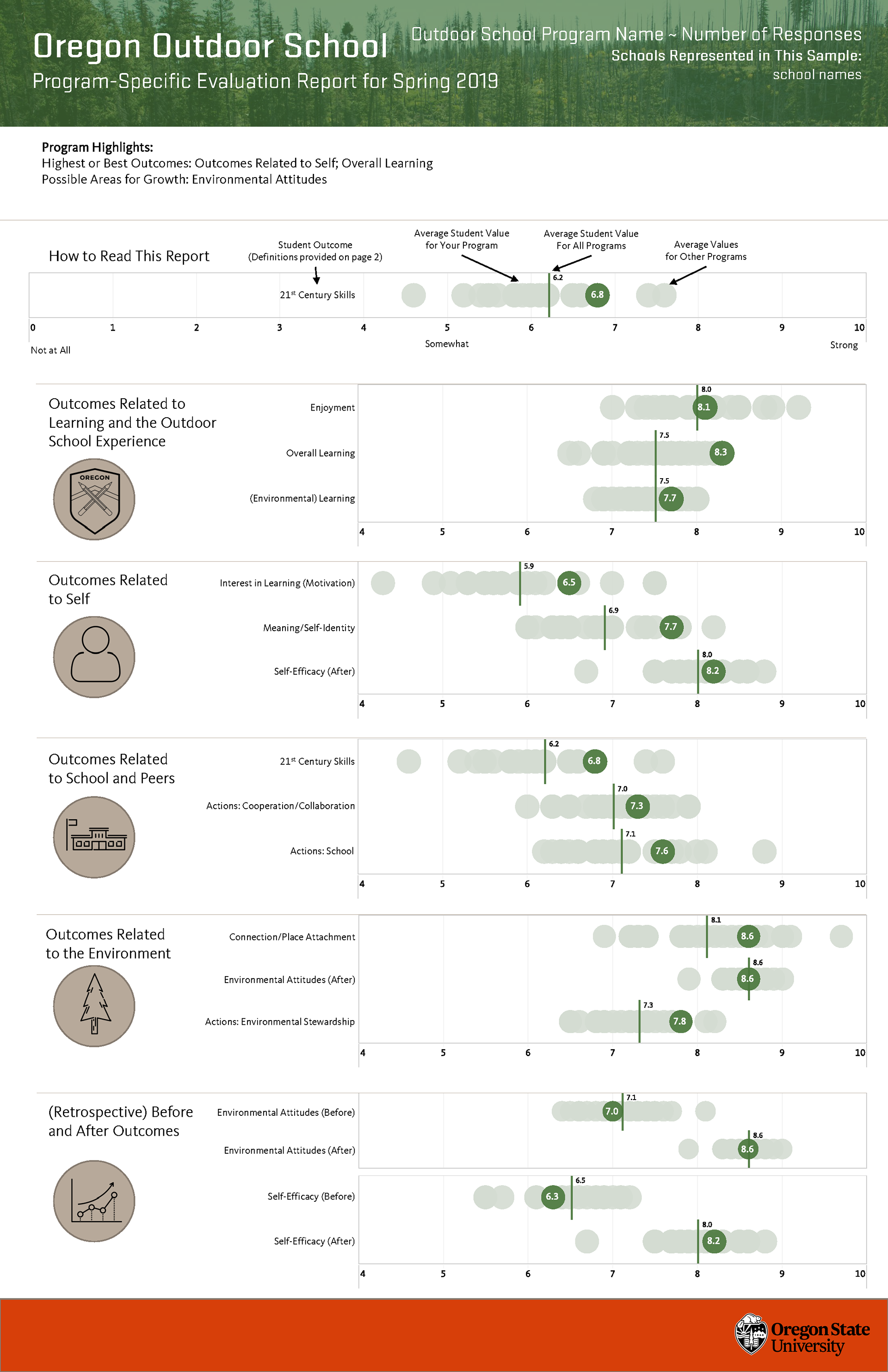
Surrounding the data with context.
In research and evaluation we use a lot of descriptive statistics. Means, medians, and standard deviations can be helpful when trying to interpret a dataset. But descriptive stats often take data out of the original context.
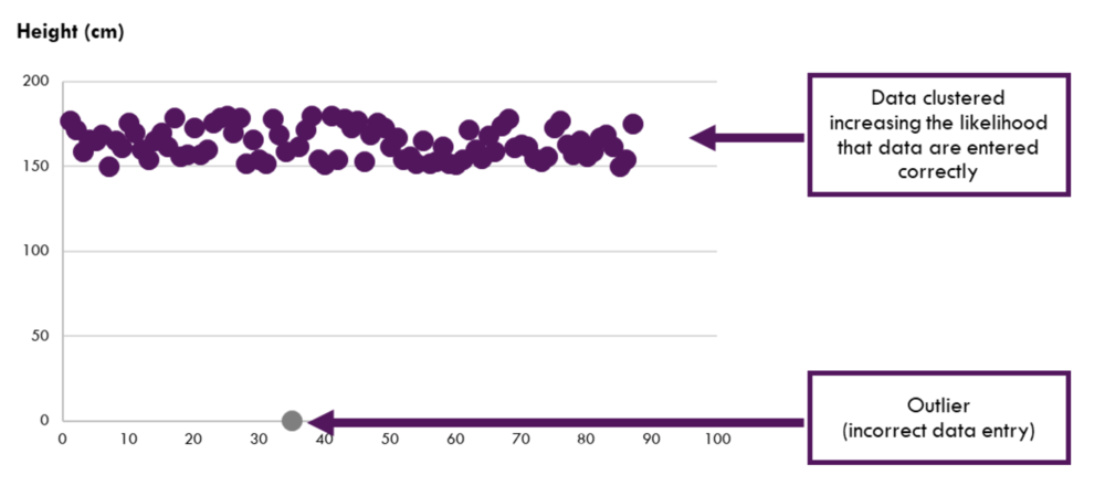
One easy way to find stories in data is to add the context back into the picture. Yes, if the average is important visualize the average. But if your dataset is not too large, which includes many research and evaluation datasets, showing all the data gives you more to draw upon.
For instance, it’s one thing to tell the story that your program is performing above average. It’s another story entirely to say that you are performing better than all other programs for a particular indicator.
Disaggregating interesting data points.
If you have a percentage, step back and look at the underlying frequencies. Every percentage started with a numerator and denominator, look at those numbers. Do this even if you have to estimate the numbers based on the percentage.

By viewing the chart through a single data point.
If you are having trouble finding a larger story sometimes it’s helpful to focus on a singular data point. If every point is a person, try to see the data through the person’s eyes. What does the data say about their experiences. Whenever possible this is also a place for exploring supporting qualitative data.
I know I’ve done this in the past but I couldn’t find an example of my own to share. So here is an example from a USAID infographic. The data source for this infographic is certainly not individualized. But the infographic switches the perspective when talking through the data.

What other story finding approaches have you used in your own work?
If you have an approach I would love to hear it. Just leave me a comment below.