• Skip to main content
  • Skip to footer
  • Home

The May 13 Group

the next day for evaluation

  • Get Involved
  • Our Work
  • About Us
You are here: Home / Archives for allblogs

allblogs

Apr 28 2020

18 Resources helping me in work and life with Covid-19

The resources designed to help us adapt to Covid-19 don’t match up with our lives right now. Every day, I sit down at my kitchen table — the same table where I (used to) host dinners and put together puzzles — in front of a make-shift workstation where I do my job. My living space is also my workspace. We’re managing a whole new definition of work-life balance right now and it turns out work is part of our lives.

Most of the resources I have been reading lately haven’t acknowledged this simple fact. Good-intentioned people with great ideas are writing about one or the other: adapting personally to cope with crisis and being at home or adapting our evaluation designs to keep up with a rapidly changing environment. But I — trying to do my office job from my kitchen table — need both.

Like many of you, I am struggling with the uncertainty of the pandemic, of feeling disconnected from what and who I love most in the world, and managing the implications of health risk, unemployment, and economic downturn in my work. My reading has helped me cope personally and professionally with the effects of this pandemic. And I am starting to adapt. I am seeking resilience, new ways to stay connected, and adapting my day-to-day job in the evaluation-sphere.

I’ve compiled below some of the resources I’ve found that have helped me both personally and professionally, sourced from great evaluation minds in our field, from mental health professionals, and from others whose voices have risen above the fray to provide value. Did I miss one? Please share your favorites in the comments.

Finding resilience within ourselves.

Yesterday, the first person I knew personally died from Covid-19. This once-in-a-century pandemic has created a lot of fear — for the health and stability of ourselves and our loved ones — and grief — for the loss of our lives as we knew them. And we don’t know how long this will last. I don’t think I’m alone in feeling a constant dark cloud around us and fighting through that cloud to find laughter and productivity.

Here are some resources I found helpful to connect to my own resilience:

  1. Living (and Working Virtually) in Uncertainty (Interaction Institute for Social Change, Cynthia Silva Parker): This was the first article to go around our office after the pandemic hit, and still may be my favorite. It helped me reflect on what is important right now, and how I can set a foundation in a time when I feel like the earth is moving under my feet. The ideas are grounded in relationships and collaboration — which mirror my own view for how we can get through together.
  2. Moving from Fear to Growth: Navigating Collective Trauma (Brodie Welch): This reflective article at once challenged me to think about how I am responding to Covid-19, while making me feel OK to not feel OK all the time.
  3. That Discomfort You’re Feeling Is Grief (Harvard Business Review, Scott Berinato): “If we can name it, perhaps we can manage it.” I appreciated this article because it gave permission for us to be affected by the change in our everyday lives, even if it is temporary, and even if we are healthy and seemingly fine. It goes into the different types of grief we are feeling and helped me think of new ways for managing it.
  4. The Three Equations for a Happy Life, Even During a Pandemic (The Atlantic, Arthur Brooks): As an evaluator, I especially appreciated having mathematical equations to consider when figuring out how to get out of my “Corona-funk.” In breaking down theories for what can make us happy, I can consider what ratio of ingredients will help me find resilience.

The organizations we love are also seeking that resilience inside themselves right now.

  1. Resiliency Guide (SDBJR Foundation): I just found out about SDBJR Foundation’s resources related to organizational resilience — including a breakdown of what makes for a resilient organization, a resiliency guide, and a list of resources to learn more.

Adapting our evaluation strategies and plans.

My clients have changed requirements for grantees and are funding additional measures specifically related to Covid-19. They are wondering how to measure their response. I am also working through some of our longer-standing evaluations — I am in the third year of a three-year evaluation and am striving to find relevance for today’s changed world while respecting the work and outcomes from the first two years. I’ve been seeking guidance for how to adapt my evaluation approach and be useful to those conducting important work for all of us right now.

Here are some resources I found helpful when contemplating the impact on my evaluation work:

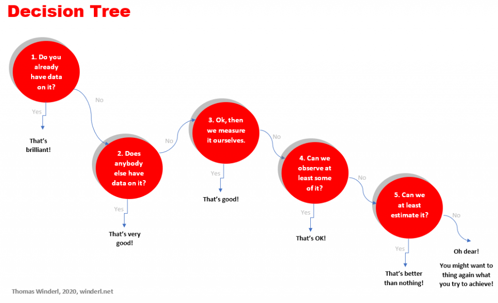
  1. Evaluation Implications of the Coronavirus Global Health Pandemic Emergency (Michael Quinn Patton): MQP does not disappoint in his list of 15 ways evaluators should be adapting now with Covid-19. His list looks like a how-to for developmental evaluation — that’s just the reality of the world we’re in right now.
  2. The Evaluation Mindset: Evaluation in a Crisis (Chris Lysy): Our favorite evaluation cartoonist shares his rambling yet pithy thoughts on what we should be doing as evaluators right now. He captures some of the same developmental concepts of MQP with some additional refreshing reminders to breathe and fun visualizations.
  3. Deciding Well in Tumultuous Times (Ian David Moss): I thought this post got really good around “How do I deal with uncertainty” and “How do I know if I made a difference,” two questions I am grappling with right now. He provides a framework for making smart decisions and thoughtful advice to focus on process rather than impact in this moment.
  4. Spring Coffee Break Webinar Series (Public Profit): I just signed up for several of the relevant (and free!) webinars from Public Profit — including one on virtual focus groups and sustaining evaluation in the midst of disruption.

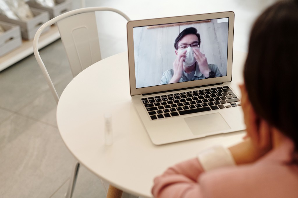
Moving to virtual meeting spaces.

In the best-timed professional development choice ever, I managed to take TOP’s virtual facilitation course right before the pandemic hit the US. It was a great course and resulted in our organization buying a license for Adobe Connect to access some of the great interactive tools available on that platform as events are cancelled and moved online. But if you’re not running highly interactive, intensive sessions with colleagues and clients — or just don’t have the funds — there are a lot of core principles and just good tips in general out there.

Here are some resources I found helpful when planning virtual meetings:

  1. A Quick Primer on Running Online Events and Meetings (Better Evaluation, Emma Smith) — This article deals with common, practical solutions to holding virtual meetings. I’m so glad she included descriptions of virtual seating charts and including a “tech helper” — tips I’ve learned along the way in isolation that Beth handily pulls together in one comprehensive how-to.
  2. How To Facilitate Effective Virtual Meetings (Beth Kanter): I especially loved the diverse virtual engagement option for collaborative and interactive meetings that Beth includes in her guide. She is the nonprofit guru, and knows that most meetings in nonprofit spaces are women-run and highly collaborative. Her meetings are the kind I want to create.
  3. Virtual Communication: Presenting with Empathy (Duarte): This is the recording of a webinar I attended that I found particularly helpful. Executive Speaker Coaches Doug and Nicole go into the specifics of practical details, like what to do with your hands on camera. Definitely worth a watch.
  4. Online Meeting Resources Toolkit for Facilitators (Crowd-sourced): This is a live google doc with facilitation resources that hundreds (it seems like??) of people have contributed to since the onset of Covid-19. I found it kind of a lot to sort through, but just that this exists and seeing all the collaboration that went into it is inspiring.

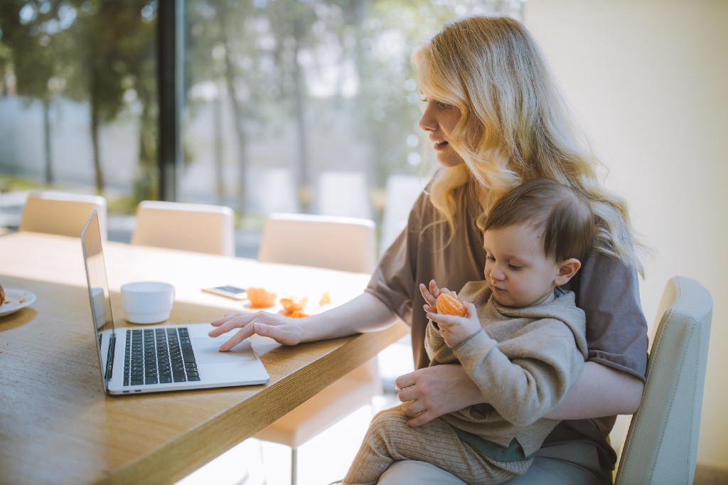
Working at home. All. The. Time.

I’ve been having some serious neck pain lately, and it’s because I don’t know how to work at home every day (That, and I may have to admit my thirty-something body isn’t what it used to be). I wasn’t as prepared as I thought I would be when we all got sent home with our laptops. I’m lucky in that I don’t also have to worry about child care, homeschooling, or taking care of an ill relative — we are all figuring out how to manage this new work-from-home life.

Here is a resource I found helpful to adjust to working at home:

  1. 26 WFH Tips While Self-Isolating During the COVID-19 Outbreak (Healthline): I liked the practicality of these tips for working at home — there’s something for everyone. I was drawn to the tips for those who don’t have an ideal WFH set-up and how to take effective breaks — but there’s also tips for people who experience anxiety and who have kids at home.

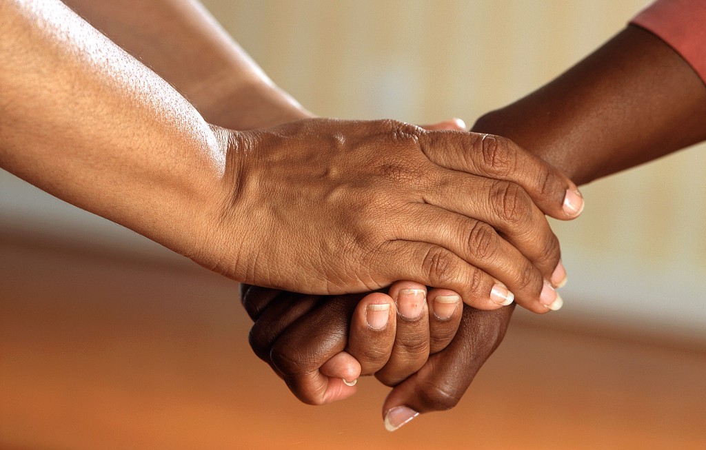
Admitting we need (to) help.

There are so many great ways to help right now that this is nowhere near comprehensive. But I can’t write a post about adapting to Covid-19 without acknowledging how deeply the pandemic is affecting the most basic needs not just of ourselves but of so many around us.

Here are resources I found particularly pithy for finding and giving support right now:

  1. FindHelp.org: This website helps you find local services to provide food assistance, help paying bills, and other free or reduced cost programs, including new programs for the COVID-19 pandemic — all based on your zip code.
  2. How to help the helpers (New York Times, Nancy Wartik): My roommate works in a hospital and I know first-hand the stress experienced at the front lines. I really valued the various and holistic options presented to support workers in this article. I know there’s a lot of attention on the other essential workers in the pandemic right now (from warehouse workers to grocery store employees to mechanics) and I think a lot of these suggestions can apply to anyone in those spaces.
  3. This is the wake up-up call for nonprofits and foundations to get political (Nonprofit AF, Vu Le) — If we really want to make a lasting difference, we need to talk about systems-change. That’s a job for politics. I love the norm-crushing language used in this post for norm-crushing times.


18 Resources helping me in work and life with Covid-19 was originally published in InnovationNetwork on Medium, where people are continuing the conversation by highlighting and responding to this story.

Written by cplysy · Categorized: innovationnet

Apr 28 2020

Measuring impact of social innovation

Impact. You know the feeling don’t you – you’ve been working on a brilliant initiative, and then someone turns up and asks you “So – what impact are you making”?

It’s a fair question – indeed, it’s a question we should be asking ourselves. If we are not making a difference, we are wasting our time, aren’t we? In this blog post we look at what we mean by impact, and how we can measure it.

Impact – what is it?

First, let’s be clear what we mean by ‘impact’  –  it’s the powerful and long-lasting effect that something we’re doing has on a situation or on people. So, for example, if we run a programme encouraging women to become entrepreneurs, hopefully some of them will set up successful businesses –  that’ll be our impact.

The question now is:  how do we know if we are achieving what we want?  Well, we are going to have to measure the impact… And this is not always as difficult as it first sounds. Most things can be measured . Check out my brief blog post on We can measure (nearly) anything.

Temple in Bhutan with three monks in the background

The 5 steps to measure impact of social innovation

To measure impact, we are going to need data –  in other words, facts.  So, to go back to our example, we could look at what percentage of trainees who set up a business, how the business grows, and how much income they generate.

Importantly, we need TWO measures  – we need the data before our intervention and the data following our intervention –  hopefully, when we compare the two, we will see that there’s been an improvement.  If not, we have wasted out time!

So how can we get our data? This is where the five steps to measure impact of social innovation come in.

Decision tree that describes five steps how to measure impact of social innovation.

Step 1: Dig deep into what we already know

You would be surprised; we often have more data available than we realise. In step 1, we carefully think through what data we are already collecting. For example, we are likely to have administrative or financial data. If we do training, we will also have data on trainees.

Example

We are training young people on digital innovation

Think about it!  We already know how many attend our training and for how long;  we just have to look at the attendance sheet the participants sign every day during our training. This is valuable data

We also know who the people are that attend our training, including their sex and age, just by looking at the trainee profiles filled out by applicants.

We can find out the extent to which participants have acquired new skills by comparing their skills before and after the training

And we may even have an idea of how many of our participants have managed to set up businesses or find employment –  just check the call log and notes from meetings with previous participants who have come back to us to ask for further support.

Step 2: Do some research about others

If we don’t have data, it’s possible that somebody else has useful data. So, before thinking about getting new data ourselves, let’s see if it is already being measured in some way by someone else. That is our step 2.

This will require some research – at least a careful search on the internet and government and non-governmental websites.

This is our chance to be a ‘clever detective’: Consider using big data, national statistical databases and reports, international data repositories, national or international surveys and indices.

Example

A youth organisation is sending a caravan across Morocco to promote the Sustainable Development Goals. We want to measure if people become more aware of the SDGs.  OK, so here’s an easy way: use Google Trends to track how many people search for the term “SDG” over time.

Example

A Ministry runs an awareness campaign to stop sexual harassment. After some research, we find out that HarassMap, a volunteer-based initiative in Egypt, already records reported incidences of sexual harassment. This data can be analysed and used to track high-level impact of the awareness campaign over time.

Step 3: Measure impact it yourself

If we do not have data ourselves – and nobody else has it either – it’s time to put our thinking hats on : We need to measure it ourselves.

Just about every imaginable phenomenon leaves some evidence that it occurred. Let us look for any trails it leaves, consider tagging it or carry out experiments:

a. Can we observe it directly?

For example, we have done some training for unemployed people in Somalia, and this requires us to measure to what extent trainees are successful in producing mobile apps. To do that, we regularly count the number of published apps with at least four stars on Google Play with the keyword “Somalia”.

b. If we can’t observe it directly, can we tag it to start tracking?

For example: 500 young people in Iraq are trained in entrepreneurship and design thinking. Six months after finishing the training, we offer 50 randomly selected trainees an additional day of tutoring with a group of established businesswomen and men. During this tutoring, we ask them to fill out a one-page questionnaire that helps us measure their success and ability to obtain additional loans.

c. If all else fails, can we create an experiment to create the conditions to observe it?

For example: A network of youth organisations support young people in political participation. To measure success, we compare how many young people under 21 are elected to councils in three supported cities compared to three similar councils in the same region that were not supported

To collect data ourselves, we have a full toolbox from Social Sciences available to us. I wrote about this toolbox in another blog post.

Step 4: Use sampling to measure impact

This is my favourite part: Step 4 is about sample surveys to collect data.

Sampling is like magic: We observe just some of the things we are interested in, and from this we can learn something about all things.

Sample surveys can be used for people, things and documents.

Sampling can be done for people (through interviews), things (through observations) and documents (through desk reviews)

And sample surveys can be small, simple and cheap, including only a single observationor one or two questions.

Example

An organisation in Somalia provides 2,000 young people with new skills in digital innovation. We want to know the impact.

Rather than interview all of them, we randomly select 100 young people at the training graduation and ask them to leave an email address. Six months later, we ask them if they have found employment, in what area and how much they earn now.

Then, we ‘extrapolate’.  That is to say: if we find that, for example, 60 of our 100 people we track have found work in the ICT sector and are earning an average of, say, $400 a month, then we can assume the same pattern will be found in all 2,000 trainees  – i.e. that 60% of the 2,000 trainees are working, and that our training has created a total additional monthly income of $480,000.  Multiply that over twelve months, and that’s well over $5 million in a year!  That’s a BIG impact!

Step 5: Estimations for measuring impact

Ok. If nothing has worked so far, we have one last option up our sleeves: estimations. No, I didn’t say ‘make things up’ (that wouldn’t be right) –  but we can get indications of impact by estimating data based on what we know already. Not convinced? Let’s look at an example:

Example

We want to know how many people our Sustainable Development Goals campaign reaches. We want to know how many young people we have reached in a year through our the campaign.

Counting every single participant at every of our 200 events per year would be a nightmare. However, we can take a photo of 15 randomly selected events. We roughly count the number of people on the picture and take an average. Let’s say 50 people on average show up.

Nothing works? Rethink what you do!

Ok. If nothing has worked so far, we may have a problem.

If we cannot measure it at all, we may need to think again about what we are trying to achieve!

The post Measuring impact of social innovation appeared first on Thomas Winderl.

Written by cplysy · Categorized: thomaswinderl

Apr 27 2020

Iniciativas para el alineamiento de l@s evaluador@s: Foro de Transformación de ODS

Una de las Iniciativas que indica Zenda Ofir en “Transformando las evaluaciones y COVID-19, Parte 4. Acelerando el cambio en la práctica”  para fomentar la alineación de l@s evaluador@s en la práctica actual es el Foro de Transformación de ODS

En la página del Foro de Transformación de ODS  se expone que dicho Foro: (1 )ayuda a las personas, instituciones y redes a comprender mejor los sistemas en los que trabajan, (2) los conecta a través de las muchas barreras disciplinarias y sectoriales, y (3) toma o apoya acciones radicales destinadas a marcar la diferencia.

Seis (todavía voluntarios) ‘equipos de administradores’ apoyan las prioridades que los expertos (en el texto original, dice expertos) identificaron como cruciales para desbloquear restricciones severas para una transformación exitosa: (1) Capacidades, (2) Gobernanza, (3) Finanzas, (4) Innovaciones, (5) Narrativas y (6) Evaluaciones.

También está surgiendo un grupo transversal de Mapeo y Análisis de Sistemas. El Foro ofrece una oportunidad única para que los profesionales de evaluación se conecten con diversos tipos de experiencia relevantes para el cambio de sistemas, la transformación y el desarrollo sostenible.

Hay tres actividades simples del Foro: (1) Compernder la escala y la complejidad con claridad, con esa claridad (2) discutir las acciones más estratégicas e impactantes para tomar con agrupaciones inusuales, y (3) tomar medidas. Pero el corazón del Foro es el espacio que proporciona para salir de nuestro entorno diario para una mayor creatividad, nuevas ideas y conexiones inusuales, para una poderosa acción transformadora.

La visión del Foro es un mundo transformado en un planeta floreciente que sea inclusivo y justo.

La misión del Foro es cocrear y amplificar urgentemente la infraestructura y las iniciativas de transformación que apoyan sistemáticamente el surgimiento de ese futuro alineado e ir más allá de los ODS y la Agenda 2030.

Sus valores inspiran una acción informada radical, basada en relaciones que honran la reciprocidad, la responsabilidad, el respeto y la sabiduría de los siglos.

He visto en una de las fotos al ilustre M. Q. Patton, sin duda un foro a entender mejor y a explorar y, viendo los miembros y leyendo el origen de los nombres de los fundadores o miembros actuales, al que dotar de un tono un poco más multicolor y multi geográfico 😉

Written by cplysy · Categorized: TripleAD

Apr 27 2020

Stephanie’s Guest Post in Art Museum Teaching: Continuing Museum-School Relationships During and After COVID-19

The coronavirus pandemic has shaken the museum community to its core.   In a guest post for Art Museum Teaching, Stephanie grapples with one aspect of museum work that will face continuing challenges, now and in the months to come—sustaining museum-school relationships during and after COVID-19.  She writes:

The question for me isn’t “will museums keep working with schools during this time?” but instead, “how do museums continue working with schools throughout and beyond the pandemic?”

See the full post here.

The post Stephanie’s Guest Post in Art Museum Teaching: Continuing Museum-School Relationships During and After COVID-19 appeared first on RK&A.

Written by cplysy · Categorized: rka

Apr 27 2020

Learn Data Visualization at Home with Ann K. Emery

Are your takeaway findings getting lost?

Bad graphs can slow down the viewer’s comprehension… increase cognitive load… and fail to inform decision-making processes.

Dusty Shelf Reports Aren’t Inevitable

With intentional editing, you can design visualizations that inform and inspire.

I Was Going to Wait…

I was going to wait and open registration for our dataviz course in a few more months, once things get back to “normal.”

But the general public is craving clear, reliable visuals. Media outlets are reporting that their COVID-19 data visualizations are their most viewed pages. Ever.

I don’t need to tell you how badly policymakers need clear, reliable visuals to guide their decisions right now.

You may not be producing visualizations for the general public or for policymakers. Maybe you need to make one-pagers, slideshows, dashboards, or infographics for your supervisor or funder.

I don’t need to tell you that nobody has spare time right now. Before, we might’ve been hopeful that our organization’s leaders would spend time reading our graphs. But now… I can’t imagine that anyone who’s working and homeschooling has that luxury of time. Clear, concise visuals matter more than ever.

Great Graphs: Design Principles is open for registration the week of April 27, 2020 through May 1, 2020.

I have moments where I want to crawl under a blanket. But now’s not the time to hide. Will you step up to the plate with me?

What’s Included in Great Graphs: Design Principles

This is our flagship data visualization course.

Watch 125+ videos whenever it’s convenient for you. Pause the videos. Re-watch them as many times as you need. Practice along with me using the spreadsheets, handouts, and ebook.

Then, join live Office Hours webinars twice each month. We meet over Zoom. Get targeted feedback on your draft visualizations.

Here’s everything that’s included:

  • 125+ recorded lessons to watch at the day and time of your choosing
  • 12+ hours of video, the equivalent of a 2-3 day training
  • Instant access to all the recorded lessons
  • Live Office Hours sessions twice a month
  • Downloadable resources like handouts and cheat sheets
  • Software-agnostic data visualization principles
  • Before/after makeovers inspired by research, evaluation, and analytics teams like yours
  • Examples from a variety of industries (public health, government, education, grantmaking, international development, hospitals, universities, and more)
  • License for the 200+ page ebook
  • Weekly messages to encourage you and keep you on track
  • The students-only Facebook community
  • Lifetime access
  • All future updates and additions

This is a best practices course, not a software how-to course. You won’t see videos about “First, click this button” and “Then, click this button.” That being said, you’ve got to use some software program. All the training examples have been made with everyday software you already own, like Excel, PowerPoint, Word, and other low-cost tools. You don’t have to be a computer programmer or a graphic designer to be a great communicator.

Register by May 1st.

What’s New for 2020

This is the third time we’ve offered this course: 2018, 2019, and 2020.

New for 2020! Live Office Hours sessions, new modules, lifetime access, guest speakers discussing COVID-19 data, & more.

What’s Inside Each of the Modules

Data visualization isn’t supposed to feel daunting. We’ll walk through a step-by-step design process that you can apply to your own projects.

Welcome (10 min)

In this introductory module, you’ll get information about our live Orientation Session; a lesson on distinguishing between mediocre graphs from great graphs; links to download the handout and the 200-page ebook; an invitation to share your mailing address so I can send you dataviz swa in the mail; and an invitation to join the students-only Facebook community.

Module 1: Analyze Your Audience (6 lessons; 19 min)

There’s no such thing as a one-size-fits-all visualization. You’ll need to tweak, tweak, tweak to get the approach right for each of your difference audience types. You’ll learn what types of questions to ask during the planning phase of your project, like whether your viewers are technical or non-technical, what types of comparison data points could be provided, and whether your audiences are expecting a story.

Module 2: Choose the Right Dissemination Format (4 lessons; 11 min)

You’ll think about which format–a report, dashboard, infographic, one-pager, etc.–is best for each type of audience that you’re trying to reach. You’ll get downloadable worksheets like my Audience Crosswalk and Communications Plan.

Module 3: Choose the Right Chart (3 lessons; 15 min)

Chart-choosing is such an important skill, and it’s a skill that must be practiced over time (not learned overnight). In this module, you can download our 2-page Chart Chooser, which you can use as a handy reference guide.

Module 4: Pies, Donuts, Square Pies, and Waffles (9 lessons; 45 min)

It’s easy for us–and a little lazy–to say “Never use pie charts!” It’s much more challenging to know which alternatives to use instead. In this module, you’ll learn the seven criteria that must be met in order to use a pie or donut. Then, you’ll learn about my love of square pies and waffles. You’ll see three before/after pie chart transformations, and then you’ll put your skills into use with two “Your Turn” activities.

Module 5: Bar Charts (3 lessons; 25 min)

You’ll master the finer points of bar charts. Learn about scaling, shading, collapsing categories, and building diverging or small multiples charts. Then, learn alternatives like area graphs, square area graphs, and tree maps. Finally, learn how to use storyboarding during live presentations so that your dense bar charts are easier to follow.

Module 6: Choose the Right Chart, continued (8 lessons; 39 min)

Transform tables into visuals; avoid a (boring) report that’s just full of bar charts; and experiment with new-ish chart types like tile grid maps and Sankey diagrams.

Module 6: Visualizing Qualitative Data (12 lessons; 54 min)

You’ve probably heard that word clouds are outdated, but are you familiar with all the other options yet?

Module 7: Chart-Choosing Practice (6 lessons; 28 min)

By popular demand! We’ve got six examples specific to surveys. You’ll learn how to visualize yes/no questions, check-all-that-apply questions, rating scales, open-ended comments, demographic data on survey respondents, and pretest-posttest results. You can download the PowerPoint slides and Excel files that accompany these examples.

Module 8: Select a Software Program (12 lessons; 21 min)

I’ll provide an overview of my favorite software programs so you can understand the strengths and weaknesses of the major players in the market. New for 2020, we’ve got some info on getting started with Canva.

Module 9: Tell a Story (2 lessons; 14 min)

Data storytelling is a different type of storytelling than reading your kids fiction books at bedtime. In this module, you’ll learn exactly what’s meant by the term “storytelling” as it applies to preattentive attributes.

Module 10: Declutter (14 lessons; 1 hr 6 min)

Decluttering is addition through subtraction. I’ll give you permission to delete a lot of unnecessary ink! You’ll also learn about the finer points of decluttering that I never have time to cover during workshops, like decluttering visuals for scientific journals.

Module 11: Color (22 lessons; 1 hr 42 min)

You’ll get a behind-the-scenes peek into designer jargon like RGB, HEX, PMS, and CMYK codes. You’ll learn how to read your existing style guide. I’ll also cover techniques that I never have time to cover during workshops, like how to choose color palettes from scratch for your reports, slideshows, and dashboards if you don’t have a style guide. You’ll also learn about 508 compliance, like how to test your visuals for sufficient foreground/background contrast, colorblindness legibility, and grayscale legibility using accessibility checkers.

Module 12: Text (14 lessons; 35 min)

You’ll learn the basics like writing titles, subtitles, and annotations that encapsulate your key finding. You’ll also learn advanced nuances, like when to use right, left, centered, or justified text; when to use title case, sentence case, or all caps; and how to strategically place text beside graphs (rather than making viewers search through long paragraphs to find your key phrases). We’ll also measure your draft’s reading grade level and practice translating the research methods terminology we learned in grad school for the non-researchers who are using our data.

Module 13: Before/After Data Visualization Makeovers (9 lessons; 1 hr 17 min)

We’ll apply the skills you’ve learned in previous segments. You’ll see “before” graphs that are similar to graphs I’ve encountered while consulting to foundations, nonprofits, universities, and government agencies over the past decade. Then, you’ll see how I choose different chart types, declutter, and apply color and text strategically to complete overhaul each graph. Five of these examples were added for 2020.

Module 14: Partnering with a Graphic Designer (3 lessons; 33 min)

New for 2020! Whether to DIY or partner with a graphic designer is different for every organization and every project. You’ll also get tips for working with graphic designers. If you hold a few productive planning calls at the beginning of your project, then you’re so much more likely to get the end result you want.

Module 15: Collecting, Analyzing, and Visualizing COVID-19 Data (3 lessons; 30 min)

New for 2020! I interviewed Amanda Makulec about collecting, analyzing, and visualizing COVID-19 data responsibly. I’ll be adding more interviews here over the next few weeks.

Module 16: Next Steps (3 lessons; 7 min)

I’ll share my final thoughts; a list of recommended resources; and invite you to complete the course evaluation survey.

Register by May 1st.

No Fancy Software Needed

This is a best practices course, not a software how-to course.

You won’t see videos about “First, click this button” and “Then, click this button.”

That being said, you’ve got to use some software program. All the training examples have been made with everyday software you already own, like Excel, PowerPoint, Word, and other low-cost tools.

You don’t have to be a computer programmer or a graphic designer to be a great communicator.

Feedback On Your Projects

You’ll get instant access to 125+ recorded lessons that you can watch anytime and two live Office Hours sessions every month to get targeted feedback on your visualizations.

What Students Are Saying

2,500+ researchers, evaluators, and analysts have taken online courses with us.

Here’s what some recent students are saying.

“This time last year I was struggling to decide (i) whether to spend money on a course to help me improve my data visualization skills and (ii) which one. Ann’s Great Graphs course exceeded my expectations and helped me improve my Excel skills as well. The course is well paced. The extra material in the monthly webinars was a super how-to to put the tools into practical use and provided the opportunity to ask questions. Having access to the webinars allowed me to go back and catch a few nifty Excel tricks that I hadn’t noticed during the webinar, saving me tonnes of time and frustration. Ann is fast and efficient! The course is well worth the time and money. Be prepared with your ideas and set aside time to follow along. You will be amazed at how much you can learn as the year flies by. Thank you Ann!”

- Judi Ekkert, Environmental Health Officer, Interior Health

“I would often see charts, graphs, and other data visuals in journal articles, and think to myself, ‘Wow, this is horrible; I have no idea what I am supposed to learn from this!” But I had no idea how to make it better or offer constructive suggestions. After just the first few weeks of Great Graphs, I learned about how to select the best type of graph and how to make it visually appealing to the intended audience. My own publications and posters have also benefited—no more hard-to-read charts filled with clutter! The videos were easy to follow along and the detailed blog posts with Excel hacks saved me a ton of time. Thank you Ann and I cannot wait to take your next course!”

- John R. Heberger, Epidemiologist, Centers for Disease Control and Prevention

“Thanks to Great Graphs, gone are the days of each of us taking the time to adjust Microsoft’s default formats by removing vertical and horizontal bars, shrinking gap widths, increasing data label font sizes and alignment, and the list goes on and on.”

– Courtney Sims, Sharp Insight

“I am in the process of completing Great Graphs. It has been so valuable to my work. The course encompasses everything from working with data, to presenting the data in reports and making presentations… After taking this course, I have much more confidence in making decisions about design elements in my work. Like many of you, I was trained in data analysis, not presentation. I have so many more tools to choose from for working in Excel, Word, and PowerPoint to ensure I get my point across to my audience. This has reduced my stress levels, increased my confidence, and freed up my mental energy to focus on the meaning of the data.”

– Cheryl Davis, Willamette Education Service District

“We’ve been so inspired in the past two years that we’ve written several reports using PowerPoint instead of Word. To tell you the truth, I wasn’t sure how our clients would receive this new format. The first time we wrote a report in PowerPoint, I was terrified the client would hate it and ask us to create a whole new traditional, text-heavy report. Luckily, that didn’t happen. Instead, the Foundation President told us it was the best evaluation report he had seen in 17 years!”

– Ann Webb Price, Community Evaluation Solutions

Register by May 1st.

FAQs

How long do I have access to the course?

Indefinitely. I used to limit access to just 12 months. I wanted to encourage you to get in here and learn with me, but instead it just stressed you out, so I’m not cutting off your access anymore.

What if I have questions about my individual dataset?

Join the live Office Hours sessions, which are held twice a month. If you can’t make the live sessions, you can submit questions in advance, and then watch the recording later to see how I addressed your question.

What if I am unhappy with the course?

We would never want you to be unhappy! If you are unsatisfied with your purchase, contact us in the first 30 days and we will give you a full refund.

I know you’re a perfectionist and always update your courses.

Yes, and you’ll be grandfathered-in to all future updates to this course.

What does an online course look like inside?

I talk with you like a real person, not a monotone robot reading off a boring script.

Register by May 1st.

Register

  • $747 USD one-time purchase
  • Or, 3 payments of $249/month

See you in the course!

Ann

P.S. Wondering whether this course is right for you? Here’s a link to my secret calendar so you can chat directly with me: https://calendly.com/depictdatastudio/20min

Written by cplysy · Categorized: depictdatastudio

  • « Go to Previous Page
  • Go to page 1
  • Interim pages omitted …
  • Go to page 271
  • Go to page 272
  • Go to page 273
  • Go to page 274
  • Go to page 275
  • Interim pages omitted …
  • Go to page 310
  • Go to Next Page »

Footer

Follow our Work

The easiest way to stay connected to our work is to join our newsletter. You’ll get updates on projects, learn about new events, and hear stories from those evaluators whom the field continues to actively exclude and erase.

Get Updates

Want to take further action or join a pod? Click here to learn more.

Copyright © 2026 · The May 13 Group · Log in

en English
af Afrikaanssq Shqipam አማርኛar العربيةhy Հայերենaz Azərbaycan dilieu Euskarabe Беларуская моваbn বাংলাbs Bosanskibg Българскиca Catalàceb Cebuanony Chichewazh-CN 简体中文zh-TW 繁體中文co Corsuhr Hrvatskics Čeština‎da Dansknl Nederlandsen Englisheo Esperantoet Eestitl Filipinofi Suomifr Françaisfy Fryskgl Galegoka ქართულიde Deutschel Ελληνικάgu ગુજરાતીht Kreyol ayisyenha Harshen Hausahaw Ōlelo Hawaiʻiiw עִבְרִיתhi हिन्दीhmn Hmonghu Magyaris Íslenskaig Igboid Bahasa Indonesiaga Gaeilgeit Italianoja 日本語jw Basa Jawakn ಕನ್ನಡkk Қазақ тіліkm ភាសាខ្មែរko 한국어ku كوردی‎ky Кыргызчаlo ພາສາລາວla Latinlv Latviešu valodalt Lietuvių kalbalb Lëtzebuergeschmk Македонски јазикmg Malagasyms Bahasa Melayuml മലയാളംmt Maltesemi Te Reo Māorimr मराठीmn Монголmy ဗမာစာne नेपालीno Norsk bokmålps پښتوfa فارسیpl Polskipt Portuguêspa ਪੰਜਾਬੀro Românăru Русскийsm Samoangd Gàidhligsr Српски језикst Sesothosn Shonasd سنڌيsi සිංහලsk Slovenčinasl Slovenščinaso Afsoomaalies Españolsu Basa Sundasw Kiswahilisv Svenskatg Тоҷикӣta தமிழ்te తెలుగుth ไทยtr Türkçeuk Українськаur اردوuz O‘zbekchavi Tiếng Việtcy Cymraegxh isiXhosayi יידישyo Yorùbázu Zulu